Kuika's ReCaptcha element is used to protect your applications against bots and automated processes. By requiring user verification, it allows only real users to perform certain actions and blocks spam, malicious requests, or automated form submissions.
The Recaptcha element plays a particularly important role in security-critical scenarios such as form submissions, sign-ups, logins, contact forms, and critical process steps. User verification runs in the background, minimizing impact on user experience while enhancing application security.
The Recaptcha element is only supported in web applications.
1.1. Common Use Cases
Protecting form submissions: Used to prevent bot-generated spam submissions in contact forms, feedback forms, or support requests.
Sign-up and login screens: Provides user verification to prevent automated account creation or login attempts.
Password reset and verification steps: Reduces the risk of misuse in password renewal, email verification, or security steps.
Payment and critical transaction steps: Used to verify real users before creating orders, initiating payments, or sending important data.
2. Key Features
Provides protection against bots and automated processes. The Recaptcha element blocks automated and malicious requests to the application, ensuring that only real users can perform transactions.
Increases the level of security. It strengthens the overall security of the application against spam submissions, bot registrations, and automated attacks.
Ability to use the verification result in actions. Different action flows can be designed depending on whether the Recaptcha verification is successful or unsuccessful.
2.1. Settings Required to Use the ReCaptcha Element
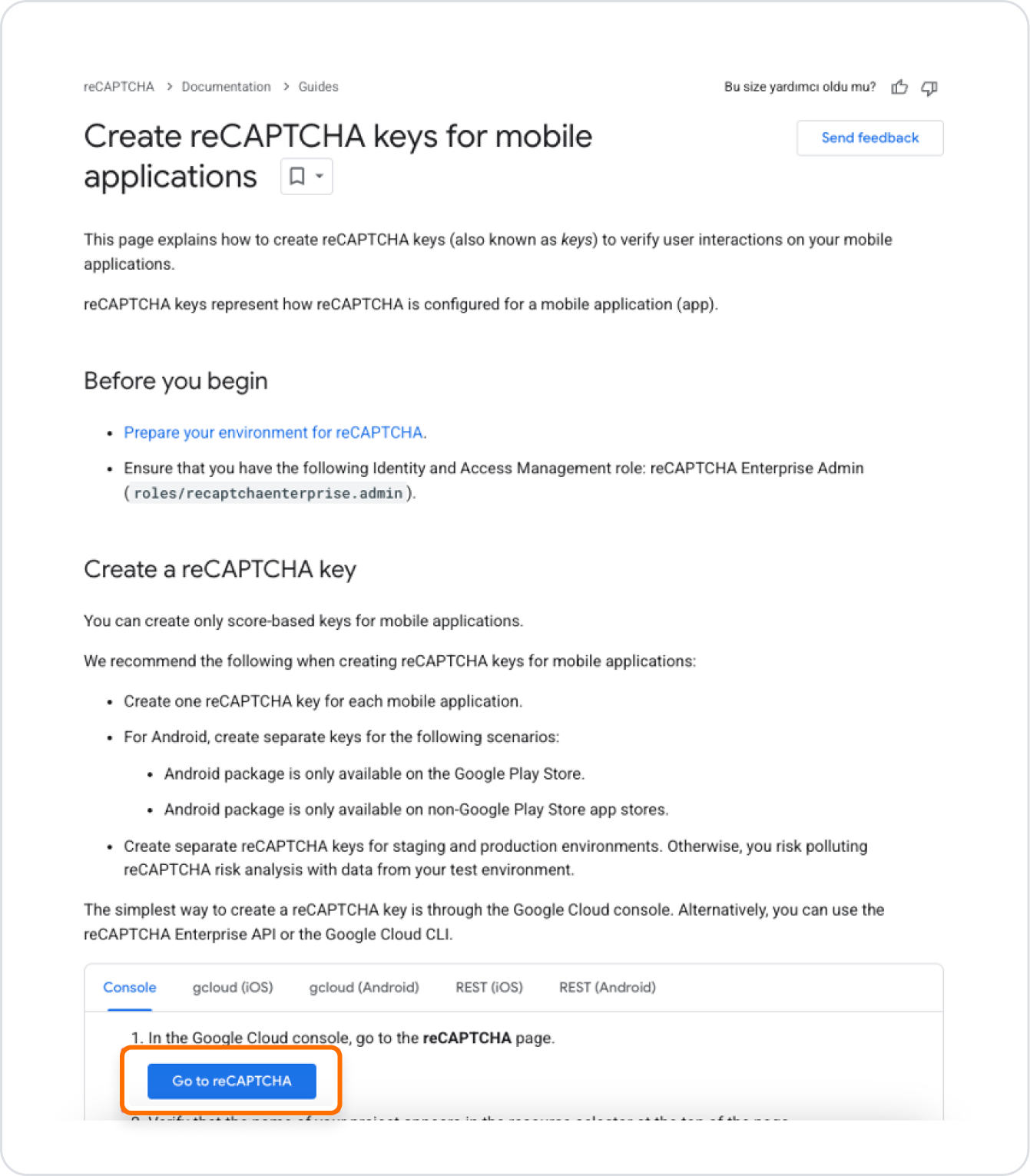
To use the ReCaptcha element, different key information is required for each platform (Web, Android, iOS). These keys, obtained from the Google ReCaptcha service, must be generated specifically for each platform. The key information obtained separately for Web, Android, and iOS must be entered into the Google ReCaptcha field in the Configuration Manager module for each platform to ensure the correct verification process.
Google Console ReCaptcha Settings
Follow these steps to obtain Google ReCaptcha keys:
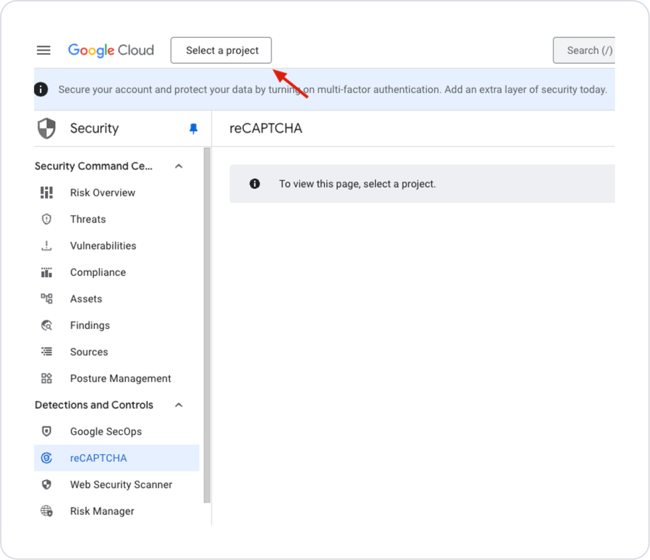
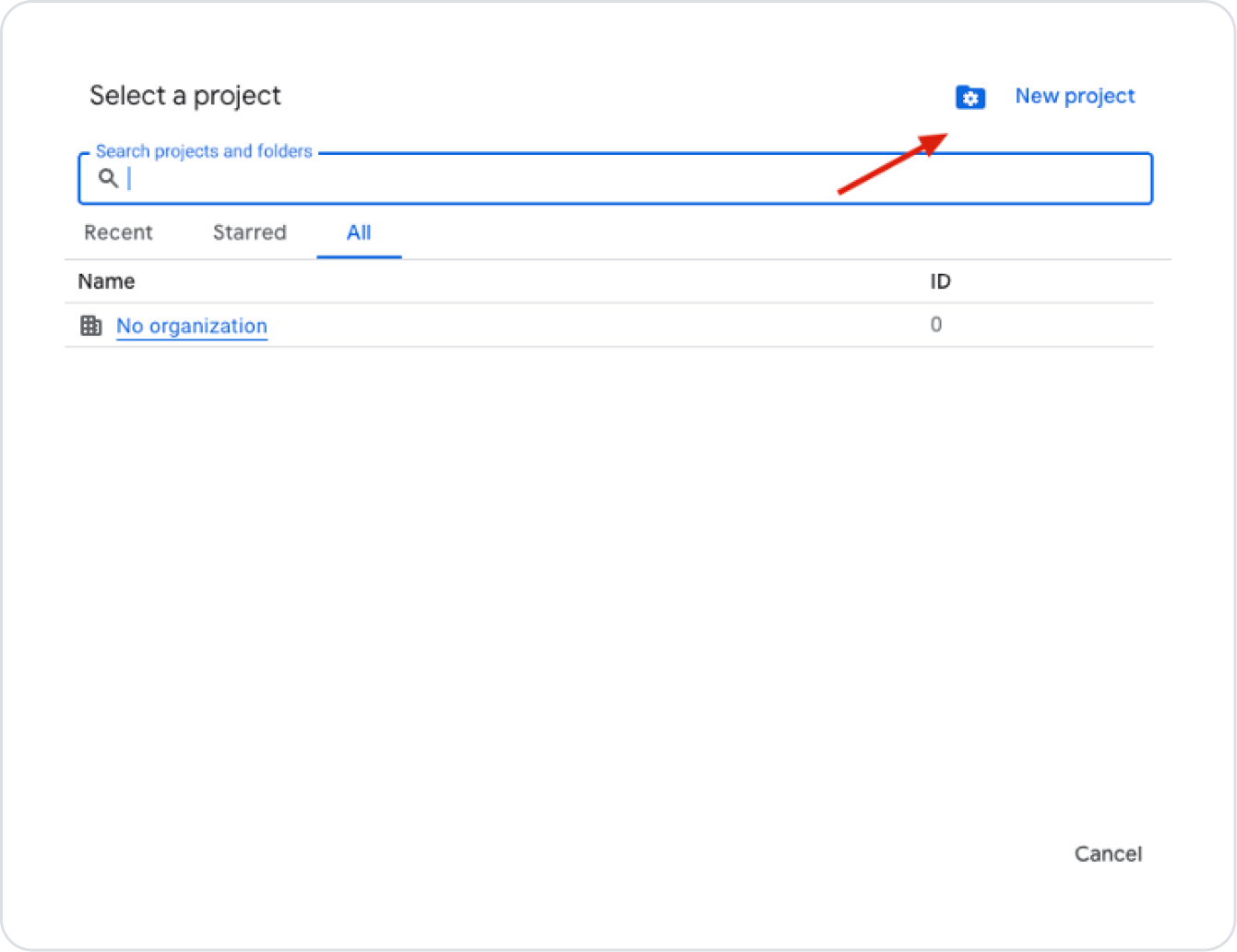
Continue by clicking the “Select a project” button.
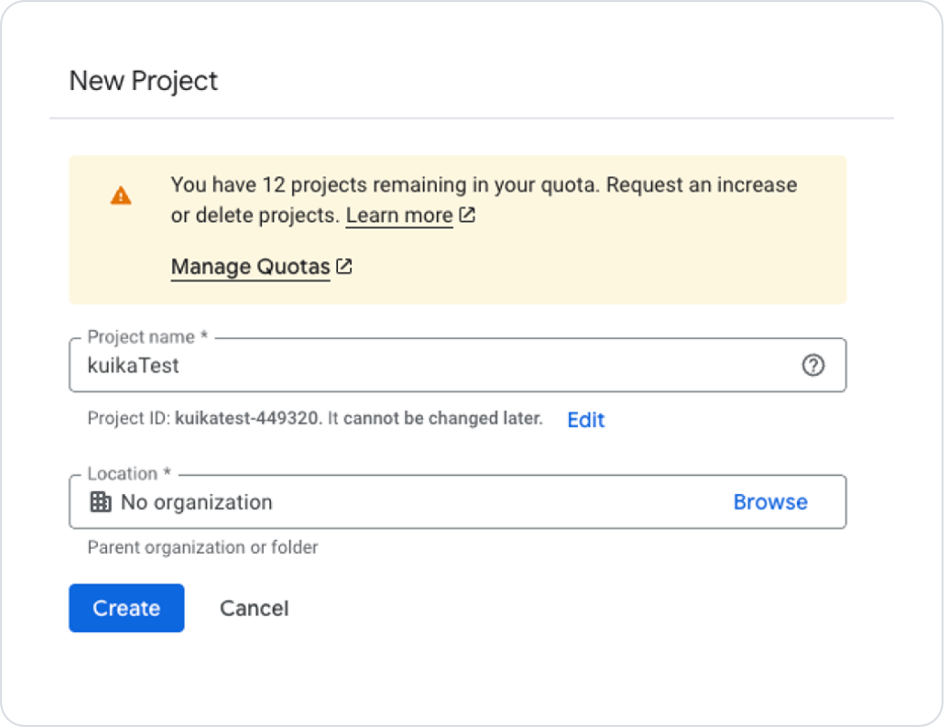
If you don't have a project, create a new one using the New Project button.
Enter the project name and click the “Create” button.
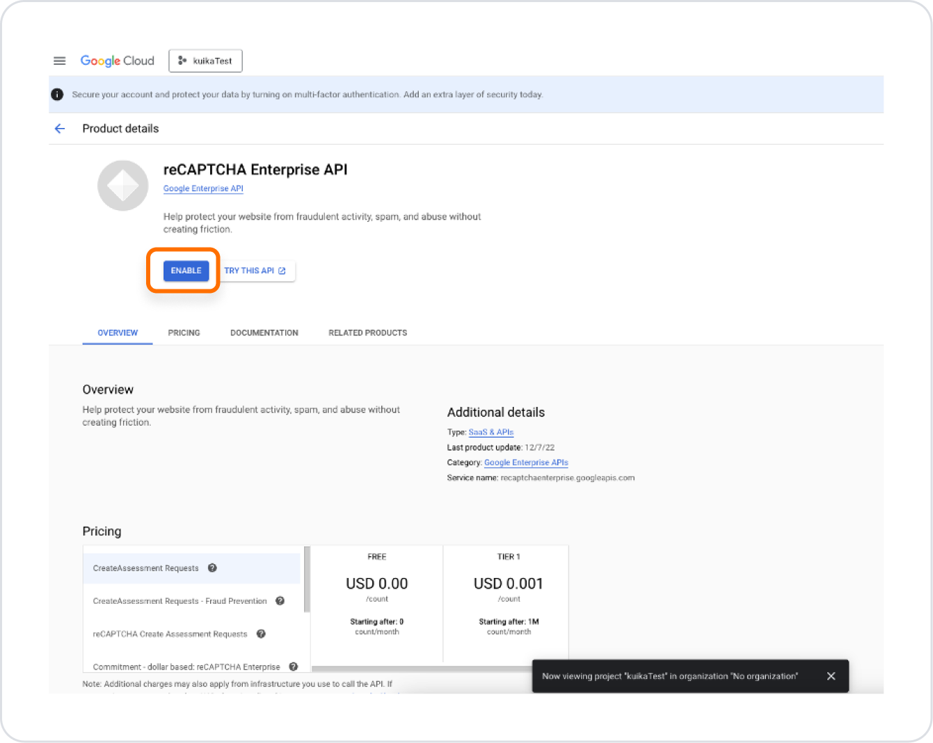
On the page that opens, press the ‘Enable’ button.
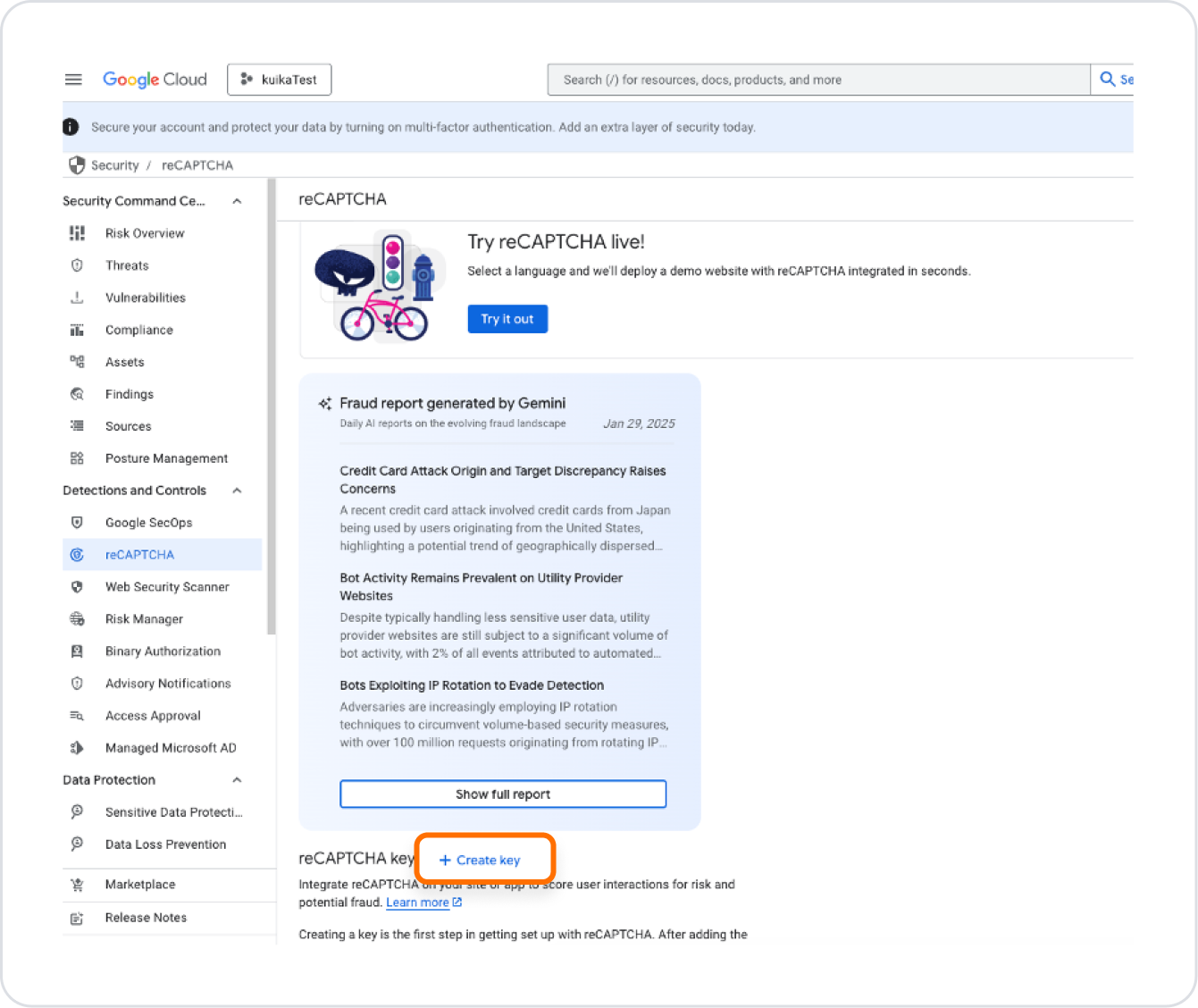
Then click the “Create Key” button.
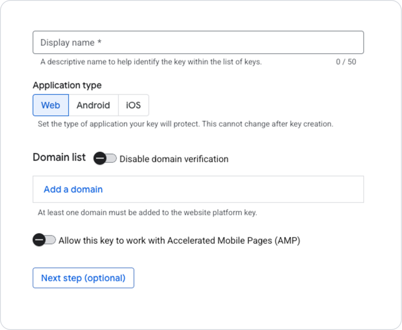
The Display Name field should be filled in as desired for how the keys should appear on the screen where they are listed.
Select the Website option for the Application Type field.
Enter the domain address of the added site in the Domain List field. (This can be disabled if desired, but is not recommended for security reasons.)
Once the necessary steps are complete, click the Next Step button.
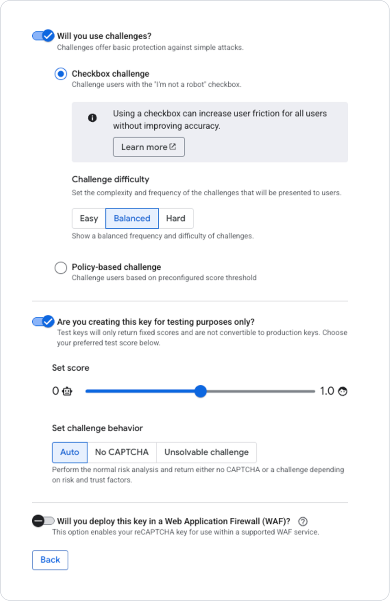
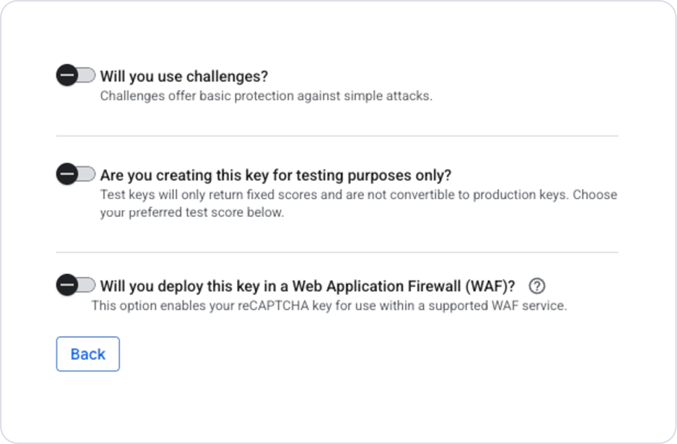
Here, options related to the created key can be enabled if desired.
Since a test key was created in this example, the following selections were made. When creating your own key, you can evaluate the relevant fields according to your needs and usage scenario and make your selection.
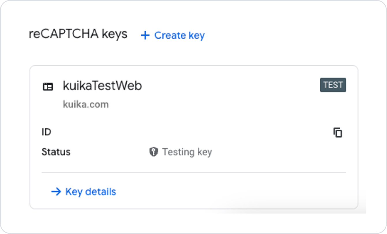
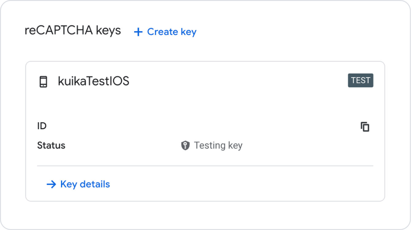
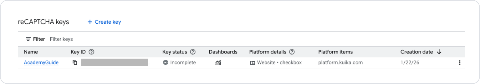
After completing the necessary steps, click the Create Key button at the bottom of the page to create the key. On the screen that opens, click the back arrow icon to view the key you created on the key list page.
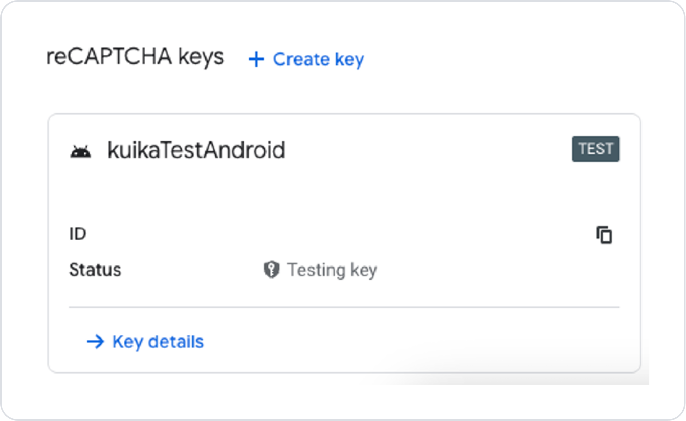
The created key will be listed on the page.
Obtaining an Android Key
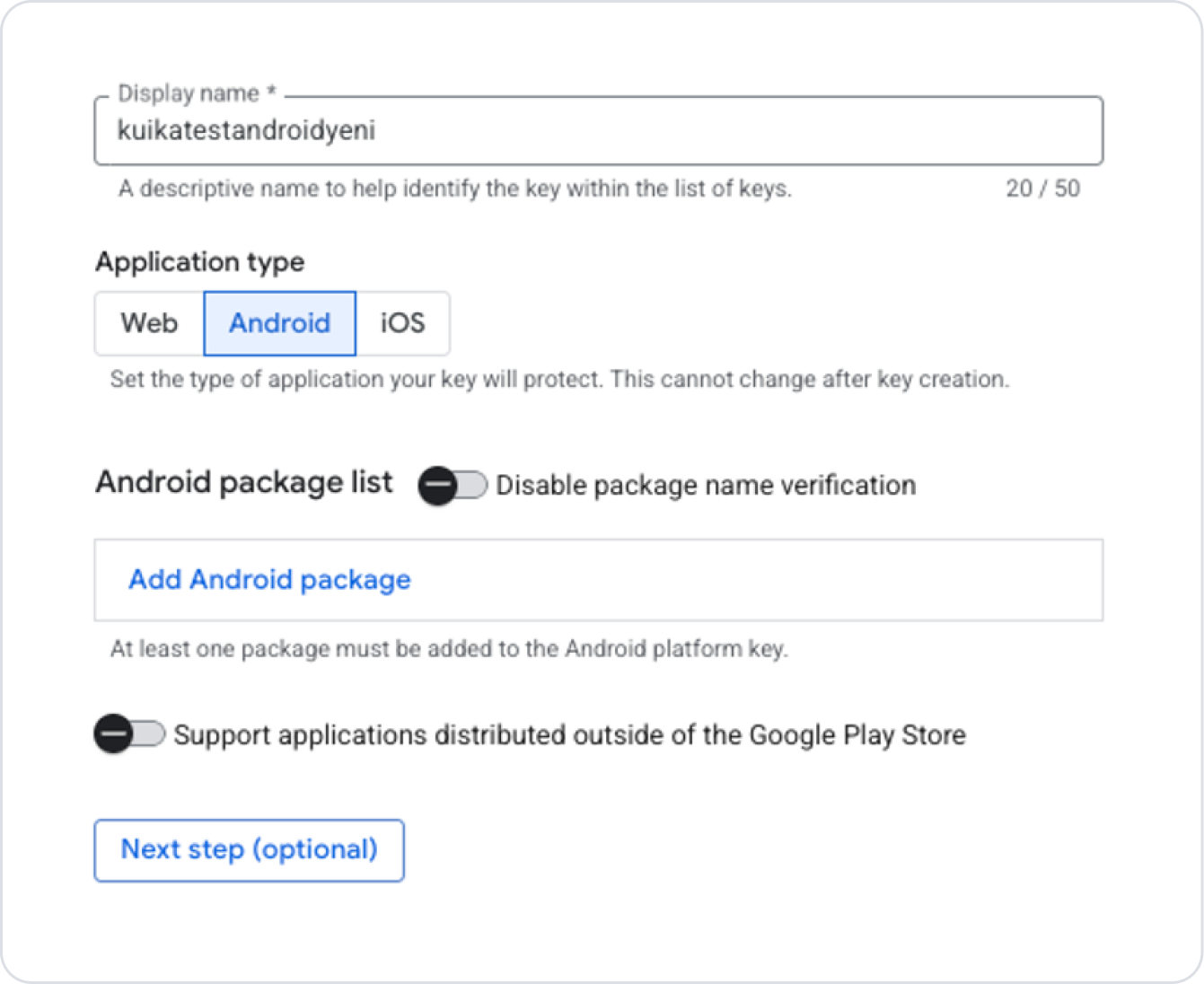
Click the Create Key button in the area where the keys are listed on the ReCaptcha page.
Fill in the Display Name field as you want the key to appear in the list.
Select the Android option for the Application Type field.
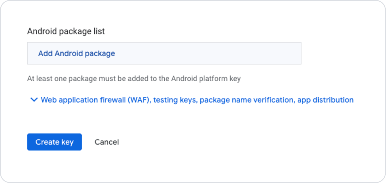
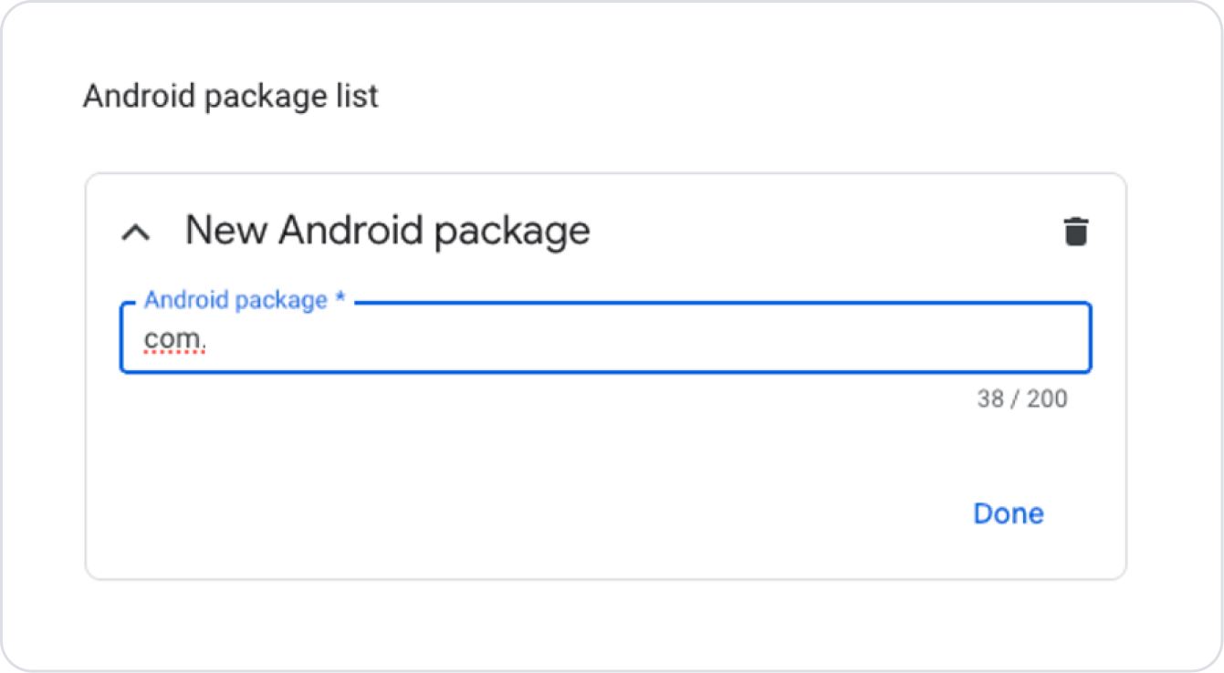
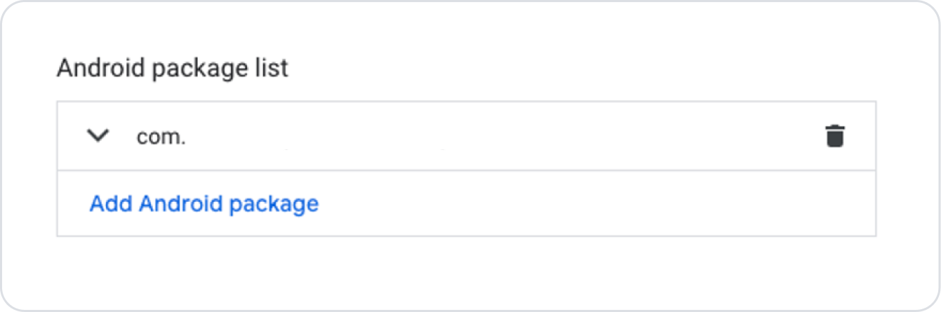
Enter the domain address of the site you added in the Domain List field. (You can find a detailed explanation of the Domain List field in the next steps of this guide.)
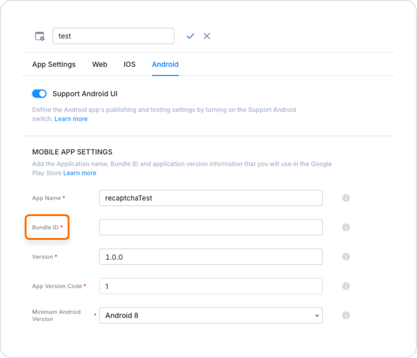
After selecting Android, enter the Bundle ID information found in the Configuration Manager → Android tab of the project you created on the Kuika platform in the field that opens.
Click the Done button to save the Bundle ID information.
After completing the necessary steps, click the Next Step button.
On the screen that opens, set the optional options for the created key according to your needs.
Finally, click the Create Key button to generate the key.
To view the generated key, click the back arrow icon on the page that opens. The key will be displayed on the key list page.
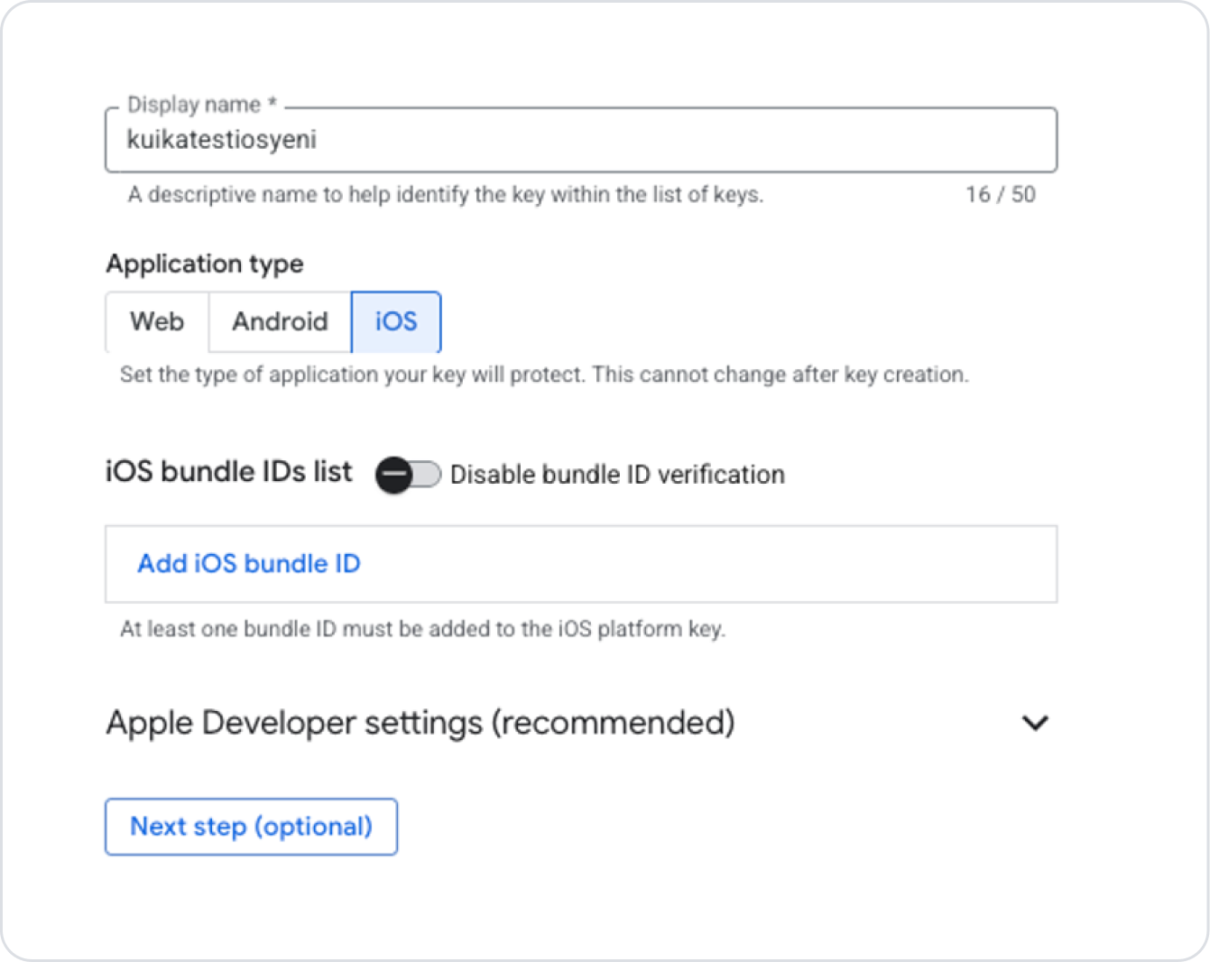
Obtaining an iOS Key
On the ReCaptcha page, click the Create Key button in the area where the keys are listed.
Fill in the Display Name field as you want the key to appear in the list.
Select the iOS app option for the Application Type field.
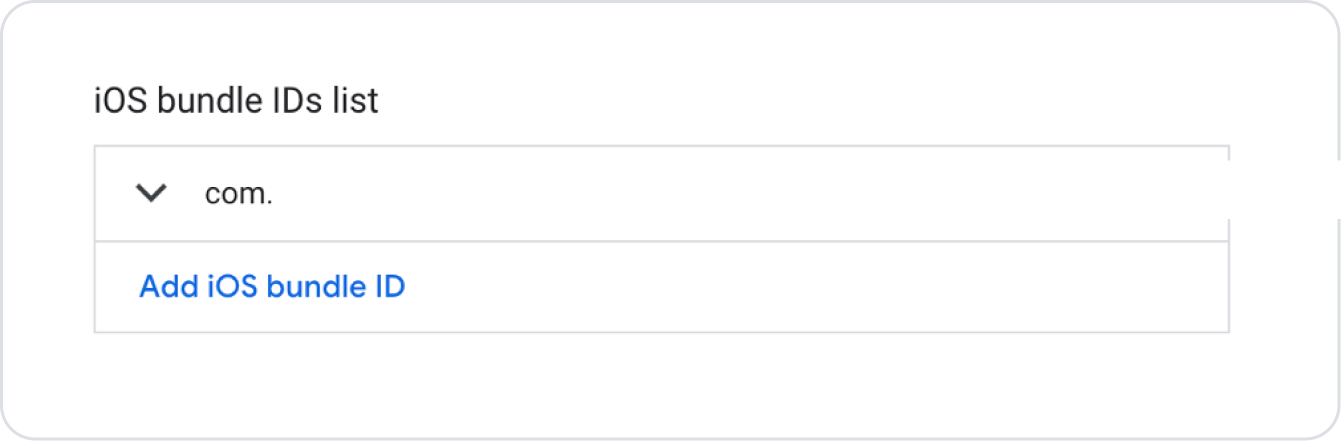
Enter the domain address of the site you added in the Domain List field. (You can find a detailed explanation of the Domain List field in the next steps of this guide.)
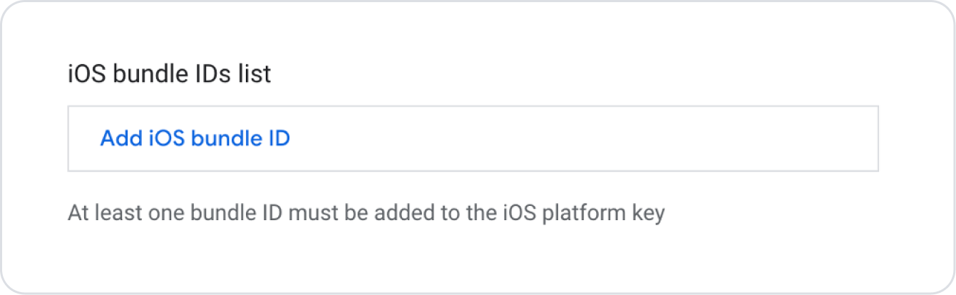
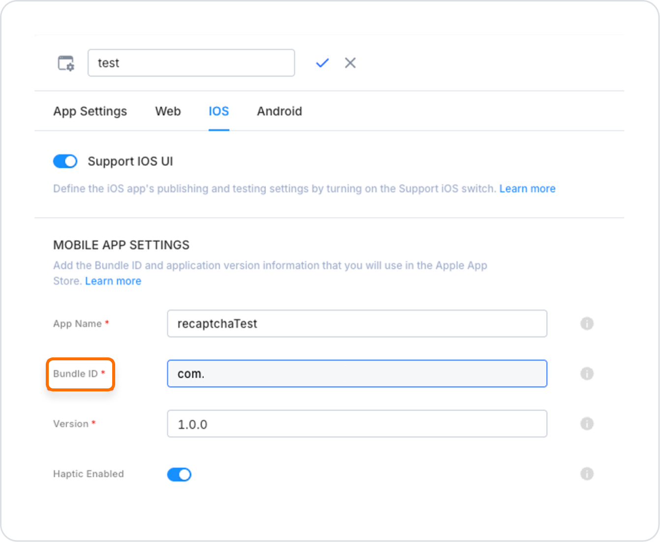
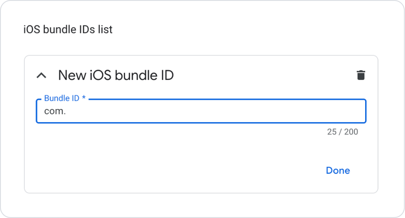
In the field that opens, enter the Bundle ID information found in the Configuration Manager → iOS tab of the project you created on the Kuika platform.
Click the Done button to save the Bundle ID information.
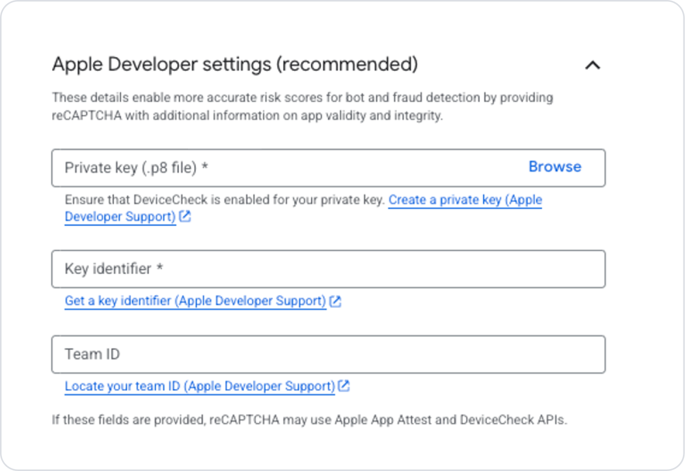
Apple Developer Settings
After saving the Bundle ID, you need to configure the Apple Developer Settings field at the bottom of the page. This information will be retrieved from your Apple Developer account.
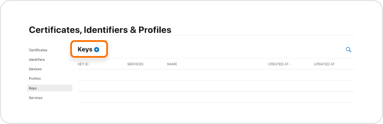
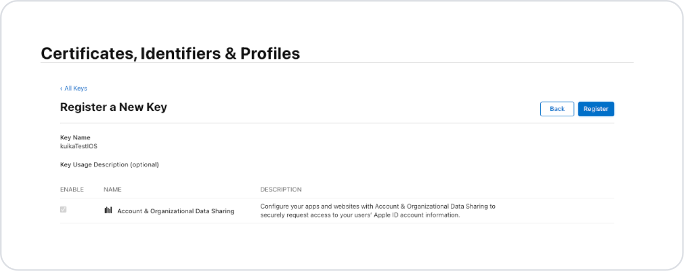
In the Certificates, Identifiers & Profiles section, go to the Keys tab.
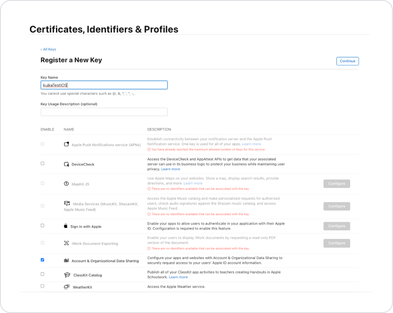
Click the + button to create a new Private Key (.p8).
Fill in the Key Name field and select the required option from the list.
Click the Register button.
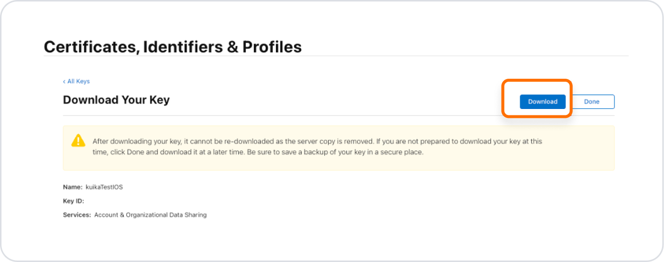
On the screen that opens, click the Download button to download the .p8 file.
The .p8 file can only be downloaded once. There is only one download right for each private key.
Adding Private Key Information
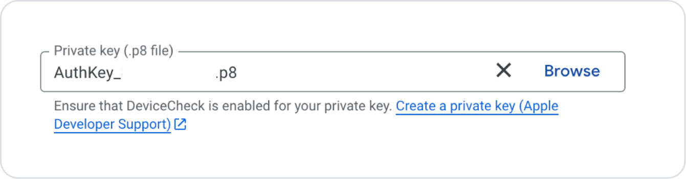
Upload the downloaded .p8 file to the relevant field on the iOS key creation page using the Browse option.
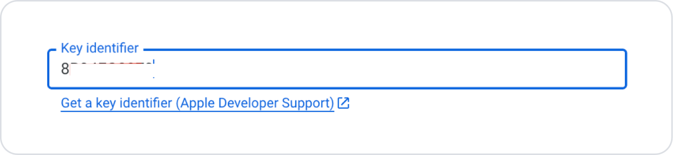
For the Key Identifier field, use the KEY ID value of the key you created in Certificates, Identifiers & Profiles → Keys.
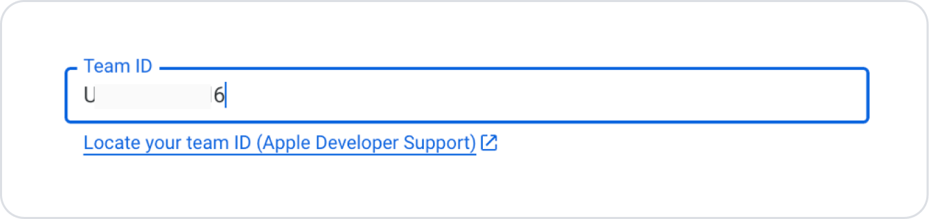
For the Team ID field, enter the Team ID code located under your name in the upper right section of the same page.
Key Creation
After completing the Apple settings, click the Next Step button.
On the screen that opens, configure the optional settings for the created key according to your needs.
Finally, click the Create Key button to create the key.
After the key is created, you can view it on the key list page by clicking the back arrow icon on the page that opens.
Kuika ReCaptcha Integration
Up to this point, we have created Web, Android, and iOS keys. Now we will use the keys we have obtained on the Kuika platform.
If you are going to use it for a mobile application, you must first create a mobile application. You can access our relevant content to create a mobile application.
WEB Integration
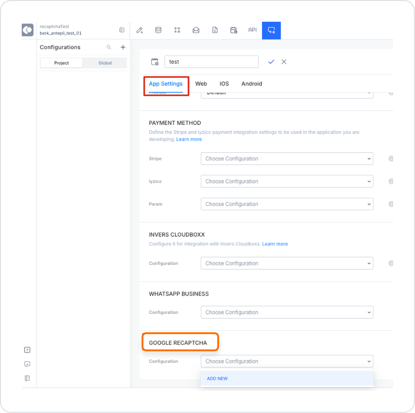
Go to the “Configuration Manager” module.
Find the “App Settings” tab and the “Google Recaptcha” field. For detailed information, you can review our Configuration Manager content.
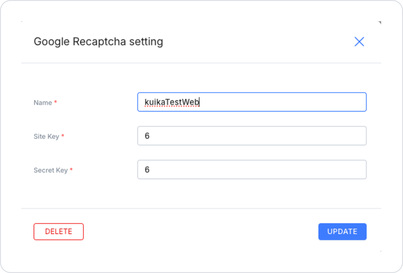
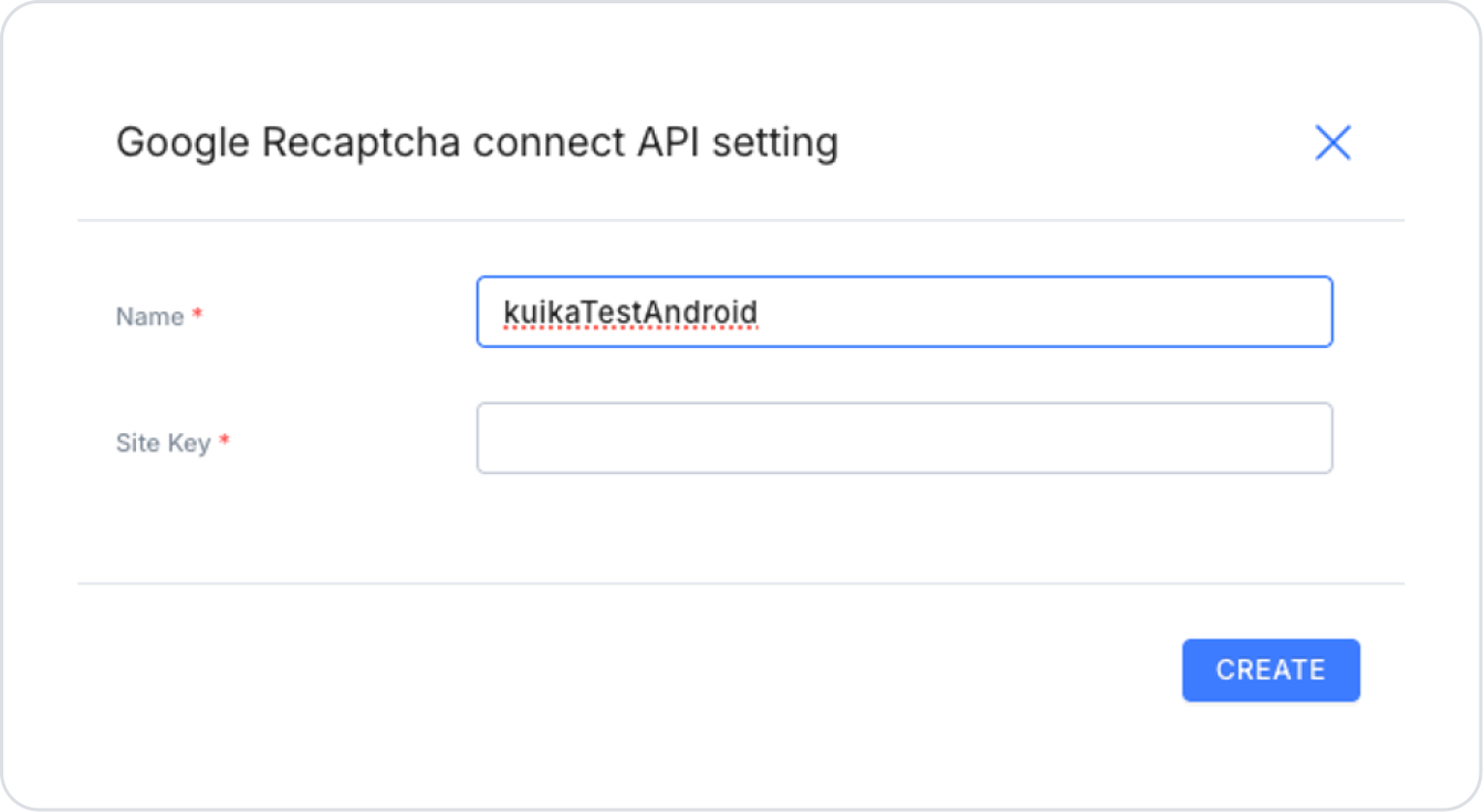
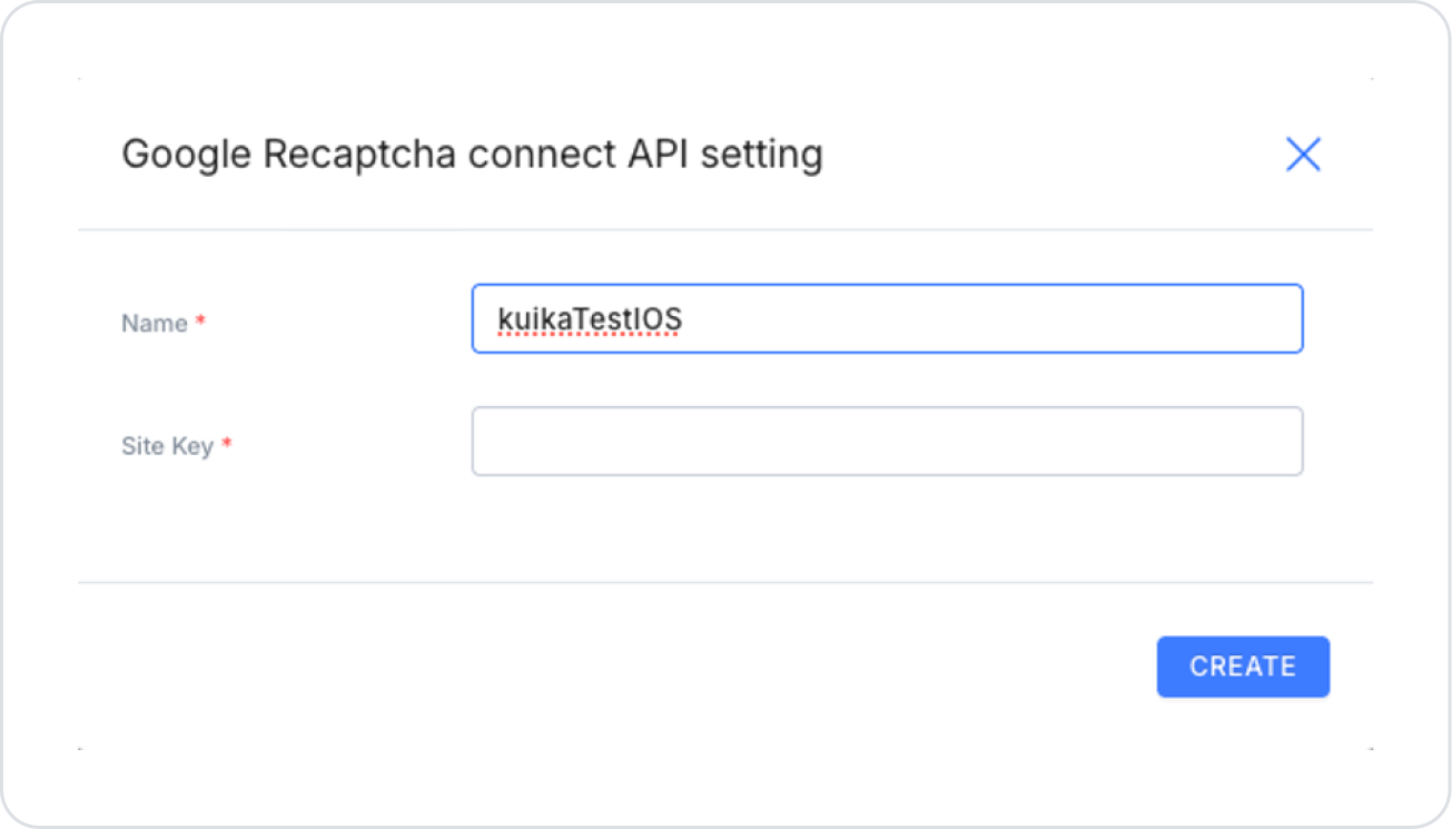
Click the “Add New” button.
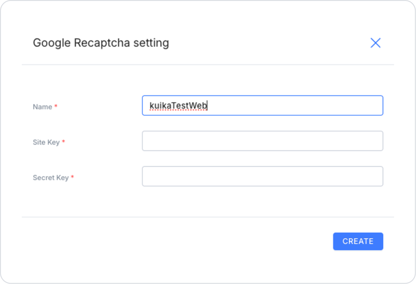
In the window that opens, fill in the ‘Name’ field as desired.
Fill in the “Site Key” and “Secret Key” fields with the values from the Web Key created by Google.
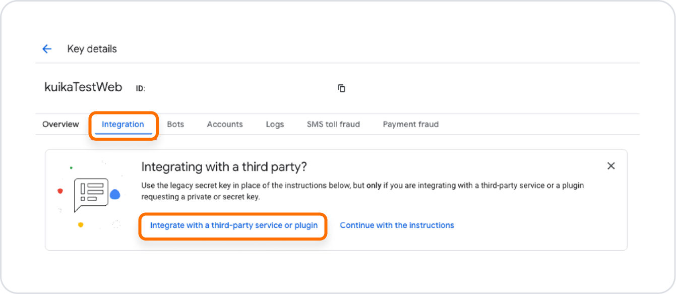
Go to the Details page, go to the Integrations tab, and click the Integrate with a third-party service or plugin button.
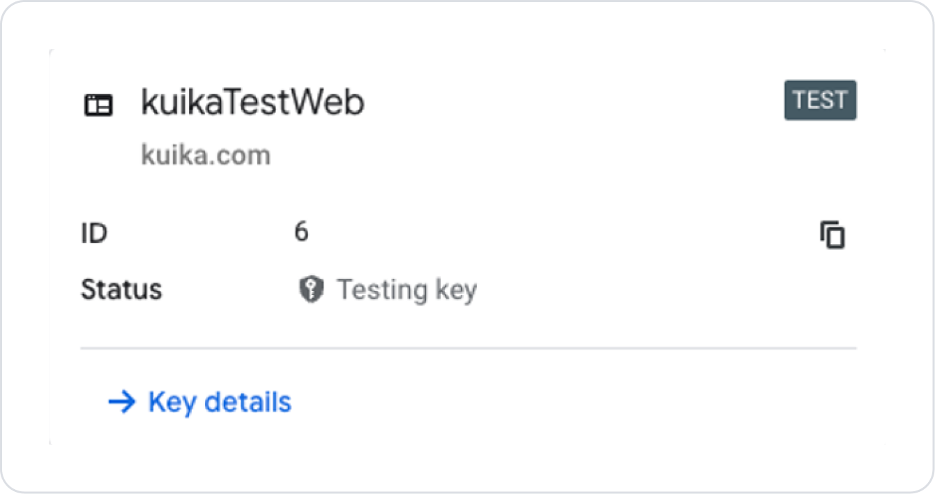
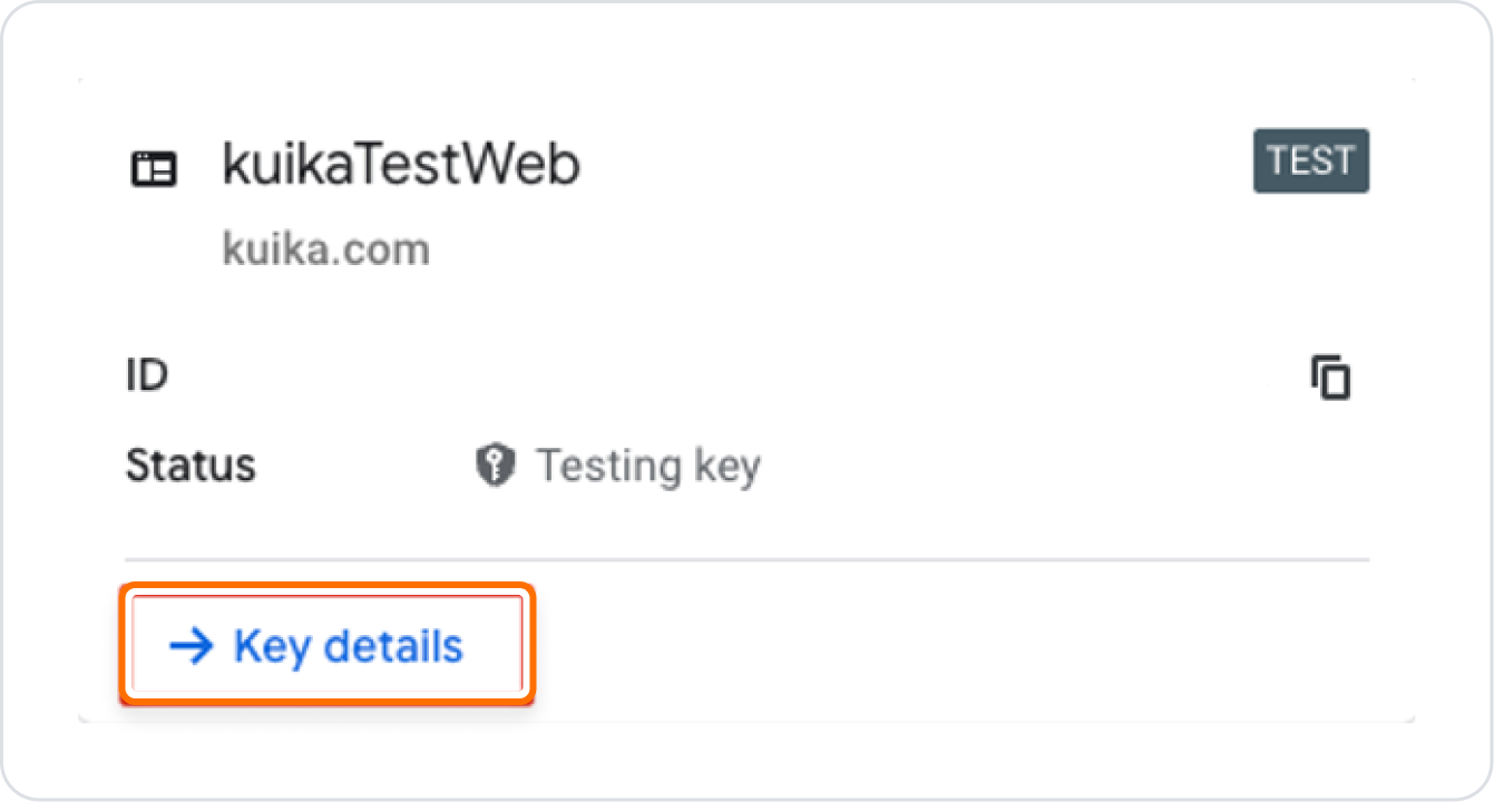
Return to the Google Recaptcha page and click the Key Details button in the web key we created.
Go to the Details page, go to the Integrations tab, and click the “Integrate with a third-party service or plugin” button.
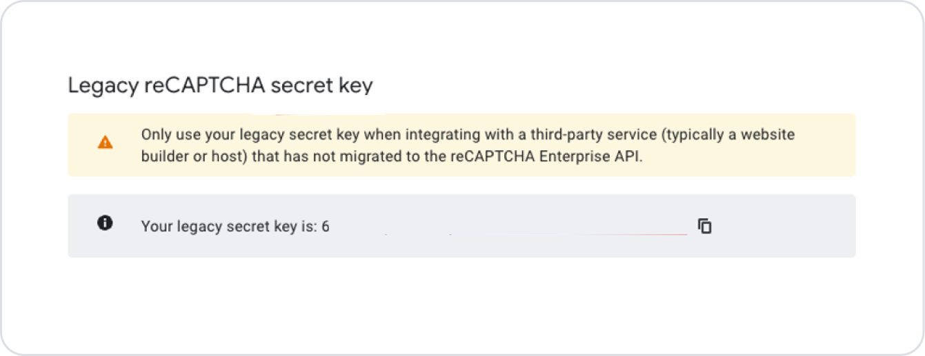
The Secret Key appears in the window that opens.
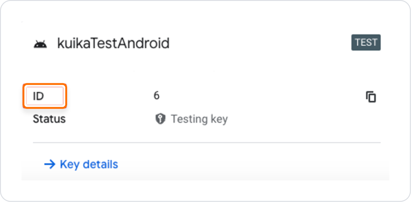
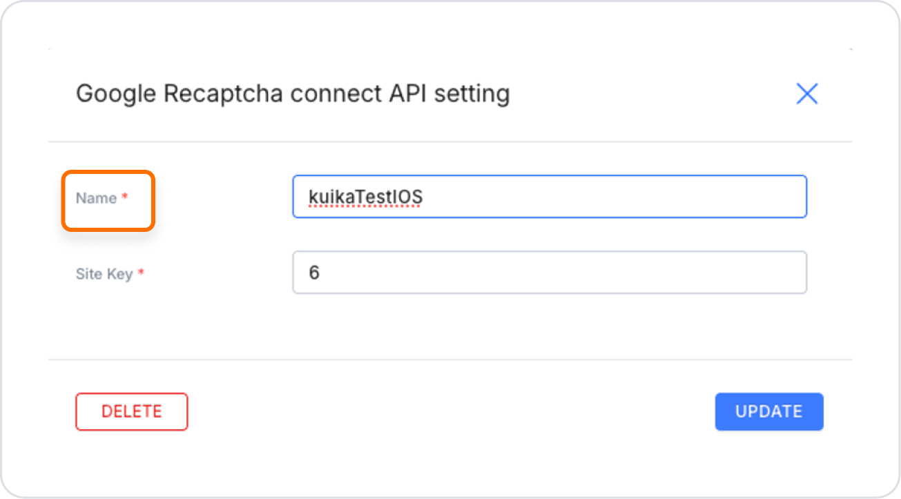
“ID” value -> “Site Key”
“Secret Key” value -> “Secret Key”
After entering the required information, save it in the Configuration Manager module. You can also create a configuration for Android and iOS applications by following similar steps.
Android Integration
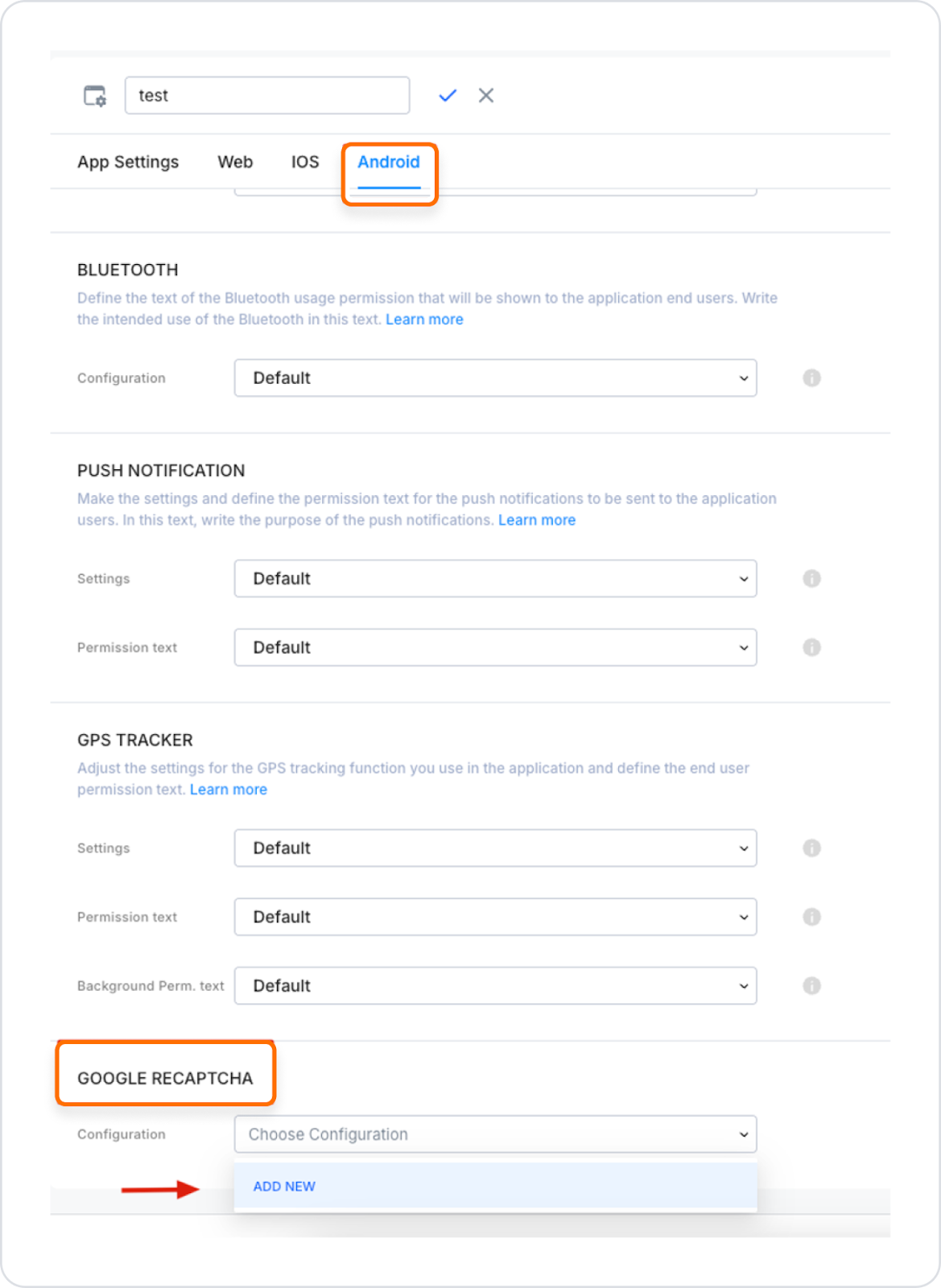
Go to the “Configuration Manager” module.
Scroll to the bottom of the “Android” tab and find the “Google Recaptcha” field.
Click the “Add New” button.
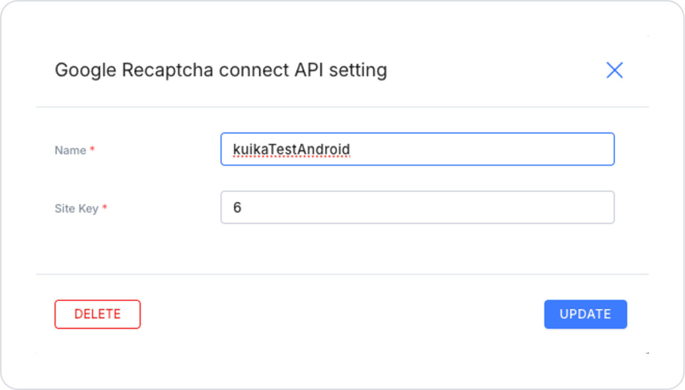
Fill in the ‘Name’ field as desired.
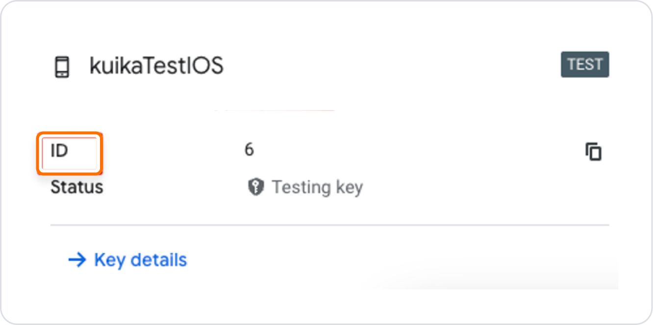
In the “Site Key” field, enter the “ID” value of the Android Key you created.
After entering the required information, save it.
iOS Integration
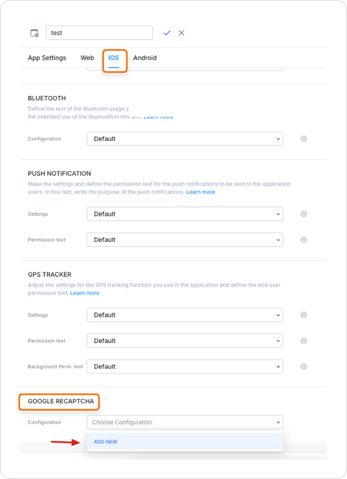
Go to the “Configuration Manager” module.
In the “iOS” tab, scroll to the bottom of the page and find the “Google Recaptcha” field.
Click the “Add New” button.
Fill in the ‘Name’ field as desired.
In the “Site Key” field, enter the “ID” value of the iOS Key you created.
After entering the required information, save it.
After completing these steps, return to the UI Design module.
Add Validation to the ReCaptcha element using the ADD VALIDATION button on the right side.
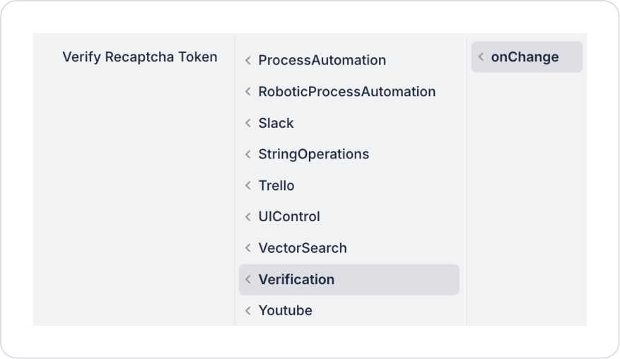
Then, add the OnClick→ Verification→ Verify ReCaptcha Token action to the button where you want to add the Recaptcha verification. If you need to log out, add the Logout action.
In other words, to add Recaptcha verification, you can add the Verify ReCaptcha Token action to the button that requires verification and theLogout action to the button that requires logout.
2.2. Actions That Can Be Added to the Recaptcha Element
The Recaptcha element does not support any actions and does not initiate any direct operations.
It only provides user verification status for control purposes and is used as a control point for security. Actions dependent on the verification result should be managed through elements or processes outside of Recaptcha.
3. How to Use the ReCaptcha Element?
In this section, we will cover the end-to-end use of the reCAPTCHA element through example scenarios.
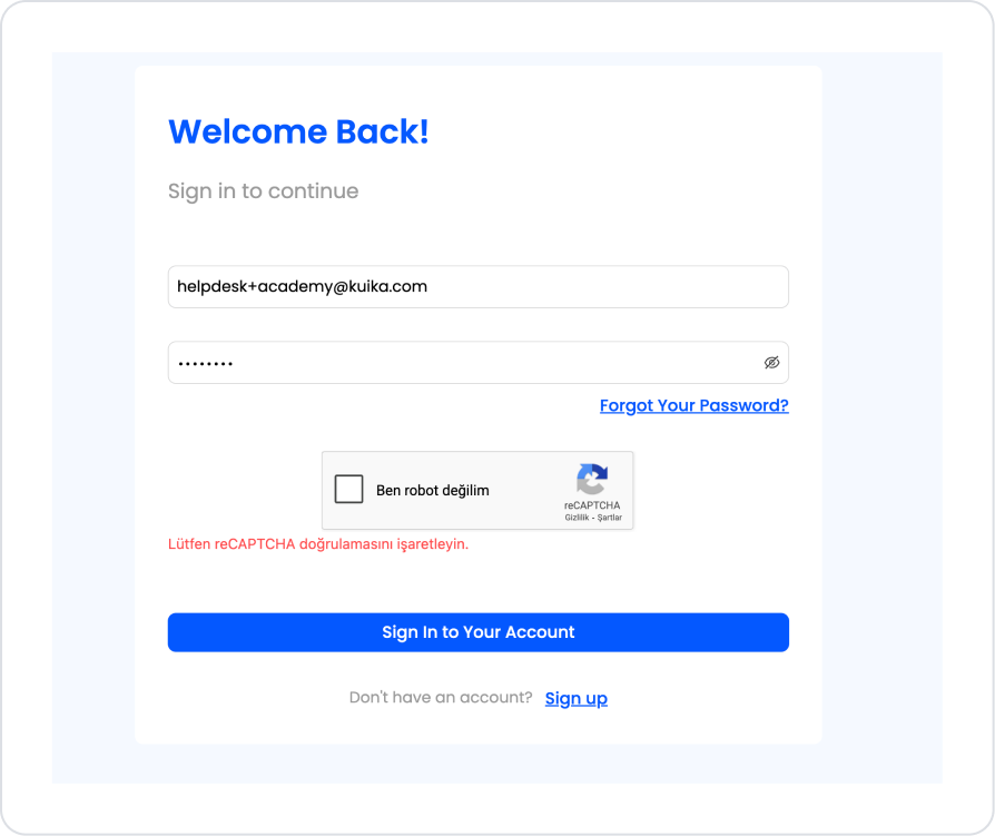
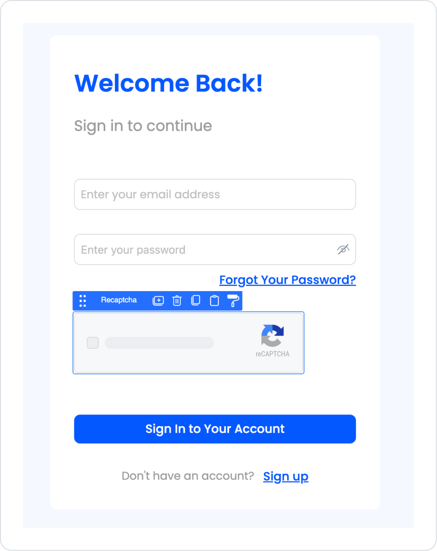
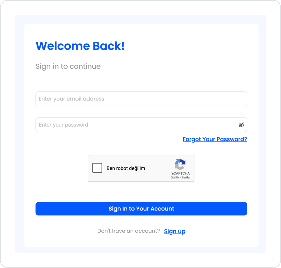
Scenario: Sign In Screen – Secure Login with reCAPTCHA
In a business management or enterprise application, the Sign In screen is configured with integrated reCAPTCHA verification to allow users to access the system securely. This screen aims to prevent unauthorized access and automated login attempts while offering a simple user experience.
In the scenario:
The user initiates the login process by entering their email address and password.
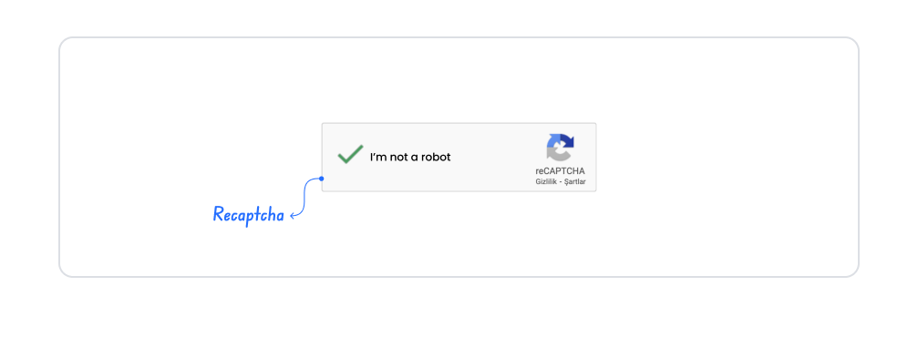
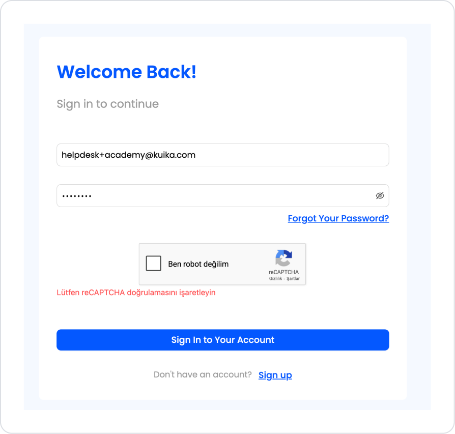
Before the login process, user interaction is verified with the “I'm not a robot” reCAPTCHA verification.
The login process cannot be completed without completing the reCAPTCHA verification, and an informative warning message is displayed to the user.
Once verification is successfully completed, the user logs into the system and is directed to the application's main screen.
Step 1 - Adding ReCaptcha to the Ready Sign In Screen
Open the UI Design module:
Follow the necessary steps on the ReCaptcha Settings page on the Academy to create the Site Key and Secret Key.
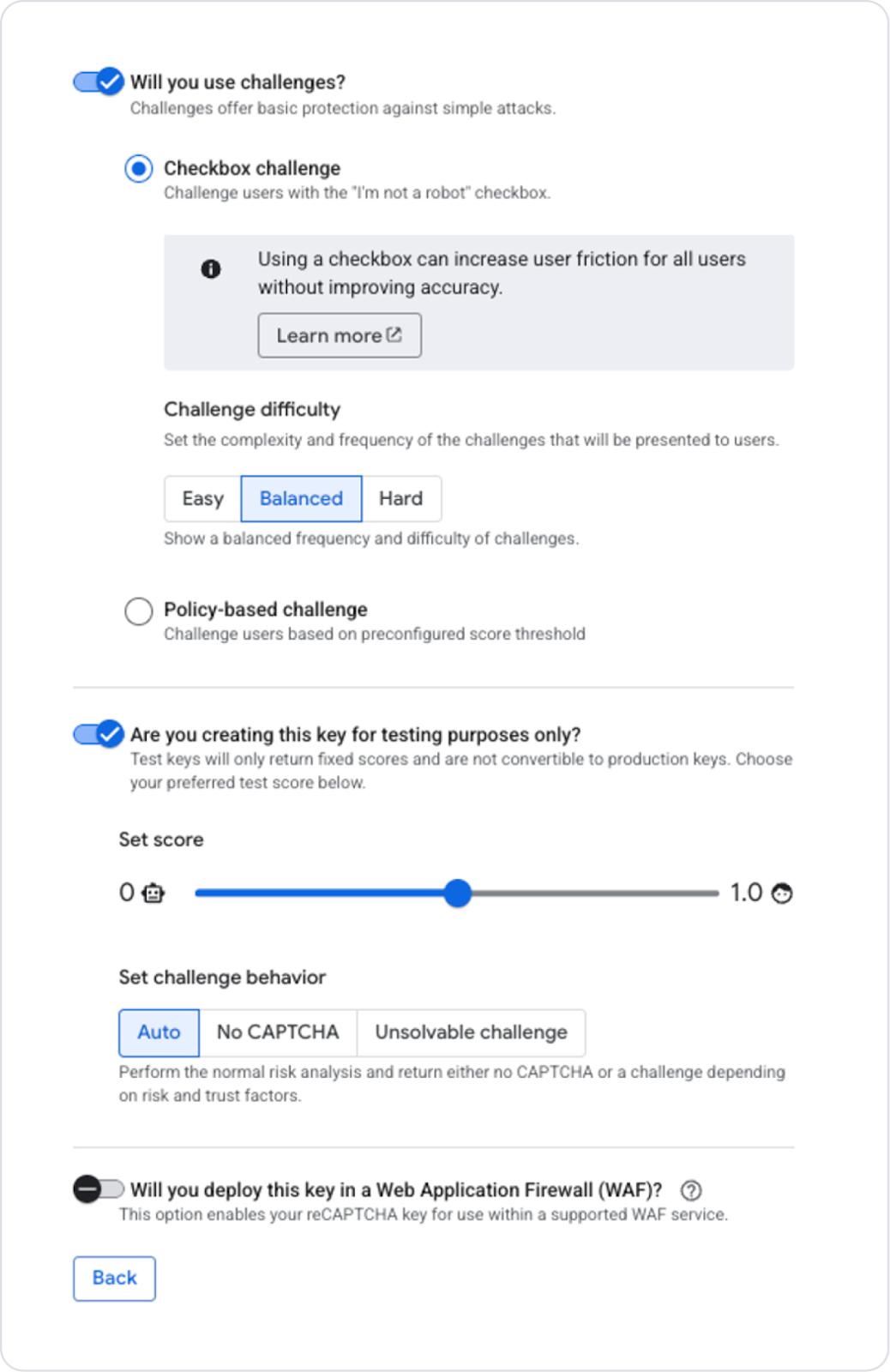
The ReCaptcha type used must be set to V2 Checkbox.
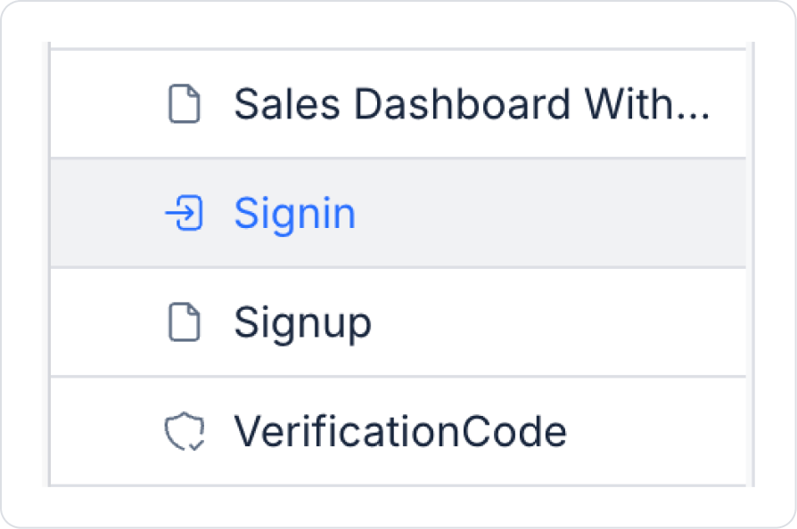
In the Screens area on the left side panel, click on the Signin screen that comes ready for each project.
Add the Elements > Interactive > ReCaptcha element to the login button on the screen.
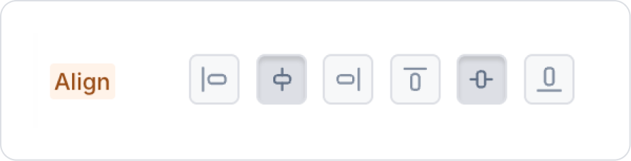
Click on the space next to the ReCaptcha element and set it to Col > Styling > Layout > Align > Center Vertically and Horizontally.
There is no styling area for ReCaptcha.
Step 2 - Adding the Verification Action
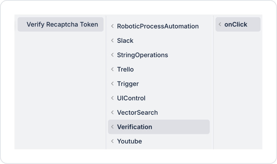
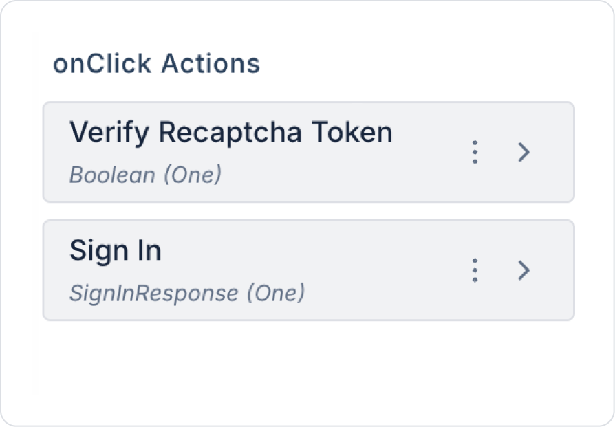
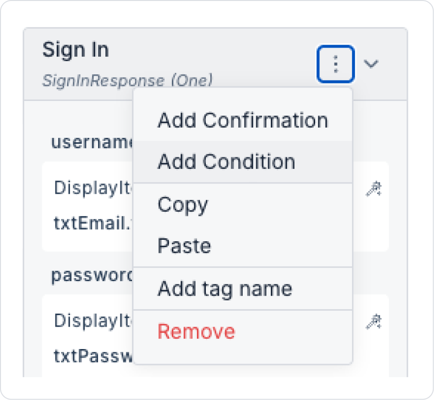
Click on the Sign In to Your Accountbuttonelement on the Sign in page. Add the Add Action > onClick > Verification > Verify Recaptcha Token action to the Button element.
Hold down the added action on the action box and move it to the first row.
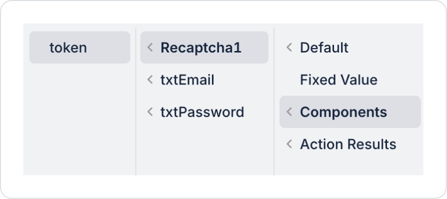
Define the token in Components > Recaptcha > token in the token field within the Verify Recaptcha Token action.
Click on the Sign In to Your Accountbuttonelement and add a condition to the Sign In action within the defined actions using the Add Condition option.
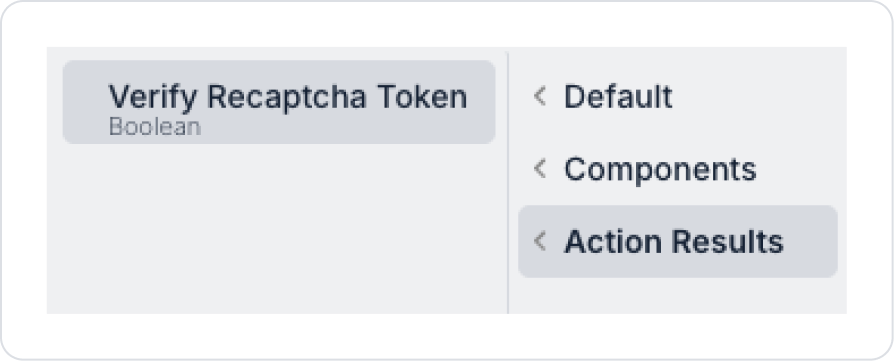
Define the condition as Field > Action Result > VerifyRecaptchaToken and define the other fields as follows.
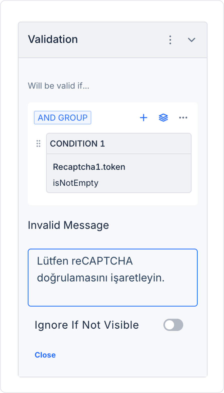
Finally, click on the ReCaptcha element and add validation from the Add Validation field.
If no additional validation is added, the element's own notification structure is used.
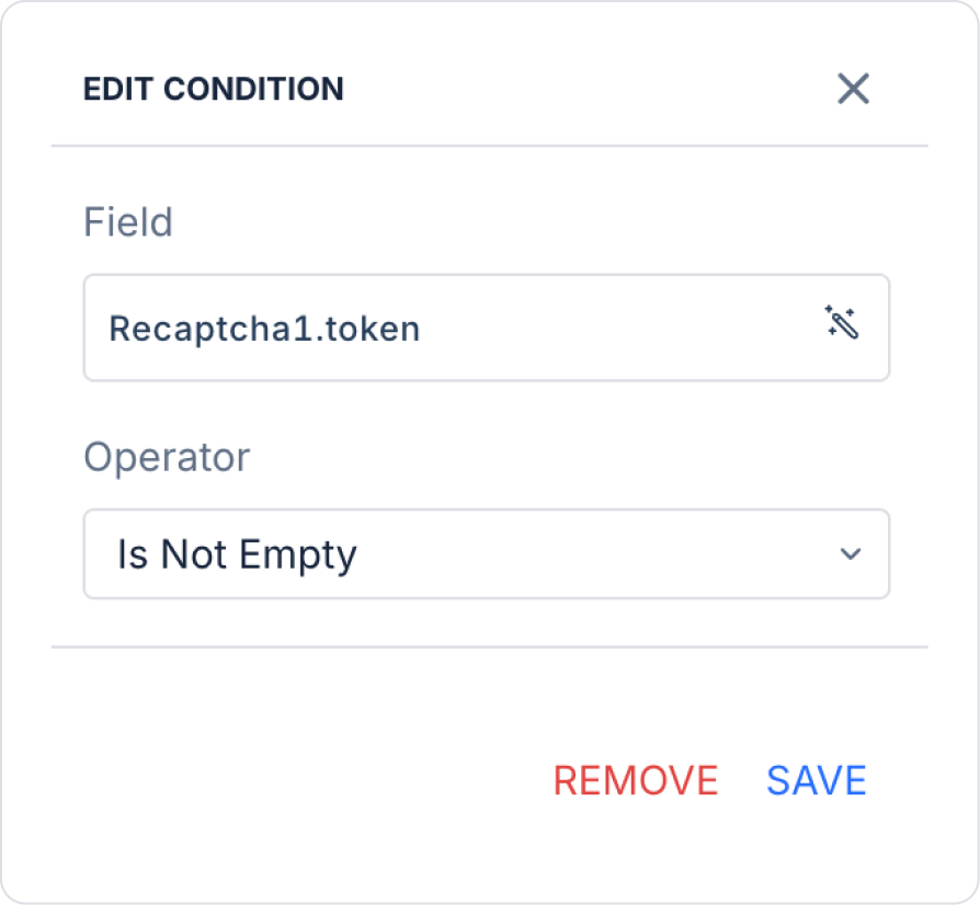
Click on Condition 1 and define the condition as follows.
Update the Invalid Message field to “Please check the reCAPTCHA verification.”
Preview
When the application is tested, it is configured so that reCAPTCHA verification is mandatory during the login process on the ready login screen. The user cannot log in without completing the verification, and an informative warning message is displayed on the screen when verification is not performed. This structure ensures that the login process is managed in a secure and controlled manner, while providing an additional layer of security against unauthorized and automated access attempts.
4. Common Properties
Some fields on the reCAPTCHA element are used commonly across all UI elements. Therefore, detailed explanations of the following properties can be found in the relevant general guide pages:


