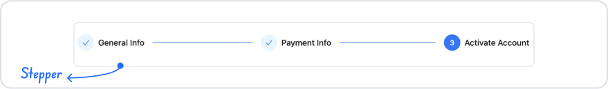
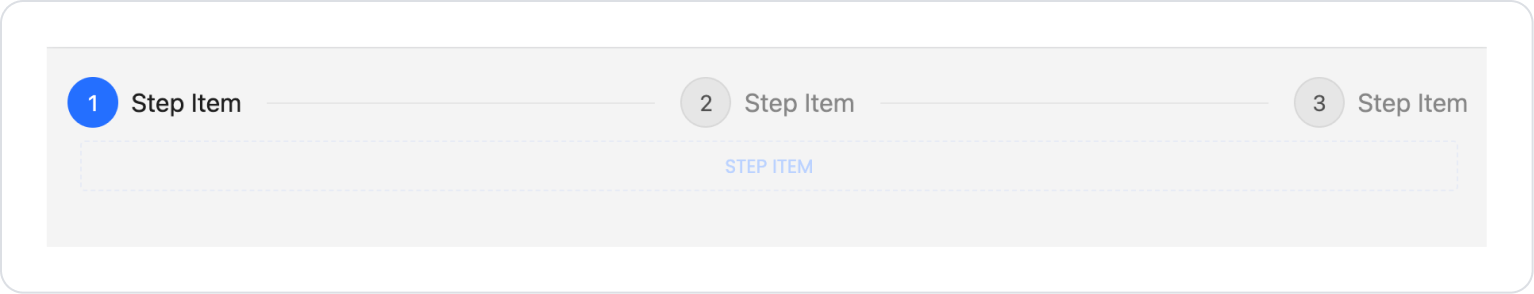
Kuika's Stepper element is a UI element used to present step-by-step processes to the user in a clear, organized, and trackable manner. Users can proceed to the next stage of the process by completing each step in sequence and can easily track which step they are on visually.
The Stepper element is supported in web and mobile applications.
1.1. Common Use Cases
Multi-step registration and membership processes
Application and request forms (permission request, credit application, support request, etc.)
Order and payment flows (address → payment → confirmation)
User onboarding processes
Identity verification and document upload steps
Settings and configuration wizards (wizard structures)
Survey, test, or evaluation processes
Workflows requiring process tracking (e.g., created → approved → completed)
2. Key Features
Offers a step-based progression structure.
Supports validation checks during step transitions; automatically redirects the user to the relevant step when required fields are left blank.
Visually distinguishes active, completed, and inactive steps.
Clearly shows the user's current step.
Provides support for moving forward and backward between steps.
Different validation and control mechanisms can be applied at each step.
Intuitively shows the user the completion status of the process.
Provides a consistent and responsive experience on both web and mobile applications.
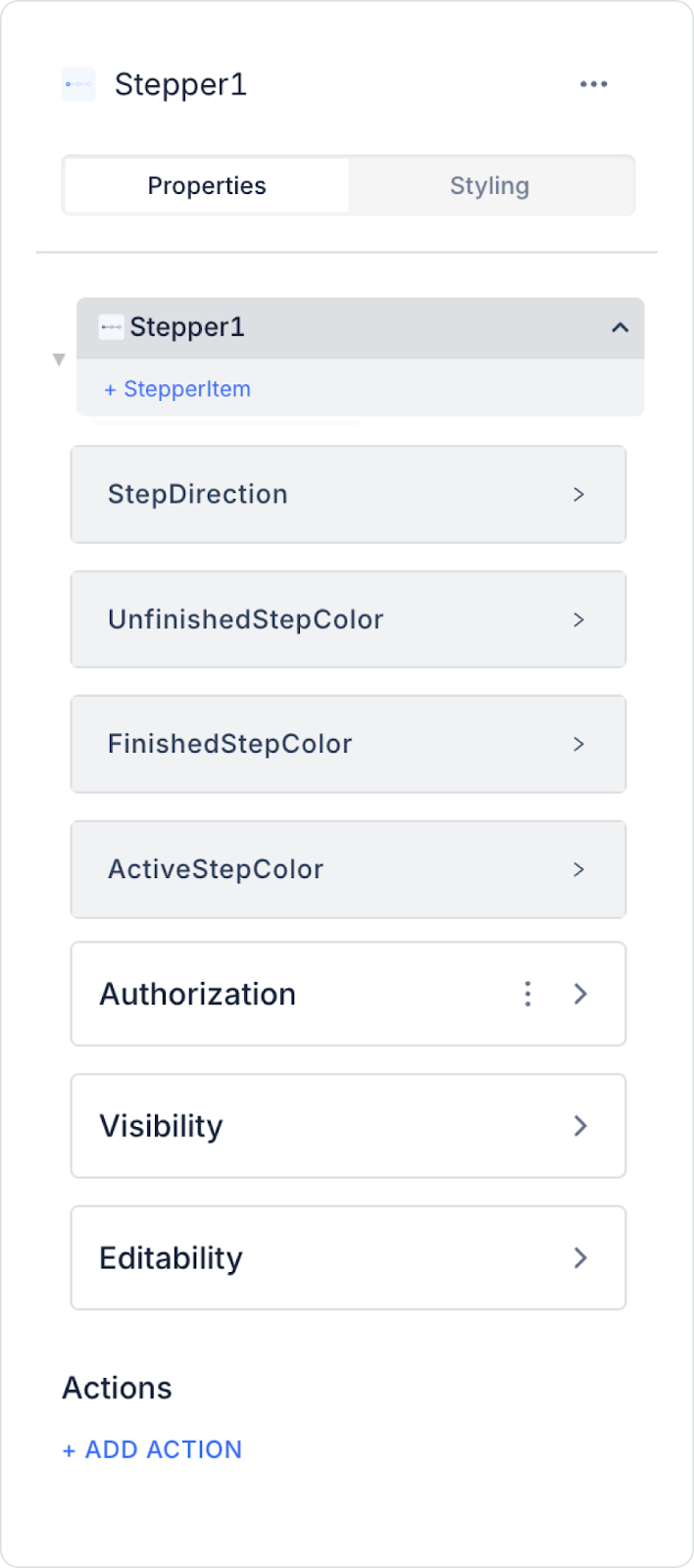
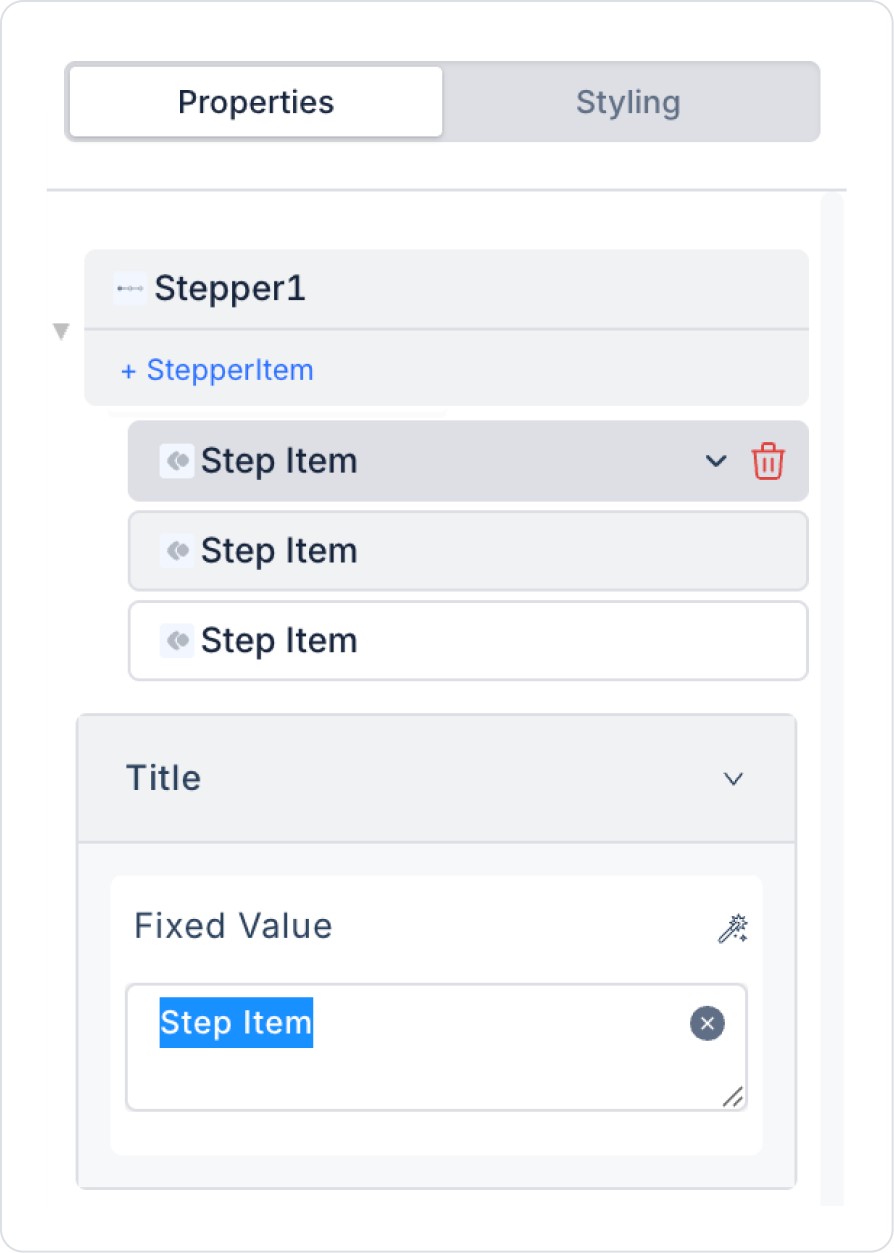
2.1. Stepper Element Properties
The following settings can be configured in the Properties panel:
Stepper1: This is where step adjustments are made. You can name the steps in the Title field by clicking on Step Item, and add new steps with +Add Stepper Item.
Step Direction: Whether steps are displayed horizontally or vertically can be set in this field.
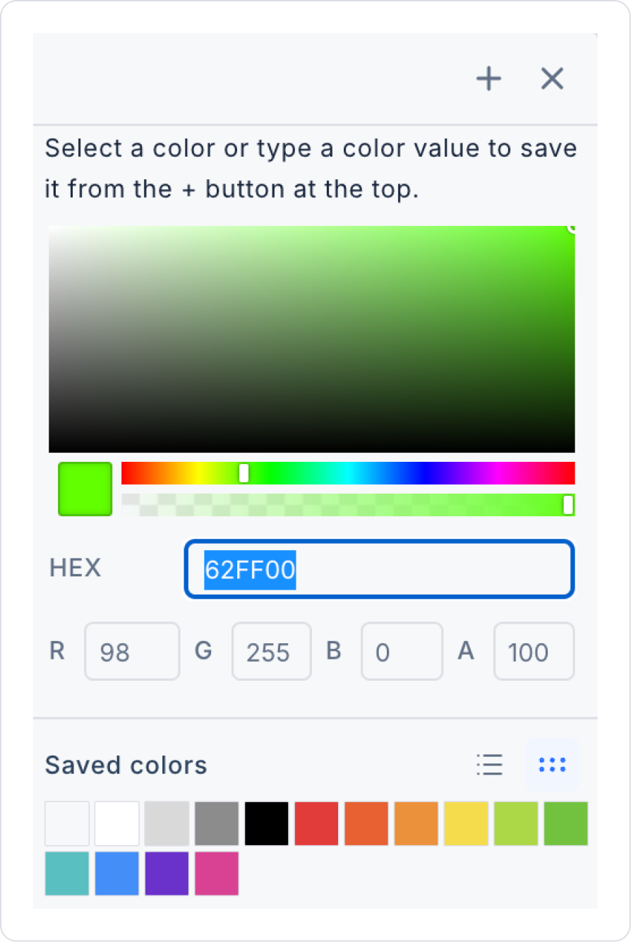
Unfinished Step Color: Determines the color of steps that have not yet been completed.
Finished Step Color: Determines the color of completed steps. Usually applied when the user passes the step.
Active Step Color: Defines the color of the step the user is currently on (active).
Disable Step Click: Allows you to enable or disable the ability for users to freely navigate between steps by clicking on step headers, based on a parameter.
2.2. Stepper Element Example Usage
In this example, when a button is clicked, the steps will run in a loop.
Step 1: Add the Stepper Element
Drag and drop the Stepper element from the Elements panel.
Step 2: Add the Button
Drag and drop the Button element from the Elements panel.
Step 3: Name the Stepper Steps
Name the steps in the stepper element as Step1, Step2, Step3, respectively.
Step 4: Name the Button
Select the button you added.
In the Properties panel, type “Run” in the Fixed Value field.
Step 5: Add Actions
When you click the button, click the +Add Action option in the Properties panel that opens.
Select the OnClick → UI Control → Set Value Of option.
In the window that opens, select Step1 from the Select Box.
Step 6: Add Other Steps
Apply the same action to Step2 and Step3.
To speed up the process, you can copy and paste the action by clicking on the three dots icon.
Step 7: Make the Steps Cyclical
After all steps are complete, select Step1 in the last action so that it returns to Step1 again.
Step 8: Run the Application
Run the application. Each time you click the button, the steps will run in sequence and return to Step1 when the cycle is complete.
By following this guide, you can effectively use the Stepper element in your application.
2.3. Actions That Can Be Added to the Stepper Element
The Stepper element supports the onChange trigger to track user step changes. This trigger fires when the user moves from one step to another.
onChange: Triggered when the user changes the active step (when moving forward or backward).
Use cases:
Run validation before moving to the next step
Load or update step-specific data
Save form data temporarily
Make buttons active/inactive in specific steps
Trigger backend actions when the step changes
Log or track which step the user is on
Important Notes:
The Stepper element does not save data itself; it only reports step transitions.
Critical operations (Save, Submit, etc.) must be controlled using the onChange trigger or button actions within the step.
onChange works for both forward and backward step transitions; therefore, it is recommended to control the action based on the current step information.
With this structure, the Stepper element provides controlled and secure flow management in multi-step processes.
3. How to Use the Stepper Element?
In this section, we will cover the end-to-end use of the Stepper element through example scenarios.
Scenario: Master Screen Menu Structure (Side Menu – Hierarchical Navigation)
In a business management or accounting application, pagination is used on the Order List screen to present high-volume order data to the user in an organized and efficient manner. This structure allows users to easily navigate through the data and quickly find the record they are looking for.
In the scenario:
Orders are listed in the table with the most recent record at the top, sorted by order date.
A limited number of records are displayed on the screen at the same time, and each page contains a specific number of orders.
The user can navigate between pages using page numbers or forward/back arrows.
The number of records displayed per page can be selected by the user.
The “Go to page” field allows direct access to the desired page.
Step 1 - Creating the Data Source
Creating a table in the DataSources module:
Go to the Datasources module.
Then go to the Tables tab.
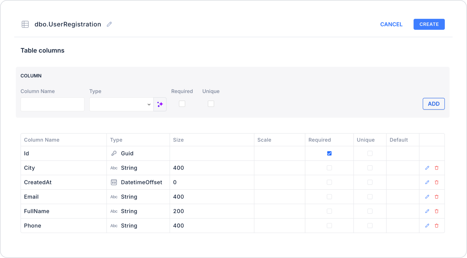
Create a new table named “UserRegistration”.
The table structure to be set up is as follows:
Important Field Names:
FullName: Text field where the user's first and last name are entered together.
Email: Field where the user's valid email address is entered and used for communication purposes.
Phone: Field where the user's phone number for communication is entered.
City: A field where the user's city information is selected or entered.
CreatedAt: Holds the date and time the record was created in the system.
Step 2 - Adding and Configuring Elements
Open the UI Design module.
Drag and drop the Elements > Interactive > Stepper action onto the page.
Optionally, you can set the colors for active, pending, and completed steps as desired. In the current scenario, the color of the completed field is set to green as Stepper > Properties > FinishedStepColor > Hex > 62FF00.
The Stepper position is set to Horizontal by default. It can be set to Vertical depending on usage.
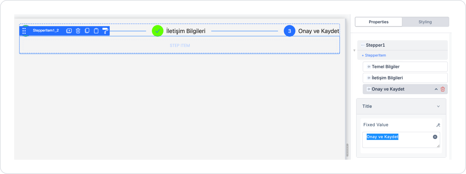
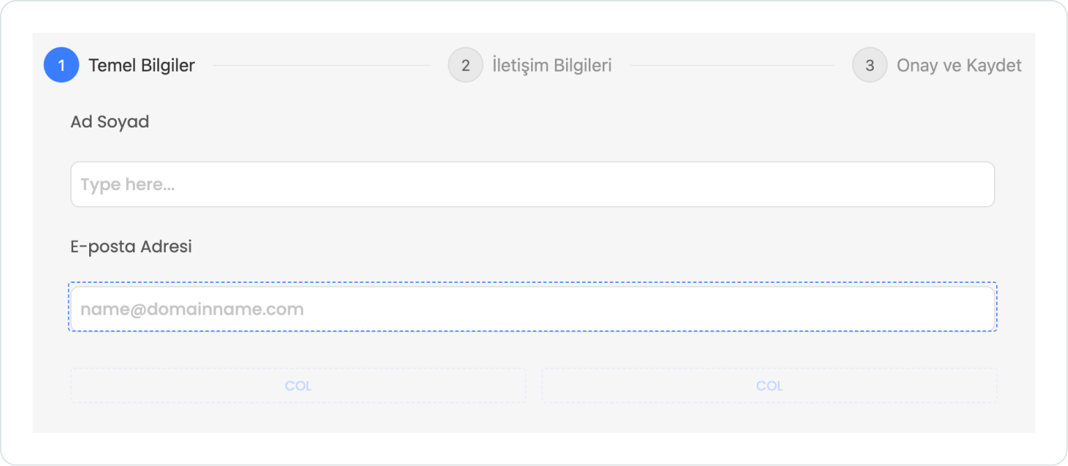
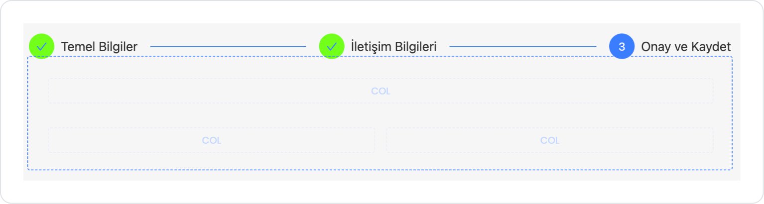
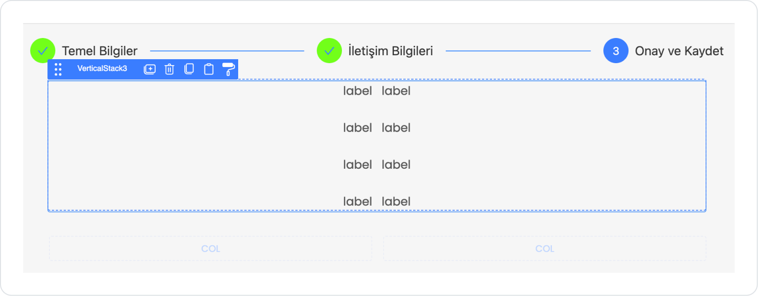
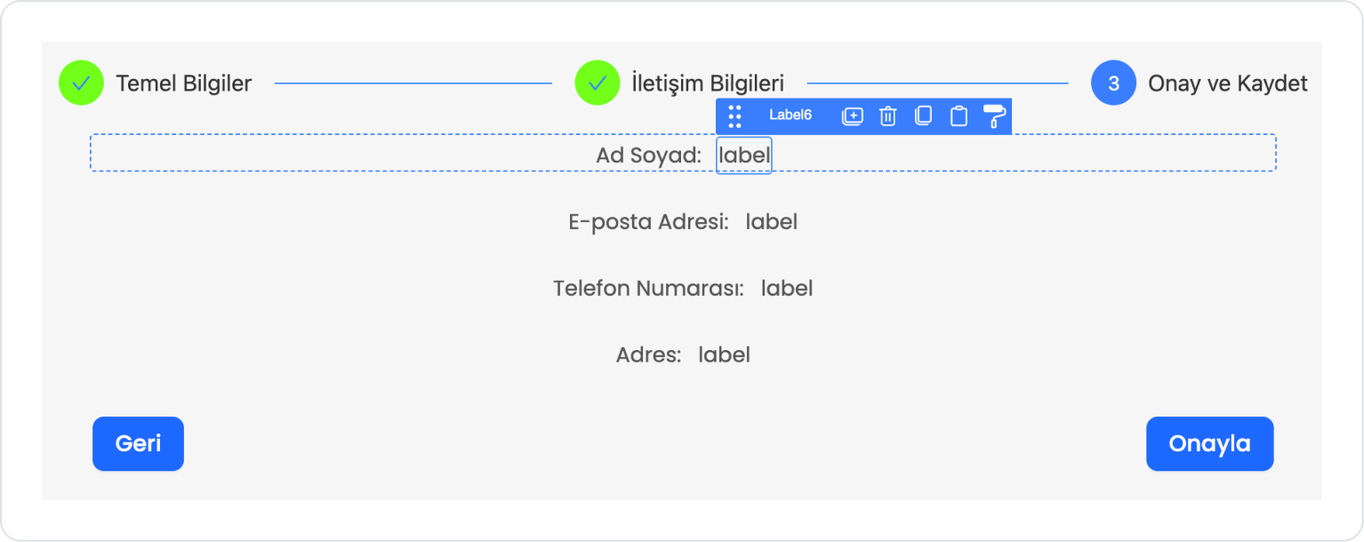
With the Stepper element selected, click on the first step and update it to Properties > StepItem > Title > “Basic Information”.
Similarly, proceed to the second step and update it to Properties > StepItem > Title > “Contact Information”.
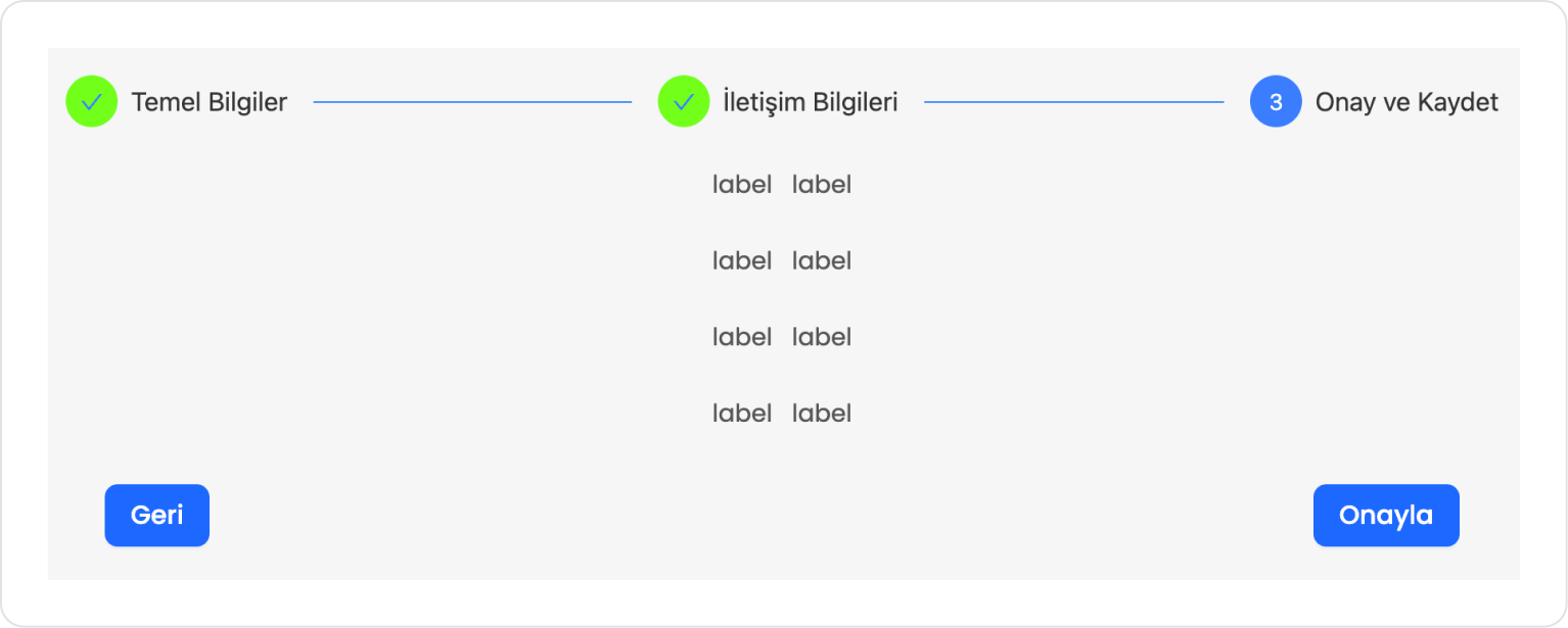
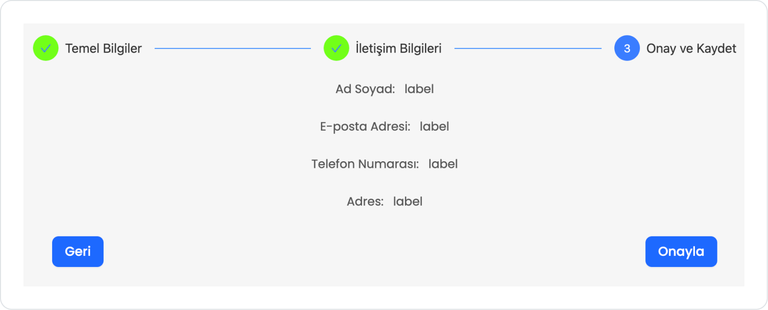
Update the title of the last step to “Confirm and Save”.
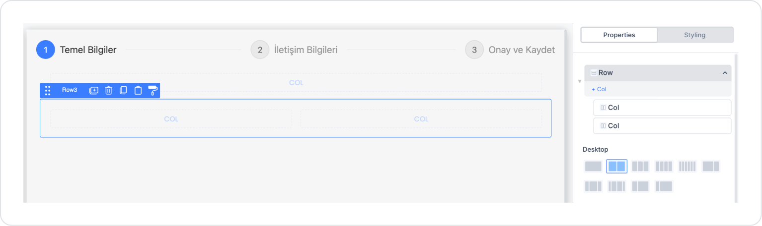
Click on the first step Basic Information and double-click on the Step Item field inside it to add the Elements > Container > Row element.
Set the number of columns in the Row element to one and two, respectively, as follows: Row > Properties > Desktop.
The bottom Row in the first and last steps can be a single column. Button elements will be added inside the columns.
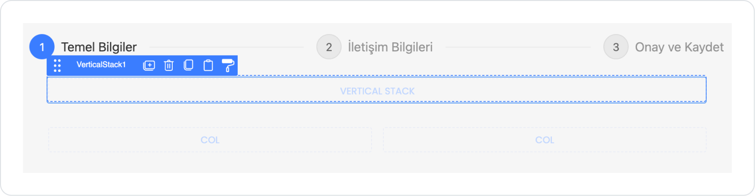
Drag and drop the Elements > Container > VerticalStack element into the first column.
Set the Vertical Stack element to VerticalStack > Style > Layout > Align > Left Aligned.
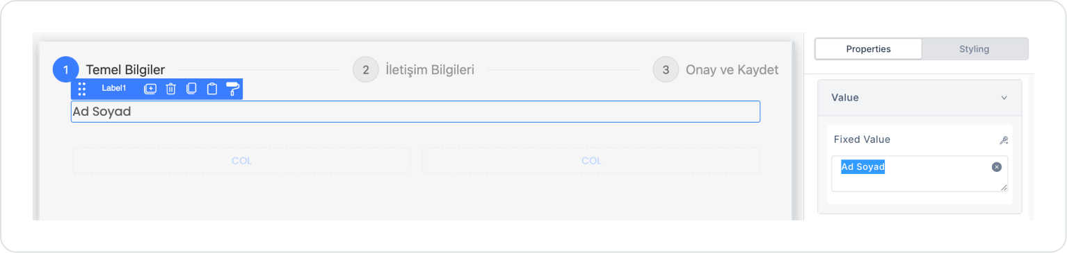
Drag and drop the Elements > Display > Label element into the Vertical Stack.
Update the text to Label > Properties > Value > “First Name Last Name”.
Drag and drop the Elements > Text Input > TextInput element below the text inside the Vertical Stack.
Drag and drop the Elements > Display > Label element below it and update the text to Label > Properties > Value > “Email Address”.
Drag and drop the Elements > Text Input > Email element below the text.
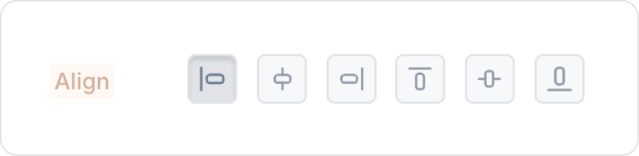
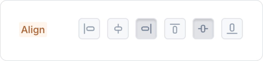
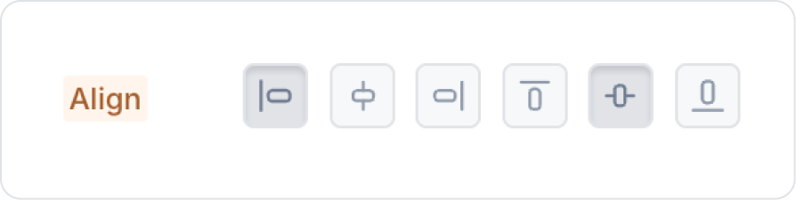
Align the following two columns Col > Styling > Layout > Align, align the left one to the left, the right one to the right, and center them vertically.
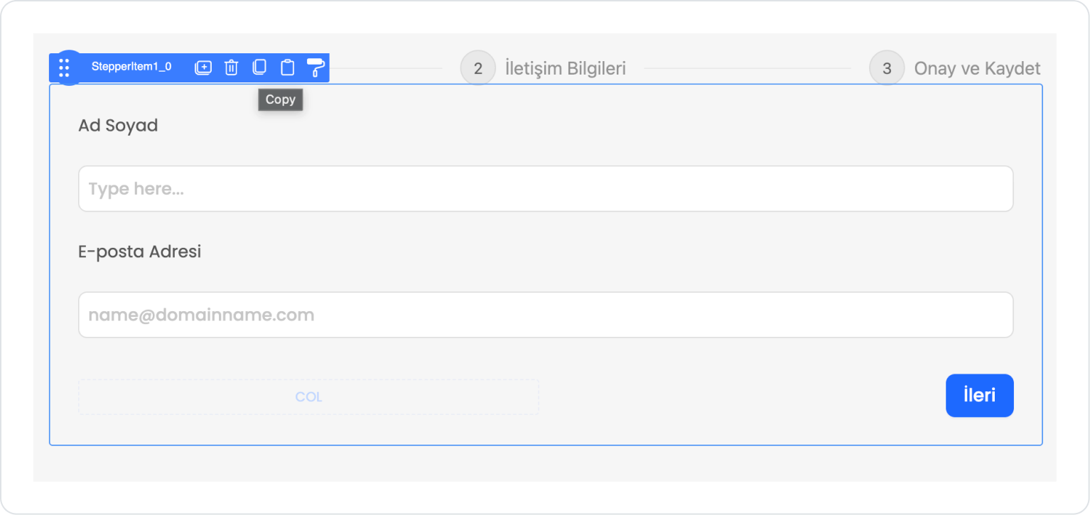
Drag and drop the Elements > Navigation > Button element into the Col on the right.
Update the Button text to Button > Properties > Label > “Next”.
Similarly, click on the Contact Information step and create the content.
As a difference, use the Text Input element instead of the Email element and drag and drop the Elements > Container > Button element into the empty column on the left.
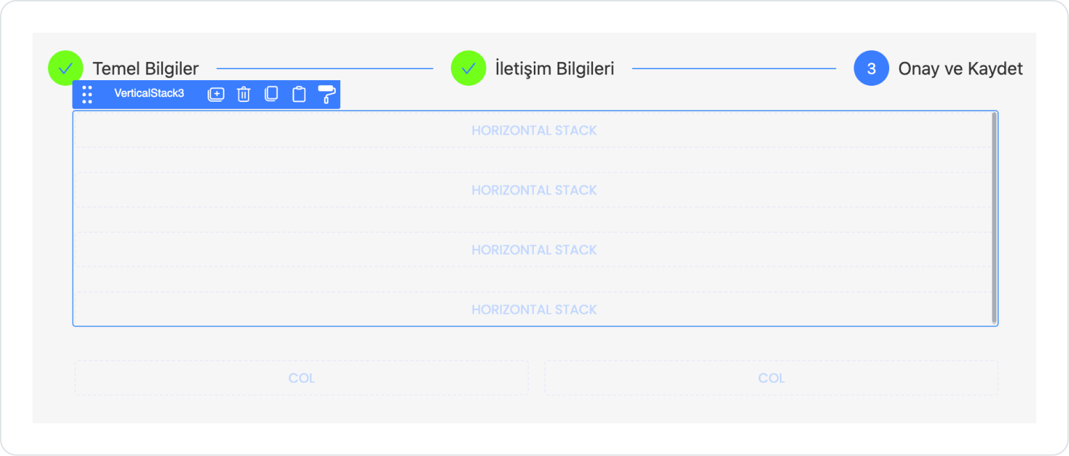
Click on the Confirm and Save stage and drag and drop two Elements > Container > Row elements into it.
Drag and drop the Elements > Container > VerticalStack element into the first Column and align it horizontally from Styling > Layout. Add four new Elements > Container > HorizontalStack elements to the Vertical Stack so that they appear one below the other.
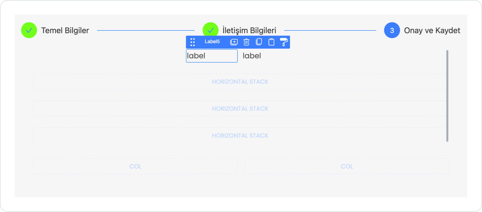
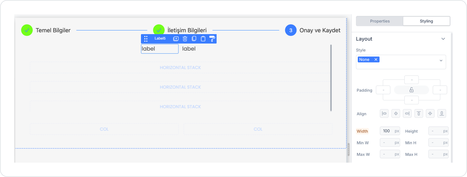
Add two Elements > Display > Label elements to the Horizontal Stack.
When the Label elements are added to the Horizontal Stack, delete the default 100 px width definition in Label > Styling > Layout > Width and leave it blank.
The default 100 px definition occurs when added to stack elements. In other cases, the field is left blank.
Apply similar operations to the remaining three Horizontal Stacks.
Align the following two columns Col > Styling > Layout > Align left for the left one and right for the right one, and center them vertically. Add the Elements > Navigation > Button element to it. Define the button texts as follows.
Update the texts in the Label on the left as follows.
Step 3 - Action Settings
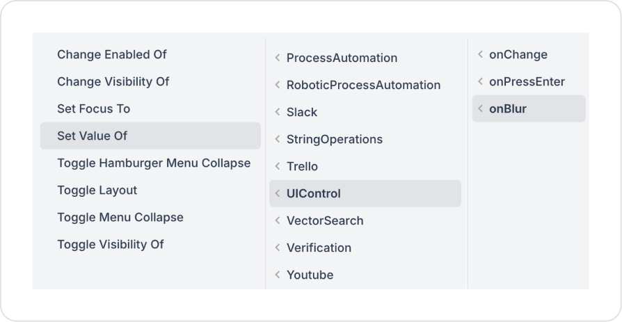
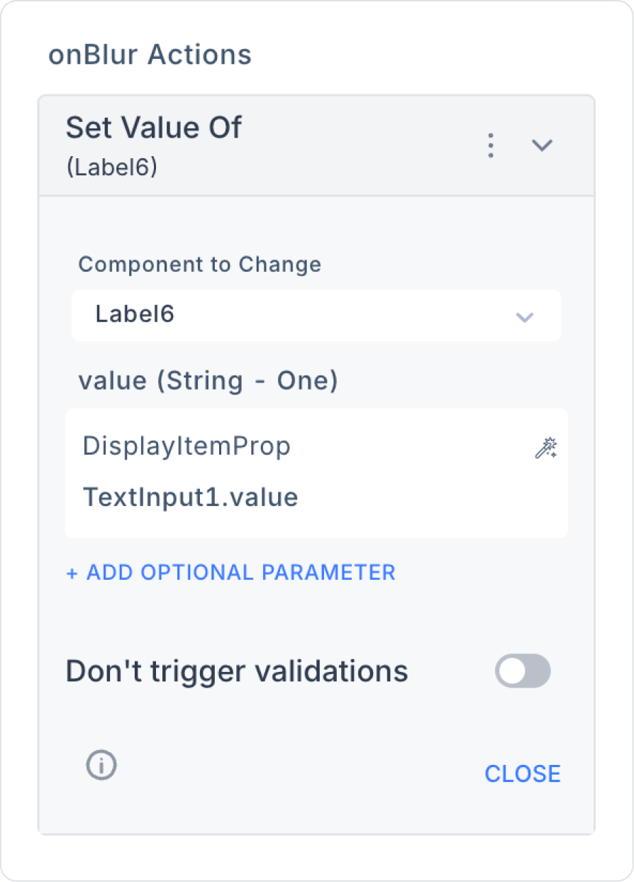
In the Confirm and Save stage, add the TextInput1 > Add Action > onBlur > UIControl > Set Value Of action to the Label element in the First Name Last Name field to show the final status.
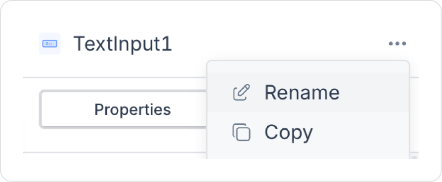
Before linking the action parameters, check the name of the relevant element, for example, it corresponds to the Label6 element opposite the first and last name. To avoid confusion, you can update the element names according to the fields beforehand.
Link the Set Value Of parameters to the relevant element name to be written in the Confirm and Save stage and define it as value > TextInput1 (First Name Last Name).
Similarly, add the Add Action > onBlur > UIControl > Set Value Of action to the remaining Input elements in the other fields, select the element name to be written in the confirm and save stage, and define the relevant input element as value.
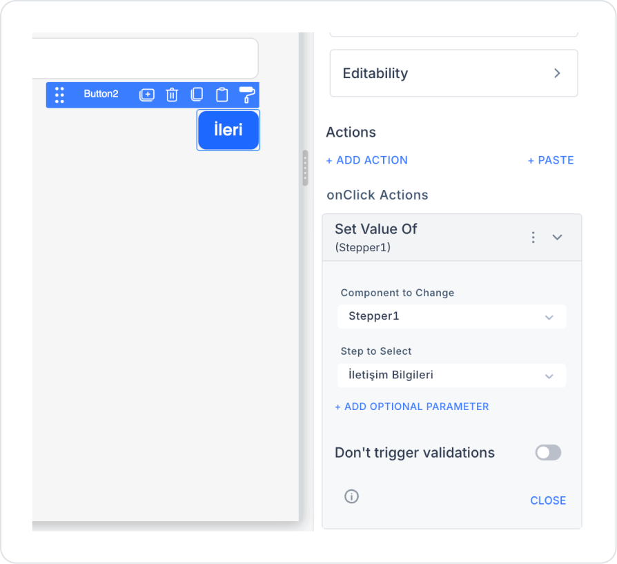
To move forward between steps, add the Button > Add Action > onClick > UIControl > Set Value Of action to the Button elements. Define Component > Stepper1 and Step to Select > Contact Information to move from the first field to the next.
Apply the same logic to the remaining forward and back buttons by selecting the steps.
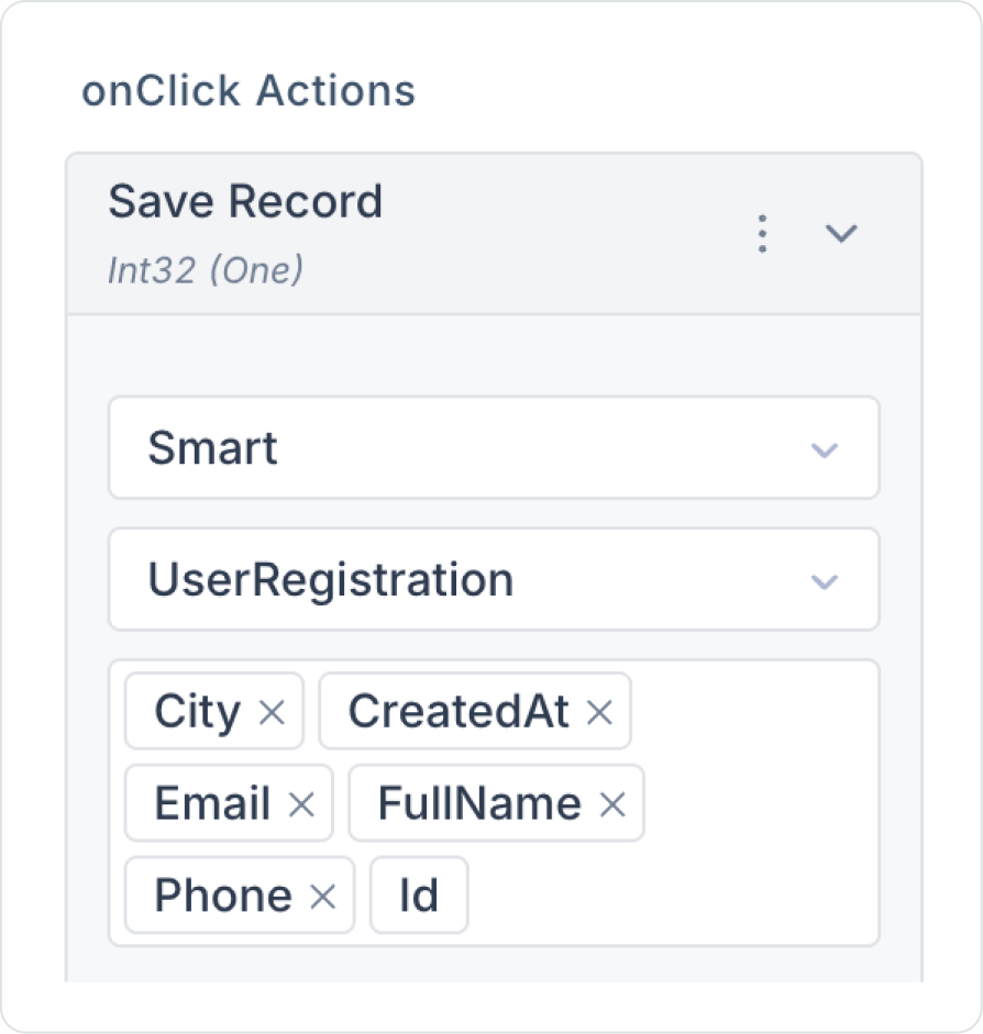
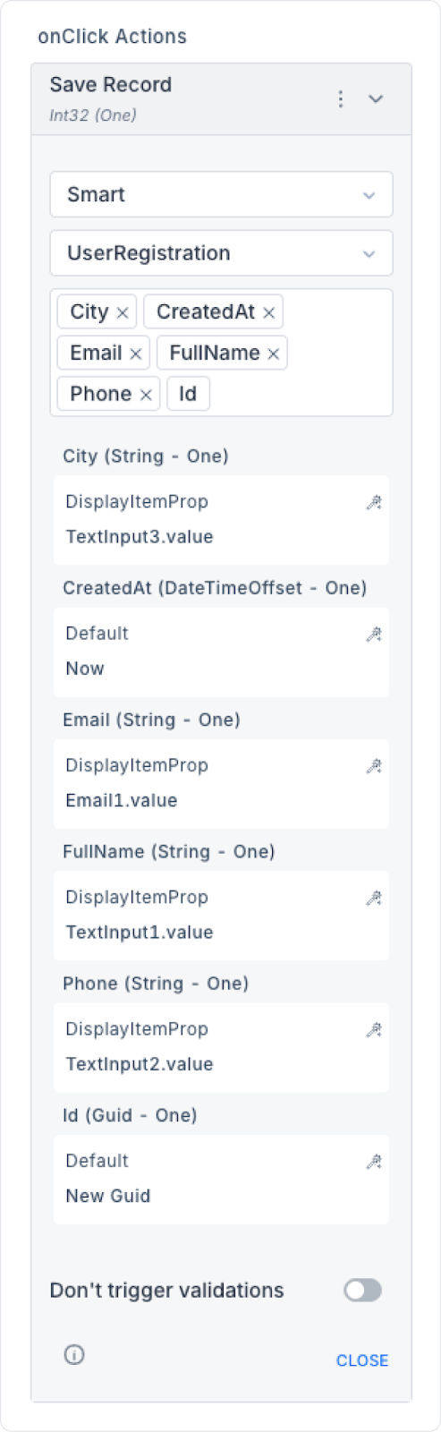
In the final step, add the Button > Add Action > onClick > Managed DB > Save Record action to the Confirm button and select all column fields.
Define the Text Input and Email element inputs in the relevant fields as Components > … > value. Separately, define CreatedAt > Default > Now and Id > Default > New Guid.
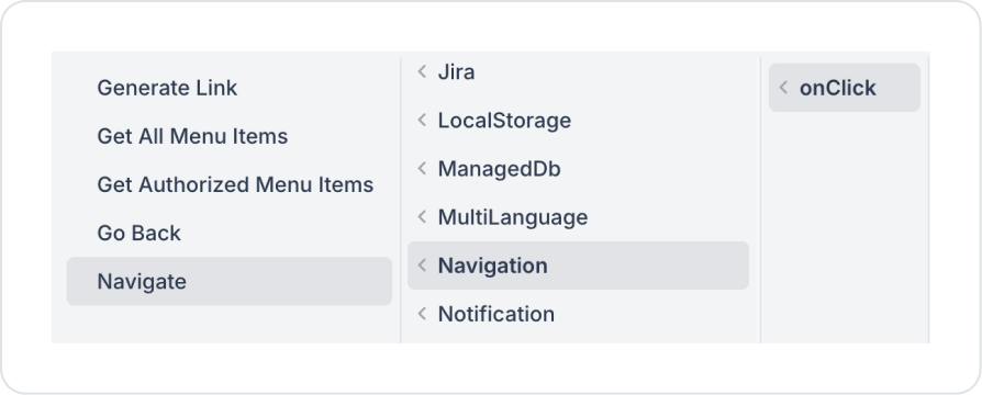
Finally, to access the desired page after the process is approved and saved, add the Add Action > onClick > Navigation > Navigate action to the approve button and select the page to go to.
Preview
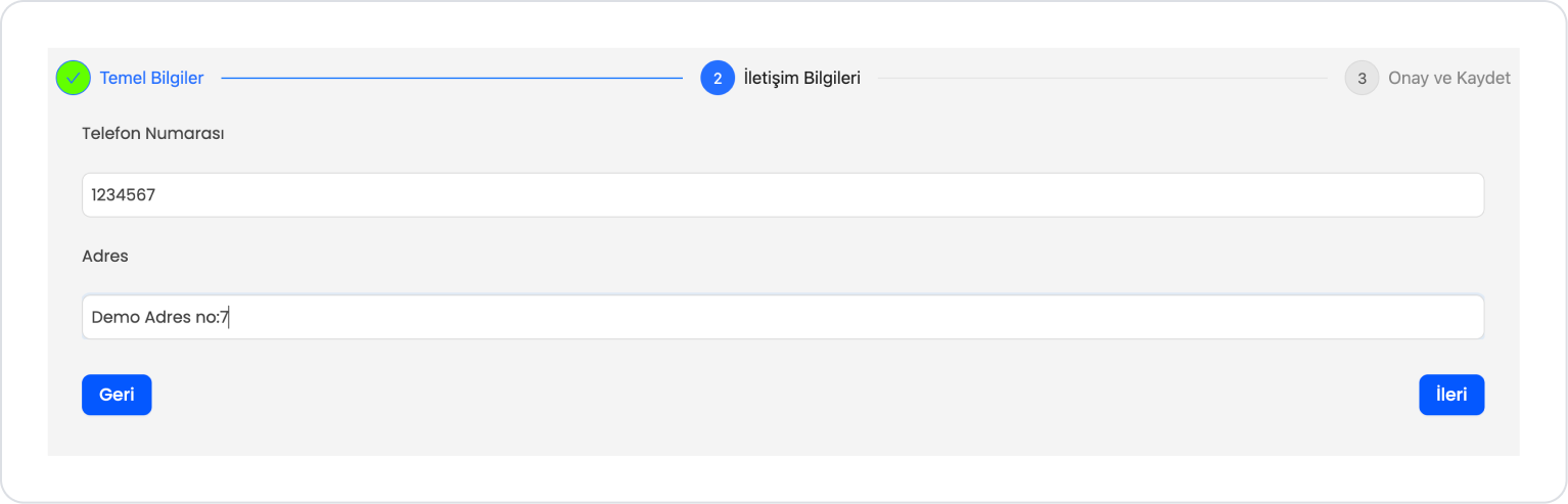
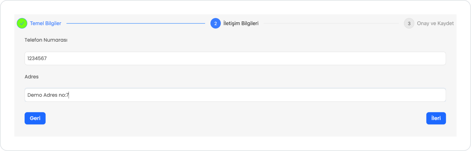
When the application is tested, it can be seen that the information collection process from the user progresses step by step and in a controlled manner with the Stepper structure. The Basic Information, Contact Information, and Confirm and Save steps can be activated not only with the Next/Back buttons but also by clicking on the stepper headers. This allows the user to flexibly navigate between the relevant steps and update their information. Active and completed steps are visually highlighted to clearly show the status of the process.
The information entered in the last step is presented in summary form, and the registration process is completed with the Confirm button. When the registration process is successfully completed, the created user information is displayed on the list screen. This allows the user to see that the registration process has been completed without any problems and to verify that the added record is active in the system.
4. Common Properties
Some fields on the stepper element are used in common across all UI elements. Therefore, detailed explanations of the following properties can be found in the relevant general guide pages:


