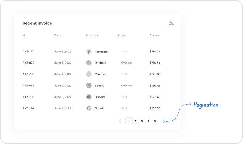
The pagination element allows large data sets to be presented to the user in pages rather than loading them all on a single screen. This approach both improves performance and allows users to navigate the data more easily. Users can easily access different sections of the data set using page numbers, forward/back controls, or direct navigation to a specific page.
The pagination element is supported in web and mobile applications.
1.1. Common Use Cases
Splitting long data lists into pages. For example: user lists, order records.
Improving table performance when used with the Table element. Instead of loading all records at once in large data sets, page-based display is provided.
Displaying search results in pages. As the user searches, results are presented in specific page sizes.
Reporting screens. Used to reduce data density in financial reports, transaction histories, or analysis tables.
Gallery or card-based listing scenarios. Page transitions are provided in product catalogs, content lists, or media galleries.
Smoother navigation in mobile applications. Splitting long lists for display on small screens improves the user experience.
2. Key Features
Page-based navigation support. Users can easily move within the data set using forward/back buttons, page numbers, or direct page selection.
Compatible with data repeater elements. Used in conjunction with elements such as Table or Gallery View, it makes data display more organized.
Page size control. Configuring how many records are displayed per page provides users with more readable content.
Use with dynamic data sources. Pagination supports dynamic data sets by working with data from SQL, REST API, or Managed DB.
User interaction-based data refresh. When the page changes, the relevant data range is re-called, loading only the necessary records.
Improved performance and user experience. Especially with large lists, both loading time is reduced and the interface runs more smoothly.
Web and mobile compatibility. The pagination structure adapts to different screen sizes, providing a consistent navigation experience.
2.1. Pagination Element Properties
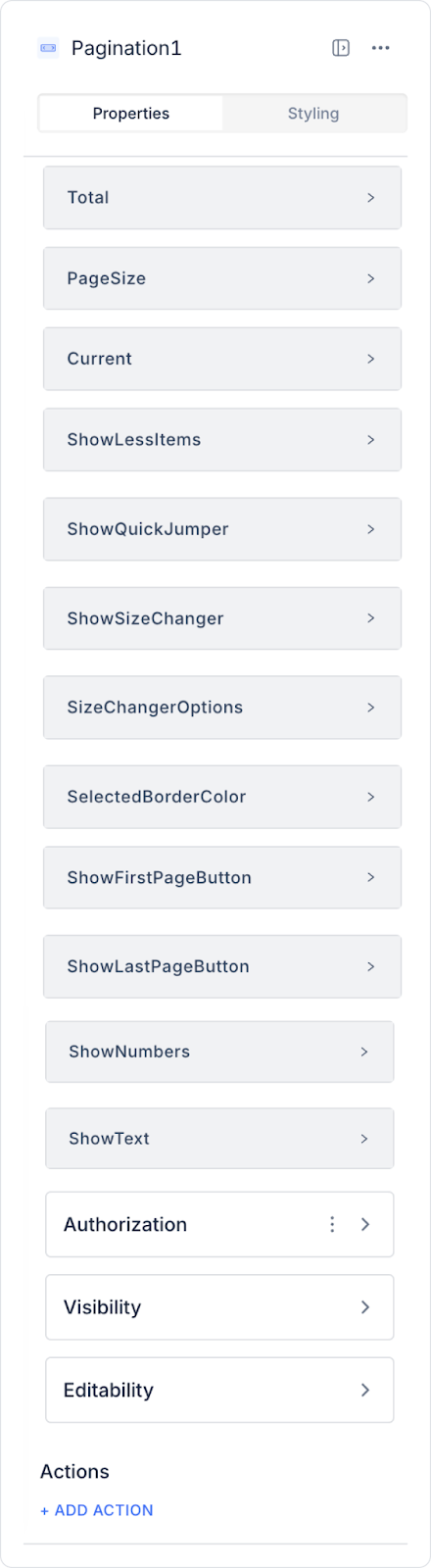
You can configure the properties of the pagination element from the Properties panel on the right side.
The pagination element automatically appears when the number of records linked to the table exceeds 10.
Total: Determines the total number of items. A static value can be entered. The total number of pages varies depending on the number of items to be displayed per page.
Page Size: You can set the number of items to be displayed on each page statically or dynamically.
Current: Determines the page number that will be displayed by default when the screen opens.
Show Less Items: Allows fewer numbers to be displayed on the page numbering.
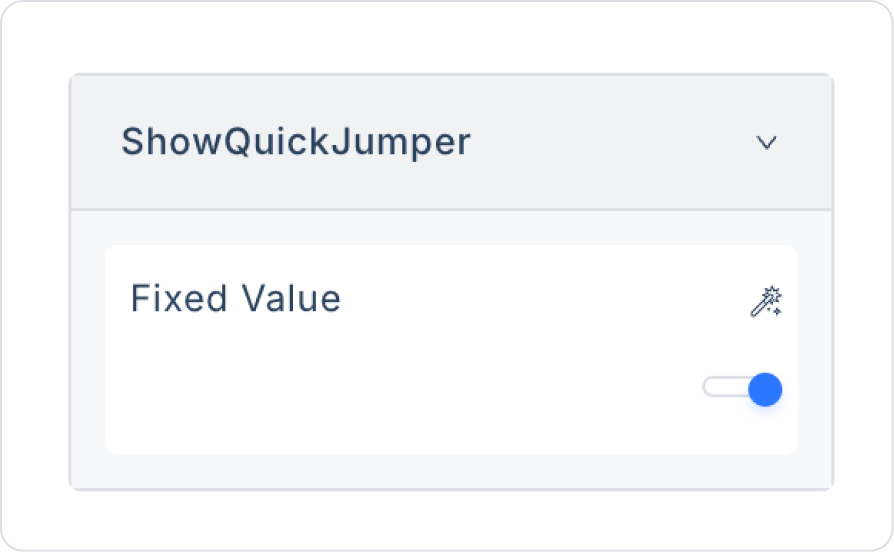
Show Quick Jumper: Allows users to quickly jump to a page by entering a page number directly.
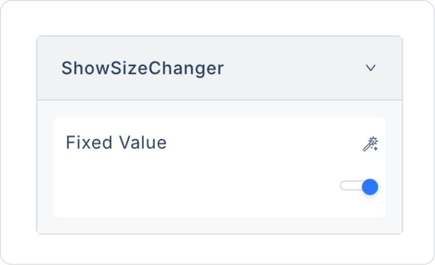
Show Size Changer: Allows users to change the number of items they want to view per page.
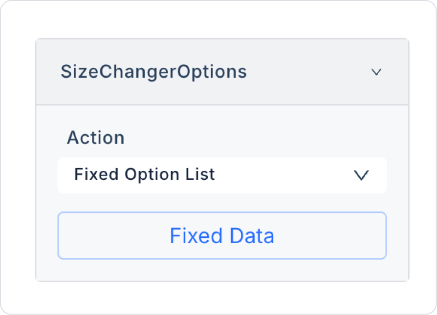
Size Changer Options: Sets the options for the number of records to display per page. For example, 10, 20, or 100 records.
Selected Border Color: Sets the border color of the selected page number.
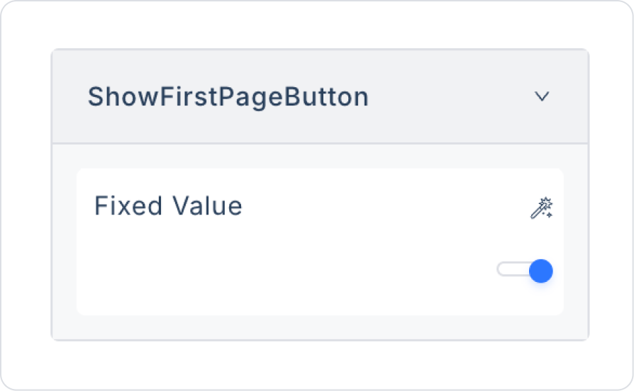
Show First Page Button: Makes the button that allows the user to go to the first page visible, regardless of the page they are currently on.
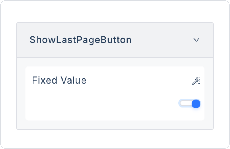
Show Last Page Button: Makes the button that takes the user to the last page visible, regardless of the page the user is currently on.
Show Numbers: Hides the page numbers. In this case, only the forward/back buttons are displayed.
Show Text: Enables the text on the forward and back buttons to be displayed.
2.2. Actions That Can Be Added to the Pagination Element (onChange)
The pagination element supports the onChange trigger based on user interaction. This action runs automatically when the user changes the page number or navigates forward or backward.
Purpose and behavior of the onChange trigger:
Triggers when the user moves to a different page.
The selected new page information (current page, page size, etc.) can be passed to actions as parameters.
It ensures that the data source is re-called based on the page change.
It allows only the relevant page data to be loaded in large data sets.
It synchronously updates the content of data repeater elements such as Table and Gallery View.
When used with filtering or sorting, new page data is fetched according to the active filter and sorting conditions.
Example usage scenarios:
Re-execution of SQL or REST API action when the user navigates to page 2
Automatic refresh of a table or gallery view linked to Pagination
Maintaining the same pagination behavior on mobile and web interfaces
Since the Pagination element is a control element that does not directly display data, it triggers actions only via onChange; it does not support any other events (such as onClick).
3. How to Use the Pagination Element?
In this section, we will cover the end-to-end use of the Pagination element through example scenarios.
Scenario: Master Screen Menu Structure (Side Menu – Hierarchical Navigation)
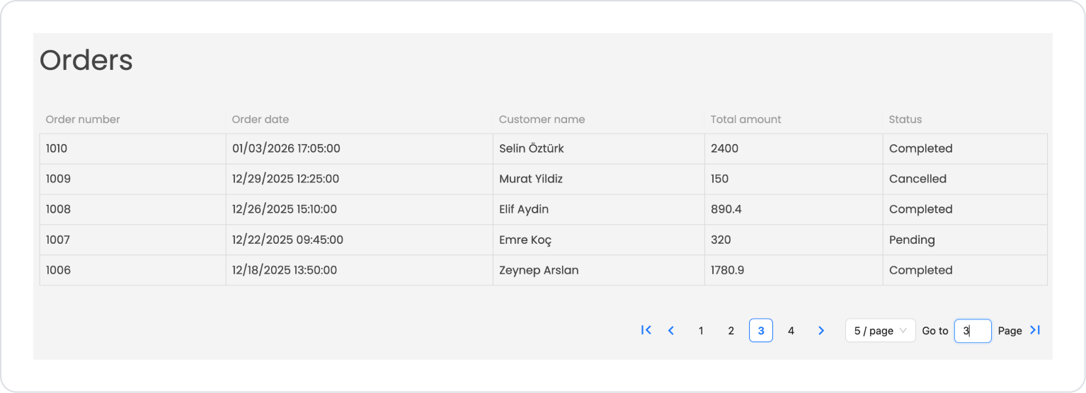
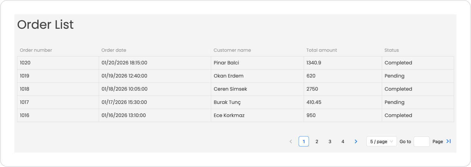
In a business management or accounting application, pagination is used on the Order List screen to present high-volume order data to the user in an organized and efficient manner. This structure allows users to easily navigate through the data and quickly find the record they are looking for.
In the scenario:
Orders are listed in the table with the most recent record at the top, sorted by order date.
A limited number of records are displayed on the screen at the same time, and each page contains a specific number of orders.
The user can navigate between pages using page numbers or forward/back arrows.
The number of records displayed per page can be selected by the user.
The “Go to page” field allows direct navigation to the desired page.
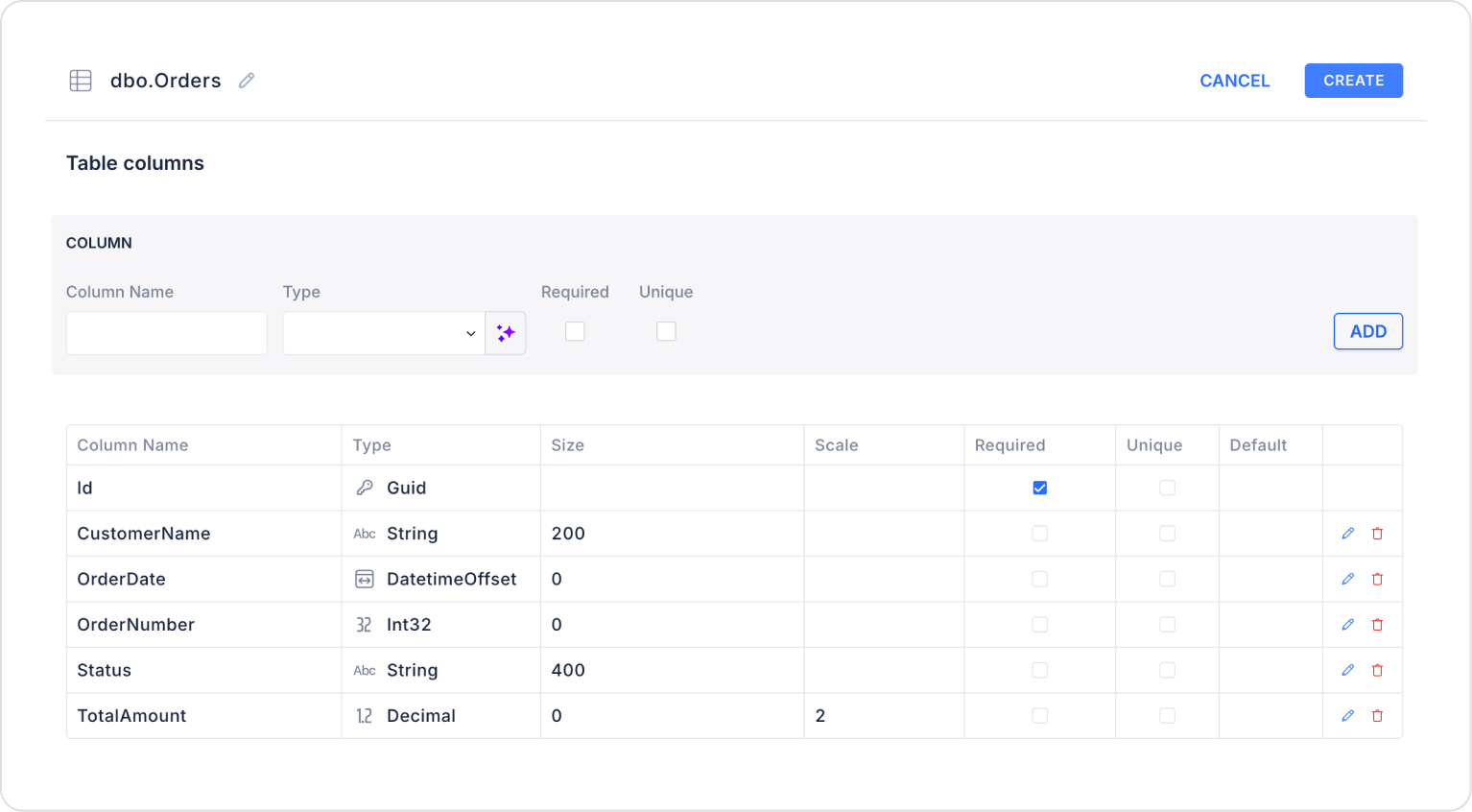
Step 1 - Creating the Data Source
Creating a table in the DataSources module:
Go to the Datasources module.
Then go to the Tables tab.
Create a new table named “Orders”.
The table structure to be set up is as follows:
Important Field Names:
CustomerName: Holds the name of the customer placing the order.
OrderDate: Indicates the date and time the order was created.
OrderNumber: Specifies the tracking number for the order.
Status: Shows the current status information of the order.
TotalAmount: Indicates the total amount of the order.
SalseRevenue: Specifies the total sales revenue (turnover) for the relevant category.
Step 2 - Defining the Necessary Actions
To display and add data in the interface:
You need to define three custom actions.
Add a new action from the Actions > New SQL Action tab in the Datasources module.
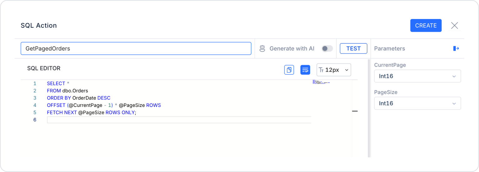
Action that Divides Data into Pages (GetPagedOrders):
SELECT *
FROM Orders
ORDER BY OrderDate DESC
OFFSET (@CurrentPage - 1) * @PageSize ROWS
FETCH NEXT @PageSize ROWS ONLY;
When applying, deletethe Orders part, rewrite Orders, and press Enter. This will add the correct schema name before the table name.
Action that Retrieves the Total Number of Records (GetTotalOrders):
SELECT COUNT(*) AS Total
FROM Orders;
When applying, delete the Orders part, rewrite Orders, and press Enter. This will add the correct schema name before the table name.
Action that Adds Sample Data (InsertOrders): To test the application with sample data, add the following SQL action and press the TEST button.
While applying, delete the Orders section, rewrite Orders, and press Enter. This will add the correct schema name in front of the table name.
Step 3 - Element and Action Settings
Open the UI Design module.
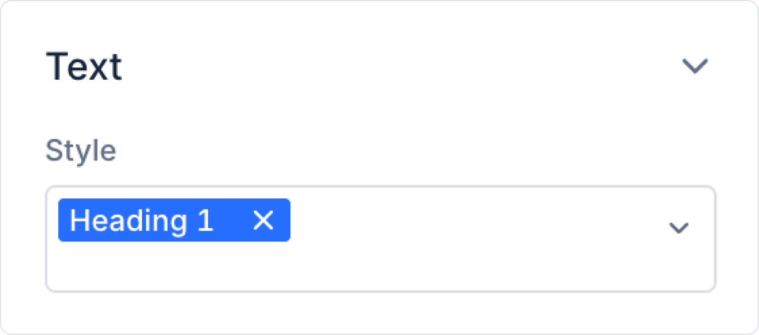
Drag and drop the Elements > Display > Label element onto the page.
Update the Label element text to Label > Properties > “Order List”.
Set the Label text style to Label > Styling > Text > Style > Heading 1.
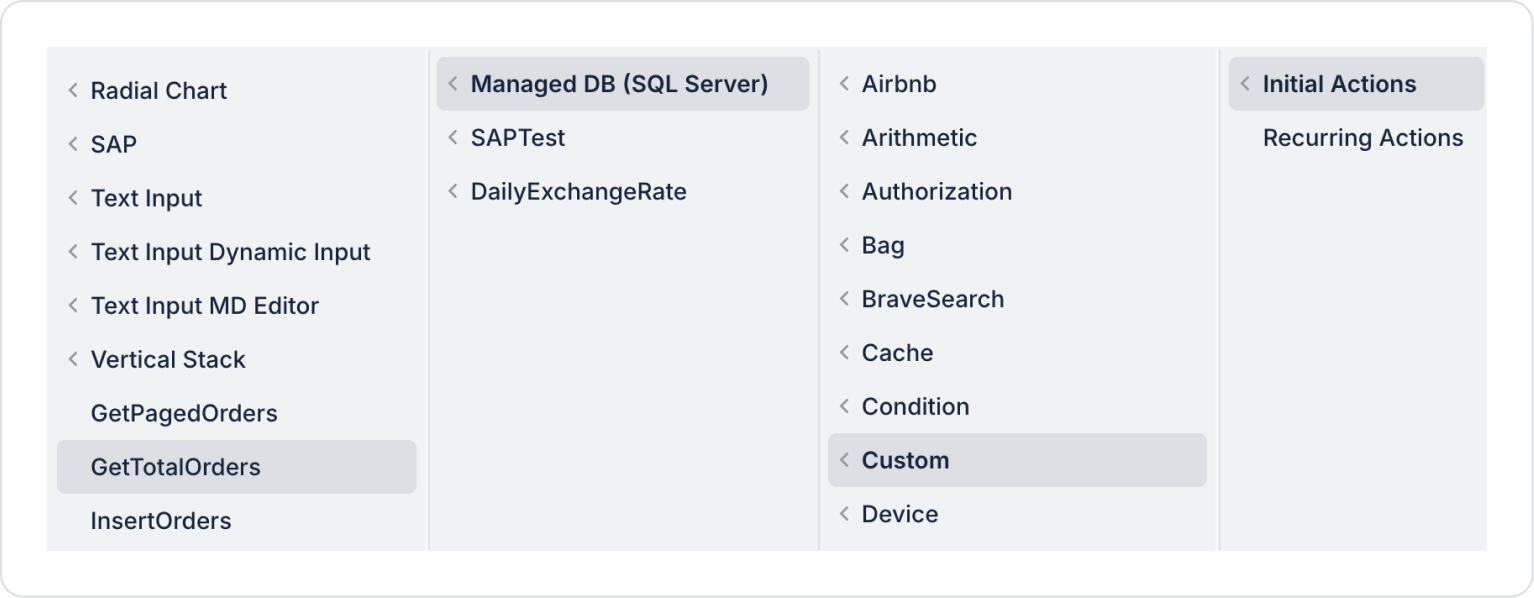
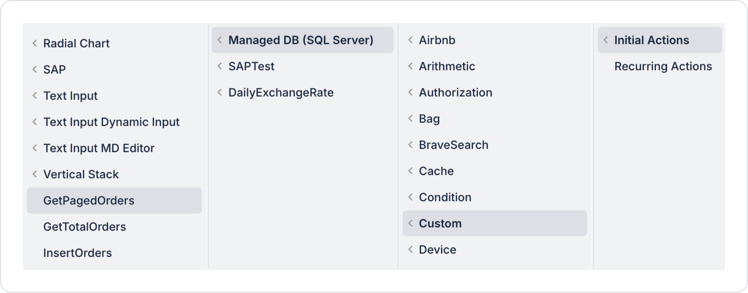
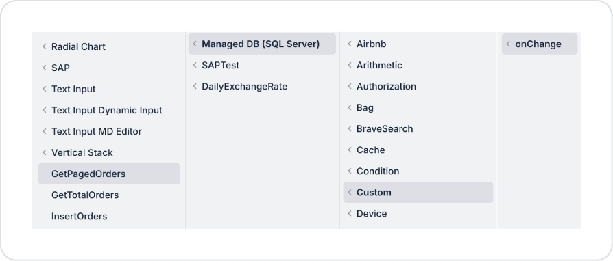
Add the pageInit action Add Action > Initial Action > Custom > Managed DB > GetTotalOrders to the page.
Add the pageInit action Add Action > Initial Action > Custom > Managed DB > GetPagedOrders to the page.
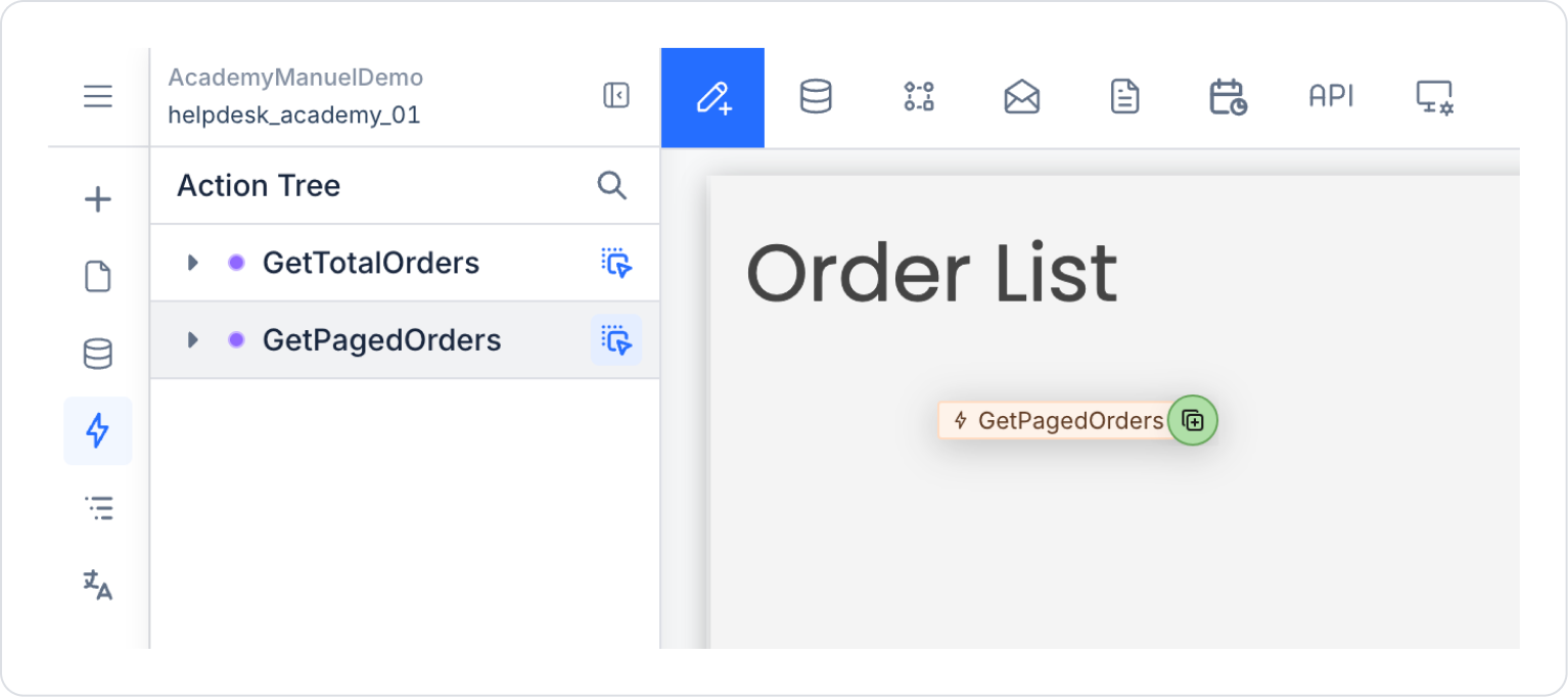
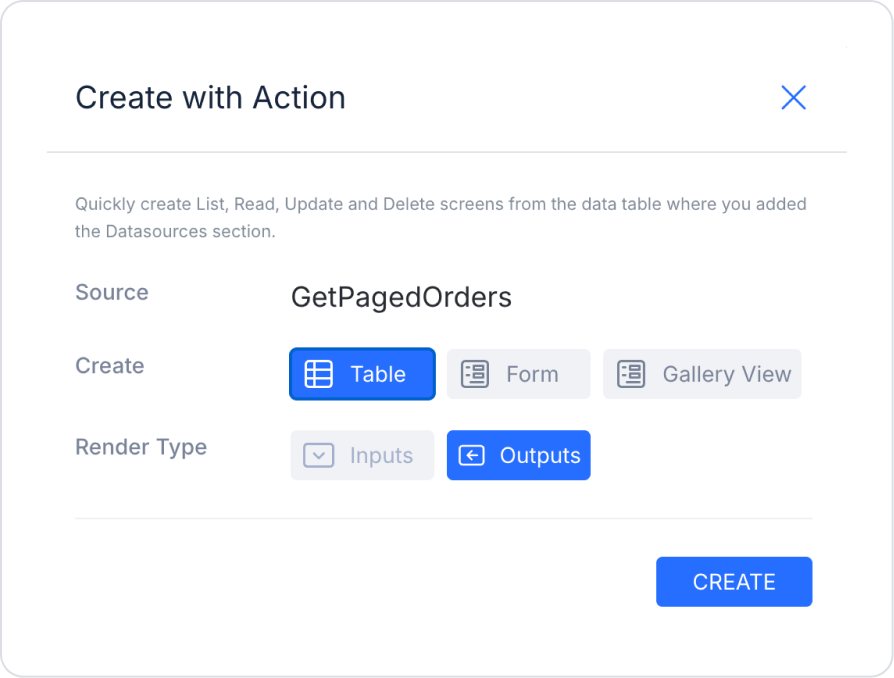
Go to the Action Tree area in the left side panel and drag the GetPagedOrders action from the blue icon next to it and drop it onto the page.
Make the following selections in the window that opens.
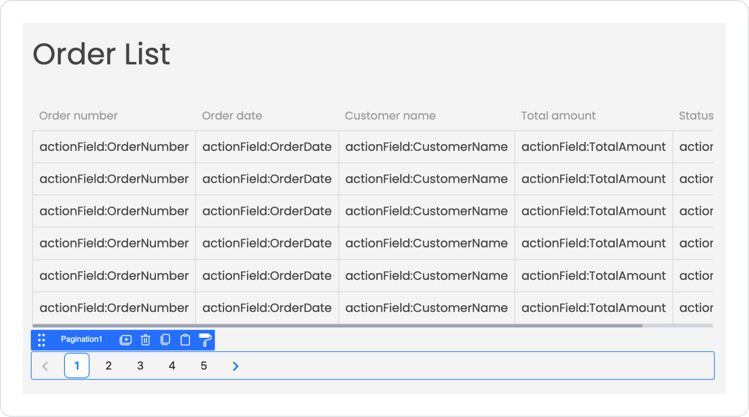
Return to the Elements area in the left side panel and drag and drop the Elements > Interactive > Pagination element onto the page.
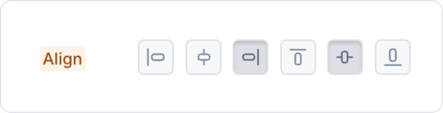
Set the Pagination position to Pagination > Styling > Layout > Align > Center Vertically and Align Right.
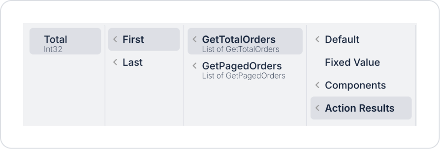
Define the total number of pages in Pagination as Pagination > Properties > Total > Action Result > GetTotalOrders > First > Total.
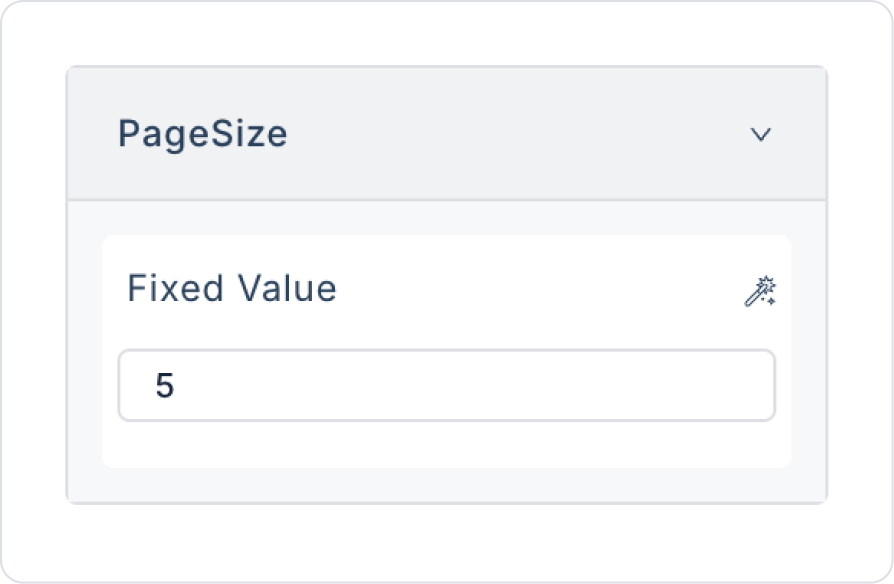
Set the number of pages as Pagination > Properties > PageSize > 5.
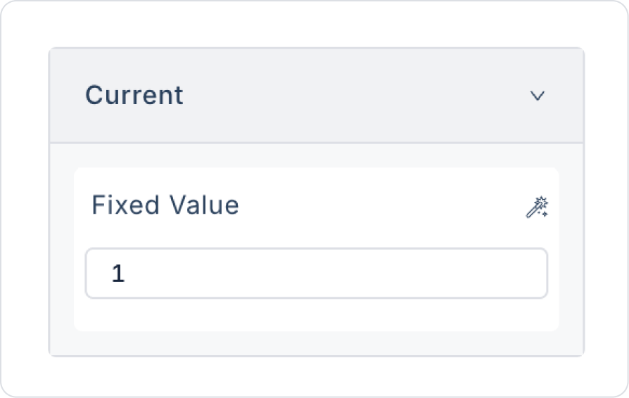
Set the starting page as Pagination > Properties > Current > 1.
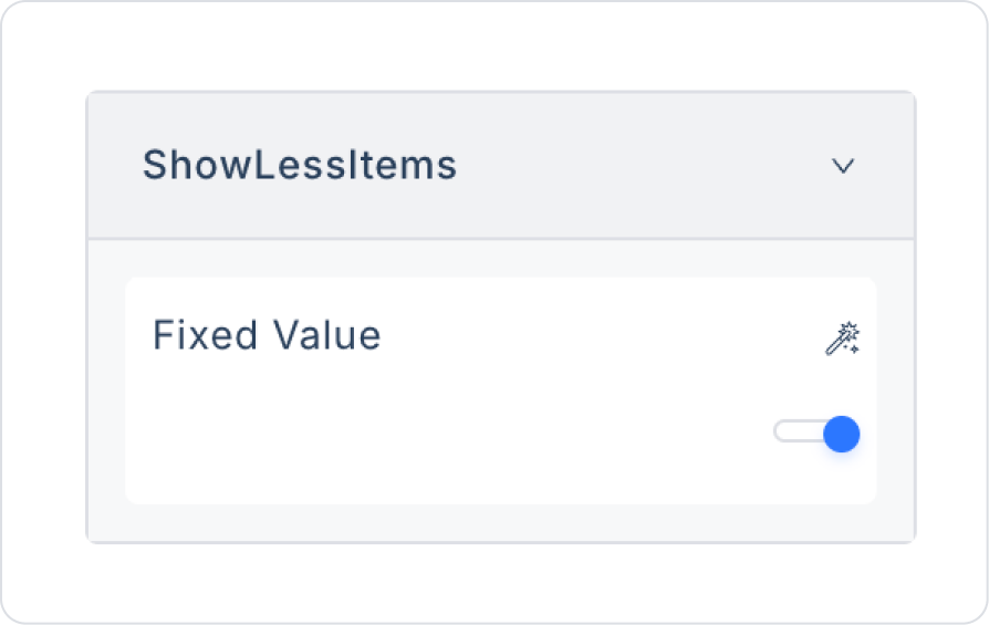
For fewer page number displays, set Pagination > Properties > ShowLessItems > On.
To jump directly to a page number, set Pagination > Properties > ShowQuickJumper > On.
To select the number of data items per page, set Pagination > Properties > ShowSizeChanger > On.
To select the number of data items, define Pagination > Properties > ShowSizeOptions > Action > Fixed Option List. Optionally, you can also provide the number of pages dynamically with an action.
To provide fixed values, make the following definition in the Fixed Data field.
To quickly return to the first page, set Pagination > Properties > ShowFirstPageButton > On.
To quickly return to the last page, set Pagination > Properties > ShowLastPageButton > Open.
To access the page settings, click on the page name via the breadcrumb at the bottom. In the current scenario, the name PaginationScreen is used.
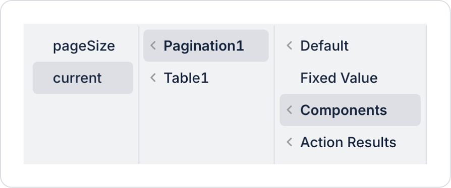
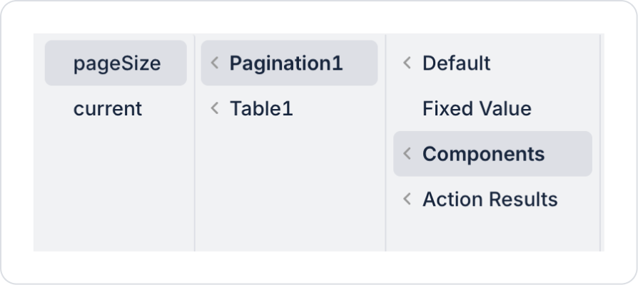
In the Properties section, define the CurrentPage and PageSize fields via the Pagination Element in the GetPagedOrders action we added in the actions area.
Define the CurrentPage field as Components > Pagination > current.
Define the PageSize field as Components > Pagination > current.
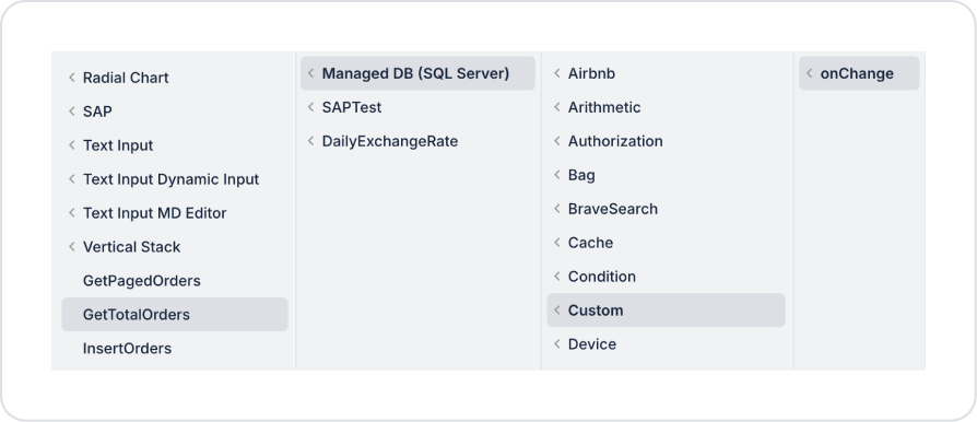
Click on the Pagination element. Add the Add Action > onChange > Custom > Managed DB > GetTotalOrders action to the Pagination element.
Similarly, add the Add Action > onChange > Custom > Managed DB > GetPagedOrders action.
Within GetPagedOrders, define CurrentPage>Components > Pagination > current and PageSize>Components > Pagination > current as in Steps 3.23 and 3.24.
Preview
When the application is tested, the Order List screen provides a listing structure where order records are listed based on date and managed with pagination. Orders are sorted with the most recent record at the top, and the number of records specified on the screen is displayed.
The user can navigate between pages using the page numbers and forward/back arrows in the lower area. The number of records displayed per page can be changed via the “per page” option, and direct access to the desired page is provided via the “Go to page” field. This structure allows long order lists to be displayed in an organized, readable, and user-friendly manner.
4. Common Properties
Some fields on the Pagination element are used in common across all UI elements. Therefore, detailed descriptions of the following properties can be found in the relevant general guide pages:
Always use the pagination element in conjunction with data repeater elements (Table, Gallery View, etc.). It does not display data on its own; it only provides pagination control.
On mobile screens, opt for a simple pagination structure rather than displaying too many page numbers.
6. Limitations
The Pagination element does not display data on its own; it must be used in conjunction with a list, table, or grid linked to a data source.
It does not support any triggers other than onChange (such as onClick, onInit, etc.).
If the data source action is not re-called with onChange, the content will not be updated even if the page number changes.
Pagination only manages page control; it does not perform filtering, sorting, or data validation on its own.


