Hello and welcome to this course where we will explore how you can improve web and mobile app design using the basic principles and elements of graphic design. These principles and elements will provide depth, meaning and aesthetic integrity to your projects.
Balance is the even distribution of the visual weight of your design. By using symmetrical, asymmetrical or radial balance, you can present information without distracting users.

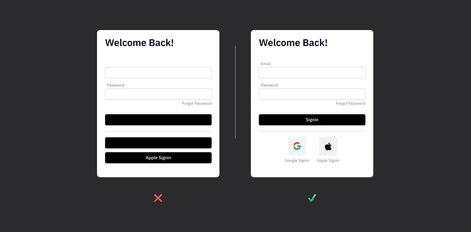
Alignment makes your design look neat and organized. It improves readability by establishing a clear visual connection between text, images and other elements.

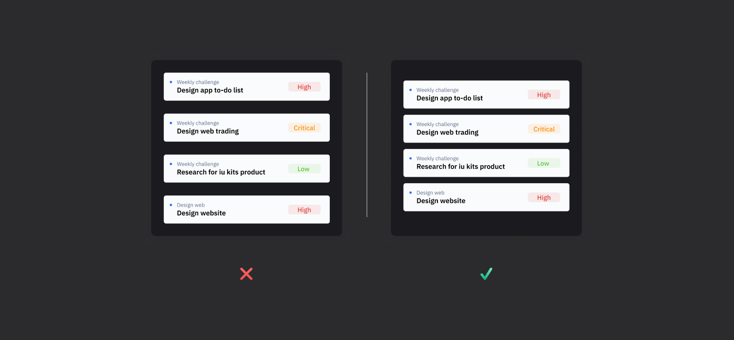
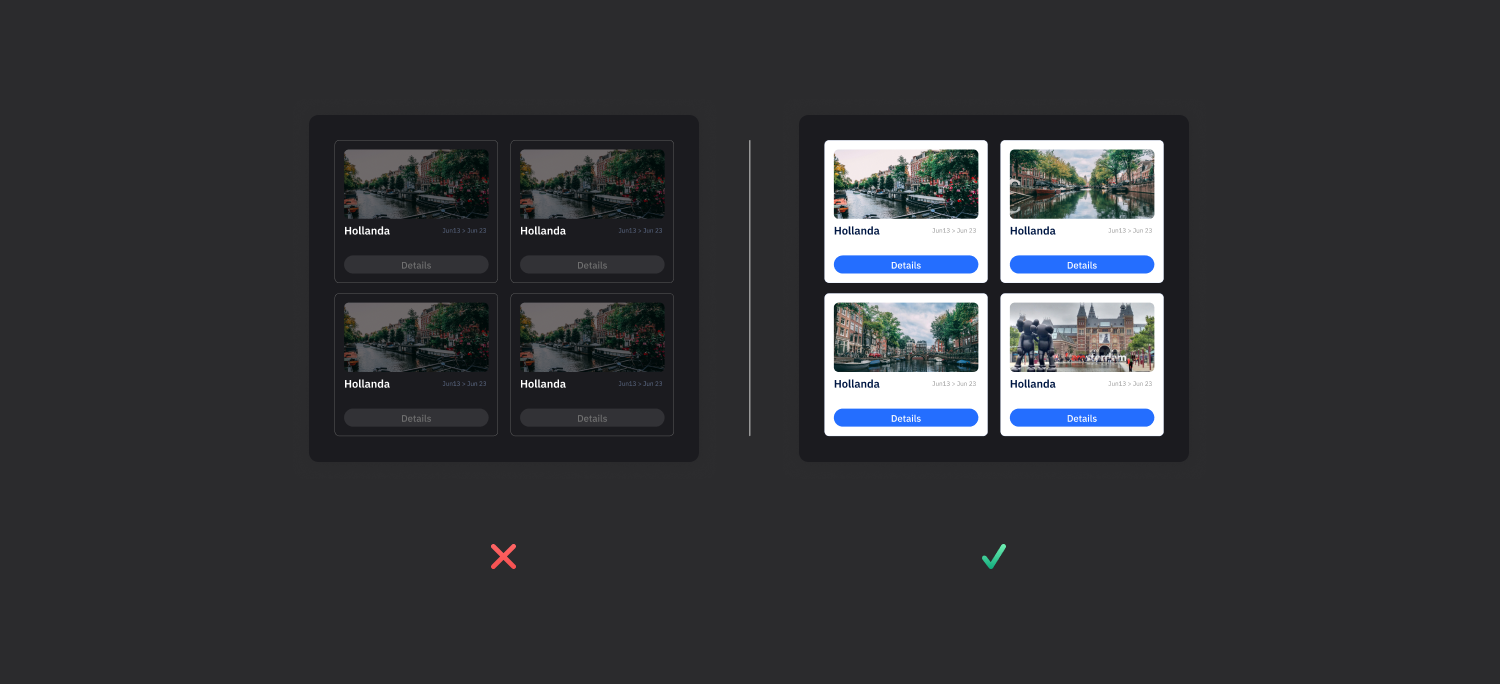
Contrast is used to emphasize certain elements. Contrast in color, size and shape is perfect for drawing users' attention to key points.
Repetition increases brand recognition and ensures unity of design. Repetition of elements such as logos, colors or graphic motifs creates a strong visual identity.
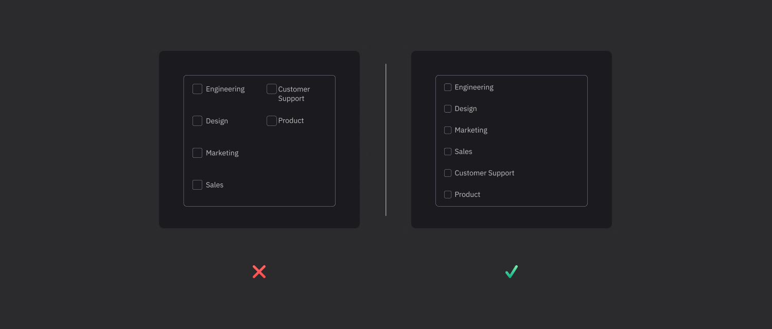
Proximity is the grouping of related items together. This makes information more organized and easier to understand.
Color and texture enrich the user experience and add atmosphere. Color theory and textures can evoke emotional responses and support the theme of your app.
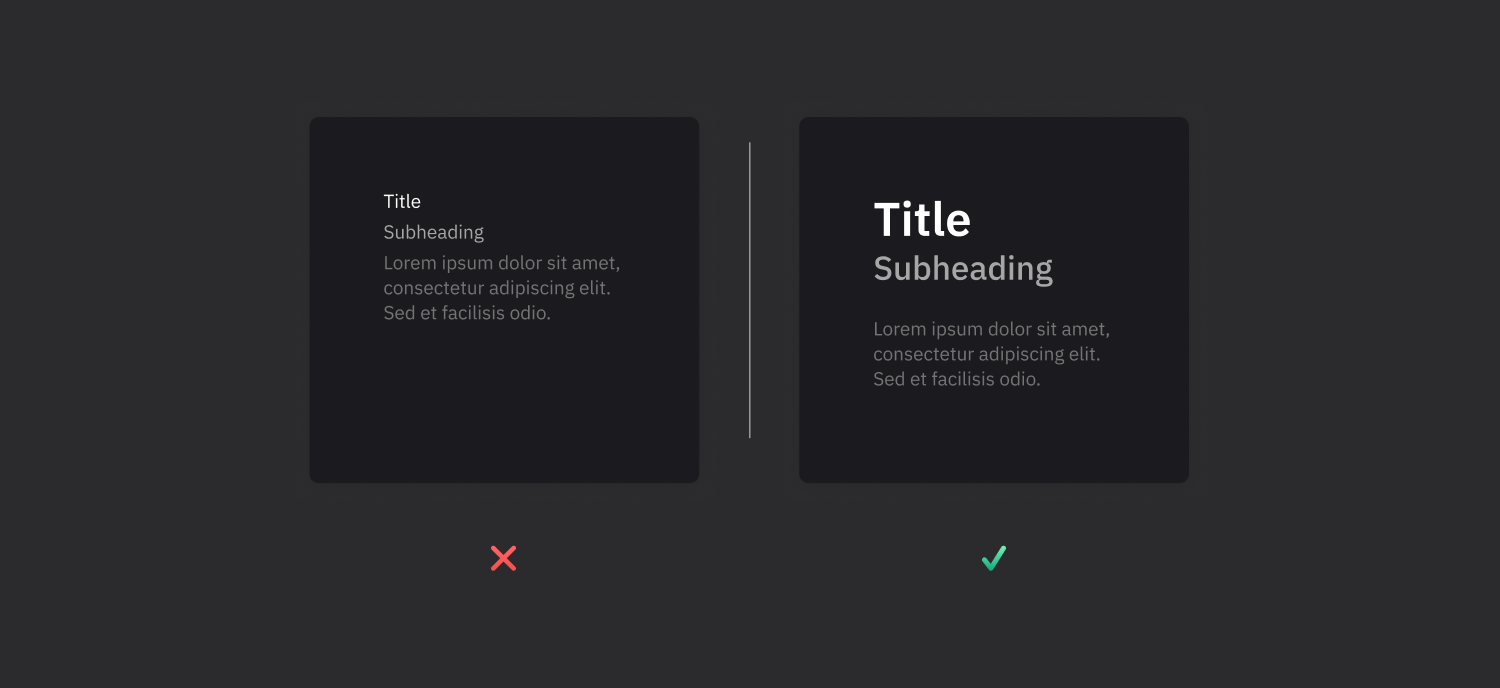
Typography affects the readability and aesthetics of text. Font choice, hierarchy and text layout are critical to conveying your message clearly.
By applying these graphic design principles and elements, you can create meaning, depth and visual appeal in your projects. Now is the time to innovate your designs with this knowledge. We wish you success on your design journey!


