Kuika's Tab element is a UI element used to present different content sections in applications in an organized and accessible manner via tabs. Users can quickly access different content within the same screen by switching between tabs.
The Tab element can be used to consolidate form groups, settings, reports, category-based content, or related information blocks into a single area. This reduces screen clutter and improves the user experience.
The Tab element is supported in web and mobile applications.
Multi-section forms (Personal Information, Contact Information, Additional Information)
Report and dashboard screens (Separating different data groups with tabs)
User profile pages (Profile, Orders, Invoices)
Documentation or help content.
Presenting the same data set with different views.
2. Key Features
Offers tab-based content organization.
Each tab can contain independent UI elements.
Users can quickly switch between tabs.
The active tab is visually highlighted.
Presents multiple pieces of content in an organized manner on the same screen.
Works with all UI elements such as Forms, Tables, Charts, and Buttons.
Reduces complexity by efficiently using screen space.
Provides a consistent and responsive structure on both web and mobile interfaces.
2.1. Tab Element Properties
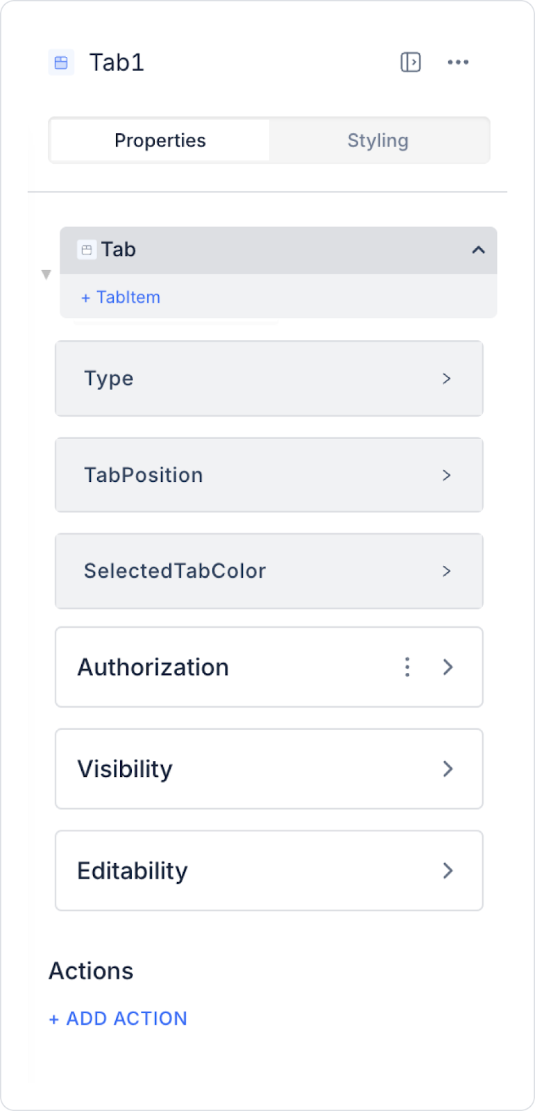
The following settings can be configured in the Properties panel:
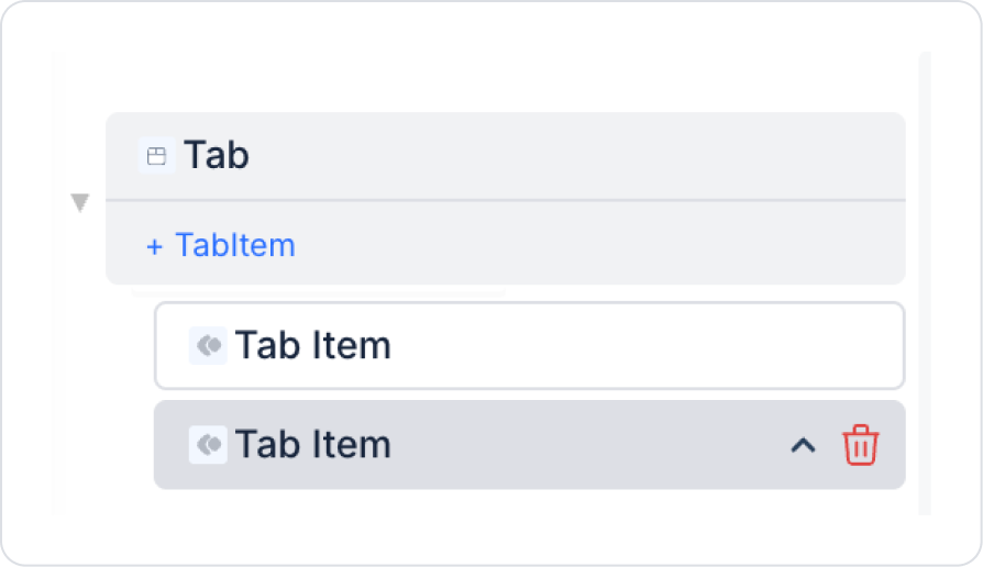
Tab: You can add new tabs, remove existing tabs, or change their order. When you remove a tab, its content is automatically deleted.
Type: You can choose from predefined appearance types for tab headers.
Tab Position: You can set tabs to appear on the top, right, bottom, or left edge of the Tab element frame.
Selected Tab Color: You can customize the font and line colors of the selected tab.
Justified Tab Titles: Ensures that the area containing the tab titles expands to fill the space evenly.
2.1.1. Tab Item Properties
Label: Specifies the text to be displayed in the tab title.
Force Render: Ensures the content is rendered even if the tab is not active; used in scenarios where pre-rendered content takes priority over performance.
Tab Title Width: Determines the width of the tab title (used primarily in tab layouts with horizontal scrolling).
Icon: Determines the icon to be displayed in the tab title.
Icon Color: Determines the color of the tab icon.
Styling and Visual Customization
The bottom line of tab titles can be removed in the Tab element, and tab styles can be customized via the Styling panel. The font color, line appearance, and overall design of the tabs can be adjusted to suit the application's interface.
By following this guide, you can effectively use the Tab element in your application.
2.2. Actions That Can Be Added to the Tab Element
The Tab element supports the onChange trigger to track user tab changes.
onChange: Triggers when the user changes the active tab.
Usage scenarios:
Load data based on the selected tab
Run a specific action or query for the tab
Dynamically update the contents of charts, tables, or lists
3. How to Use the Tab Element?
In this section, we will cover the end-to-end use of the Tab element through example scenarios.
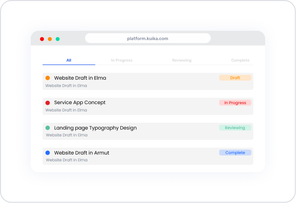
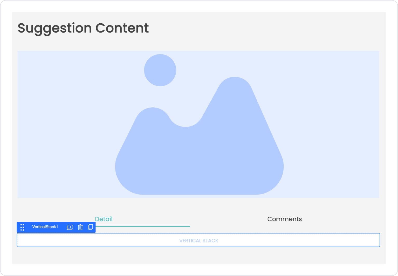
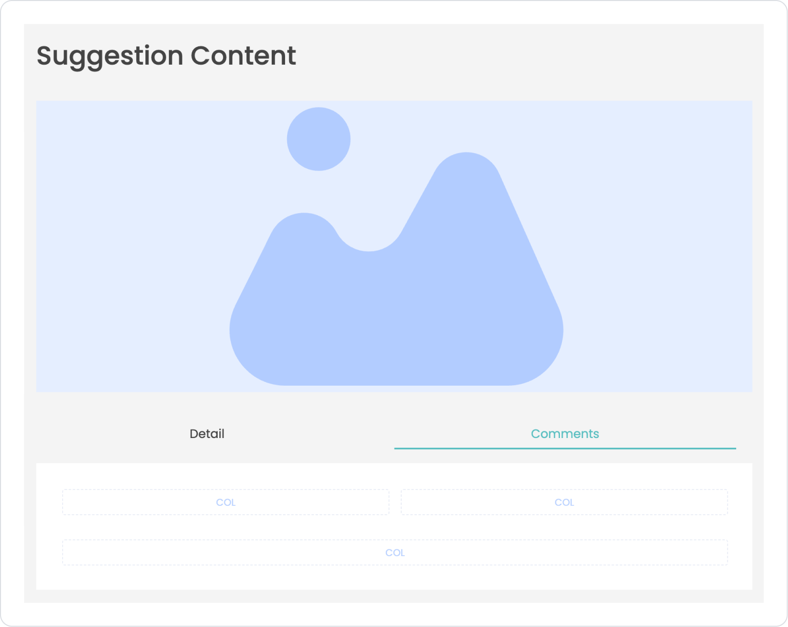
Scenario: Viewing Suggestion Details and Comments
The Tab structure is used in an application to allow users to review shared suggestions in detail and quickly access comments. In this scenario, visual content, description information, and user comments related to a suggestion are presented on a single screen.
In the scenario:
Visual content related to the recommendation is displayed at the top of the screen.
The Tab structure at the bottom organizes recommendation information and comments under separate tabs.
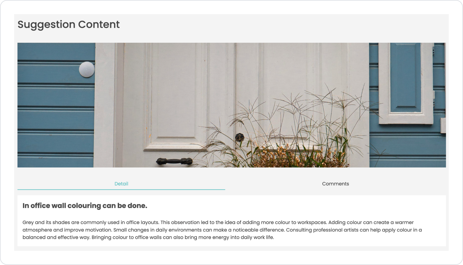
When the Detail tab is active, the recommendation's title and description text are displayed.
When the Comments tab is selected, user comments related to the suggestion are listed.
When switching between tabs, the content is updated without refreshing the page.
Step 1 - Defining the Required Action
To display data in the interface:
you need to define two actions.
Add a new action from the Actions > New SQL Action tab in the Datasources module.
Action Providing Sample Data (GetSuggestionDetail):
SELECT
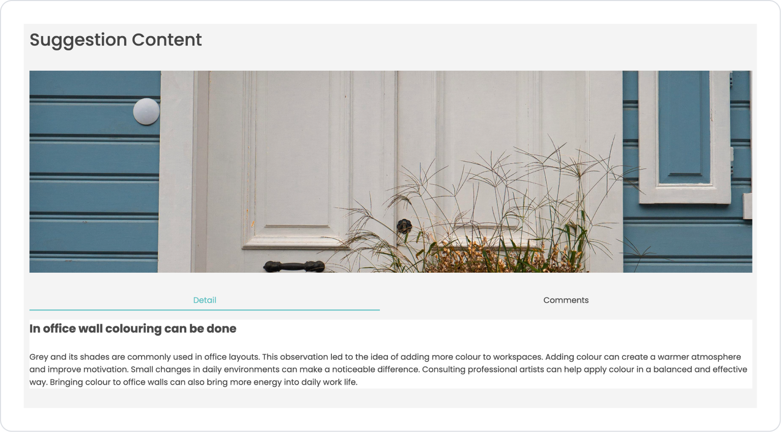
‘In office wall coloring can be done’ AS Title,
'Grey and its shades are commonly used in office layouts. This observation led to the idea of adding more color to workspaces. Adding color can create a warmer atmosphere and improve motivation. Small changes in daily environments can make a noticeable difference. Consulting professional artists can help apply color in a balanced and effective way. Bringing color to office walls can also bring more energy into daily work life.‘ AS Description,
'https://images.pexels.com/photos/5674102/pexels-photo-5674102.jpeg’ AS ImageUrl;
Action Providing Sample Data (GetComments):
SELECT
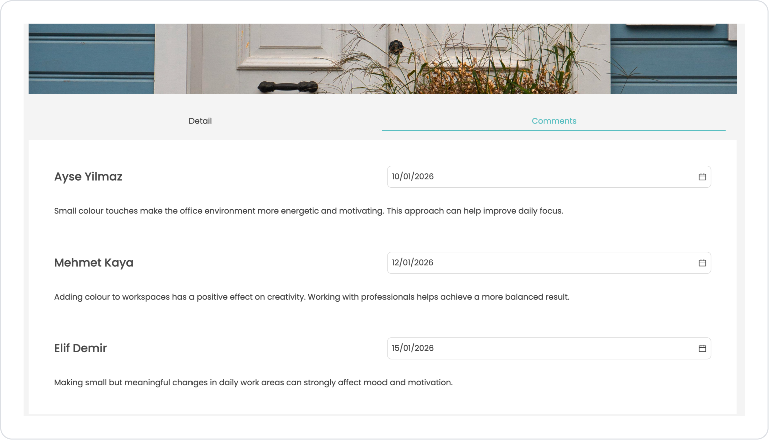
‘Ayse Yilmaz’ AS CommentUser,
‘Small touches of color make the office environment more energetic and motivating. This approach can help improve daily focus.’ AS CommentText,
‘2026-01-1009:15’ AS CommentDate
UNION ALL
SELECT
‘Mehmet Kaya’ AS CommentUser,
‘Adding color to workspaces has a positive effect on creativity. Working with professionals helps achieve a more balanced result.’ AS CommentText,
‘2026-01-1214:40’ AS CommentDate
UNION ALL
SELECT
‘Elif Demir’ AS CommentUser,
‘Making small but meaningful changes in daily work areas can strongly affect mood and motivation.’ AS CommentText,
‘2026-01-1511:05’ AS CommentDate;
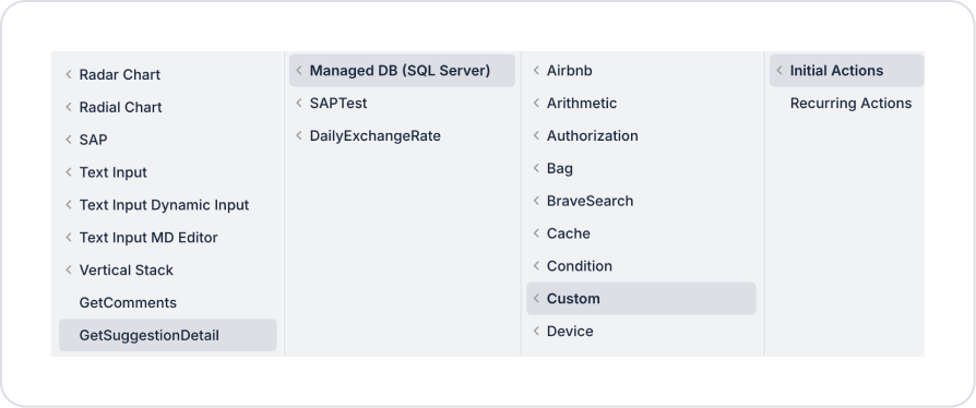
Step 2 - Adding Initial Action
Initially on the home page:
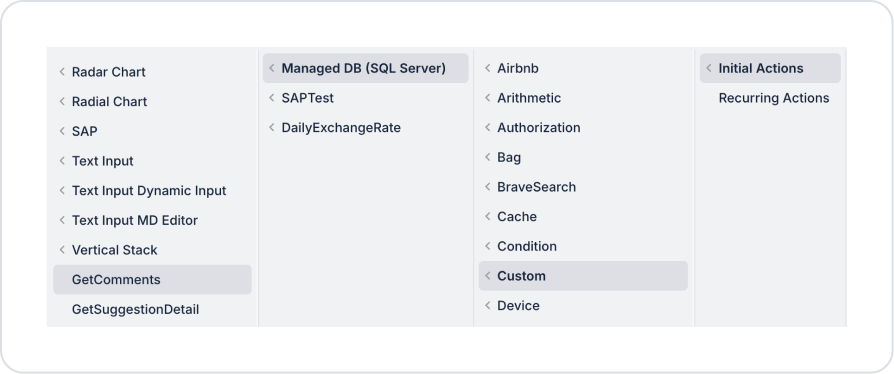
To display sample data in the details area, add the Add Action > Initial Action > Custom > Managed DB > GetSuggestionDetail action.
To display sample data in the comments area, add the Add Action > Initial Action > Custom > Managed DB > GetSuggestionDetail action.
Step 3 - Add Element and Edit Style
Initially on the home page:
Open the UI Design module.
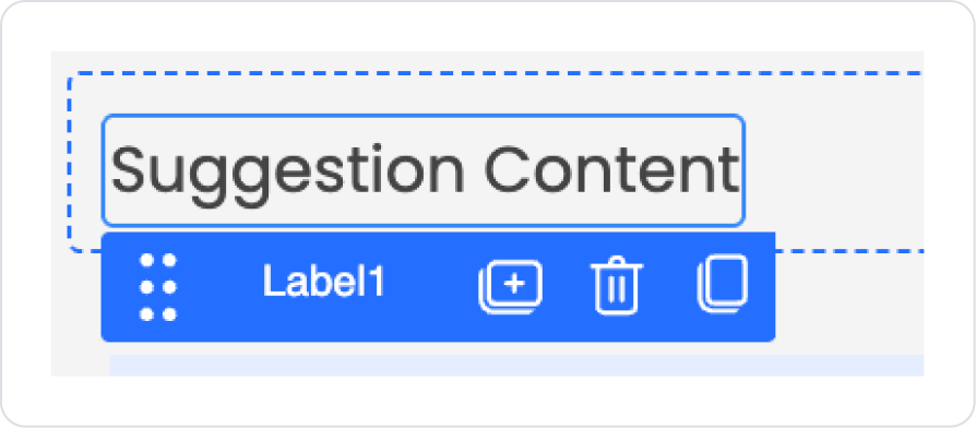
From the left side panel, drag and drop the Elements > Display > Label element onto the page.
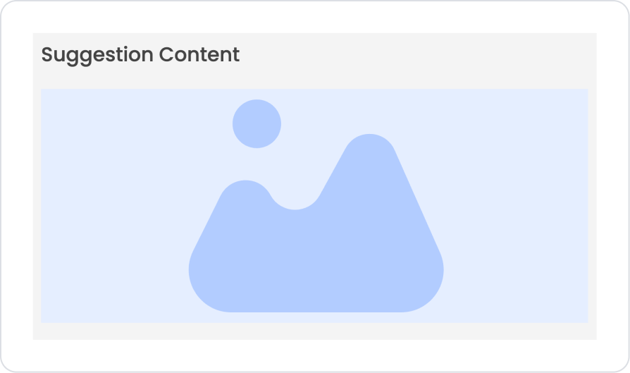
Update the text to Label > Properties > Value > “Suggestion Content”.
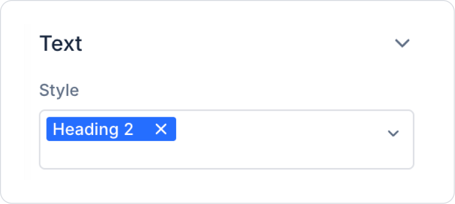
Set the text style to Label > Styling > Text > Style > Heading 2.
Drag and drop the Elements > Display > Image element onto the page.
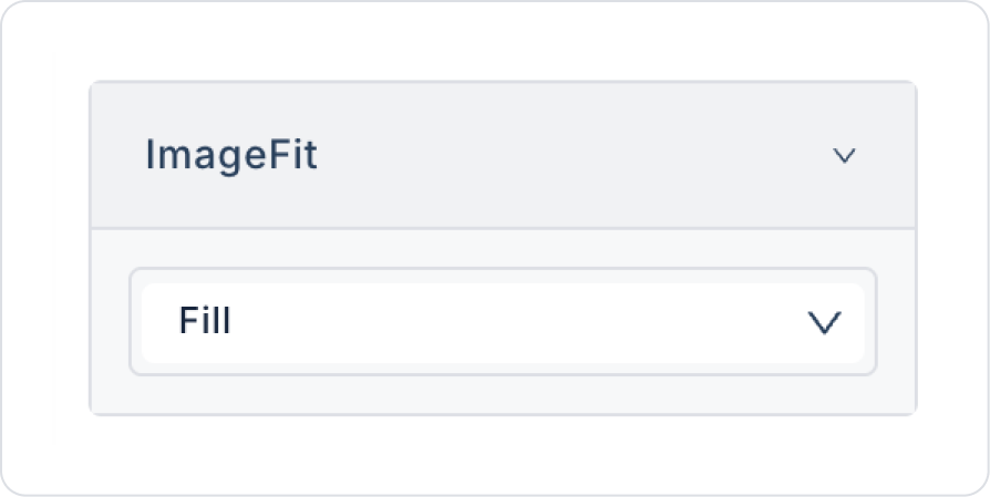
To fill the image area, select the Image > Properties > ImageFit > Fill option.
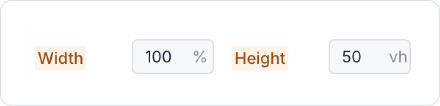
Set the dimensions by adjusting the Image > Styling > Layout > Width and Height fields as follows.
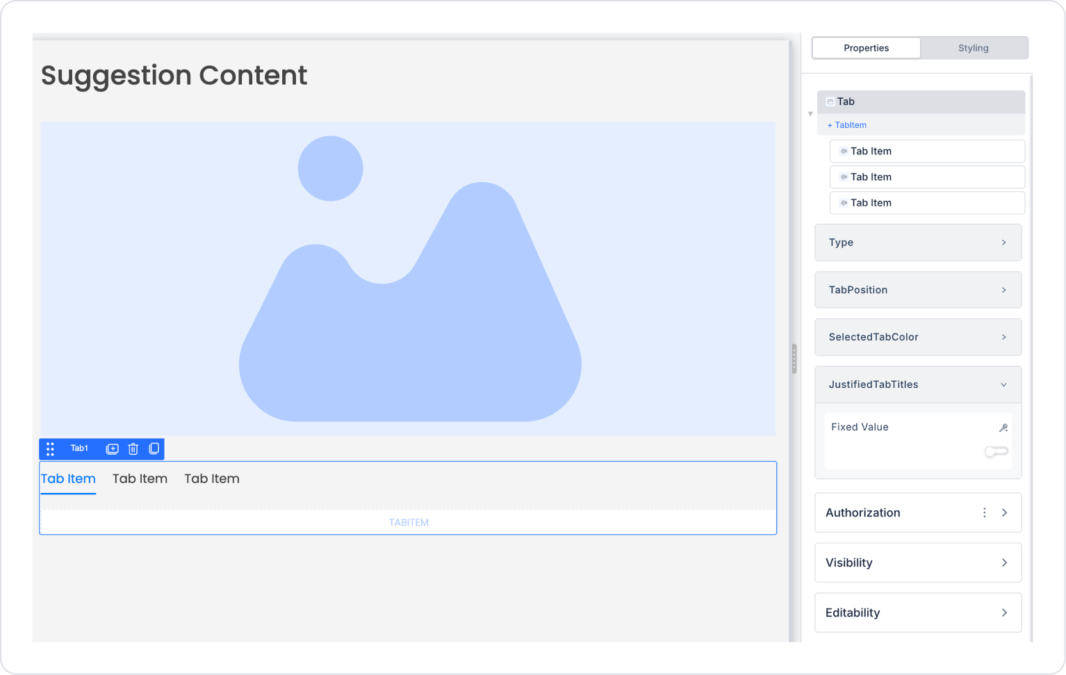
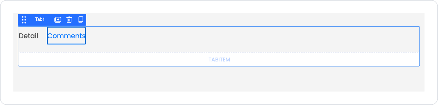
Drag and drop the Elements > Interactive > Tab element below the Image.
To update the number of fields to two, delete one of the default Tab Items by selecting Tab > Properties > Tab Item > Delete.
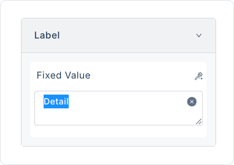
Click on the first Tab Item and update its name to Tab Item > Label > “Detail”.
Similarly, update the second one to Tab Item > Label > “Comments”.
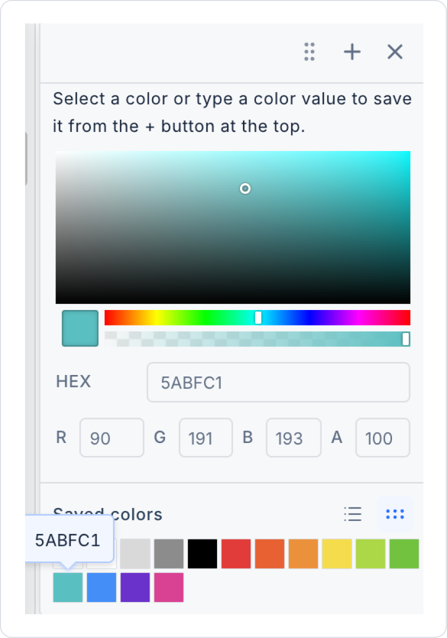
Click on the Tab element again and set the selected area color to Tab > Properties > SelectedTabColor > Hex > 5ABF1.
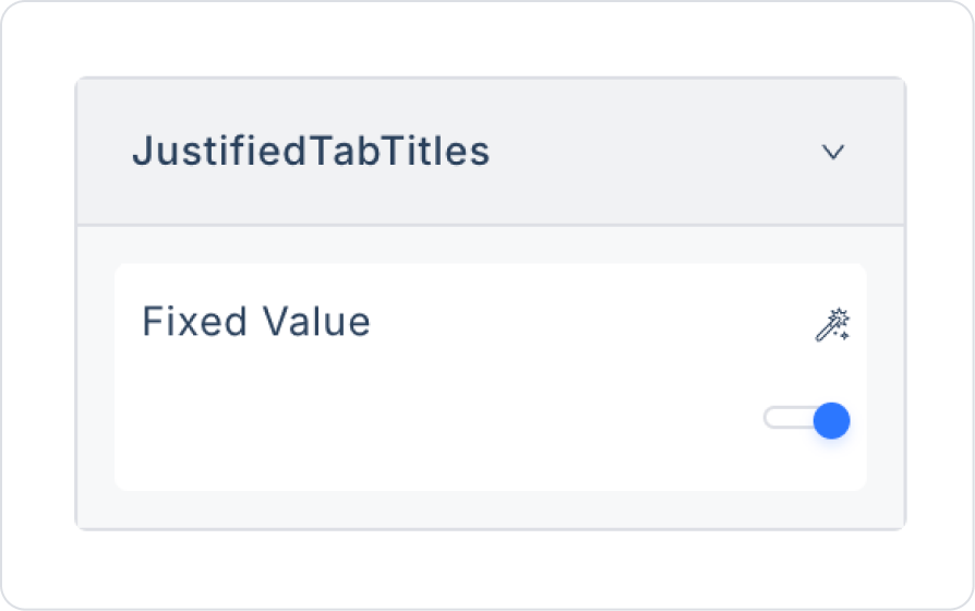
To align the tab titles, set Tab > Properties > JustifiedTabTitles > On.
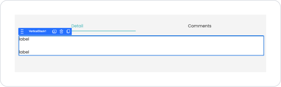
Click on the Detail header and drag and drop the Elements > Display > Label element into it.
Add two Elements > Display > Label elements into the Vertical Stack element.
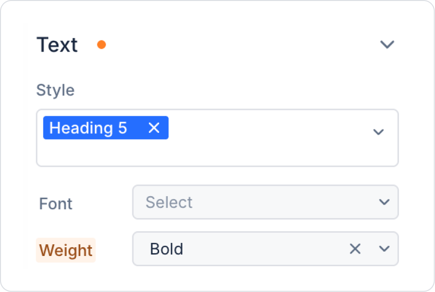
Set the style of the first label element to Style > Heading 5 and Weight > Bold.
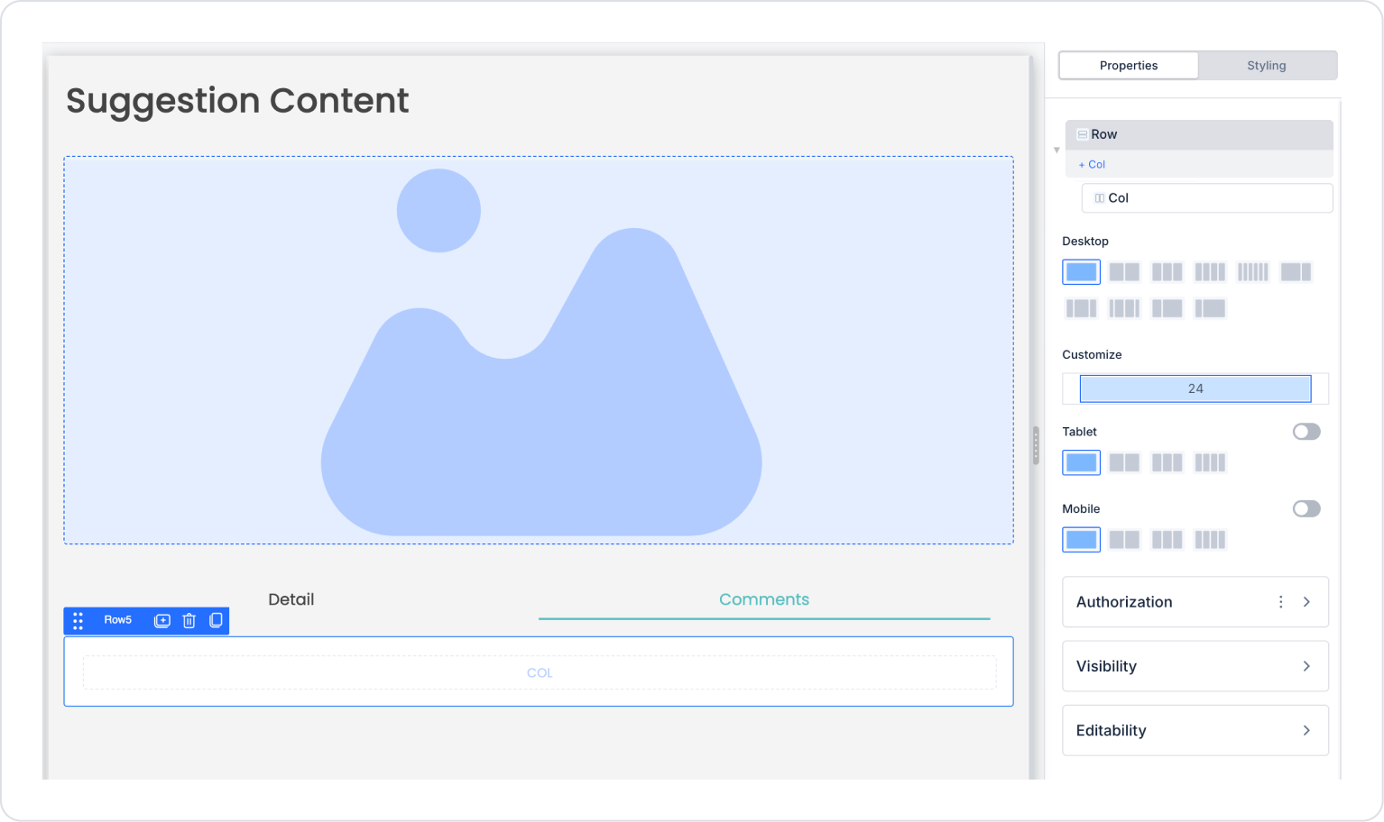
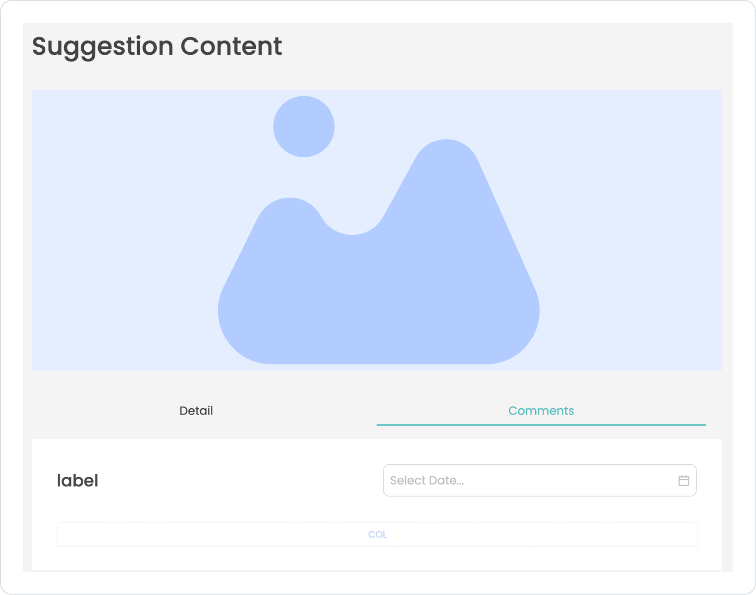
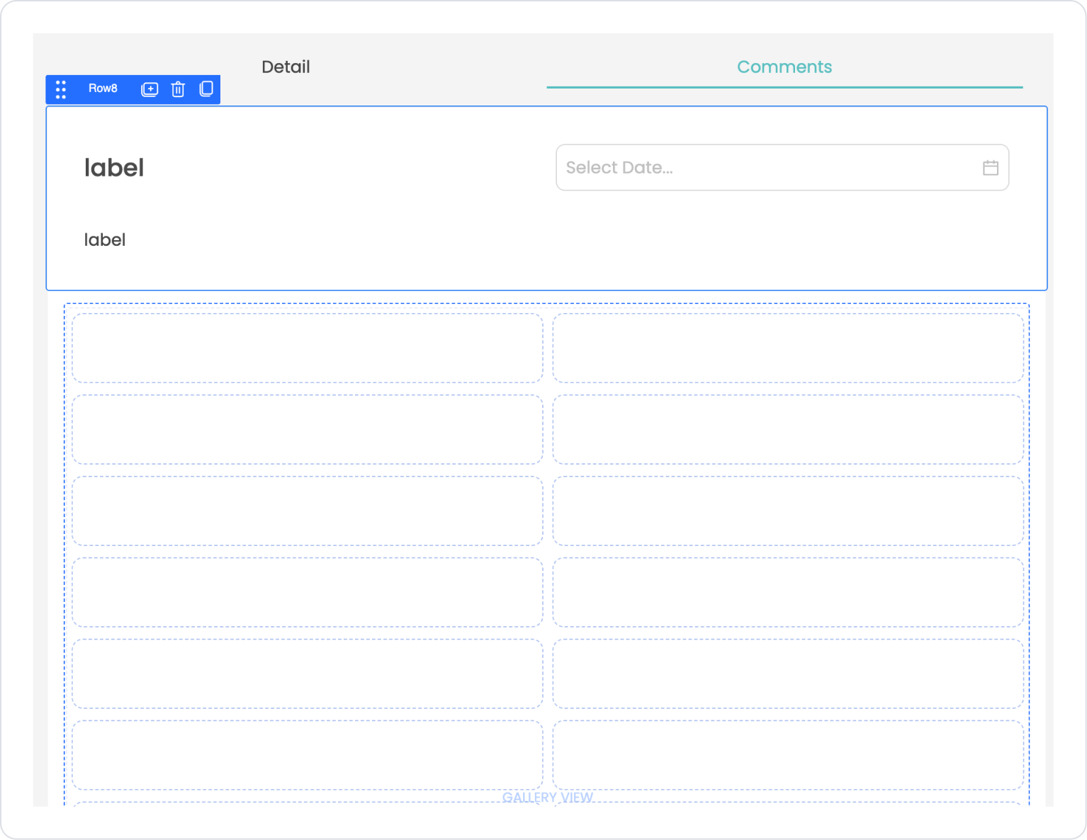
Click on the Comments header and drag the Elements > Container > Row element into it. Set the Column count to one.
Drag two new Elements > Container > Row elements into it. Set the first Column count to two and the second Col count to one.
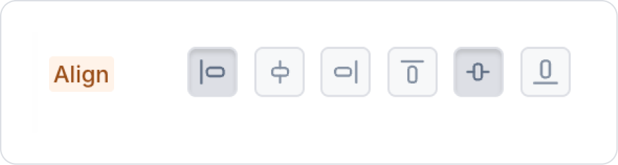
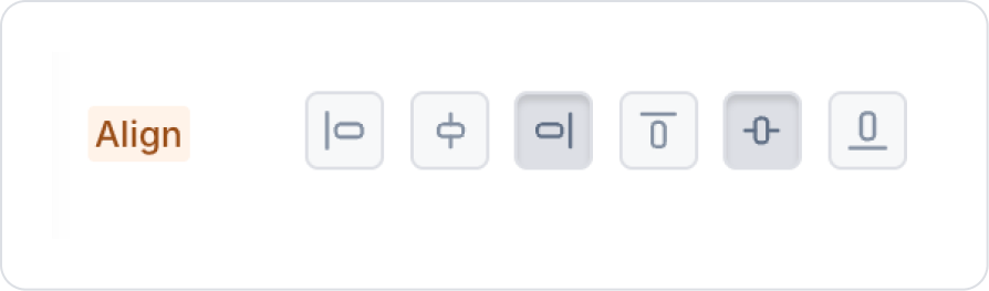
Align the left Column area to the left, the right Column area to the right, and center both vertically.
Add the Elements > Display > Label element to the first left Column.
Set the text style to Label > Styling > Text > Style > Heading 4.
Add the Elements > Date and Time Input > Date element to the second right Column.
Drag and drop the Elements > Display > Label element into the empty Column.
Drag and drop the Elements > Data > Gallery element below the Label element.
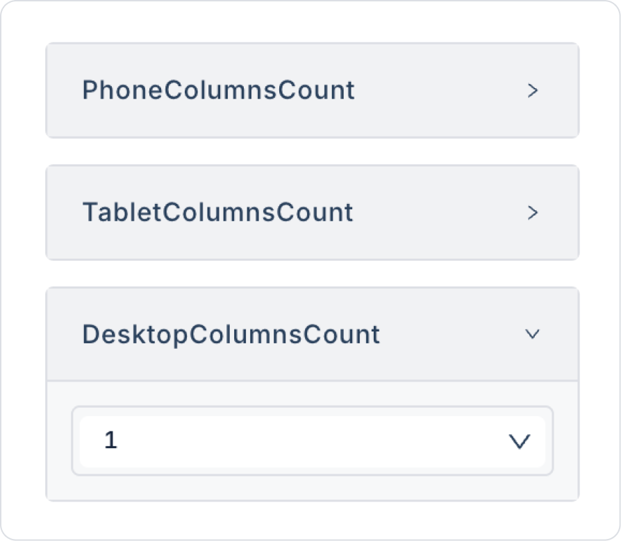
In the Gallery, set the Properties phoneColumnsCount, tabletColumnsCount, and DesktopColumnsCount fields to 1 to display one column for all types.
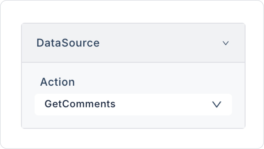
For the data source, connect the GalleryView > Properties > DataSource > GetComments action.
In Gallery View, click on the comment element group. In the Row8 options that appear, drag and drop from the area on the left edge.
Step 4 - Data Binding
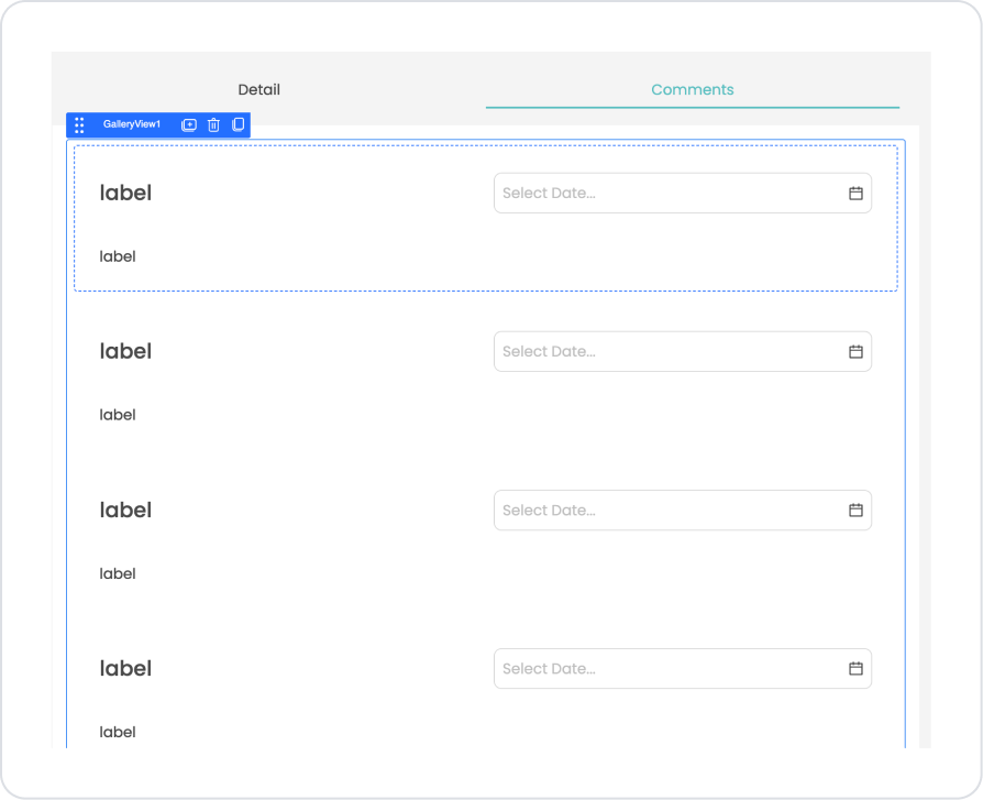
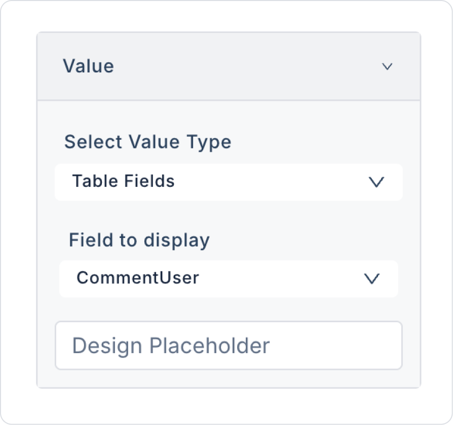
Click on the Comments heading in the tab and define the Label > Properties > Value > Field to display > CommentUser field in the first label element inside.
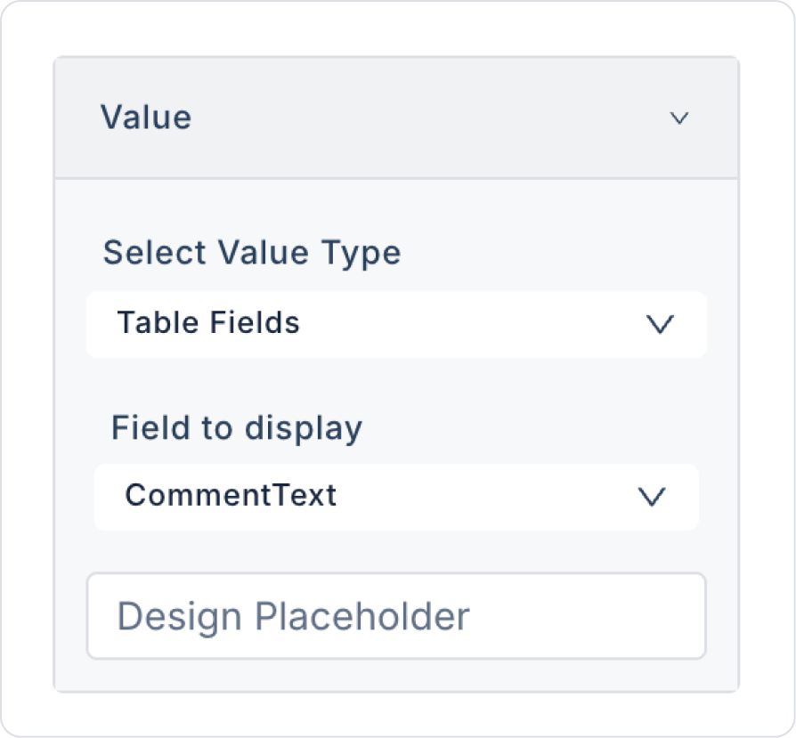
Click on the second label element and define the Label > Properties > Value > Field to display > CommentText field.
Click on the Date element and define the Date > Properties > Value > Field to display > CommentDate field.
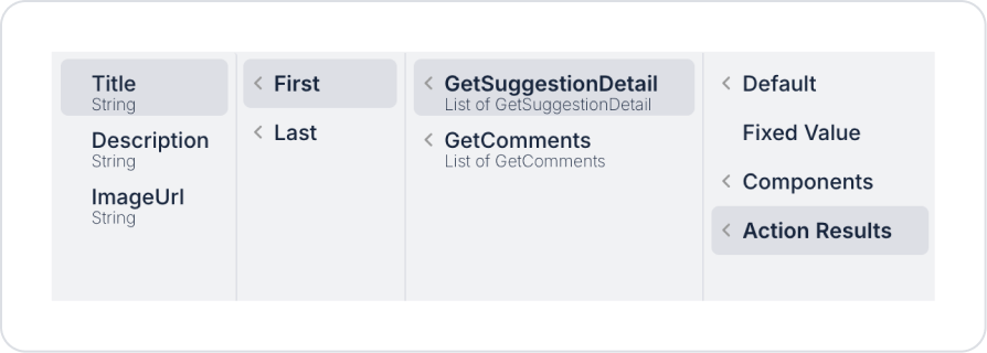
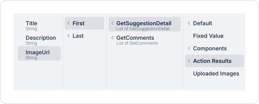
Click on the Detail heading in the tab and click on the first label element and define the Label > Properties > Value > Action Result > GetSuggestionDetail > First > Title field.
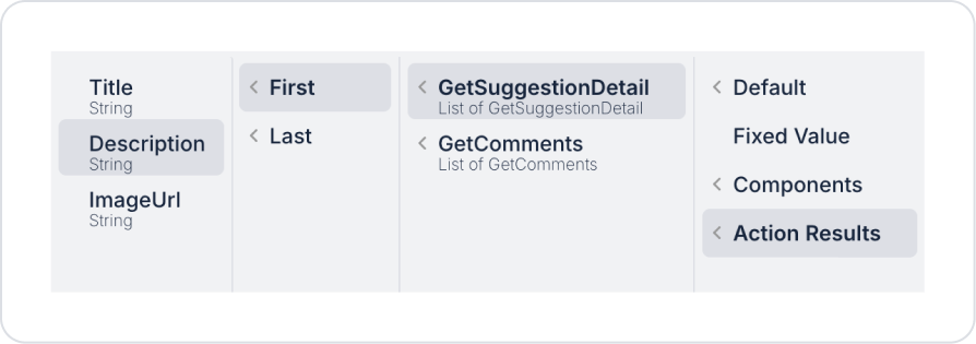
Click on the second label element and define the Label > Properties > Value > Action Result > GetSuggestionDetail > First > Title field.
Click on the Image element and define the Image > Properties > Value > Action Result > GetSuggestionDetail > First > ImageUrl field.
Preview
When the application is tested, the title and description information of the suggestion is displayed in a detailed content area when the Detail tab is active. In this area, the purpose and scope of the suggestion are presented in a readable and organized manner for the user.
When switching to the Comments tab, user comments on the suggestion and the dates they were written are listed on the same page. Each comment is structured with the user name, comment text, and date field, making it easy to track feedback.
4. Common Properties
Some fields on the tab element are used commonly across all UI elements. Therefore, detailed explanations of the following properties are provided in the relevant general guide pages:


