The button element is a fundamental interaction element that allows users to initiate an action within the application. It is used in many scenarios, such as triggering an action, sending data, redirecting pages, or starting a process. Its visually appealing structure aims to prompt the user to take action.
The button element is only supported in web applications.
1.1. Common Usage Scenarios
Form submission (Submit, Save, Update operations)
Navigation between pages (Navigate)
Opening and closing modals/pop-ups
Triggering data source actions (Get, Save, Delete, etc.)
Fully compatible with other UI elements and actions
2.1. Button Element Features
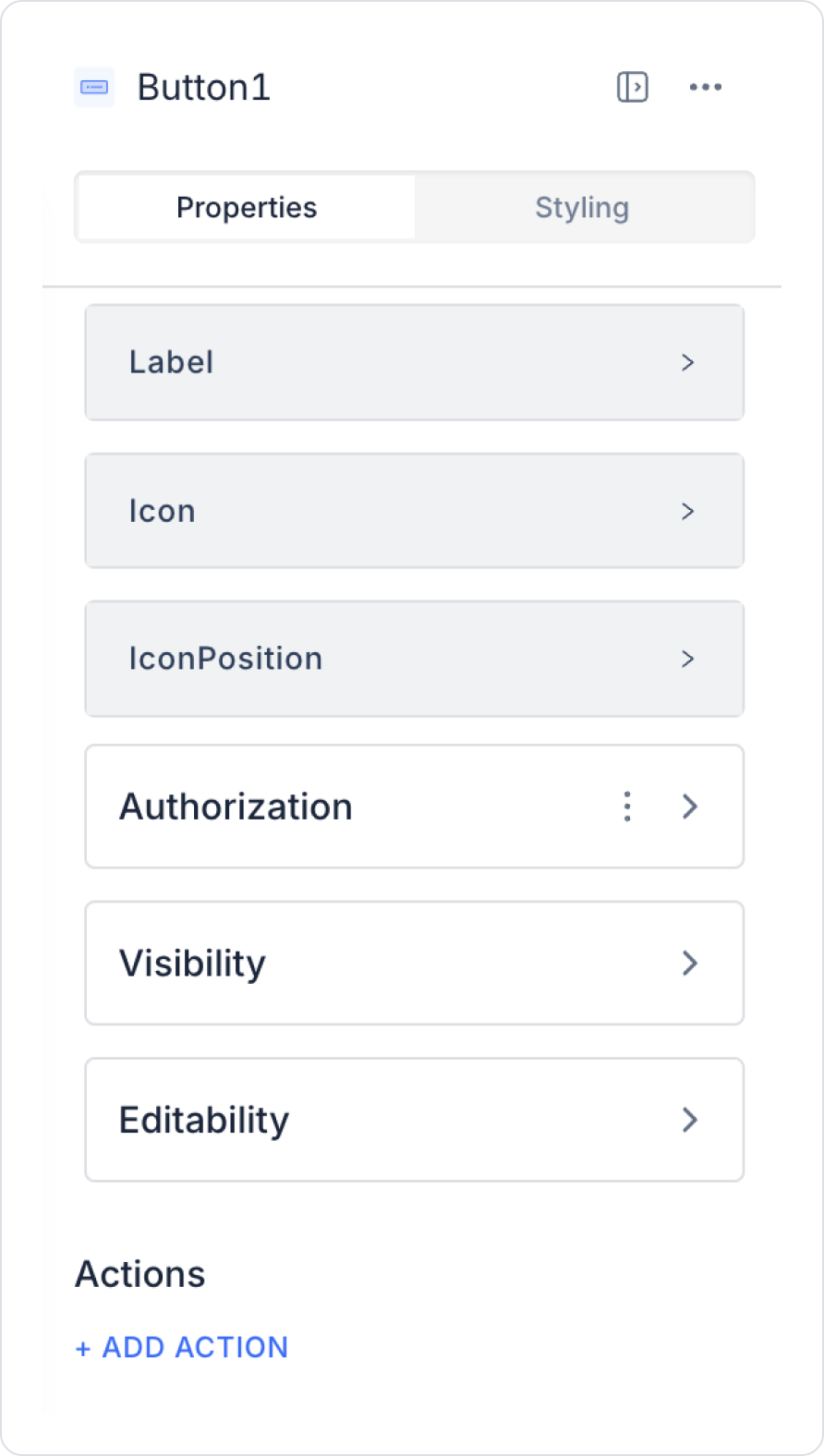
When you select the button element, you can configure the settings via the Properties panel on the right.
All settings are explained below:
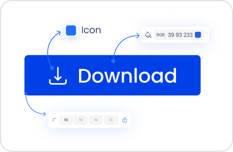
Label: Determines the text on the button. Helps users quickly understand the button's function.
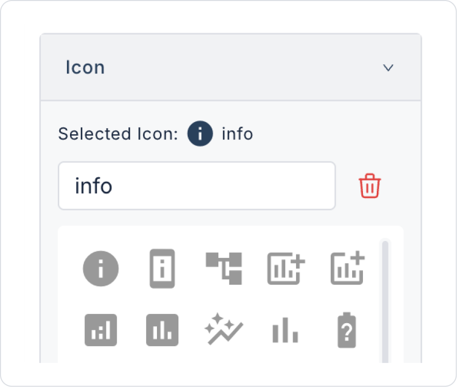
Icon: Represents the visual symbol added to the button. Enhances the button's aesthetics and functionality.
Icon Position: You can set the icon's position on the button. The icon can be placed to the left or right of the text.
By following this guide, you can effectively use the Button element in your application.
2.2. Actions That Can Be Added to Elements
Since the Button element is an element based on user interaction, it supports the onClick trigger. When the Button is clicked, the following scenarios can be performed:
Execute a Managed DB or REST API action
Redirect to another page or screen
Changing the value of another element with Set Value Of
Opening a Modal, Drawer, or Pop-up
Starting a Process (Process Automation)
Creating different flows with conditional actions
3. How to Use the Button Element?
In this section, we will cover the end-to-end use of the Button element through example scenarios.
Scenario: Viewing Details Page
In an application, a Drawer structure is preferred so that users can quickly access detailed information without leaving the current page. In this scenario, the Button element is used to display detailed content in the drawer without switching pages.
In the scenario:
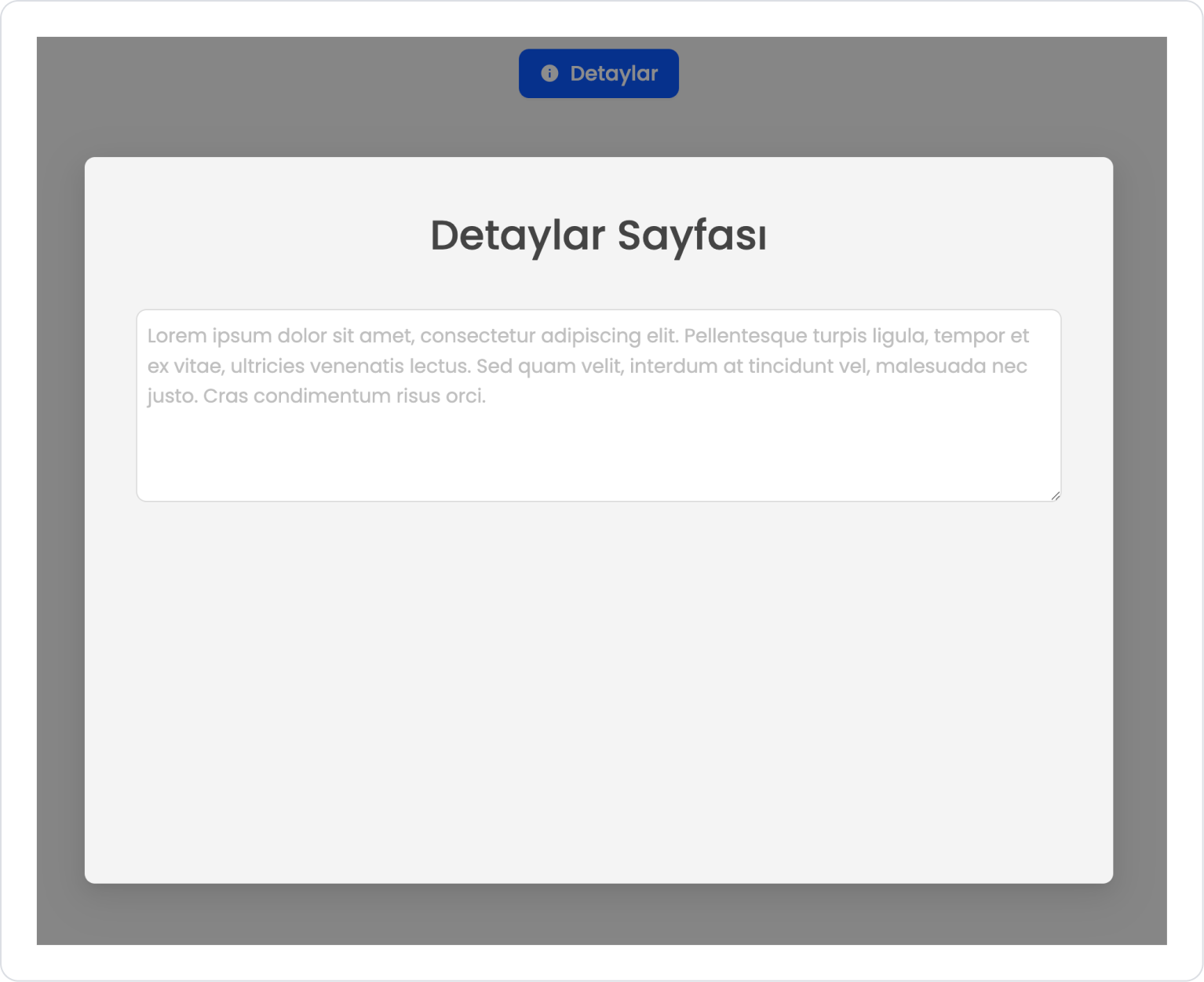
The user views the Details button located on the list or main screen.
When the user clicks the Details button, the defined action is triggered and the Drawer panel opens from the side of the screen.
The Details Page title and related description content are displayed in the opened drawer.
The user can review the drawer content and continue their actions without losing the context on the main page.
When the drawer is closed, the user remains on the same page.
Adding the Element and Linking the Action
Drag and drop the Elements > Navigation > Button element onto the page.
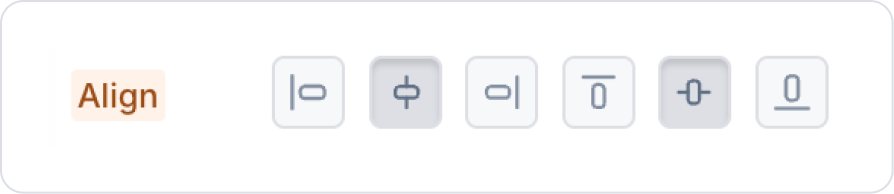
Click on the empty space next to the Button element and set it to Col > Styling > Layout > Align > Center Vertically and Horizontally.
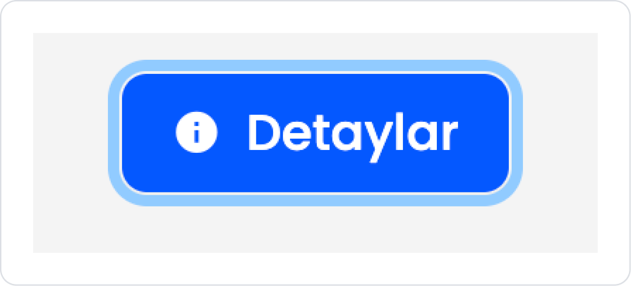
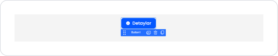
Update the text on the Button to Button > Properties > Label > “Details”.
Add the “info” icon to the button by going to Button > Properties > Icon > “info”.
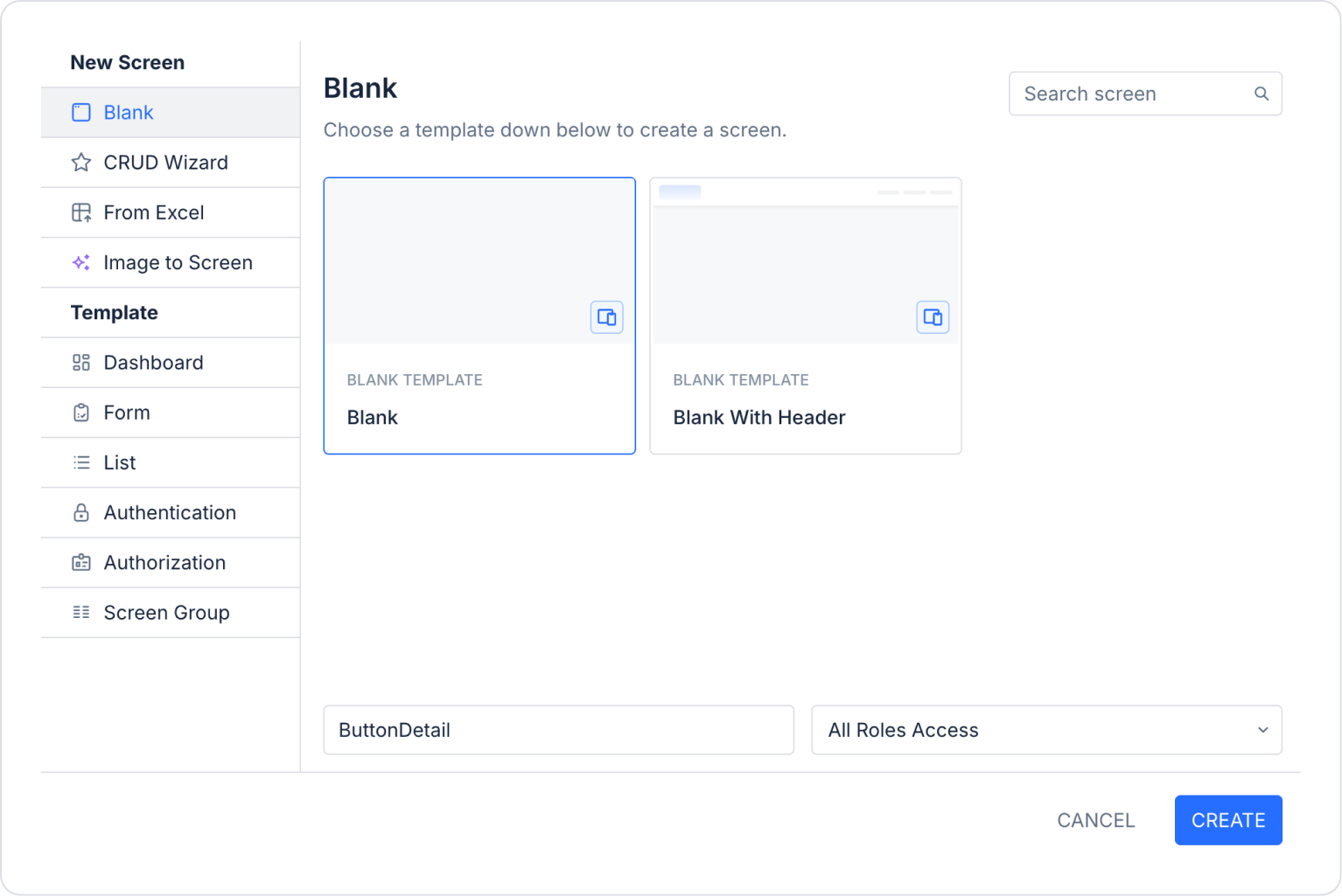
Create the page where the details will be displayed in the last side panel: Screens > New Screen > Screen name > ButtonDetail
Return to the main page where the Button element is located.
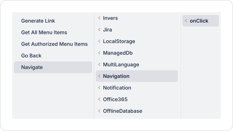
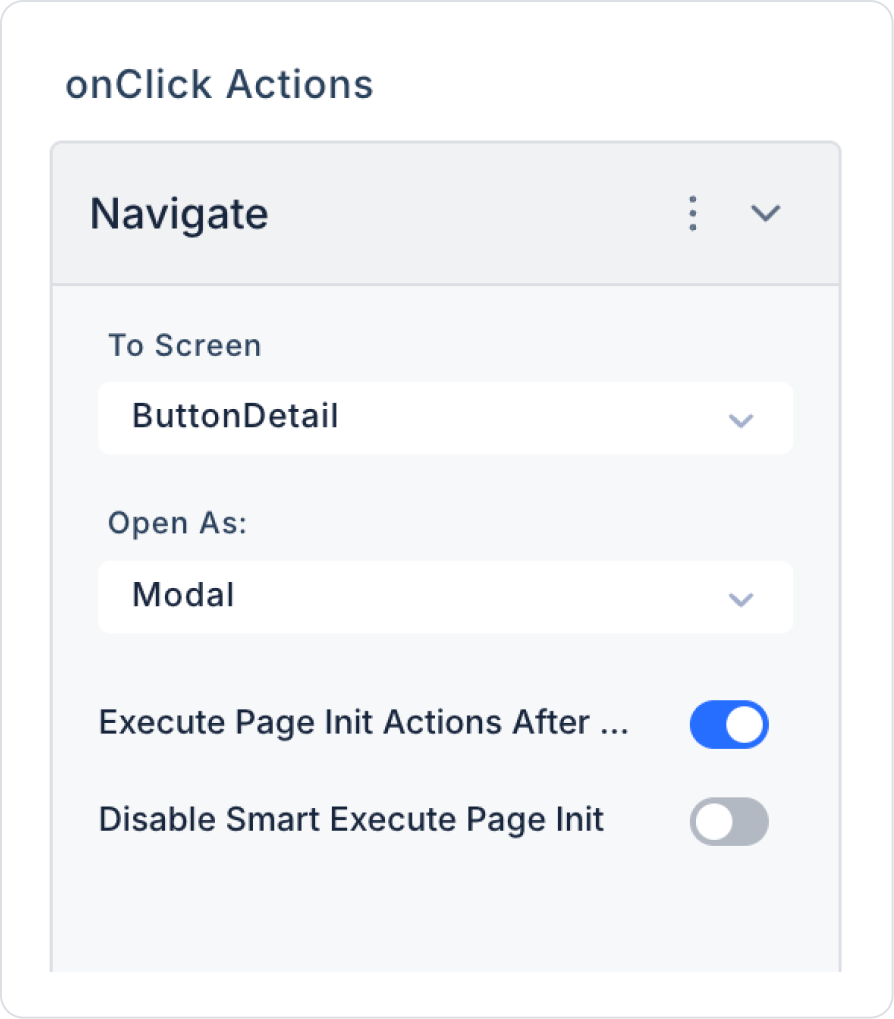
Add the Navigate action to the Button element: Button > Add Action > onClick > Navigation > Navigate.
Within the Navigate action, make the following two required definitions.
Preview
When the application is tested, click the Details button in the relevant content area. Clicking the button dims the current page, making it inactive, and opens the Details Page in the foreground. This structure allows the user to view detailed information without leaving the current page.
When the user closes the page after reviewing the detailed content, the background screen remains unchanged. This usage allows the user to focus on the detailed information without experiencing a page transition, and the flow within the application is not interrupted.
4. Common Properties
Some fields on the Button element are used commonly across all UI elements. Therefore, detailed descriptions of the following properties can be found in the relevant general guide pages:


