The thumbnail element is an element used to display small visual previews in applications. It provides users with a quick idea about the content through a small version of an image or video and creates a basic entry point for accessing larger content.
The thumbnail element is only supported in web applications.
1.1. Common Use Cases
Product listings and e-commerce catalogs: Enables users to quickly compare products by displaying small images.
Media galleries (photos & videos): Offers a fast browsing experience with small previews of large media content.
Profile lists: Can be used to display small versions of user, employee, or team profile photos.
Article, blog, or news cards. A small featured image accompanying the text card increases engagement.
2. Key Features
Small preview area. The thumbnail gives the user a quick idea by showing a small version of large images or media content.
Static or dynamic image support. The image URL can be a fixed value or can be dynamically retrieved from a database or API using the Symbol Picker.
Clickable structure (Hover & Click scenarios). The thumbnail can act like a button or link; when the user clicks, actions such as opening the large image, redirecting the page, or triggering a modal can be performed.
2.1. Thumbnail Element Properties
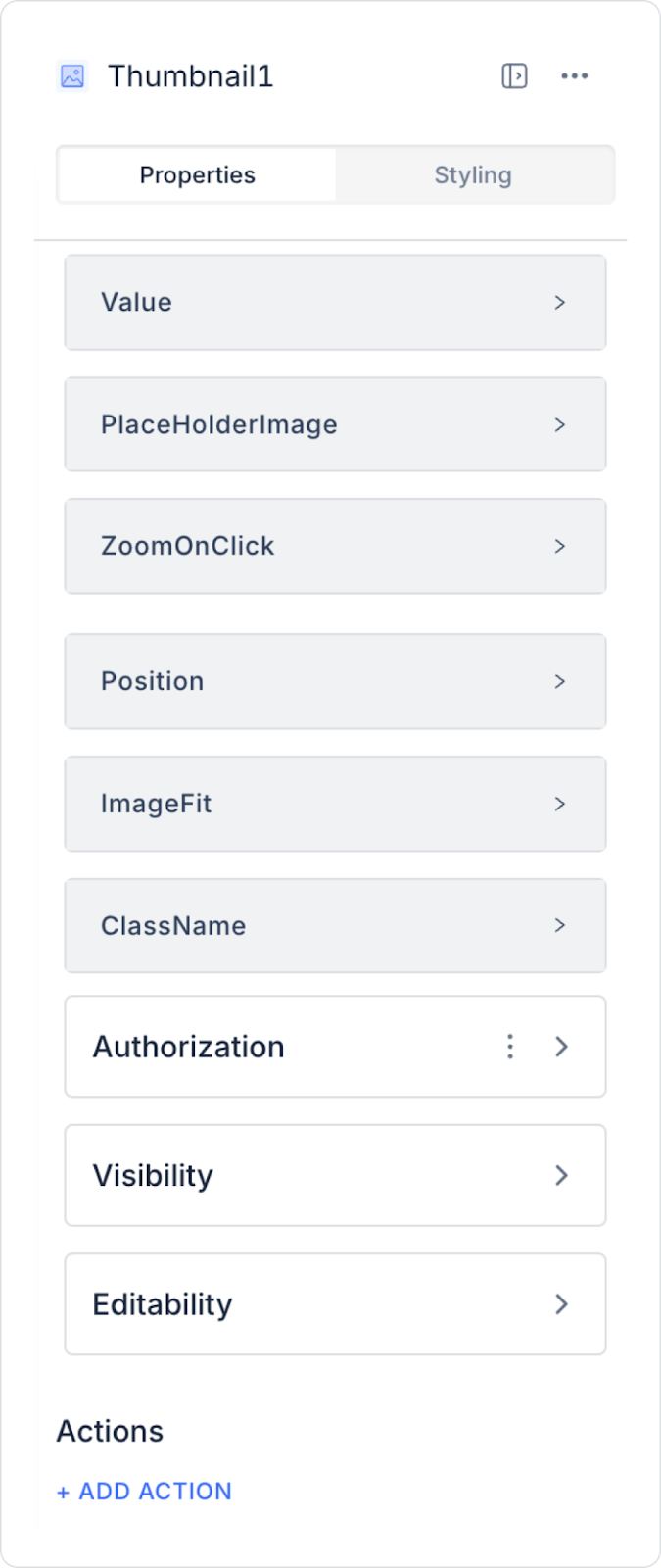
You can configure the properties of the thumbnail element from the Properties panel on the right side.
Value: You can add a static value or dynamically retrieve a state, the content of the Thumbnail element, or a value obtained as a result of an action via the Symbol Picker tool.
Placeholder Image: This is the image displayed when there is no image value. If no content is loaded, this image is displayed instead of a blank space.
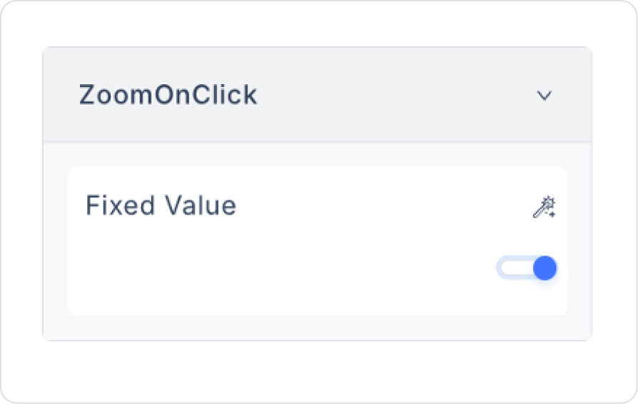
Zoom On Click: When the user clicks on the thumbnail, it displays a larger version of the image. When Switch is enabled, the small preview turns into a full-size image.
Image Fit: Determines how the image will scale according to the dimensions specified in the Styling > Layout tab or the dimensions of the parent element.
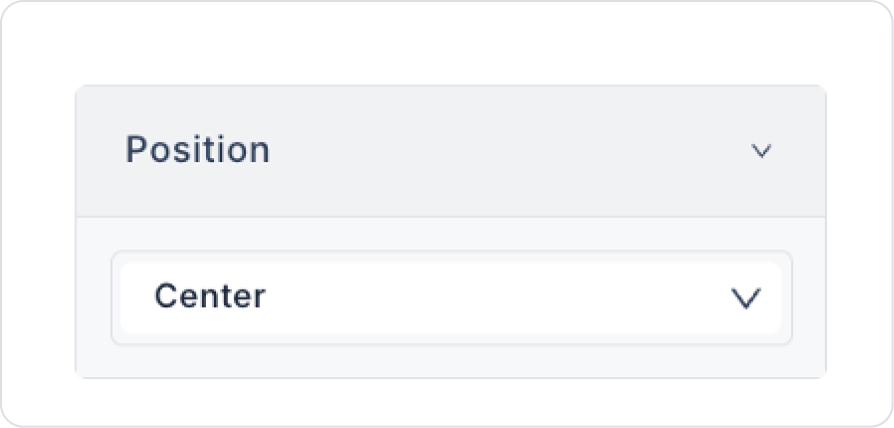
Position: Determines the position of the image to be displayed. You can choose from the following options in the drop-down menu:
Bottom: Aligns the image at the bottom.
Center: Aligns the image in the center.
Right: Aligns the image on the right.
Left: Aligns the image on the left.
Top: Aligns the image at the top.
Image Fit: Determines how the image will be scaled according to the dimensions defined in the Styling > Layout tab or the parent element. The options are generally values.
Class Name: Allows you to define custom CSS class(es) for advanced customization.
2.1.1. Adding an Action to the Thumbnail Element
Click the Value field in the Properties panel on the right side.
Select the Uploaded Images option from the menu that opens.
The image library contains the following options:
ADD IMAGE: You can add images from your device by dragging and dropping or selecting a file.
GENERATE WITH AI: You can generate images not found in browsers by describing the image you want with the AI assistant. You can add the generated images to the library by clicking the Download icon in the upper right corner.
Add Set Value Of Action
Click the +ADD ACTION button in the Properties panel on the right side.
Select the OnClick → UI Control → Set Value Of option.
In the window that opens, select the Thumbnail element in the Component To Change field.
Click the Symbol Picker to fill in the Value parameter:
Select the Action Results → Upload File → Data option.
Click the Run button in the upper right corner to preview the application.
After these steps, clicking the button will open a screen to upload a file from your device. Here, you can select a PDF or image file. If the selected file is a PDF, a PDF icon will be displayed; if it is an image file, a preview image will be displayed.
The thumbnail element is ideal for displaying visual content quickly and effectively. Thanks to the zoom feature, users can switch from small previews to full-size images. This feature enhances the user experience, especially in product catalogs, gallery applications, and media content.
2.2. Actions That Can Be Added to Elements
The thumbnail element supports two different triggers (events) based on user interactions: onClick and onChange. Thanks to these triggers, actions such as changing images, opening modals, and redirecting to detail screens can be performed via the thumbnail.
onClick
Triggered when the user clicks on the Thumbnail element. This trigger can be used in the following scenarios:
Displaying a large image when the thumbnail is clicked (manually opening a modal if Zoom On Click is not active).
Displaying image details by opening a pop-up.
Triggering a file upload action (Upload File → Set Value Of).
Redirecting to another page or sending parameters.
Dynamically changing the value of the thumbnail.
onChange
Triggered when the user changes the value of the thumbnail (e.g., when a new image is assigned with Set Value Of). If the image cannot be changed directly by the user, this event is mostly used when the value is updated as a result of an action.
Usage scenarios:
Automatically saving when the image changes.
Updating the value of another field when the thumbnail is updated.
Displaying a validation or warning based on the image change.
3. How to Use the Thumbnail Element?
In this section, we will cover the end-to-end use of the Thumbnail element through a sample scenario.
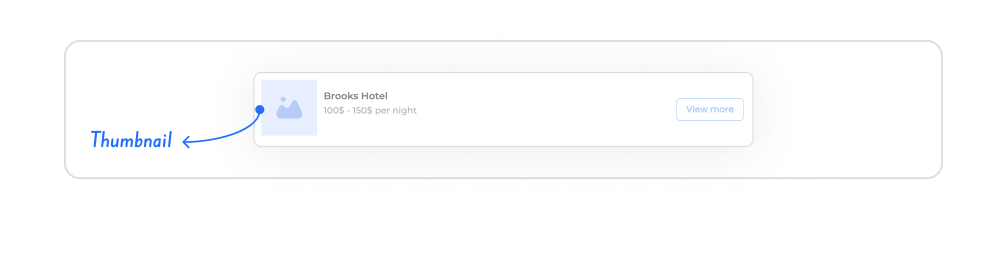
Scenario: Hotel Display Screen (Mockdata Thumbnail)
In a hotel reservation application, when the user views the hotel list, they see a small preview image of each hotel as a Thumbnail. A default Placeholder Image is displayed for hotels without an image. When the user clicks on a hotel, they are directed to the details screen.
Step 1 - Defining Actions Required for Dynamic Usage
To display data in the interface:
You need to define an action.
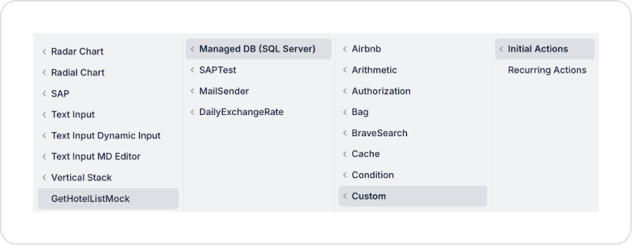
Add a new action from the Actions > New SQL Action tab in the Datasources module.
Add the Initial Actions > Custom > Managed Db > GetUserInfo action to the page using the ADD ACTION button.
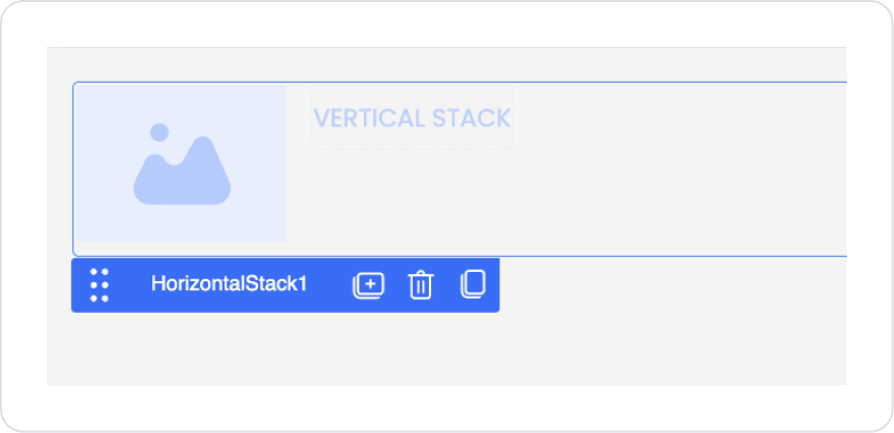
Drag and drop the Elements > Container > VerticalStack element onto the page.
Drag and drop the Elements > Display > Thumbnail element into the Vertical Stack.
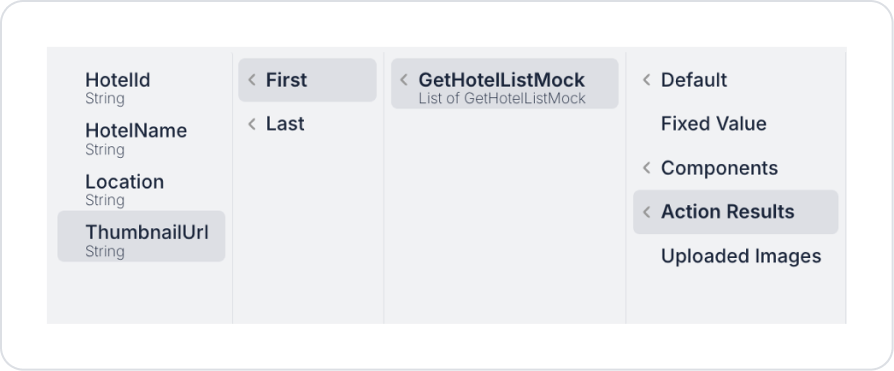
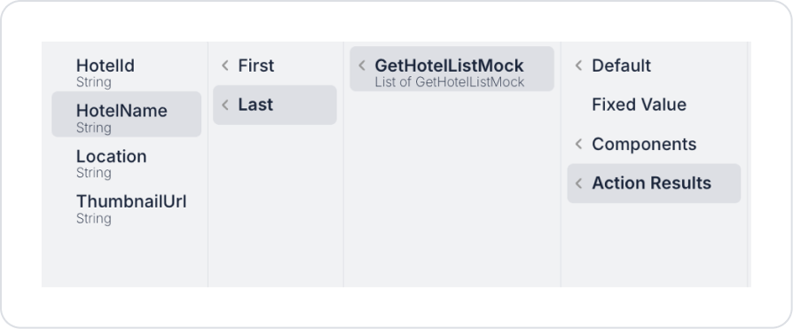
Define the image to be displayed in Thumbnail > Properties > Value > Action Results > GetHotelListMock > ThumbnailUrl.
If there is no image URL, you can select an image you have uploaded from the Thumbnail > Properties > PlaceHolderImage > Uploaded Images field for display.
To make the image enlarge when clicked, set Thumbnail > Properties > ZoomOnClick > On.
Set the position of the image within the thumbnail area to Center for the current scenario in Thumbnail > Properties > Position.
Set Thumbnail > Properties > ImageFit > Fill to fill the area with the incoming image.
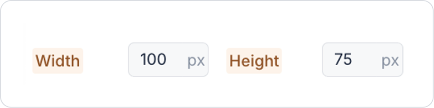
Set the thumbnail size in the Thumbnail > Styling > Layout area in % and px types as follows.
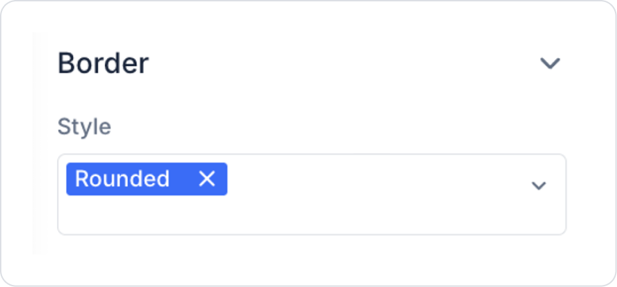
Define the shape of the edges as Rounded in Thumbnail > Styling > Border > Style.
Drag and drop the Elements > Container > VerticalStack element into the Horizontal Stack next to the Thumbnail element.
Add two Elements > Display > Label elements to the Vertical Stack.
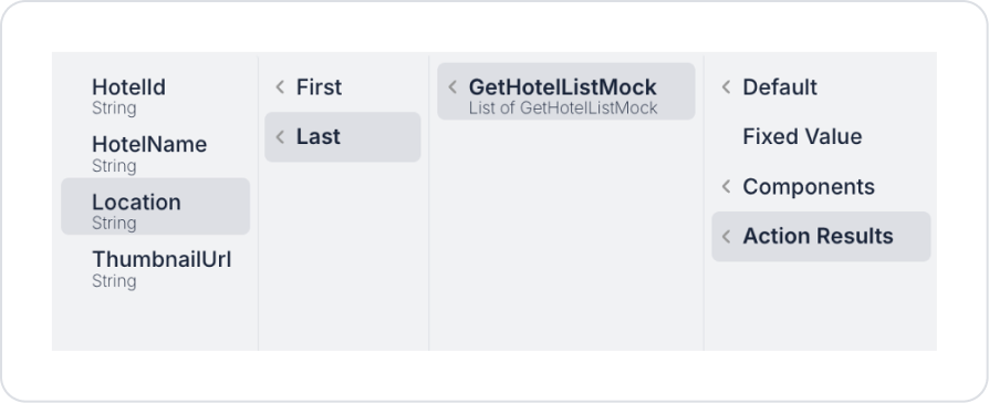
Set the value of the first Label element to Label > Properties > Value > Action Results > GetHotelListMock >HotelName.
Set the value of the second Label element to Label > Properties > Value > Action Results > GetHotelListMock >Location.
Preview
When the application is tested, a small preview of the hotel image is displayed on the Thumbnail element. The hotel name and city information are neatly listed next to the image. This structure allows the user to quickly get an idea about the content and provides a visually supported, readable presentation on the listing screens.
When the image is clicked, the relevant image opens in full screen. When the image is clicked again, it returns to its previous size.
4. Common Properties
Some fields on the thumbnail element are used in common across all UI elements. Therefore, detailed descriptions of the following properties can be found in the relevant general guide pages:
Optimize image sizes. Keeping the file sizes of images used in thumbnails low increases page loading speed.
Don't forget to use Placeholder Images. Using a placeholder image instead of empty space when data is not available provides a more professional look.
Use the Zoom On Click feature according to the content type. It greatly improves the user experience for product images, document previews, or media content.
Prefer the Set Value Of action for dynamic image changes. The Upload File → Set Value Of flow makes it easy for users to update images directly via the Thumbnail.
6. Limitations
The thumbnail element is only supported in web applications. This element is not displayed or executable in mobile applications.
Supported actions are limited. Thumbnails only support onClick and onChange events; no other triggers can be added.
The content of the image cannot be changed directly by the user. Image update operations must be triggered by an action such as Set Value Of.
When no dynamic data is connected, the element is displayed empty. If Placeholder Image is not defined, an empty box may appear, which may disrupt the design integrity.


