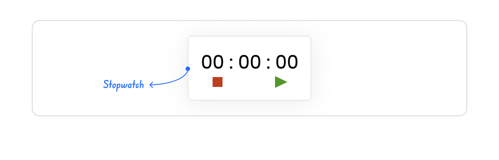
Kuika's Stopwatch element is a timer element used to measure the time elapsed since the start of a process or activity. The Stopwatch allows users to track time in real-time and helps evaluate process performance by counting time forward.
It can be used in many scenarios, such as tracking task completion time, measuring working time, recording activity durations, or triggering time-based actions. Its simple and effective interface makes it easy for users to manage time.
The Stopwatch element is supported in web and mobile applications.
1.1. Common Use Cases
Task completion time measurement: Can be used to track how long it takes a user to complete a task (e.g., call duration, transaction processing time).
Performance tracking: Preferred in applications that want to measure how long an activity lasts (e.g., sports, tests, speed measurements).
Process timing: Can be used for reporting or analysis purposes by measuring the total working time of a process.
Education and exam applications: Can be used to calculate the time a student takes to solve a question or test.
Operation and production tracking screens: Can be used to visualize how long a step takes on a production line.
Live activities: Can be used to display the elapsed time during an event or broadcast.
2. Key Features
Advanced count-up support: The stopwatch functions as a continuously increasing timer from a specified starting point.
Manual start/stop control: Users can trigger Start and Stop actions on the timer.
Real-time display: The elapsed time is updated instantly on a per-second basis, providing the user with clear time tracking.
2.1. Element-Specific Settings (Properties)
Unlike many other UI components, the Stopwatch element does not have a dedicated Properties panel. Therefore:
There is no list of configurable properties for the Stopwatch.
It is ready for use with its default operating logic (forward counting) as soon as the element is added.
Settings such as the start value, format, speed, style, etc. cannot be changed via the Properties panel.
Functionality is provided by controls such as start, stop, or reset, and these controls are usually performed via other UI elements (e.g., Button).
2.2. Actions That Can Be Added to the Element
The Stopwatch element supports triggering actions based on the timer's operating status. When you select the element, the following events can be added via the ADD ACTION panel on the right:
onStart
Triggered when the user starts the timer.
Usage scenarios:
Create a log entry when a process starts
Update another UI element when the counter starts
Display a notification to the user
onPause
Runs when the timer is paused.
Use cases:
Record the user's pause time
Process the paused operation in the database
onStop
Triggered when the timer is completely stopped.
Use cases:
Record the total elapsed time
Process that a task has been completed
Display a result screen or notification
onResume
Runs when the paused timer is restarted.
Use cases:
Record that time tracking has resumed from where it left off
Update status indicators on the interface
The Stopwatch enables you to integrate time-based processes with other operations through these actions.
3. How to Use the Stopwatch Element?
In this section, we will cover the end-to-end usage of the Stopwatch element through an example scenario.
Scenario: Measuring Task Completion Time
In a task management application, it is important for users to be able to track how long it takes to complete a task. For this purpose, a Stopwatch is used on the task details screen.
When a user starts a task:
The Stopwatch is started manually,
The time stops when the task is paused,
The time is reset when the task is completed and can be reused for a new task.
This structure allows the time spent on each task to be measured clearly and transparently.
In the scenario:
The Stopwatch is placed on the task details screen.
Time measurement begins with user interaction.
The user can start, pause, or reset the time.
The same structure can be reused for different tasks.
Step 1 – Adding an Element to the Home Page
Drag and drop the Elements > Display > Stopwatch element onto the page from the left side panel.
The stopwatch is ready for user interaction as soon as it is added to the screen.
Step 2 – Using the Stopwatch (Interaction Flow)
Control of the stopwatch element is entirely up to the user:
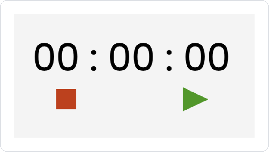
Start
Click the green ▶️ icon.
The time increases starting from 00:00:00.
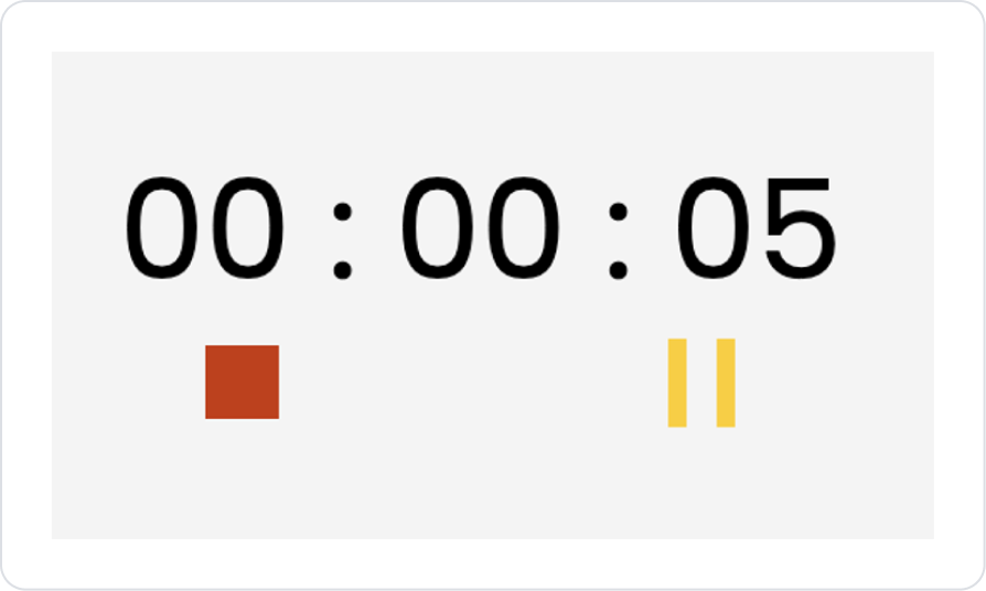
Pause
Click the orange ⏸ icon.
The time stops at its current point.
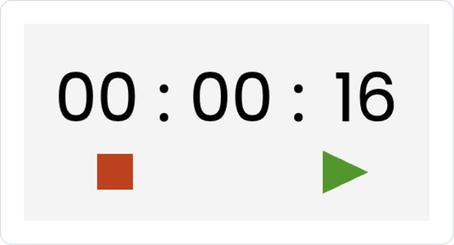
Reset
Click the red ⏹ icon.
The time is reset and becomes ready for a new measurement.
Preview
When the application is tested, the time elapsed on the Stopwatch element is displayed live in the hour:minute:second format. When the user presses the Start button, the counter starts running. The Pause button can be used to temporarily stop the time, and it resumes from where it left off when Start is pressed again. When the Stop action is used, the counter resets and is ready for a new measurement.
4. Common Properties
Some fields on the Stopwatch element are common to all UI elements. Therefore, detailed descriptions of the following properties can be found in the relevant general guide pages:
Add visual feedback using Label or Icon elements to clearly show the status of the timer (started, paused, stopped) on the interface.
Integrate time tracking with system processes by using the onStart, onPause, onStop, and onResume triggers in a logical manner.
Prefer to save the time in onStop or onPause actions to prevent data loss if the user accidentally stops it.
6. Limitations
The Stopwatch element does not have a Properties panel where you can directly control the count value; its appearance and functionality are largely fixed.
The timer value cannot be changed manually or assigned a starting value; the counter always starts from 0.
The time unit cannot be customized (e.g., displaying only seconds). The format is fixed.
The Stopwatch does not store data internally; you must use actions (onStop, onPause, etc.) to write the time to a database.


