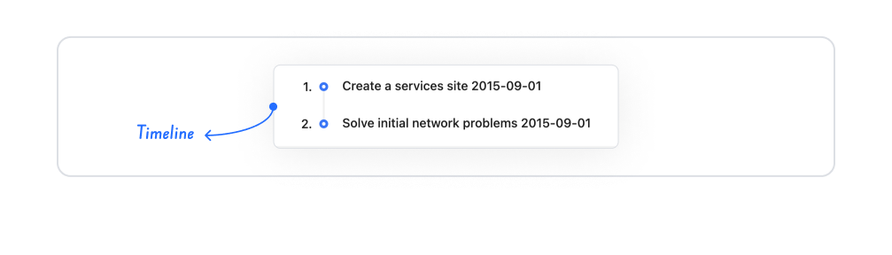
Kuika's Timeline element allows events, tasks, or process steps to be presented to the user visually in chronological order. It can be used to show how a process progresses, which steps have been completed, or events that occurred on specific dates in an understandable format.
The Timeline element is supported in web and mobile applications.
1.1. Common Use Cases
Project Management Processes: Displaying all steps chronologically from the start of the project to the delivery phase. For example: Analysis → Design → Development → Testing → Release.
Order & Delivery Flow: Showing the user step-by-step stages such as order received, being prepared, shipped, in transit, delivered.
Event or Training Program Flow: Presentation of a conference's session times, training modules, or an event's timeline.
Display of Historical Processes: History-based narratives such as a brand's development from its inception to the present, a product's evolution, or a project's milestones.
Task/Ticket Process Tracking: Showing the status of a task: created, assigned, in progress, completed, closed.
2. Key Features
Chronological Visualization: The Timeline element organizes events in chronological order, allowing users to easily follow all steps of a process from start to finish.
Step-Based Content Display: A title, description, date, icon, or image can be added for each step. Users can quickly grasp which stage of the process they are at.
Dynamic Data Binding: Timeline content can be entered manually as static data or dynamically filled via Datasource. This allows the event list to be automatically updated via a database or API.
Rich Content Support: Other Kuika elements such as Label, Image, and Icon can be added to steps to create visually rich timelines.
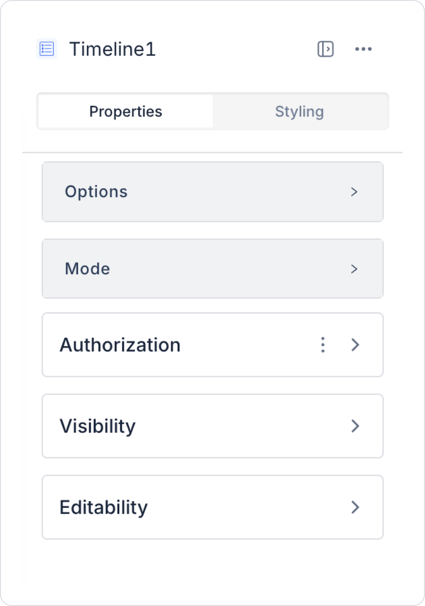
2.1. Timeline Element Properties
You can configure the properties of the timeline element from the Properties panel on the right side.
Options: This is where action links and data binding operations are performed. After creating an action link, new properties are displayed in this area.
To use this area, you must first create a table in the Datasource and then create SQL Actions.
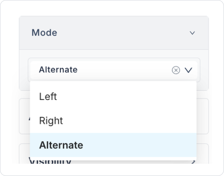
Mode: Determines how timeline data is displayed on the screen. You can choose from the following options:
Right: All events are displayed on the right side.
Left: All events are displayed on the left side.
Alternate: Events are displayed alternately on the right and left sides (default setting).
2.1.1. Example with SQL Datasource
In this example, the Timeline element will display data by connecting to an SQL Datasource.
1. Creating a Datasource
Enter the Datasource module.
Create a new table and define the following variables:
title (String): Event title
description (String): Event description
color (String): Color code to be used for each event
Click the CREATE button to create the table.
2. Creating an SQL Action
Click the + icon in the Actions section of the left panel.
Select the New SQL Action option.
Create a new SQL Action by entering the following SQL command:
SELECT * FROM timeline_datasource
Click the CREATE button to complete the process.
3. Linking the SQL Action to the Timeline Element
Select the Timeline element.
Click the +Add Action button in the Properties panel on the right side.
Type the name of the SQL Action you created (for example, TimelineAll) in the Search Box field and select the action.
The selected action will be displayed in the Options field of the Timeline element.
At this stage, match the data as follows:
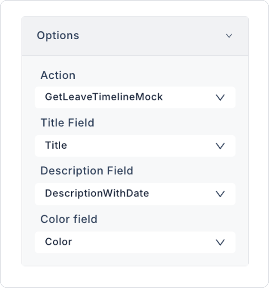
Title: title
Description: description
Color: color
Important Notes
You can use the Mode field to set the Timeline to display on the right, left, or alternately.
The Timeline element is automatically updated as the data is updated.
After completing these steps, your Timeline element will now work with the data you have specified.
2.2. Actions That Can Be Added to the Element
Since the Timeline element is a passive component focused on displaying information, it does not support actions triggered by user interaction. Therefore, when Timeline is selected, the ADD ACTION button does not appear in the right panel, and actions such as OnClick or OnChange cannot be added to the element.
The following points explain the action structure of the Timeline element:
No action is triggered when clicking, selecting, or interacting with steps on the Timeline.
For example: If the timeline content needs to change when a filter is selected, this is done using other triggers such as Select Box, Button, or Page Init.
The Timeline only visually presents the data linked to it and does not initiate any processes within itself.
3. How to Use the Timeline Element?
In this section, we will cover the end-to-end use of the Timeline element through an example scenario.
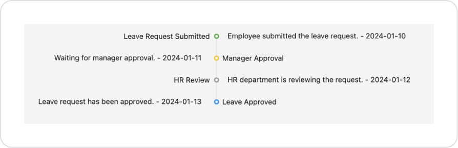
Scenario: Displaying the Permission Request Process on the Timeline
In an HR application, employees want to track the status of the permission requests they have created. The Timeline element is used to present this process in a clear and visually organized manner.
When the user creates a leave request:
The step the request is in,
Which stages have been completed,
Which steps are pending
are displayed chronologically on the Timeline.
This structure allows the user to track the entire leave process at a glance.
In the scenario:
Timeline data is dynamically retrieved from SQL Action.
The Timeline is automatically populated when the page opens.
Colors are used to distinguish between statuses.
Step 1 - Defining Actions Required for Dynamic Use
To display data in the interface:
You need to define an action.
Add a new action from the Actions > New SQL Action tab in the Datasources module.
Action Adding Sample Data (GetHotelListMock):
SELECT *
FROM (
VALUES
(1, ‘Leave Request Submitted’,
‘Employee submitted the leave request. - 2024-01-10’,
‘#4CAF50’),
(2, ‘Manager Approval’,
'Waiting for manager approval. - 2024-01-11',
‘#FFC107’),
(3, ‘HR Review’,
'HR department is reviewing the request. - 2024-01-12',
‘#9E9E9E’),
(4, ‘Leave Approved’,
‘Leave request has been approved. - 2024-01-13’,
‘#2196F3’))
AS LeaveTimeline(StepId, Title, DescriptionWithDate, Color)
ORDER BY StepId;
Step 2 – Adding Elements to the Home Page
Open the UI Design module.
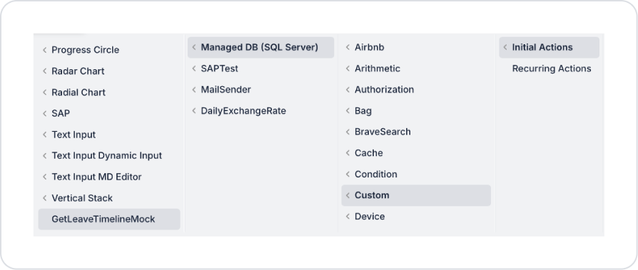
Add the Initial Actions > Custom > Managed Db > GetLeaveTimelineMock action to the page using the ADD ACTION button.
Drag and drop the Elements > Display > Timeline element onto the page.
Link the Timeline element to dynamic data Timeline > Properties > Options > Action > GetLeaveTimelineMock. Define the fields as follows.
Mode can be set as desired. In the current scenario, Alternate is used by default. It ensures that steps alternate between right and left in long processes.
Preview
When the application is tested, the process associated with the permission request is displayed step by step and in chronological order on the Timeline structure. The title, description, and date information of the process are presented together at each step. While the current status of the process is highlighted with colored indicators, the user can clearly track the stage of the permission request and the previous steps on a single screen.
4. Common Properties
Some fields on the Timeline element are used in common across all UI elements. Therefore, detailed explanations of the following properties can be found in the relevant general guide pages:
Organize the timeline consistently. Ensure that events on the Timeline are chronologically correct; if reverse order is required, sort the data source.
Avoid long descriptions. The Timeline is used to provide quick information. If texts are too long, display the event details on a separate page or modal.
Use colors meaningfully. Create a consistent color system to distinguish different event types (completed, ongoing, pending, etc.).
Test the mobile view. Since the Timeline will be displayed in a narrower space on mobile screens, pay attention to text lengths and icon sizes.
6. Limitations
The Timeline element does not support actions. Actions triggered by user interaction, such as OnClick or OnChange, cannot be added.
A data source is required. A Datasource or Set Value must be connected for the Timeline to display content; otherwise, the timeline will appear empty.


