The Radar Chart element is a powerful graphic element that allows you to visually analyze multidimensional data by spreading it across axes on a circle. Each category or criterion is represented as an axis, and the data is marked and combined as points on these axes to create a multidimensional shape. This structure is used to visualize similarities, differences, strengths, and weaknesses between different categories simultaneously. It is frequently used in performance measurements, competency comparisons, product comparisons, and multi-criteria evaluations. Users can understand the overall profile of a data set at a glance.
The Radar Chart element is supported in both web and mobile applications.
1.1. Common Use Cases
Competency and skill comparisons (e.g., employee performance, student competency analysis, team skill distribution)
Product or brand comparisons (e.g., comparing two different products in terms of criteria such as design, quality, price, durability)
Performance evaluation reports. Used to analyze multi-criteria KPIs together.
Visualizing the profile of multi-dimensional data sets. Allows you to understand the strengths and weaknesses of the data at a glance.
Comparison of teams or units (e.g., annual performance analysis between departments)
2. Key Features
Multi-dimensional data visualization support. Allows you to perform multi-criteria analysis by comparing multiple categories on the same graph.
Ability to display multiple data series on the same radar. For example, you can present the competency comparison of two candidates or the performance profile of two products on the same graph.
Ability to define separate categories for each axis. Each category is represented as a radial axis on the graph.
Automatic merging of data points. Points are merged to form a polygonal area.
Customizable color, line thickness, point width, and opacity settings.
Dynamic loading of chart data from the data source. Fully compatible with SQL, REST API, or Managed DB actions.
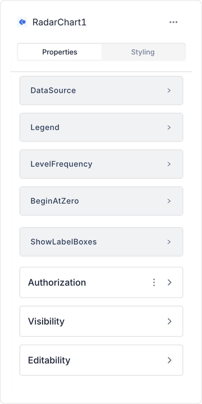
2.1 Element Properties
When you select the Radar Chart element, you can configure data sources, axis labels, color configurations, level circles, and tooltip content in detail via the Properties panel on the right. All settings are explained below:
Datasource
Datasource Action: This action fetches the data to be displayed on the Radar Chart. Data loading occurs when this action is executed.
When no action is linked to the Datasource, the data mapping fields are not visible.
Data Field Mappings
Data Label: Specifies the category name to be displayed on each axis. For example: “Performance,” “Speed,” “Quality,” “Cost.”
Tooltip Custom Title Data Label: Specifies the data label to be displayed as the title in the tooltip.
Tooltip Custom Content Data Label: The data field used to display explanatory content or additional information in the tooltip.
Multi Tooltip Content Fields: Allows multiple data fields to be displayed simultaneously in the tooltip. Ideal for multi-criteria explanations.
Data Field: Defines the main data series on the radar. The value represented for each category is taken from this field.
Data Bg Color: Defines the background color or line/fill color of the main data series.
Second Data Field: Used to define a second data series in the chart. For example, comparing two people or two products.
Second Data Bg Color: Defines the color of the second data series.
Third Data Field: Used to add a third data series. Can be used in multiple performance or profile analyses.
Third Data Bg Color: Determines the color of the third data series.
Legend
Legend: Ensures that each data series is displayed in the description box. The user can hide or show the corresponding polygon by clicking on a series in the legend.
Label and Level Settings
Show Label Boxes: Determines whether category names are displayed in boxes.
On → Labels are displayed in boxes.
Off → Labels are displayed plainly.
Show Level Value Boxes: Controls the visibility of numerical values on the level circles of the radar chart. Used to show the scale used on the value circles.
Level Frequency: Determines the density of the level circles within the radar. Example:
3 → 3 level circles
5 → 5 level circles
The more circles there are, the more detailed the graph appears.
Point Label Color: Sets the color of the labels displayed at the endpoints of the categories (at the end of each axis).
Value Start and Scale Settings
Begin At Zero: Determines whether all axis values in the radar chart start at zero.
On → All axes start at 0.
Closed → The start can be set according to the smallest data value.
Visual Style Settings
Angle Lines Color: Determines the color of the “spider web” lines (radial lines) in the radar chart. It is used to increase the readability of the chart or to provide a look that suits the design.
2.2 Actions That Can Be Added to Elements
The Radar Chart element is a passive chart element focused on data visualization. Therefore, when the element is selected, the ADD ACTION button is not displayed, and no user interaction triggers an action on the Radar Chart.
The Radar Chart's action structure works according to the following principles:
Clicking, tapping, hovering, or selecting on the Radar Chart does not trigger an action.
Updating the chart occurs when the Datasource Action linked to the Radar Chart is triggered externally.
If the chart needs to change based on user selections (e.g., “draw a new radar chart when the year is selected”), this is done by assigning actions to other UI elements such as Button, Radio Group.
The Radar Chart only visually represents the data; it does not initiate any actions.
Even if multiple data series are used, these series cannot trigger actions; they are only displayed.
Actions cannot be added to the Radar Chart. All data updates and user interactions are managed through external UI elements that trigger the chart's data source.
3. How to Use the Radar Chart Element?
In this section, we will cover the end-to-end use of the Radar Chart element through an example scenario.
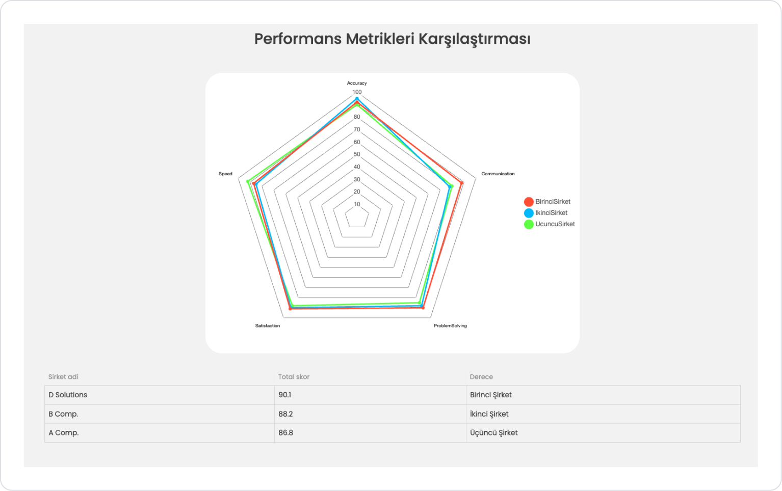
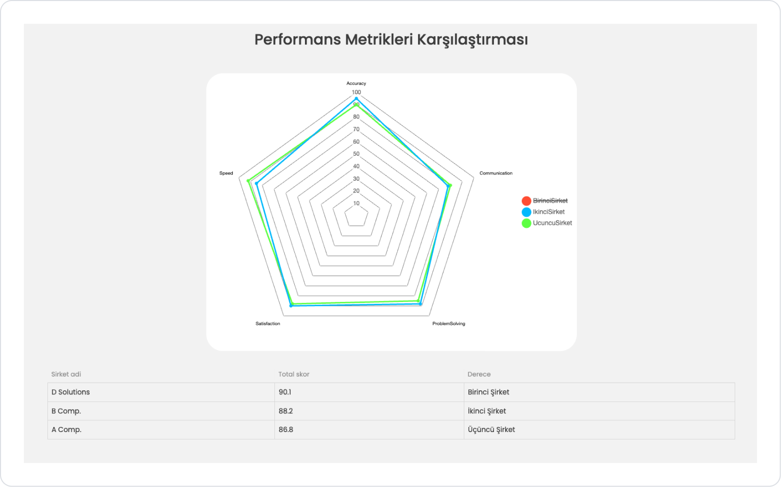
Scenario: Multi-dimensional Comparison of the Performance Criteria of the Top Three Companies
The Radar Chart is an effective visualization method used to compare multiple performance metrics simultaneously. This chart type reveals the strengths and weaknesses of companies based on metrics at a glance.
In the scenario:
In this scenario, the top three companies selected based on their total performance score are displayed as three separate series on the Radar Chart. Each company is represented by a different color to make metric comparisons more readable and understandable.
For example:
Speed → 85
Accuracy → 92
Communication → 78
Problem Solving → 88
Customer Satisfaction→ 90
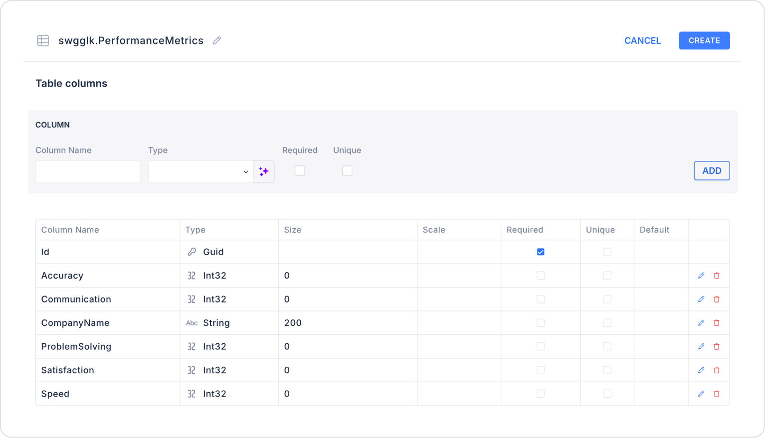
Step 1 - Creating a Data Source
Creating a table in the DataSources module:
Go to the Datasources module.
Then go to the Tables tab.
Create a new table named “PerformanceMetrics”.
The table structure to be set up is as follows:
Important Field names:
CompanyName: Represents the name of the company being evaluated. Indicates which company is displayed on the Radar Chart.
Speed: Represents the speed at which tasks are completed. Measures the time management aspect of performance.
Accuracy: Shows the level of accuracy of the work performed. People with low error rates have high scores.
Communication: Represents the company's communication skills. It is an important criterion in terms of internal team coordination and customer communication.
ProblemSolving: Represents the company's ability to solve problems, analyze, and make the right decisions.
Satisfaction: Represents the customer satisfaction score. It is a critical metric in the overall assessment of service quality.
Step 2 - Defining the Necessary Actions
To display and add data in the interface:
You need to define three actions.
Add a new action from the Actions > New SQL Action tab in the Datasources module.
Action Adding Sample Data (InsertPerformanceMetrics): Add the following SQL action to test the application with sample data and press the TEST button.
When applying, delete the PerformanceMetrics section, rewrite PerformanceMetrics, and press Enter. This will add the correct schema name before the table name.
Action Providing Data (GetBestCompResult):
;WITH Ranked AS (
SELECT
CompanyName AS CompanyName,
CAST(
Accuracy * 0.3 +
Communication * 0.2 +
ProblemSolving * 0.2 +
Satisfaction * 0.2 +
Speed * 0.1AS DECIMAL(10,2)) AS TotalScore,
ROW_NUMBER() OVER (
ORDER BY
Accuracy * 0.3 +
Communication * 0.2 +
ProblemSolving * 0.2 +
Satisfaction * 0.2 +
Speed * 0.1 DESC
) AS RankNo
FROM PerformanceMetrics
)
SELECT
CompanyName,
TotalScore,
CASE RankNo
WHEN 1 THEN ‘First Company’
WHEN 2 THEN ‘Second Company’
WHEN 3 THEN ‘Third Company’
END AS Rank
FROM Ranked
WHERE RankNo <= 3ORDER BY RankNo;
The relevant query ranks according to the weighted average results of the metric criteria in the PerformanceMetrics table and returns the top three companies.
When applying, delete the PerformanceMetrics part, rewrite PerformanceMetrics, and press Enter. This will add the correct schema name before the table name.
Action Providing Chart Data (GetPerformanceMetrics):
;WITH TopCompanies AS (
SELECT
CompanyName,
CAST(
Accuracy * 0.3 +
Communication * 0.2 +
ProblemSolving * 0.2 +
Satisfaction * 0.2 +
Speed * 0.1AS DECIMAL(10,2)) AS WeightedScore,
ROW_NUMBER() OVER (
ORDER BY
Accuracy * 0.3 +
Communication * 0.2 +
ProblemSolving * 0.2 +
Satisfaction * 0.2 +
Speed * 0.1 DESC
) AS RankNo
FROM PerformanceMetrics -- field to be deleted and re-added
),
MetricLabels AS (
SELECT ‘Accuracy’ AS MetricName, N'Accuracy rate' AS MetricLabel
UNION ALL SELECT ‘Communication’, N'Communication quality'UNION ALL SELECT ‘ProblemSolving’, N'Problem-solving ability'UNION ALL SELECT ‘Satisfaction’, N'Satisfaction level'UNION ALL SELECT ‘Speed’, N'Task completion speed'),
Unpivoted AS (
SELECT
tc.RankNo,
tc.CompanyName,
v.MetricName,
v.MetricValue
FROM PerformanceMetrics pm -- field to be deleted and re-added
INNER JOIN TopCompanies tc
ON pm.CompanyName = tc.CompanyName
CROSS APPLY (VALUES
(‘Accuracy’, pm.Accuracy),
(‘Communication’, pm.Communication),
(‘ProblemSolving’, pm.ProblemSolving),
(‘Satisfaction’, pm.Satisfaction),
(‘Speed’, pm.Speed)
) v(MetricName, MetricValue)
WHERE tc.RankNo <= 3 -- only the top 3 companies
)
SELECT
u.MetricName,
ml.MetricLabel,
-- Metric values for the top 3 companies (based on weighted score)
MAX(CASE WHEN u.RankNo = 1 THEN u.MetricValue END) AS FirstCompany,
MAX(CASE WHEN u.RankNo = 2 THEN u.MetricValue END) AS SecondCompany,
MAX(CASE WHEN u.RankNo = 3 THEN u.MetricValue END) AS ThirdCompany,
-- Colors
‘#FF5733’ AS FirstColor,
‘#33C1FF’ AS SecondColor,
‘#75FF33’ AS ThirdColor,
-- Company names for the legend
MAX(CASE WHEN u.RankNo = 1 THEN u.CompanyName END) AS FirstCompanyName,
MAX(CASE WHEN u.RankNo = 2 THEN u.CompanyName END) AS SecondCompanyName,
MAX(CASE WHEN u.RankNo = 3 THEN u.CompanyName END) AS ThirdCompanyName
FROM Unpivoted u
LEFT JOIN MetricLabels ml
ON ml.MetricName = u.MetricName
GROUP BY
u.MetricName,
ml.MetricLabel
ORDER BY
u.MetricName;
This action, which feeds the Radar Chart, ranks all companies' performance metrics based on weighted scores, automatically selects the top three companies, and generates the metric values for the chart in the required format. Additionally, color information and legend names for each company are provided in the same query, enabling the Radar Chart to run directly.
When applying, delete the table name PerformanceMetrics, rewrite PerformanceMetrics, and press Enter. This will add the correct schema name before the table name.
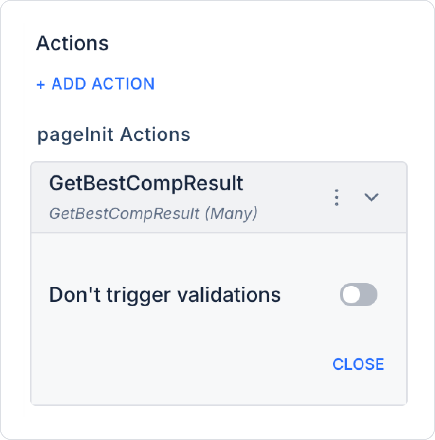
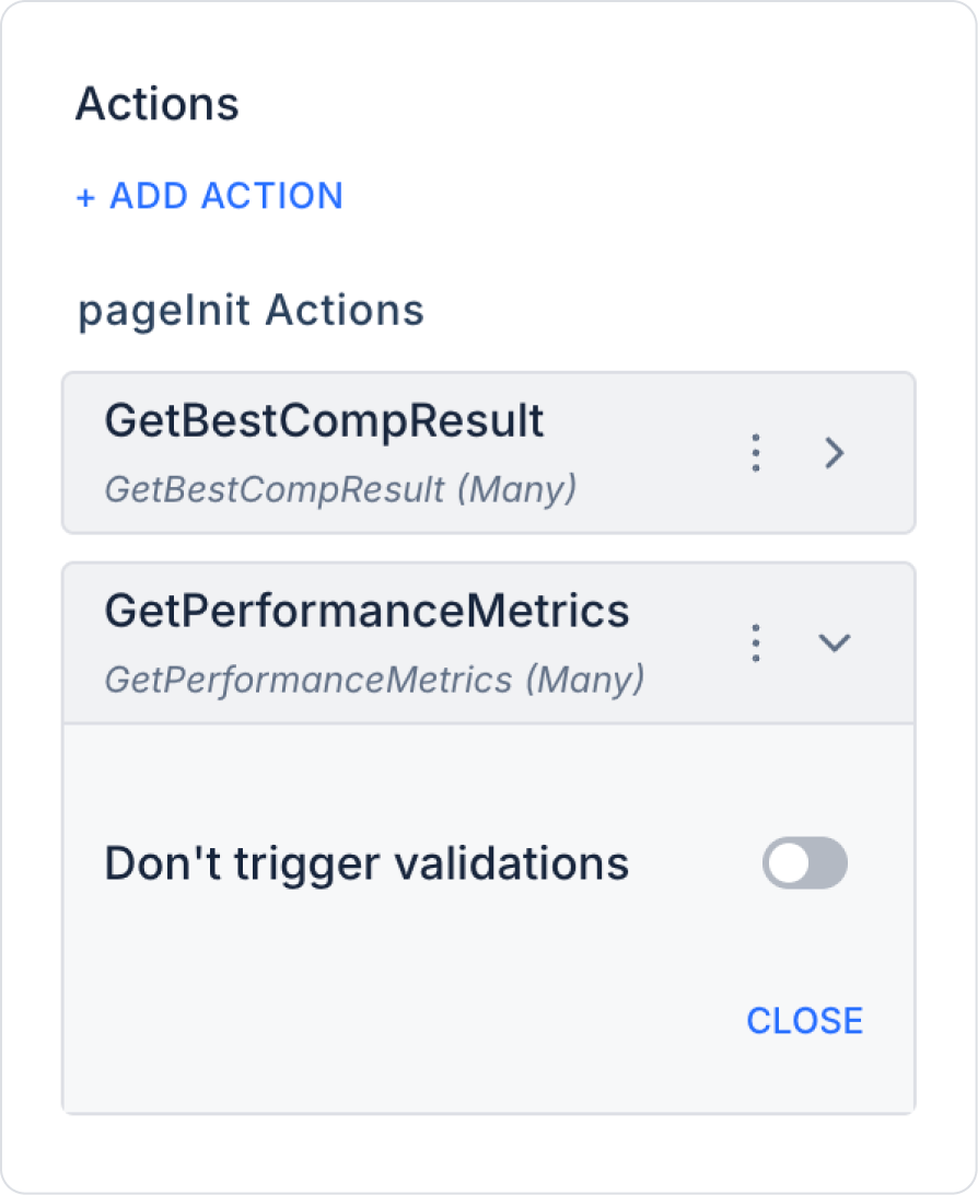
Step 3 - Add Initial Action
Open the UI Design module.
Add the Initial Actions > Custom > Managed Db > GetBestCompResult action to the page using the ADD ACTION button.
Similarly, add the Initial Actions > Custom > Managed Db > GetPerformanceMetrics action to the page using the ADD ACTION button.
Step 4 - Element Placement and Style Settings
Drag and drop the Elements > Display > Label element onto the page from the left panel.
Set the Label > Properties > Value to ‘Performance Metrics Comparison’.
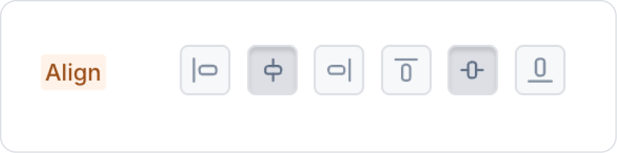
In the Label > Styling > Layout > Align field, center it vertically and horizontally.
Set the font of the Label field to Label> Styling > Text > Style > Heading 2.
Drag and drop the Elements > Container > Panel element onto the page from the left panel.
Define the size of the Panel element as Panel > Styling > Layout > Width and Height (800,600) px.
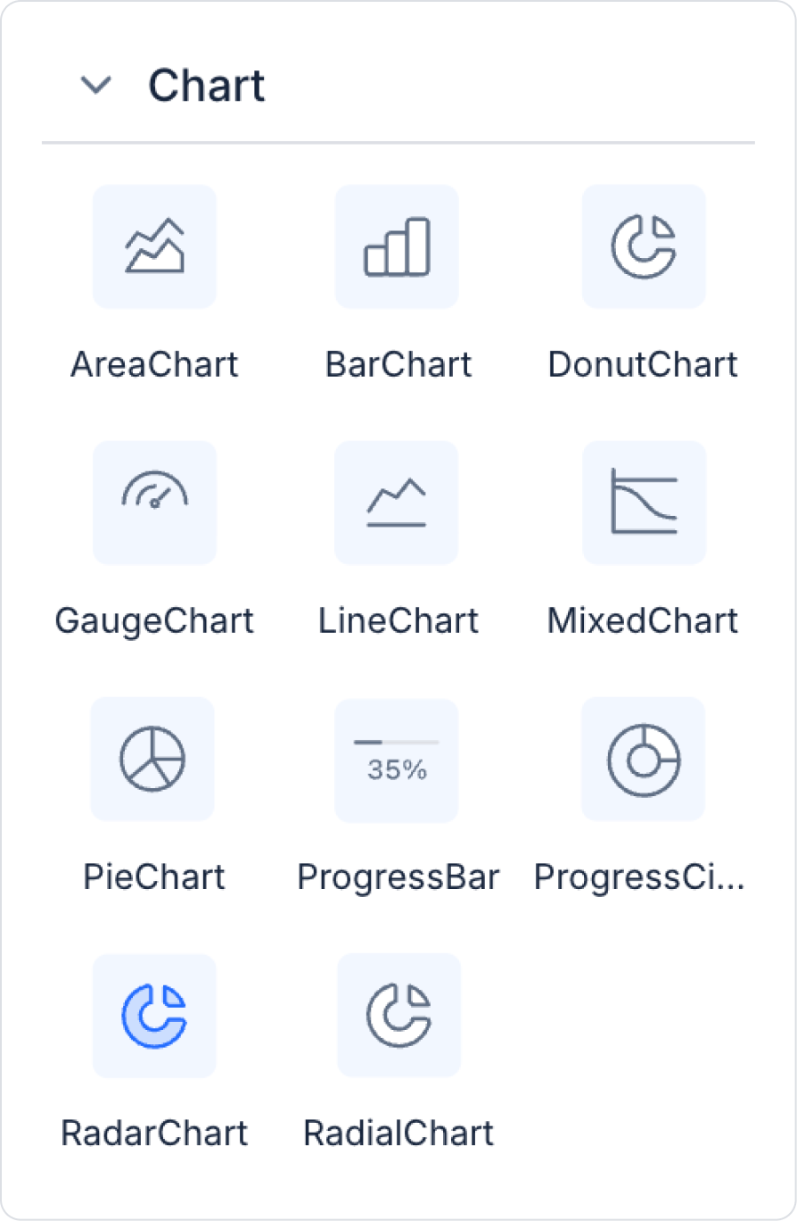
From the left panel, add the Elements > Chart > RadarChart element to the panel element.
Step 5 - Configuring Element Settings
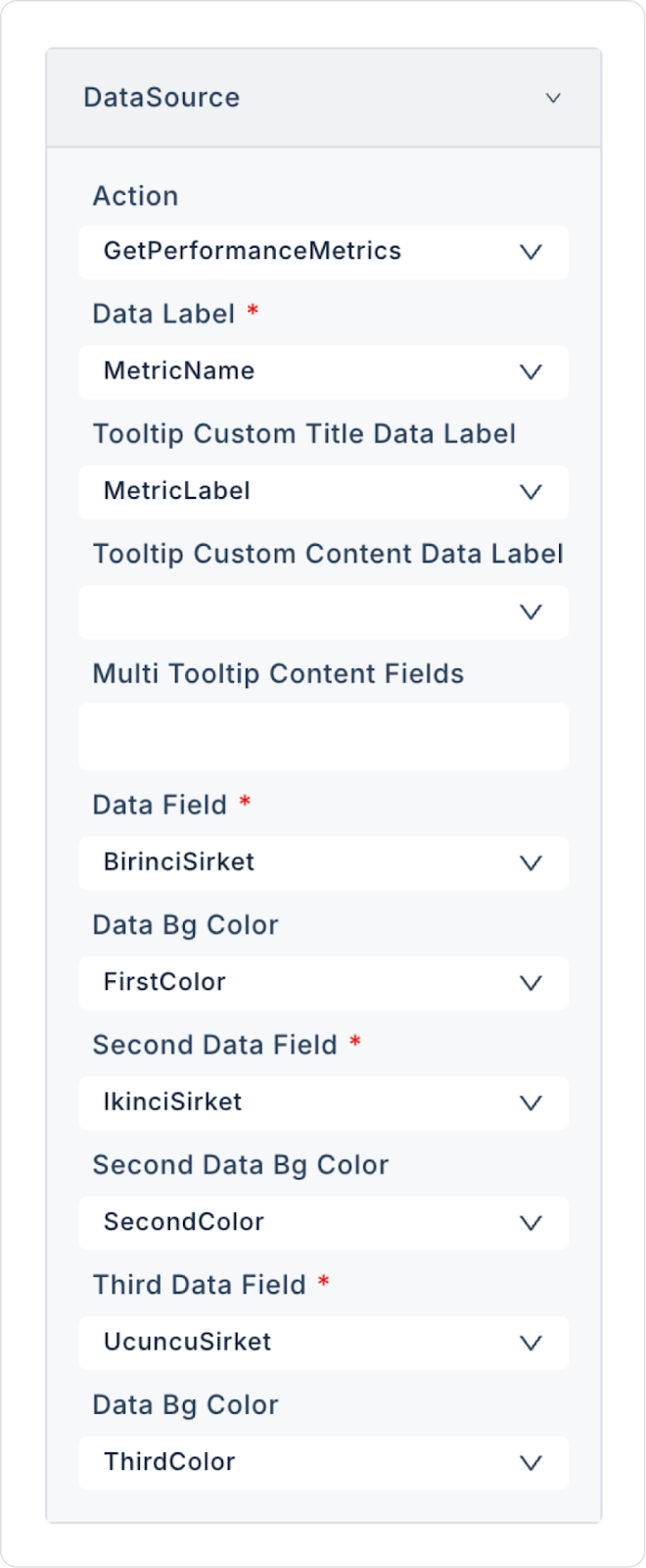
Add the RadarChart > Properties > DataSource >Action > GetCategorySales action to provide data to the Bar Chart. Make the following definitions:
Set RadarChart > Properties > Legend > Right.
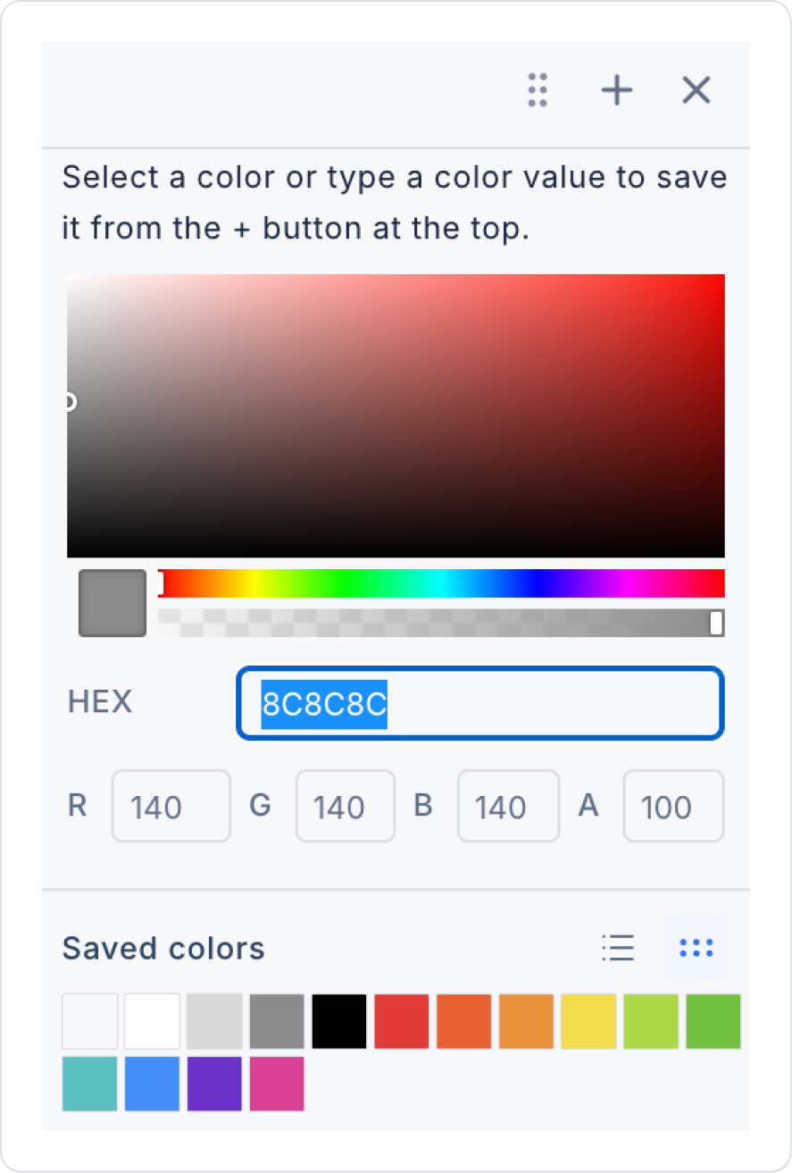
Enter the line color as “8C8C8C” in the HEX field in BarChart > Properties > LevelColor and close.
Define the value ranges as RadarChart > Properties > LevelFrequency > 10.
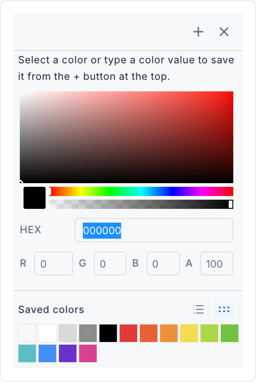
Enter the line color as “000000” in the HEX field in BarChart > Properties > PointLabelColor and close.
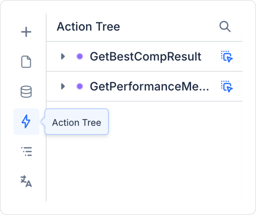
Enter the Action Tree area on the left side panel. Hold down the blue icon next to the GetBestCompResult action in the area and drag it to the bottom of the RadarChart element.
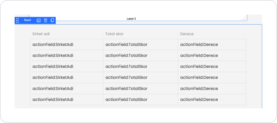
After dragging, the table that should appear is as follows:
Preview:
When the application is tested, the performance metrics of the top three companies are compared on the Radar Chart. The strengths and weaknesses of the companies can be easily distinguished visually on each metric axis. You can easily filter the visibility of each company by clicking on the Legend field next to the chart.
4. Common Properties
Some fields on the Radar Chart element are common to all UI elements. Therefore, detailed descriptions of the following properties are available in the relevant general guide pages: