The Progress Circle element is a visual component that allows you to display progress statuses in a circular format. It provides users with a clear sense of progress by displaying percentage progress as a completion share on a circle. It enables processes such as task completion percentage, project progress, performance targets, or loading operations to be presented in a more aesthetic and compact manner. Its round form factor provides a minimal and modern look on both dashboards and mobile screens.
The Progress Circle element is supported in both web and mobile applications.
1.1. Common Use Cases
Display task completion percentage (e.g., completion rate of a task, form, or process)
Visualize project progress (e.g., sprint progress, completion percentage of total workload)
Track loading or processing steps in a circular format (e.g., report generation, file uploading processes)
Show how much of the performance targets have been achieved. It offers an ideal structure for KPI-based percentages.
Create minimal percentage indicators in mobile applications. The circular design provides a more ergonomic look on small screens.
Create compact and modern progress indicators on dashboards.
2. Key Features
Circular progress indicator: Percentage progress is clearly expressed with completed and incomplete sections on the circle.
Static or dynamic data support: Percentage values can be entered manually or dynamically retrieved from actions such as SQL, REST API, Managed DB.
Fully customizable color scheme: Circle color, progress color, background color, and gradient transitions can be adjusted.
Progress animation support: A smooth and fluid animation is displayed on the circle as the percentage value changes.
Ability to display percentage information within the circle: The user can directly see the progress rate with the text located in the center of the circle.
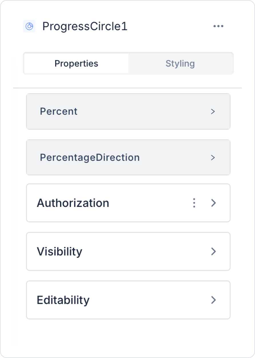
2.1 Element Settings (Properties)
When you select the Progress Circle element, you can easily configure the progress percentage, orientation, and visual settings via the Properties panel on the right. All of the following fields are explained in detail:
Progress Settings
Percent: Determines the progress percentage of the Progress Circle.
If you want to use a fixed value, you can enter a number directly using the Fixed Value option.
If you want to use a dynamic value, you can link a value from an SQL query, API response, user input, or another UI element via the Symbol Picker.
The value range must be between 0–100.
Direction Setting
Percentage Direction: Determines the direction in which the percentage fill will progress on the circle. It offers two options:
Left: The progress circle expands towards the left.
Right: The progress circle expands towards the right. This setting controls the animation direction and the progress flow on the circle.
2.2 Actions That Can Be Added to Elements
As the Progress Circle element is a visual progress indicator, it does not support triggering actions with user interaction. Therefore, when the element is selected, the ADD ACTION button is not visible, and no trigger specific to the Progress Circle can be added.
How actions work:
Actions cannot be triggered by clicking, hovering, or dragging on the Progress Circle.
Updating the Percent field is done by assigning an action to another UI element that triggers the data source linked to the Progress Circle.
The Progress Circle only visualizes the data; it does not initiate any actions.
Dynamic progress values are refreshed by externally triggering the linked action.
Actions cannot be added to the Progress Circle; all progress updates are managed through actions triggered by external UI elements.
3. How to Use the Progress Circle Element?
In this section, we will cover the end-to-end use of the Progress Circle element through an example scenario.
Scenario: Displaying Task Completion Rate
The Progress Circle is used to visually track progress within a project, sprint, or task list.
In the scenario:
Total number of tasks (TotalTasks)
Number of completed tasks (CompletedTasks)
Using these values, the task completion rate is calculated and displayed on the Progress Circle as a circular progress indicator. When the user selects a project, sprint, or task group (ContextName) via the Select Box, the completion percentage for the relevant record is automatically updated in the Progress Circle.
When the user selects a project, sprint, or task group (ContextName) via the Select Box, the task completion percentage for the relevant record is updated in the Progress Circle.
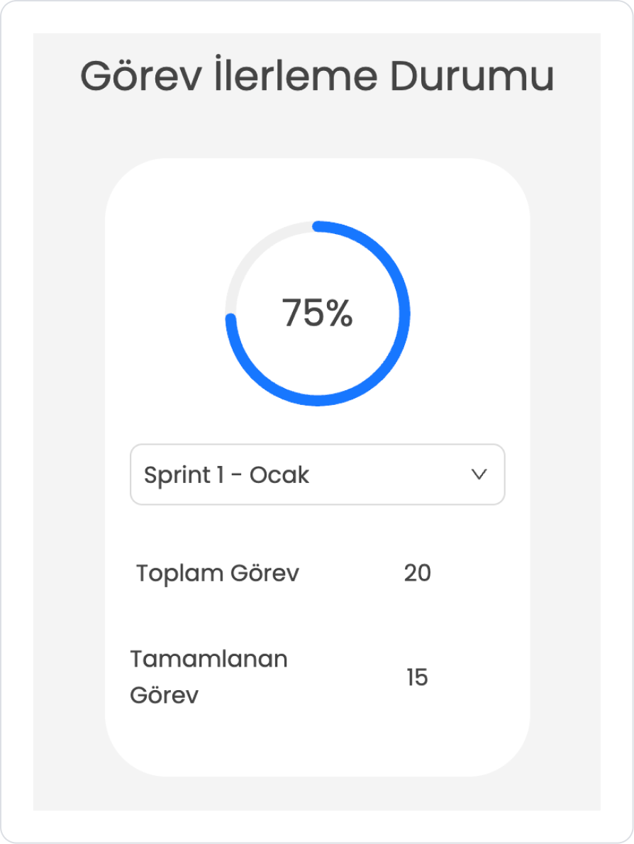
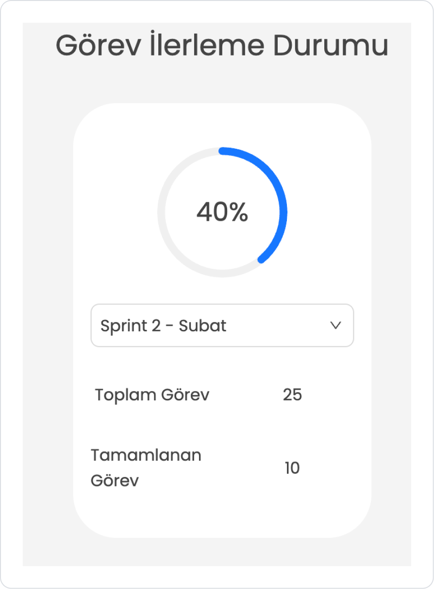
For example (Sprint-Based Task Completion):
Sprint Name → “Sprint 1 – January”
Total Tasks → 20
Completed Tasks → 15
Completion Rate → 75%
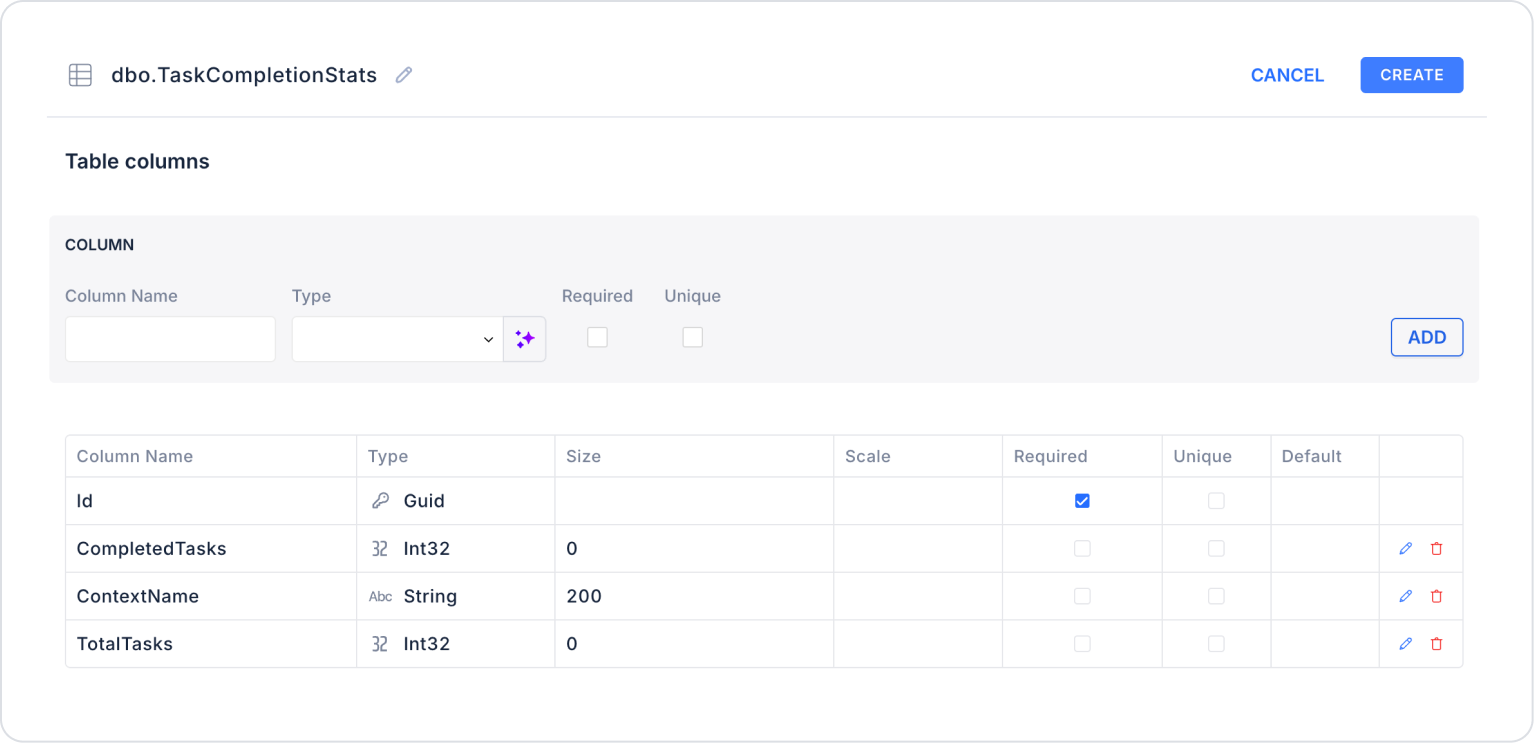
Step 1 - Creating a Data Source
Creating a table in the DataSources module:
Go to the Datasources module.
Then go to the Tables tab.
Create a new table named “TaskCompletionStats”.
The table structure to be set up is as follows:
Important Field names:
ContextName: Represents the task group for which the completion rate is calculated. This field can be the project name, sprint name, or the title of a specific task set. It shows the user which scope is displayed on the Progress Circle.
TotalTasks: Specifies the total number of tasks in the relevant task group. It is the basic reference value used in calculating the completion percentage.
CompletedTasks: Represents the number of tasks completed out of the total tasks. It is the main metric that determines how much the Progress Circle will fill.
Step 2 - Defining the Necessary Actions
To display and add data in the interface:
You need to define three actions.
Add a new action from the Actions > New SQL Action tab in the Datasources module.
Action that Adds Sample Data (InsertCategorySalesStats): To test the application with sample data, add the following SQL action and press the TEST button.
When applying, delete the TaskCompletionStats part, rewrite TaskCompletionStats, and press Enter. This will add the correct schema name before the table name.
Action that Provides and Filters Data (GetTaskCompletionStats):
SELECT
ContextName,
TotalTasks,
CompletedTasks,
CAST((CAST(CompletedTasks AS DECIMAL(10,2)) / TotalTasks) * 100 AS DECIMAL(5,2)) AS CompletionRate
FROM TaskCompletionStats
WHERE ContextName =
ISNULL(
NULLIF(@SelectedContext, ‘’), -- Returns NULL ifnull or empty
(SELECT TOP 1 ContextName -- If NULL, retrieve the first record
FROM dbo.TaskCompletionStats
ORDER BY ContextName ASC)
);
When applying, delete the TaskCompletionStats part, rewrite TaskCompletionStats, and press Enter. This will add the correct schema name before the table name.
When applying, delete the TaskCompletionStats part, rewrite TaskCompletionStats, and press Enter. This will add the correct schema name before the table name.
Step 3 - Adding Initial Action
Open the UI Design module.
Add the Initial Actions > Custom > Managed Db > GetTaskCompletionContextName action to the page using the ADD ACTION button.
As the second action, add the Initial Actions > Custom > Managed Db > GetTaskCompletionStats action using the ADD ACTION button.
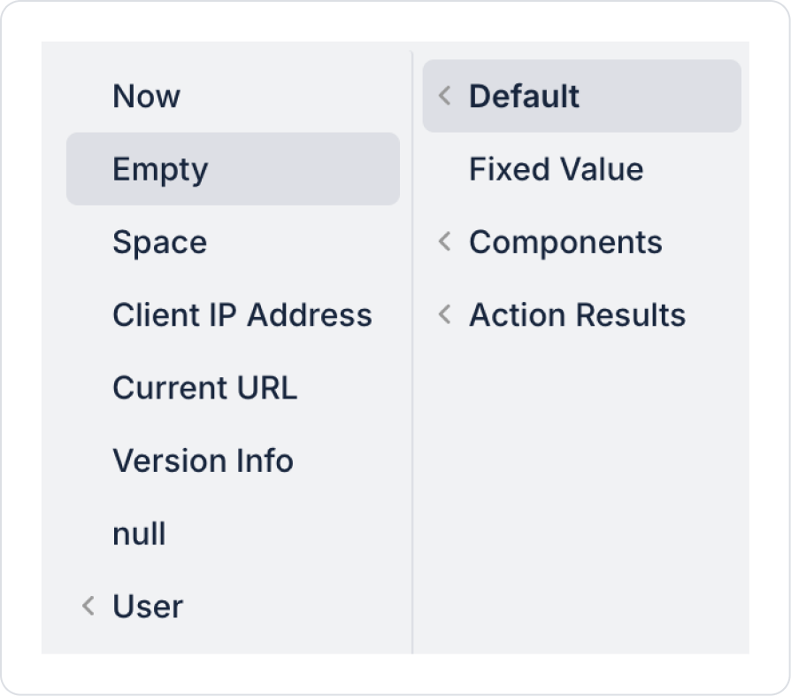
Set the GetTaskCompletionStats > SelectedContext parameter field to Default > Empty.
Step 4 - Element Placement and Style Settings
Add the Elements > Display > Label element from the Left Panel.
Set the Label > Properties > Value to “Task Progress Status”.
Label > Styling > Layout > Align: Center vertically and horizontally.
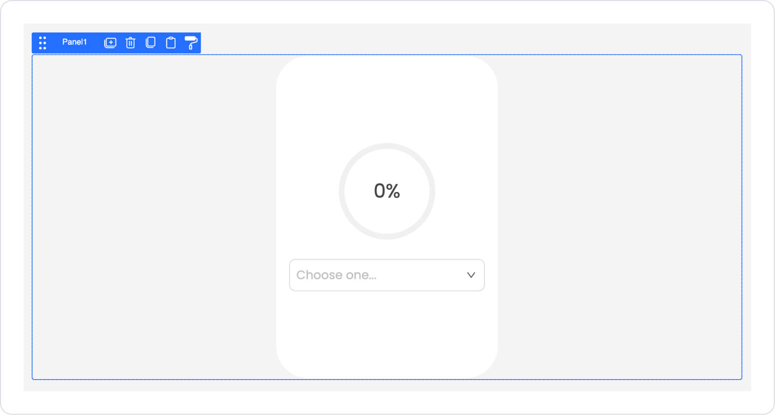
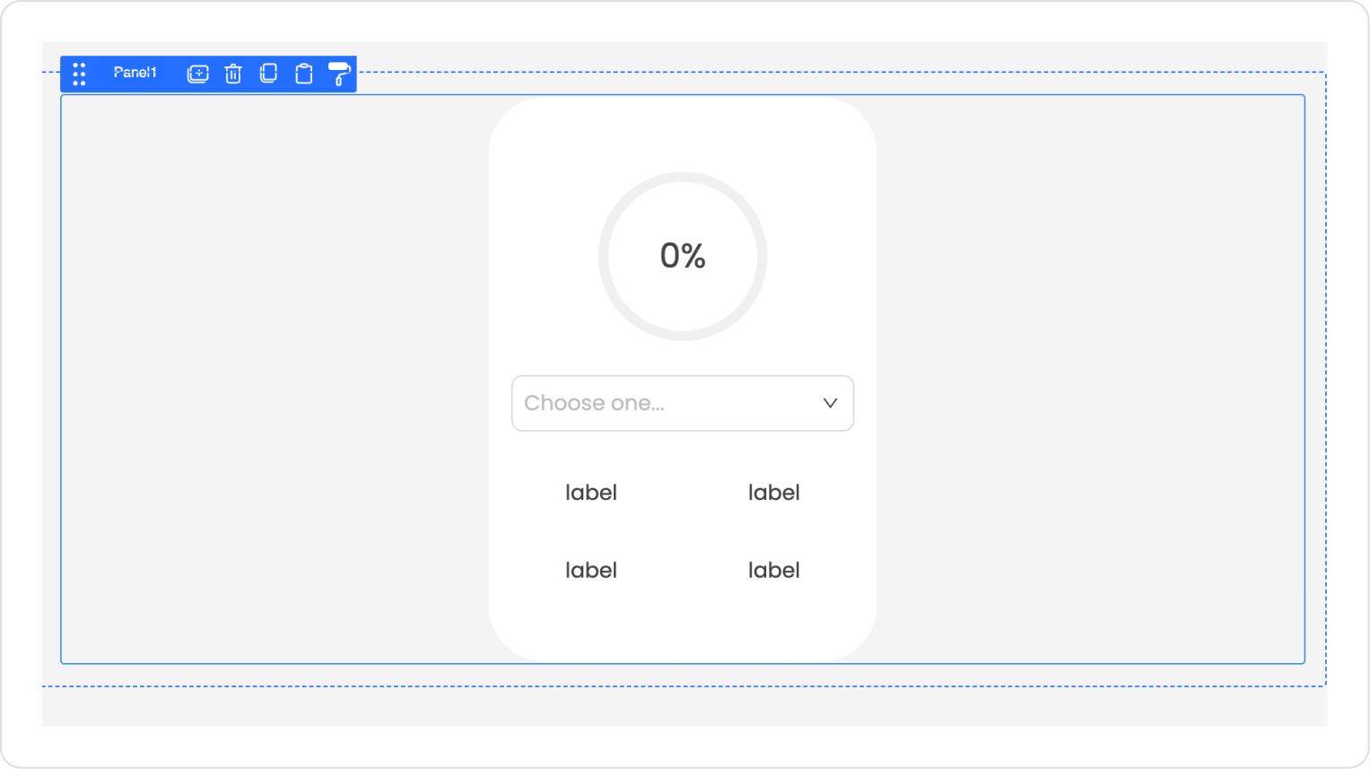
Add the Elements > Container > Panel element from the left panel.
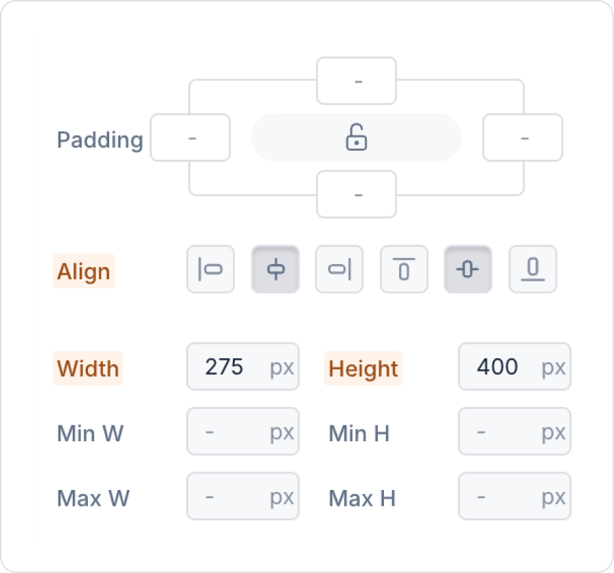
Define the size of the panel element as Panel > Styling > Layout > Width and Height (275,400) px.
Set the background of the panel element as Panel > Styling > Fill > White Background.
Set the panel's borders to Panel > Styling > Style > Border > Radius > 40 px.
Drag and drop the new Elements > Container > Row element into the panel element.
Add the Elements > Container > VerticalStack element to the Col field within the Row.
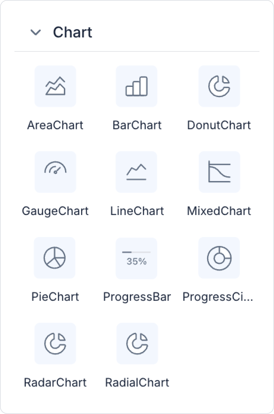
Add the Elements > Charts > ProgressCircle element to the Vertical Stack.
Add the Elements > Select Input > SelectBox element below the Progress Circle inside the Vertical Stack.
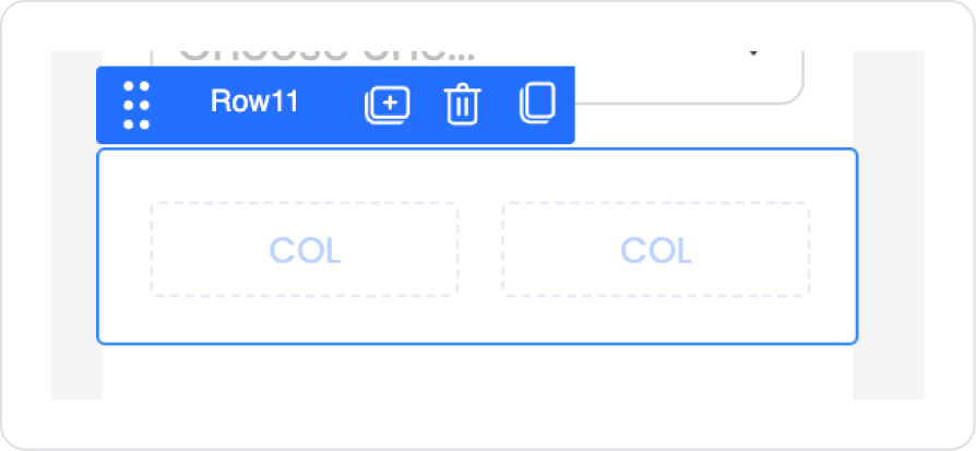
Add the Elements > Container > Row element for the text inside the Panel and select Row > Properties > Desktop > 2.
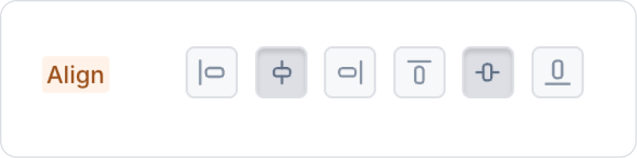
Center both Col contents horizontally and vertically using Col >Styling > Layout > Align.
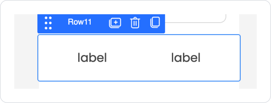
Drag and drop the Elements > Display > Label element into both Cols.
Copy the created Row element using the first option, Duplicate.
The expected result after all steps is as follows.
Step 5 - Configuring Element Settings
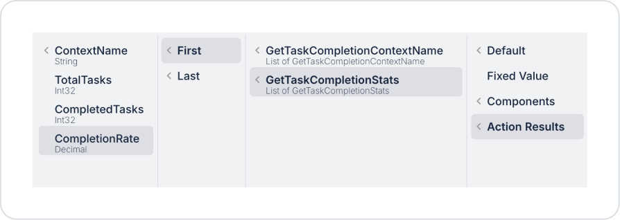
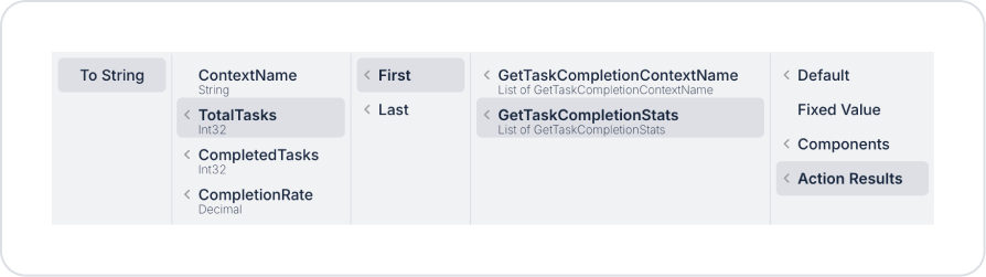
Add the percentage information to ProgressCircle > Properties > Percent > Action Result > GetTaskCompletionStats > First > CompletionRate.
For the initial value, make the following definition in the SelectBox > Properties > Value field.
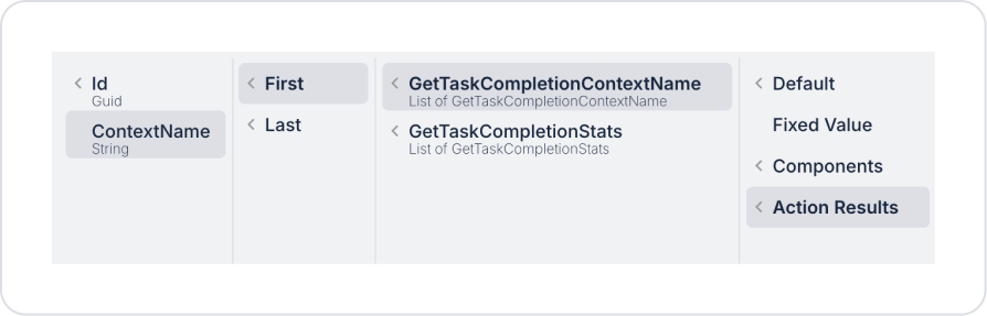
Similarly, to display the default value, define the ContextName action result in the SelectBox > Properties > Placeholder field as in the previous step.
To list the options, make the following definition in the SelectBox > Properties > Options field.
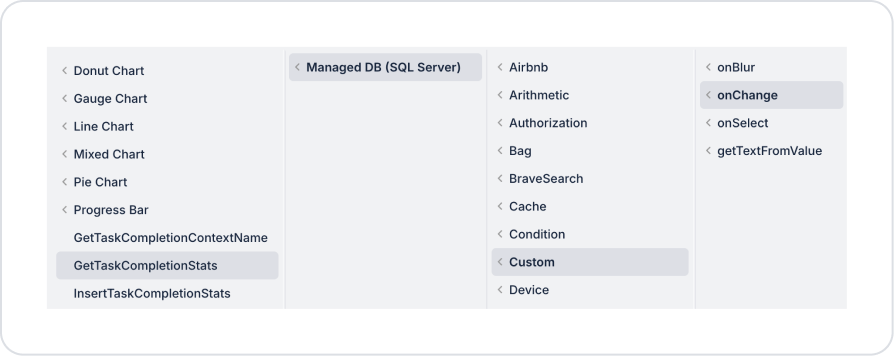
To retrieve the Select Box selection information, make the following definition: SelectBox > Add Actions > onChange > Custom > Managed DB > GetTaskCompletionStats.
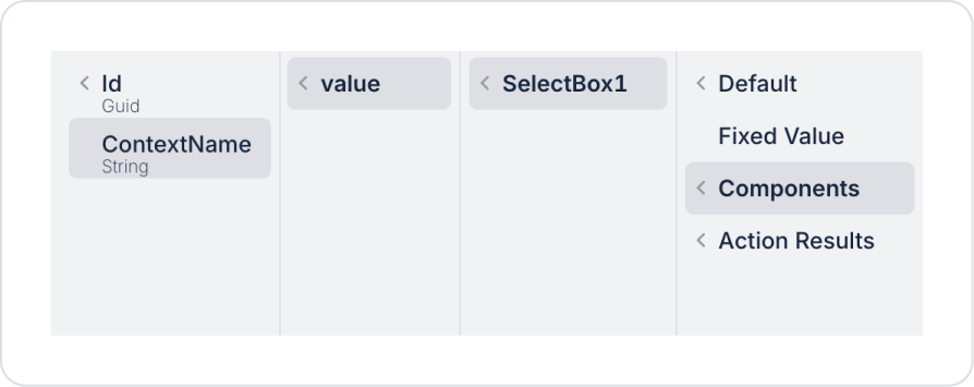
To retrieve the Select Box selection information, make the following definition: SelectBox > onChange > GetTaskCompletionStats > Components > SelectBox > value > ContextName.
In the first Label in the first column, define Label > Properties > Value as ‘Total Tasks’.
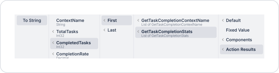
In the first Label in the second column, link the following action result to the Label > Properties > Value field.
In the first Label in the second column, define Label > Properties > Value as ‘Completed Tasks’.
In the first Label of the second column, link the following action result to the Label > Properties > Value field.
Preview:
When the application is tested, the total task and completed task information for the selected task group is displayed on the Progress Circle with the correct completion rate. You can select which project, sprint, or task group status to display using the Select Box.
4. Common Properties
Some fields on the Progress Circle element are common to all UI elements. Therefore, detailed descriptions of the following properties can be found in the relevant general guide pages:
The following recommendations should be considered to make the Progress Circle element more effective and readable:
Adjust the circle thickness according to the design. Very thin circles are difficult to see on mobile devices, while very thick circles can reduce readability.
Be sure to add explanatory text for slow-running processes. For example, notifications such as “Preparing...” or “Loading...” reassure the user.
Percentage Direction (Left/Right) selection should be consistent with the design. Circles moving from left to right generally create a more natural perception.
If multiple Progress Circles are used, their sizes should be consistent with each other.
6. Limitations
The following limitations should be considered when using the Progress Circle element:
Actions cannot be triggered by user interaction. The progress circle is for display purposes only.
Dynamic progress is not possible without defining a datasource. The Percent field must be provided manually or through an action.
Progress Circle displays a single progress value; it is not suitable for multiple data series.


