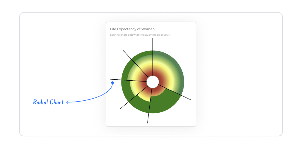
The Radial Chart element provides an effective display, particularly for ratio, performance, and comparison-focused analyses, by visualizing data on a circular axis. With categories placed along the radial axis, the value for each category is represented as a bar/slice extending outward from the center of the circle. This structure allows users to quickly interpret the relationships, ratios, and rankings between different categories in the data set.
The Radial Chart element is supported in both web and mobile applications.
1.1. Common Use Cases
Displaying category-based performance metrics (e.g., department performance scores, product-based ratings)
Presenting ratios and percentages in a circular arrangement (e.g., target achievement percentages, distribution ratios)
Visually comparing different categories. Data comparison becomes intuitive thanks to categories arranged along the circle.
Analyzing the overall situation and ranking at a glance. The highest and lowest values are easily identified.
2. Key Features
Category-based data display with a circular bar structure. Each category is placed on the circle and represented by a bar/slice extending outward according to its value.
Ideal structure for proportional data analysis. Each category can be compared based on percentage or score values.
Simultaneous comparison for multiple categories. All categories are displayed on the same reference plane on the circle.
Dynamic loading support from the data source. Current data can be automatically retrieved using SQL, REST API, or Managed DB actions.
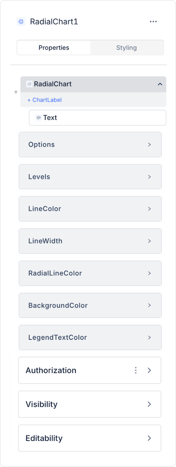
2.1. Element Settings (Properties)
When you select the Radial Chart element, you can define data sources, levels, slice labels, percentage values, and line/style configurations in detail via the Properties panel on the right. All settings are explained item by item below.
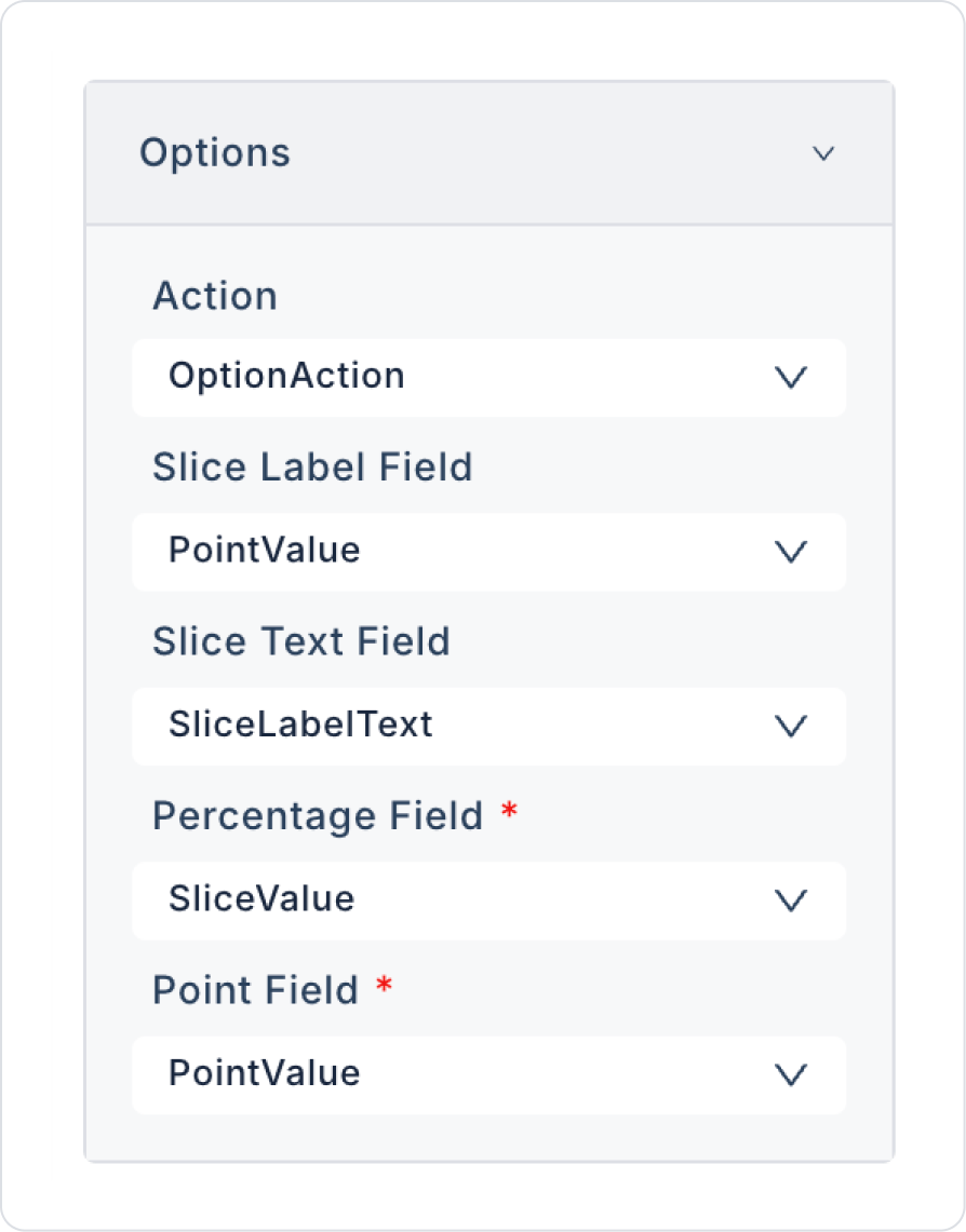
Options (General Data Settings)
Actions: Defines the SQL actions that bring the categorical data to be displayed on the Radial Chart. One or more actions can be used as the data source.
Slice Label Field: Specifies the category label to be displayed on each slice. E.g.: “Sales,” “Performance,” “Capacity.”
Slice Text Field: Defines the text to be displayed inside the slices. Can be used as an additional explanation, short description, or value representative.
Percentage Field: Specifies the percentage value to be displayed in the slice. Represents the share of each slice in the total.
Point Field: Defines the values of specific points on the chart. Used to highlight specific data points, especially in multi-level or multi-point radial structures.
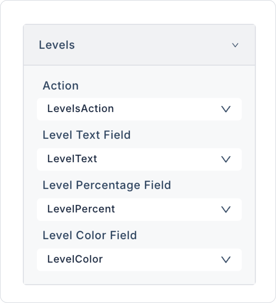
Levels
This area is used to configure the rings/levels within the Radial Chart.
Level Label Field: Defines the labels to be displayed on the level circles. E.g.: “Low,” “Medium,” “High.”
Level Text Field: Defines the text to be displayed inside each level. Can be used for level descriptions, category summaries, or additional information.
Level Percentage Field: Displays the percentage of each level within the total. Expresses the relative size of the levels.
Level Color Field: Defines the color palette for the levels. A different color can be assigned to each level, or single color variations can be used.
Line and Color Settings
Line Color: Determines the color of the main lines that form the radial chart. Used to customize the appearance of the circle lines and level contours.
Line Width: Sets the line thickness in the range of 1–8. Thicker lines provide a more prominent appearance, while thinner lines provide a more minimal appearance.
Radial Line Color: Determines the color of the radial lines extending outward from the center of the chart. Controls the visibility of the “spider web” lines that align the data points.
Background Color: Customizes the chart background color. Used to create a dark mode, light mode, or brand-themed appearance.
Legend Text Color: Determines the color of the text in the legend area. This is important for improving category readability in charts that use multiple slices or levels.
2.2. Actions That Can Be Added to Elements
Since the Radial Chart element is purely a visual data display component, it does not support triggering actions through user interaction. Therefore, when the element is selected, the ADD ACTION button is not visible and no trigger can be assigned to the chart.
Basic principles regarding action behavior:
Clicking, hovering, or selecting the Radial Chart does not trigger an action.
Updating the chart data is achieved by triggering SQL actions in the Datasource / Actions field linked to the Radial Chart by external UI elements.
If the chart needs to change based on user selections (e.g., year selection, category filter, user selection), this behavior is achieved by adding actions to elements such as Button, Radio Group.
The Radial Chart only displays data; it does not initiate any actions on its own.
Actions cannot be added to the Radial Chart; all data updates are managed by external actions.
3. How to Use the Radial Chart Element?
In this section, we will cover the end-to-end use of the Radial Chart element using an example scenario.
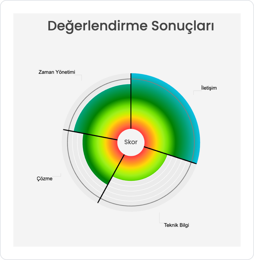
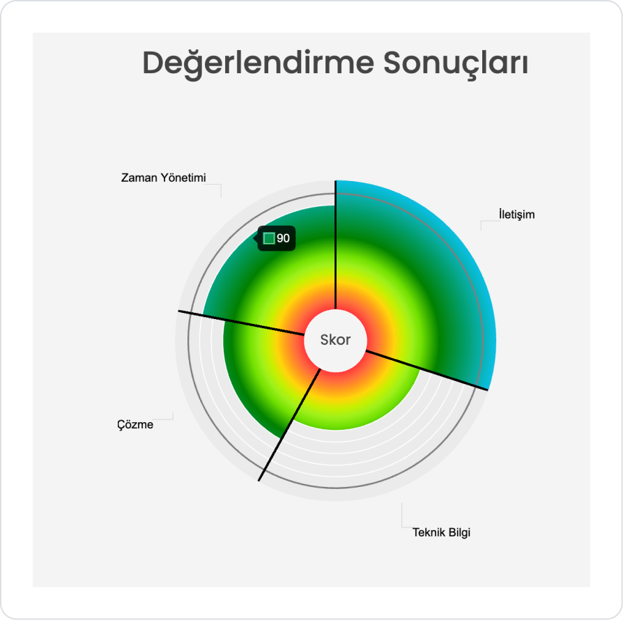
Scenario: Performance Evaluation Results
On an evaluation screen, a single user’s competency-based performance results are visually presented on a radial chart. The chart covers four core competencies: Communication, Technical Knowledge, Problem Solving, and Time Management. Thanks to color gradients and the slice structure, the weight of each area within the overall score is clearly visible.
When the application is tested, the user’s score for each competency is displayed as a separate slice on the chart. While the score area in the center represents overall performance, the outer rings visually highlight the strengths and areas for improvement in each competency level.
In the scenario:
This structure aims to analyze a single user’s current performance distribution quickly and clearly. Thanks to the graph, the user can assess at a glance where they are strong and which competencies need improvement.
For example:
Communication: 140
Technical Knowledge:
Problem Solving: Good
Time Management: Room for Improvement
Step 1 - Defining Actions
To display data on the interface:
You need to create two new actions.
Add a new action from the Actions > New SQL Action tab within the Datasources module.
Action to Retrieve Sample Data (OptionAction):
SELECT N'İletişim' AS SliceLabelText,
30 AS SliceValue,
140 AS PointValue
UNION ALL
SELECT N'Teknik Bilgi',
28,
50UNION ALL
SELECT N'Problem Çözme',
20,
70UNION ALL
SELECT N'Zaman Yönetimi',
22,
90;
Action to Apply Sample Color Coding (LevelsAction):
SELECT 0 AS LevelPercent, 'Level1' AS LevelText, '#FF0000' AS LevelColor
UNION ALL
SELECT 10, 'Level2', '#FF3B3B'UNION ALL
SELECT 20, 'Level3', '#FF6F3C'UNION ALL
SELECT 30, 'Level4', '#FF9F1C'UNION ALL
SELECT 40, 'Level5', '#FFD60A'UNION ALL
SELECT 50, 'Level6', '#C7F000'UNION ALL
SELECT 60, 'Level7', '#9EF01A'UNION ALL
SELECT 70, 'Level8', '#70E000'UNION ALL
SELECT 80, 'Level9', '#38B000'UNION ALL
SELECT 90, 'Level10', '#008000'UNION ALL
SELECT 100,'Level11', '#006400'UNION ALL
SELECT 150,'Level11', '#09bddcff';
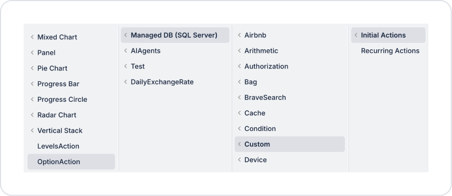
Step 2 - Adding an Initial Action
Open the UI Design module.
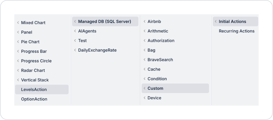
Use the ADD ACTION button to add the Initial Actions > Custom > Managed Db > OptionAction action to the page.
Use the ADD ACTION button to add a second Initial Actions > Custom > Managed Db > LevelsAction action to the page.
Step 3 - Element Placement and Style Settings
Drag and drop the Elements > Display > Label element onto the page from the left panel.
Set the Label > Properties > Value to “Evaluation Results.”
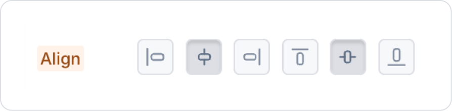
Click in the empty space next to the Label element. In the Column > Styling > Layout > Align section, center it both vertically and horizontally.
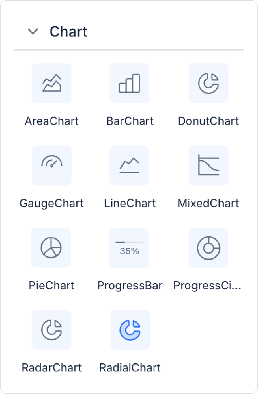
From the left panel, add the Elements > Chart > RadialChart element inside the panel element.
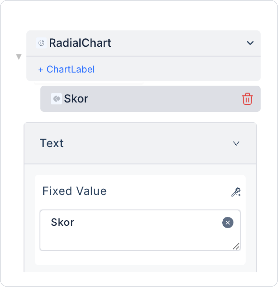
Update the text in the center of the Radial Chart to “Score” under Properties > Text > Fixed Value.
Step 4 - Configuring Element Settings
Add the RadialChart > Properties > Options >Action > OptionAction action to the Radial Chart to provide data. Make the following configurations:
Add the RadialChart > Properties > Levels >Action > LevelsAction action to set the color scheme. Make the following configurations:
Preview:
When the application is tested, the evaluation results for a single user are visualized prominently on the Radar Chart. The chart clearly reflects the distribution of scores across core competency areas such as Communication, Technical Knowledge, Problem Solving, and Time Management. When the mouse hovers over a specific area, the score information for that competency is displayed. This structure allows the user’s strengths and areas for improvement to be analyzed quickly and clearly through a single chart.
4. Common Properties
Some areas on the Radial Chart element are common to all UI elements. Therefore, detailed explanations of the following properties can be found in the relevant general guide pages:


