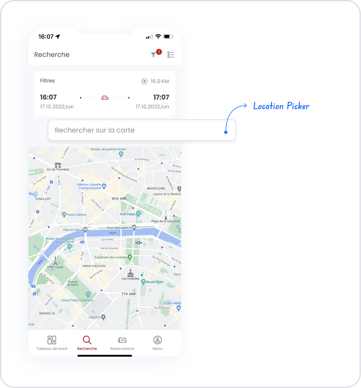
The Location Picker element is an interactive input element that allows users to select a location on a map. By supporting basic map interactions such as panning, zooming in, and zooming out, it helps users easily pinpoint the correct location.
The Location Picker element is used in scenarios requiring address selection, delivery point determination, event location marking, and any other scenarios involving geographic data. Thanks to its visual and intuitive design, it reduces the need for manual address entry and improves location accuracy.
The Location Picker element is supported in both web and mobile applications.
1.1. Common Use Cases
Delivery and address selection screens
Marking a location on a map
Determining the location of an event, store, or office
Location-based filtering and search scenarios
Defining an address or location in a user profile
2. Key Features
Zoom in/out support: Location accuracy can be improved by zooming in or out on the map.
Real-time location updates: Selected coordinates are updated in real time as the user’s location changes.
2.1. Location Picker Element Features
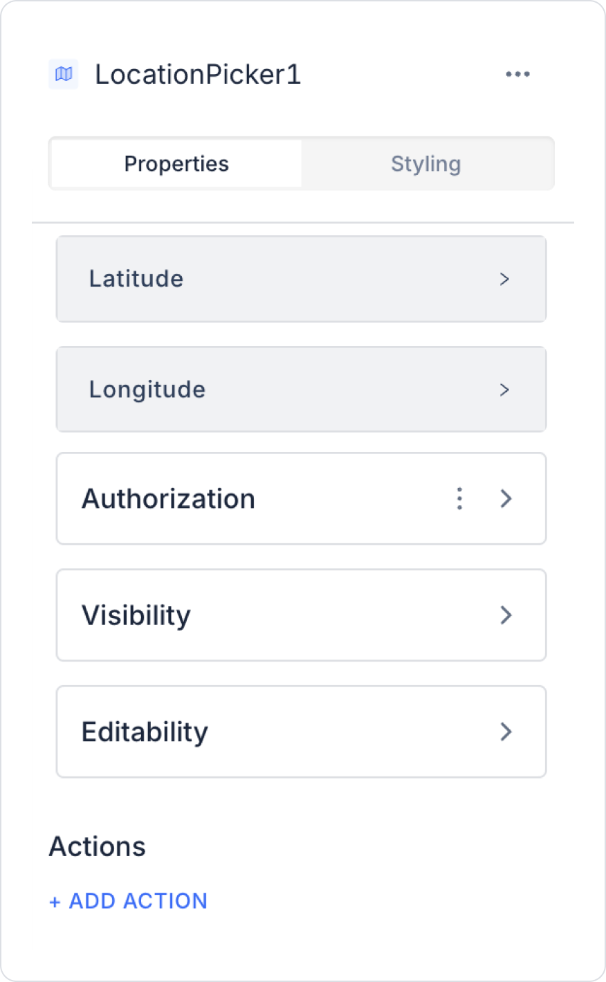
Latitude: Allows you to enter latitude information manually or from a database.
Longitude: Allows you to enter longitude information manually or from a database.
If latitude and longitude values are not entered, the map starts at the default (0,0) location. The user is asked for location permission, and if granted, the current location is selected.
2.2. Actions That Can Be Added to the Element
The Location Picker element supports triggering event-based actions based on users selecting a location on the map. Actions are not tied to the element itself; they are linked to the event triggered when the user clicks a point on the map.
Actions for the Location Picker element can be defined via the following event through the Properties > Add Action section.
Supported Action Triggers
onClick: Triggered when the user clicks a point on the map.
Usage purposes:
Save the selected location (coordinates/address) to a state or variable
Automatically populate related fields after location selection (e.g., province/district, address details, ZIP code, etc.)
Update the map marker based on the selected location
Trigger location-based filtering or listing operations
Save or verify location information by triggering an API or workflow
Example scenario: When the user selects a delivery address on the map, the selected location is saved to the state, and the address information is automatically populated into the form fields.
Basic Rules Regarding Actions
The Location Picker element executes actions event-based; onClick is triggered only when a click occurs on the map.
Multiple actions can be defined for the same onClick event.
API calls for validation or saving after location selection should be carefully planned for performance.
The Location Picker element offers a powerful and user-friendly experience when used with actions, particularly in scenarios where address selection and location-based processes need to be initiated.
3. How to Use the Location Picker Element?
In this section, we will cover the end-to-end usage of the Location Picker element through an example scenario.
Scenario: Location Selection on a Map and Coordinate Display
The user uses the Location Picker element to select a location on the map and view the latitude and longitude information for that point. When the user selects a desired point on the map, the coordinate information for the selected location is automatically retrieved and displayed on the screen.
In the scenario:
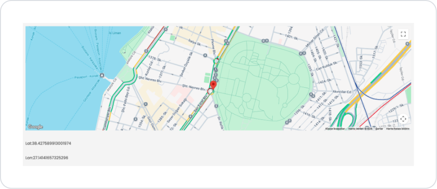
A Location Picker element is displayed on the screen, allowing the user to select a location on the map. When the user clicks on any point on the map or drags the location marker to a different point, the coordinate information for the selected location is automatically updated.
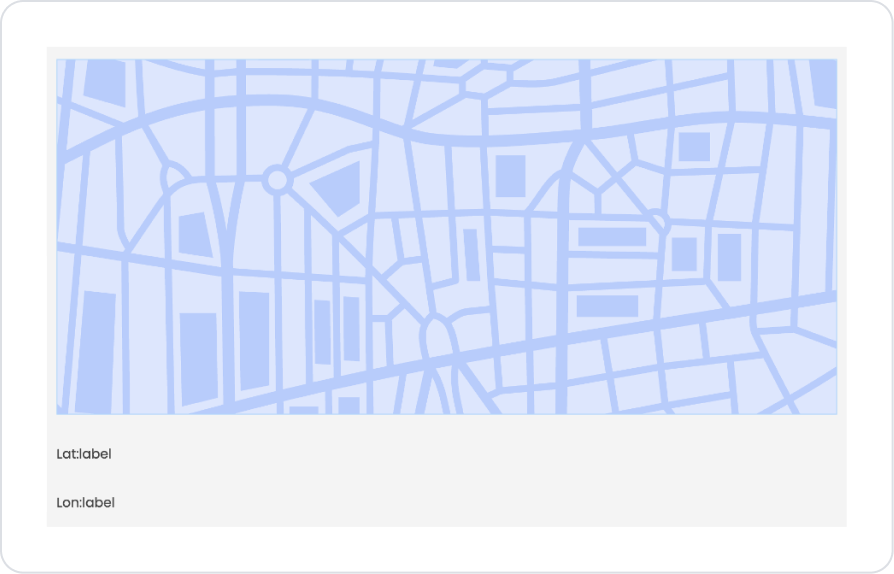
The Latitude (Lat) and Longitude (Lon) values of the selected location are displayed in real-time in the fields located below the map. When the user selects a different point on the map, the coordinate information is updated again.
This scenario clearly demonstrates, in a simple and understandable way, how users can dynamically obtain latitude and longitude information for the location they select on the map and display it on the screen.
Step 1 - Adding the Location Picker Element and Defining Text Translations
Start on the home page:
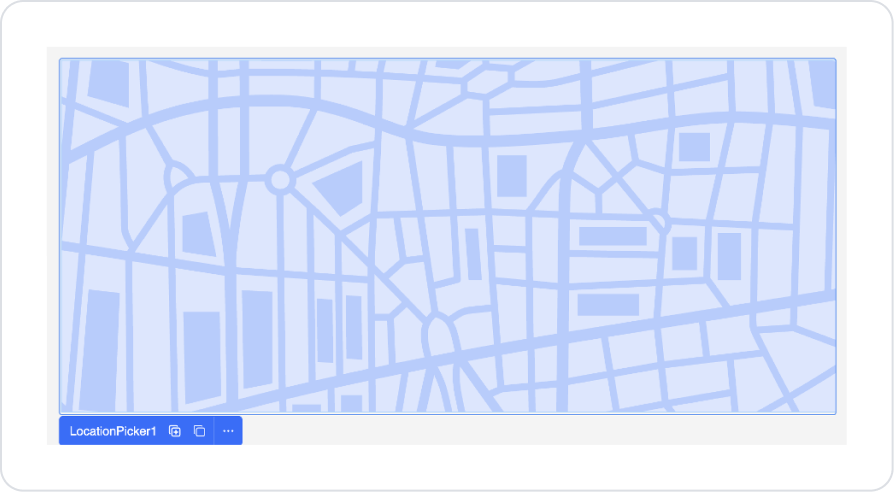
Drag and drop the Elements > Select Input > LocationPicker element onto the page.
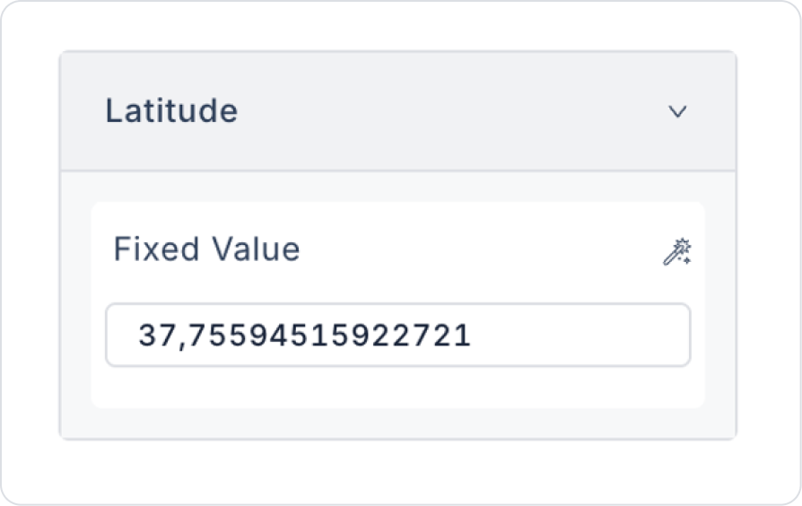
At screen startup, set the initial coordinates to LocationPicker > Properties > Latitude > “37.75594515922721” and LocationPicker > Properties > Longitude > “-122.69700643032144”.
You can set this as a dynamic or static fixed value. In the current scenario, a fixed location has been set.
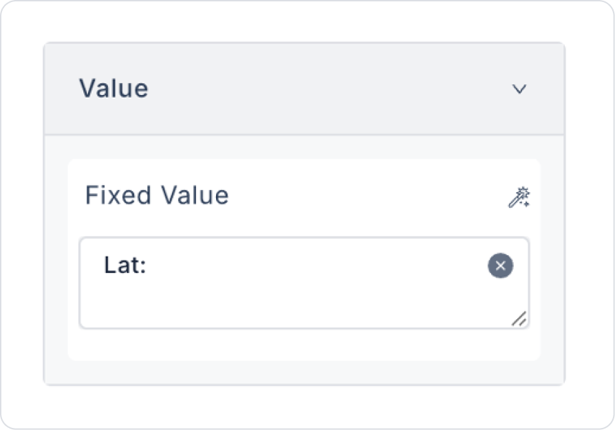
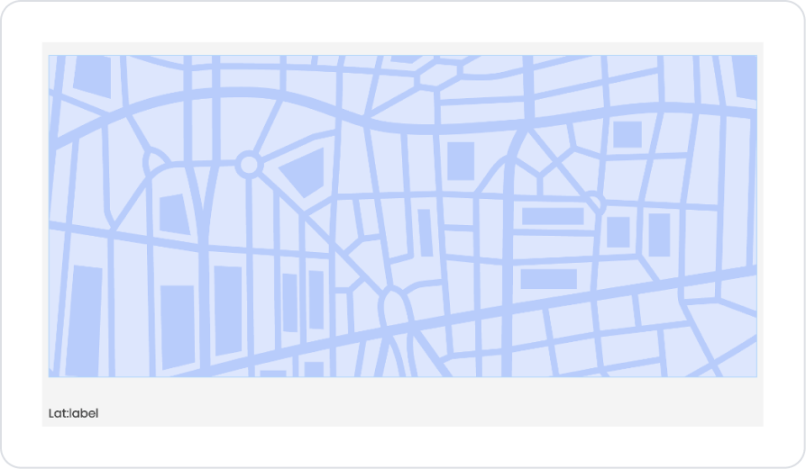
Below the Location Picker element, drag and drop the Elements > Display > Label element to display the Latitude information.
Set the text to Label1 > Properties > Value > “Lat:”.
Next to the Label element, drag and drop the Elements > Display > Label element to display the text to be translated.
Similarly, add two labels for Longitude and set the initial text content to Label3 > Properties > Value > “Lon:”.
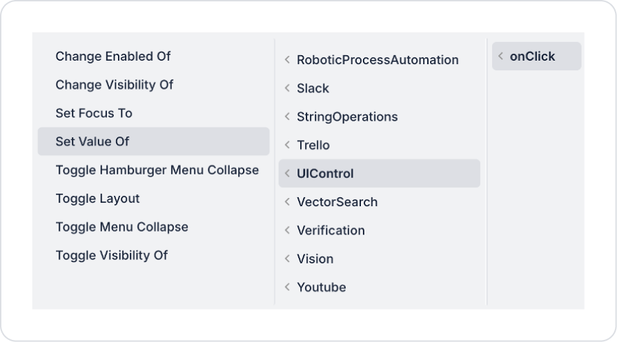
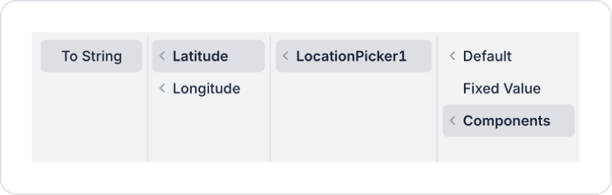
To display the Latitude information when a location is selected in the Location Picker element, add the LocationPicker > Properties > Add Action > onClick > UIControl > Set Value Of action.
Within the Set Value Of action, define Component to Change > Label2 and Value > Components > LocationPicker > Latitude > To String.
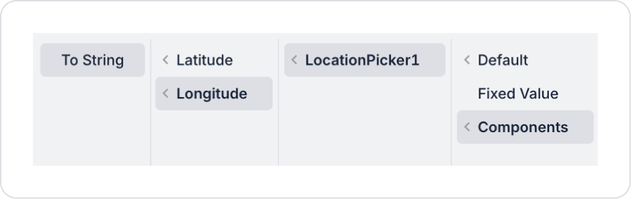
Similarly, to display the Longitude information when a location is selected in the Location Picker element, add the LocationPicker > Properties > Add Action > onClick > UIControl > Set Value Of action.
Within the Set Value Of action, set Component to Change > Label4 and value > Components > LocationPicker > Longitude > To String.
Preview:
This example demonstrates how to select a location on the map using the Location Picker element and display the latitude (Latitude) and longitude (Longitude) information for the selected location.
When the map first opens, it is displayed with the center positioned at the location determined by the initial Lat and Lon values provided to the element. The user can navigate the map and select a new location by clicking on any point.
When the user selects a point on the map, the Latitude and Longitude values for the selected location are automatically updated and displayed below the map. This allows the user to see the coordinate information for the selected location in real time.
4. Common Properties
Some fields on the Location Picker element are shared across all UI elements. Therefore, detailed descriptions of the following properties can be found in the relevant general guide pages:
Set a meaningful starting location on the map. The default map location should be close to the region where the majority of users are located.
Visually clarify the location selection. Clearly displaying the selected point with a marker ensures users are confident they have selected the correct location.
Autofill address details. Automatically updating the province, district, or address fields after a location is selected improves the user experience.
6. Limitations
The Location Picker element depends on map services; it may not work in situations where map access is unavailable.
Actions can only be triggered via the onClick event.
Map display and interactions are limited by the capabilities provided by the map service being used.


