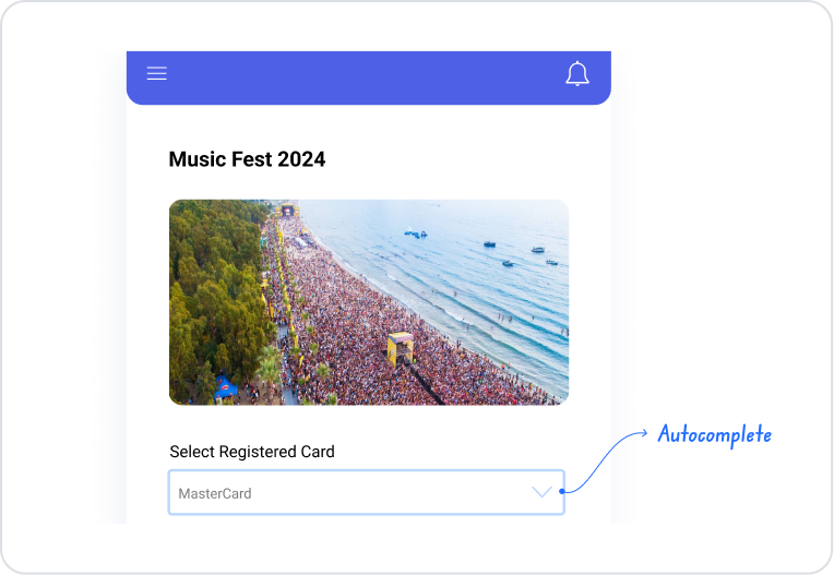
The Auto Complete element is an interactive input element that allows users to make quick and accurate selections from predefined datasets while entering text. When the user begins typing, suggestions that match the entered text are automatically listed, and the user can select from this list.
The Auto Complete element reduces the need for manual typing in selection fields containing long lists, increases data entry speed, and prevents typos. It significantly improves the user experience, particularly in search, filtering, and selection scenarios.
The Auto Complete element is supported in both web and mobile applications.
1.1. Common Use Cases
City, country, or address selection
User product or tag search fields
Category or subcategory selection
Quick selection from large datasets
Text-based selection fields in filtering and search screens
2. Key Features
Dynamic suggestion list: As the user types, suggestions matching the entered phrase are automatically listed.
Fast and error-free selection experience: Users reduce data entry time by selecting from a list instead of typing.
Text-based search and filtering: Suggestions are narrowed down based on the characters entered, and only relevant results are displayed.
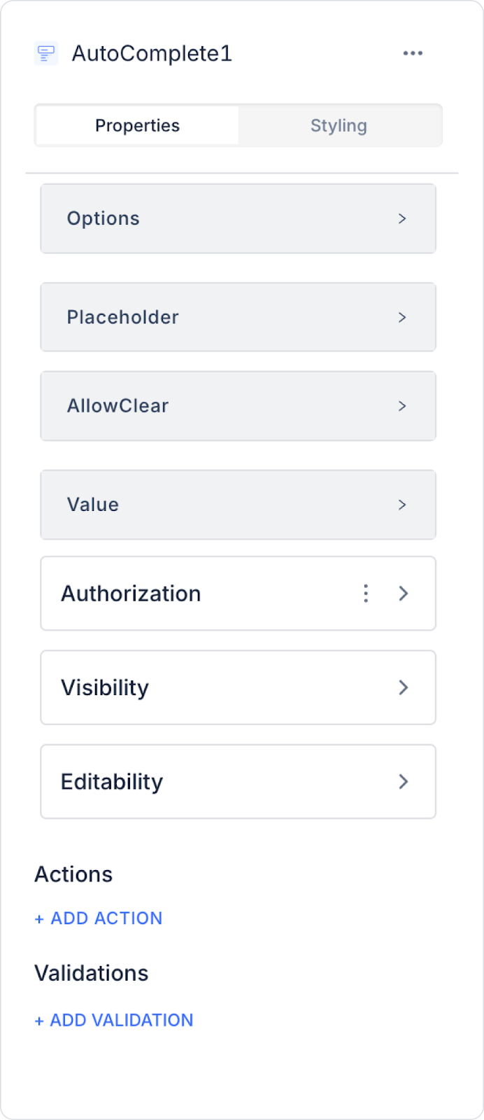
2.1. Auto-Complete Element Properties
You can configure the following settings from the Properties panel:
Options: You can link the data to be displayed in the list. You can also create a static list.
Fixed Options List: Lists manually defined fixed data that is not tied to a database.
Fixed Data: Specifies the visible name (Text) and the value (Key) to be used within the application for each piece of data that makes up the list.
Placeholder: The placeholder text displayed when the user has not entered any data.
Allow Clear: Adds a Clear (X) icon on the right side to allow the entered data to be cleared with a single click.
Value: You can add a static value or dynamically display the content of another element or the result of an action using the Symbol Picker.
2.2. Binding Data to the Auto Complete Element Using the Fixed Options Feature
Open the Properties panel on the right side.
Click the Please Select button under Actions in the Options dropdown menu.
Select the Fixed Options List option from the menu that opens.
Click the Fixed Data button under Fixed Options List.
Manually fill in the Key and Text fields on the screen that opens.
Click the UPDATE button to bind the data.
2.3. Actions That Can Be Added to the Element
The Auto Complete element supports defining event-based actions based on user interactions. Actions are not tied to the element itself but are linked to events triggered by user inputs and selections.
Actions for the Auto Complete element can be added via the following events through the Properties > Add Action section.
Supported Action Triggers
onSearch: Triggered when the user performs a search. Also runs when the search text is cleared.
Usage purposes:
Dynamically generate a suggestion list based on the entered text
Filter results by making an API call
Improve search performance in large datasets
Example scenario: As the user types a city name, matching cities are retrieved via the API and displayed in a list.
onSelect: Triggered whenever the user makes a selection.
Usage purposes:
Assign the selected value to a state or variable
Automatically populate related fields
Update form data
Example scenario: When the user selects a product, the product details are automatically populated in the relevant fields.
onChange: Triggers only when the selected item changes.
Usage purposes:
Monitor user input
Display tooltips or warnings
Update the state of dependent fields
onBlur: Triggered when the user loses focus on the Auto Complete field.
Usage purposes:
Run validation if the field is left blank
Check if the entered value is valid
getTextFromValue: Used to retrieve the text to be displayed from the selected value.
Usage purposes:
Display the correct text in data structures with a Value–Label distinction
Provide meaningful labels to the user in complex data structures from the API
Example scenario: Displaying the user_id as the value and the First Name and Last Name as the text.
Basic Rules Regarding Actions
The Auto Complete element can trigger actions via multiple events.
Multiple actions can be defined for the same event.
When the onSearch event is used intensively, API calls must be carefully planned for performance reasons.
In complex data matching scenarios, it is recommended to use `onSelect` and `getTextFromValue` together.
The Auto Complete element offers a powerful and flexible user experience, especially in scenarios involving search, filtering, and selecting from large datasets when used in conjunction with actions.
3. How to Use the Auto Complete Element?
In this section, we will cover the end-to-end usage of the Auto Complete element using an example scenario.
Scenario: Product Category Selection
The user uses the Auto Complete element to filter products within the application or quickly view records belonging to a specific category. When the user begins typing in the search field, the system filters the category records in the data source and displays matching results in a list. When the user selects the appropriate option from the list, the value is automatically transferred to the relevant field.
In the scenario:
The application features two AutoComplete fields on the product listing or product management screen: First Category and Second Category.
When the user begins typing in the First Category field, the system filters the category records in the data source and lists matching category suggestions. When the user selects the appropriate category from the list, the selected value is transferred to the relevant field and used as the first parameter for filtering.
Similarly, when the user types in the Second Category field, the system filters the records in the Second Category field within the data source to generate a list of suggestions. When the user selects a category from the list, the selected value is set as the second filter parameter.
After the user makes selections in both category fields, the system filters and lists the relevant products or records based on the selected First Category and Second Category values.
Thanks to this structure, users can make quick and error-free selections from results that filter as they type, rather than manually selecting from long lists. Additionally, category-based filtering becomes more practical, and the user experience is significantly improved.
Step 1 - Creating a Data Source
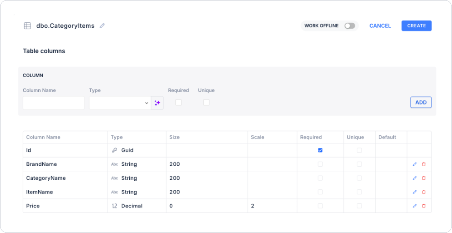
Creating a table in the DataSources module:
Go to the DataSources module.
Then go to the Tables tab.
Create a new table named “CategoryItems”.
The table structure to be created is as follows:
Important Field Names:
CategoryOne: Represents the first category information for the product or record. It creates the category options presented to the user in the first Auto Complete field and is used as the first selection parameter during the filtering process.
CategoryTwo: Represents the second category information for the product or record. It generates the category options presented to the user in the second Auto Complete field and is used as the second selection parameter during the filtering process.
ItemName: Represents the name of the relevant product or record. It is the primary information field displayed in the listed results after the user completes the filtering process.
BrandName: Represents the brand information of the relevant product. It enables the records retrieved after filtering to be understood by brand and is used to present product information in greater detail.
Price: Specifies the price information for the relevant product or record. It is used to display the price information of the records listed as a result of filtering.
Step 2 - Defining the Required Action
To display data on the interface:
You need to define three sample actions.
Add a new action from the Actions > New SQL Action tab within the Datasources module.
Action to Add Sample Data (InsertCategoryItems): To test the application with sample data, add the following SQL action and click the TEST button.
When applying, delete the ‘CategoryItems’ section, type ‘CategoryItems’ again, and press Enter. This will add the correct schema name before the table name.
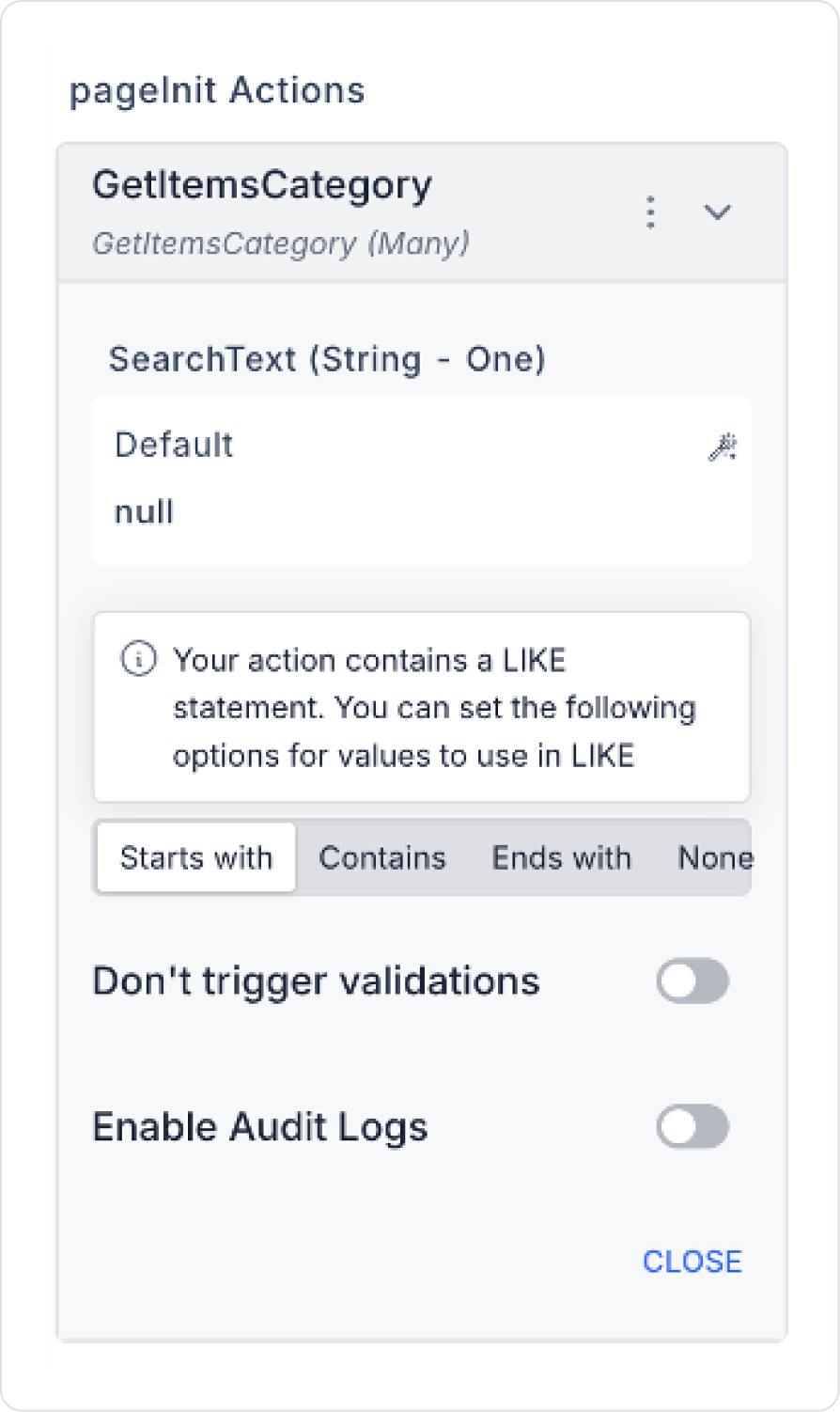
Action to Filter Categories (GetItemsCategory):
SELECT
MIN(Id) AS Id,
CategoryName
FROM CategoryItems
WHERE @SearchText IS NULL
OR @SearchText = ‘’
OR CategoryName LIKE ‘%’ + @SearchText + ‘%’
GROUP BY CategoryName
When applying, delete the CategoryItems section, type CategoryItems again, and press Enter. This will add the correct schema name before the table name.
Action to Filter Products (GetItems):
SELECT
Id,
CategoryName,
ItemName,
BrandName,
Price
FROM dbo.CategoryItems
WHERE CategoryName = @CategoryName
When applying, delete the CategoryItems section, type CategoryItems again, and press Enter. This will add the correct schema name before the table name.
Step 3 - Adding an Initial Action
On the home page initially:
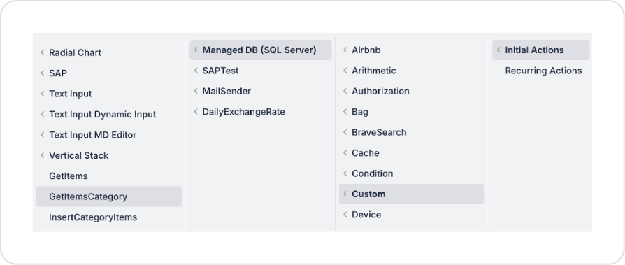
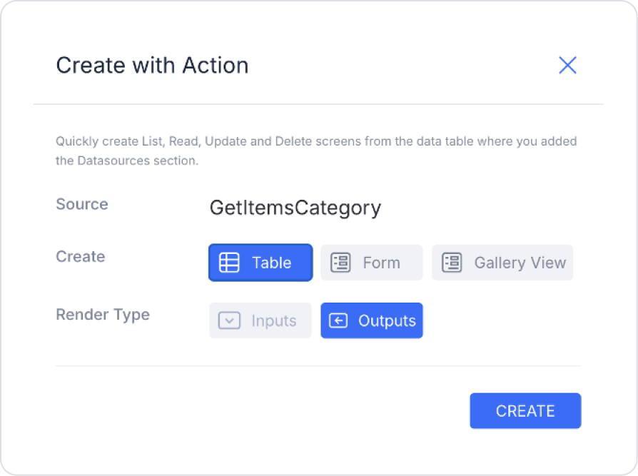
Within the Element, add the Add Action > Initial Action > Custom > Managed DB > GetItemsCategory action to display sample data.
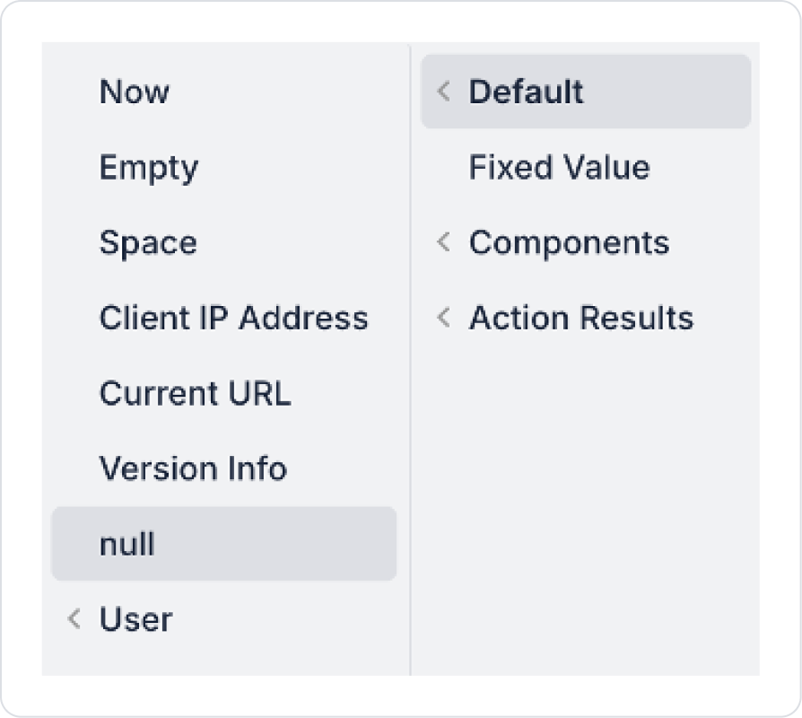
To display all categories initially, set the SearchText field to Default > null.
Step 4 - Adding the Auto Complete Element and Defining the Action
On the home page:
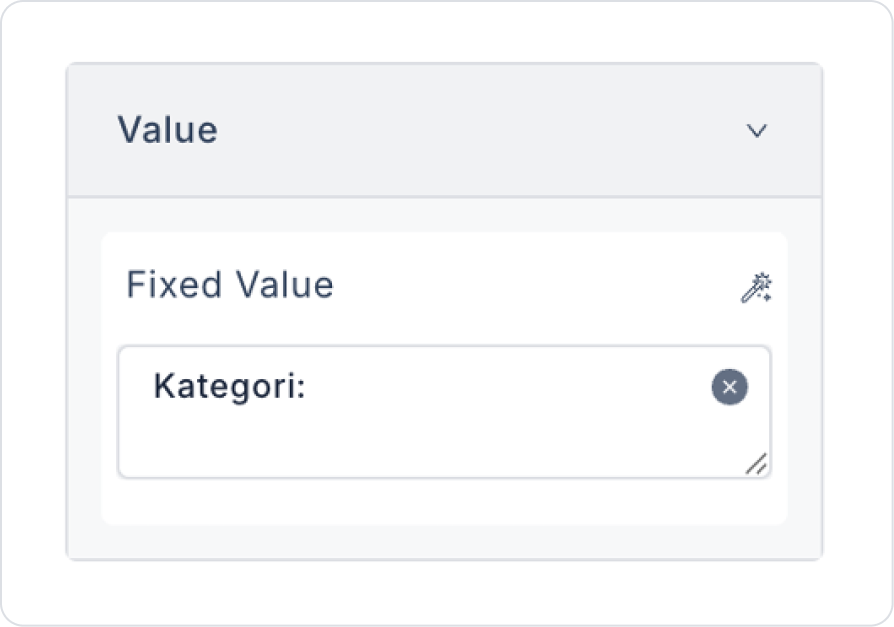
Drag and drop the Elements > Display > Label element from the left panel onto the page.
Set the text to Label > Properties > Value > “Category:”.
Below this, drag and drop the Elements > Select Input > AutoComplete element from the left panel onto the page.
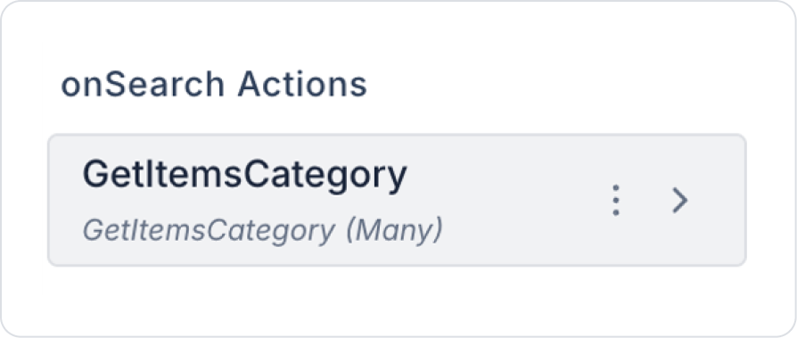
In the AutoComplete element, bind the AutoComplete > Properties > Add Action > onSearch > GetItemsCategory action for filtering after the search.
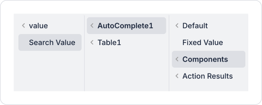
Set the SearchText field to Components > AutoComplete > Search Value.
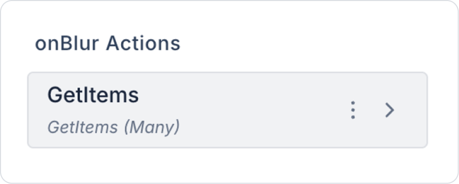
To list the results below, bind the AutoComplete > Properties > Add Action > onBlur > GetItems action. (The onSearch definition can also be used optionally)
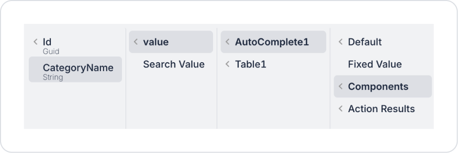
Define the CategoryName field as Components > AutoComplete > Value > CategoryName.
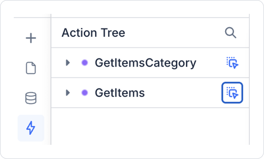
Finally, to view data for the relevant category in the table, hold down the blue icon next to the GetItems action in the Action Tree area on the left sidebar, drag it onto the page, and select the relevant fields.
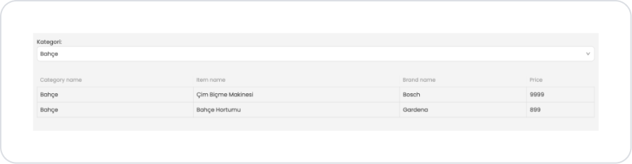
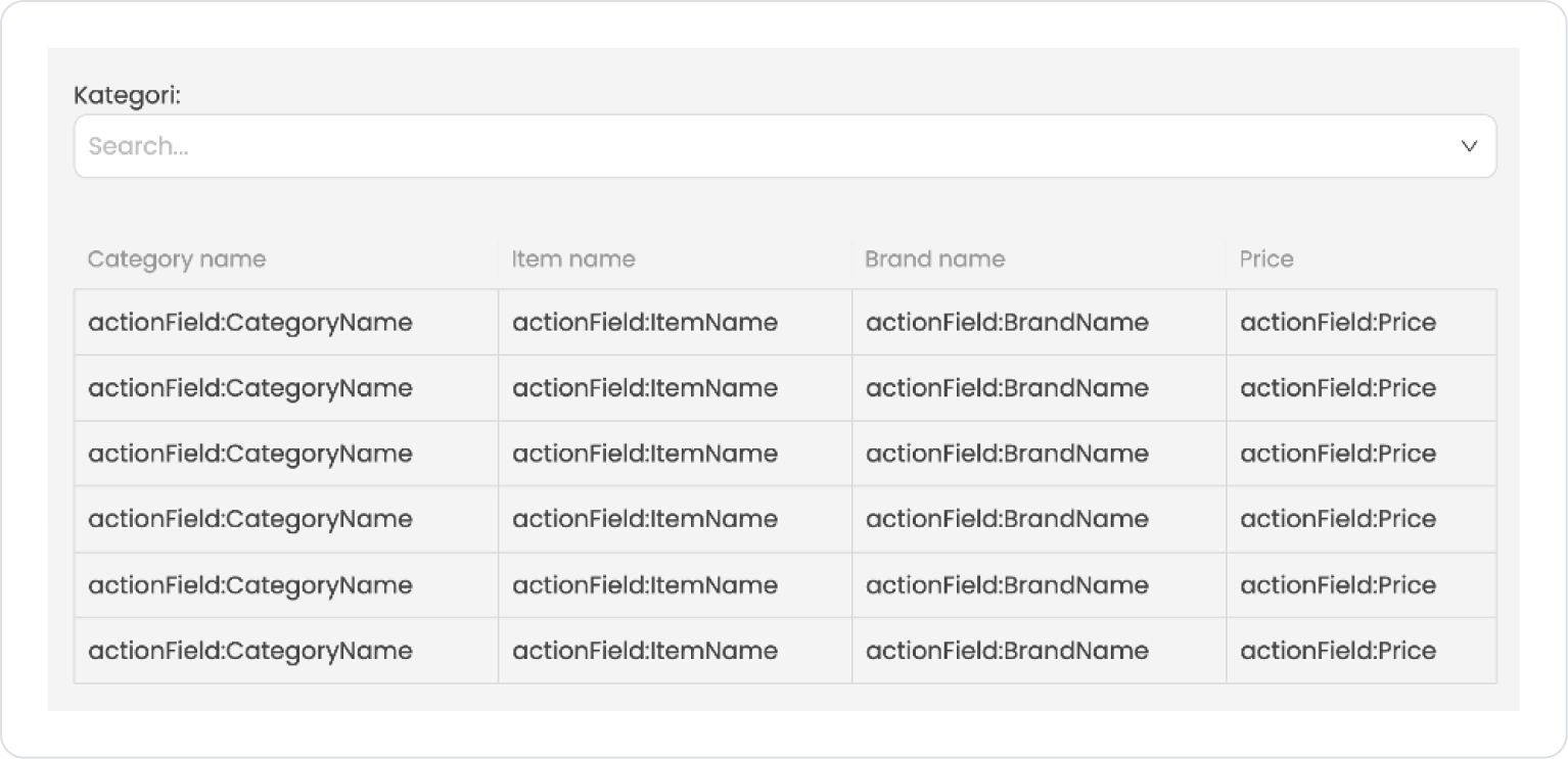
Preview:
In this example, the AutoComplete element is used to allow users to quickly filter products by category. When the user begins typing in the Category field at the top of the screen, the system filters the category records in the data source and displays matching results in a list. When the user selects a category from the list, the selected value is automatically transferred to the relevant field.
After the category is selected, the system lists the products belonging to the selected category in the Table located in the lower section. The table displays the Category Name, Product Name, Brand Name, and Price information for each product. This allows users to quickly view products belonging to a specific category with a single selection.
4. Common Properties
Some fields on the Auto Complete element are shared across all UI elements. Therefore, detailed descriptions of the following properties are available on the relevant general guide pages:
Manage the onSearch event carefully for performance. Since it triggers with every character input, API calls should be debounced or limited to a minimum character count.
Clarify the use of getTextFromValue. In data structures with a Value–Label distinction, ensure the text displayed to the user is clear and understandable.
Automatically populate fields linked to onSelect. Update related fields to speed up the post-selection form experience.
Guide the user with placeholders. Phrases like “Search” or “Select” clarify the expected interaction.
Prevent incorrect entries by adding validations. Define validation rules for required fields or invalid values.
6. Limitations
In very large datasets, using the `onSearch` event without precautions can lead to performance issues.
Actions can only be triggered via supported events (`onSearch`, `onSelect`, `onChange`, `onBlur`).


