The Language Selector element is a specialized selection element that allows users to select their preferred language within the application interface. It is used to personalize the user experience in multilingual applications and to present content in different language options.
The Language Selector element is supported only in web applications.
1.1. Common Use Cases
Multilingual web applications
Platforms with an international user base
Language switching options in admin panels
Language preferences based on user profile
2. Key Features
Multi-language support: Allows users to select from the languages defined in the application.
Instant language switching: The interface language can be updated instantly when the user selects a language.
User-preference-based structure: The selected language can be saved to the user profile or state to make it persistent.
3. How to Use the Language Selector Element?
In this section, we will cover the end-to-end usage of the Language Selector element through an example scenario.
Scenario: Language Selection
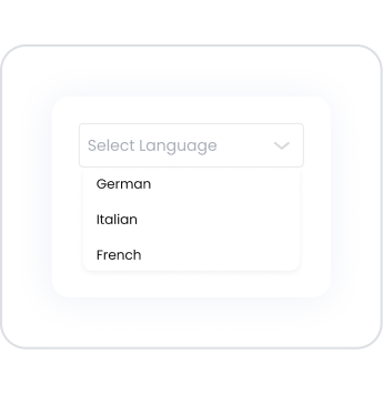
The user uses the Language Selector element to use the application interface in their preferred language. The languages defined in the UI Design section are displayed as a list within this element.
When the user selects a language via the Language Selector, the application’s interface text is updated according to the selected language. This allows the user to view the application in their preferred language and enjoy a more user-friendly experience.
In the scenario:
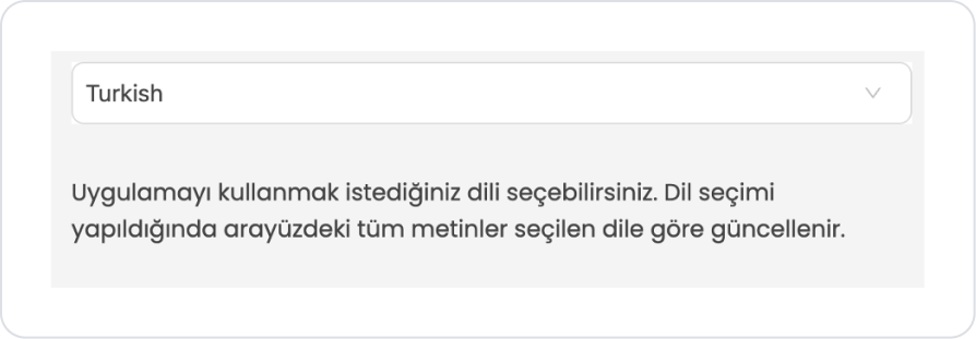
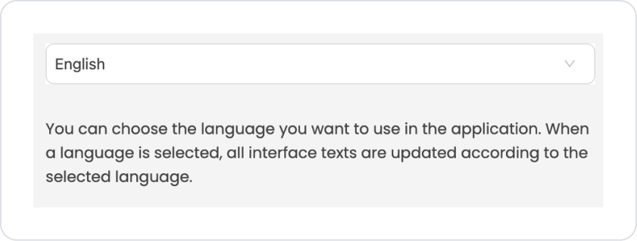
The Label element on the page within the application contains English text by default. Thanks to the language management defined in the UI Design section, the Turkish translation of this text is added to the translation field.
When testing the application, if the user changes the language via the Language Selector element, the text in the Label on the page is automatically updated according to the selected language. For example, when English is selected, the text is displayed in English, while when Turkish is selected, the Turkish translation of the same text is shown.
This scenario demonstrates how text within the application can be defined for different languages and how the text on the interface dynamically updates when the language is changed.
Step 1 - Adding the Language Selector Element and Defining Text Translations
Start on the homepage:
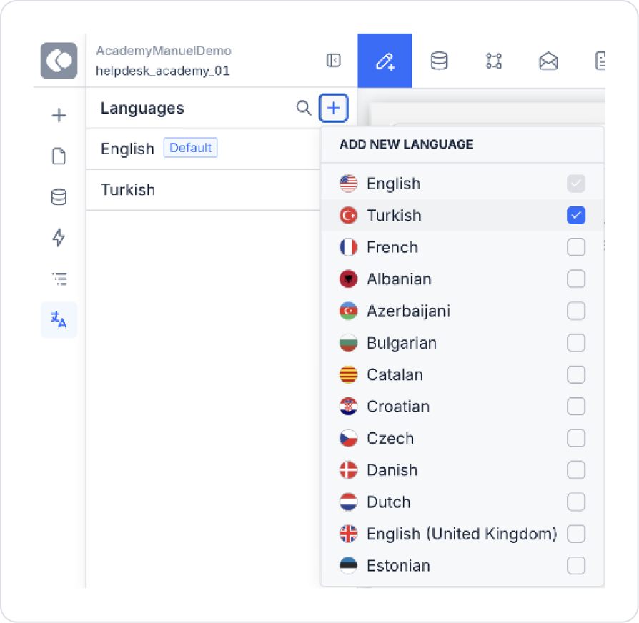
Drag and drop the Elements > Select Input > LanguageSelector element onto the page.
Below the Language Selector element, drag and drop the Elements > Display > Label element to display the text to be translated.
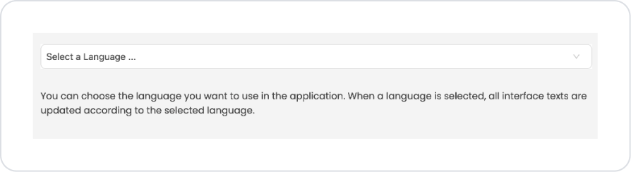
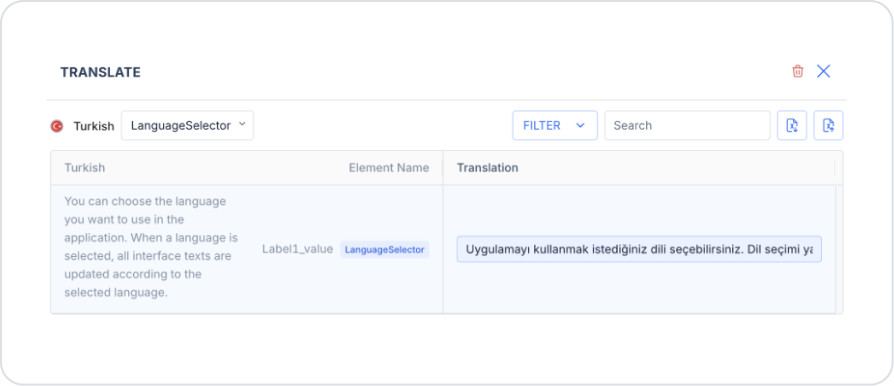
Set the text to be translated to Label > Properties > Value > “You can choose the language you want to use in the application. When a language is selected, all interface texts are updated according to the selected language.”
In the Languages section of the left-hand panel, add the “Turkish” language option.
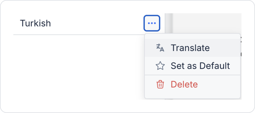
Click the Translate field in the Turkish language option.
In the pop-up window, add the Turkish translation of the text on the relevant page (“You can choose the language you want to use in the application. When a language is selected, all interface texts are updated according to the selected language.”) and save it.
Preview:
In this example, the Language Selector element is used to allow users to view the application interface in their preferred language. First, in the Languages section of the UI Design section, the Turkish language is defined in addition to the default English language. Then, the Turkish equivalents of the English text on the relevant page are added as page-based translations under the Turkish language.
The Label element on the page contains English text by default. Once the Turkish translation of this text is defined for the relevant page within the Turkish language, the text is automatically updated based on the language selection made via the Language Selector when the application is run.
When the user selects the language as Turkish, the text within the Label is displayed in Turkish; when the language is selected as English, the text is displayed in English. This structure enables multilingual support within the application, and interface texts are dynamically updated according to the selected language.
4. Common Properties
Some fields on the Language Selector element are shared across all UI elements. Therefore, detailed descriptions of the following properties can be found in the relevant general guide pages:
Keep language options limited and meaningful. Only languages that the application actually supports should be displayed; languages with incomplete or partial translations should not be listed.
Set the default language correctly. It is recommended to assign the default language based on the user’s location or browser language.
Clearly reflect language changes to the user. Immediate interface updates after selection make it easier for users to perceive the action.
Make the language preference persistent. The user’s selected language should be stored via state, profile, or storage to be preserved in subsequent sessions.
Place the language selector in an accessible location. Easily accessible areas such as the header, footer, or settings screen should be preferred.
Display language names in the target language. Displays such as “English”, “Türkçe”, “Deutsch” help users find their own language more easily.
6. Limitations
The Language Selector element is supported only in web applications.
The element provides language selection only; the management of translated content and localization logic depends on the application configuration.


