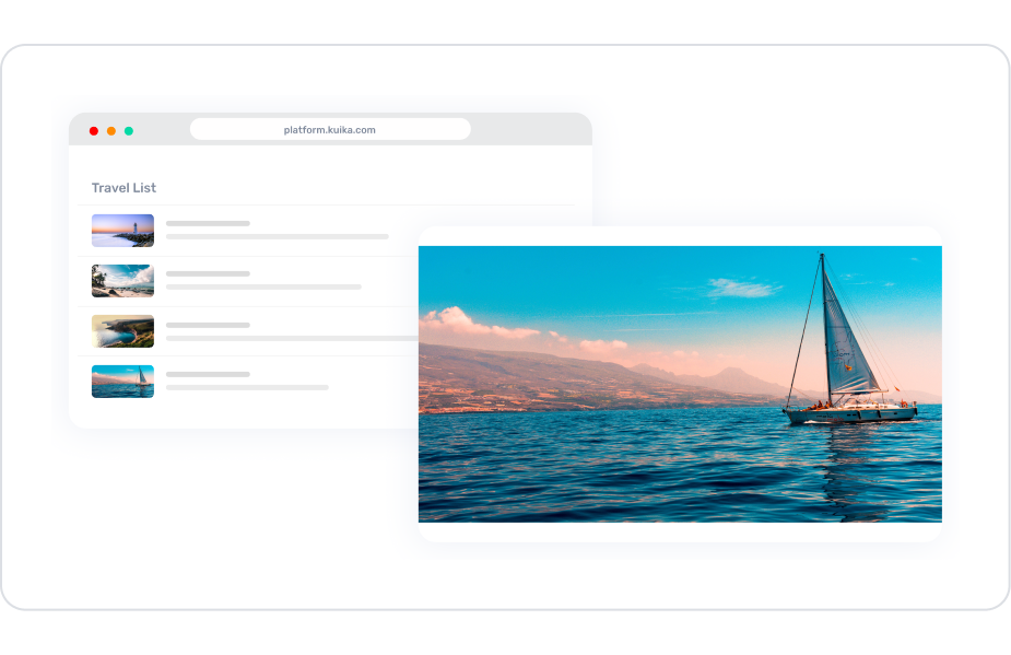
Kuika's Image element allows you to add visual content to your application, making the user experience richer, more aesthetic, and easier to understand. The Image element supports both static images and images dynamically pulled from a data source. This makes it easy to display product images, profile photos, banner content, campaign images, or images updated from a database.
The Image element is not limited to just displaying images; it allows you to create a powerful user interface with many customizations such as clickability, responsive sizing, scaling methods, corner rounding, thumbnail usage, and use as a background image.
The Image element is fully supported in web and mobile applications.
1.1. Common Use Cases
Displaying Product Images: Listing product photos in e-commerce applications, displaying large images on detail pages.
Using Profile Photos: Displaying profile photos on user account screens via static or dynamic data sources.
Banners and Campaign Areas: Creating large images for advertising, campaigns, or informational purposes on home pages.
Dynamic Image Loading: Automatically changing images based on URLs from a database or API.
Gallery and Slideshow Structures: Enhancing image presentations within components such as Carousel, Horizontal Grid, or Gallery View.
Placeholder Image Display: Automatically displaying a default image when the image URL is empty (e.g., default avatar if there is no user profile picture).
Navigation with Clickable Images: Use OnClick to navigate to a different page, open a modal, or trigger an action when the image is clicked.
2. Key Features
Static or Dynamic Image Support: The Image element can be used with a fixed image URL or linked to a dynamic image from the database via the Symbol Picker.
Responsive Design: Automatically adapts to screen widths in web and mobile applications, ensuring correct display on different devices.
Clickable Image Usage: The Image element can behave like a button; when clicked by the user, a specified action can be triggered (e.g., page transition or modal opening).
2.1. Image Element Properties
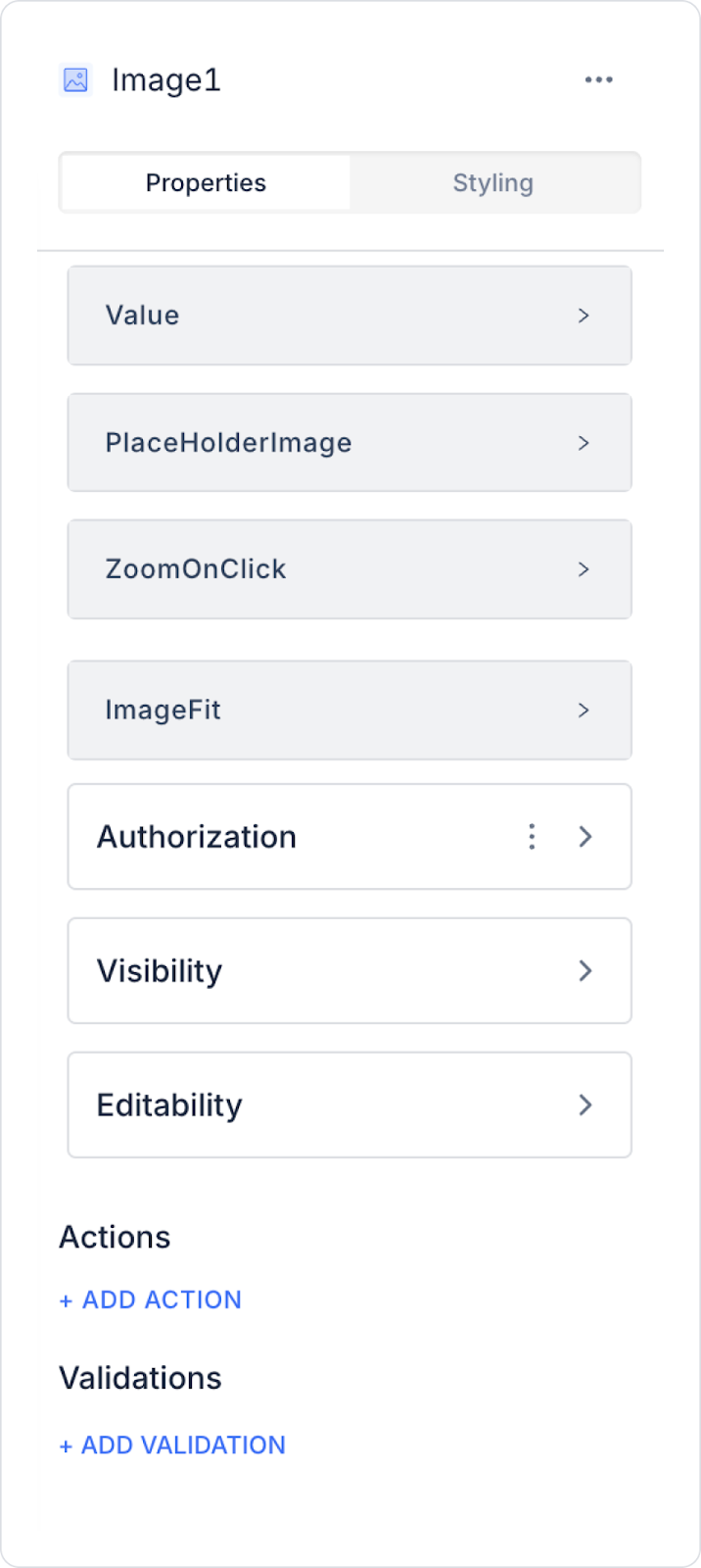
You can configure the properties of the Image element from the Properties panel on the right side.
Value: Determines the static or dynamic values that the Image element will take. You can select an image from the image library using the Symbol Picker and the Uploaded Images option. When a data connection is established, the image in the data table can also be displayed.
Placeholder Image: Displays a default image when the image is not loaded. You can change this image as needed.
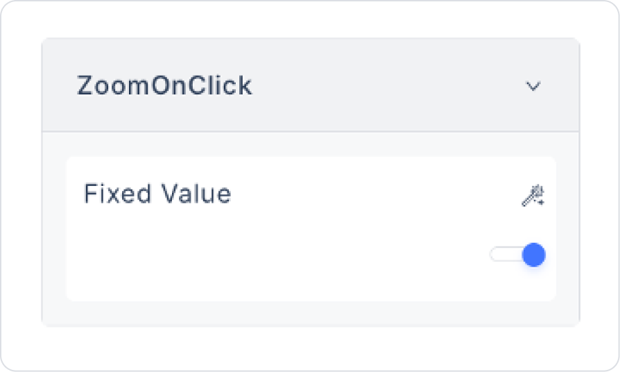
Zoom On Click: Allows zooming in by double-clicking or tapping on the image.
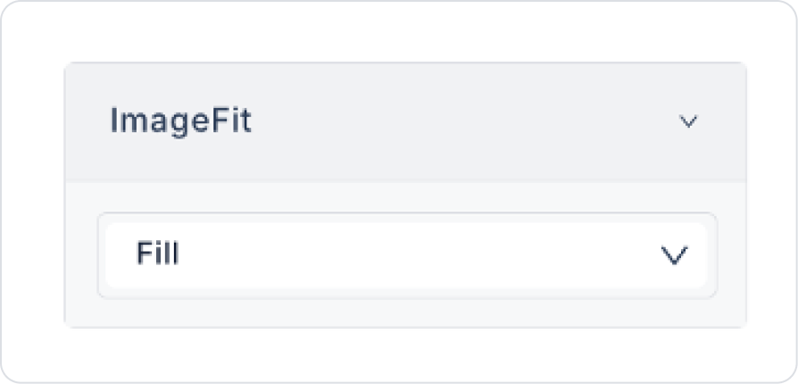
Image Fit: Determines how the image will fit into the size specified in the Styling > Layout section. It can also adapt to the size specified by the element's parent element.
2.1.1.Using the Image Library
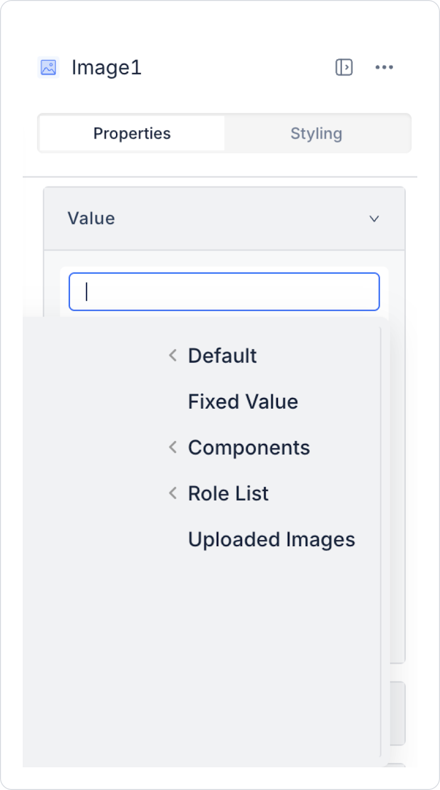
Click the Value field in the Properties panel.
Select the Uploaded Images option from the menu that opens.
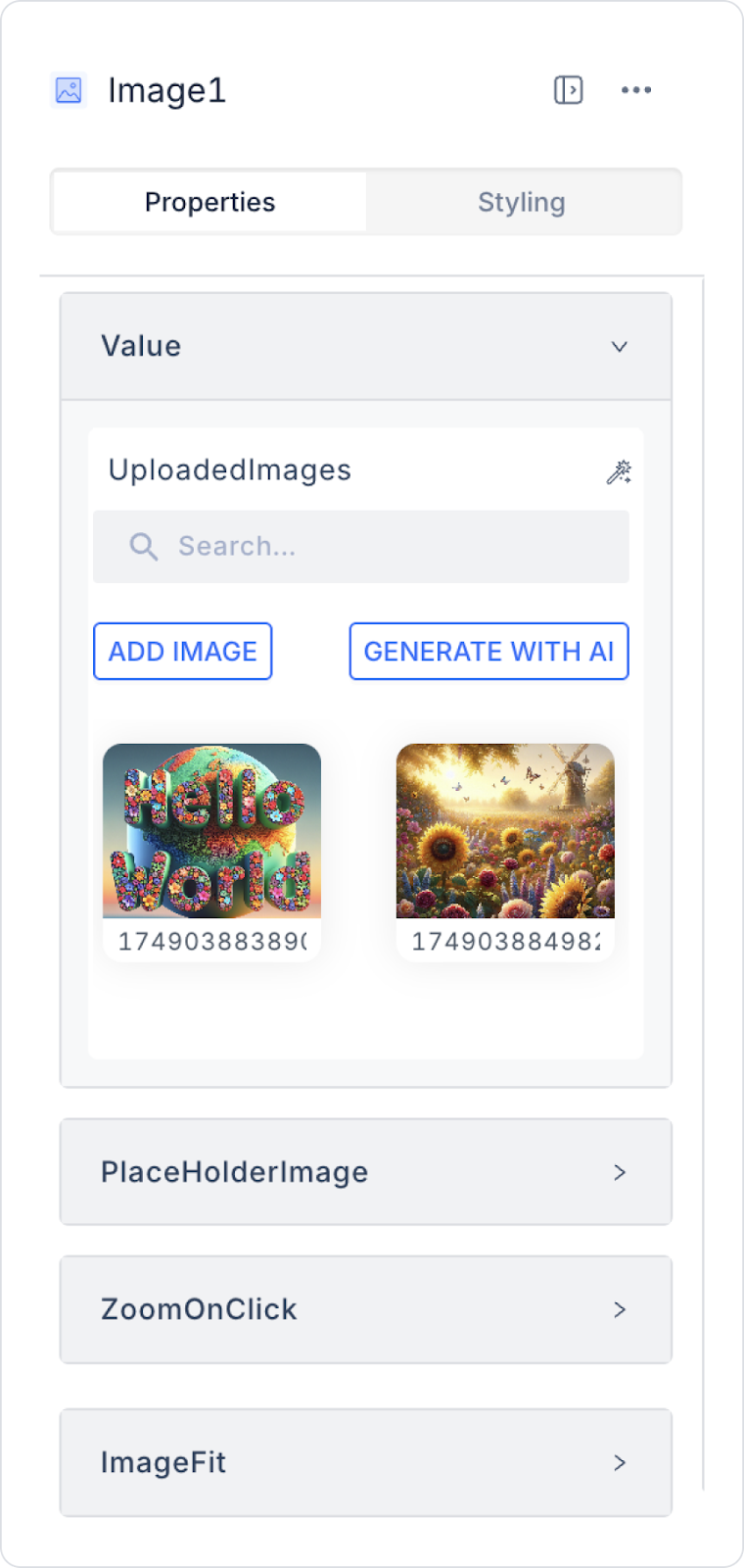
The image library window contains the following options:
ADD IMAGE: You can add images by dragging and dropping them from your device or by selecting a file.
GENERATE WITH AI: You can generate images not found in browsers by describing the image you want with the AI assistant. You can add the generated images to the library by clicking the Download icon in the upper right corner.
PNG, JPG, and SVG formats can be viewed directly in both web and iOS applications. However, the SVG format is not supported in Android applications. For this, you must upload images in the Android Vector Drawable - XML format. When you upload both .svg and .xml formats with the same name, Kuika automatically selects the appropriate format based on the device type.
2.1.2. Adding an Image to the Data Source with the Image Element
Open your application on the Kuika platform.
In the UI Design module, drag the Image element from the Elements panel onto the screen.
Drag an Icon element from the Elements panel and place it under the Image element.
Click on the Icon element you added.
In the Properties panel on the right side, click on the ADD ACTION option.
Select OnClick → Device → Photo From Gallery.
Return to the ADD ACTION menu and select OnClick → UI Control → Set Value Of.
In the menu that opens:
Component To Change: Select the Image element where the image will be loaded.
Value: Select Action Results → Photo From Gallery using the Symbol Picker tool.
Now, when you run the application, you can load an image from your device by clicking on the relevant icon.
2.1.3. Removing the Image Added to the Data Source
Place an Icon element (for example, an “X” icon) below the Image element.
Click on the Icon element.
Click the ADD ACTION option in the Properties panel on the right side.
Select OnClick → UI Control → Set Value Of.
In the menu that opens:
Component To Change: Select the Image element from which the image will be deleted.
Value: Select Default → Empty using the Symbol Picker.
After completing these steps, the image will be removed when the user clicks the “X” icon.
2.1.4. Instant Photo Upload
Place an Icon element (for example, a “camera” icon) below the Image element.
Click on the Icon element.
In the Properties panel on the right side, click on the ADD ACTION option.
Select OnClick → Device → Photo Take.
Return to the ADD ACTION menu and select OnClick → UI Control → Set Value Of.
In the menu that opens:
Component To Change: Select the Image element where the image will be uploaded.
Value: Select Action Results → Photo Take via the Symbol Picker tool.
After completing these steps, clicking on the camera icon will open your device's camera, allowing you to take instant photos and upload them to your application.
Important Notes
The Image element loads quickly even with large data sets and provides high performance without negatively impacting the user experience.
Photos stored in Base64 format are displayed via the table's ID to avoid slowing down the network.
You can customize the size, alignment, and other style properties of images using the Styling > Layout settings.
2.2. Actions That Can Be Added to Elements
The Image element supports two basic actions that can capture user interactions. These actions are used to trigger specific processes when the image is clicked or when the image source changes.
onClick
This action is triggered when the user clicks on the image. Common usage scenarios:
Redirecting to a page
Opening a modal or popup
Navigating to a detail page
Enlarging the image (preview)
Performing data recording or updating by executing an action
onChange
This action is triggered when the source of the Image element (URL or Base64 image data) changes. Common use cases:
Monitoring dynamically changing images
Automatically initiating an action when an image in a form changes
Processing a new image to be saved to the database
Triggering a validation or control action
Thanks to these two triggers, the Image element responds to both user clicks and image changes, increasing the application's level of interaction.
3. How to Use the Image Element?
In this section, we will cover the end-to-end use of the Image element through a screen showing system error conditions.
Scenario: Campaign/Banner Image Usage
Banner images are used to quickly and attractively convey campaigns or announcements presented to users in an application.
In this scenario, the campaign image positioned on the main screen visually highlights a discount, opportunity, or special announcement, allowing the user to perceive the content at a glance.
In the scenario:
The Image element is positioned in the center of the screen.
The visual presents banner content representing the active campaign or announcement.
The campaign description text and navigation buttons are located below the visual.
Step 1 - Defining the Required Action
To display and add data in the interface:
You need to define an action.
Add a new action from the Actions > New SQL Action tab in the Datasources module.
Action Providing Periods (GetCampaignImage):
SELECT N'Spring Deals Campaign' AS CampName, 'https://images.openai.com/static-rsc -3/dnXoeFS39sSiiwyNe_hZSsY7P7FvDc796R6XiB5M7J2G_7iEOsfBVC63fjkUyoZbnjyCXArTnuOkimtDq6OAHMGLqntZzaIavA56fEyxXJA?purpose=fullsize' AS ImageUrl
Step 2 - Add Initial Action
Open the UI Design module.
Add the Initial Actions > Custom > Managed Db > GetCampaignImage action to the page using the ADD ACTION button.
Step 3 – UI Design Module Operations
Open the UI Design module.
Add the Elements > Display > Label element to the page from the left panel.
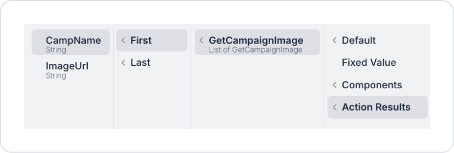
Update the text to Label > Properties > Value > Action Results > GetCampaignImage > First > CampName.
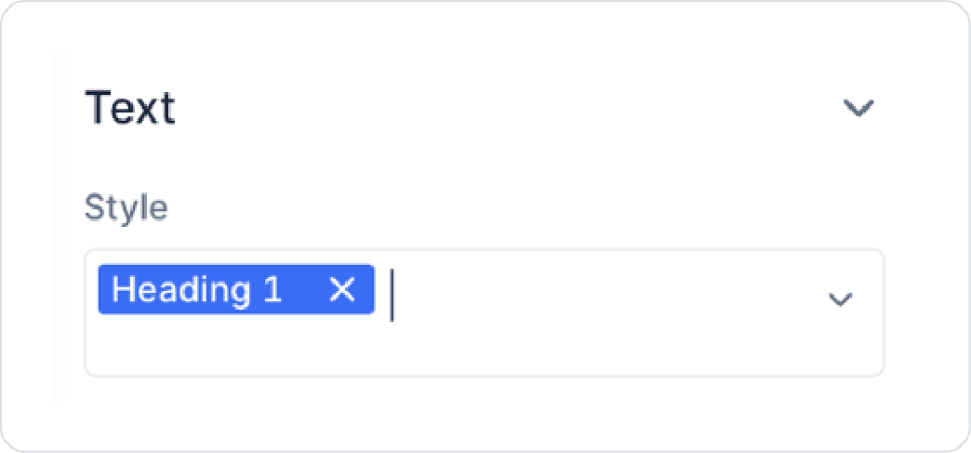
Set the text style to Label > Styling > Text > Style > Heading 1.
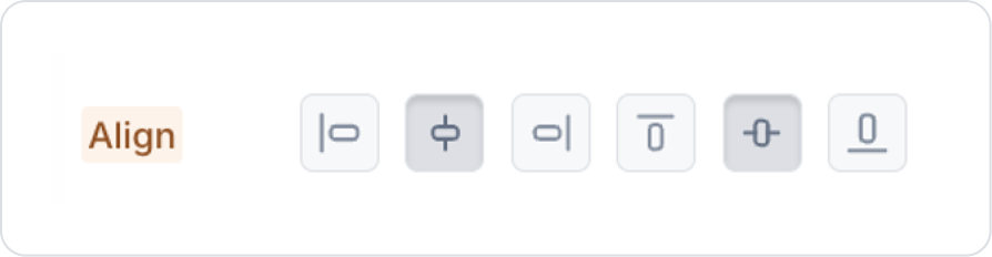
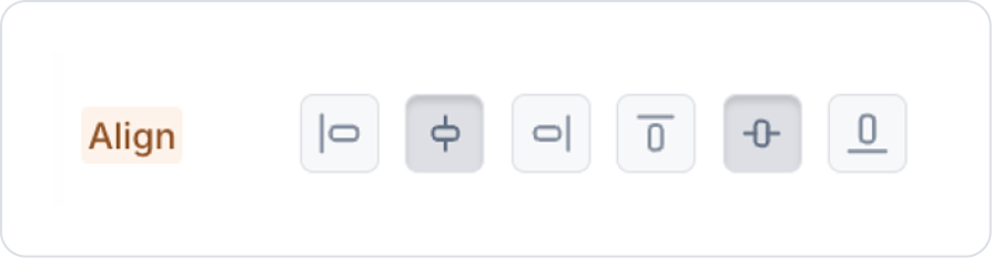
Click on the space next to the Label element and set the Col options that appear to Col > Styling > Layout > Align > Center Vertically and Horizontally.
Drag and drop the Elements > Display > Image element onto the page.
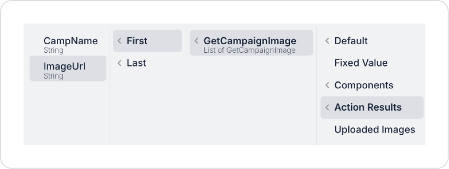
Define the image to be displayed in the Image > Properties > Value > Action Results > GetCampaignImage > First > ImageUrl field. To enlarge the image when clicked, set Image > Properties > ZoomOnClick > On.
To fill the entire area with the image, set Image > Properties > ImageFit > Fill.
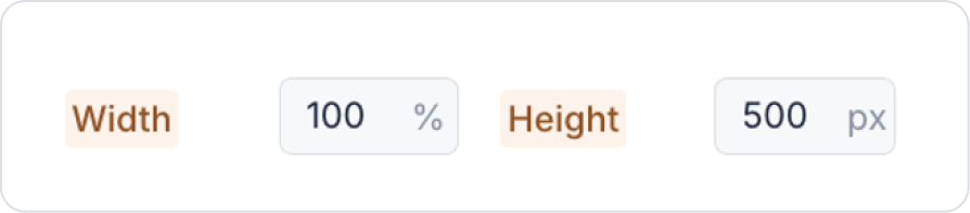
Set the image dimensions to Image > Styling > Layout > Width > 100% to fill the entire column, and set the height to Height > 500 px.
Set the image dimensions to Image > Styling > Layout > Width > 100% to fill the entire column, and set the height to Height > 500 px.
Don't forget to select % instead of px in the Width field.
Image element and set it to Col > Styling > Layout > Align > Center Vertically and Horizontally in the Col options that appear.
Preview
When the application is tested, you will see that the campaign banner image is displayed on the screen using a URL directly through the Image element. The image can be easily customized in terms of size, alignment, and style settings to fit the desired design structure. This allows campaign content to be updated quickly and flexibly.
4. Common Properties
Some fields on the Image element are common to all UI elements. Therefore, detailed explanations of the following properties can be found in the relevant general guide pages:
Define a clear action target for clickable images. It should be clearly defined where the user will be directed or what action will be triggered when they click on the image.
Prefer responsive sizing. Set the width and height settings of the Image element to ensure compatibility with mobile and tablet devices.
Use the onChange trigger carefully. Control mechanisms should be added to prevent unnecessary action triggers in scenarios where the image source changes frequently.
Pay attention to background transparency. It is important to control the background contrast for transparent images such as PNGs, depending on the dark or light theme.
6. Limitations
The image may not load if an invalid or empty URL is used. The Image element depends on the status of the URL it loads directly.
onChange is only triggered when the image source changes. It does not work with interactions such as clicks or hovers; only onClick can be used for these actions.


