Kuika's Icon element is a small yet powerful visual element used to convey information quickly, simply, and effectively in the user interface. Icons are graphical symbols that represent a specific function, state, or theme, enriching the user experience both aesthetically and functionally.
The Icon element is supported in web and mobile applications.
1.1. Common Use Cases
In Navigation Menus: Icons are used to represent transitions between pages in the submenu (tabbar), side menu (sidebar), or top menu (e.g., Home, Settings, Profile).
Action Buttons: Icons are used with buttons to quickly convey actions such as delete, edit, save, and share to the user.
Status and Warning Indicators: Icons are displayed alongside messages such as success, error, information, and warning to increase comprehensibility.
In Forms and Input Fields: Functional auxiliary visuals such as the magnifying glass icon in the search bar, the eye icon in the password field, or calendar selector icons.
In Card and List Content: Represents actions such as adding to favorites (heart), sharing (share), commenting (comment), or more options (three dots).
In Map and Location-Based Applications: Provides quick guidance to the user with meaningful icons such as a pin, arrow, or location.
In Social Content Displays: Icons are commonly used for interaction elements such as likes, comments, shares, and follows.
Headings and Information Areas: Icons can be used next to headings or in content blocks to emphasize the purpose of a section.
2. Key Features
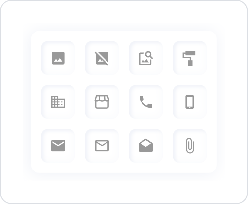
Extensive icon library support: Choose from a large number of ready-made icons available in Kuika. This allows you to quickly add appropriate graphical symbols for different functions.
Size customization: The size of the icon can be easily adjusted. Icons can be scaled down or up according to different screen sizes or design requirements.
Color management: The icon color can be set statically or dynamically to suit the design. State-based color changes (e.g., active/inactive) can be designed.
Alignment options: The position of the icon within its area (left, right, center) can be easily adjusted.
Use with text or elements: Icons can be used together with labels, buttons, or other elements to create more descriptive and functional interfaces.
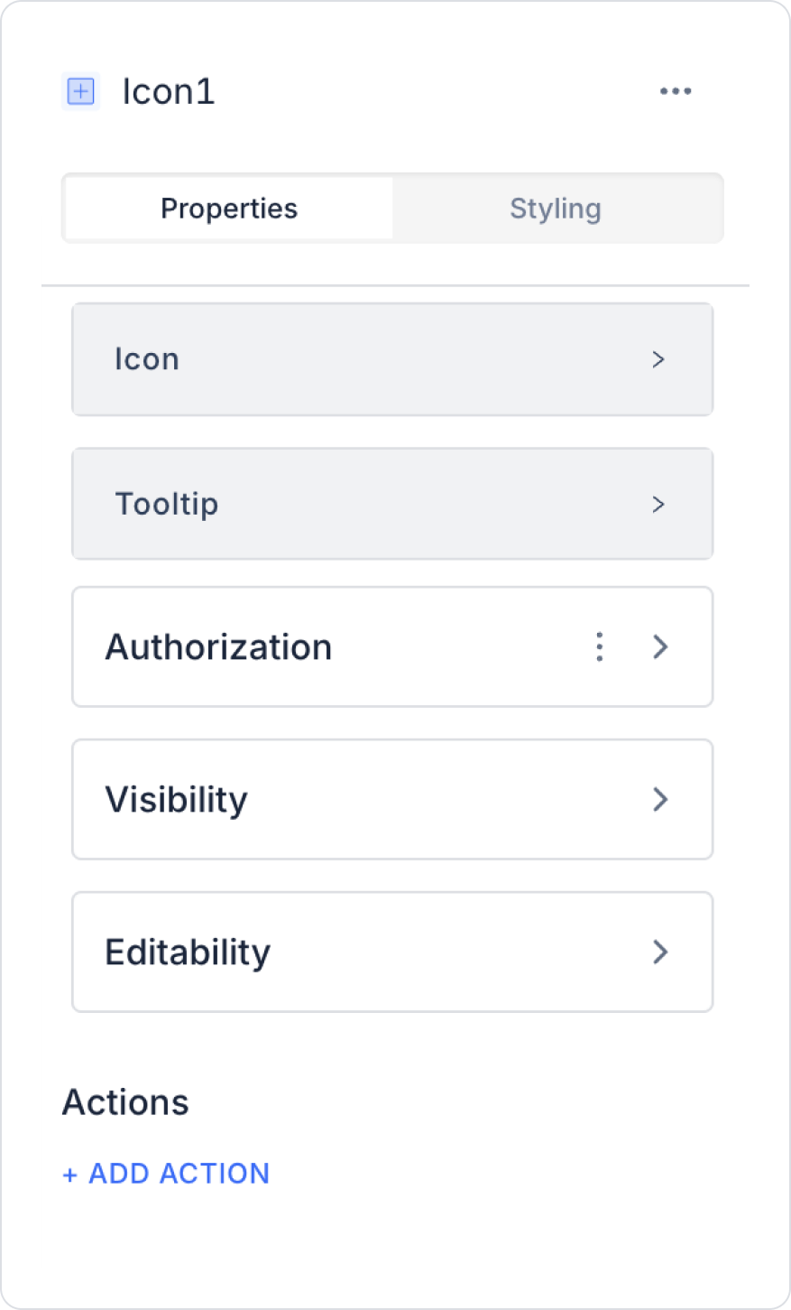
2.1. Icon Element Properties
You can configure the properties of the icon element from the Properties panel on the right side.
Icon: You can change the icon you want to use by selecting it from the list.
Tooltip: In web applications, you can add help text that will appear when the cursor is hovered over the icon.
The Icon element allows users to quickly recognize functions and improves the user experience of the application.
2.2. Actions That Can Be Added to the Element
The Icon element is a component that supports user interaction and can trigger actions based on click events. Therefore, when you select the Icon element, the ADD ACTION button becomes active and the following trigger becomes available:
onClick
This triggers when the user clicks on the icon. This trigger allows the icon to become an interactive element beyond just being a visual element.
Usage Scenarios:
Redirecting to a page or screen
Opening a modal or drawer
Filtering a list
Updating a value (e.g., changing the status when clicking on the favorite icon)
Trigger an API call
Perform tab switching in menu structures
3. How to Use the Icon Element?
In this section, we will discuss how the Icon element is used in a form-based user registration screen through an example scenario.
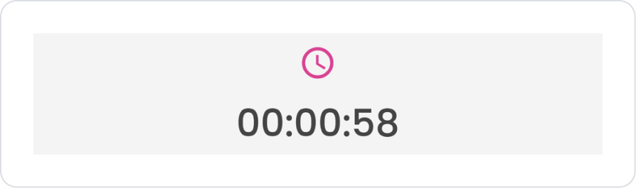
Scenario: Using Icons on the Counter Screen
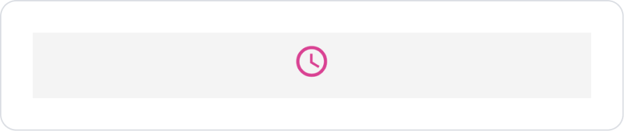
The icons used on the counter screen visually convey the purpose and status of the countdown to the user. Icon elements are positioned to support the counter information, intuitively conveying to the user whether the time is active, ongoing, or nearing its end without the need to read text.
Step 1 - UI Design Module Operations
UI Design module.
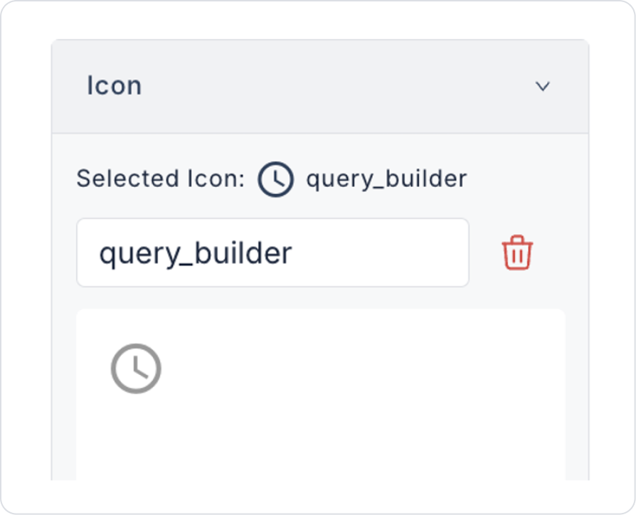
Select the Elements > Display > Icon element from the left panel.
Set the icon shape to Icon > Properties > Icon > “query_builder”.
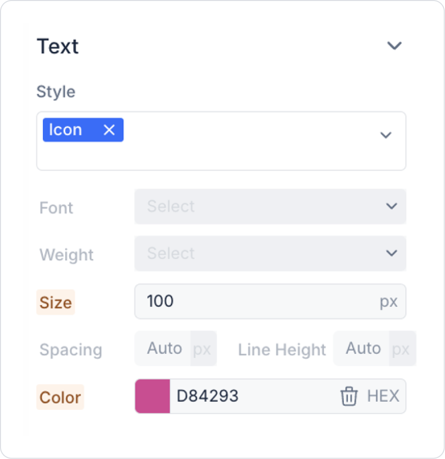
Set the icon size to Icon > Styling > Text > Size > 100 px.
Set the icon color to Icon > Styling > Text > Color > HEX > D84293.
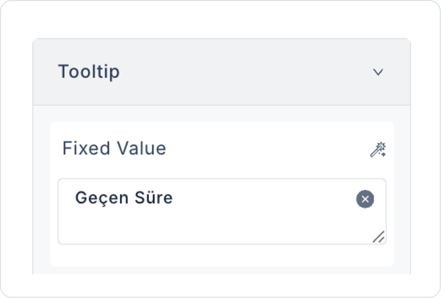
To display the content information you want when hovering over the icon, edit Icon > Properties > Tooltip > Fixed Value > “Time Elapsed”.
Preview
When the application is tested:
Each input field is displayed with its corresponding icon.
Users can understand what to enter in each field without reading the text.
Users can check their input thanks to the password visibility icon.
The registration screen gains a simpler, clearer, and more modern look.
4. Common Properties
Some fields on the Icon element are used commonly across all UI elements. Therefore, detailed explanations of the following properties can be found in the relevant general guide pages:
Choose consistent icon sets. Using icons with the same style on different pages makes the interface look professional.
Consider adding text support to icons. Especially in mobile interfaces, using a short description (“Profile,” “Settings,” etc.) below the icon increases understandability.
6. Limitations
Icons may not convey meaning on their own. Some users may have difficulty interpreting the function represented by an icon alone; text or tooltips should be added when necessary.
Visual style may vary across devices. The size or alignment of the same icon may be perceived differently on web and mobile, so responsive design should be checked.
There are no action triggers other than onClick. The icon element can only execute actions through the click event.


