Kuika's Label element is one of the basic and most frequently used UI elements for presenting text, explanations, or information in the user interface. Static or dynamic information that needs to be displayed to the user in an application is communicated via Label. It can be used to explain form fields, add headings, display contextual messages, or support other UI elements.
The Label element is supported in both web and mobile applications.
1.1. Common Use Cases
Explaining Form Fields: Adding labels such as “Name,” “Phone,” “Department,” etc. to indicate the purpose of fields such as TextInput, Selectbox, and Checkbox within a form.
Dynamic Data Display: Display dynamic content to the user by linking values returned from an action, API results, or fields in a data table with the Symbol Picker. For example: “Total Order Count: 42”
Heading or Subheading Usage: Display page, card, or section headings. For example: “General Information,” “Summary,” “Transaction Details.”
Displaying Status/Warning/Information Messages: Present transaction results, error messages, redirect text, or explanatory information to the user. For example: “Registration completed successfully,” “Please fill in all fields.”
Data Display Within Tables: Use dynamic Labels to display the information in each row within a Table element.
Adding Explanations with Buttons or Icons: Add short explanations next to action buttons. For example: “Delete (cannot be undone)”, “Settings”.
Short Information Labels / Badge-Like Uses: Display small descriptions, category labels, user roles, or status information. For example: “Active,” “Admin,” “New.”
2. Basic Features
Static Text Display: Fixed text can be displayed to the user for explanation, title, information, or direction purposes.
Dynamic Data Display: An action result, data table field, calculated value, or user input can be linked to the Label via the Symbol Picker. For example: “Total Amount: {{OrderTotal}}”
Text Formatting Support: The text on the Label can be customized with font size, color, alignment, boldness, and other style settings.
Flexible Use with Other Elements: It can be used to display explanatory or complementary information within elements such as Button, Icon, Panel, Row, and Horizontal Grid.
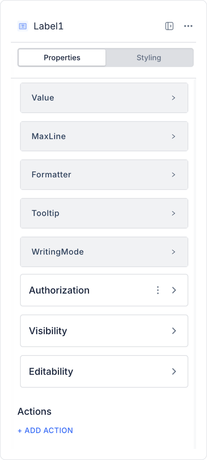
2.1. Label Element Properties
You can configure the properties of the Label element from the Properties panel on the right side.
Value: This is where you can write static text. Using the Symbol Picker, you can dynamically display the value of another element or the result of an action.
Maxline: Ensures that the content is displayed up to a certain number of lines, regardless of the text length.
Writing Mode: Determines the direction in which the text is displayed.
Horizontal: Text is displayed from left to right, in a standard horizontal manner.
Vertical: Text is displayed vertically.
Formatter: Ensures that the content to be displayed is formatted or arranged in a specific way. You can use the following options from the drop-down menu in the Properties panel:
money: Displays the amount of money with 2 decimal places after the comma. (e.g., 27.99)
money-var-1: Displays the amount of money without commas or cents. (e.g., 28)
money-4-decimal: Displays the amount of money with 4 decimal places after the comma. (e.g., 27.9999)
money-tl: Displays the amount of money with the TL symbol added. (e.g., 27,99 ₺)
phone: Displays the phone number in the format (999) 999-9999.
percent: Represents a percentage by adding the percent symbol. (e.g., %25)
fractional-2: Displays a number with 2 decimal places. (e.g., 3.14)
fractional-5: Displays a number with 5 decimal places. (e.g., 3.14159)
datetime: Displays the date and time in DD/MM/YYYY HH:mm:ss format. (e.g., 10/20/2023 14:30:45)
date: Displays the date in DD/MM/YYYY format. (e.g., 10/20/2023)
date-var-1: Displays the date in DD:MM:YYYY format. (e.g., 20:10:2023)
short-date: Displays the date in short format. (e.g., Oct 20)
time: Displays the time in HH:mm:ss format. (e.g., 14:30:45)
time-ago: Shows how long ago a specific date and time occurred. (e.g., 2 days ago)
Tooltip: Specifies the explanatory text that appears when the user hovers over the Label element. For example, hovering over an “Email Address” label could display an explanation such as “Please enter a valid email address.”
For the Label element used in Android applications, not only bold but also other font weight styles are now supported. This provides more flexible and customizable text style options.
The Label element allows users to quickly and clearly perceive information in an application. It also contributes to making your application look more organized and professional by presenting different data types in a specific format.
2.2. Actions That Can Be Added to Elements
The Label element can capture click events in scenarios that require user interaction. This means that Label does not just display text; it can also act like a button and initiate an action.
The only action trigger that can be added to the Label element is onClick.
onClick
It works when the user clicks on the Label. Thanks to this trigger, Label can be used to initiate an action or redirect to another screen.
Usage Scenarios:
Open the details screen when the information text is clicked
Make text such as “Show More” clickable
Trigger a page transition (Navigate)
Open a pop-up
Display a confirmation/warning message to the user
3. How to Use the Label Element?
In this section, we will discuss the end-to-end use of the Label element through an example scenario.
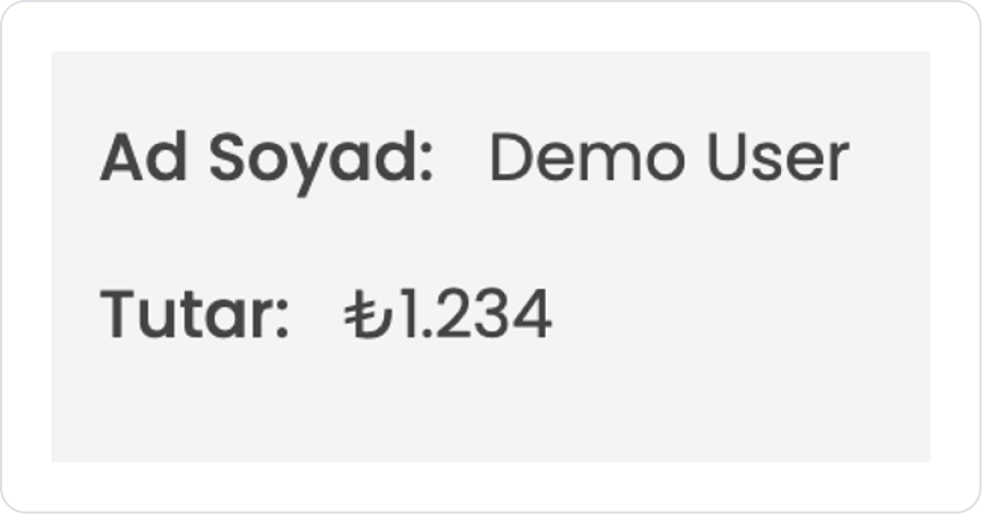
Scenario: Displaying the User's Name and Amount Information
In an application, displaying the logged-in user's First Name Last Name information along with their current balance in the upper right corner of the page allows the user to quickly understand their status within the application. When the user navigates to different pages, this information remains visible and they can access the current data without any additional action.
In the scenario:
First Name Last Name and Balance information are retrieved from the data source.
Each piece of information is displayed with a separate Label element.
Labels are positioned in the upper corner of the page.
The information is provided for reading purposes only and does not involve user interaction.
Step 1 - Defining Actions Required for Dynamic Use
To display data in the interface:
You need to define an action.
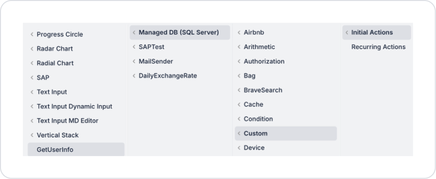
Add a new action from the Actions > New SQL Action tab in the Datasources module.
Action Adding Sample Data (GetUserInfo):
SELECT ‘Demo User’ AS UserName, ‘1234’ AS Price
Step 2 – Adding an Element to the Main Page
Open the UI Design module.
Add the Initial Actions > Custom > Managed Db > GetUserInfo action to the page using the ADD ACTION button.
Go to the Elements section in the left panel and drag and drop the Elements > Container > VerticalStack element onto the page.
To set the spacing within the Vertical Stack, set VerticalStack > Properties > Gap > 6.
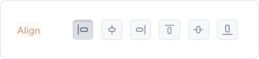
Set the Vertical Stack element to VerticalStack > Styling > Layout > Align > Align Left.
Drag and drop the Elements > Container > HorizontalStack element into the Vertical Stack.
Drag and drop the Elements > Display > Label element into the Horizontal Stack.
When the Label element is added to the Horizontal Stack, it comes with a default Width value of 100 px. To use auto-sizing, you can clear the value in Label > Styling > Layout > Width. In the current scenario, it has been cleared for all Label elements.
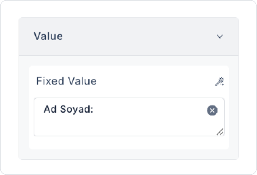
Update the text inside the to Label > Properties > Value > “First Name Last Name:”.
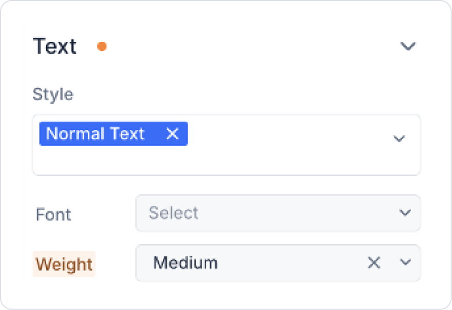
Set the text weight to Label > Styling > Text > Weight > Medium.
Drag and drop the Elements > Display > Label element into the Horizontal Stack next to the First Name Last Name Label element.
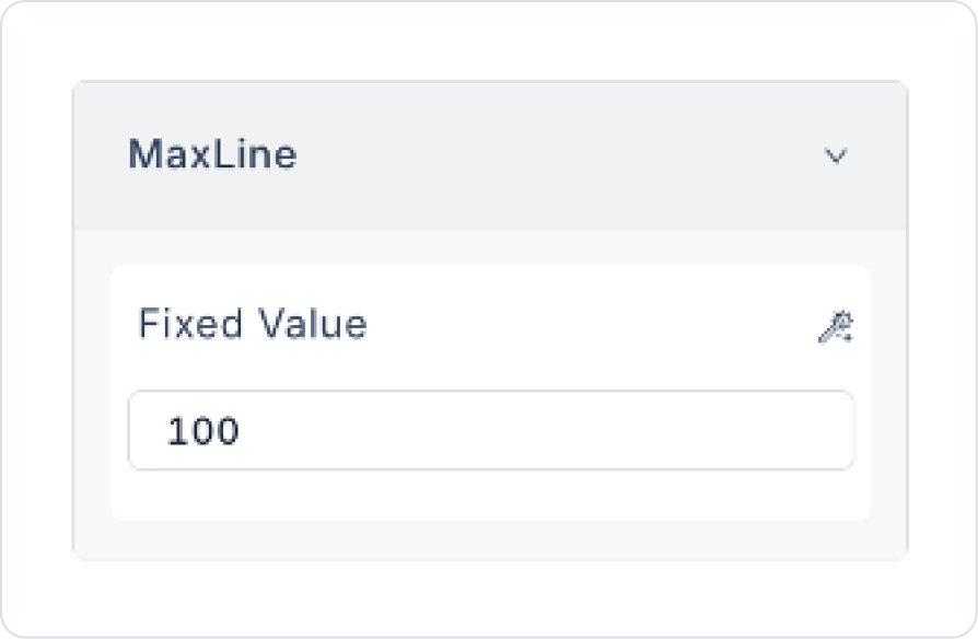
To display long texts on the screen at a specific length, set Label > Properties > MaxLine > 100.
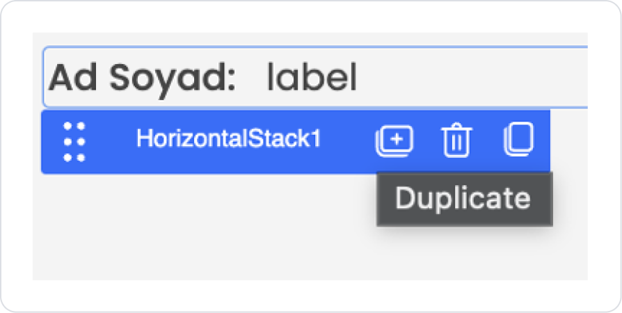
When you click on the blank space next to the Label element, the Horizontal Stack element will be selected. Press Duplicate from the options that open.
Update the First Name Last Name text we just added to Label > Properties > Value > “Amount:”.
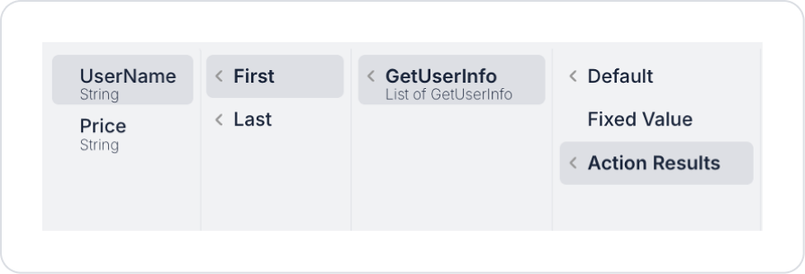
Click on the Label element next to the first name and last name and define Label > Properties > Value > Action Results > GetUserInfo > First > UserName.
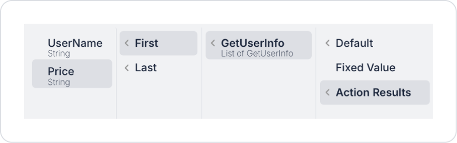
Click on the Label element next to Amount and define Label > Properties > Value > Action Results > GetUserInfo > First > Price.
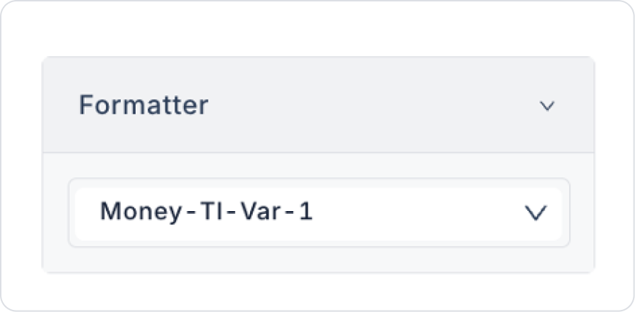
Set the text format to Label > Properties > Formatter > Money- Tl -Var - 1.
Preview
When the application is tested, the time remaining until the end of the active campaign is displayed in real-time as a countdown in the Countdown element in the format hours:minutes:seconds. As the campaign period progresses, the counter automatically decreases, and when the time is up, the countdown resets to zero, clearly indicating to the user that the campaign has ended.
4. Common Properties
Some fields on the Label element are used commonly across all UI elements. Therefore, detailed explanations of the following properties can be found in the relevant general guide pages:
Check for empty values when binding dynamic data. Values coming from the Symbol Picker may be null. In these cases, displaying placeholder-like text improves the user experience.
Use Label to create hierarchy in heading and content layouts. You can configure heading, subheading, and description texts with different font size/weight values.
When using it as explanatory text in form fields, keep it short and clear. Form communication texts should be simple and direct.
6. Limitations
The Label element is designed to display text only. It is not suitable for complex content (images, videos, parsed HTML content, etc.).
Inline editing is not possible on the Label. Users cannot directly modify the text via the Label. For these scenarios, Text Input or EditableTableColumn should be used.
It does not support multiple action triggers. Only the onClick event is available on the Label.


