The Dynamic Input element is a flexible data input element that allows users to choose from existing options or enter a new value if needed. It can work with fixed lists or be dynamically populated by connecting to data sources.
The Dynamic Input element is only supported in web applications.
1.1. Common Use Cases
Fields requiring new values in addition to predefined options
Selections supported by tags, categories, or free text
Input fields connected to dynamic data sources
Forms requiring search and autocomplete
Flexible and user-focused data collection screens
2. Key Features
Selection and free entry support: Users can select options from a list or add a new value.
Working with dynamic data sources: Options can be defined statically or loaded dynamically via data sources and action outputs.
Structure that reduces user errors: Suggestion lists minimize incorrect or inconsistent data entry.
Suitability for flexible form scenarios: Provides versatile usage such as category, tag, and free text-supported fields.
2.1. Dynamic Input Element Properties
You can configure the following settings from the Properties panel:
Value: Defines the default or associated value of the element. This value represents the data coming from the data source or the user.
Placeholder: The informational text that appears when the user has not made a selection or entered a value.
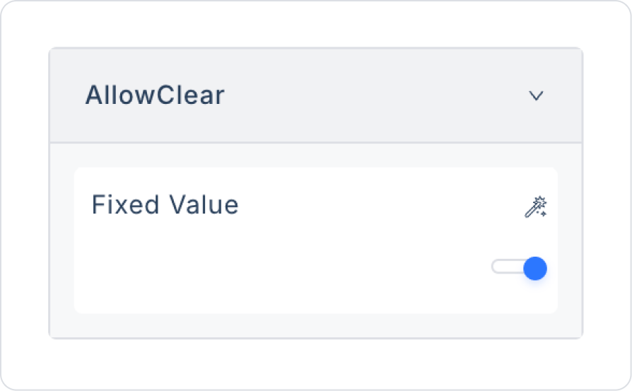
Allow Clear: When enabled, the user can use a delete icon to clear the selected value.
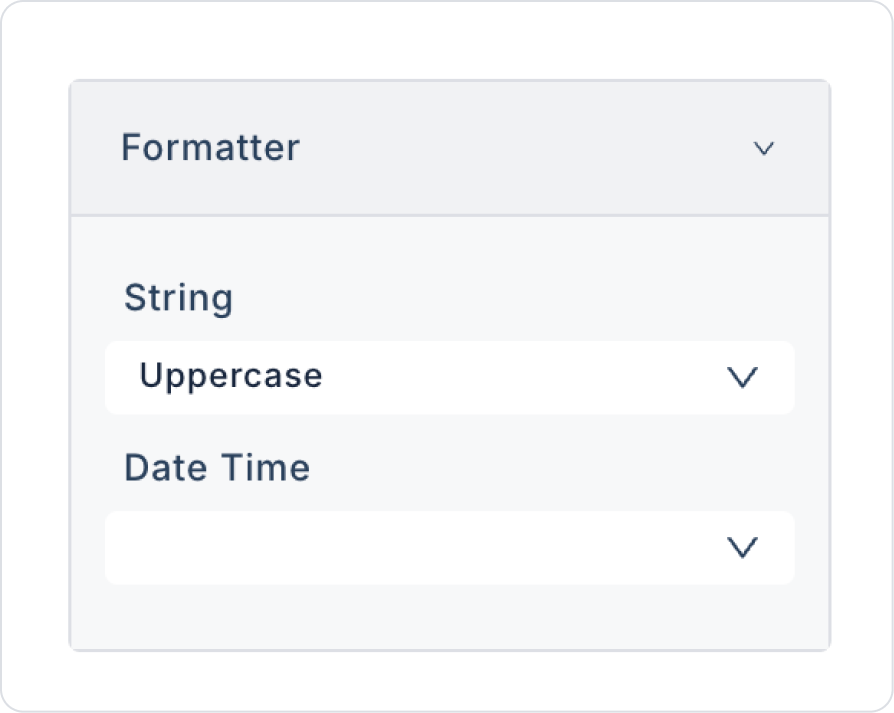
Formatter: This is the formatting function used to determine how the entered value or selected item will be displayed. The following options are available under Formatter:
String: Defines formatting rules for text (string) values.
None: The entered text is displayed as is, without any conversion.
Lowercase: All entered text is automatically converted to lowercase.
Uppercase: All entered text is automatically converted to uppercase.
Date Time: Determines the format in which date and time values will be displayed. The following predefined formats are supported:
DD/MM/YYYY
MM/DD/YYYY
YYYY/MM/DD
YYYY/DD/MM
MM/DD
YYYY/MM
D M Y
YYYY-MM-DD HH:mm
DD-MM-YYYY HH:mm
DD-MM-YYYY HH:mm:ss
mm:ss
Data Type: Defines the data type of the input data. For example, values such as text, number, boolean can be selected.
2.2. Actions That Can Be Added to Elements
The Dynamic Input element supports the onChange trigger based on user interactions. This trigger fires when the user changes the value in the field.
onChange: Triggers when the selected value in the Dynamic Input field changes or when the user enters a new value.
Usage scenarios:
Updating other elements based on the value entered in form fields
Performing dynamic filtering or conditional field display
Validating or formatting the entered value
The onChange trigger enables the Dynamic Input element to be used effectively in flexible and dynamic form scenarios.
3. How to Use the Dynamic Input Element?
In this section, we will cover the end-to-end use of the Dynamic Input element through example scenarios.
Scenario: Recording Purchased Products
In a personal finance or expense tracking application, users want to quickly and conveniently record information about the products they have purchased into the system. The Dynamic Input element ensures that each field is automatically created in the appropriate input type according to its data type in this scenario.
In the scenario:
The user enters the product name as text in the Product Name field.
The Price field only allows numerical input, as appropriate for the numerical data type.
The Purchase Date field is automatically displayed as a date picker, according to the date data type.
When the user fills out the form and clicks the Save button, the entered information is saved to the system in a single action.
Step 1 - Creating the Data Source
Creating a table in the DataSources module:
Go to the Datasources module.
Then go to the Tables tab.
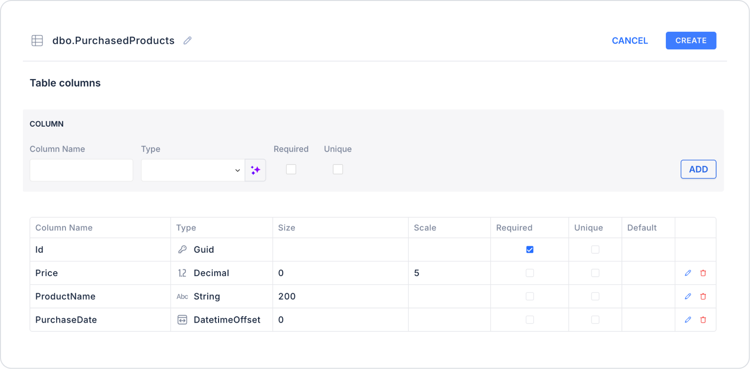
Create a new table named “PurchasedProducts”.
The table structure to be set up is as follows:
Important Field Names:
ProductName: Stores the name of the purchased product. This is the main text field entered by the user on the form.
Price: Represents the purchase price of the product. It is a numeric data type and is used in amount-based calculations.
PurchaseDate: Stores the date and time the product was purchased. It is used in time-based filtering and reporting scenarios.
Step 2 - Defining the Necessary Actions
To display and save data in the interface:
Three actions will be used in this scenario.
The Save Record ready-made system action provided by Kuika is used for recording operations.
Add a new action from the Actions > New SQL Action tab in the Datasources module.
Action that Retrieves Data (GetPurchasedProducts):
SELECT * FROM PurchasedProducts;
When applying, deletePurchasedProducts, rewritePurchasedProducts, and press Enter. This will add the correct schema name before the table name. You will also use the schema name in the following action.
Action that Retrieves Field Data Types (GetFieldType):
SELECT
MAX(CASE
WHEN COLUMN_NAME = ‘Id’ THEN DATA_TYPE
END) AS IdType,
MAX(CASE
WHEN COLUMN_NAME = ‘Price’ THEN DATA_TYPE
END) AS PriceType,
MAX(CASE
WHEN COLUMN_NAME = ‘ProductName’
AND DATA_TYPE IN (‘nvarchar’, ‘varchar’, ‘nchar’, ‘char’)
THEN ‘string’
WHEN COLUMN_NAME = ‘ProductName’
THEN DATA_TYPE
END) AS ProductNameType,
MAX(CASE
WHEN COLUMN_NAME = ‘PurchaseDate’ THEN DATA_TYPE
END) AS PurchaseDateType
FROM INFORMATION_SCHEMA.COLUMNS
WHERE TABLE_SCHEMA = ‘’
AND TABLE_NAME = ‘PurchasedProducts’;
When implementing, update the TABLE_SCHEMA field with your own schema name.
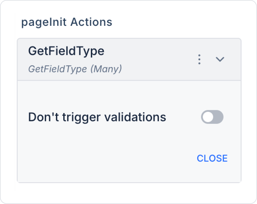
Step 3 - Add Initial Action
Open the UI Design module.
Add the Initial Actions > Custom > Managed Db > GetFieldType action to the page using the ADD ACTION button.
Step 4 - Adding and Configuring Elements
Drag and drop the Elements > Text Input > DynamicInput element onto the page.
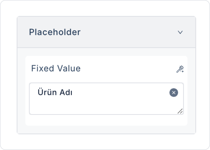
For the placeholder text, enter DynamicInput > Properties > PlaceHolder > “Product Name”.
To clear the content, set DynamicInput > Properties > AllowClear > Open.
To make all names uppercase, set DynamicInput > Properties > Formatter > Uppercase.
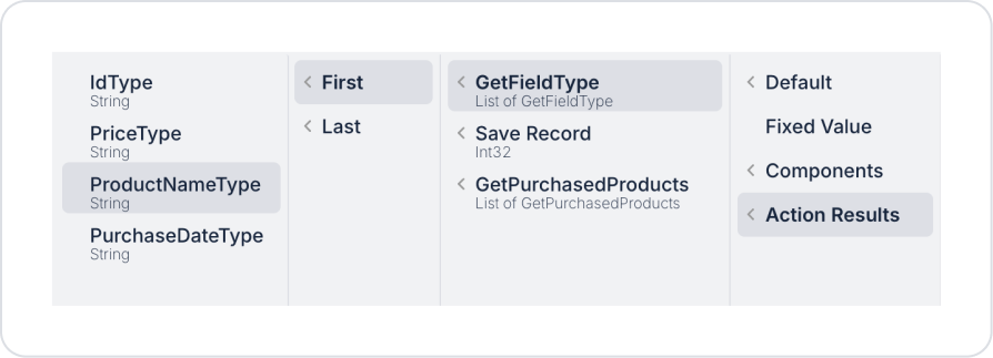
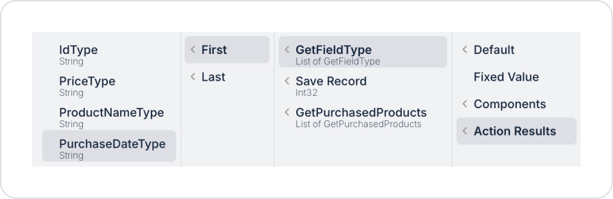
To enable dynamic input behavior based on data type, set the DynamicInput > Properties > DataType field to Action Result > GetFieldType > First > ProductNameType.
Add a new Elements > Text Input > DynamicInput element to the page.
For the placeholder text, enter DynamicInput > Properties > PlaceHolder > “Product Price”.
To clear the content, set DynamicInput > Properties > AllowClear > Open.
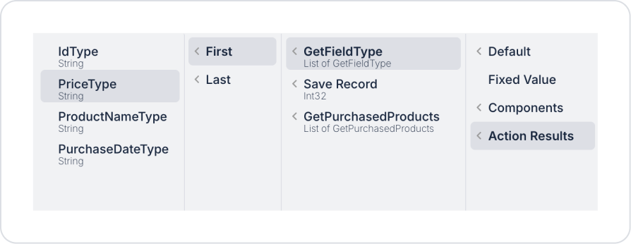
To enable dynamic input behavior based on the data type, set the DynamicInput > Properties > DataType field to Action Result > GetFieldType > First > PriceType.
Add the last Elements > Text Input > DynamicInput element to the page.
For the placeholder text, enter the text “Purchase Date” in DynamicInput > Properties > PlaceHolder.
To clear the content, set DynamicInput > Properties > AllowClear > On.
To enable dynamic input behavior based on the data type, set the DynamicInput > Properties > DataType field to Action Result > GetFieldType > First > PurchaseDateType.
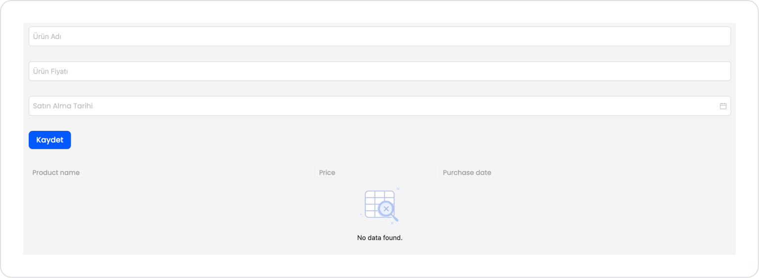
At this stage, the page should look as follows.
Drag and drop the Elements > Navigation > Button element onto the page.
Edit the Button text to Button > Properties > Label > “Save”.
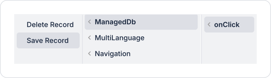
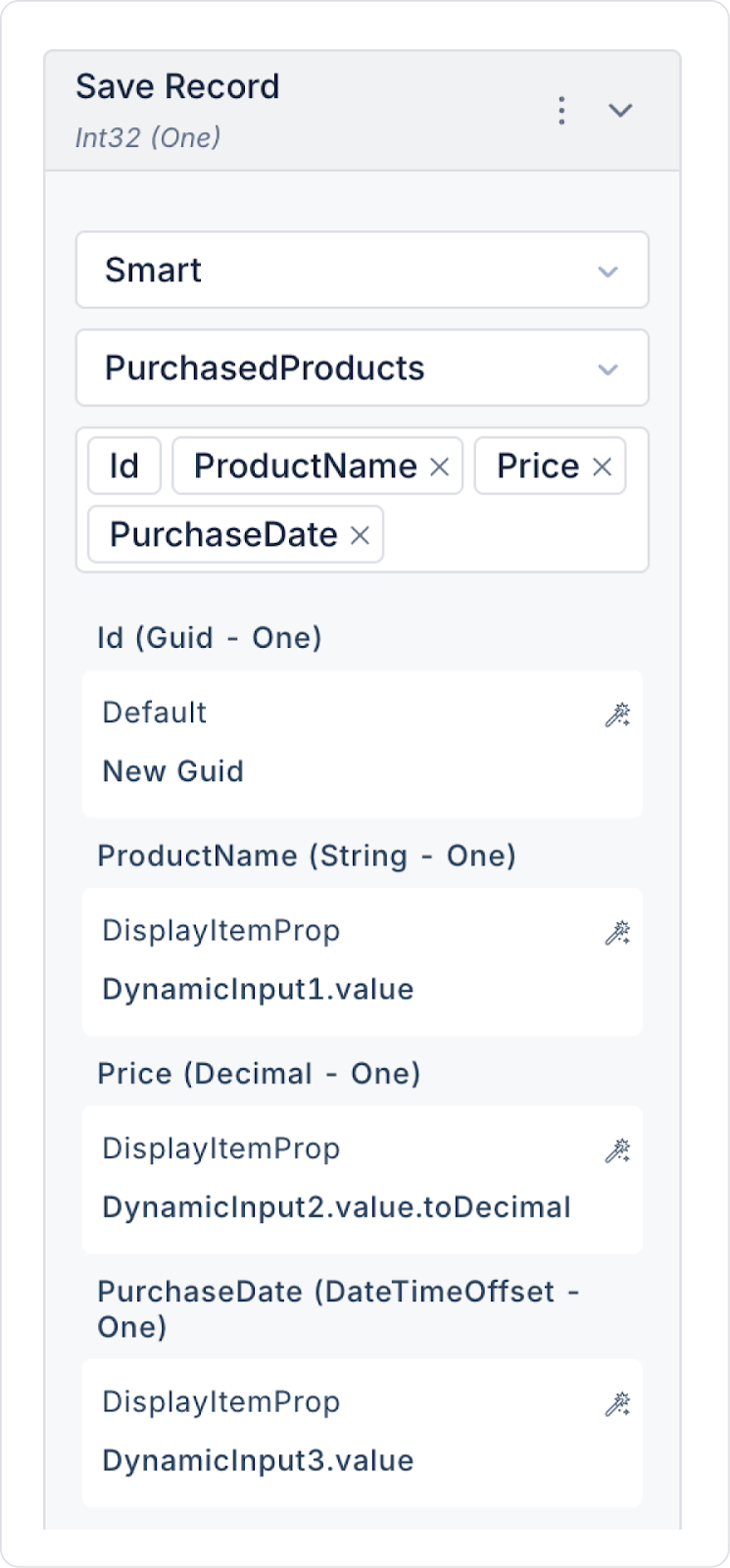
Add the save action to the Button element: Button > Add Action > onClick > ManagedDb > Save Record.
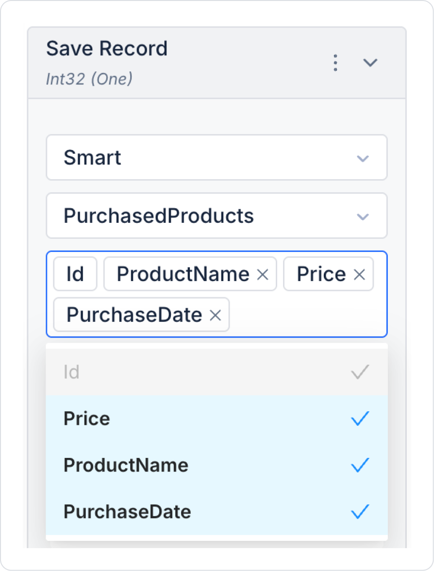
In the Save Record action, select the PurchasedProducts table. In the column names field that opens, select all column names.
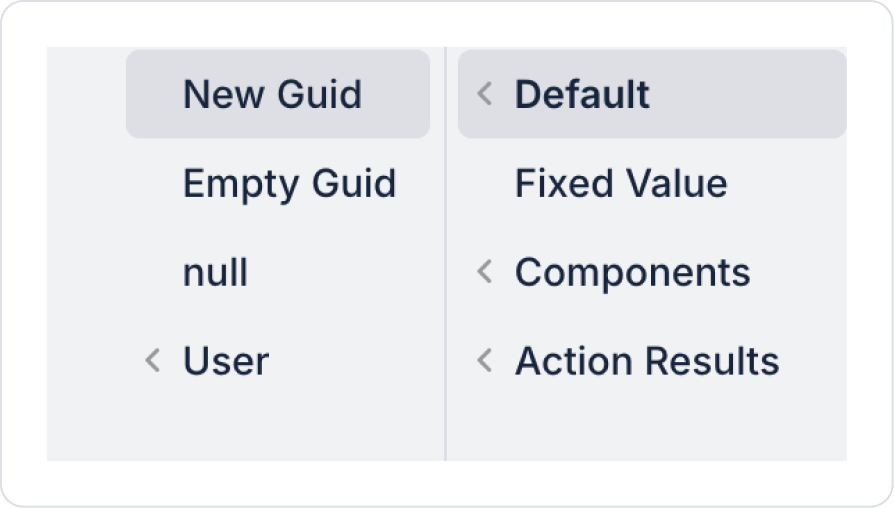
Define the Id field as Default > New Guid.
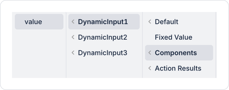
Define the ProductName field as Components > DynamicInput1 > value.
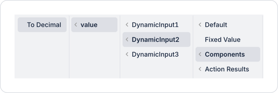
Define the Price field as Components > DynamicInput2 > value > To Decimal.
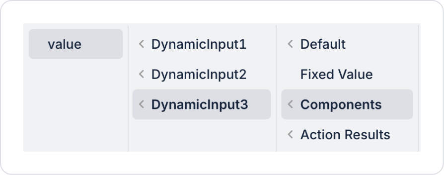
Define the PurchaseDate field as Components > DynamicInput3 > value > To Decimal.
As a result of these definitions, all fields in the Save Record action should be as follows.
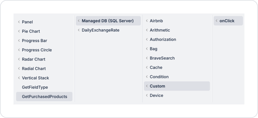
Add the action that fetches the records added to the Button element: Button > Add Action > onClick > Custom > ManagedDB > GetPurchasedProducts.
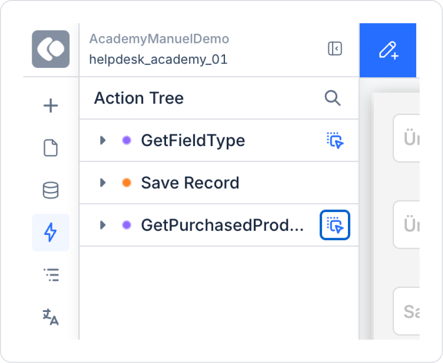
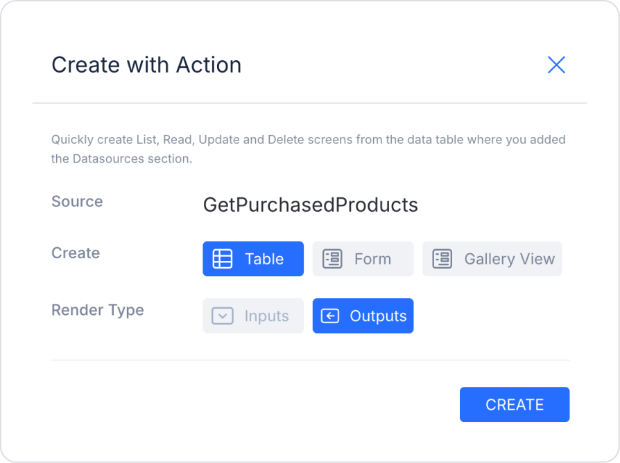
From the Action Tree area on the left side panel, click and hold the blue icon next to the GetPurchasedProducts action and drag it onto the page.
Make the following definition on the screen that opens.
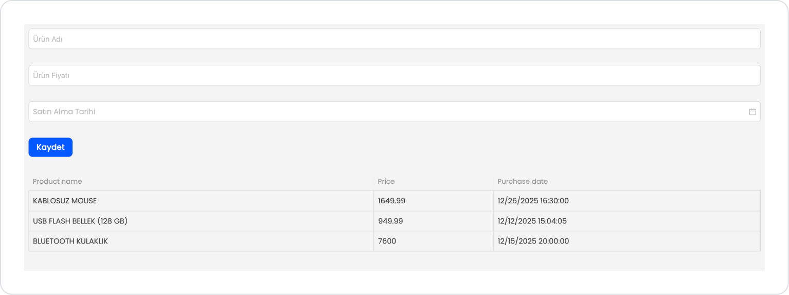
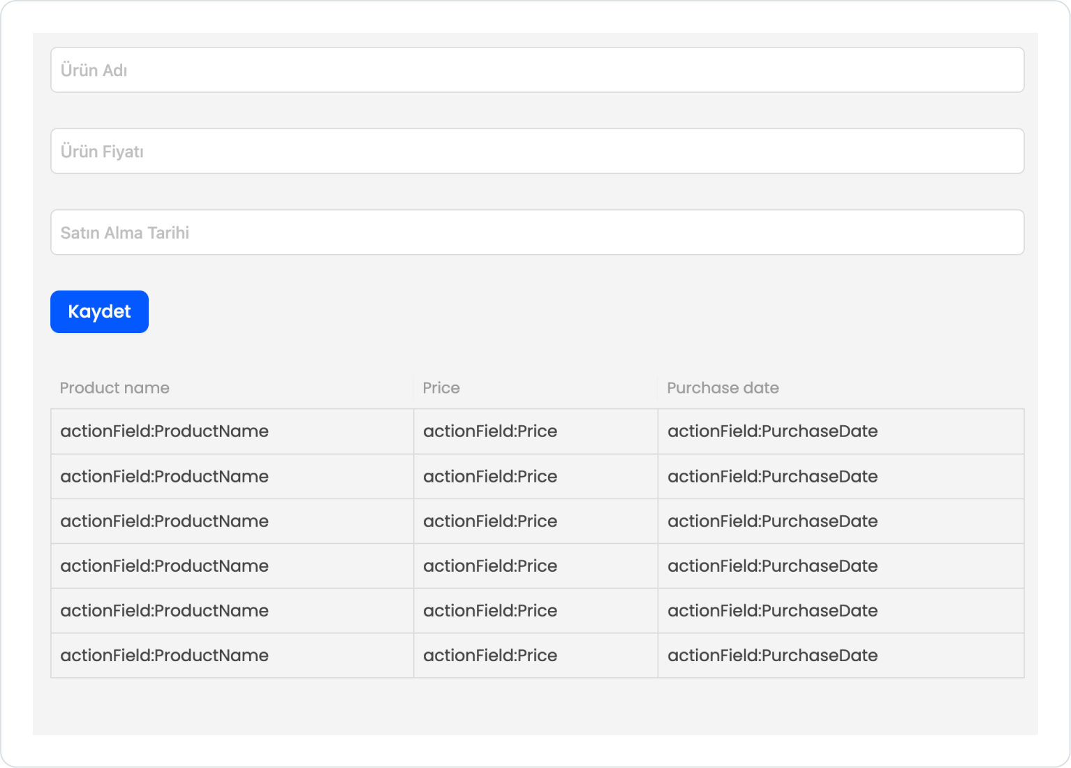
The page should now look like this.
Preview:
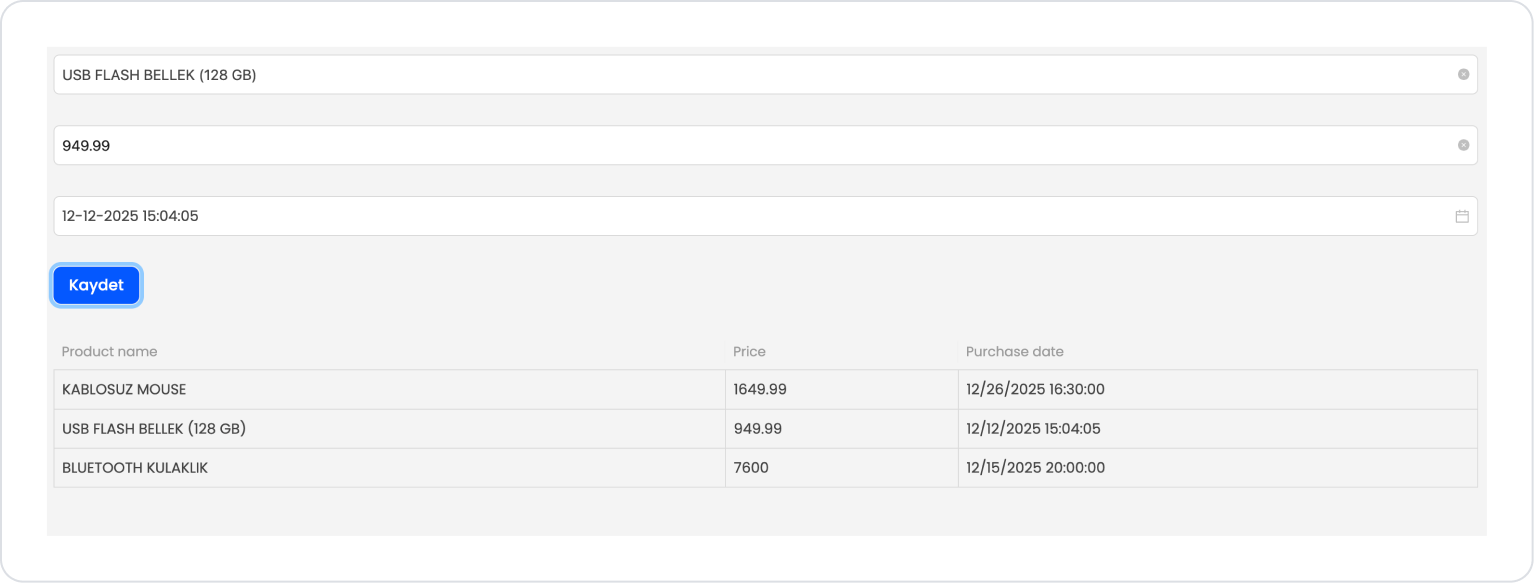
When the application is tested, product information can be easily entered using the form created with Dynamic Input. The product name field is displayed appropriately for text entry, while the price field is automatically configured to allow only numerical data entry. The purchase date field is presented as a date picker that supports date and time selection.
When the user fills out the form and clicks the Save button, the entered product information is added to the table, and the list in the lower section is updated instantly. This ensures a simple and consistent data entry experience for the user by automatically determining the input types for fields with different data types.
4. Common Properties
Some fields on the Dynamic Input element are used in common across all UI elements. Therefore, detailed explanations of the following properties can be found in the relevant general guide pages:


