
The Web View element is a UI element that enables the direct display of external or internal web content within an application. Users can view web pages, explore content, or interact with web-based forms without leaving the application.
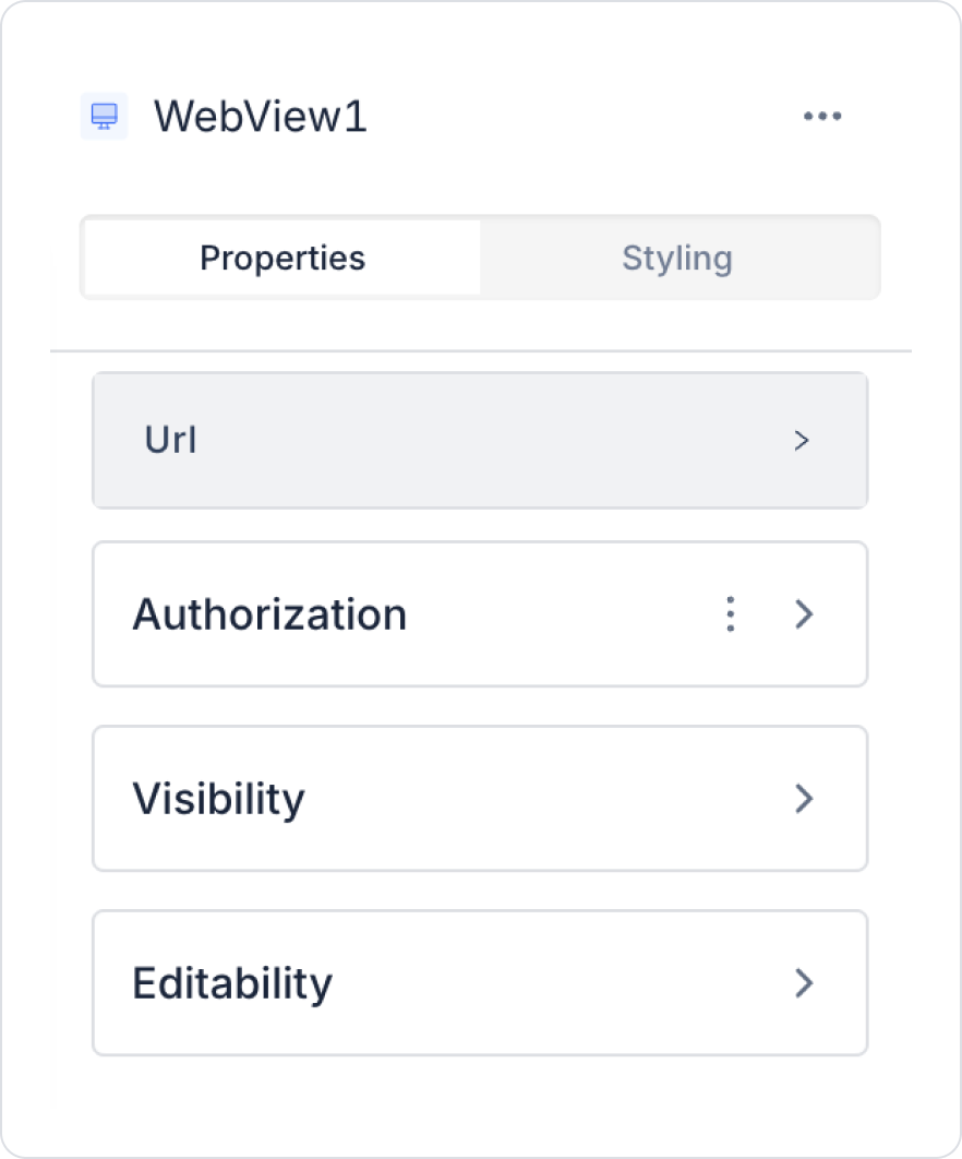
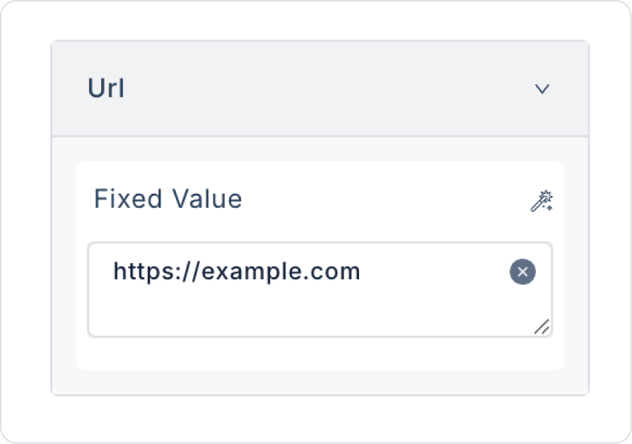
You can configure the Web View element’s properties from the Properties panel on the right.
The Web View element enhances the user experience by allowing users to access external links from within the application.
The Web View element does not support directly adding actions (Add Action). The element does not have onClick, onChange, or similar events, and there is no action trigger in the right-hand Properties panel.
The Web View is used solely for displaying web content. Any actions requiring processing, redirection, or interaction must be managed through the Web View content’s own structure or other UI elements within the application.
In this section, we will cover the end-to-end usage of the Web View element through an example scenario.
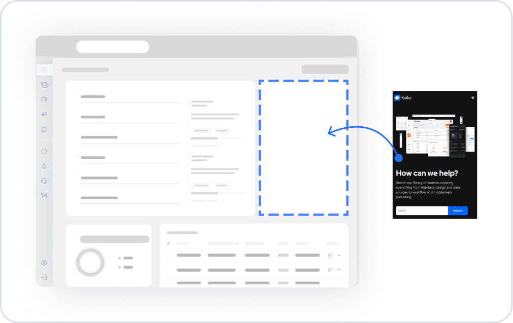
Scenario: Using the Web View
The Web View element allows an external website to be displayed within the application. In this scenario, the user can view a specific web page without leaving the application.
For example, a URL is defined within the Web View to display training documents to the user. When the page loads, the relevant website opens directly within the app, and the user can review the content from there.
Start on the home page:
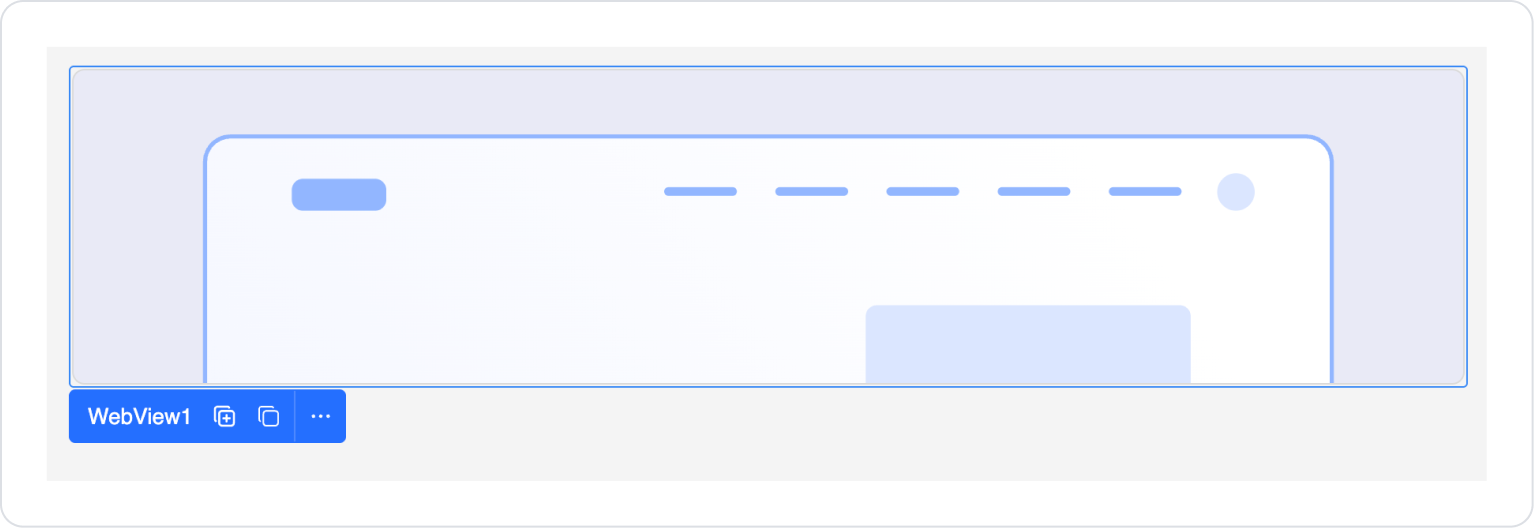
With the Web View element, external websites can be displayed within the application, and users can access the relevant content without leaving the app.
Some fields on the Web View element are shared across all UI elements. Therefore, detailed descriptions of the following properties can be found in the relevant general guide pages:

