The email element is a special input component that allows users to enter data in a valid email address format. Unlike standard Text Input elements, it automatically checks that the entered value complies with the email format.
The Email element is used to ensure reliable data entry in user registration forms, contact forms, notification settings, and identity verification scenarios. It prevents incorrect or incomplete email entries by requiring the “@” and “.” characters, thereby improving data quality.
The Email element is supported in both web and mobile applications.
1.1. Common Use Cases
User registration and login forms
Contact and feedback forms
Email notification settings
Password reset and verification processes
CRM and user management screens
2. Key Features
Automatic email format validation: The system checks whether the entered value is in a valid email address format.
Prevention of invalid entries: Entries that do not contain the “@” and “.” characters are considered invalid.
Compatible with form validation: Provides reliable data in form submit processes when used with validation rules.
Dynamic value binding support: Values can be entered statically or dynamically linked via the Symbol Picker using state, variable, or action outputs.
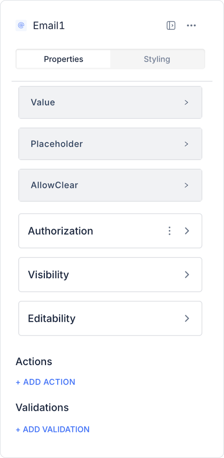
2.1. Email Element Properties
You can configure the following settings from the Properties panel:
Value: Represents the current email address entered into the Email element or retrieved from external sources. When the user enters an email address or information is pulled from a database, this value is displayed in the Email element.
Placeholder: The placeholder text displayed when the user has not entered any data (e.g., “Enter your email address”).
Allow Clear: Allows the user to quickly clear the data entered into the Email element using an icon.
2.2. Actions That Can Be Added to the Element
The Email element supports multiple triggers (events) based on user interactions. These triggers allow actions to be controlled based on the email input.
onChange: Triggers every time the user changes the value in the email field.
Usage scenarios:
Transfer the entered email address to state or variables
Performing instant validation based on the email format
Making buttons or form fields active/inactive
onPressEnter: Triggered when the user presses the Enter key in the email field.
Use cases:
Initiating the form submit process
Triggering login or registration actions
Redirecting the user to the next step
onBlur: Triggered when the user loses focus from the email field (moves to another field).
Usage scenarios:
Perform validation when leaving the field
Display a warning for incorrect email entries
Run the control mechanism when user interaction is complete
3. How to Use the Email Element?
In this section, we will cover the end-to-end use of the Email element through example scenarios.
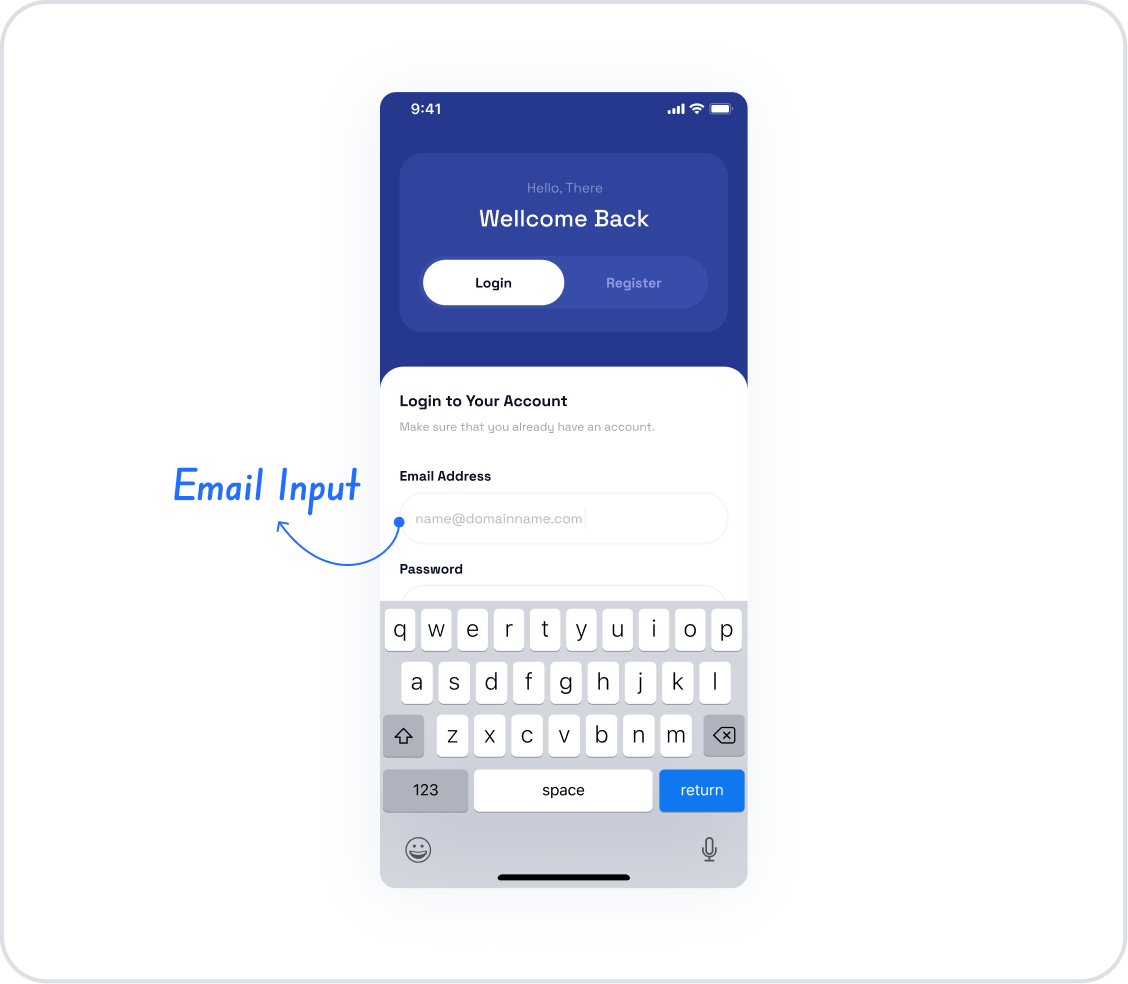
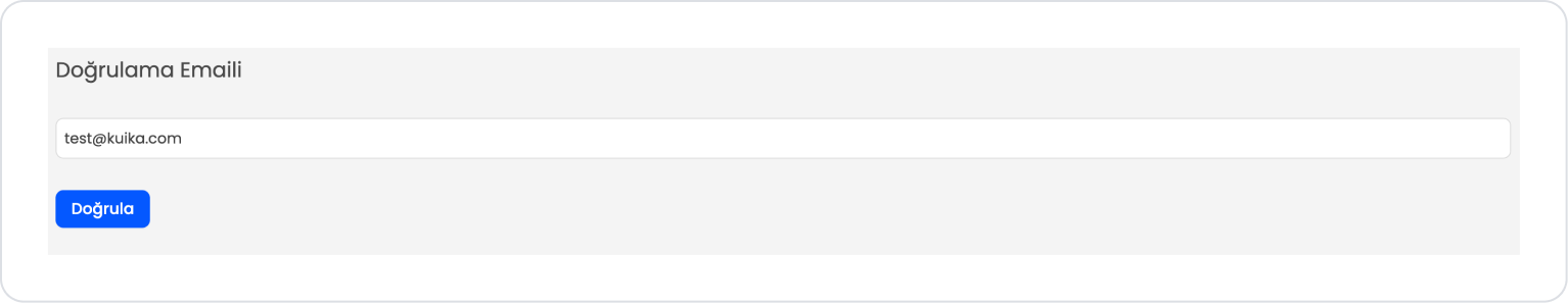
Scenario: Verification Email
In an application, it is crucial for users' email addresses to be correct and valid for communication and verification processes. In this scenario, the Email Input element automatically verifies the email address entered by the user.
In the scenario:
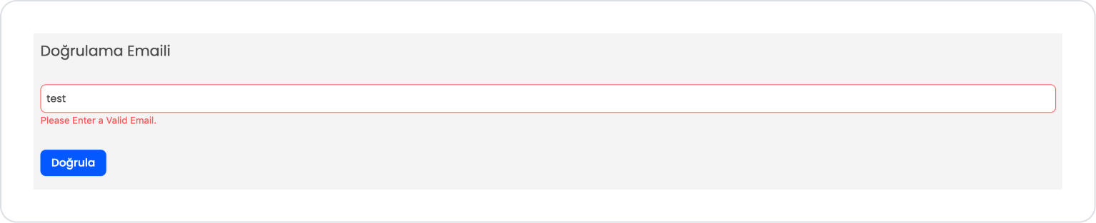
The user enters their email address in the Verification Email field.
If the entered value does not match the email format, the input field is visually highlighted and a warning message is displayed to the user, indicating that they must enter a valid email address.
When the user enters a valid email address, the verification error is automatically removed.
When the Verify button is clicked, only valid email addresses are allowed to proceed.
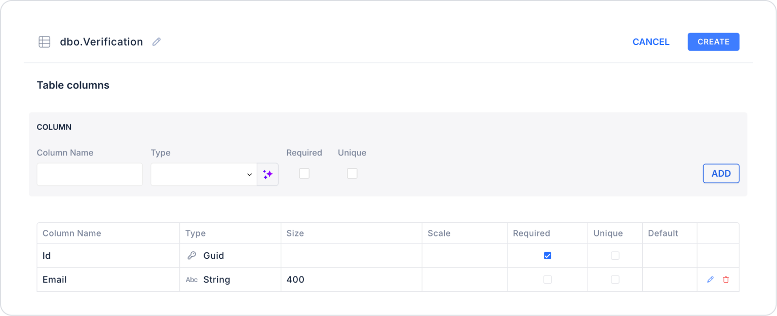
Step 1 - Creating the Data Source
Creating a table in the DataSources module:
Go to the Datasources module.
Then go to the Tables tab.
Create a new table named “Verification”.
The table structure to be set up is as follows:
Important Field names:
Email: Holds the email address to be verified. This field is obtained from the user via the Email input and is subject to format validation.
Step 2 - Adding and Configuring Elements
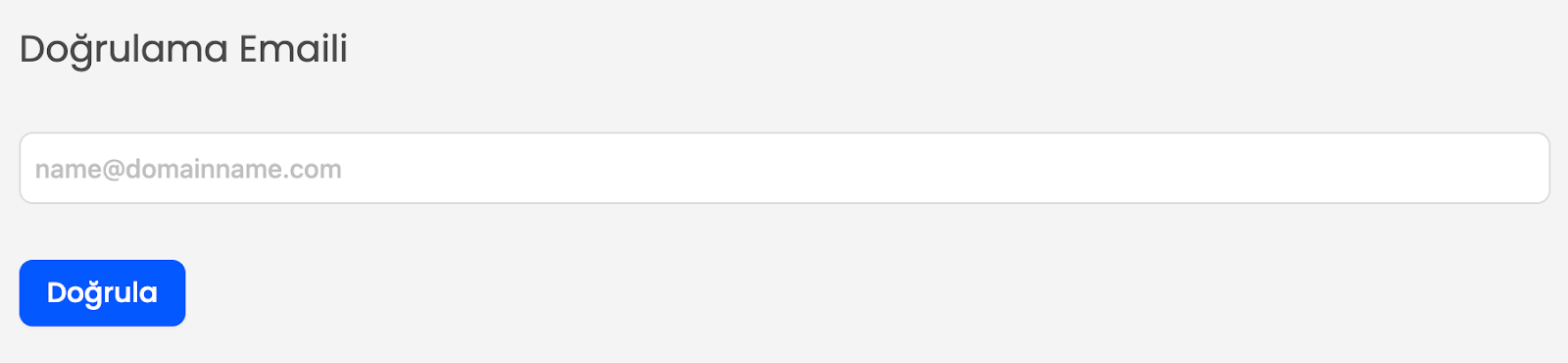
Drag and drop the Elements > Display > Label element onto the page.
Edit the text to Label > Properties > Value > “Verification Email”.
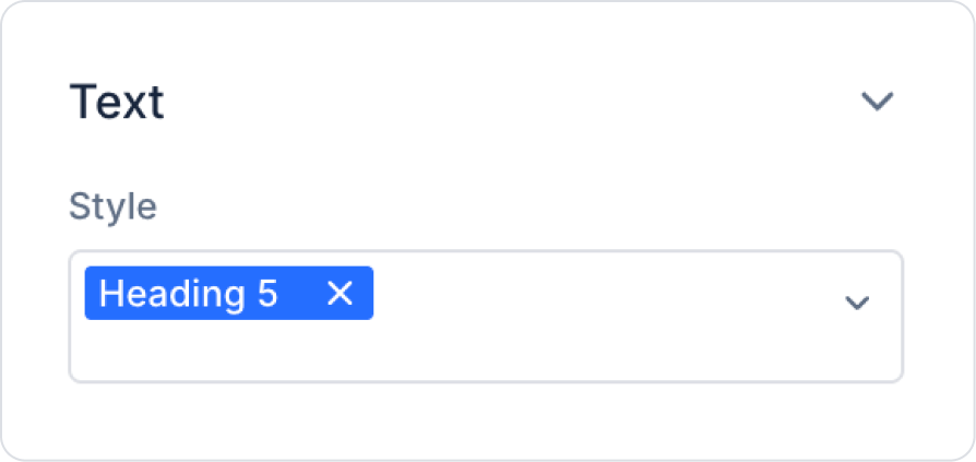
Set the font to Label > Styling > Text > Style > Heading 5.
Drag and drop the Elements > Text Input > Email element onto the page.
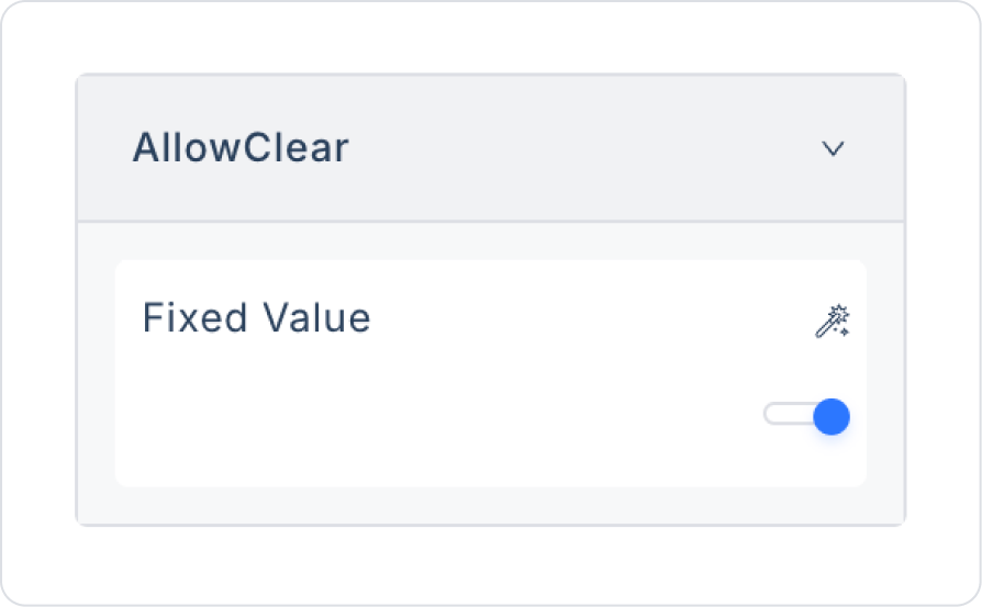
Set Email > Properties > AllowClear > Open to clear the content.
Drag and drop the Elements > Navigation > Button element onto the page.
Edit the Button text to Button > Properties > Label > “Verify”.
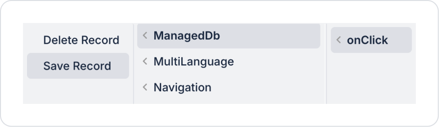
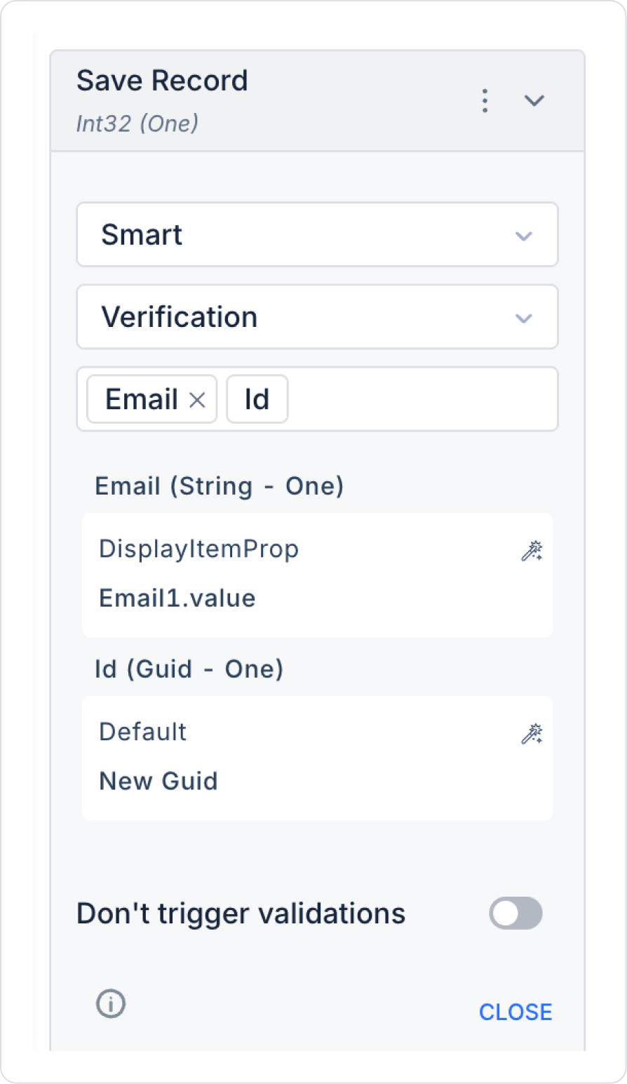
Add the save record action to the Button element: Button > Add Action > onClick > ManagedDb > Save Record.
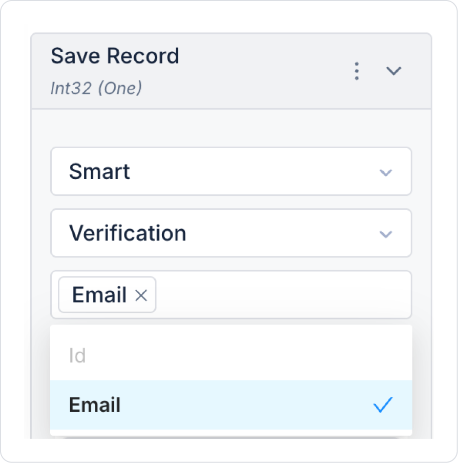
In the Save Record action, select the Verification table. In the column names field that opens, select all column names.
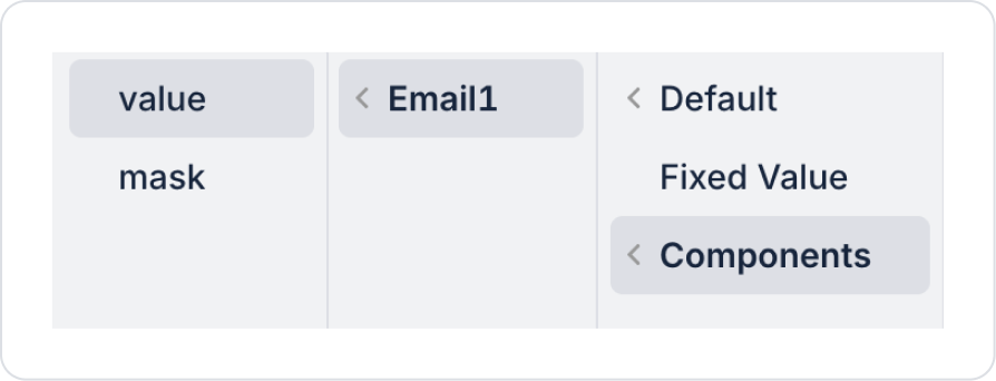
Define the Email field as Components > Email1 > value.
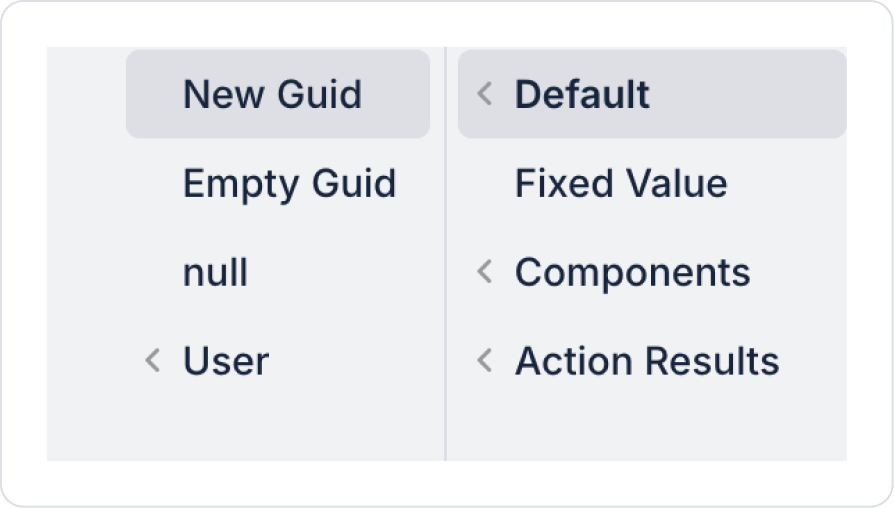
Define the Id field as Default > New Guid.
As a result of these definitions, all fields in the Save Record action should be as follows.
The page should look like this in its final state.
Preview:
When the application is tested, if an invalid email address is entered in the Verification Email field and the verification process is started, the input field enters a warning state. In this case, an error message is displayed to the user indicating that they must enter a valid email address, and the process is not performed.
When the user enters the email address in the correct format, the verification error is automatically removed, and the process can continue smoothly with the Verify button. Thanks to this structure, email information is obtained through a controlled verification process that guides the user and prevents incorrect entries.
4. Common Properties
Some fields on the Email element are used in common across all UI elements. Therefore, detailed explanations of the following properties are provided in the relevant general guide pages:


