The FlexGrid element lists automatically refreshed data in card-style panels, automatically adjusting to the screen width to create a neat and comparable grid view.
If you want to display multiple items in your application—such as product lists and image galleries—in a flexible layout that automatically adapts to the screen width, the most powerful solution is to use the FlexGrid element.
First, write your code named DailyExchangeRate in the C# Functions section under the Development heading within the Data Source module.
In the UI Design module, add a Recurring Action to your page via the Add Action section. Set the triggerOnPageInit field to “On” so that it runs when the page loads. Use Add Action to link the DailyExchangeRate action.
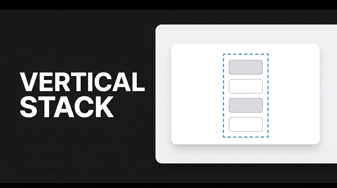
Next, drag the FlexGrid element onto your screen and connect your action to the DataSource field. Change the Width value of the Panel element you’ll drag into the FlexGrid to 200 px in the Styling section and center it vertically. Set the background to “White Background” in the Style section. Change the Radius value in the Border section to 15 px. Add a Vertical Stack element and drag two Label elements into it. For the first Label element, set the Field to Display in the Value section to “CurrencyName”; for the second Label, set it to “Value.”
With this structure, users can compare different exchange rates on a single screen and quickly access rate information with a clean, organized layout.