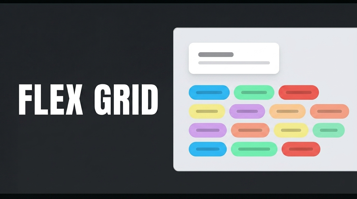
The Horizontal Grid element saves screen space by listing similar product and campaign cards in a compact, horizontal, scrollable, and auto-scrolling layout.
If you want to display multiple types of content—such as similar product recommendations, campaign banners, or short information cards—in a compact layout while saving screen space in your app, the most practical solution is to use the Horizontal Grid element. This element lists your content in a horizontal layout, presenting it on your screen with a modern design.
In this video, we’ll examine an example of using the Horizontal Grid element through the “Show Similar Products with Campaigns” scenario. First, create two table structures named BaseProduct and CampaignSimilarProducts, as shown on the screen. Then, create the action from the New SQL Action field, add “dbo.” before your table name, test it, and save it. Perform the same steps for the “GetBaseProduct” and “GetCampaignSimilarProducts” actions.
Switch to the UI Design module. From the “Add Action” section, connect your Initial Action queries—which will retrieve the data—to the page. For the “BaseProductID” field, follow the steps. Add the “Panel” element to your page. In the ‘Styling’ section, set the “Width” value to 70%. In the Style section, select “White Background” for the background. Set the Radius value in the Border section to 45 px; center it vertically and horizontally. Drag and drop a Row element into the Panel. From the Desktop section, select a 2-column layout. Align the first Label element to the left and the second to the right using the Align field in the Layout section. Add a Label element inside each one. Set the second Label element to “Heading 6” in the “Style” section. Add an Image element below the Label, click the “Column” field, and center it using the “Align” field under “Styling.” Resize the Image element by setting its “Width” and “Height” values to 232 px. Add a Row element below the Image. Set it to a single column in the “Desktop” section. Align it to the right using the “Align” field in “Styling,” and add a “Horizontal Stack” inside it. Drag and drop two Label elements. In the ‘Width’ field under “Styling,” delete the default value of 100 px for both of them. Then, add a “Horizontal Grid” element to the page. Connect your query to this element via the “DataSource” field. You can use `SlideToScroll` to set the number of products displayed on the screen and `SlideToShow` to set the number of products to display. Enable the `Swipe` property to activate the swipe-to-switch feature. To have the cards scroll automatically, enable the `AutoPlay` property. Enter your `AutoPlaySpeed` value. Center the `Horizontal Grid` element both horizontally and vertically.
Copy the Panel element group you prepared for the main product. Click on the Horizontal Grid element and paste it there. Adjust the size of the Image element appropriately using the Styling and Layout sections so that it matches the on-screen layout. Add a Label element and center it using the Styling panel. Add another Label element next to the bottom Label. Set the color of the first bottom Label using the Text Color field and make the appropriate selection in the Decoration section. First, define the values for the Label and Image elements in the structure we created at the top through the “Value” fields in the “Properties” panel, respectively. Then, for the structure below, make the selections in the “Field to display” section within “Value” in the correct order.
When the application is tested, a product showcase will appear consisting of the featured main product card in the upper section and other product cards listed side by side in the lower section. The main product card clearly displays the product name, stock status, large product image, and price information, while the cards in the lower section show campaign rates, stock status, product images, and discounted prices together.