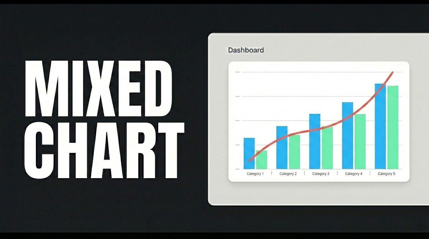
A Mixed Chart combines different chart types (Bar, Line, Point) on a single axis to compare multiple metrics (sales volume, growth trends, target points) at the same time.
Mixed Chart, the most professional solution for analyzing relationships between different data types at a glance, combines chart types such as Bar, Line, and Point on a single axis, allowing you to visualize sales volumes, growth trends, and critical target points simultaneously.
To get started, define the table in the Data Sources module as shown on the screen. Then create the InsertGrowthProjections and GetGrowthProjections actions; when applying them, delete the “GrowthProjections” part, retype it, and press Enter. This step ensures that the correct schema name is prepended to the table name. Click the Test button for each action.
Switch to the UI Design module and, to ensure all data layers load synchronously when the page opens, link the GetGrowthProjections action to the Initial Action using Add Action. Drag a Label and a Mixed Chart element onto the page. From the Mixed Chart section in the Properties panel, add two more Line elements. In the Options section, define the Action and X Axis Field. Then, fill in the Action, X Axis Field, and Axis Value Field fields for Line1, Line2, Line3, and Point, respectively; select your colors from the Color field. Finally, fill in the Value field of the Label element and set it to Heading 2 in the Text field of the Styling panel.
When you click the Preview button, you’ll clearly see the relationships between different metrics on a single screen; with the Mixed Chart, you’ll be able to easily simplify complex analyses.