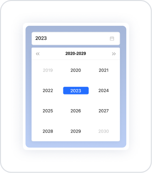
Kuika's Year Picker element is a selection element that allows users to select only the year. Users can either enter the year manually or easily select it using the year picker. It is ideal for year-based data processing, reporting screens, filtering, or annual planning processes. The Year Picker prevents incorrect data entry by ensuring the correct year is selected, simplifying the user experience.
The Year Picker element is supported in both web and mobile applications.
1.1. Common Use Cases
Year-based reporting screens: Used in situations where only year selection is sufficient, such as financial reports, sales performance, annual analyses, or KPI tracking.
Annual leave, contract, or membership start year selection: Used when users need to select the year a process began or is valid.
Academic year selection: Used in student tracking systems to retrieve information such as enrollment years or graduation years.
Graph and table filtering: Often preferred on screens where graphs or tables need to be automatically updated with data for the relevant year when the user selects a year.
Year determination in report or document creation processes: Used in official document creation processes such as invoice year, declaration year, or activity report year.
2. Key Features
Manual entry or year selector support: Users can specify the year either by typing it into a text box or by selecting it from a drop-down list.
Format compatibility: The selected year is returned only in the “YYYY” format to be compatible with the backend or other components.
Clear feature: Allow Clear enables users to reset the selected year with a single click.
Performing instant operations with the onChange trigger: When the year changes, tables, charts, lists, or forms can be automatically updated.
2.1. Year Picker Element Properties
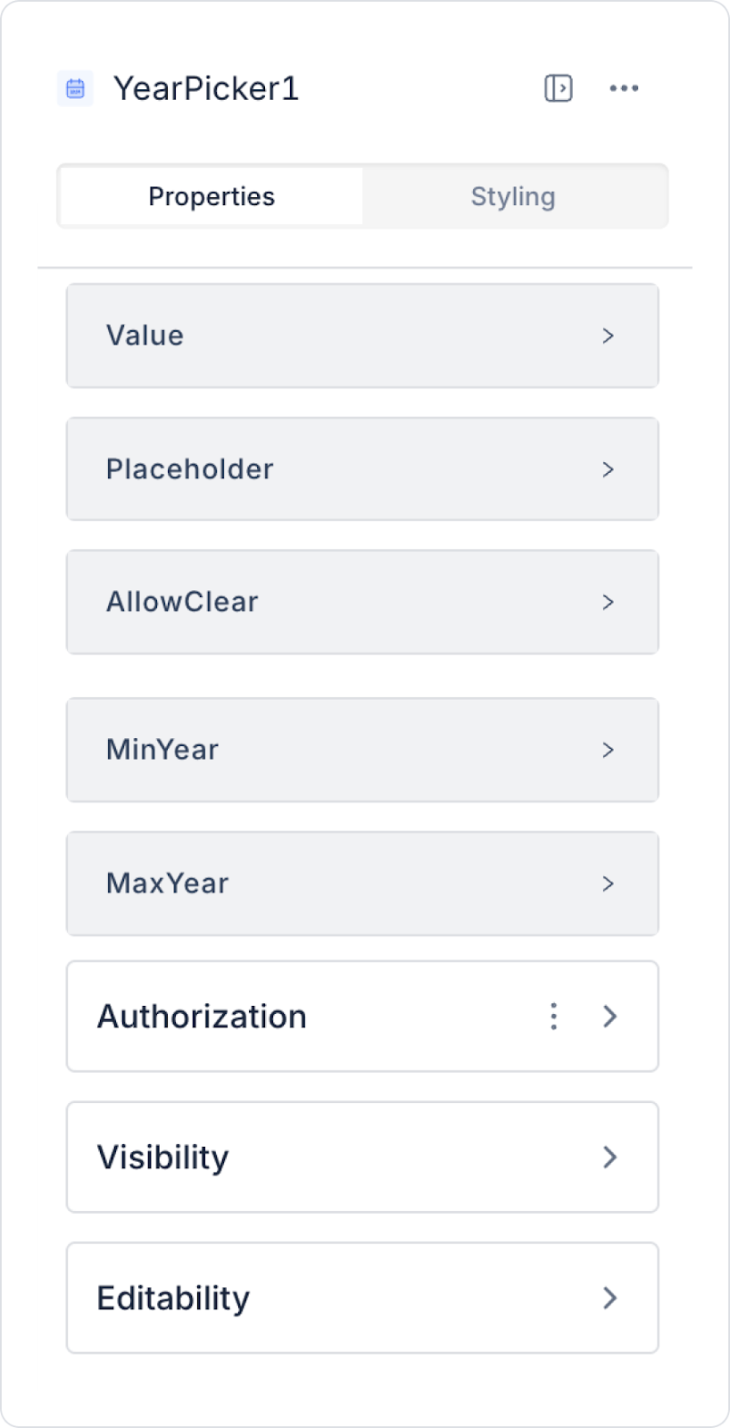
You can configure the properties of the Year Picker element from the Properties panel on the right side.
Value: You can set a static year value or assign dynamic values using the Symbol Picker.
In Android applications, if no year is selected for the Year Picker element, the element may be displayed empty (Null) or with an unspecified value.
Placeholder: Specifies the placeholder text displayed when the user has not made a selection. For example, “Select Year”.
Allow Clear: Allows the user to clear the selected year with a single click. The entry can be reset using the Delete (X) icon that appears in the right corner.
Min Year: Specifies the lowest year value the user can select.
Max Year: Specifies the highest year value the user can select.
2.2. Actions That Can Be Added to Elements
The Year Picker element supports the onChange event so that it can trigger an action when the user selects a year or changes the current year. Thanks to this trigger, operations such as data filtering, list updating, or calculations based on year changes can be performed automatically.
onChange
Triggers when the user makes a selection in the year field or changes the current year.
Usage Scenarios:
Filtering tables or lists based on the selected year (e.g., “Show only 2024 records.”)
Reloading year-based reports
Updating data in Chart elements based on the selected year
Changing dynamic fields in forms based on the selected year
Fetching data for that year by making API calls
Refreshing annual summary data in the dashboard
The Year Picker element only supports the onChange action; there are no other triggers.
3. How to Use the Year Picker Element?
In this section, we will cover the end-to-end use of the Year Picker element through example scenarios.
Scenario: Displaying Annual Expenses
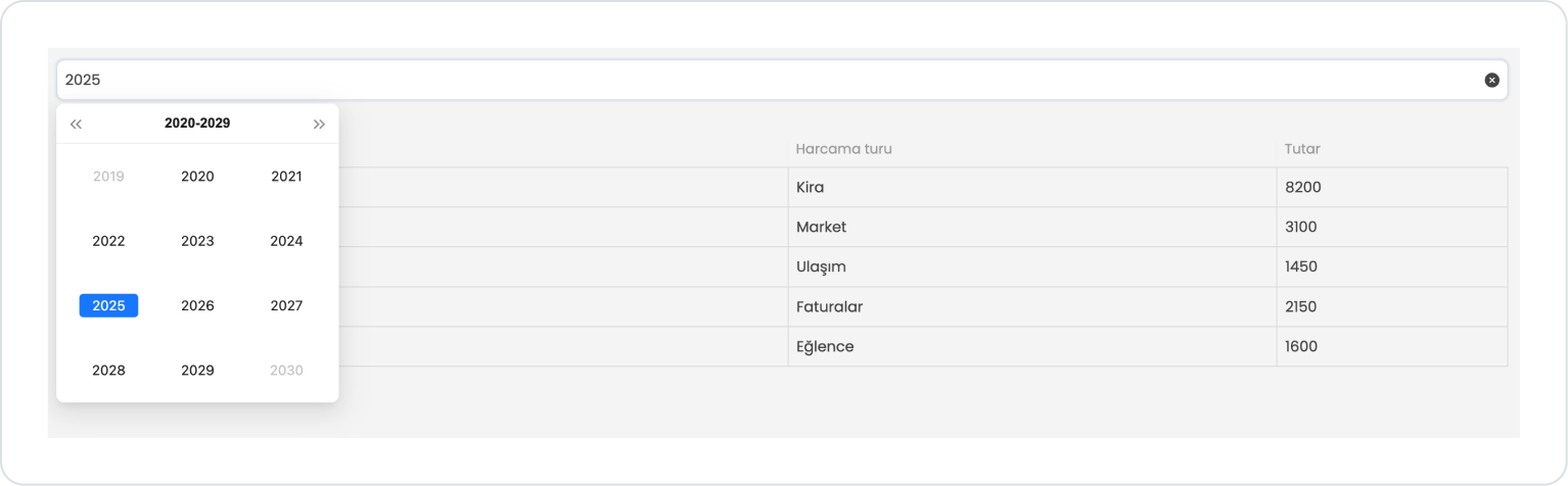
In a personal finance or expense tracking application, users want to view their expenses for a specific year on a single screen. The Year Picker element is used in this scenario to select which year's data will be listed.
In the scenario:
The user can filter expenses for the relevant periods by selecting the year.
For the selected year, the expense type and amount information are listed in the table.
The Year Picker allows for simple and controlled date selection.
Both year selection and listing operations are easily completed on a single page.
Step 1 - Creating a Data Source
Creating a table in the DataSources module:
Go to the Datasources module.
Then go to the Tables tab.
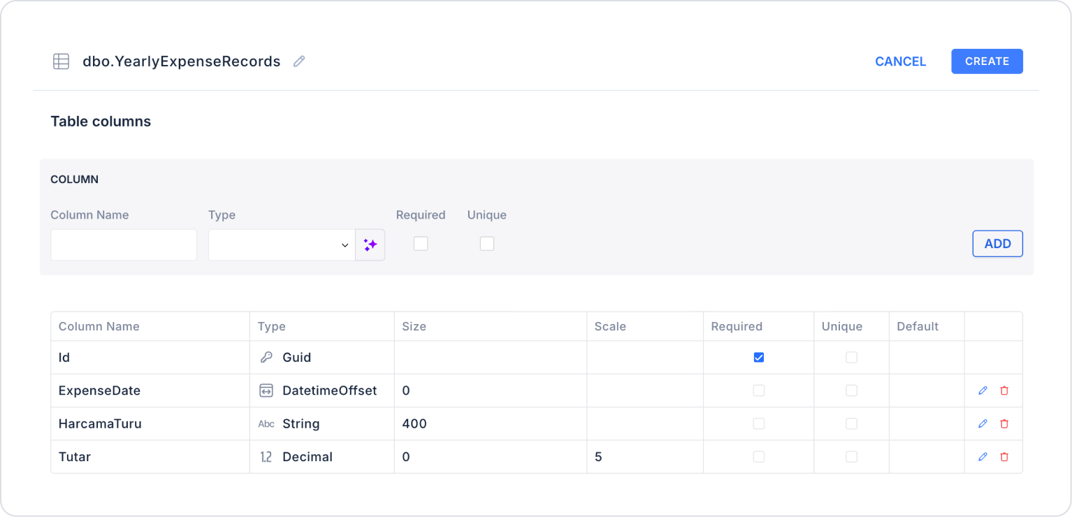
Create a new table named “YearlyExpenseRecords”.
The table structure to be set up is as follows:
Important Field Names:
ExpenseDate: Holds the date the expense occurred. This field is used as the basis for yearly filtering (Year Picker) and period-based reporting.
ExpenseType: Indicates the category of the expense (e.g., Rent, Groceries, Transportation, Bills). Used in charts, summary tables, and category-based analysis.
Amount: Specifies the monetary value of the expense. The main field used to calculate totals, averages, and comparative financial analysis.
Step 2 - Defining the Necessary Actions
To display and save data in the interface:
Two actions will be used in this scenario.
Add a new action from the Actions > New SQL Action tab in the Datasources module.
Action that Adds Sample Data (InsertYearlyExpenseRecords): To test the application with sample data, add the following SQL action and press the TEST button.
INSERT INTO YearlyExpenseRecords (Id, ExpenseDate, ExpenseType, Amount)
-- ======================
-- 2023-- ======================
SELECT NEWID(), CAST(‘2023-02-05’ AS date), N'Rent', 5200 UNION ALL
SELECT NEWID(), CAST(‘2023-02-12’ AS date), N'Groceries', 1800 UNION ALL
SELECT NEWID(), CAST(‘2023-06-08’ AS date), N'Transportation', 750 UNION ALL
SELECT NEWID(), CAST(‘2023-06-18’ AS date), N'Invoices', 1100 UNION ALL
SELECT NEWID(), CAST(‘2023-09-22’ AS date), N'Entertainment', 900 UNION ALL
-- ======================
-- 2024-- ======================
SELECT NEWID(), CAST(‘2024-01-03’ AS date), N'Rent', 6500 UNION ALL
SELECT NEWID(), CAST(‘2024-01-14’ AS date), N'Market', 2400 UNION ALL
SELECT NEWID(), CAST(‘2024-04-10’ AS date), N'Transportation', 1100 UNION ALL
SELECT NEWID(), CAST(‘2024-04-20’ AS date), N'Invoices', 1600 UNION ALL
SELECT NEWID(), CAST(‘2024-08-25’ AS date), N'Entertainment', 1300 UNION ALL
-- ======================
-- 2025-- ======================
SELECT NEWID(), CAST(‘2025-03-04’ AS date), N'Rent', 8200 UNION ALL
SELECT NEWID(), CAST(‘2025-03-16’ AS date), N'Market', 3100 UNION ALL
SELECT NEWID(), CAST(‘2025-07-09’ AS date), N'Transportation', 1450 UNION ALL
SELECT NEWID(), CAST(‘2025-07-19’ AS date), N'Invoices', 2150 UNION ALL
SELECT NEWID(), CAST(‘2025-11-29’ AS date), N'Entertainment', 1600;
When applying, delete the YearlyExpenseRecords part, rewrite YearlyExpenseRecords, and press Enter. This will add the correct schema name in front of the table name.
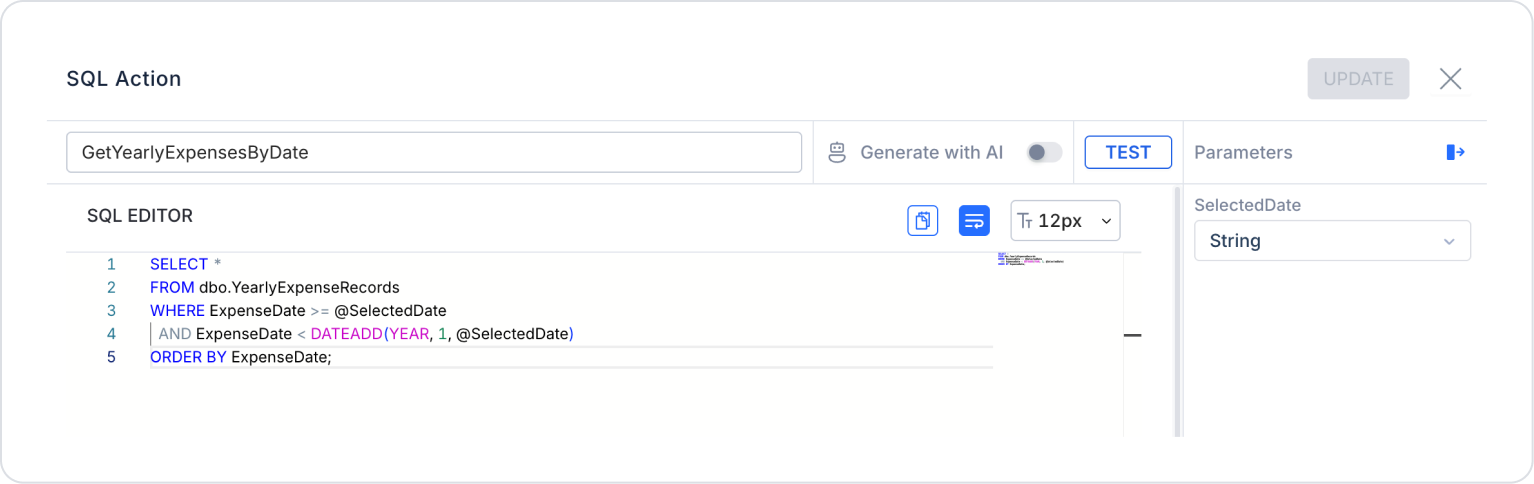
Action that Filters and Provides Data (GetYearlyExpensesByDate):
SELECT *
FROM YearlyExpenseRecords
WHERE ExpenseDate >= @SelectedDate
AND ExpenseDate < DATEADD(YEAR, 1, @SelectedDate)
ORDER BY ExpenseDate;
When adding the action, set the SelectedDate type as string in the SQL Action > Parameters field on the side.
When applying, delete the YearlyExpenseRecords section, rewrite YearlyExpenseRecords, and press Enter. This will add the correct schema name before the table name.
Step 3 - Add Element and Action
Drag and drop the Elements > Date and Time Input > YearPicker element onto the page.
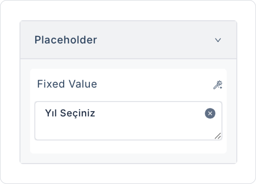
In the Year Picker element, add the text to the YearPicker > Properties > Placeholder > “Select Year” field.
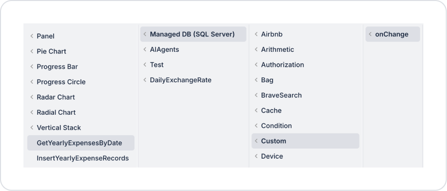
To retrieve the list after selecting the year, add an action while the Year Picker element is selected. Add the YearPicker > Add Action > onChange > Custom > Managed DB > GetYearlyExpensesByDate action.
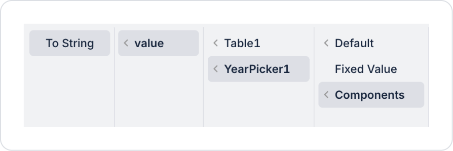
In the action, define the date parameter as GetYearlyExpensesByDate > Components > YearPicker > value > To String.
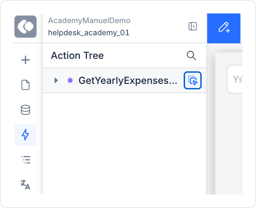
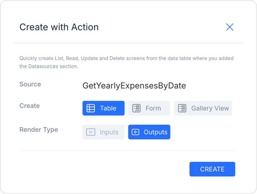
To use the action directly as a ready table, navigate to the ActionTree area in the left side panel and drag the nearby blue icon of the GetYearlyExpensesByDate action onto the page.
In the screen that opens, select the Table and Outputs fields and press Create.
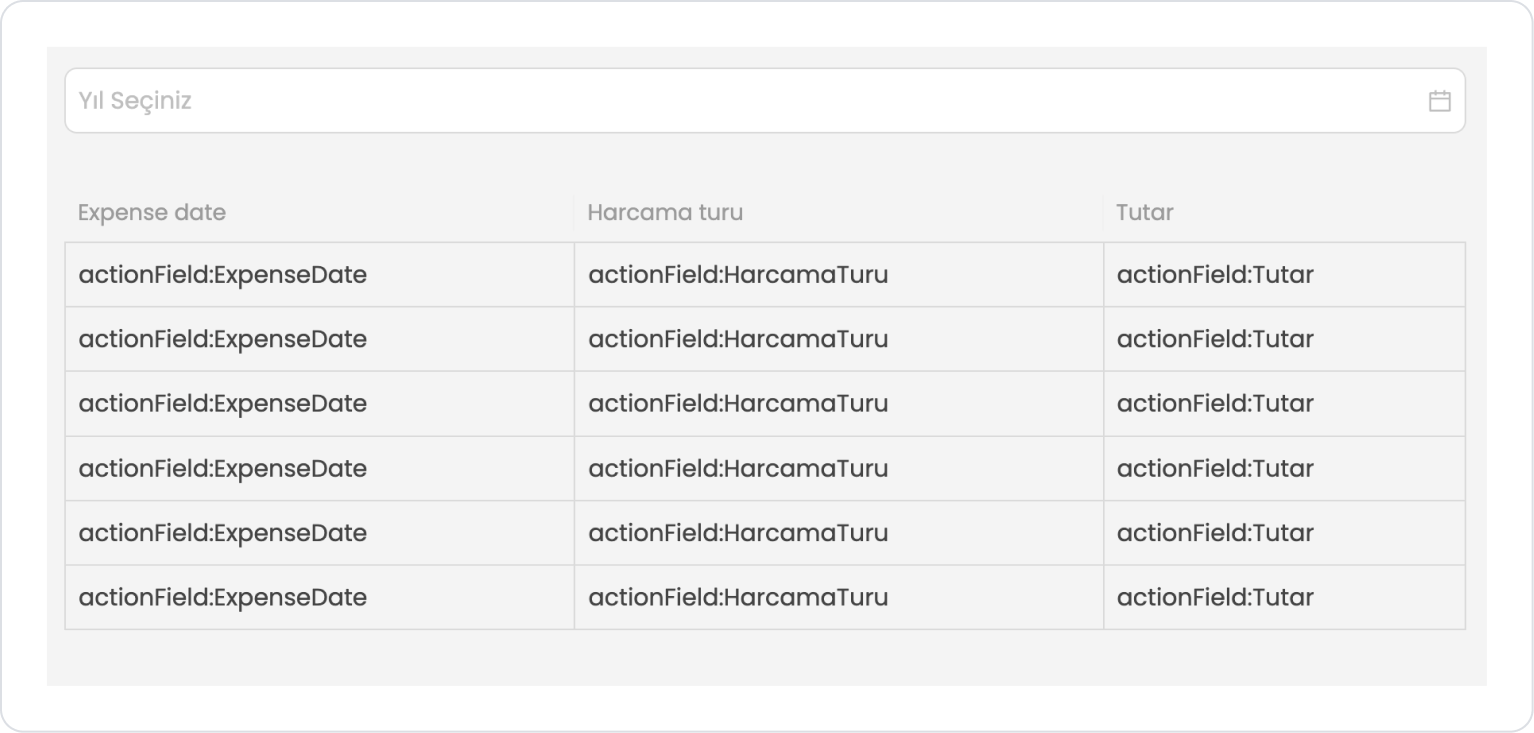
The final screen content should look like the following.
Preview:
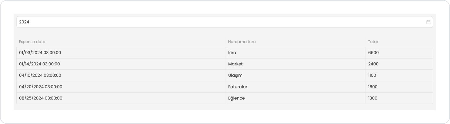
When the application first opens, the year picker field at the top is displayed empty, and the user is prompted to select an expense period. In this case, only sample values representing field names are displayed in the table to indicate that data is pending.
When the user selects a year, the expense type, amount, and expense date information for the selected year is automatically listed in the table. This allows the user to view all expenses for the relevant year in a single screen in an organized and understandable manner.
4. Common Properties
Some fields on the Year Picker element are used in common across all UI elements. Therefore, detailed explanations of the following properties can be found in the relevant general guide pages:
Define the Min Year and Max Year ranges logically. You can create a more controlled selection experience by hiding years that the user cannot select. (E.g., 2000–2030 range in financial reporting applications)
Automate filtering by processing the selected year with onChange. You can update lists, tables, charts, or reports without the user having to press an extra button.
Use descriptive placeholder text. An expression appropriate to the context, such as “Report Year” instead of “Select Year,” improves UX.
6. Limitations
Only the year can be selected; month or day information cannot be obtained. If more detailed time selection is required, Date, Date Time, or Date Range should be used.
Only supports the onChange action.
If the Min Year / Max Year values are set incorrectly, selection may be completely blocked. If the range does not overlap, the user cannot select any year.


