Kuika's Badge element is a small, eye-catching label element used to highlight, emphasize, or quickly convey specific information in the user interface. It is most often used to display numbers, status information, warnings, or notifications.
Badges prevent users from missing important information in the application and make interaction areas more visible.
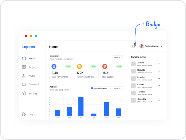
Badge elements can be placed on top of icons, buttons, cards, or other UI elements, creating a quick visual notification area.
Badge elements are supported in web and mobile applications.
1.1. Common Use Cases
Thanks to its small but eye-catching structure, the badge element can be used in many different scenarios. The most common use cases are listed below:
Notification and Message Management: Used to display the number of unread messages, notifications, invitations, or tasks in applications. For example, a badge such as “3” appears on a message icon.
Task and To-Do Lists: It can be used to show the number of uncompleted tasks, pending jobs, or remaining items on a to-do list.
Status and Alert Indicators: It can be used to highlight system alerts, errors, pending approvals, or critical situations. For example, a red badge can show the number of errors.
E-commerce Applications: Often preferred for the number of items in the cart, the number of products added to favorites, or campaign notifications.
Social Media Functions: Used with icons to show the number of new comments, likes, follow requests, or messages.
2. Key Features
Compact and eye-catching label structure: Provides a small but visually prominent label, allowing users to quickly notice important information.
Dynamic data binding support: The value to be displayed in the badge can be linked to data sources or action results via the Symbol Picker. This allows the badge to update automatically based on changing data.
Can be used with icons: The Badge element is usually added to the corner of elements such as Image, Icon, or Button to create a more effective notification or warning display.
2.1. Badge Element Properties
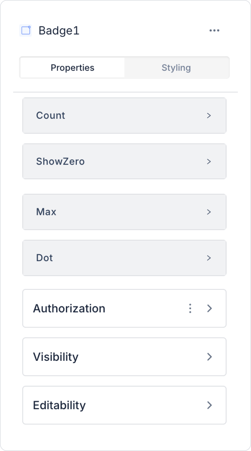
You can configure the properties of the Badge element from the Properties panel on the right side.
Count: You can add a static value or dynamically retrieve a status, the content of an Input element, or a value associated with an action result using the Symbol Picker.
Show Zero: Determines whether the Badge is displayed when the notification count is zero. This setting can also be configured dynamically using the Symbol Picker.
Max: Sets the highest value the Badge can display. You can enter a static value or assign a dynamic value using the Symbol Picker. For example, if the maximum value is 99, values above this number will be displayed as “99+”.
Dot: Displays only a dot instead of a numerical representation. This setting is typically used for notifications that do not require a numerical value.
Icon: Specifies the icon to be displayed within or next to the badge; used to visually indicate the notification type.
Tooltip: Specifies the informational text to be displayed when the mouse hovers over the badge.
2.2. Actions That Can Be Added to the Badge Element
Since the badge element is only for visual display, it does not support action definition.
When you select the element, the ADD ACTION button does not appear in the right panel, and no events triggered by user interaction on the Badge can be added.
The following points explain the action structure of the Badge element:
The Badge does not execute actions as a result of a click, change, or interaction.
If interactions such as notification click scenarios are required, this process must be done through the Container, Panel, Icon, or Button where the Badge is located.
The Badge only functions as a visual numerical/status indicator; it does not have the ability to initiate a workflow.
The Badge does not initiate any actions itself; it only displays information.
3. How to Use the Badge Element?
In this section, we will discuss the end-to-end use of the Badge element in Kuika applications through an example scenario.
Scenario: Using Badges for Message Notifications
In a chat or collaboration application, it is important for users to be able to notice new notifications without opening the application.
For this purpose, a Badge element positioned on top of the message icon is used.
In this scenario:
The Badge is positioned in the upper right corner of the notification icon.
The number of unread notifications for the user is dynamically displayed on the Badge.
If there are no unread notifications, the Badge is hidden.
An upper limit is set for very high notification counts to ensure a clean appearance.
Step 1 – Creating an Action for Dynamic Use
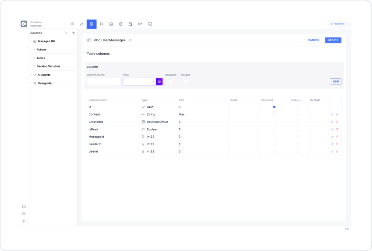
Defining a Table in the Data Sources Module
Go to the Datasources module.
Then click the + icon next to the Tables heading and name the table “UserMessages”.
Create the following table.
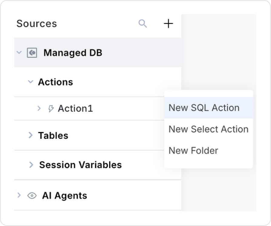
Then click on SQL Actions and name the action “UnreadMessageCount”.
Then click on the + icon next to the Tables heading.
Click on New SQL Action.
Set the action name to UnreadMessageCount.
Add the following SQL query
SELECT COUNT(*) AS UnreadMessages
FROM (
    VALUES (0), (0), (1), (0)
) AS Messages(IsRead)
WHERE IsRead = 0;
Step 2 – Creating Pages
Open the UI Design module:
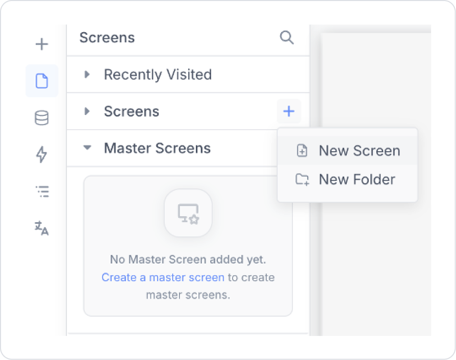
In the left side panel, create a new page named “Unread Notifications” from the Screens section.
For example, you can create the page for Unread Notifications as follows.
Step 3 - Using Badges in the UI Design Module
Open the UI Design module.
On the relevant screen, click the Add Action button.
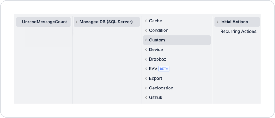
To add a Page Init Action, follow these steps: Add Action > Initial Action > Managed DB > Custom > UnreadMessageCount.
Click on Elements > Display > Icon element in the left side panel. The element will be added automatically.
Drag the Badge element and drop it on the notification icon.
In the Properties panel:
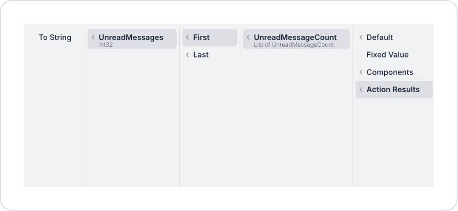
Open the Symbol Picker for the Count field.
Select the Action Result > UnreadMessages field.
Linking the Badge to Dynamic Data
Click on the Badge element.
From the Properties panel:
Open the Symbol Picker in the Count field.
Select the UnreadMessages field from the UnreadMessageCount action.
Configure the following settings for visual behavior:
Show Zero → Off
Max → 99
Dot → On/Off depending on the mobile scenario
With this structure, the Badge is only displayed when there are unread messages.
Preview
When the application is tested:
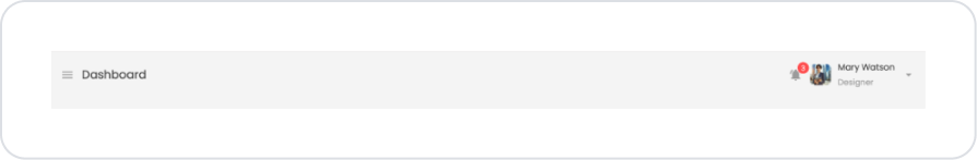
The user sees a Badge in the corner of the message icon showing the number of unread messages.
If there are no unread messages (Show Zero is off), the Badge is not visible.
High message counts are displayed as 99+ thanks to the Max value.
The Dot format can be used for a simple mobile experience.
4. Common Properties
Some fields on the Badge element are used commonly across all UI elements. Therefore, detailed descriptions of the following properties can be found in the relevant general guide pages:


