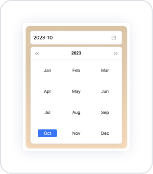
The Month Picker element is a date element that allows users to select only the month. Operating in the year–month format, this element provides a fast, error-free, and user-friendly experience in all applications requiring month-based selection.
Users can either enter the month information manually or easily select it using the month selector. Since it only supports month selection, it simplifies form and filter fields in situations that do not require date range or day selection.
It is particularly preferred in scenarios such as month-based analysis, reporting, billing periods, performance tracking, and budget planning. It prevents incorrect entries by ensuring the user selects a valid month and improves date consistency in the application.
The Month Picker element is only supported in web applications.
1.1. Common Usage Scenarios
Monthly reporting screens: Used to select a specific month for financial status, sales performance, budget tracking, or operational reporting.
Invoice and payment period selection: Allows users to specify the month an invoice belongs to or the period a payment will be made.
Monthly data filtering: Creates a suitable selection field to display only data for the selected month in table, chart, or list components.
Monthly reservation or planning screens: Used in scenarios that require month-based planning only, such as staff shift planning, vehicle usage calendar, or class schedule.
Monthly target and performance tracking: Provides users with easy selection options for sales targets, production quantities, or monthly KPI evaluations.
2. Key Features
Manual entry or month picker usage: Users can type the month information directly or quickly select it from the drop-down month picker.
Format customization support: The month display format (MM/YYYY, YYYY-MM, etc.) can be adjusted according to the application's needs.
Clear support: With the Allow Clear feature, users can clear their selection with a single click.
Change trigger support: Thanks to the onChange trigger, relevant lists, charts, or queries can be automatically updated when the user changes the month.
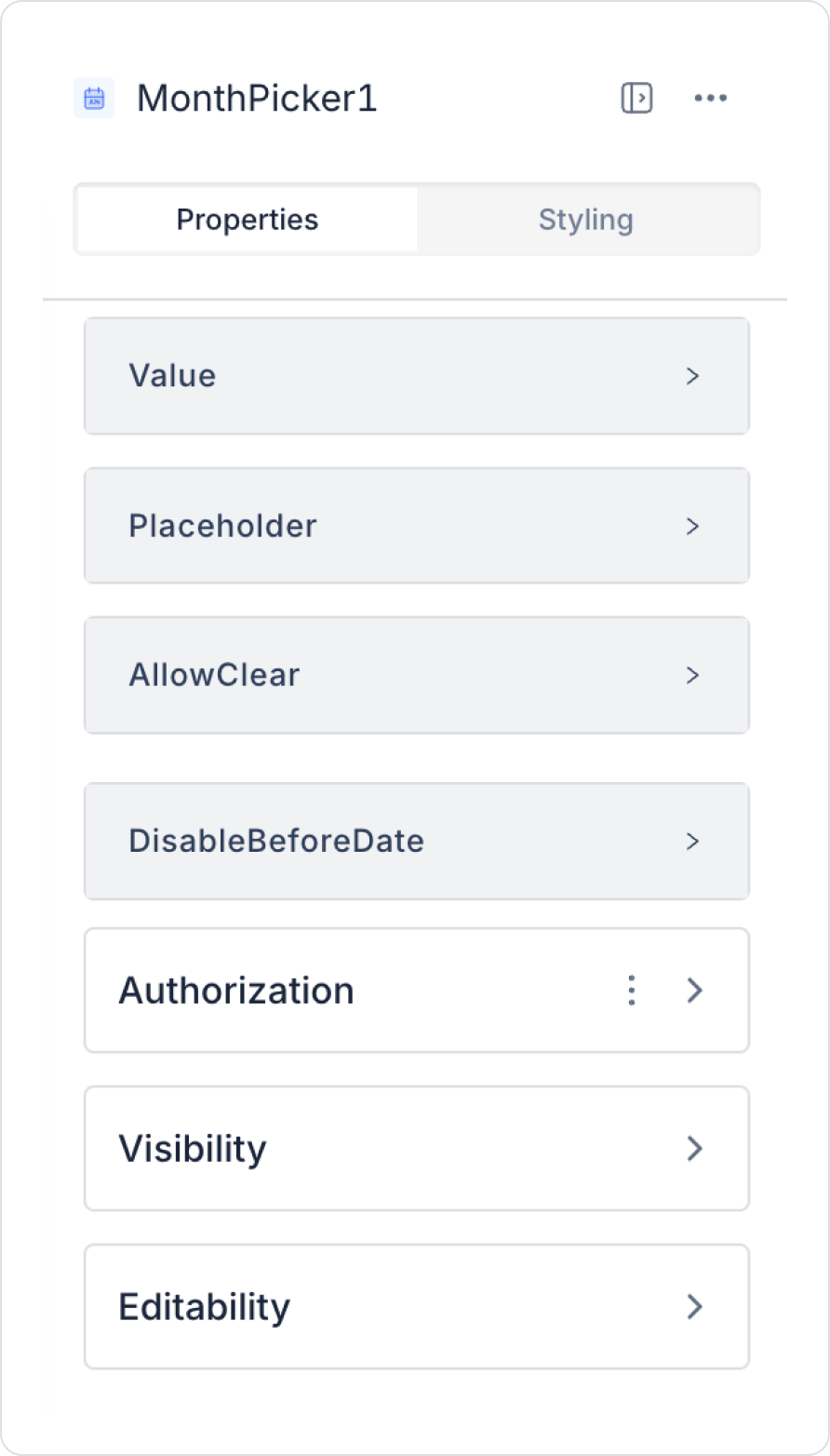
2.1. Month Picker Element Properties
You can configure the properties of the Month Picker element from the Properties panel on the right side.
Value: You can set a static month value or assign dynamic values using the Symbol Picker.
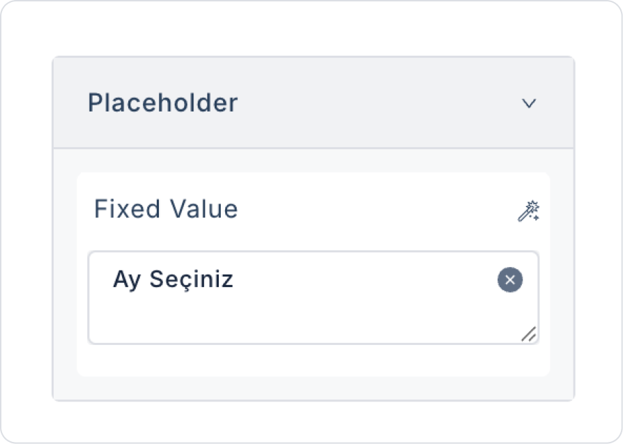
Placeholder: Specifies the placeholder text displayed when the user has not made a selection. For example, “Select Month”.
Allow Clear: Allows the user to clear the selected month with a single click. The entry can be reset using the Delete (X) icon that appears in the right corner.
Disable Before Date: Prevents the user from selecting months before a specific month. You can set a static month or use a dynamic value with the Symbol Picker.
2.2. Actions That Can Be Added to Elements
The Month Picker element allows you to trigger an action when the user selects a month or changes the current selection. The only trigger available for this element is the onChange Event.
onChange
Triggers when the user selects a month, changes the month, or clears the selection. This event allows you to pass the selected month value to other components and automate processes such as data filtering or query execution.
Common Use Cases
Filter a table or list based on the selected month
Update a chart based on the selected month information
Querying new data when the user selects a month on reporting screens
Changing the visibility of fields linked to month selection in forms
Triggering another action on the page when the month changes
3. How to Use the Month Picker Element
In this section, we will cover the end-to-end use of the Month Picker element through example scenarios.
Scenario: Displaying Monthly Expenses
In a personal finance or expense tracking application, users want to view their expenses for a specific month and year on a single screen. The Month Picker element is used in this scenario to select which month's data will be listed.
In the scenario:
The user can filter expenses for the relevant period by selecting the month and year.
For the selected month, the expense type and amount information are listed in the table.
The Month Picker allows for simple and controlled date selection.
Both date selection and listing operations are easily completed on a single page.
Step 1 - Creating a Data Source
Creating a table in the DataSources module:
Go to the Datasources module.
Then go to the Tables tab.
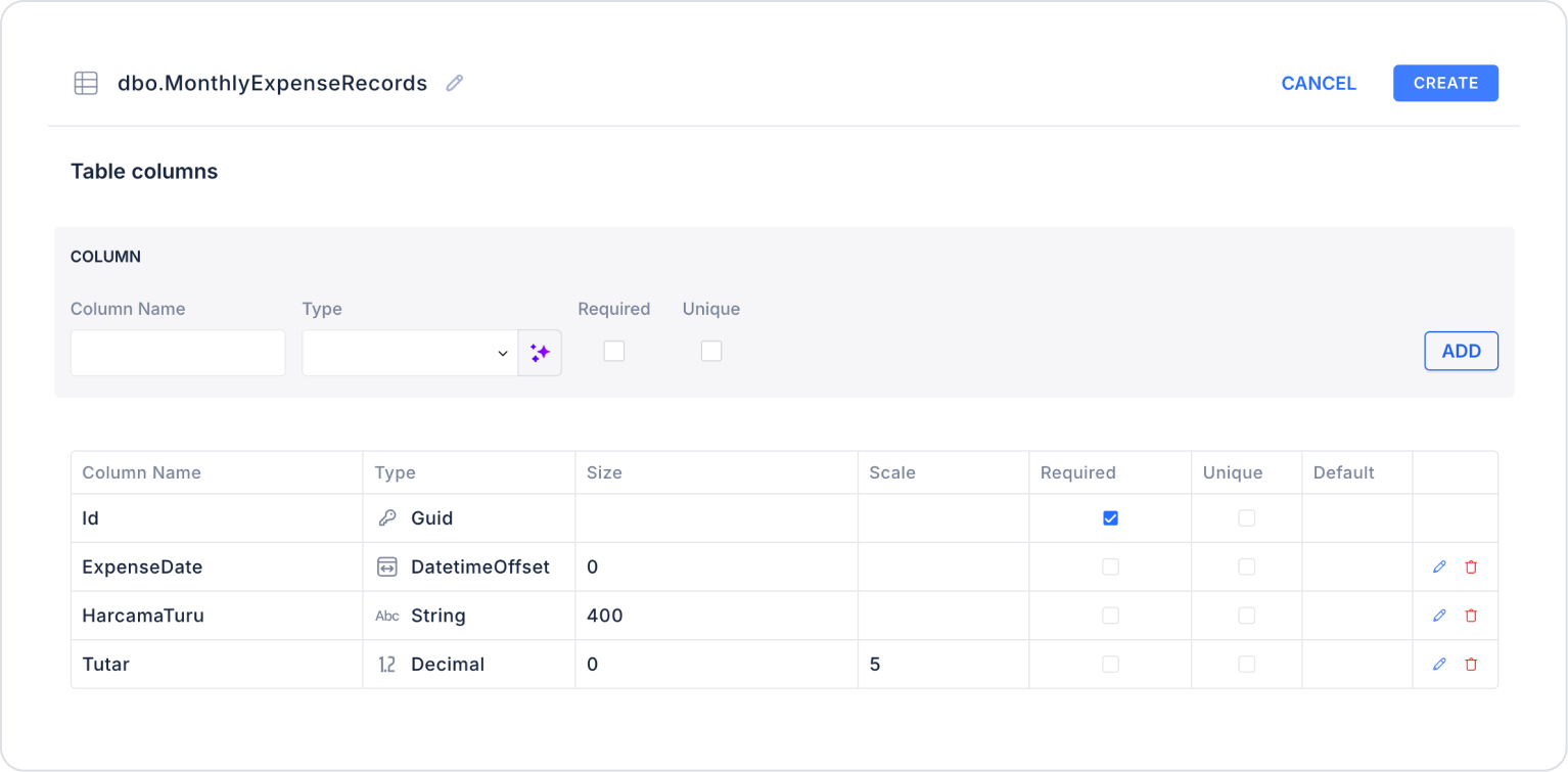
Create a new table named “MonthlyExpenseRecords”.
The table structure to be set up is as follows:
Important Field names:
ExpenseDate: Holds the date information when the expense occurred. This field is the basis for monthly filtering (Monthly Picker) and period-based reporting.
ExpenseType: Indicates the category of the expense (e.g., Rent, Groceries, Transportation, Bills). Used in charts, summary tables, and category-based analysis.
Amount: Specifies the monetary value of the expense. The main field used to calculate totals, averages, and comparative financial analysis.
Step 2 - Defining the Necessary Actions
To display and save data in the interface:
Two actions will be used in this scenario.
Add a new action from the Actions > New SQL Action tab in the Datasources module.
Action that Adds Sample Data (InsertMonthlyExpenseRecords): To test the application with sample data, add the following SQL action and press the TEST button.
INSERT INTO MonthlyExpenseRecords (Id, ExpenseDate, ExpenseType, Amount)
-- OCTOBER 2025SELECT NEWID(), CAST(‘2025-10-02’ AS date), N'Rent', 8500 UNION ALL
SELECT NEWID(), CAST(‘2025-10-05’ AS date), N'Groceries', 3200 UNION ALL
SELECT NEWID(), CAST(‘2025-10-10’ AS date), N'Transportation', 1200 UNION ALL
SELECT NEWID(), CAST(‘2025-10-15’ AS date), N'Invoices', 2100 UNION ALL
SELECT NEWID(), CAST(‘2025-10-28’ AS date), N'Entertainment', 1400 UNION ALL
-- NOVEMBER 2025SELECT NEWID(), CAST(‘2025-11-03’ AS date), N'Rent', 8800 UNION ALL
SELECT NEWID(), CAST(‘2025-11-04’ AS date), N'Market', 3400 UNION ALL
SELECT NEWID(), CAST(‘2025-11-11’ AS date), N'Transportation', 1350 UNION ALL
SELECT NEWID(), CAST(‘2025-11-16’ AS date), N'Invoices', 2250 UNION ALL
SELECT NEWID(), CAST(‘2025-11-29’ AS date), N'Entertainment', 1600 UNION ALL
-- DECEMBER 2025SELECT NEWID(), CAST(‘2025-12-02’ AS date), N'Rent', 9000 UNION ALL
SELECT NEWID(), CAST(‘2025-12-05’ AS date), N'Market', 3700 UNION ALL
SELECT NEWID(), CAST(‘2025-12-10’ AS date), N'Transportation', 1500 UNION ALL
SELECT NEWID(), CAST(‘2025-12-15’ AS date), N'Invoices', 2400 UNION ALL
SELECT NEWID(), CAST(‘2025-12-28’ AS date), N'Entertainment', 1800;
When applying, delete the MonthlyExpenseRecords part, rewrite MonthlyExpenseRecords, and press Enter. This will add the correct schema name before the table name.
Action that Filters and Provides Data (GetMonthlyExpensesByDate):
SELECT *
FROM MonthlyExpenseRecords
WHERE ExpenseDate >= @SelectedDate
AND ExpenseDate < DATEADD(MONTH, 1, @SelectedDate)
ORDER BY ExpenseDate;
When applying, delete the MonthlyExpenseRecords section, rewrite MonthlyExpenseRecords, and press Enter. This will add the correct schema name before the table name.
Step 3 - Add Element and Action
Drag and drop the Elements > Date and Time Input > MonthPicker element onto the page.
In the Month Picker element, add the text to the MonthPicker > Properties > Placeholder > “Select Month” field.
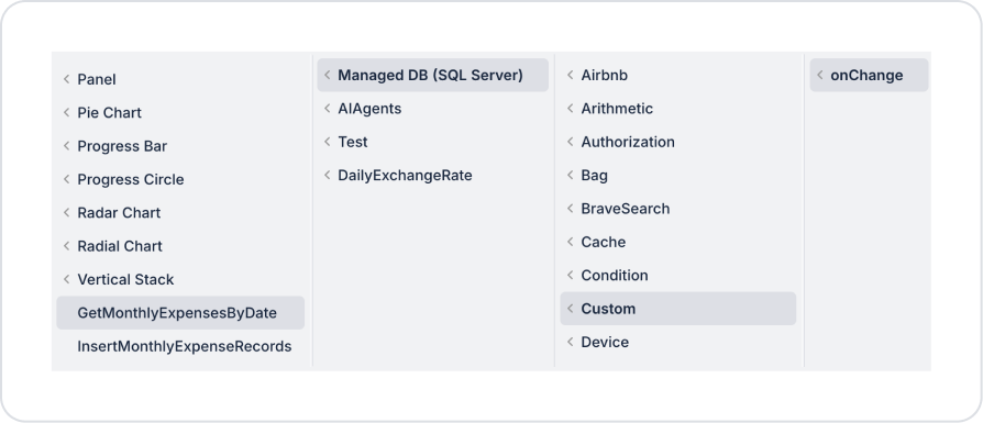
Add an action while the Month Picker element is selected to retrieve the list after the date selection. Add the MonthPicker > Add Action > onChange > Custom > Managed DB > GetMonthlyExpensesByDate action.
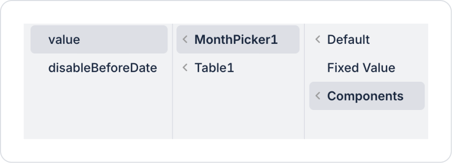
Define the date parameter in the action as GetMonthlyExpensesByDate > Components > MonthPicker > value.
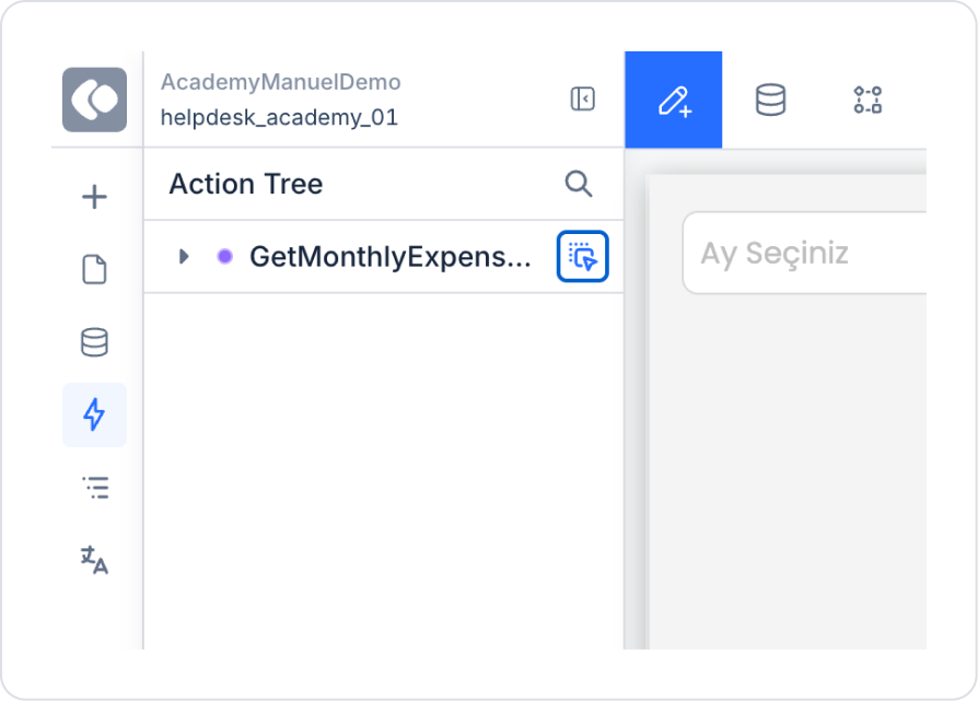
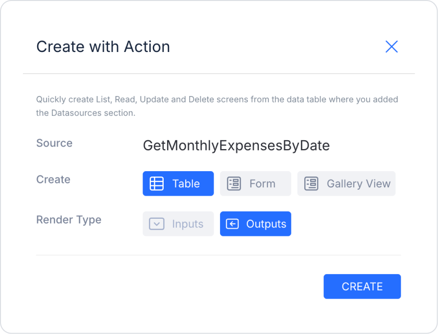
To use the action directly as a ready table, navigate to the ActionTree area in the left side panel and drag the nearby blue icon of the GetMonthlyExpensesByDate action onto the page.
In the opened screen, select the Table and Outputs fields and press Create.
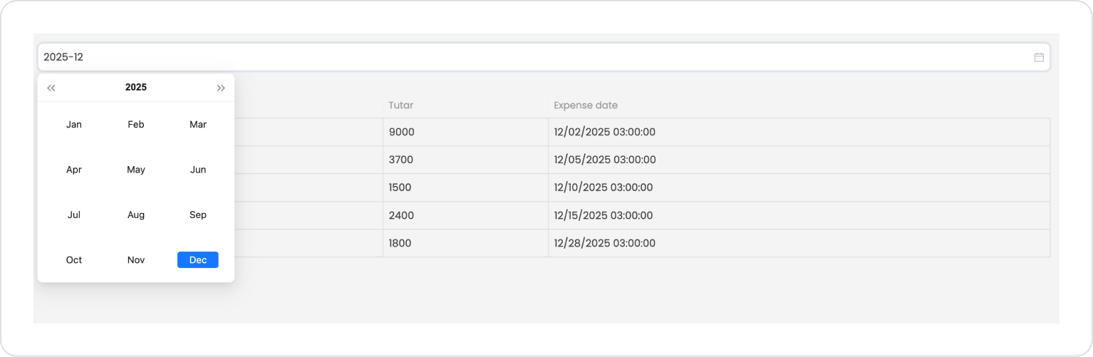
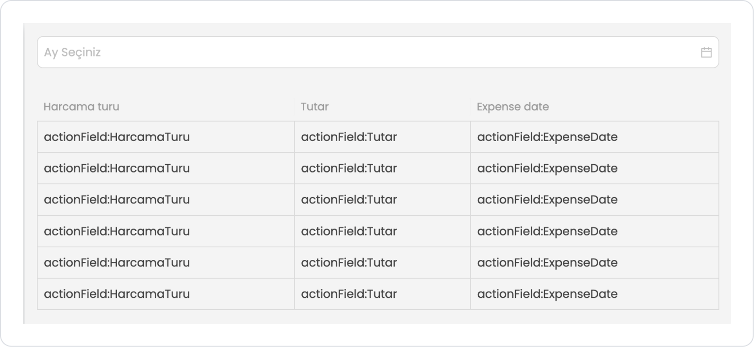
The final screen content should look like the following.
Preview:
When the application first opens, the month selector field at the top is displayed empty, and the user is prompted to select an expense period. In this case, only sample values representing field names are displayed in the table to indicate that data is pending.
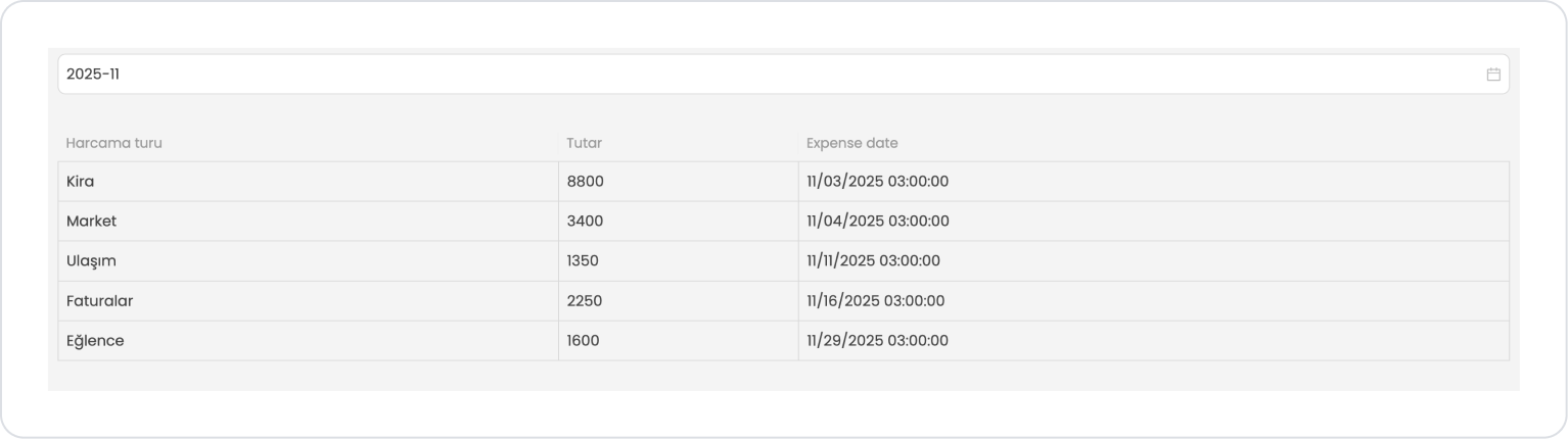
When the user selects a month, the spending type, amount, and spending date information for the selected period is automatically listed in the table. This allows the user to view all expenses for the relevant month in a single screen in an organized and understandable manner.
4. Common Properties
Some fields on the Month Picker element are used in common across all UI elements. Therefore, detailed descriptions of the following properties can be found in the relevant general guide pages:
Check the year information when selecting a month. The Month Picker only selects the month; year control must be done separately in the application logic. For example, if you want to prevent the selection of months from previous years, you must add validation.
Use the Disable Before Date feature correctly. In scenarios where the user should not select months before a specific date (e.g., membership start month, campaign validity date), this feature completely prevents incorrect entries.
Use onChange effectively in filtering scenarios. When a month is selected, automatically update components such as tables, charts, or lists to make user interaction fluid.
Write descriptive placeholder text. Especially on month-based reporting screens, clearly indicating to the user which range to select enhances the experience.
Actively use the Clear (Allow Clear) feature. Allowing the user to reset their selection with a single click is particularly useful on filtering screens.
6. Limitations
Year selection cannot be made directly. The user can only select the month; the year information must be obtained with an additional field.
The Disable Before Date feature works on a monthly basis, not on a daily basis. For example, a rule such as “no selection can be made before March 15” cannot be applied directly; only the entire month of March can be disabled.


