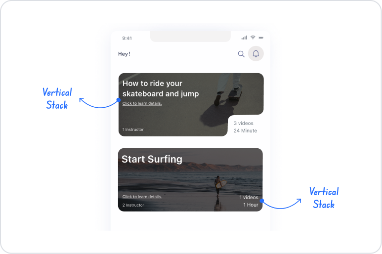
The Vertical Stack element is a fundamental layout element used to align user interface elements vertically, one above the other. It organizes the UI elements within it into a single column structure, ensuring that content is presented in a more readable, organized, and hierarchical manner.
It can be used for form fields, information blocks, card content, or any UI element that needs to be displayed one below the other. Vertical Stack makes UI layouts more controlled and consistent with features such as spacing (gap management), alignment, and responsive behavior.
The Vertical Stack element is supported in web and mobile applications.
1.1. Common Use Cases
Arrange form fields vertically. For example: Displaying input fields such as Name, Surname, Email, Phone one below the other.
Divide complex content into logical blocks. Ideal for card structures, profile sections, or information descriptions.
Create a column-based screen layout. Used especially for content that needs to be stacked vertically on mobile devices.
Creating list-like content. For example, designing a vertical list by placing multiple Rows within a Vertical Stack.
Creating card-based title – description – action sequences. Vertical Stack is the most commonly used element in such hierarchical layouts.
All UI scenarios require vertical content flow. Such as news feeds, description blocks, forms, and settings screens.
2. Key Features
Vertical alignment support. Arranges all UI elements added to the Vertical Stack on top of each other in a single-column structure.
Flexible layout structure. Content can be automatically scaled according to screen width; it can work with fixed or flexible heights.
Spacing between elements. The spacing between stacked elements can be easily adjusted, making the layout more readable.
Horizontal alignment control. Elements within Vertical Stack can be aligned left, center, or right.
Responsive compatibility. Works seamlessly on mobile and web screens; particularly effective on mobile screens with long form and content structures.
A container layout element. Text, Button, Input, Icon, Image, Row, and all other UI elements can be added to it.
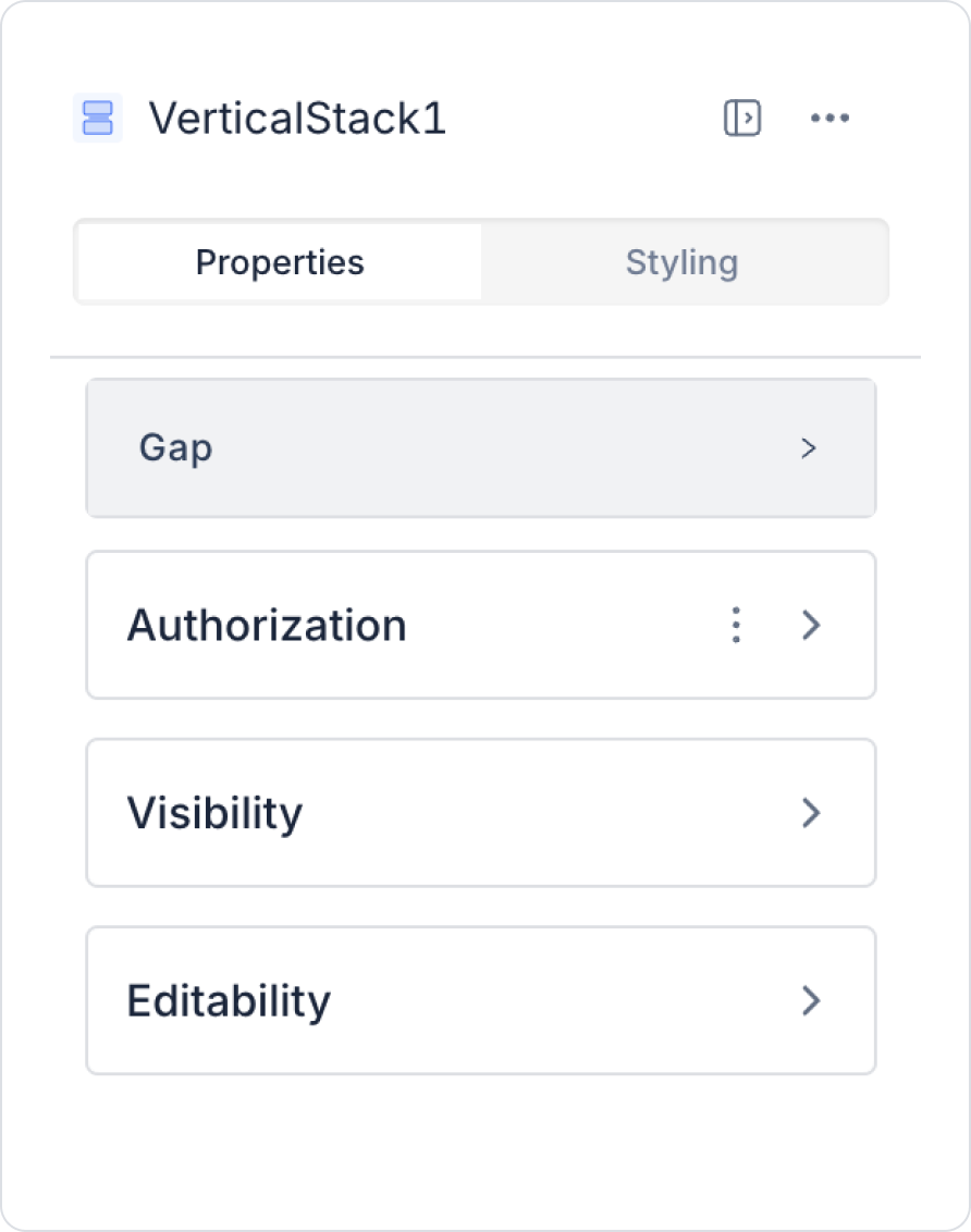
2.1. Element Properties
When you select the Vertical Stack element, you can control the spacing and alignment behavior of the vertical layout via the Properties panel on the right. The following setting currently constitutes the basic feature of Vertical Stack:
Gap: Determines the vertical spacing between UI elements added to Vertical Stack. Default spacing value: 12 px. With this setting, you can:
Increase or decrease the distance between elements.
Improve the readability and layout of the vertical layout.
2.2. Actions That Can Be Added to Elements
Since the Vertical Stack element is a layout element, it does not directly support the action addition feature. Therefore:
Actions cannot be linked to the Vertical Stack element with ADD ACTION.
The action panel is not visible when the element is selected.
Actions such as clicking, redirecting, and data processing cannot be triggered via Vertical Stack.
In scenarios requiring interaction:
Actions can be added to elements placed inside the Vertical Stack, such as Button, Text, Icon, Image, and Row.
Actions are triggered from these child elements; the Vertical Stack only provides the layout.
The Vertical Stack only creates a vertical layout; interaction behaviors are managed in the child elements.
3. How to Use the Vertical Stack Element?
In this section, we will cover the end-to-end use of the Vertical Stack element through example scenarios.
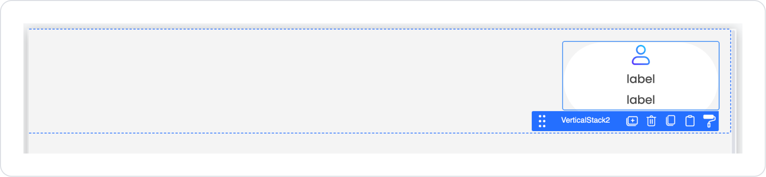
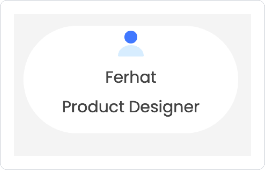
Scenario: Creating a Profile Summary Card
In applications such as social media, internal company portals, or education management systems, it is important to display the user's basic profile information quickly and clearly. In this scenario, the user's profile icon, name, and position information are presented on a single card in a structured layout.
Profile components are arranged from top to bottom within the Vertical Stack to create a clean and simple look. Following the card containing the user's image in the first row, the user's name and title information are displayed hierarchically.
In the scenario:
The icon representing the user is located at the top of the card.
The user's name is displayed below it, and their position or title information is displayed at the bottom.
Vertical Stack provides a simple interface for the user's identity summary by ensuring that all this information is neatly aligned on a single card.
Step 1 - Creating a Data Source
Creating a table in the DataSources module:
Go to the Datasources module.
Then go to the Tables tab.
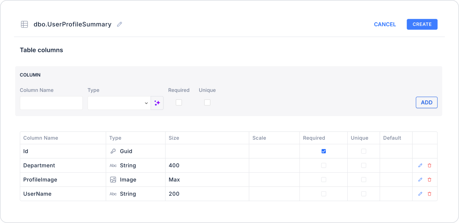
Create a new table named “UserProfileSummary”.
The table structure to be set up is as follows:
Important Field names:
UserName: Holds the user's visible name or the name information to be displayed on the profile card.
Department: Stores the user's department, position, or title information.
ProfileImage: Stores the user's profile image in Image format. The user icon or photo on the card is displayed from this field.
Step 2 - Defining the Necessary Actions
To display and add data in the interface:
You need to define two actions.
Add a new action from the Actions > New SQL Action tab in the Datasources module.
Action that Adds Sample Data (InsertUserProfileSummary): Add the following SQL action to test the application with sample data and press the TEST button.
The profile photo has been added to the database in base64 format. You can use the profile photos in the current user profile table. Since images are uploaded instead of URLs in the profile stages, they are used in binary format in this scenario. Optionally, image URLs can also be used.
When applying, delete the UserProfileSummary section, rewrite UserProfileSummary, and press Enter. This will add the correct schema name before the table name.
Action that Provides and Filters Data (InsertUserProfileSummary):
SELECT TOP 1 * FROM UserProfileSummary;
Since a demo user was used in the example scenario, a structure linked to the logged-in user or user ID was not used. If you wish, we can adapt the scenario to real user information.
When applying, delete the UserProfileSummary section, rewrite UserProfileSummary, and press Enter. This will add the correct schema name before the table name.
Step 3 - Adding Elements and Editing Styles
Initially on the home page:
Open the UI Design module.
From the left side panel, drag and drop the Elements > Container > Row element onto the page.
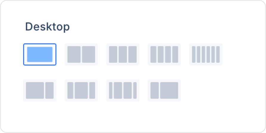
Within Row, set the Row > Properties > Desktop field as a column.
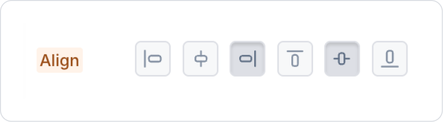
Click on the Col field inside the Row and align the column to the right and center it vertically from the Col > Styling > Layout > Align field.
Drag and drop the Elements > Container > Panel element from the left side panel into the Col.
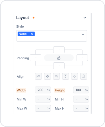
Make the following definitions in the Panel > Styling > Layout field in the Panel element.
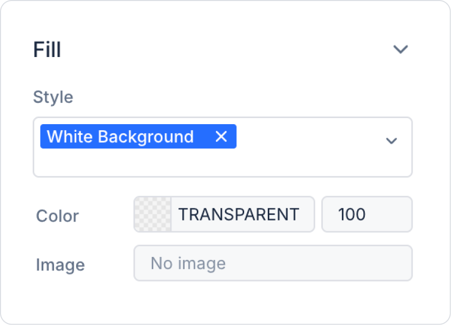
Select the background color as Panel > Styling > Fill > White Background.
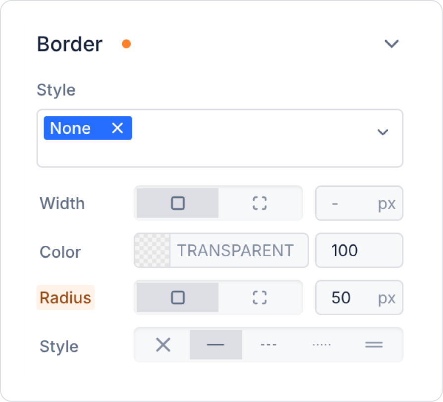
Set the borders to 50 px in the Panel > Styling > Border > Radius field.
Add the Elements > Container > VerticalStack element to the Panel element.
Center the Vertical Stack horizontally in the VerticalStack > Styling > Layout > Align field.
Vertical alignment cannot be performed within Vertical Stack.
Add the Elements > Display > Image element to Vertical Stack.
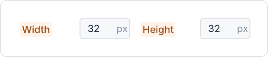
Set the Image > Styling > Layout > Width and Height fields to 32 px in Image.
Add the Elements > Display > Label element below Image.
Add an Elements > Display > Label element below the Label element.
Step 4 - Defining the User Retrieval Action
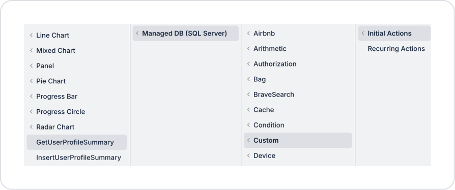
Define the Add Action > Initial Action > Custom > Managed DB > GetUserProfileSummary action on the page.
Step 5 - Configuring Element Settings
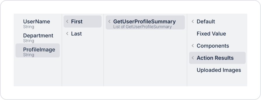
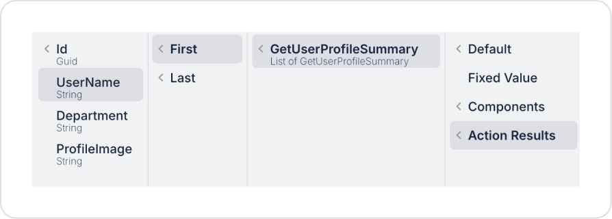
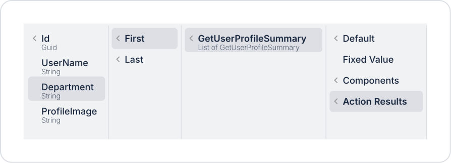
In the Image element, we define the profile image from the Image > Properties > Value > Action Results > GetUserProfileSummary > First > ProfileImage field.
In the first Label element, we define the user name from the Label > Properties > Value > GetUserProfileSummary > First > UserName field.
Finally, in the second Label element, we define the user's department from the Label > Properties > Value > GetUserProfileSummary > First > Department field.
Preview:
When the application is tested, the profile icon, name, and position information of the user are displayed neatly stacked on top of each other on the profile card created using the Vertical Stack element. Thanks to this structure, all the information on the card is presented to the user in a simple, readable, and aesthetic way.
4. Common Properties
Some areas on the footer element are used commonly across all UI elements. Therefore, detailed explanations of the following properties are provided in the relevant general guide pages:
Keep the layout simple when creating a vertical flow design. Placing too many elements can reduce the readability of Vertical Stack.
Adjust the gap value according to the content density. Wider gaps can be used in forms, and more compact gaps can be used in information cards.
Pay attention to the inner alignment when using Vertical Stack as a container. Although left alignment is the most readable structure, center alignment may be preferred in some card designs.
You can create complex layouts by adding Row to Stack. E.g., each row can be Row, and all rows can be inside Vertical Stack.
6. Limitations
Vertical Stack only provides vertical alignment; Row or Horizontal Stack is required for horizontal alignment.


