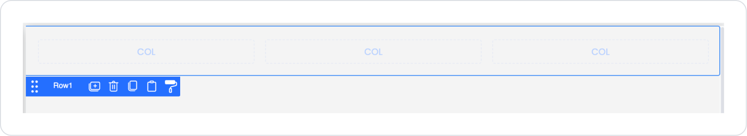
The Row element is a fundamental layout element used to align user interface components horizontally. It allows you to arrange multiple UI elements in a single row, control their alignment, and manage the spacing between them.
In form structures, card designs, short information groups, or any content that needs to be displayed side by side, the Row element makes the layout more readable, organized, and compact.
Row is frequently used to group text, inputs, icons, buttons, and various visual components in a single row. It helps you create a consistent and responsive horizontal layout in both web and mobile applications.
The Row element is supported in web and mobile applications.
1.1. Common Use Cases
Grouping short information blocks on the same line. Can be used for content such as user information, summary values, and mini statistics.
Creating icon + text combinations. For example: Location icon + address text, info icon + description text.
Create side-by-side button groups. For example: Save – Cancel, Confirm – Reject, Filter – Clear buttons.
Create top/bottom information rows in card designs. Provides a clean horizontal layout for profile cards, product cards, or list rows.
Set up row-based layouts in responsive interfaces. The Row + Column combination is frequently used for horizontal layouts on the web and vertical layouts on mobile.
Design horizontal list elements. Tags, categories, or short menu items can be presented on the same line.
2. Key Features
Spacing management between elements. The spacing between elements can be easily adjusted to make the layout more readable.
Responsive design support. Works seamlessly on web and mobile screens; can be used with grid or column structures to create more flexible layouts if needed.
Works as a container layout element. Text, Icon, Input, Button, Image, and all other UI elements can be added to Row.
2.2. Element Properties
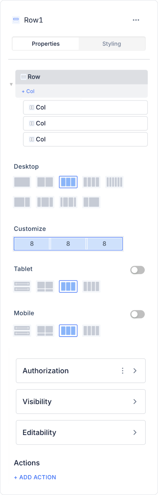
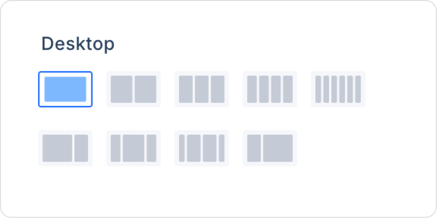
When you select the Row element, you can configure how it will appear on different device types and the column layout via the Properties panel on the right.
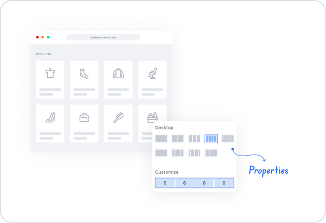
Column Customize
The Row element has a total of 24 columns in its grid structure. This allows each element within the Row to be distributed according to this 24-column structure.
The user can specify the area that elements in the row will occupy for specific devices:
One element can be set to occupy 8 columns, another 16 columns.
This makes the design more controlled and organized.
Thanks to this system:
A structure is created that is more distributed on wide screens
and more compact on mobile screens, facilitating stacking.
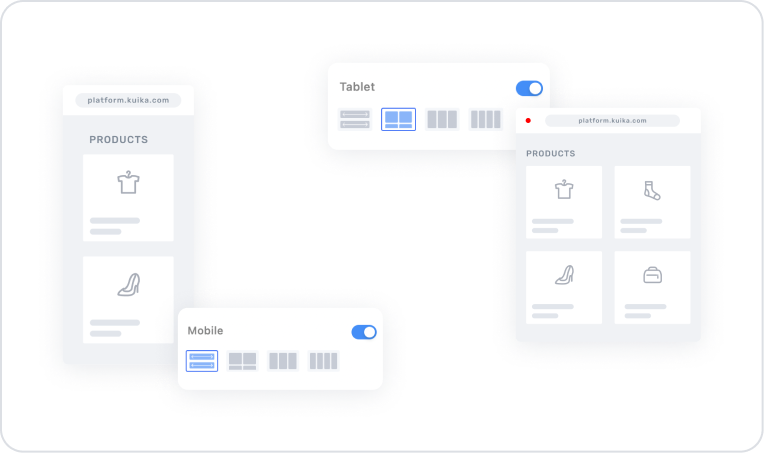
Web / Tablet / Mobile Column Configurations
The Row element allows you to define different column widths for each device type.
Web (Desktop): Wider column distributions can be made using more space on wide screens. For example: Dividing form fields into two 12–12 columns.
Tablet: Different column distributions can be used to make elements more compact on medium screen sizes. For example: 16–8 or a single 24-column.
Mobile: Mobile compatibility is the most critical point; most content is stacked vertically. For example: Using full width by selecting 24 columns for each element.
Column configuration can be specified separately for each device type, thus achieving a fully responsive line layout.
2.3. Actions That Can Be Added to Elements
The Row element is a user interaction-supporting structure as well as a layout component. Therefore, when Row is selected, the following trigger can be used via the ADD ACTION panel on the right:
onClick
This is the action triggered when the user clicks on Row. It is used to create clickable areas in card structures arranged in rows, mini information blocks, or horizontal content.
onClick Common Use Cases
Redirecting to the detail screen (e.g., from a list row → go to user details)
Opening a modal/pop-up. Opening a detail modal when clicking on an information card.
Triggering a filter or search operation
Marking the selected row / updating the data set
Dynamic data loading. For example, executing an action that updates a chart or table when a Row is clicked.
Row-based selection operations. E.g., “Store the relevant ID when the Row is selected”.
3. How to Use the Row Element?
In this section, we will cover the end-to-end use of the Row element through example scenarios.
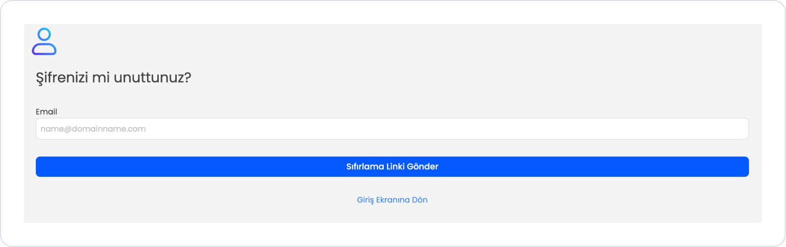
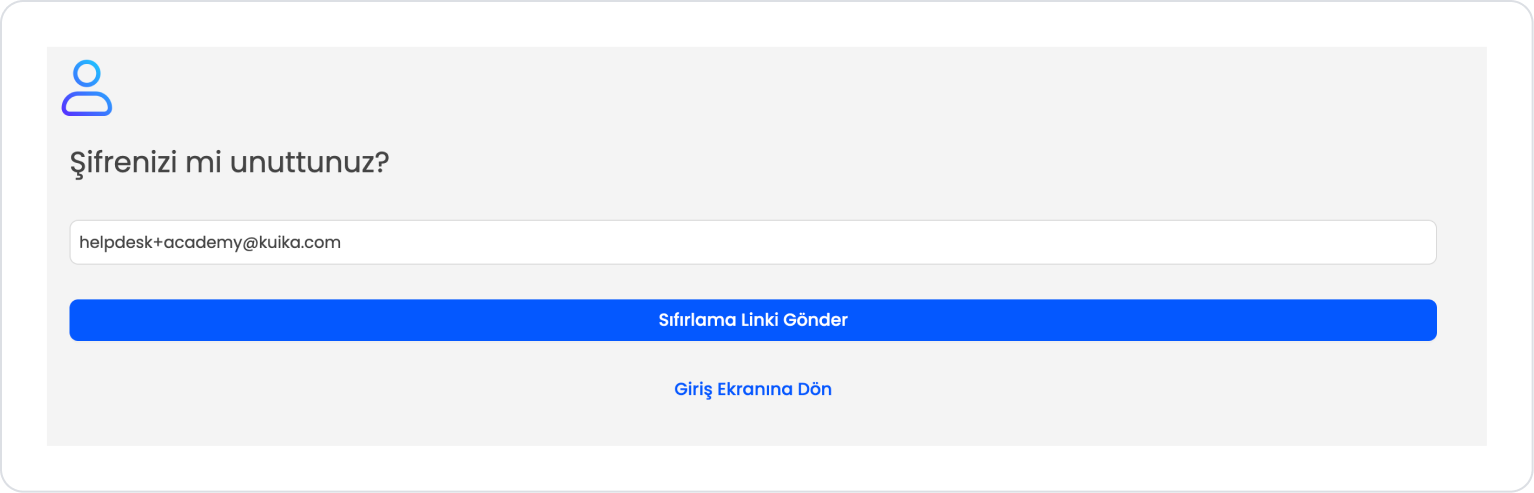
Scenario: Creating a Password Reset Screen
In applications that include user management or a login system, the “Forgot My Password” screen should provide a simple and clear user experience. Proper layout on this screen is crucial, especially for the form fields and navigation links to appear organized.
In this scenario, the Row element is effectively used to align the form fields and position the navigation link correctly on the page.
In the scenario:
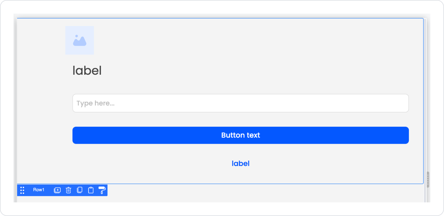
The email entry and description fields are placed in a vertical flow, while the “Return to Login Screen” link in the lower section is displayed centered using the Row element.
Thanks to Row, the link does not lose its position on different screen sizes; it is always neat, centered, and easily accessible.
The form button (“Send Reset Link”) and the bottom redirect link are visually separated to provide the user with a clear flow.
Benefits of Using Row:
Center alignment: The bottom redirect link is centered on all devices.
Consistent structure: Creates a clean visual separation between form fields and secondary actions.
Compatibility: Maintains the same layout on mobile and desktop devices.
The password reset screen can be designed with different UI layouts. This example scenario is intended solely to provide an alternative perspective on the row element.
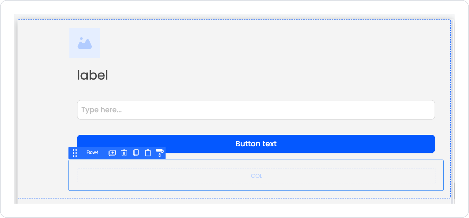
Step 1 - Adding Elements and Editing Styles
To begin:
Open the UI Design module.
Drag and drop the Elements > Container > Row element onto the page from the left side panel.
With the Row element selected, set Row > Properties > Desktop to single column.
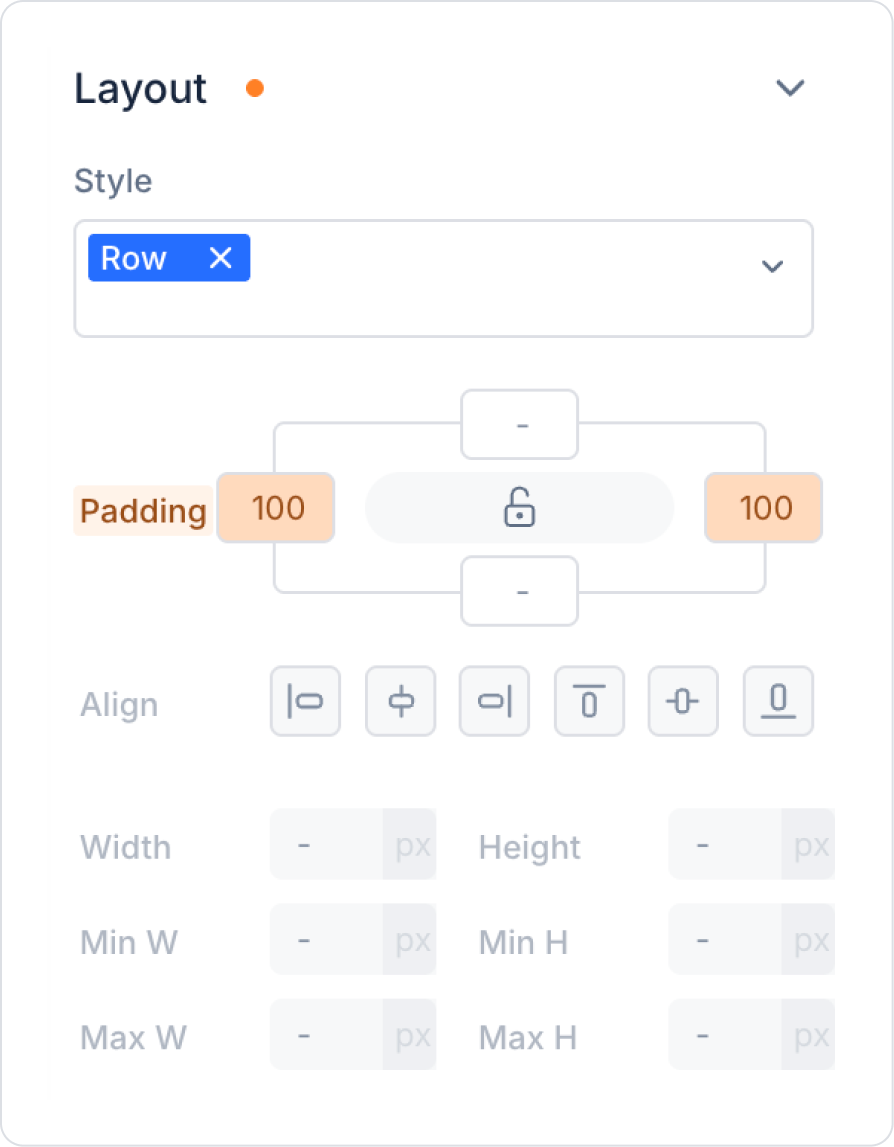
In the Row element, set Row > Styling > Layout > Padding > Left and Right Margin > 100 from the right side panel.
Drag and drop the Elements > Display > Image element into the Row element.
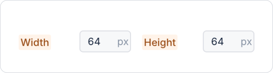
In the Image element, set the Image > Styling > Layout > Width and Height fields to 64 px.
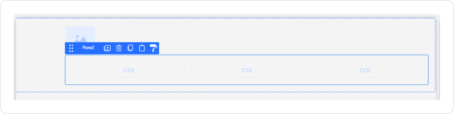
Drag and drop the Elements > Container > Row element below the Image element in the Row.
With the new Row element selected, set the Row > Properties > Desktop field to single column.
Drag and drop the Elements > Display > Label element into the Col field within the Row.
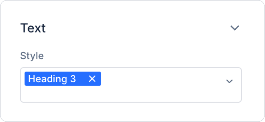
With the Label element selected, select Label > Styling > Text > Style Heading 3 only.
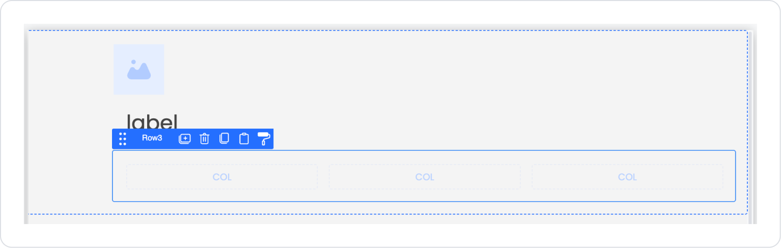
Drag and drop the Elements > Container > Row element below the Label element.
With the new Row element selected, set the Row > Properties > Desktop field to single column.
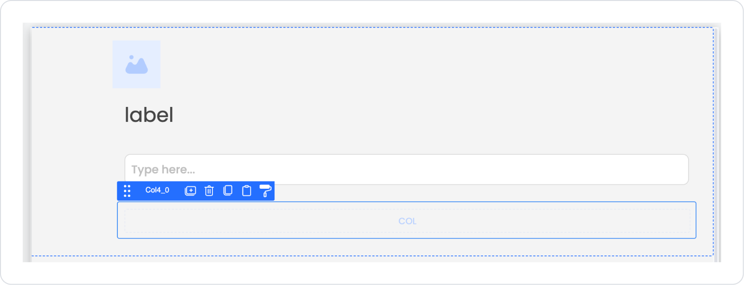
Drag and drop the Elements > Text Input > TextInput element into the Col field within the Row.
Drag and drop the Elements > Container > Row element below the Text Input element and set the Row > Properties > Desktop field to single column.
Drag and drop the Elements > Navigation > Button element into the Col field within the Row.
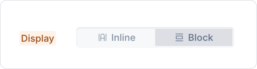
With the Button element selected, select Button > Styling > Layout > Display > Block.
Drag and drop the Elements > Container > Row element under the Text Input element and set the Row > Properties > Desktop field to single column.
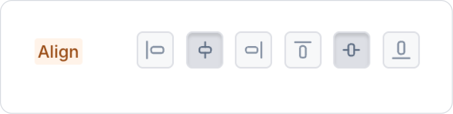
Click on the Col field within the Row. In the Col > Styling > Layout > Align field, select center both vertically and horizontally.
Drag and drop the Elements > Display > Label element into the Col field within the Row.
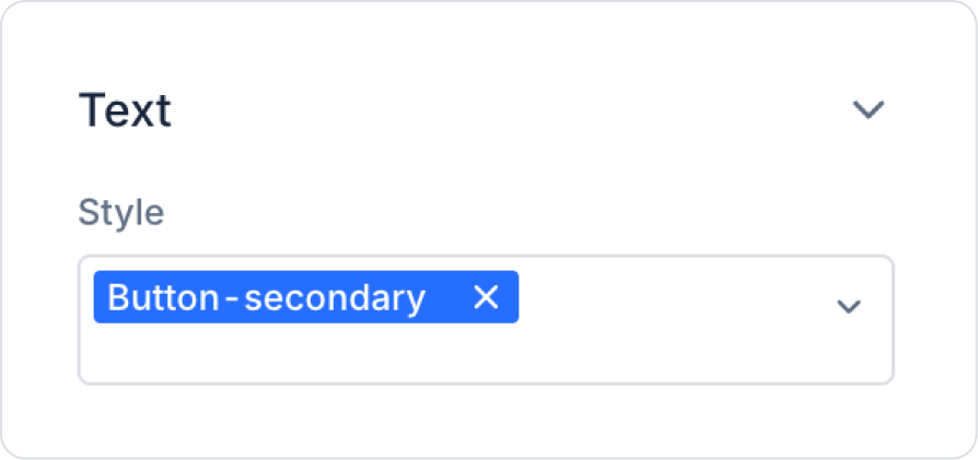
With the Label element selected, in the Label > Styling > Text > Style field, select only the Button-Secondary option.
After all these steps, the expected result is as follows.
Step 2 - Configuring Element Settings
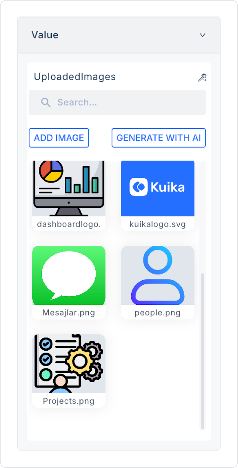
Click on the Image element on the page. Select Image > Properties > Value > UploadedImages and add the image you want to upload or select one from the existing ones.
Click on the first Label element on the page. Add the text ‘Forgot your password?’ to the Label > Properties > Value field.
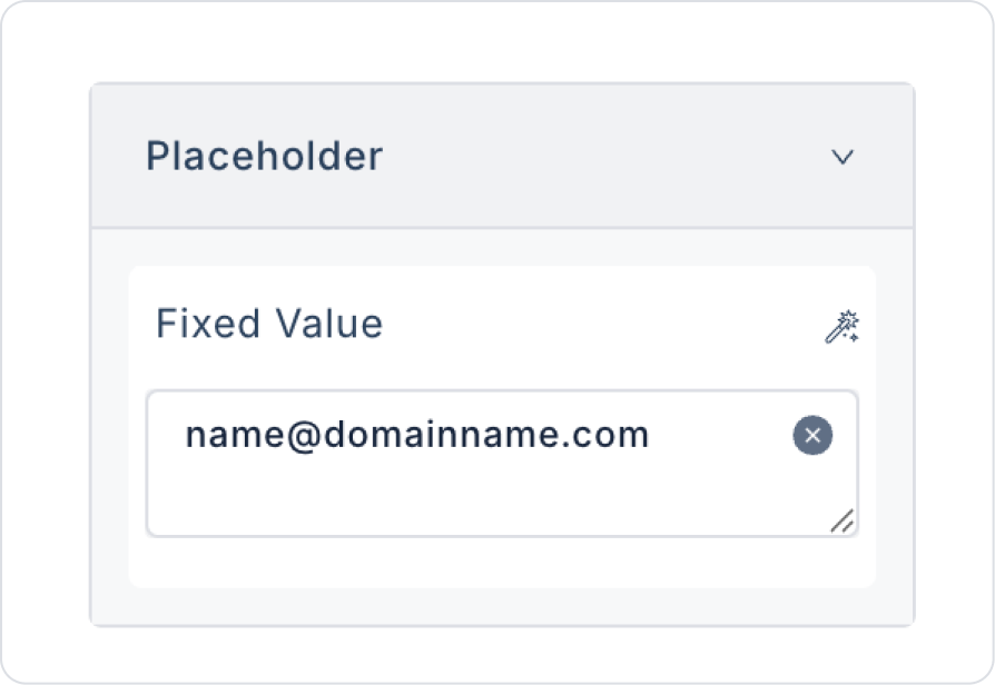
Click on the Text input element on the page. Add the text name@domainname.com to the TextInput > Properties > PlaceHolder field.
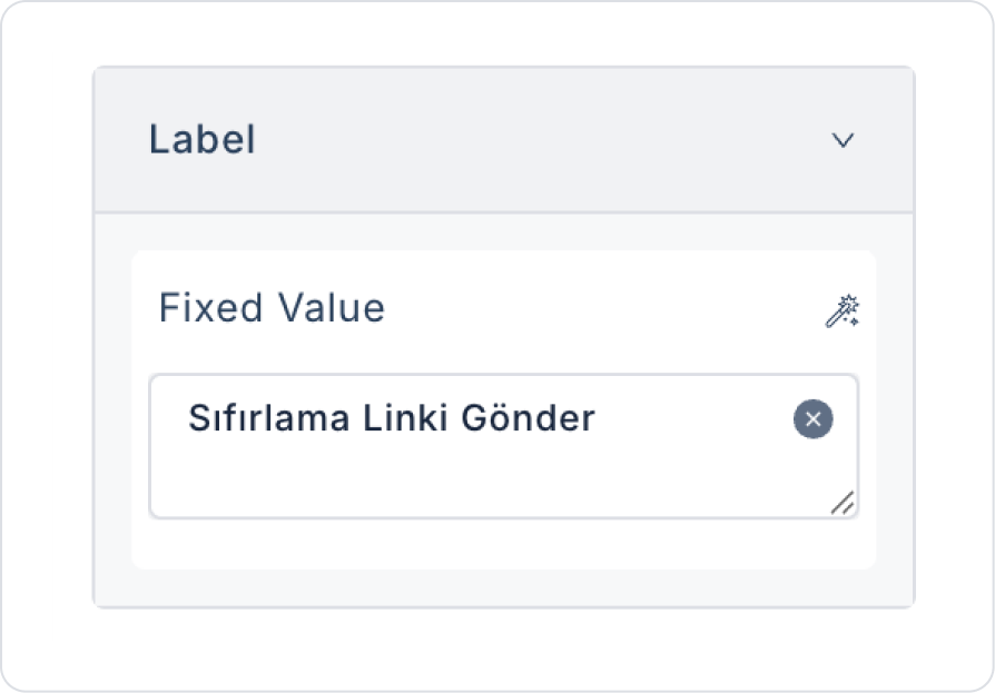
Click on the Button element on the page. Add the text ‘Send Reset Link’ to the Button > Properties > Label field.
Click on the bottom Label element on the page. Add the text ‘Return to Login Screen’ to the Label > Properties > Value field.
Step 3 - Adding Actions
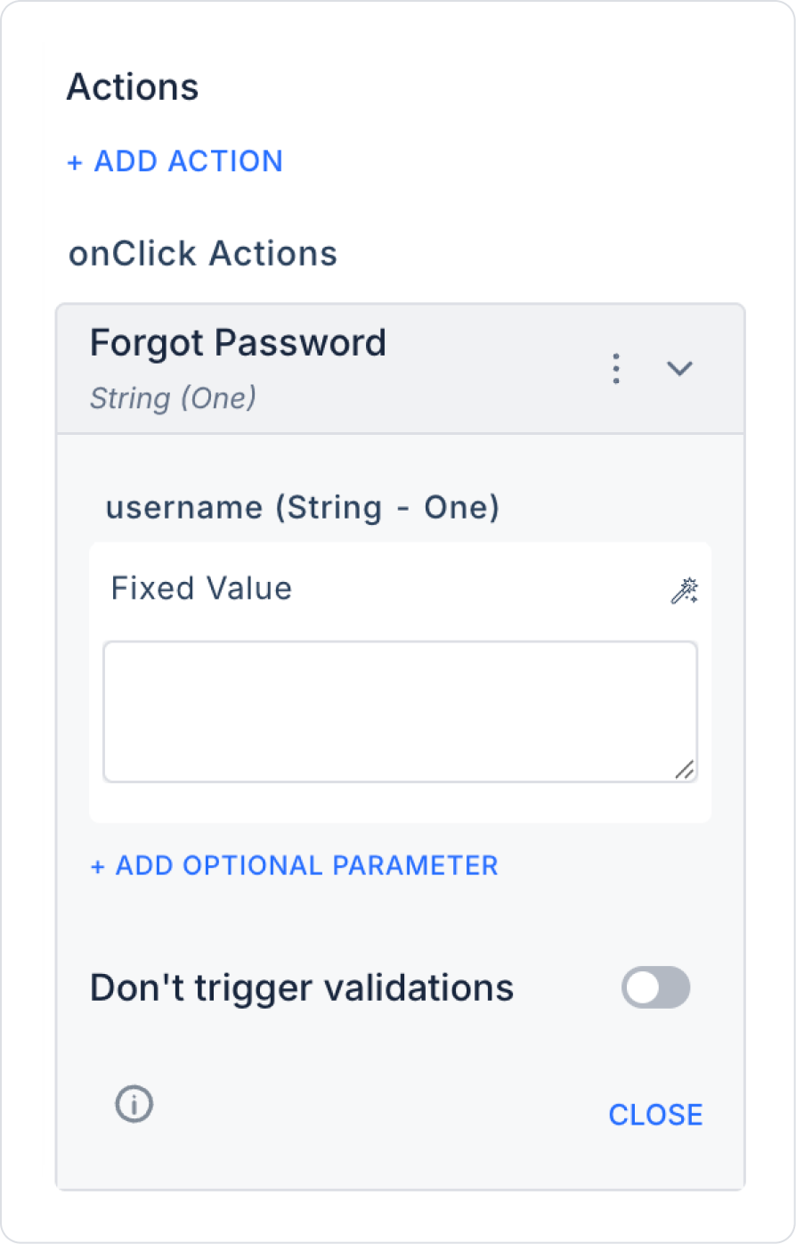
In the UI Design module, click on the button element on the page. Add the ready-made system action Button > Properties > Add Action > onClick > Authorization > Forgot Password to the element.
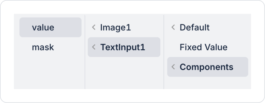
Define the username field within the action as username > Components > TextInput > value.
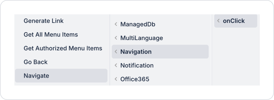
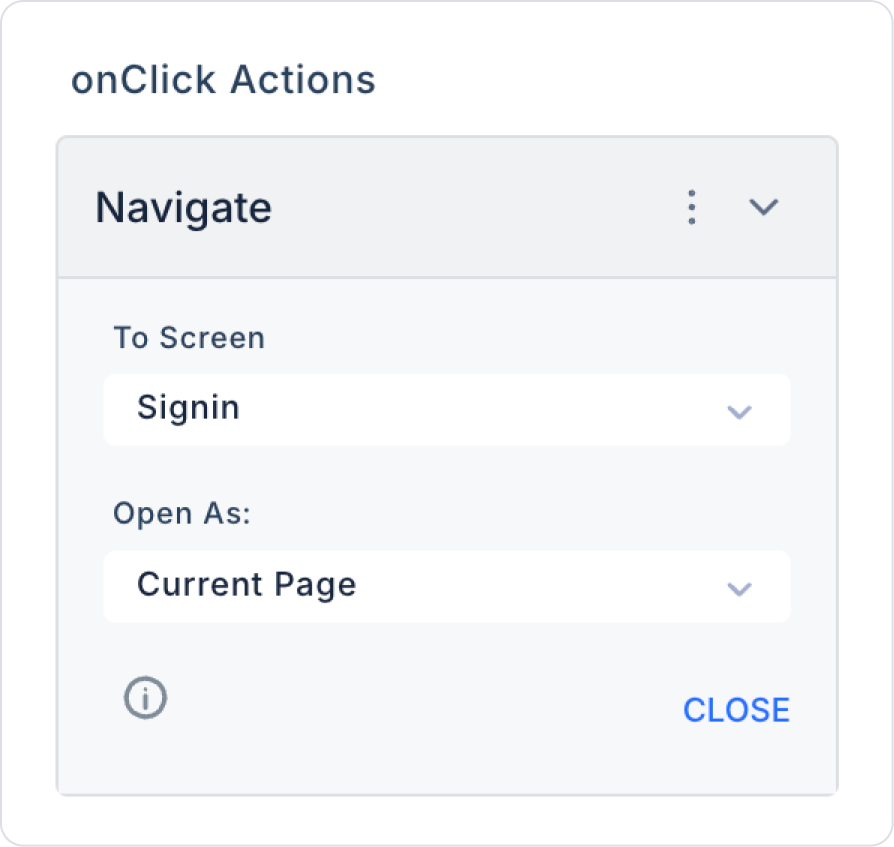
Click on the Label element at the bottom. Add the ready-made action Label > Properties > Add Action > onClick > Navigation > Navigate to the element.
In the To Screen field within the Navigate action, select the predefined ‘Signin’ page.
Preview:
When the application is tested, the password reset screen provides the user with a simple and clear interface. The email entry field, explanatory title, and “Send Reset Link” button are neatly arranged. At the bottom of the page, the “Return to Login Screen” link is centered using the Row element.
This structure allows the user to easily complete the password reset step and return to the login screen with a single click if needed. The interface provides a consistent and user-friendly experience on both desktop and mobile devices.
4. Common Properties
Some fields on the row element are commonly used in all UI elements. Therefore, detailed explanations of the following properties are provided in the relevant general guide pages:
Keep spacing and alignment consistent. Adjusting the spacing and vertical alignment of elements within the Row improves the user experience.
Customize column structures for devices with mobile compatibility in mind. Having fields that appear side-by-side on the web appear one below the other on mobile devices provides a good user experience.
6. Limitations
Row supports only a single “onClick” trigger. More complex interactions may require adding separate actions to child elements.
Row layout provides only horizontal alignment. Vertical Stack should be used for vertical layout.
Incorrect column settings on tablets and mobile devices may cause display issues.


