The Calendar element is a basic date picker element that allows users to select a date or date range within the application. Users can mark the desired day on the calendar view to perform data entry, filtering, planning, or time-based operations.
Calendar offers different usage scenarios such as single date selection, multiple date selection, or specifying a range for a specific period. It plays a critical role in all applications that require appointment management, event planning, leave tracking, or time filtering.
Thanks to the visual calendar structure offered by Calendar, users can select date information quickly and accurately, making processes more fluid.
The Calendar element is only supported in web applications.
1.1. Common Usage Scenarios
Situations requiring single date selection. For example: delivery date selection, payment date, appointment date.
Scenarios requiring date range selection. For example: leave start–end dates, reporting period selection, reservation dates.
Multiple date selection. Situations where the user needs to mark more than one day (e.g., working days, event days).
Date-based selection for list or table filtering. Filtering data such as orders, log records, activity lists by a specific date.
Appointment management. Doctor appointments, service request dates, training schedules.
Period-based settings or time-period selections. For example, the user can select the month in which an invoice is valid.
Marking specific days in the calendar view. Highlighting information such as alerts, holidays, and special days on the calendar.
2. Basic Features
Single date selection support. The user can select only one day from the calendar.
Date range selection. The user can specify a start and end date. Commonly used in reporting, leave, and reservation processes.
Multiple date selection. Allows multiple days to be marked. Suitable for event days, work calendars, or special dates.
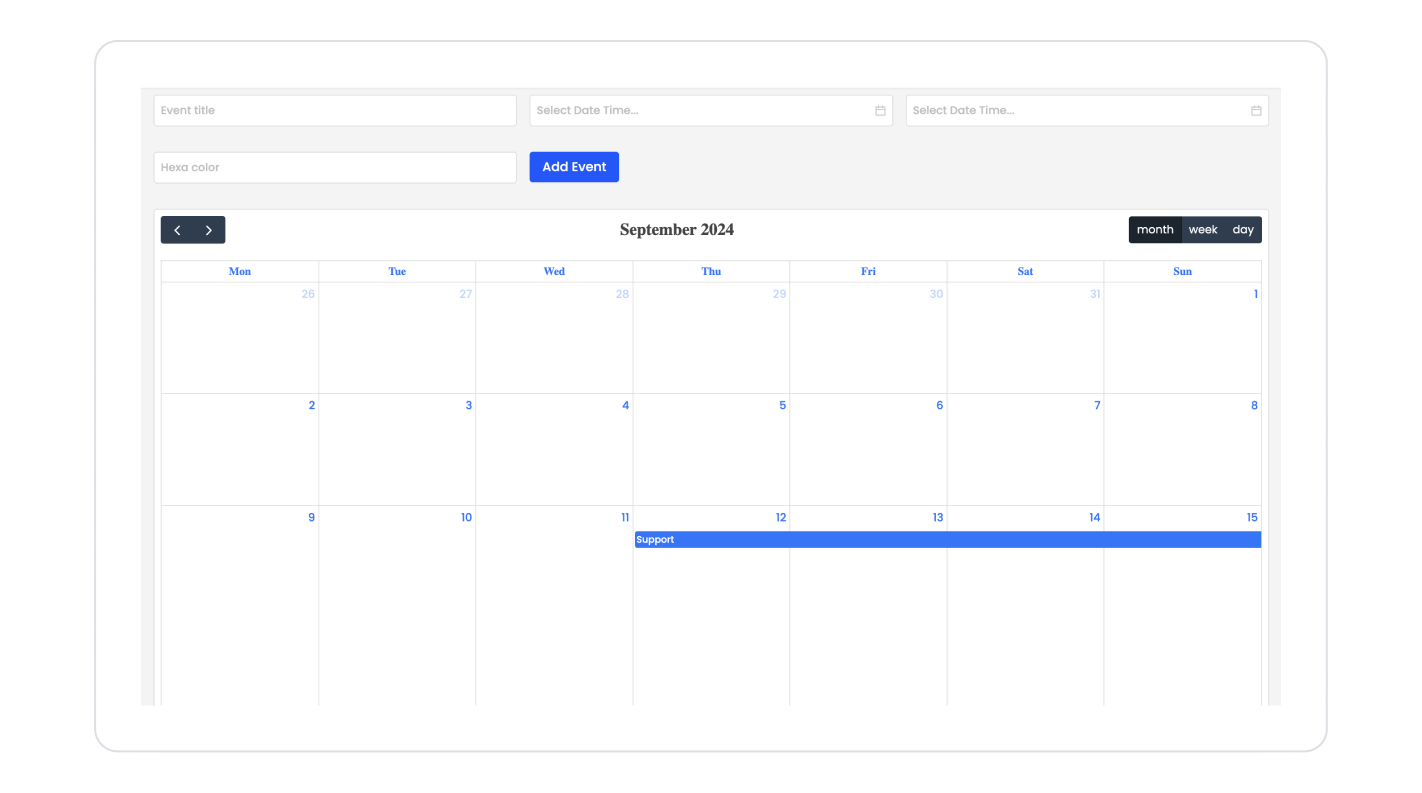
Easy to use thanks to the visual calendar structure. Offers a user-friendly date experience with day, week, and month views.
Direct data binding support. The selected date or date range can be sent as a parameter to other actions or elements.
2.1. Element Properties
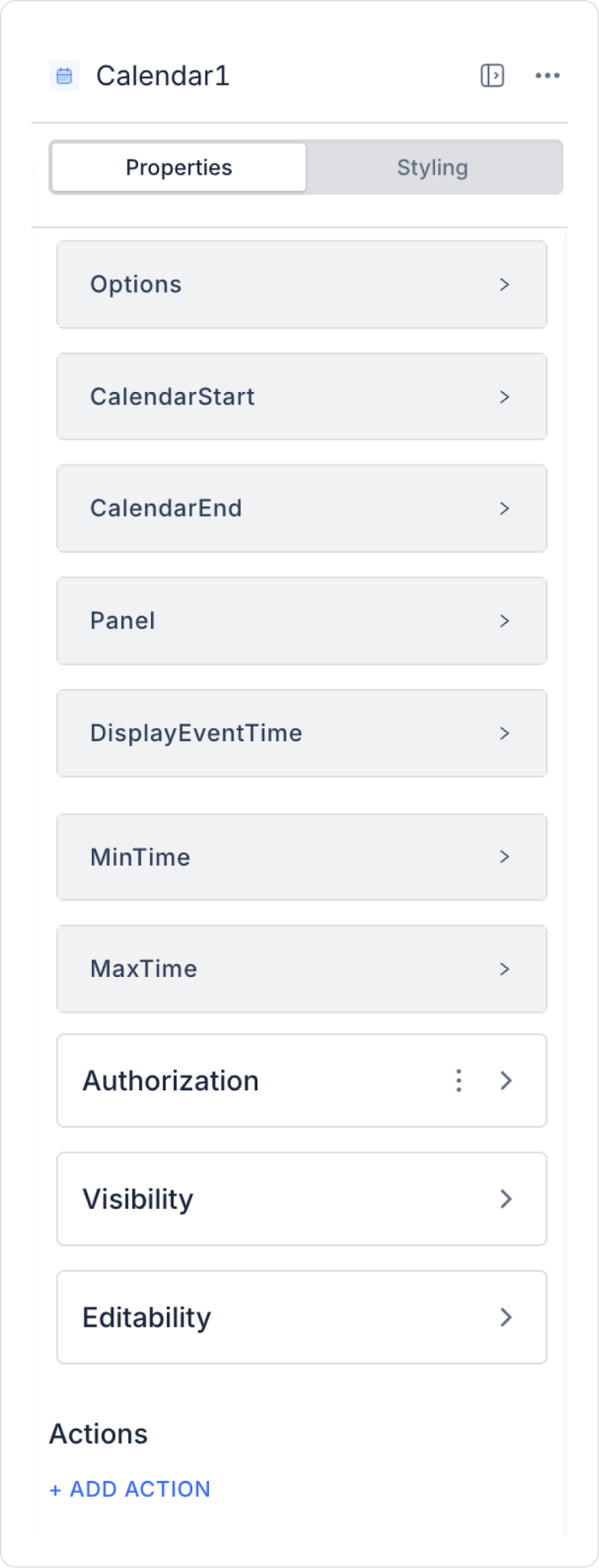
When you select the Calendar element, you can configure all the necessary settings for the events to be displayed on the calendar in the Properties panel on the right. Each feature is explained in detail below:
Options: This field determines which columns the events to be displayed on the calendar will come from. Parameters such as Event Title, Start Date, and End Date are fed from the fields in this section. The Options content is automatically shaped according to the selected action or data source.
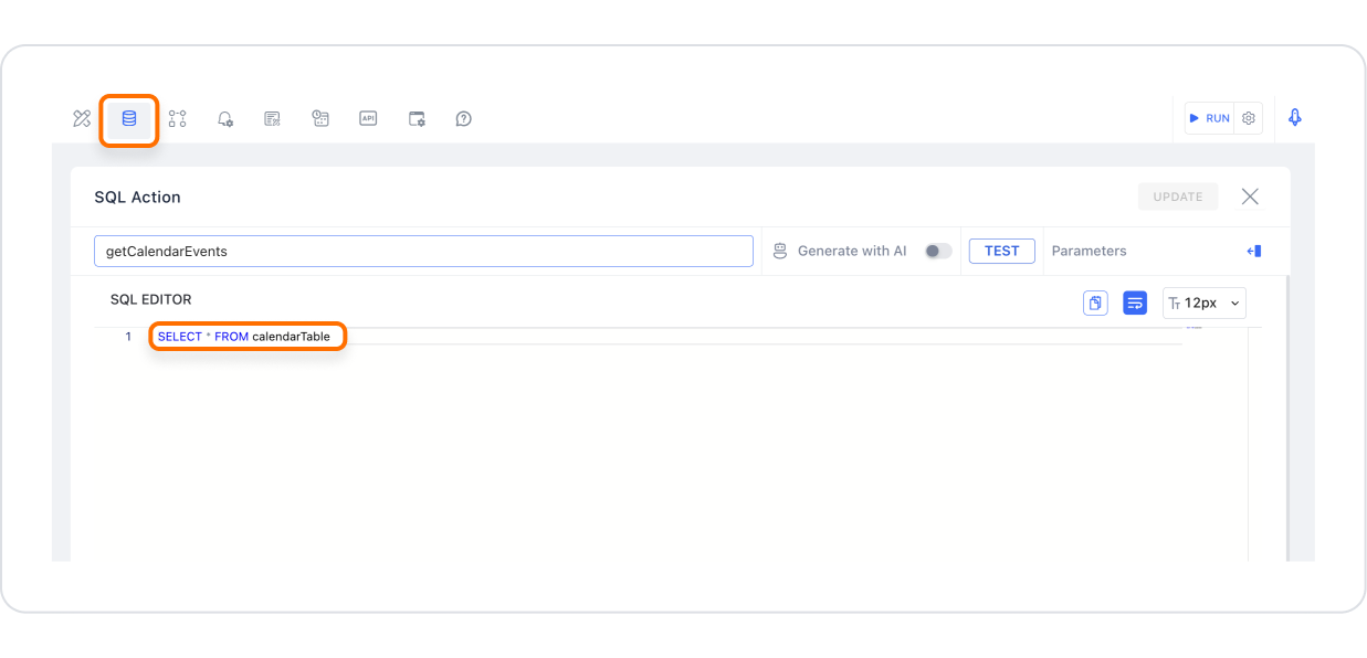
Action: This is the action that brings up the list of events to be displayed on the Calendar. The action to be performed during the initial load or user interactions is defined here. Example: Initial Action → Managed DB → GetCalendarEvents
Event Id Field: Uniquely identifies each event to be displayed on the calendar. It is required for updates, deletions, or selections to work correctly.
Event Title: The event name to be displayed to the user on the calendar. The title visible on the Event card comes directly from this field.
Start Date: Specifies the day and time the event will start on the calendar. It must be in datetime format.
End Date: Specifies the end time of the event. Cannot be before the start date.
Event Color Hex: Specifies the background color with which events will be displayed on the calendar. Hex color format is used (e.g., #28a745, #ffcc00).
Event Height: Sets the height of each event card (event bar/block) on the calendar in pixels. This can be increased to make the card easier to view when the event content is extensive (images, icons, long titles, etc.).
Font Color: Determines the text color of the text displayed within the event card (title, time information, etc.). The hex format is supported (e.g., #ffffff).
Font Family: Determines the font family of the text in the event card. This is used to ensure consistency with the typography used throughout the application.
Font Size: Determines the font size of the text on the event card. It can be adjusted to maintain readability on small cards or to condense text in dense calendar views.
Font Weight: Determines the boldness of the text on the event card (e.g., Normal, Bold, Semi-Bold). It can be used to highlight important events or titles.
Event Icon: Defines a small icon to be displayed next to the title on the event card. It is used to visually distinguish the event type (meeting, leave, reminder, etc.).
Event Avatars: This field allows one or more profile pictures (avatars) of individuals to be displayed on the event card for each event. When matched with the corresponding image/URL column in the data source, these appear on the card as small circular profile photos. For example, in an Annual Leave template table, the photo of the employee on leave can be displayed directly on the event card in the calendar; if multiple people are involved in the same event, the avatars can be listed stacked on top of each other or side by side.
Calendar Start / Calendar End: Defines the date range to be displayed on the calendar.
Calendar Start: The first day of the view
Calendar End: The last day of the view Example: 2025-01-01 → 2025-01-31
Panel: Specifies the view mode of the calendar:
Day
Week
Month
Year
Display Event Time: Determines whether the time information for events is displayed.
If enabled: Time information such as 09:00 – 11:00 is visible.
If disabled, only date-based information is visible.
minTime / maxTime: Determines which time range will be displayed in the daily and weekly views of the calendar.
minTime: The earliest time to be displayed in the calendar
maxTime: The latest time to be displayed in the calendar
2.2. Connecting a Data Source to the Calendar Element
A data source must be connected to list events in the Calendar. You can follow the steps below:
Select the Calendar element.
Go to the Properties panel → +ADD ACTION → OnClick (or Initial Action) → Managed DB → GetCalendarEvents
This action fetches the data to be displayed in the calendar.
Match the fields in the Options section with the columns returned by the action:
Event Id Field
Event Title
Start Date
End Date
Event Color Hex
Can also be used with Calendar Datasource; data can be retrieved via REST API or Managed DB.
2.3. Adding Events to the Calendar Element
You can add events to the Calendar with the following steps:
2.3.1. Creating a data table
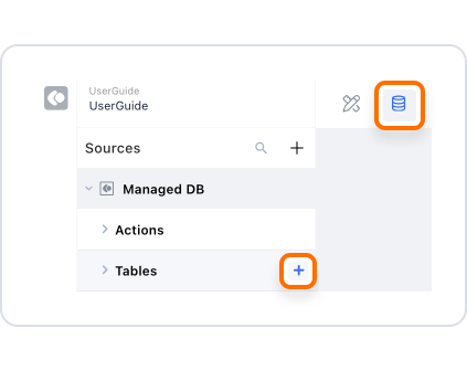
Go to the Datasources module.
Create a new table (e.g., CalendarEvents).
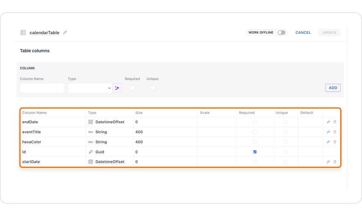
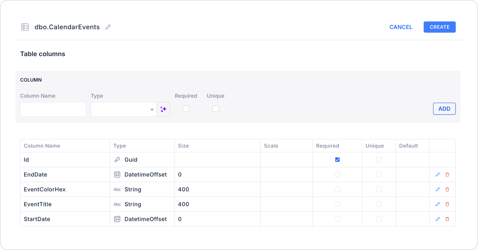
Add the following fields:
id
title
startDate
endDate
colorHex
2.3.2. Fetching data when the page loads
A SELECT query is executed on Page Init:
SELECT id, title, startDate, endDate, colorHex FROM CalendarEvents
2.3.3. Filling in Calendar Properties
Select the Calendar element and match the following fields with the table columns:
Event ID Field → id
Event Title → title
Start Date → startDate
End Date → endDate
Event Color Hex → colorHex
Action → GetCalendarEvents
2.4 Actions That Can Be Added to Elements
The Calendar element allows you to add actions that will run based on user interactions. After selecting the Calendar, the following triggers can be used via ADD ACTION in the right panel:
onClickDay: Triggered when the user clicks on a specific day in the calendar. This trigger is especially useful for date-based operations.
Usage scenarios:
Create a new event
Filter the list or table based on the selected day
Display the details screen for that day by opening a pop-up
Automatically fill in the date field in the form
onClickEvent: Triggers when the user clicks on an event on the calendar. It is the most commonly used trigger for event management.
Use cases:
Display event details
Open a modal to edit the event
Deleting the event
Redirecting to another action via Event ID
onPanelChange
Triggered when the user changes the calendar view (Month → Week → Day) or navigates forward or backward.
Use cases:
Updating the data list according to the newly selected date range
Reloading events for the relevant month when the month changes
Execute different actions based on the view mode
Example:
Re-execute the GET EVENTS action when the user switches from January to February
Call only the events for the relevant week when switching to the weekly view.
3. How to Use the Calendar Element?
In this section, we will cover the end-to-end use of the Calendar element through an example scenario.
Scenario: Creating a Calendar Application
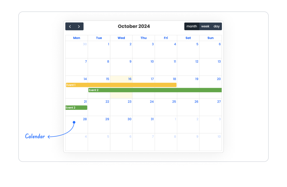
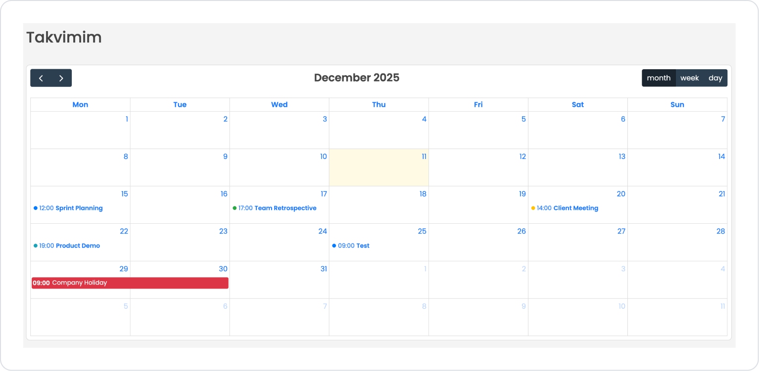
In a task, project, or team management application, it is very convenient for users to see their meetings, events, and important workflows within a given month on a single screen. The Calendar element presents this information in an organized and understandable way with monthly, weekly, and daily view options.
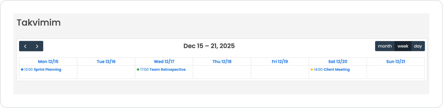
In this scenario, events from the user's personal or team calendar are displayed in a monthly view with date, time, and color codes.
In the scenario:
The user can navigate between months using the Navigation keys on the Calendar element.
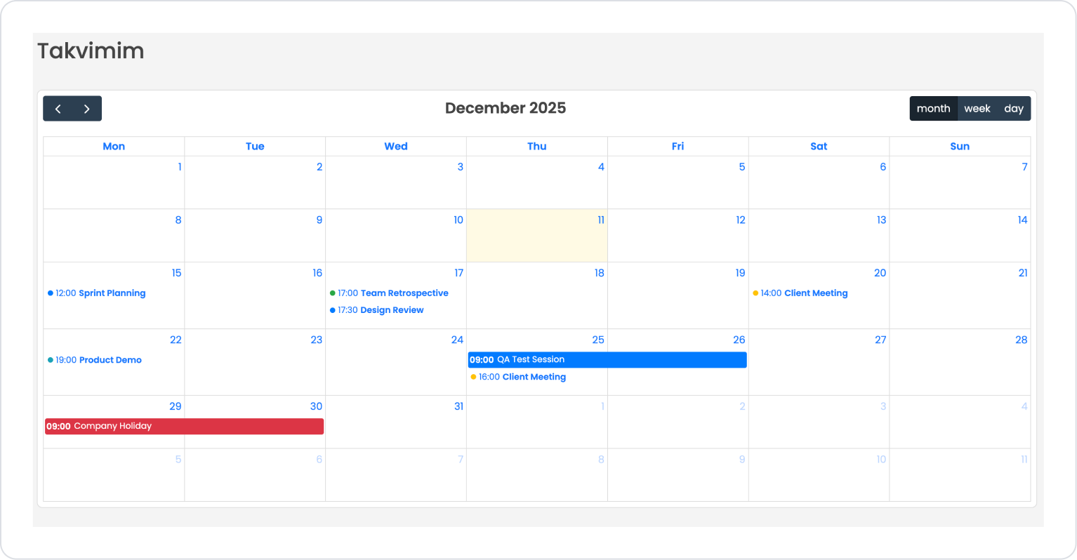
In the monthly view, events for each day are marked with color codes:
Blue → Meeting
Green → Team events
Yellow → Customer visits
Red → Public holiday or important alerts
Events are listed in day boxes along with time information; the user can access details by clicking on the relevant event.
Thanks to the “Month / Week / Day” options, the user can convert the calendar to a broad or narrow time view according to their needs.
For example:
December 15 → 12:00 Sprint Planning (Blue)
December 16 → 17:00 Team Retrospective (Green)
December 19 → 14:00 Client Meeting (Yellow)
December 22 → 7:00 PM Product Demo (Blue)
December 29–30 → 9:00 AM Company Holiday (Red – all day)
Step 1 - Creating a Data Source
Creating a table in the DataSources module:
Go to the Datasources module.
Then go to the Tables tab.
Create a new table named “CalendarEvents”.
The table structure to be set up is as follows:
Important Field names:
EventTitle: Specifies the name of the event to be displayed on the calendar (e.g., “Sprint Planning,” “Client Meeting”).
EventDate: Contains the date the event will take place.
EventTime: Indicates the time of the event (e.g., 12:00, 17:00).
EventColor: Holds color information to distinguish event types (blue: meeting, green: team event, yellow: client meeting, red: holiday).
EventType: Specifies the category of the event (e.g., “Meeting,” “Holiday,” “Demo,” “Retrospective”).
Step 2 - Defining the Necessary Actions
To display data and add data in the interface:
You need to define two actions.
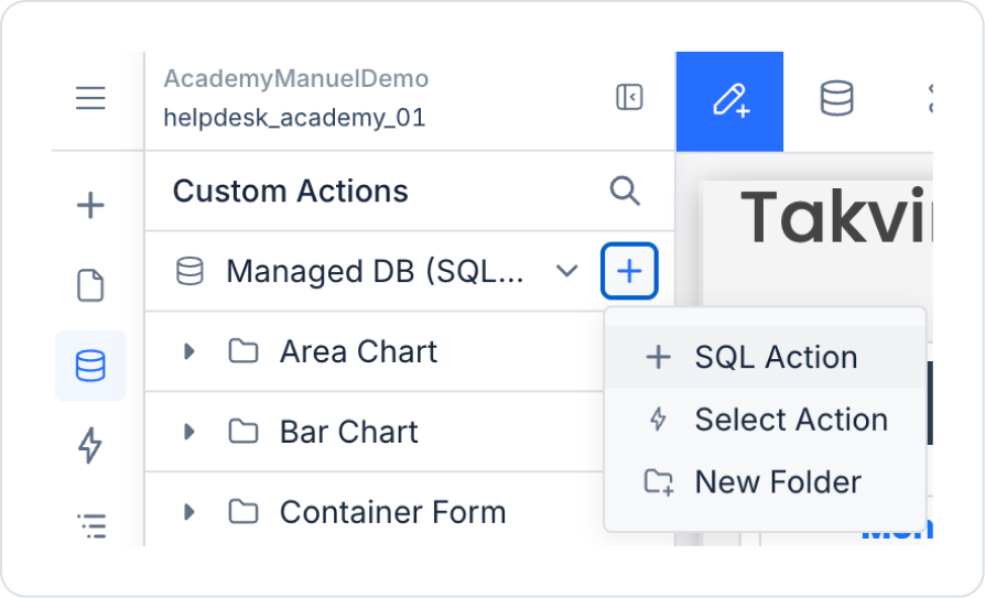
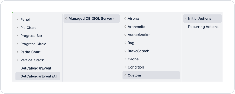
Go to the Custom Action field in the UI Design module and click Create New SQL Action.
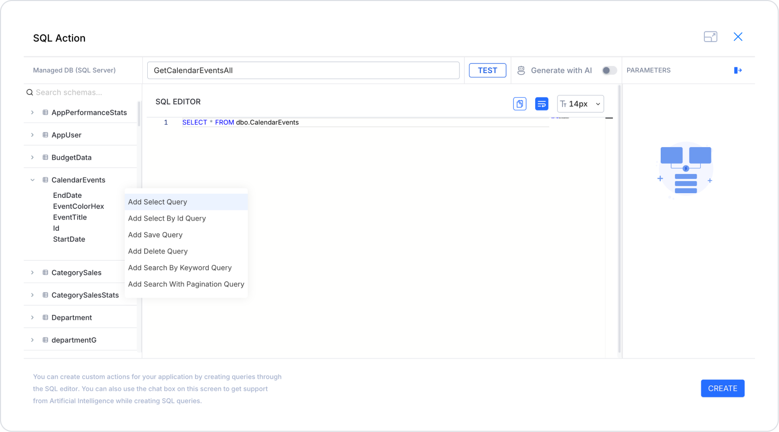
On the screen that opens, select the Add Select Query field from the CalendarEvents table options to list all events, define the action name as GetCalendarEventsAll, and create it.
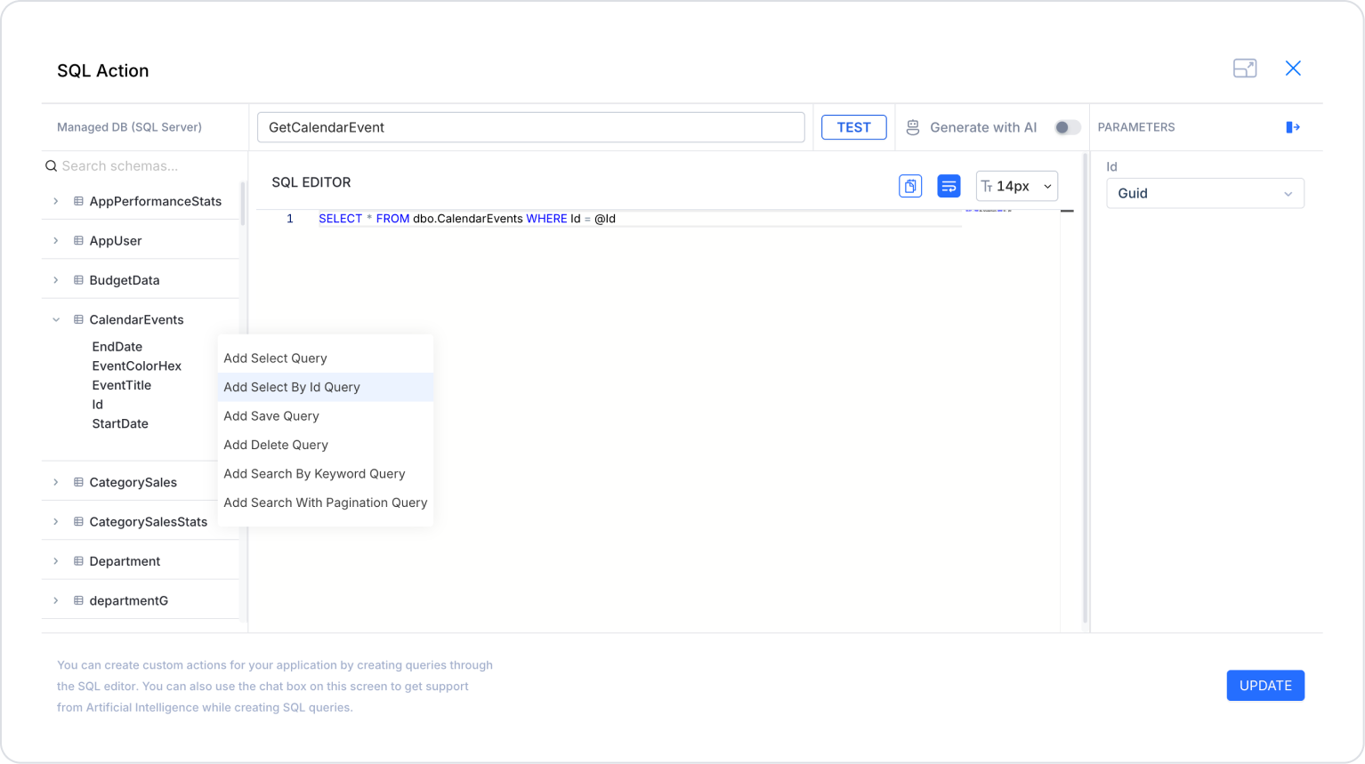
Perform the same process to create an action named GetCalendarEvent to retrieve the clicked event content.
Step 3 - Creating Pages
Open Screens from the side panel in the UI Design module.
Click New Screen and create two new pages named ‘AddEvent’ and ‘EventDetails’.
Step 4 - Developing the Add Event Page
Open the AddEvent page from Pages > Screens in the left side panel.
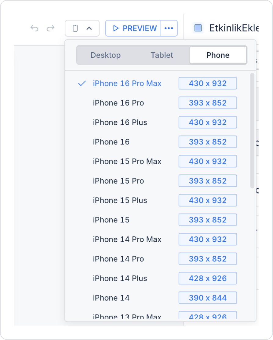
Set the page to mobile size from the top panel.
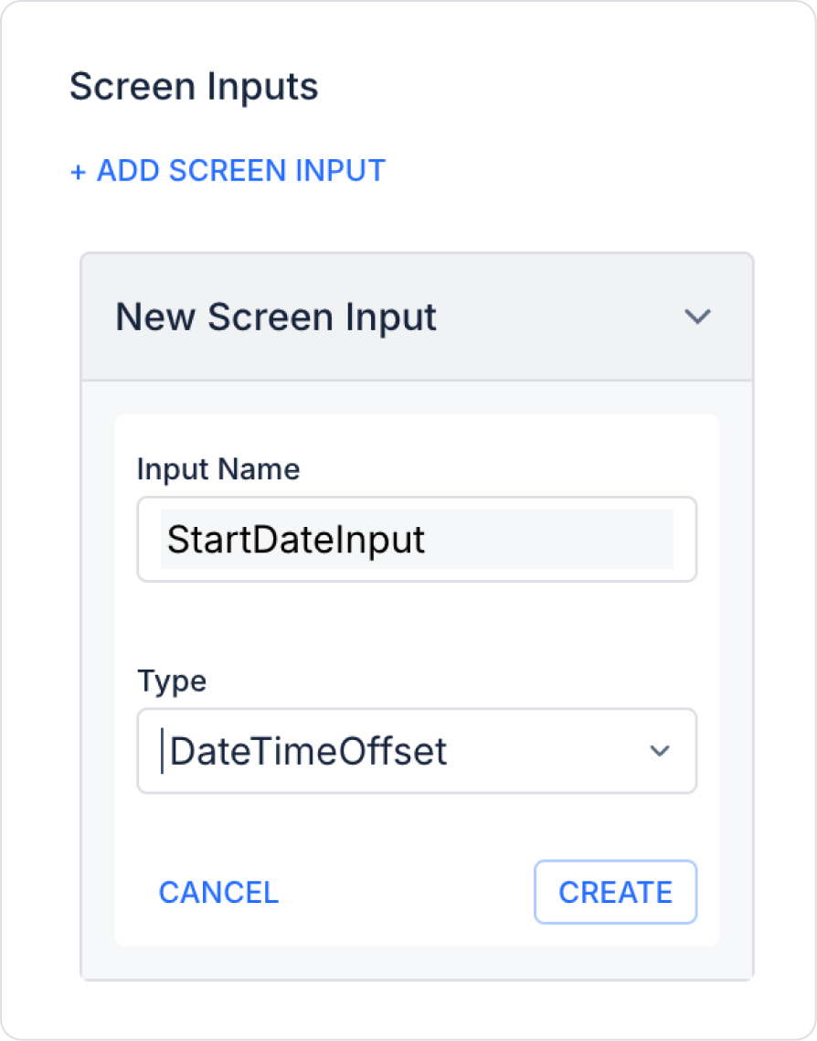
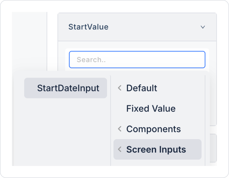
Add a screen input named StartDateInput of type DateTimeOffset to the page using the Add Screen Input button.
Drag and drop the Elements > Display > Label element from the left side panel onto the page.
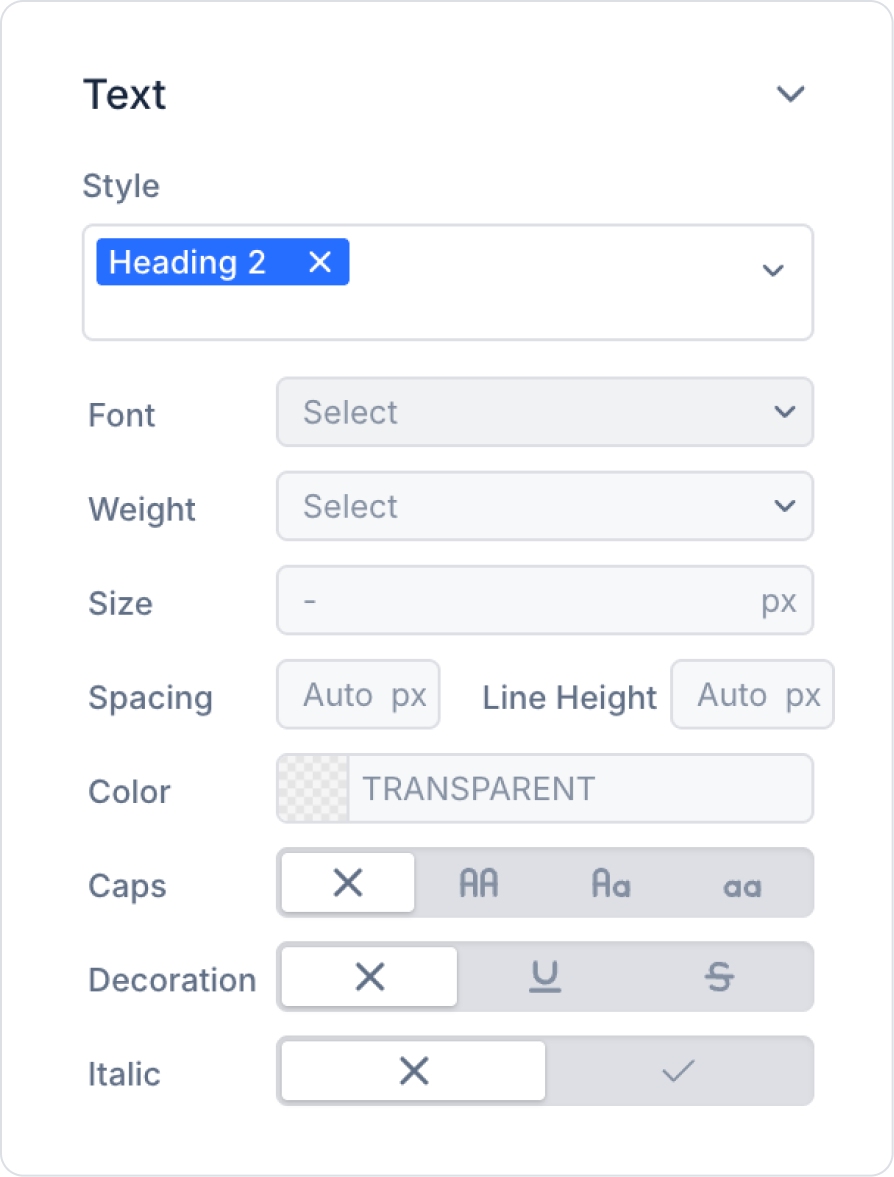
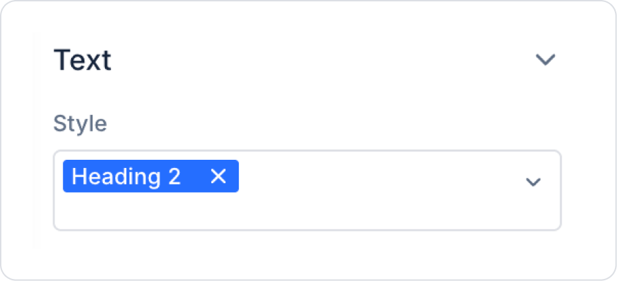
Click on the Label element and set it to Label > Styling > Text > Style > Heading 2.
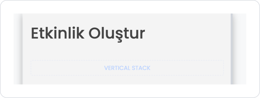
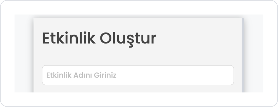
In the Label element, add the text ‘Create Event’ to the Label > Properties > Value field.
Drag and drop the Elements > Container > VerticalStack element below the Label element.
Add the Elements > Text Input > TextInput element inside the Vertical Stack element.
In the Text Input element, add the text ‘Enter Event Name’ to the TextInput > Properties > Placeholder field.
Add the Elements > Date and Time Input > DateTimeRange element below the Text Input element.
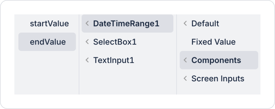
In the DateTimeRange element, define the ScreenInput > StartDateInput in the DateTimeRange > Properties > StartValue field.
Add the Elements > Select Input > SelectBox element below the DateTimeRange element.
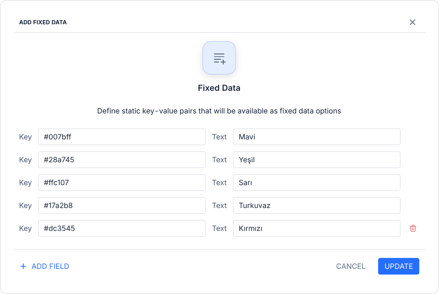
In the Select box element, make the following addition in the SelectBox > Properties > Options > Fixed Option List > Fixed Data field.
If you wish, you can provide colors in the Options field using an SQL action. The Fixed Data method has been used for convenience in the relevant scenario.
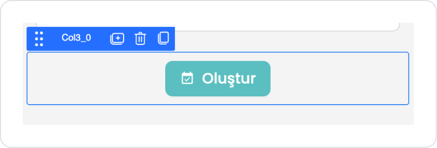
Add the Elements > Navigation > Button element below the Select Box element.
In the Button element, add the text ‘Create’ to the Button > Properties > Label field.
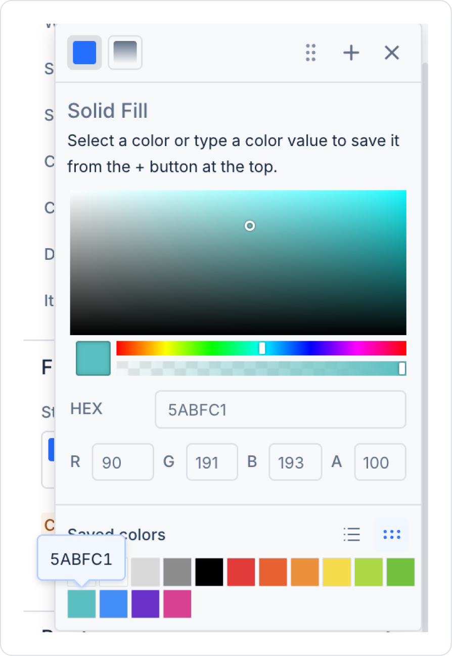
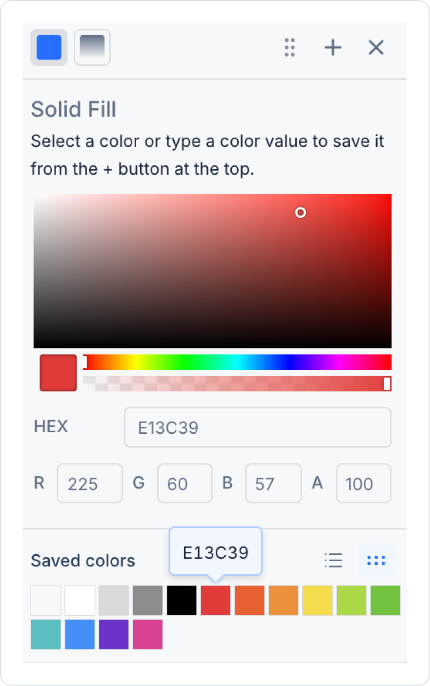
In the Button element, select the following color in the Button > Styling > Fill > Color field.
In the Button element, select the ‘event_available’ icon in the Button > Properties > Icon field.
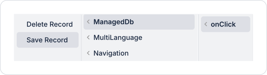
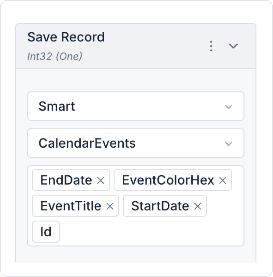
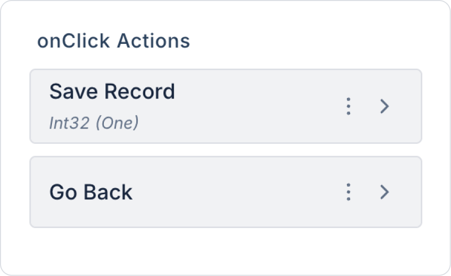
Add the Button > Add Action > onClick > ManagedDb > Save Record predefined action to the Button.
Select the following fields in Save Record.
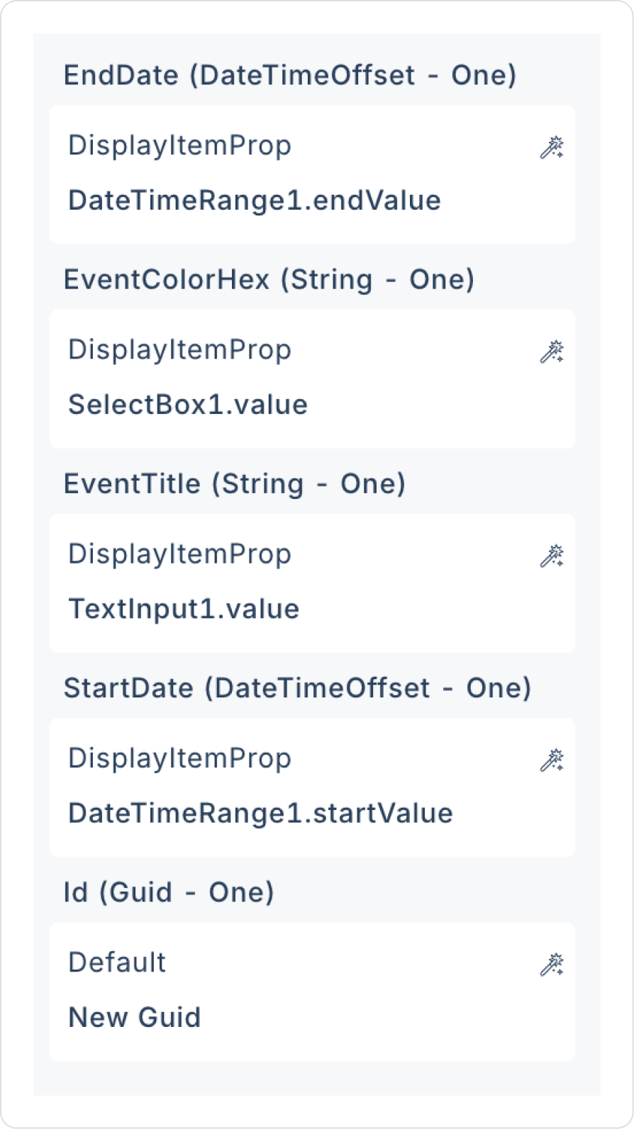
Link the relevant fields in the component category to the fields in the action. The first field example for endDate > Components > DateTimeRange > endValue is as follows.
Define the DateTimeRange component field for EndDate and StartDate, the TextInput component field for EventTitle, and the SelectBox component field for EventColorHex.
Define the Id field as Id > Default > New Guid.
Add a second Button > Add Action > onClick > Navigation > Go Back action to the button.
Click on the empty space next to the Button element.
Select the Col field. In the Col > Styling > Layout > Align field, select center vertically and horizontally.
Step 5 - Developing the Event Details Page
Clone the AddEvent page from the Pages field in the left panel using the option next to it.
Rename the cloned page to EventDetails.
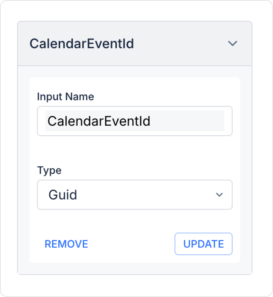
Update the StartDateInput Screen Input to CalendarEventId as shown below.
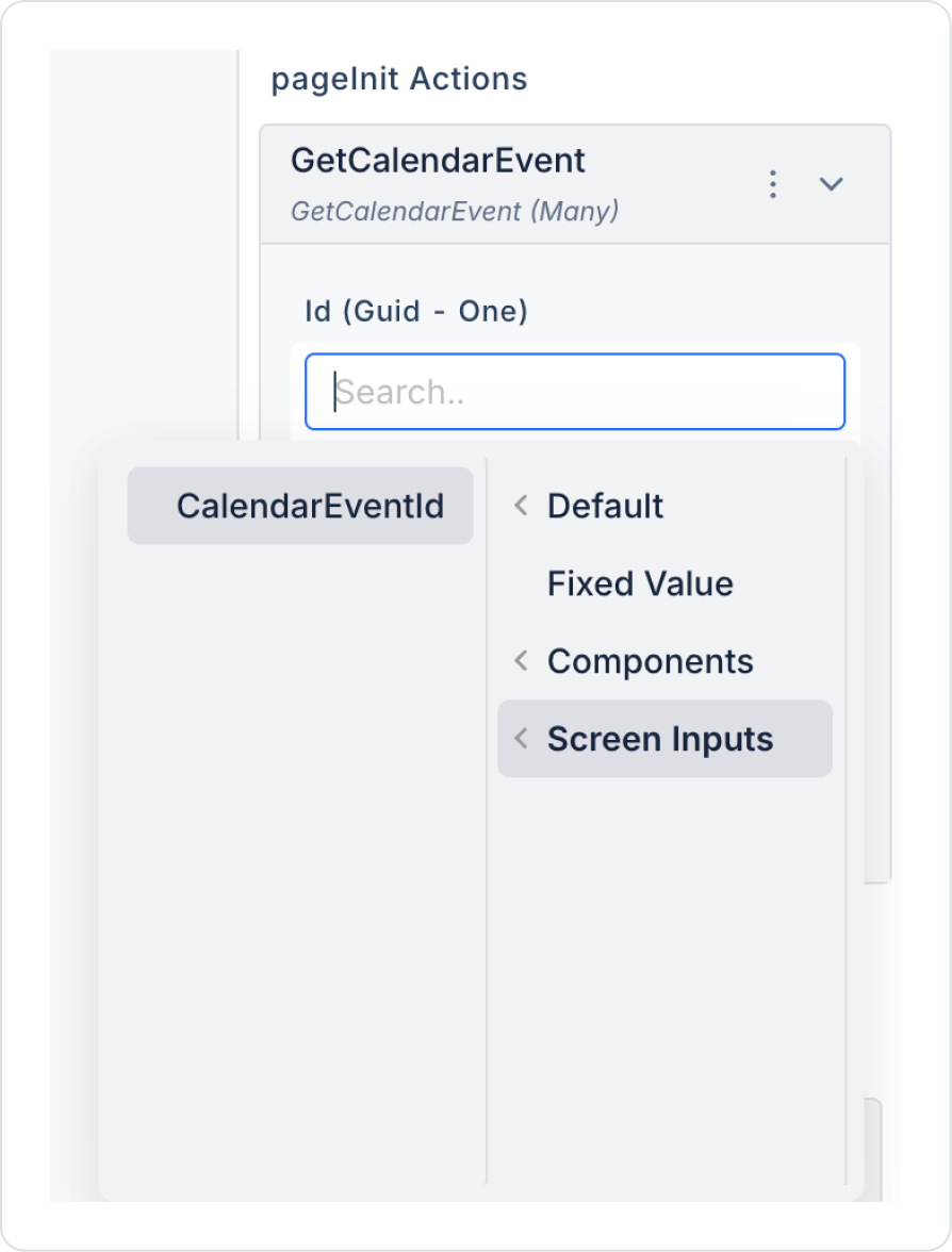
Add the PageInit action to the page and follow the steps Add Action > Initial Action > Custom > Managed DB > GetCalendarEvent. Then, bind the Id field to the ScreenInputs > CalendarEventId value.
In the Label element, update the Label > Properties > Value field to ‘Event Details’.
Click on the empty space next to the Button element and select right alignment horizontally.
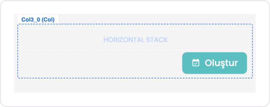
Add the Elements > Container > HorizontalStack element next to the Button element and drag the Button element into the Horizontal Stack.
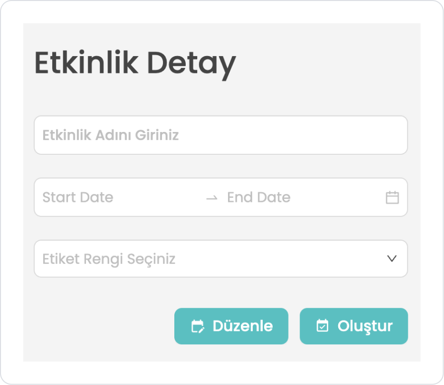
Click on the Button element and duplicate it by pressing the first option, the duplicate button.
Click on the button remaining on the left and change the text in Button > Properties > Label to ‘Edit’.
Then set the icon in Button > Properties > Icon to ‘edit_calendar’.
In the Save Record action inside the Button, update the id field to id > Screen Inputs > CalendarEventId.
Change the ‘Delete’ text in the ‘Create’ button by modifying the ‘Button > Properties > Label’ field.
Then set the icon in ‘Button > Properties > Icon’ to ‘event_busy’.
Set the button color to a red tone by adjusting the ‘Button > Styling > Fill > Color’ field.
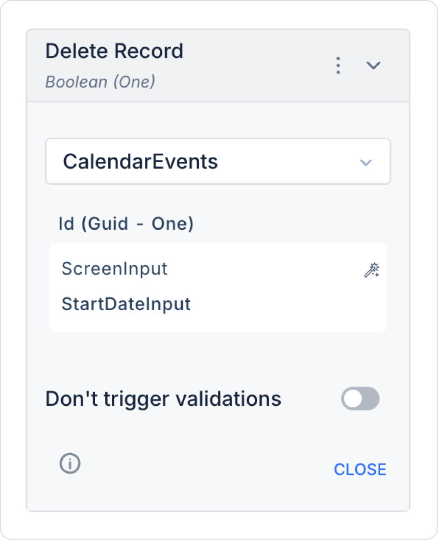
Add the Button > Add Action > onClick > ManagedDb > Delete Record predefined action to the button.
Make the following definitions within the Delete Record action.
Define the Button > Add Action > onClick > Navigation > Go Back action for the Delete button.
Make the following definition in the TextInput > Properties > Value field in the Text Input field.
In the DateTimeRange field, make the following definition in the DateTimeRange > Properties > StartValue field.
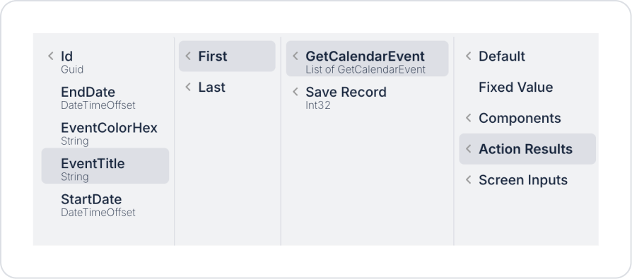
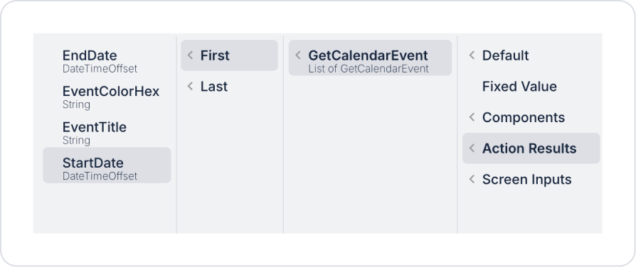
Similarly, make the Action Result > GetCalendarEvent > First > EndDate definition in the DateTimeRange > Properties > EndValue field.
Step 6 - Developing the Main Page
Go to the HomePage page via Pages in the side panel.
Add the Add Action > Initial Action > Custom > Managed DB > GetCalendarEventsAll action to the page.
Add the Elements > Display > Label element to the blank page.
In the Label, set it to Label > Styling > Text > Heading 2.
Drag and drop the Elements > Data > Calendar element below the Label.
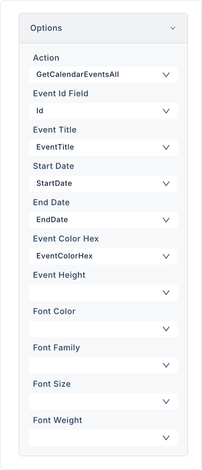
In the Calendar element, define the Calendar > Properties > Options field as follows.
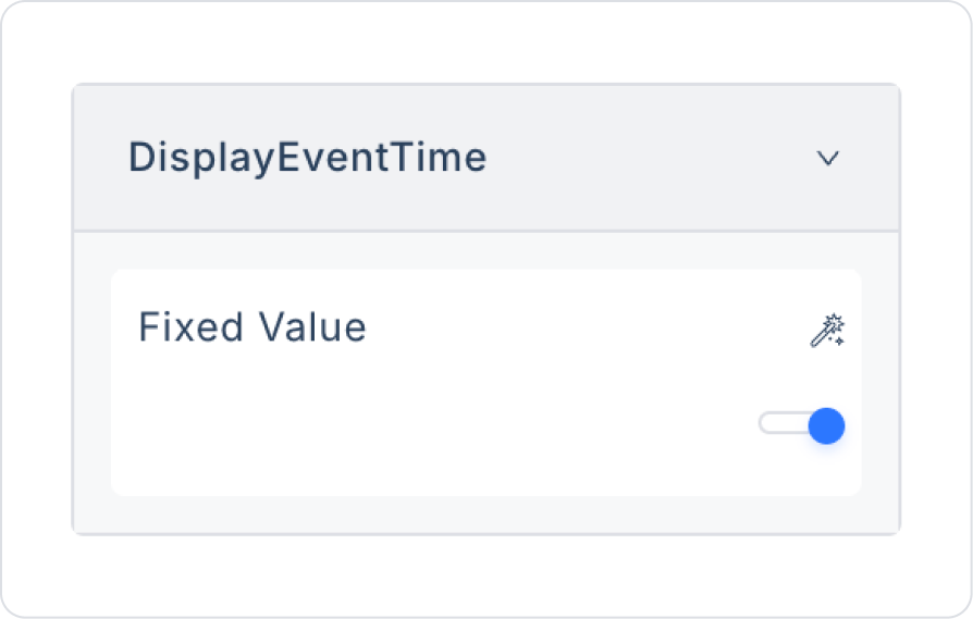
In the Calendar element, set the Calendar > Properties > DisplayEventTime option to on.
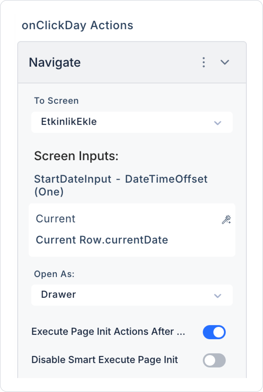
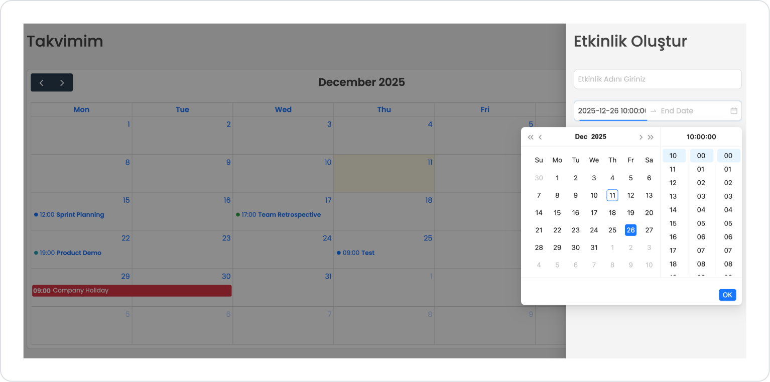
In the Calendar element, add the Calendar > Add Action > onClickDay > Navigation > Navigate action.
In Navigate, define it as To Screen > AddEvent, Screen Inputs > Current > currentDate, and Open As > Drawer.
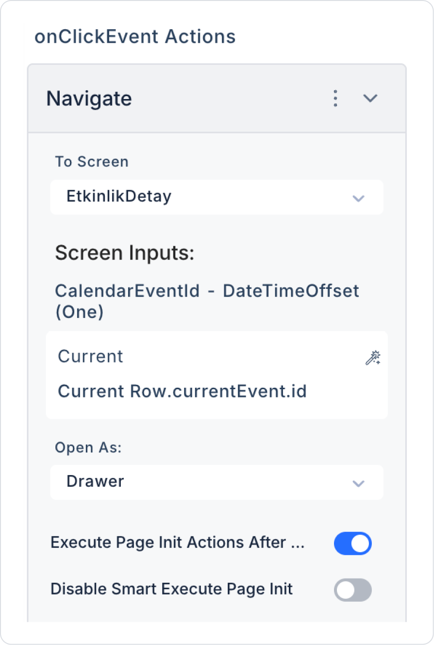
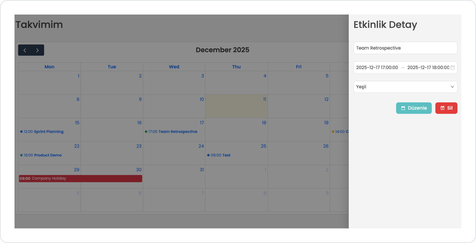
Finally, add the Calendar > Add Action > onClickEvent > Navigation > Navigate action in the Calendar element.
In Navigate, define it as To Screen > EventDetails, Screen Inputs > Current > currentEvent > id, and Open As > Drawer.
Preview:
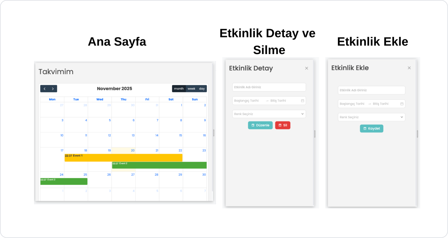
When the app is tested, the calendar component lists all events in monthly, weekly, and daily views, providing the user with a comprehensive planning experience.
When the user clicks on a day, they can quickly create a new event via the panel that opens as a drawer on the right.
When an existing event is clicked, the event details are displayed in the drawer on the right; the user can edit or delete the event from here.
This structure allows event management to be completed easily, quickly, and intuitively.
Monthly Calendar:
This calendar structure lists all events in a broad view on a monthly basis. Users can view the entire month on a single screen and easily evaluate their overall planning.
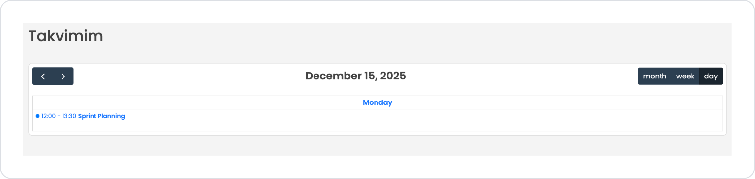
Daily Calendar:
Events for the selected day are displayed in detail. Ideal for day-based planning and workload control.
Weekly Calendar:
Events for a week are presented in a horizontal layout. Allows for quick analysis of weekly work plans or meeting schedules.
Creating a new event:
When the user clicks on any calendar day, they can easily add a new event by entering the event name, date, and other information via the drawer panel that opens on the right.
Editing or Deleting an Existing Event:
Clicking on an event in the calendar opens the drawer panel, allowing the user to edit the event or delete it with a single click.
4. Common Properties
Some fields on the Calendar element are used in common across all UI elements. Therefore, detailed explanations of the following properties can be found in the relevant general guide pages:
Always keep date fields in datetime format. Incorrect data types (string, int, etc.) may prevent events from being displayed on the calendar.
Categorize event colors meaningfully. Using contrasting colors for different event types (meeting, task, leave, appointment) enhances the user experience.
Use the PanelChange trigger efficiently. Do not call unnecessary actions when changing months, weeks, or days. Fetching data only for the relevant date range improves performance.
Order the Start Date and End Date correctly. If End Date < Start Date, the event may not appear or may be positioned incorrectly.
6. Limitations
The Calendar element is only supported in web applications. The Calendar element is not supported in mobile applications.
Events will not be displayed without a defined data source. If no action or datasource is linked in the Options section, the calendar will appear blank.
Date format errors may prevent events from being displayed. Dates coming from REST API or Managed DB must be in yyyy-MM-dd or datetime format.
onClickEvent is only triggered when the event is clicked; it does not work if the day is empty. onClickDay should be used for clicking on empty space on the day.
The onPanelChange trigger re-runs the action with every direction change. Additional control should be added to prevent unnecessary data loading.


