Kuika's Tooltip element is a lightweight and interactive information bubble used to provide additional information about an element in the user interface. When the user hovers over the relevant element, the Tooltip appears and displays an explanatory message about the element. This allows the interface to remain simple, while providing users with additional information only when needed.
The Tooltip element is only supported in web applications.
1.1. Common Use Cases
Button or icon descriptions: Used to display brief information when the user hovers over a button to understand its function. E.g.: Explaining what the “Delete” icon does.
Form field instructions: Used to provide additional information to the user when filling out forms. Example: The explanation “Password must be at least 8 characters long.”
Explanation of abbreviated or overflowing text: You can use Tooltip to display the entire text that does not fit in lists or tables. Example: Long explanations appearing on hover.
Advanced or technical information explanation: Suitable for providing information when needed without overwhelming the user. Example: Showing the technical details of a parameter.
Providing status or warning information: Used to provide additional information about an item that is incorrect, incomplete, or has a special status. Example: “This operation is restricted by administrators.”
2. Key Features
Works by attaching to a UI element: Tooltips are not displayed on their own; they work by being added to another element such as Text, Icon, Button, or Image.
Provides short and descriptive text: Tooltips contain short text that guides, informs, or explains to the user.
Flexible positioning: Tooltip text can be displayed in different positions, such as top, bottom, right, or left. This allows for placement that suits the design.
Use specific to web applications: Since the tooltip element is only supported in web applications, it is not visible or functional in mobile applications.
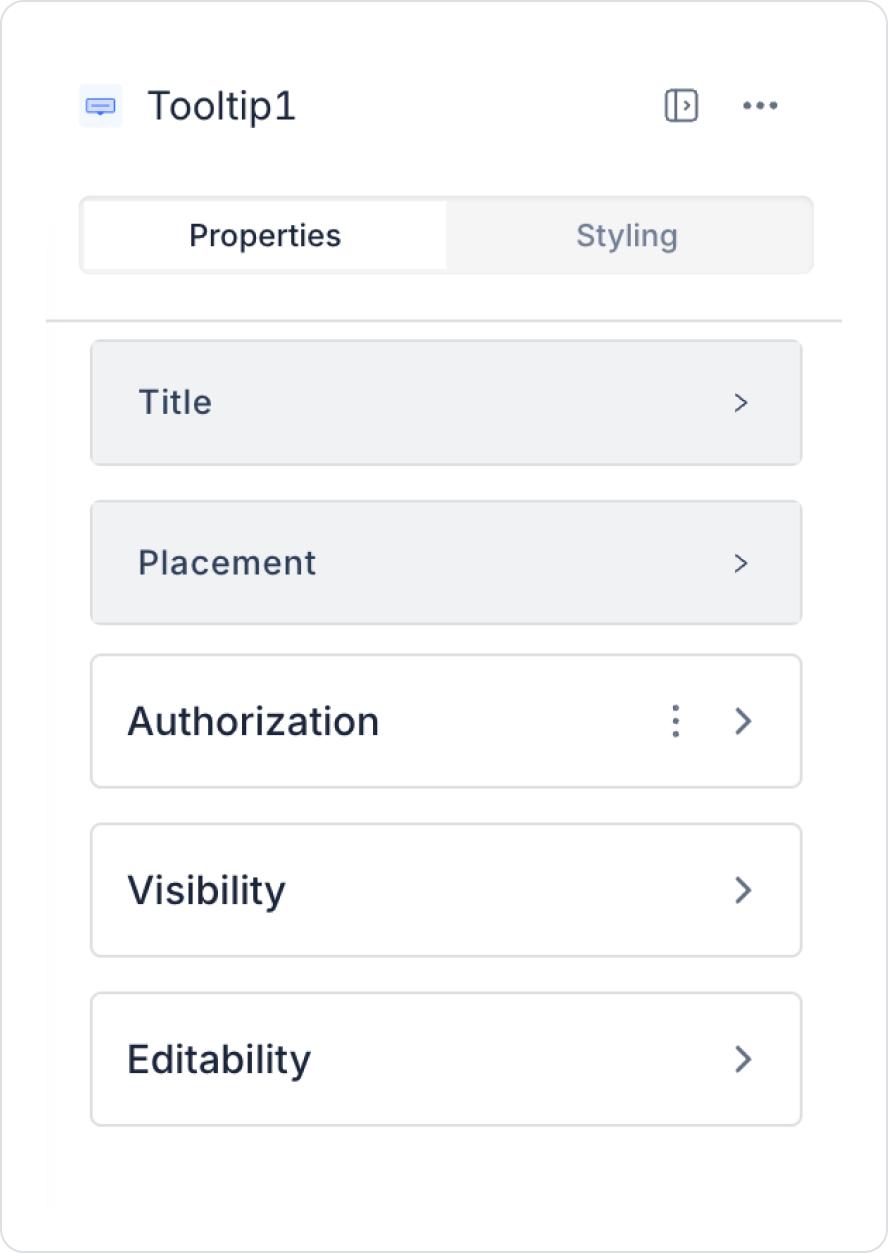
2.1. Tooltip Element Properties
You can configure the properties of the tooltip element from the Properties panel on the right.
Title: This is the title displayed in the tooltip. It can contain static text or dynamic values via the Symbol Picker to provide information to the user.
Placement: This determines the direction in which the tooltip opens on the screen. You can choose one of the following directions to improve the user experience:
Top: The tooltip is displayed above the element.
Bottom: The tooltip is displayed below the element.
Left: The tooltip is displayed to the left of the element.
Right: The tooltip is displayed to the right of the element.
Color: Determines the background color of the tooltip. This setting increases the visibility of informative messages by improving design consistency.
2.2. Actions That Can Be Added to Elements
Since the tooltip element is a passive element designed solely for displaying information, it does not support any actions. Therefore, when you select the tooltip element, the ADD ACTION button is not visible, and no trigger can be added to the element.
Important points regarding the action structure of the tooltip:
The tooltip only displays information with user interaction (hover/click) and does not execute any actions.
Text or information added to the Tooltip cannot be used to initiate any process.
Since the Tooltip is not a UI control, there are no triggers such as onClick or onChange.
If you want to add an action to the element to which the Tooltip is attached, you must add it to the element to which the Tooltip is attached, such as a Button, Icon, Image, or Label, not to the Tooltip itself.
3. How to Use the Tooltip Element?
In this section, we will cover the end-to-end use of the Menu element through example scenarios.
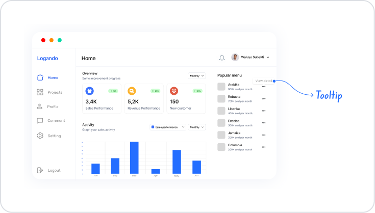
Scenario: Displaying Additional Information via Visuals
In an application, the Tooltip element is used when additional information is needed while keeping the user interface simple. When the user hovers over an image element, a short text explaining what the image represents is displayed in the tooltip.
In the scenario:
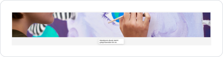
The tooltip is associated with an Image element.
When the user hovers over the image, the tooltip opens automatically.
A short and descriptive text is displayed in the tooltip.
When the user moves away from the image, the tooltip closes.
Step 1 – Adding an Element to the Page
Open the UI Design module.
Drag and drop the Elements > Display > Tooltip element onto the page.
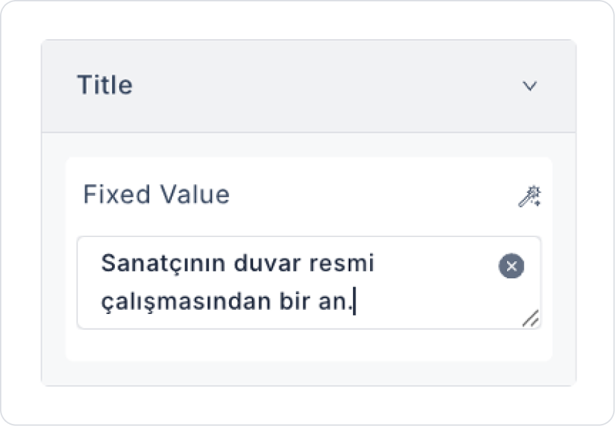
Update the text to be displayed in the tooltip to Tooltip > Properties > Title > “A moment from the artist's mural work.”
As with other elements, you can dynamically link the action result to the Title field.
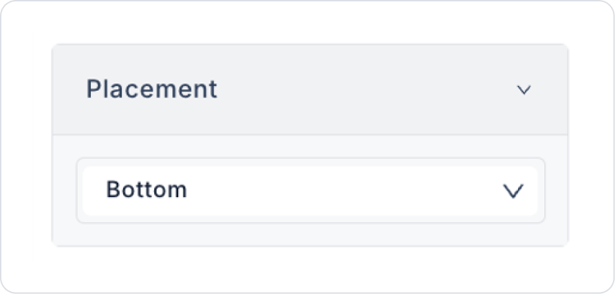
Set the display location to Tooltip > Properties > Placement > Bottom.
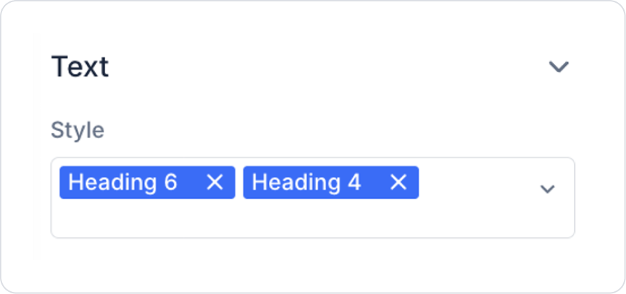
Select the text style in the tooltip as Tooltip > Styling > Text > Heading 4 and Heading 6.
Drag and drop the Elements > Display > Image element into the tooltip.
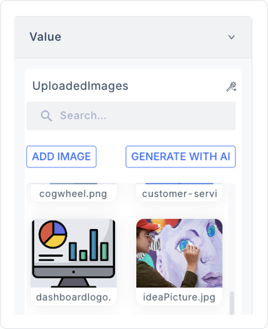
You can set the image from one you have previously uploaded or want to upload Image > Properties > Value > Uploaded Images.
Set Image > Properties > ImageFit > Fill so that the image fills the area.
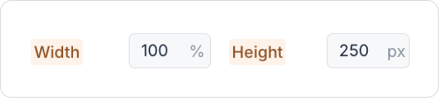
Set the image size in the Image > Styling > Layout > Width and Height fields in % and px types as follows.
Preview
When the application is tested, the Tooltip element automatically appears when hovering over the image and provides a short text explaining what the image represents. The tooltip closes when the user moves the cursor away from the image. This structure provides quick and clear information to the user without using additional space on the screen.
4. Common Properties
Some fields on the tooltip element are common to all UI elements. Therefore, detailed explanations of the following properties can be found in the relevant general guide pages:
Use tooltips only for brief and descriptive information.
They can be used for technical terms, icon meanings, or form field descriptions.
Position the element where the tooltip will appear (e.g., Icon, Label, Button) clearly and understandably; the user should notice the tooltip's presence.
Maintain design consistency by controlling the tooltip's visibility with Styling settings.
6. Limitations
The tooltip element is only supported in web applications; it is not visible or functional in mobile applications.
Direct actions cannot be added to the tooltip; the ADD ACTION button is not used for this element.
The tooltip only works for visual interactions such as hover or click; it is not a functional trigger.


