Kuika's Tree element is a powerful visualization element that allows hierarchical data structures to be presented to the user in a layered and organized manner. This structure, which allows you to expand and collapse an item's sub-items, enhances the user experience by displaying complex data sets in an easy-to-understand format.
The Tree element can be used to display multi-level content such as folder structures, menus, categories–subcategories, organizational charts, or relational data lists. It is particularly preferred in interfaces where large data groups need to be displayed in an organized manner.
The Tree element is only supported in web applications.
1.1. Common Use Cases for the Tree Element
File/Folder Structures: Displaying folders and subfolders in a file manager. For example: Documents > Projects > 2025 > Drafts
Category and Subcategory Lists: Hierarchical presentation of product categories in e-commerce applications. Example: Electronics → Computers → Laptops → Accessories
Organizational Charts: Displaying the company structure at the unit → sub-unit → employee level.
Content Management Systems (CMS): Presentation of page → subpage → module → content structures.
Role and Permission Management: Visual representation of role → permission → sub-permission relationships.
Menu Structure Management: Management and organization of multi-level menus or navigation trees.
Relational Data Displays: Hierarchical presentation of sub-records linked to a record and their sub-records.
Project & Task Management: Presentation of structures in the form of project → main task → sub-task → sub-sub-task.
2. Key Features
Hierarchical structure support: The Tree element presents multi-level data structures (main element → sub-element → sub-sub-element) in a clean and organized manner.
Dynamic data binding: Records from the data source (Datasource, REST API, Managed DB) can be automatically converted to a hierarchical structure and displayed.
Level-based visual hierarchy: Indentation, icons, lines, and structure differ for each level, providing a more understandable view for the user.
Clickable node structure: Elements (Label, Icon, Image, etc.) located on each node support user interaction.
Versatile use: Can be used in many different structures such as menus, folder views, CMS content lists, category trees, and organizational charts.
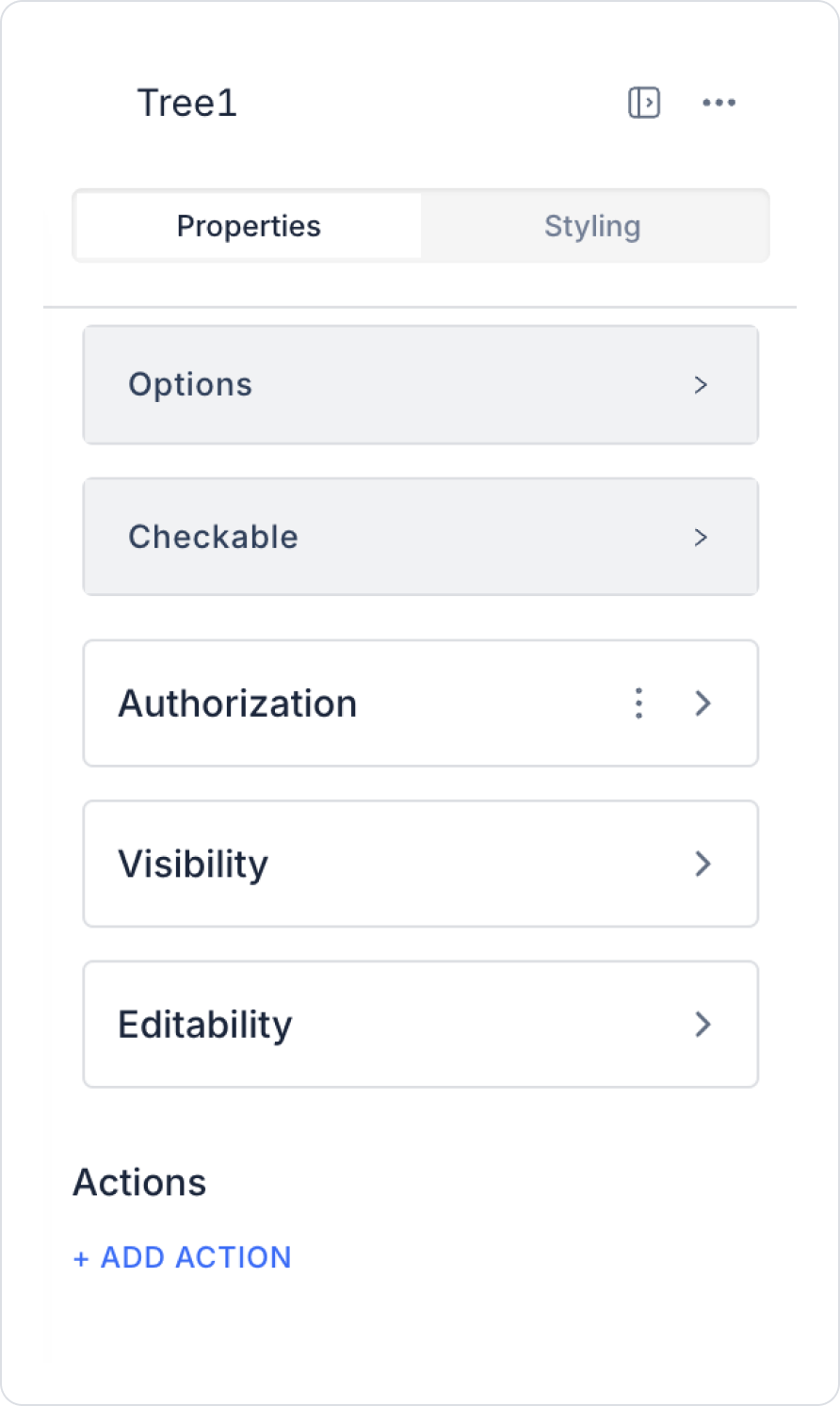
2.1.Tree Element Properties
The Tree element cannot be used as a special list; therefore, it is linked to a data table. Follow these steps for the data binding process:
1. Creating a Datasource
Enter the Datasource module.
Create a new table and define the following columns:
ID (Guid): Unique identifier of the data
Title (String): Title of the item to be displayed
ParentID (Guid): ID of the parent item to which the data is linked (use null value for parent items)
2. Create an SQL Action
Go to the Actions module.
Click the + icon and select New SQL Action.
Enter the following SQL command:
SELECT * FROM your_datasource_name
Click the CREATE button to create the SQL Action.
3. Bind Data to the Tree Element
Select the Tree element.
Go to the Options section in the Properties panel on the right.
Click the Actions field and select the SQL Action you created.
Configure the following fields:
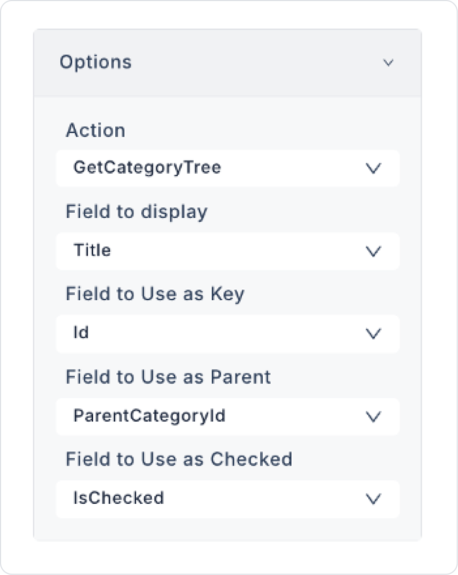
Field to Display ID: Select the database column to display the data (e.g., Title).
Field to Use as Key: The column to use as the unique key for the data (usually ID is selected).
Field to Use as Parent: The column that determines which parent element the child elements belong to (ParentID). If the data will be at the top level, this field's value should return null.
Checkable: When this option is enabled, Tree elements are displayed with a checkbox next to them. This allows users to select multiple items.
Default Checked Keys: This field determines which nodes you want to be automatically selected when the application first opens.
You can enter a static list of IDs.
It can also be filled dynamically via the Symbol Picker.
It does not work if the Checkable feature is disabled.
2.2. Actions That Can Be Added to Elements
The Tree element can trigger three different actions depending on user interactions.
These actions are triggered when the user selects a node, changes it, or checks a checkbox. After selecting the Tree element, the following triggers appear in the Actions section of the right panel:
onChange
Triggered when the user makes a selection or expands/collapses the Tree structure. This action is typically used in the following scenarios:
Updating page content based on the selected node information
Filtering lists or tables based on the selected category
Filling in the details field when the node changes
onSelect
Triggered when the user clicks on a node or selects a node. onSelect is used specifically to capture “which item was clicked.”
Usage examples:
Opening the details page of the clicked item
Using the node ID as a parameter in another action
Dynamically loading child items
onCheck
It becomes active if the checkable property is enabled. It is triggered when the user checks or unchecks the checkbox next to a node.
Initiating batch processing after multiple selections
3. How to Use the Tree Element?
In this section, we will cover the end-to-end use of the Tree element through a hierarchical data structure.
Scenario: Displaying the Category and Subcategory Structure with Tree
In an admin panel or content management system, users need to be able to review category and subcategory structures in an organized manner. Such data becomes much more understandable when displayed using the Tree element instead of a flat list.
In the scenario:
Hierarchical data is dynamically generated using SQL Action.
Tree data is automatically loaded when the page opens.
Users can expand and collapse parent items.
Child items are listed in the correct hierarchy.
Step 1 - Creating the Data Source
Creating a table in the DataSources module:
Go to the Datasources module.
Then go to the Tables tab.
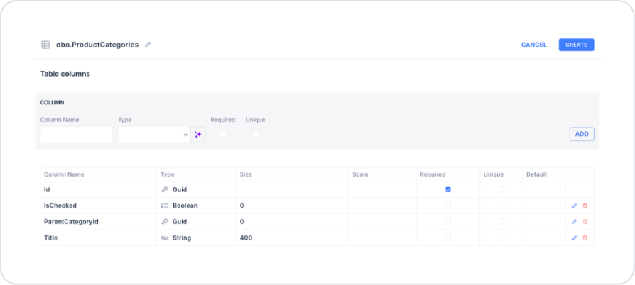
Create a new table named “ProductCategories”.
The table structure to be set up is as follows:
Important Field Names:
Id: Represents the unique ID of category records and is the key field for each node in the Tree structure.
Title: Represents the category name displayed to the user in the Tree element.
ParentCategoryId: Parent category information used to establish hierarchical relationships between categories.
IsChecked: Determines whether the relevant category will be selected by default when the Tree is loaded.
Additionally, create another new table named “
To enable checking and filtering, set Tree > Properties > Checkable > On.
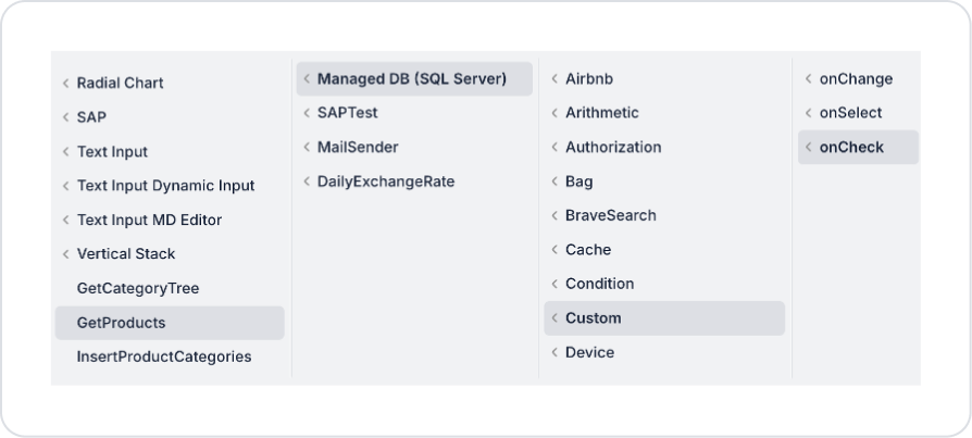
Add the Tree > Properties > Add Action > onCheck > Custom > Managed Db > GetProducts action to the Tree element to filter when categories are clicked.
”.
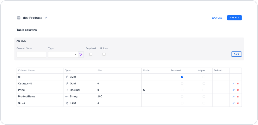
The table structure to be set up is as follows:
Important Field Names:
Id: Represents the unique ID of product records.
ProductName: The name displayed in the product list and detail screens.
CategoryId: Holds the category information to which the product belongs and enables filtering based on the selection made in the Tree element.
Price: Represents the product's sales price information.
Stock: Shows the current stock quantity of the product and is used for inventory tracking.
Step 2 - Defining the Necessary Actions
To display and add data in the interface:
You need to define three actions.
Add a new action from the Actions > New SQL Action tab in the Datasources module.
Action Adding Sample Data (InsertProductCategories): To test the application with sample data, add the following SQL action and press the TEST button.
When applying, delete the ProductCategories and Products sections, rewrite them, and press enter. This will add the correct schema name before the table name.
Action Providing Categories (GetCategoryTree):
SELECT *
FROM ProductCategories
ORDER BY Title;
When applying, delete the ProductCategories section, rewrite ProductCategories, and press enter. This will add the correct schema name before the table name.
Action that Filters and Provides Products (GetProducts):
DECLARE @Ids NVARCHAR(MAX) = CAST(@CategoryIds AS NVARCHAR(MAX));
SELECT
Id,
ProductName,
Price,
Stock
FROM Products
WHERE CategoryId IN (
SELECT TRY_CAST(LTRIM(RTRIM(value)) AS UNIQUEIDENTIFIER)
FROM STRING_SPLIT(@Ids, ‘,’)
WHERE TRY_CAST(LTRIM(RTRIM(value)) AS UNIQUEIDENTIFIER) IS NOT NULL
)
ORDER BY ProductName;
When implementing, delete the Products part, rewrite Products, and press enter. This will add the correct schema name in front of the table name.
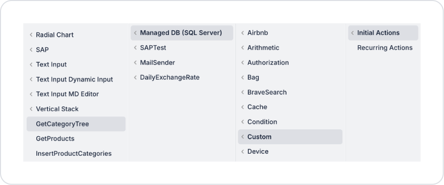
Step 3 - Adding Initial Action
Open the UI Design module.
Add the Initial Actions > Custom > Managed Db > GetCategoryTree action to the page using the ADD ACTION button.
Step 4 - Add Main Page Element
Open theUI Design module.
From the left panel, drag and drop the Elements > Display > Tree element onto the page.
Add the action that will provide data to the Tree element: Tree > Properties > Options > Action > GetCategoryTree. Define the fields that open as follows.
To enable checking and filtering, set Tree > Properties > Checkable > On.
Add the Tree > Properties > Add Action > onCheck > Custom > Managed Db > GetProducts action to the Tree element to filter when categories are clicked.
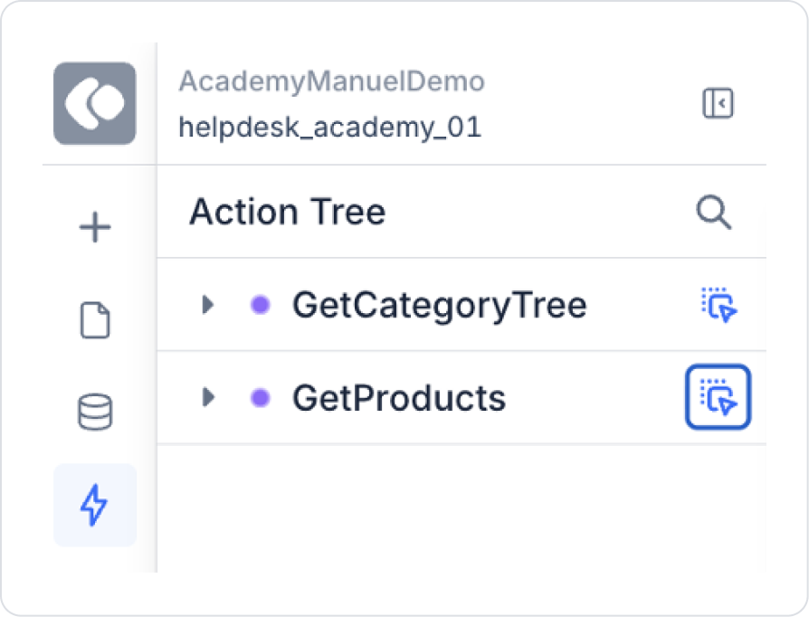
Finally, drag and drop the GetProducts action from the Action Tree area in the left side panel onto the page.
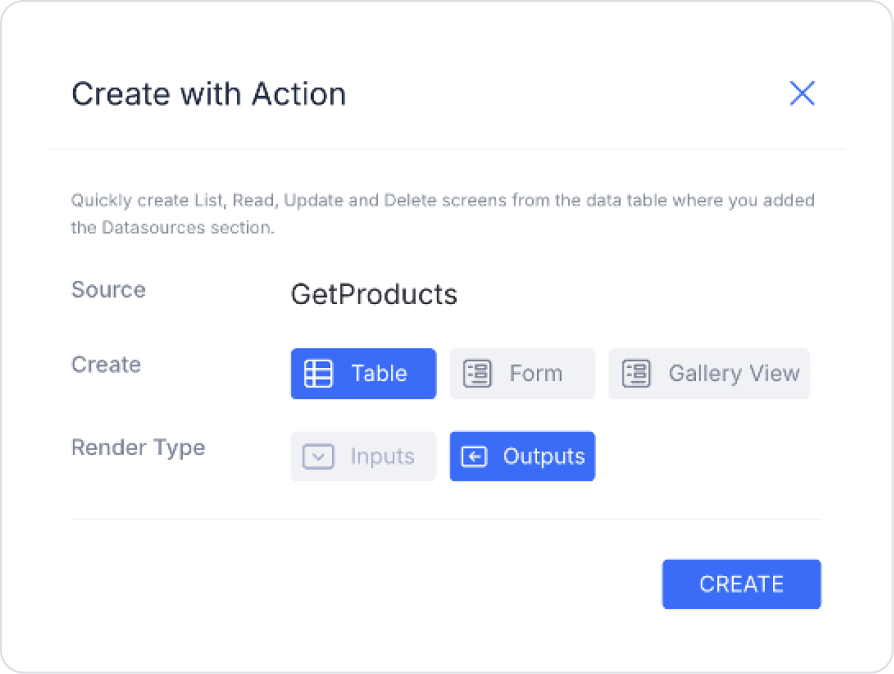
Make the following selections on the screen that opens and press Create. This will list your filtered products after category selections in the Tree element.
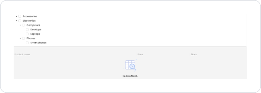
Preview
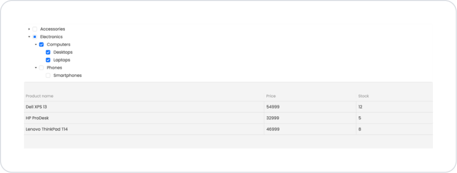
When the application is tested, a hierarchical Tree structure appears on the left side of the screen. Through this structure, users can view product categories with their upper and lower divisions and make selections for multiple categories.
When subcategories such as Electronics → Computers → Desktops / Laptops are selected on the Tree, products belonging to the selected categories are automatically filtered and displayed in the product list. The product name, price, and stock information are updated simultaneously in the list area, and only products related to the selected categories are displayed.
4. Common Properties
Some fields on the Tree element are used commonly across all UI elements. Therefore, detailed descriptions of the following properties are provided in the relevant general guide pages:
Set up the data structure correctly. The Tree element requires a hierarchical structure; therefore, consistency in the ID and ParentID fields ensures correct display.
Distinguish between onSelect and onCheck actions. Selection and checking have different results; avoid confusion by using both triggers in the correct context.
6. Limitations
The Tree element is only supported in web applications. The Tree structure cannot be displayed in mobile applications.
Data will not be displayed if the parent–child relationship is not set up correctly. If ParentID is empty or incorrectly defined, items may not appear in the tree structure.
The onCheck trigger only works if Checkable is active. When Checkable is disabled, checkbox behavior or marking scenarios are not supported.


