User Manual

Toggle Menu Collapse

7/7/25
Toggle Menu Collapse

Kuika's Toggle Menu Collapse action is an interactive UI control action used to manage the opening and closing of menus in the user interface. It is ideal for simplifying the navigation experience and providing a more organised view to the user, especially in mobile designs or multi-level menu systems.

Technical Features

  • Dynamic Menu Management (UI Control Panel):The Toggle Menu Collapse action reverses the current display state of a specified menu component:
    • Closes the open menu.
    • Opens the closed menu.
  • User-Centric Interface Design: Simplifies the management of complex menus, providing a clean user experience. Especially effective in left navigation menus and responsive designs.
  • Web & Mobile Support: The action works seamlessly in both web and mobile applications developed on the Kuika platform.

Toggle Menu Collapse Action Application Steps

1. Define the Action in UI Design

  • UI Design module and select the screen where you want to define the action.
  • Identify the UI area where the menu element is located (e.g., left navigation menu).
  • Create a trigger (e.g. an icon, button or heading) that will control the menu.
  • +ADD ACTION menu, follow this path: Select the trigger event (Initial Actions, OnClick, etc.) that suits your needs and add the UI Control > Toggle Menu Collapse action.

2. Configure Action Parameters

  • Component to Change
    • Type: Menu element
    • Required: Yes
    • Description: Select the menu component to be opened or closed.
    • Example: SideMenu, MobileNav, CategoryList

This field can be easily selected using the Symbol Picker. All menu components previously defined in the application are listed.

Use Case: Mobile Side Menu Control

In a mobile application, when the user clicks on the menu icon in the upper left corner, the left menu should open and close when clicked again.

Application Steps:

  1. Add a Menu element in the UI Design module.
  2. Add a Button or Icon element (e.g., the three-lined menu icon).
  3. Select this element and add the following action from the +ADD ACTION menu:
    • OnClick → UI Control → Toggle Menu Collapse
  4. Action Parameter:
    • Component to Change: MobileNav

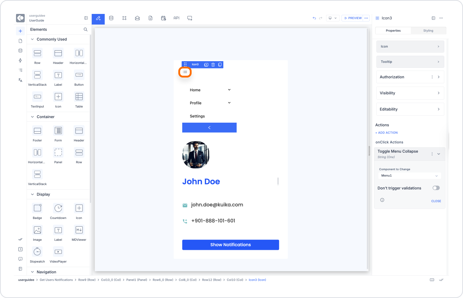
This allows users to open and close the menu by clicking the icon.

Toggle Menu Collapse Action Advanced Customisations

  • Conditional Management of Menu Open/Closed Status: The menu status can be controlled in conjunction with other actions. For example:
    • Hide certain content when the menu is open.
  • Parallel Application in Different Menus: If there are multiple menus on the same screen (e.g., top menu and side menu), each can be controlled independently using different buttons.
  • Use with Other Actions: Can be integrated with actions such as Change Visibility Of, Set Value Of, Navigate, and Set Focus To to make the user flow more effective.

Technical Risks

  • Incorrect Component Selection: If an element that is not defined as a menu is selected, the action will have no effect.
  • Timing Conflicts: If other actions are triggered while the menu is opening/closing, animation conflicts may occur.
  • Mobile Compatibility: Design details such as the menu covering the screen or content scrolling when the menu is opened must be carefully considered.

Toggle Menu Collapse is a powerful action used to design simple and intuitive interfaces on the Kuika platform. It facilitates navigation while providing a user-centric experience. Thanks to its mobile compatibility and integration with other UI actions, it is indispensable for modern and dynamic applications.

Other Related Content

No items found.

Glossary

No items found.

Alt Başlıklar