Kullanıcı Kılavuzu

Toggle Visibility Of

Toggle Visibility Of

Kuika's Toggle Visibility Of action is used to dynamically control the visibility of an element in the user interface. With this action, a specific component can be hidden if it is visible, or displayed if it is hidden. It is ideal for showing or hiding form fields, description boxes, or informative labels depending on the user.

Technical Features

  • Dynamic Visibility Change (UI Control Panel): This action reverses the visibility status of the target element:
    • If the current status is Visible, it becomes Hidden.
    • If the current status is Hidden, it becomes Visible.
  • User Interaction Management: User selections, button clicks, or system actions can trigger the action. This helps simplify the interface and reduce information overload.
  • Web & Mobile Support: The action is supported in all web and mobile applications developed on the Kuika platform.

Toggle Visibility Of Action Application Steps

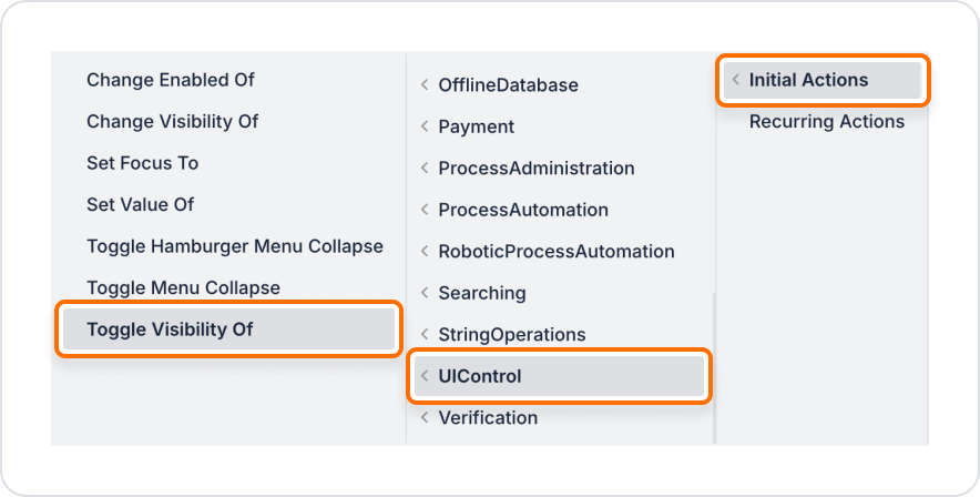
1. Define the Action in UI Design

  • Open your project on the Kuika platform.
  • Go to the UI Design module and select the screen where the component whose visibility will be changed is located.
  • Add an information box, description text, or form field.
  • Example: When the ‘Show Details’ button is clicked, a text field should appear, and when clicked again, it should be hidden.
  • Add a trigger element that will control this element (e.g. button, checkbox, icon).
  • Click on this element and add the UI Control > Toggle Visibility Of action by selecting the trigger event (Initial Actions, OnClick, etc.) that suits your needs from the +ADD ACTION menu.

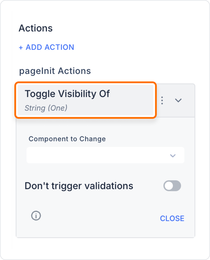
2. Configure Action Parameters

  • Component to Change:
    • Required: Yes
    • Description: Select the element whose visibility will be reversed.

Usage Scenario: Show/Hide Detailed Information

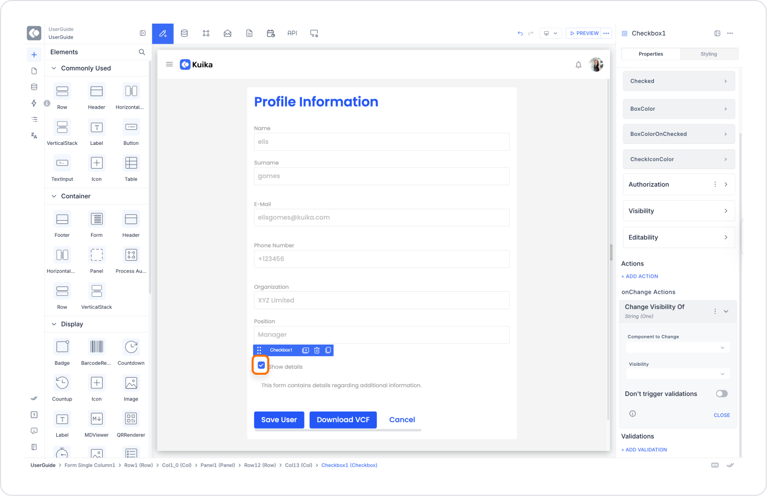
On a form screen, when the user selects the ‘Show Details’ checkbox, an explanatory text should appear; when the checkbox is deselected, the text should be hidden.

Application Steps:

  1. Switch to the UI Design module.
  2. Add a Checkbox element and name it ‘ShowDetailsCheck’.
  3. Add a Label element, enter the description content.
  4. Click on the Checkbox element, select the following action from the +ADD ACTION menu:
    • OnChange → UI Control → Change Visibility Of
  5. Action Parameters:
    • Component To Change: DetailsText

Toggle Visibility Of Action Advanced Customisations

  • Conditional Triggering Control: The toggle operation can be restricted based on user type or specific inputs. Example: Only the ‘Administrator’ role can show/hide this element. → Configure using Add Condition.
  • Combination with Other Actions: Can be used in combination with actions such as Set Value Of, Set Focus To, Navigate, Change Enabled Of. Example: After an element becomes visible, a value can be assigned to it or it can be focused.
  • Different Behaviour for Different Devices: The button can be an icon on mobile devices and text on the web. The toggle action can be applied in the same way in both applications.

Technical Risks

  • Inaccessible Element: When attempting to toggle a hidden element, the user may not notice anything. In this case, redirection or a message display may be necessary.
  • UI Consistency: Rapid clicks in succession may cause visibility confusion. Transition animations and button states (such as icon changes) are recommended.

Toggle Visibility Of is a practical action used in Kuika applications to provide a simple and user-friendly interface. It offers ideal solutions for displaying only the information the user needs, hiding unnecessary content, and creating smart interactions.

Other Related Content

No items found.

Glossary

No items found.

Alt Başlıklar