
Toggle Hamburger Menu Collapse is a UI Control action used to control the opening and closing (expand/collapse) of the hamburger menu component on the Kuika platform. This action was developed to simplify navigation and optimize user interaction in hamburger menu structures used on mobile or narrow-screen devices.
Technical Features
1. Prepare the UI Design


The relevant menu element can be easily selected via the Symbol Picker.
This scenario includes two different menu controls:
Scenario: Fully Open/Close Menu with Hamburger Menu
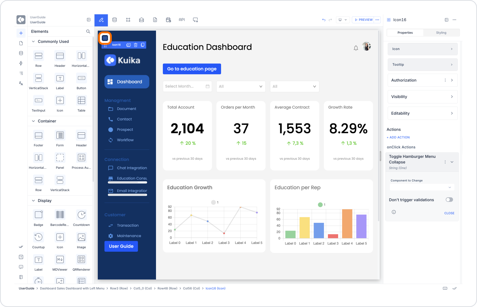
Mobile users should be able to fully open or close the menu by clicking the ☰ icon in the top left corner of the screen.
Application Steps:
With this structure, users can completely close the menu to get a wider content area.
Additional Scenario: Collapsing the Menu (Collapse Menu)
Users can use a separate button to collapse the menu (show only the icons) while the menu is open.
Application Steps:
This allows users to save space by collapsing the menu instead of closing it completely.
Technical Warnings
Toggle Hamburger Menu Collapse is an essential action for all applications aiming to provide a simple, flexible, and user-centric interface. It modernizes menu interactions on both mobile and web platforms, optimizes screen space, and simplifies navigation for users.

