The Text Area element is a data input element that allows users to enter long and multi-line text. Compared to standard single-line input fields, it provides a wider writing area, making it possible to write and edit text comfortably.
The Text Area element is supported in both web and mobile applications.
1.1. Common Use Cases
Description and comment fields
Feedback and contact forms
Note and detail information entries
Form fields requiring long text
Content and description-focused screens
2. Key Features
Multi-line text input: Users can write text containing multiple lines in a single field.
Spacious and readable writing area: Writing and viewing long texts is more comfortable.
Dynamic value binding support: Values can be managed via state, variables, or action outputs.
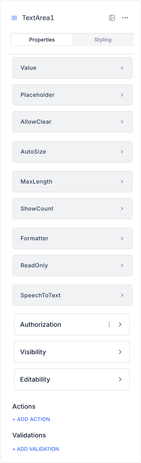
2.1. Text Area Element Properties
You can configure the following settings from the Properties panel:
Value: Represents the text entered by the user. You can add a static value or dynamically display data from other elements or actions using the Symbol Picker.
Placeholder: The placeholder text visible before the user enters anything (e.g., “Type your text here”).
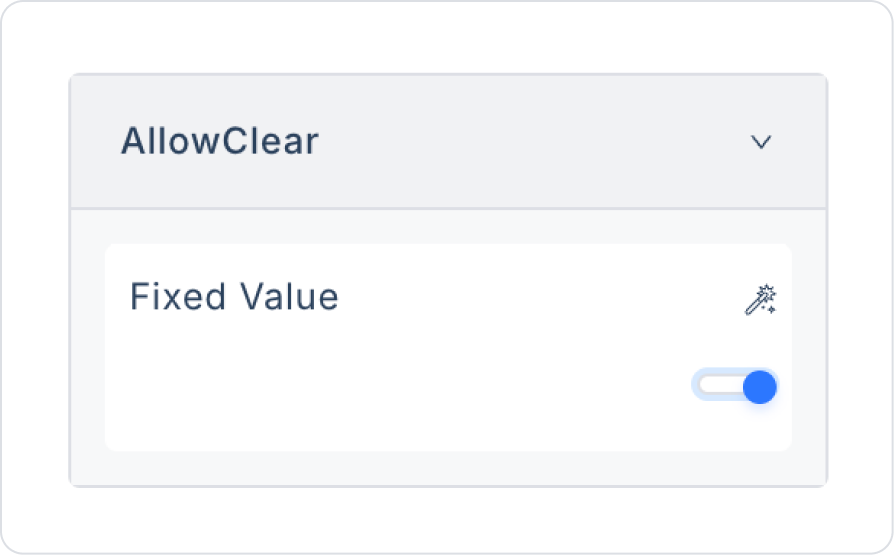
Allow Clear: Displays a Delete (X) icon on the right side to allow the user to quickly clear the text.
Autosize: Automatically adjusts the height of the Text Area element based on the length of the text entered by the user.
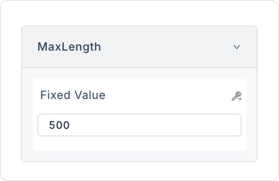
Max Length: Sets the maximum number of characters the user can enter (e.g., 200-character limit).
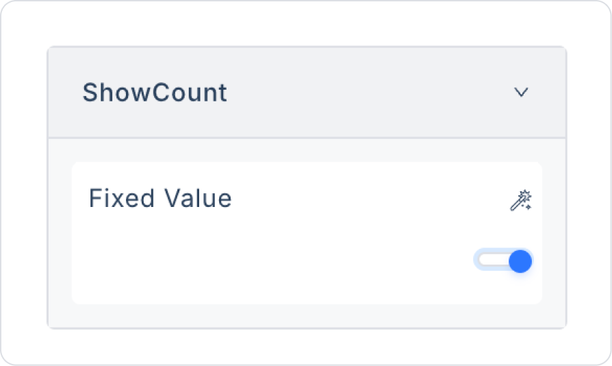
Show Count: Displays the number of characters entered by the user in real time.
Formatter: Automatically converts the entered text to a specific format (e.g., all uppercase, all lowercase).
Read Only: Makes the text field read-only. Users can view the content but cannot edit it.
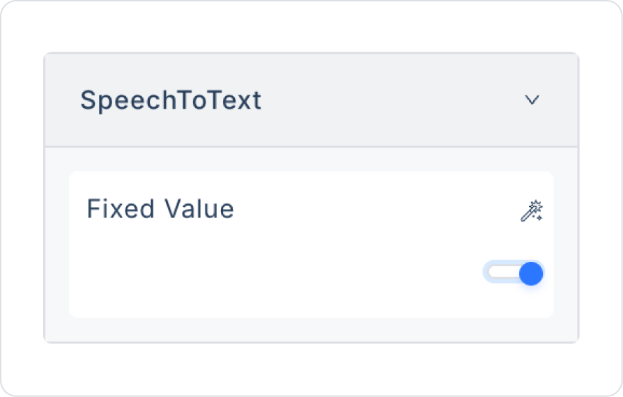
Speech To Text: Allows text input via voice commands.
2.2. Actions That Can Be Added to Elements
The Text Area element supports multiple triggers (events) depending on user interactions. These triggers allow long text entries to be managed in a controlled manner.
onChange: Triggers every time the user changes the Text Area content.
Usage scenarios:
Transferring the entered text to states or variables
Performing live character counting
Dynamic field display or filtering
onPressEnter: Triggered when the user presses the Enter key in the Text Area field.
Use cases:
Initiating the form submit process
Redirecting the user to the next step
Marking the text entry as complete
onResize: Triggered when the user changes the size of the Text Area field.
Use cases:
Updating the UI layout based on field size
Making dynamic layout or responsive adjustments
onBlur: Triggered when the user loses focus from the Text Area field.
Use cases:
Validate after text input is complete
Display warnings for empty or invalid content
3. How to Use the Text Area Element?
In this section, we will cover the end-to-end use of the Text Area element through example scenarios.
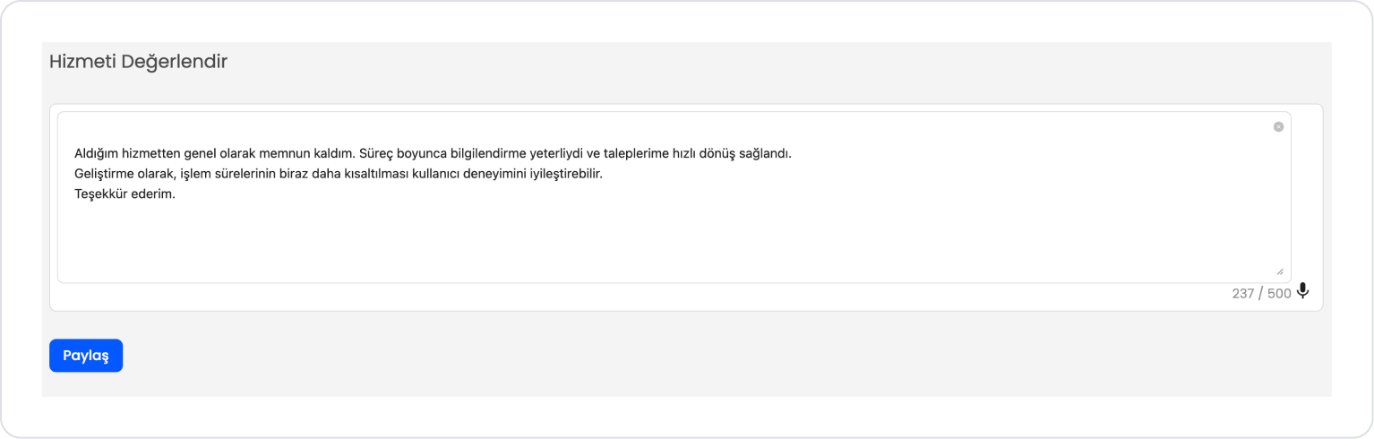
Scenario: Service Evaluation and Feedback Sharing
In an application, users want to share their experiences with the service they received in a detailed and understandable way. The Service Evaluation field allows users to easily express their opinions, suggestions, and satisfaction in a single text field in this scenario.
In the scenario:
The user writes their comments about the service in the text field under the Service Evaluation heading.
The text field offers a large usage area suitable for long content entries.
The written content is displayed instantly within the field, and the character counter allows the user to track the maximum character limit.
The user can edit the text or clear it and rewrite it if they wish.
When the feedback is complete, the evaluation is saved to the system by clicking the Share button.
Step 1 - Creating a Data Source
Creating a table in the DataSources module:
Go to the Datasources module.
Then go to the Tables tab.
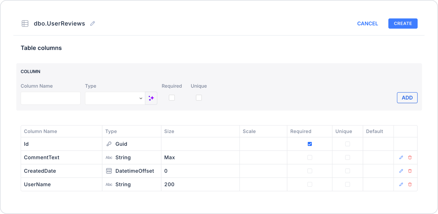
Create a new table named “UserReviews”.
The table structure to be set up is as follows:
Set the Size field in the CommentText column to Max or 500.
Important Field Names:
CommentText: Stores text content entered via the Text Area. Free-form content such as ideas and opinions is stored in this field.
CreatedDate: Specifies the date and time the content was created. Used for time-based tracking of records.
UserName: Stores information about the user or source that created the content. Used in user-based content differentiation and authorization scenarios.
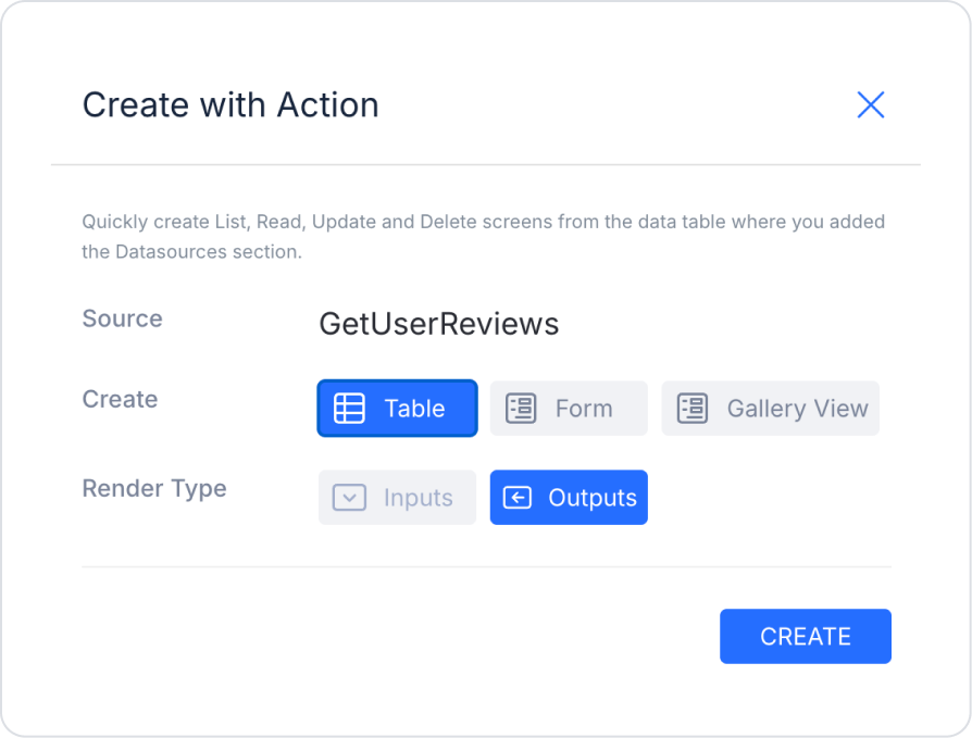
Step 2 - Defining the Required Action
To display and add data in the interface:
You need to define two actions.
Add a new action from the Actions > New SQL Action tab in the Datasources module.
Action that Lists Sample Data (GetUserReviews):
SELECT * FROM UserReviews;
When applying, deletethe UserReviews part, rewrite UserReviews, and press Enter. This will add the correct schema name before the table name.
Step 3 - Adding and Configuring Elements
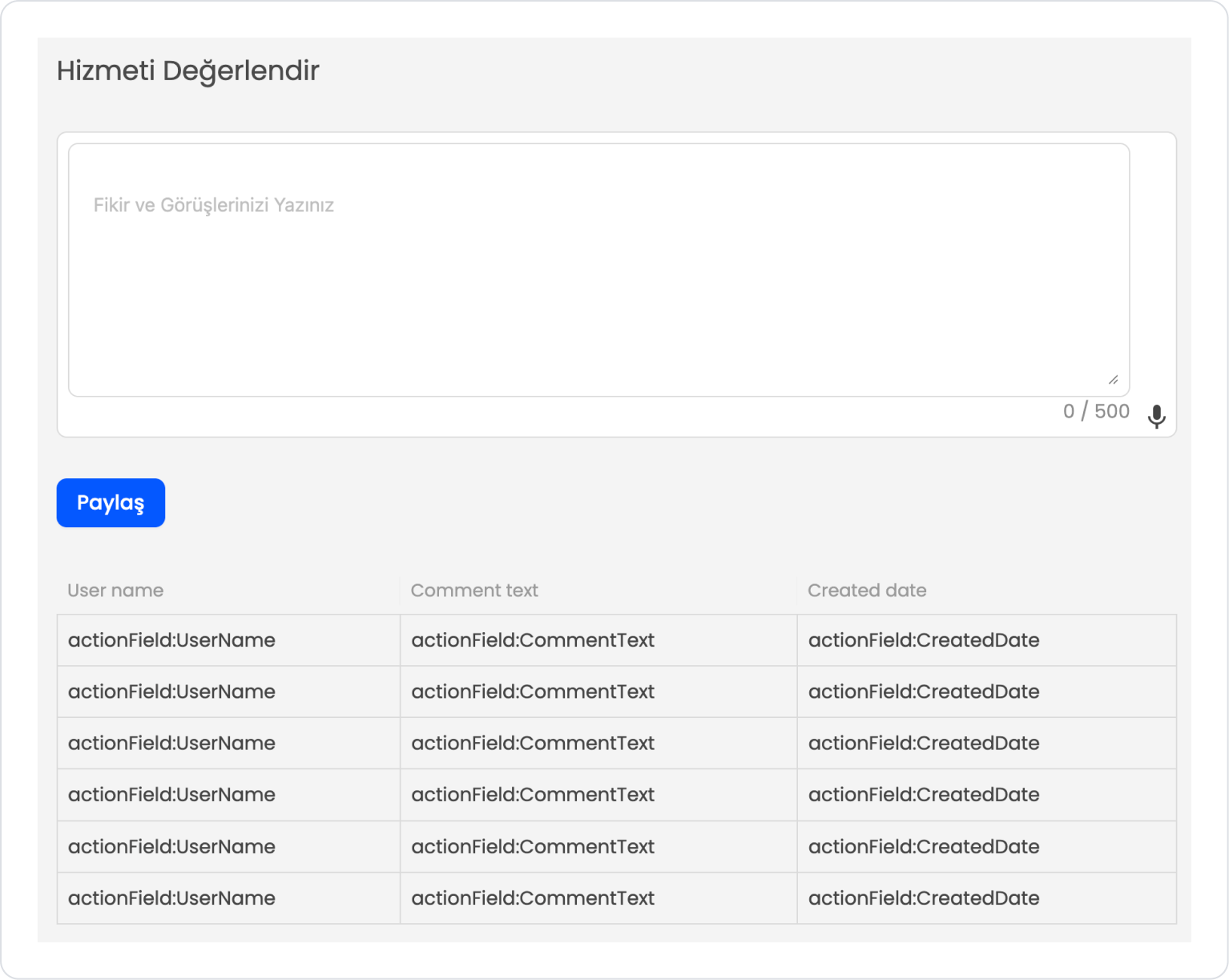
Drag and drop the Elements > Display > Label element onto the page.
Set the text style to Label > Styling > Text > Style > Heading 5.
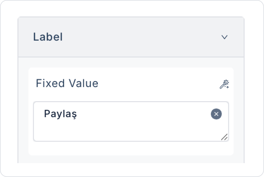
Add the text Label > Properties > Value > “Rate the Service”.
Drag and drop the Elements > Text Input > TextArea element onto the page.
Add the text TextArea > Properties > Placeholder > “Write Your Thoughts and Opinions” to the placeholder text inside the Text Area.
Set TextArea > Properties > AllowClear > Open so that the text can be easily cleared.
Define the maximum character count as TextArea > Properties > MaxLength > 500.
To display the character limit and count, set TextArea > Properties > ShowCount > On.
To create text using speech, set TextArea > Properties > SpeechToText > On.
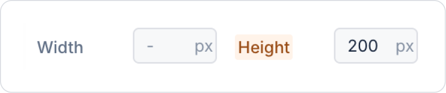
To automatically resize the text area as text is added, set TextArea > Properties > AutoSize > On. Since the scenario uses a 500 character limit, TextArea > Styling > Layout > Height > 200 px has been defined.
Drag and drop the Elements > Navigation > Button element onto the page.
Edit the Button text to Button > Properties > Label > “Share”.
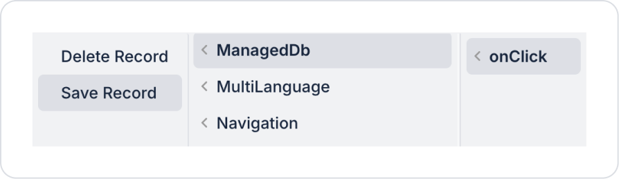
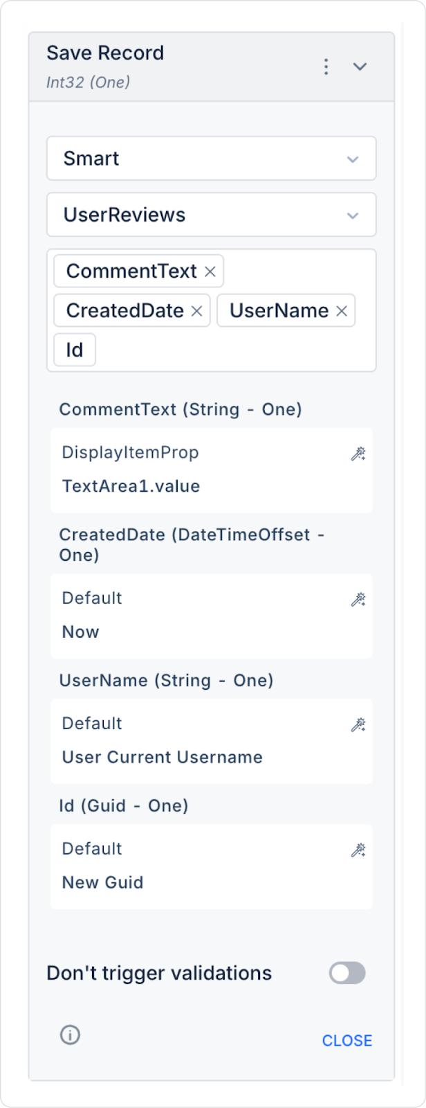
Add the save action to the Button element: Button > Add Action > onClick > ManagedDb > Save Record.
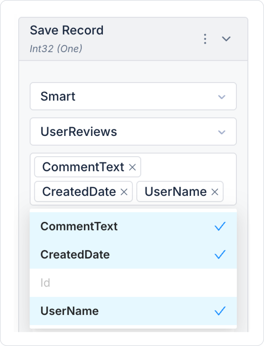
In the Save Record action, select the UserReviews table. In the column names field that opens, select all column names.
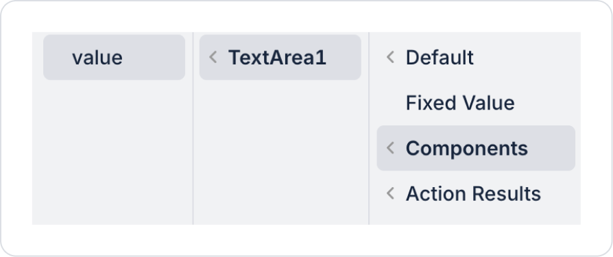
Define the CommentText field as Components > TextArea > value.
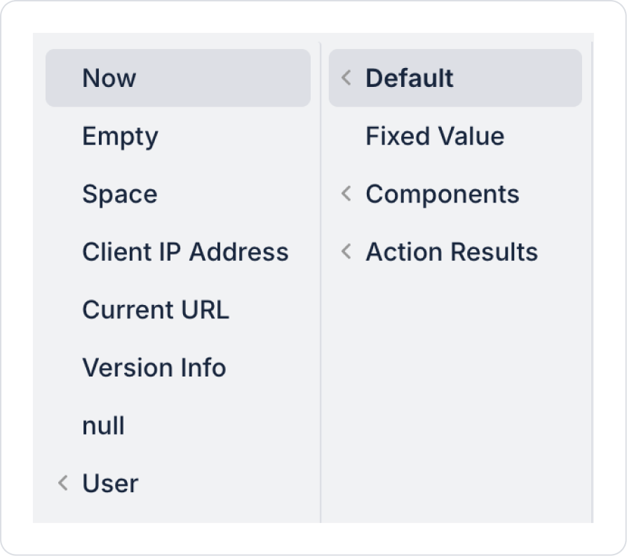
Define the CreatedDate field as Default > Now.
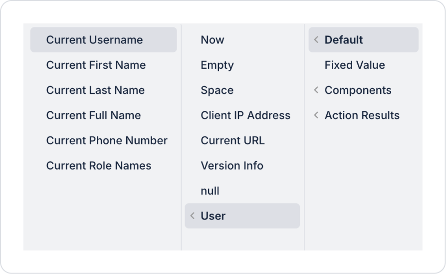
Define the UserName field as Default > User > Current Username.
Define the Id field as Default > New Guid.
As a result of these definitions, all fields in the Save Record action should be as follows.
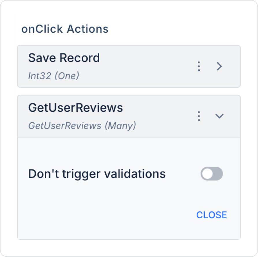
To view previously saved and newly saved records after clicking the button, add the Button > Add Action > onClick > Custom > Managed DB > GetUserReviews action.
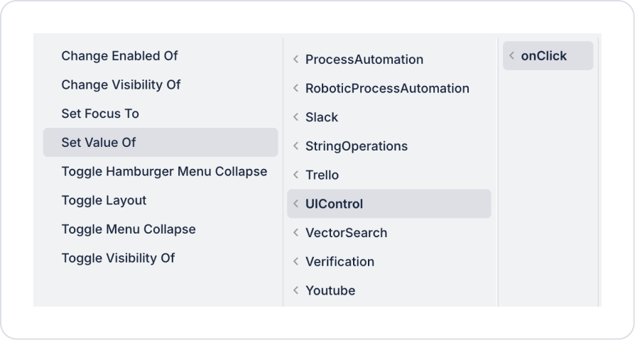
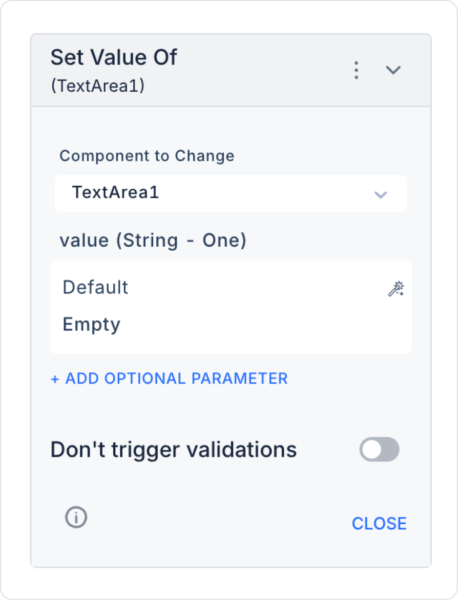
To clear the Text Area after the review is saved, add the Button > Add Action > onClick > UIControl > Set Value Of action.
In the Set Value Of action, define the fields as follows: Component to Change as TextArea1, Value as Default > Empty.
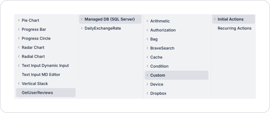
To view past posts when the page opens, add the Add Action > Initial Action > Custom > Managed DB > GetUserReviews action to the page.
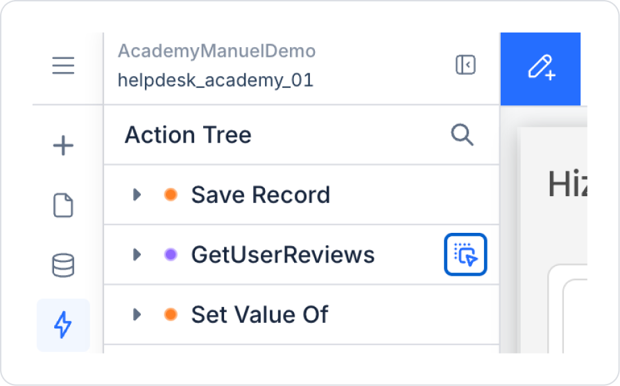
From the Action Tree area on the left side panel, press and hold the blue icon next to the GetUserReviews action and drag it to the page.
Select and create the relevant fields in the window that opens.
The page should look like this in its final state.
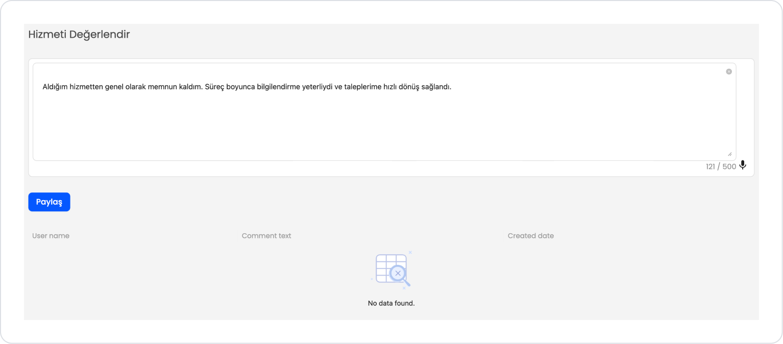
Preview:
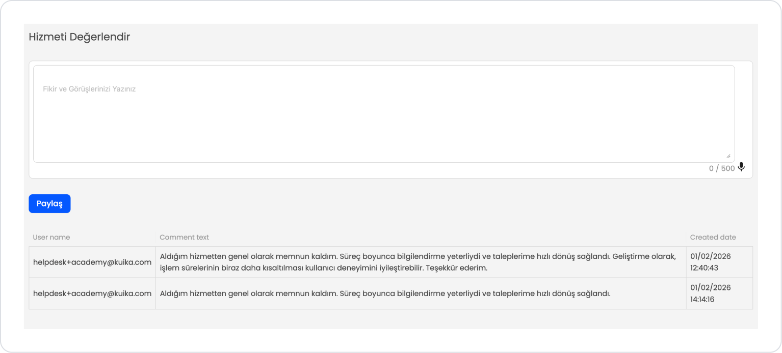
When the application is tested, the user can write their comment in the Rate the Service field or make a voice entry using the microphone icon in the lower right corner. The text field can be expanded and collapsed from the lower right corner; the character count and 500-character limit can be tracked in real time via the counter located at the bottom right.
The user can clear the text area in one step by clicking the X icon in the upper left. When the Share button is pressed, the entered evaluation is added to the table, and when the process is complete, the text area is automatically cleared and ready for a new comment entry.
You can see previously added and newly added data on the Table at the bottom of the page.
4. Common Properties
Some fields on the Text Area element are used in common across all UI elements. Therefore, detailed explanations of the following properties are provided in the relevant general guide pages:


