The Text Input element is a basic data input element that allows users to enter single-line text within the application. When the Text Input field is empty, users see a placeholder text and can clear the text they have entered with a single click using the Allow Clear feature located on the right side.
The Text Input element is supported in both web and mobile applications.
1.1. Common Use Cases
First name, last name, and short text entries
Search fields
Title and label entries
Form fields
Screens requiring filtering and user input
2. Key Features
Single-line text input: Provides an input field for short and medium-length text.
Placeholder support: Displays guidance text to the user about the expected input when the field is empty.
Quick clearing with Allow Clear: Users can clear their input with a single click.
Compatible with validation Can be used with rules such as required fields and minimum/maximum length.
Formatting support: Ensures that the entered text is formatted according to specific rules.
Dynamic value binding: Values can be entered statically or managed dynamically with state, variables, and action outputs.
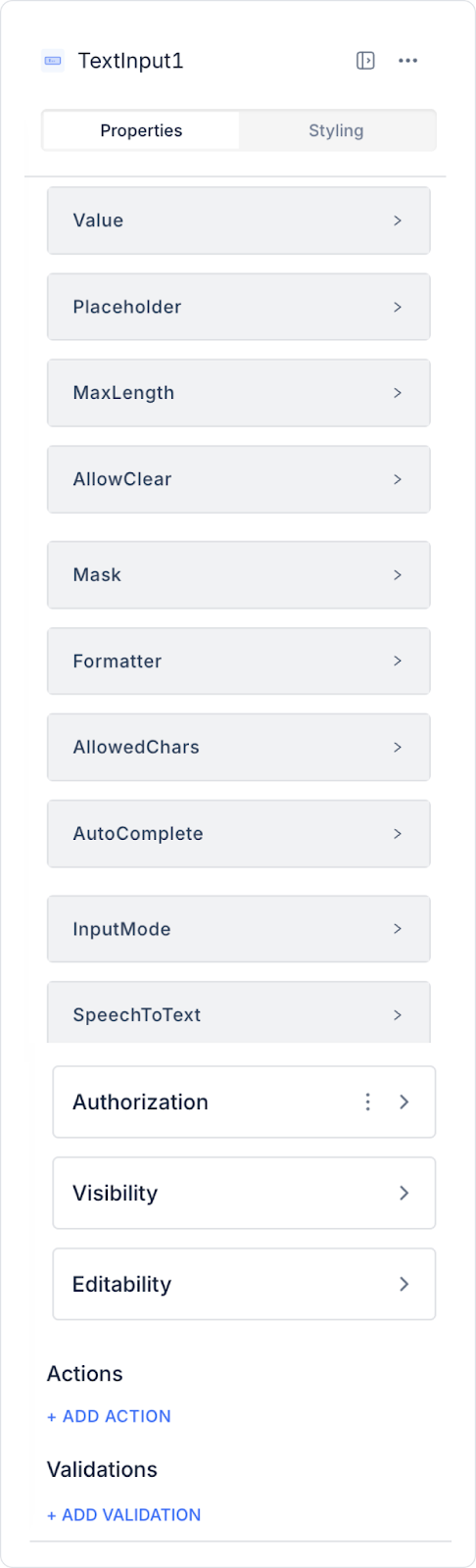
2.1. Text Input Element Properties
You can configure the following settings from the Properties panel:
Value: Represents the text entered by the user or assigned initially.
Placeholder: Informative text visible when the user has not entered any text (e.g., “Enter your name”).
Max Length: Limits the maximum number of characters the user can enter (e.g., 30 characters).
Allow Clear: Allows the text to be quickly cleared using the Clear (X) icon on the right side.
Mask: Ensures the user enters text in a specific format (e.g., ##/##/#### for dates).
Formatter: Converts the entered text to a specific format:
Lowercase: Converts letters to lowercase.
Uppercase: Converts letters to uppercase.
Input Mode: Determines the keyboard layout (e.g., all – all characters, char – letters and symbols, number – numbers only).
Allowed Chars: Determines which characters can be entered (e.g., only numbers and characters such as “-”, “(”, “)”.
Auto Complete: Provides suggestions based on the text entered by the user (e.g., when “İ” is typed, options such as ‘İzmir’ and “İstanbul” appear).
Input Mode: Determines the keyboard layout. Options:
all: All characters are allowed
char: Letters and symbols are allowed
number: Only numbers can be entered
Speech To Text: Enables text input via voice commands.
Content Type: Determines the input type recommended by the system based on the purpose of the text input. This feature ensures that the appropriate keyboard type and autofill behavior are used, particularly on mobile devices. Available only in mobile apps. Available options:
Default: Standard text input is used.
SMSCode: Supports the autofill of verification codes received via SMS.
Name: Provides an input field optimized for the user's first name.
Surname: The text input type used for the user's last name.
FullName: Used for entering both first and last name information together.
Email Address: Provides a suitable keyboard and autofill support for email address entry.
Phone Number: Offers a numeric keyboard and phone number format support for phone number entry.
2.2. Masking in the Text Input Element
The Text Input element supports masking operations to ensure data entry complies with specific formats. This guarantees that user-provided data is in the correct and consistent format.
Basic Mask Symbols
9: Number (0-9)
a: Letter (A-Z, a-z)
*: Alphanumeric character (A-Z, a-z, 0-9)
Sample Mask Formats
99/99/9999: Date format (e.g., 01/01/2023)
(999)-999-9999: Phone number (e.g., (555)-555-1234)
$999,999.00: Currency (e.g., $123,456.00)
aaaa9999: Mix of letters and numbers (e.g., ABcd2025)
***-***: Serial number format (e.g., aZ3-bT7)
AA 9999: License plate format (e.g., TR 1234)
Country-Specific Phone Formats
Turkey: 999 999 99 99
Germany: +49 99 999 99
France: 9 99 99 99 99
Application Steps
Drag the Text Input element from the Elements panel onto the page.
Open the Mask section in the Properties panel on the right.
In the Mask → Fixed Value field:
Enter a mask format manually,
or link a value from the database.
After configuring the masking settings, you can test the result by previewing.
2.3. Actions That Can Be Added to Elements
The Text Input element supports the following triggers (events) based on user interactions. These triggers allow text input to be managed instantly or in a controlled manner.
onChange: Triggers every time the user changes the value in the Text Input field.
Usage scenarios:
Instantly transfer the entered text to states or variables
Perform live search or filtering
Dynamic field display/hiding
Instant validation or character counting
onBlur: Triggered when the user loses focus from the Text Input field.
Usage scenarios:
Perform validation after the user finishes typing
Displaying warnings for empty or incorrect entries
Field-based control and data cleaning operations
onPressEnter: Triggered when the user presses the Enter key in the Text Input field.
Use cases:
Initiating the form submit process
Triggering a search or filtering action
Redirecting the user to the next step
3. How to Use the Text Input Element?
In this section, we will cover the end-to-end use of the Text Input element through example scenarios.
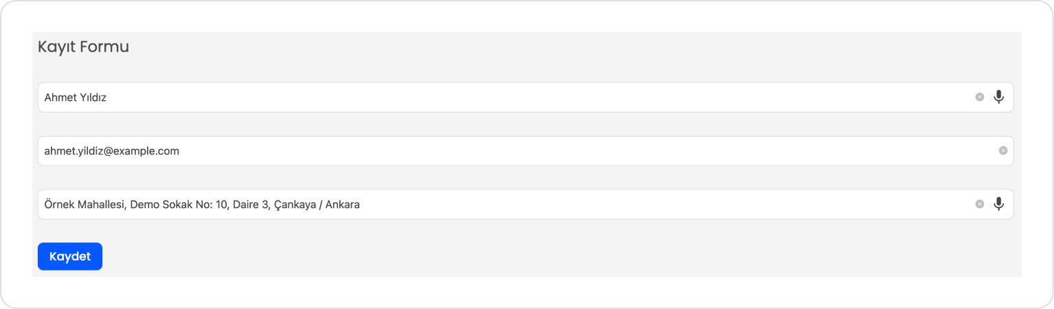
Scenario: Collecting User Information with a Registration Form
A Registration Form is used in an application to quickly and systematically record users' basic information in the system. In this scenario, the form aims to create a single record by collecting the necessary information from the user step by step.
In the scenario:
The user enters their identity information as text in the First Name Last Name field.
A valid email address is entered in the Email Address field; this field is saved for use in communication and verification processes.
(Note: The email field has been created for illustrative purposes. For more efficient and accurate use, the Email element may be preferred.)
The user enters their address information as free text in the Home Address field.
After all fields are filled in, the Save button is clicked.
With the save operation, the entered information is transferred to the system, and the user is provided with feedback that the operation was successful.
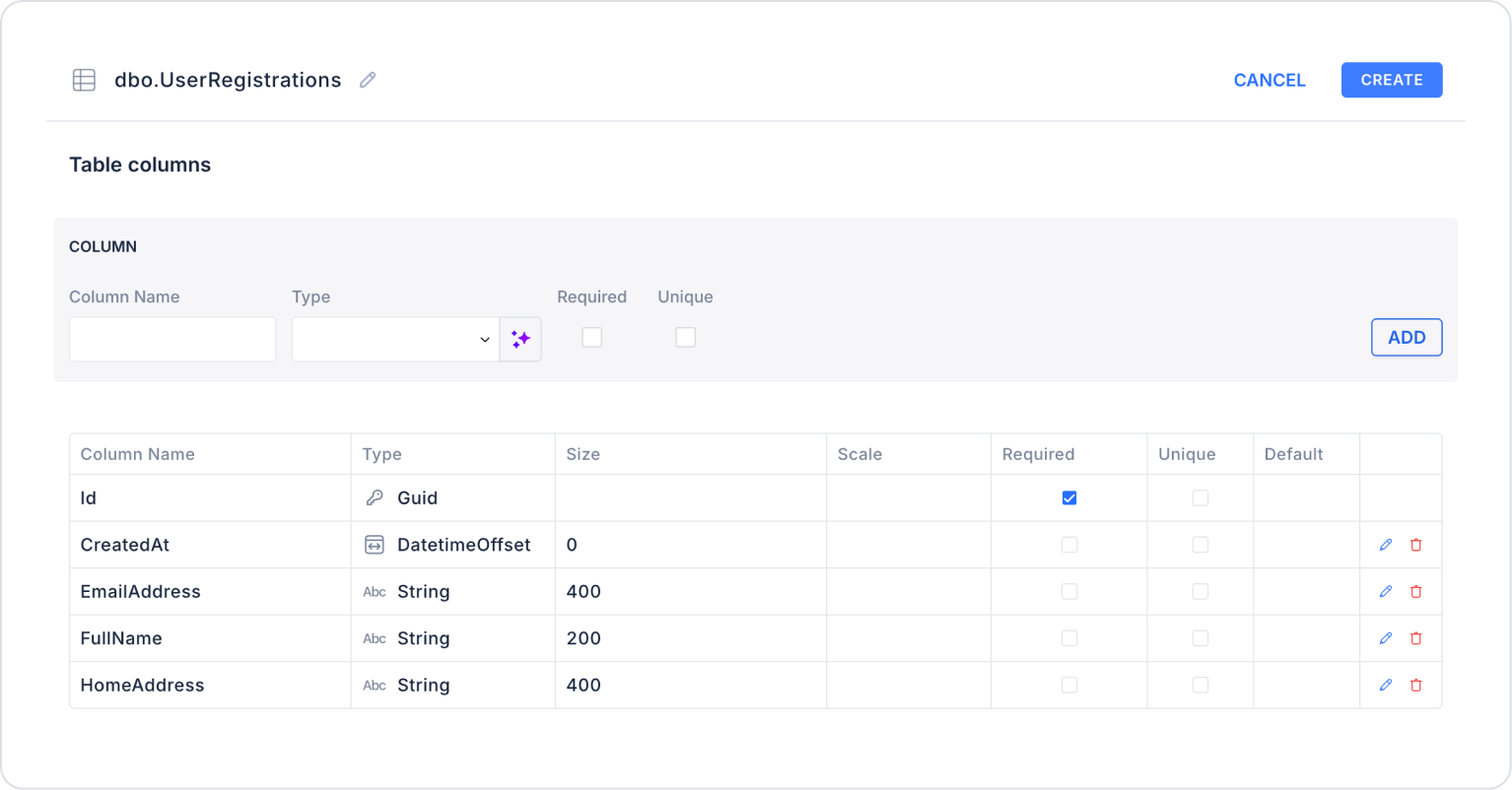
Step 1 - Creating a Data Source
Creating a table in the DataSources module:
Go to the Datasources module.
Then go to the Tables tab.
Create a new table named “UserRegistrations”.
The table structure to be set up is as follows:
Important Field names:
FullName: Stores the user's first and last name information.
EmailAddress: Stores the user's email address. Used for communication and verification purposes.
HomeAddress: Contains the user's home address information.
CreatedAt: Stores the date and time the registration was performed.
Step 2 - Defining the Required Action
To display and add data in the interface:
You need to define two actions.
Add a new action from the Actions > New SQL Action tab in the Datasources module.
Action that Lists Sample Data (GetUserRegistrations):
SELECT * FROM UserRegistrations;
When applying, deletethe UserRegistrations part, rewrite UserRegistrations, and press Enter. This will add the correct schema name in front of the table name.
Step 3 - Adding and Configuring Elements
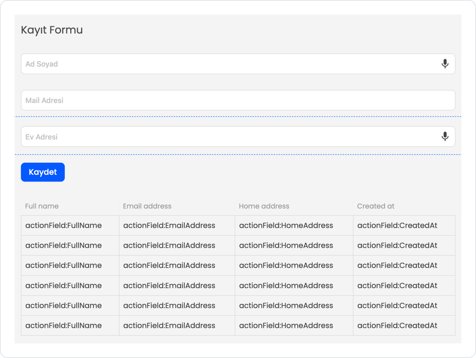
Drag and drop the Elements > Display > Label element onto the page.
Set the text style to Label > Styling > Text > Style > Heading 5.
Add the text Label > Properties > Value > “Registration Form”.
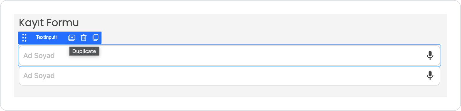
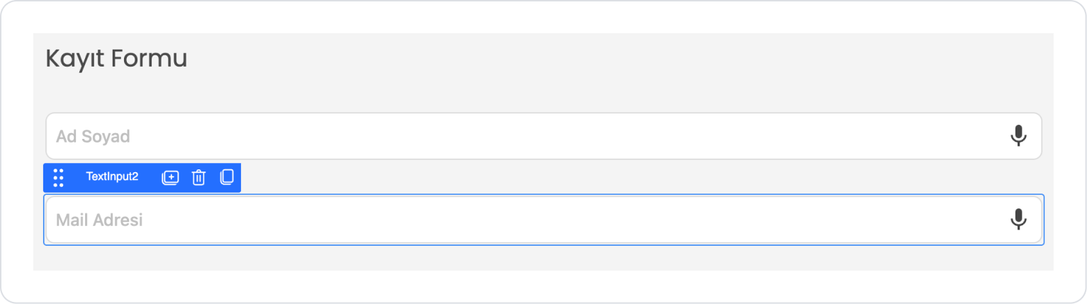
Drag and drop the Elements > Text Input > TextInput element onto the page.
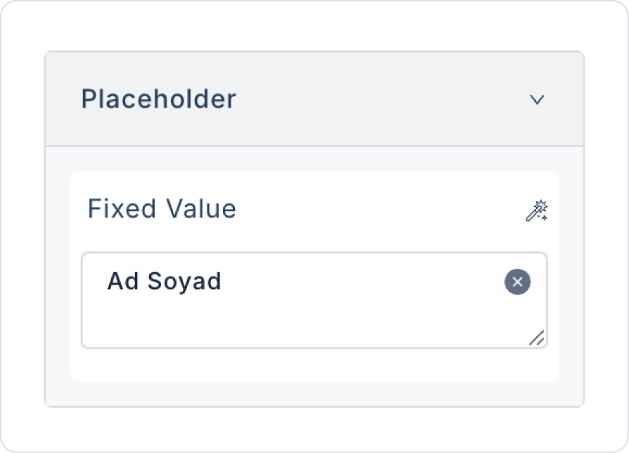
Add the text TextInput > Properties > Placeholder > “First Name Last Name” to the placeholder text inside Text Input.
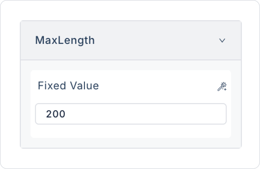
Set the character limit to TextInput > Properties > MaxLength > 200.
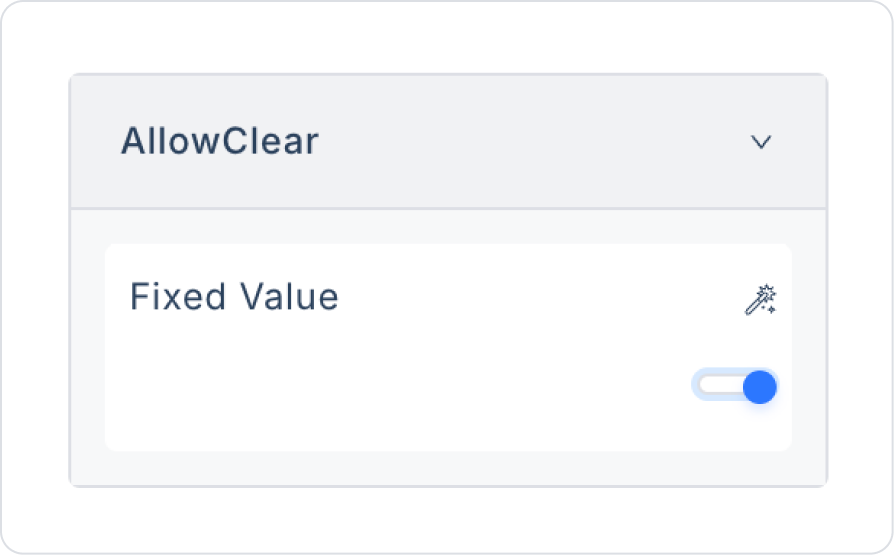
To make it easy to clear the text, set TextInput > Properties > AllowClear > On.
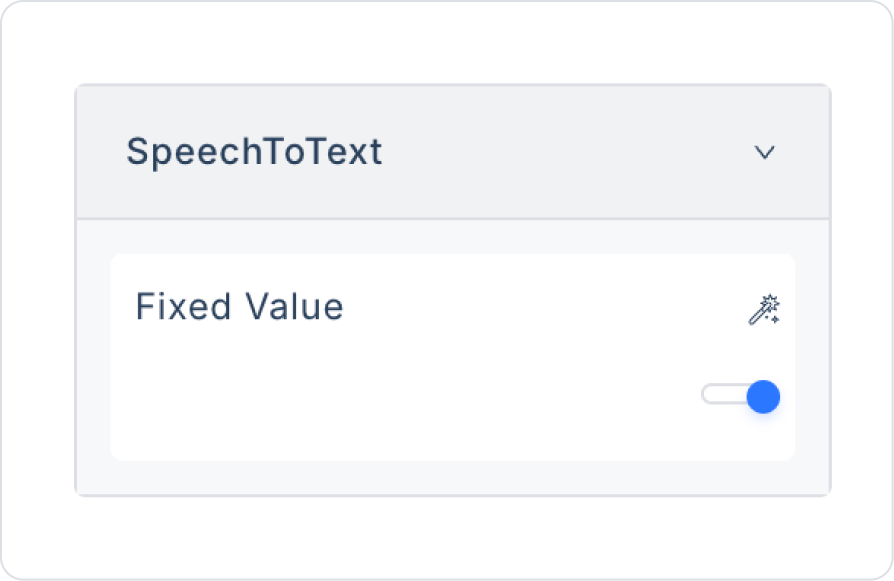
To create text with speech, set TextInput > Properties > SpeechToText > On.
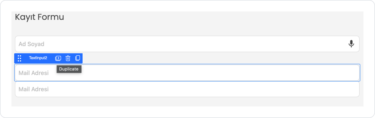
Click on the TextInput element, press the first option that opens, “Duplicate,” and duplicate the element.
Click on the Text Input element below and drag it into the space below to separate the elements within the same column.
Update the placeholder text to TextInput2 > Properties > Placeholder > “Email Address”.
Set the email address character limit to TextInput2 > Properties > MaxLength > 254, in accordance with standards.
Update speech-to-text for the email address to TextInput2 > Properties > SpeechToText > Off.
Click on the TextInput2 element and press the first option that opens, “Duplicate,” to duplicate the element.
Click on the TextInput3 element below and drag it into the space below to separate the elements within the same Col.
Update the placeholder text to TextInput3 > Properties > Placeholder > “Home Address”.
Set the email address character limit to comply with standards: TextInput3 > Properties > MaxLength > 400.
Update speech-to-text for the home address to TextInput3 > Properties > SpeechToText > On.
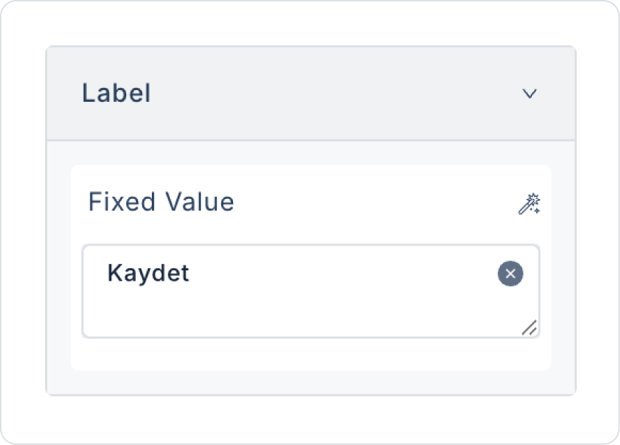
Drag and drop the Elements > Navigation > Button element onto the page.
Edit the Button text to Button > Properties > Label > “Save”.
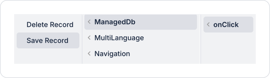
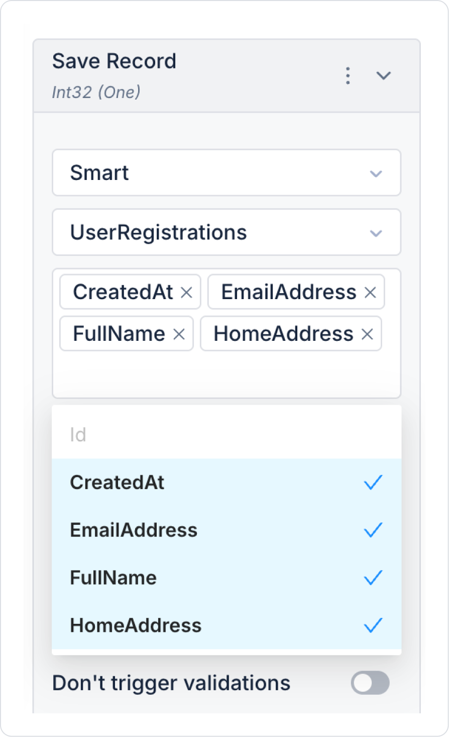
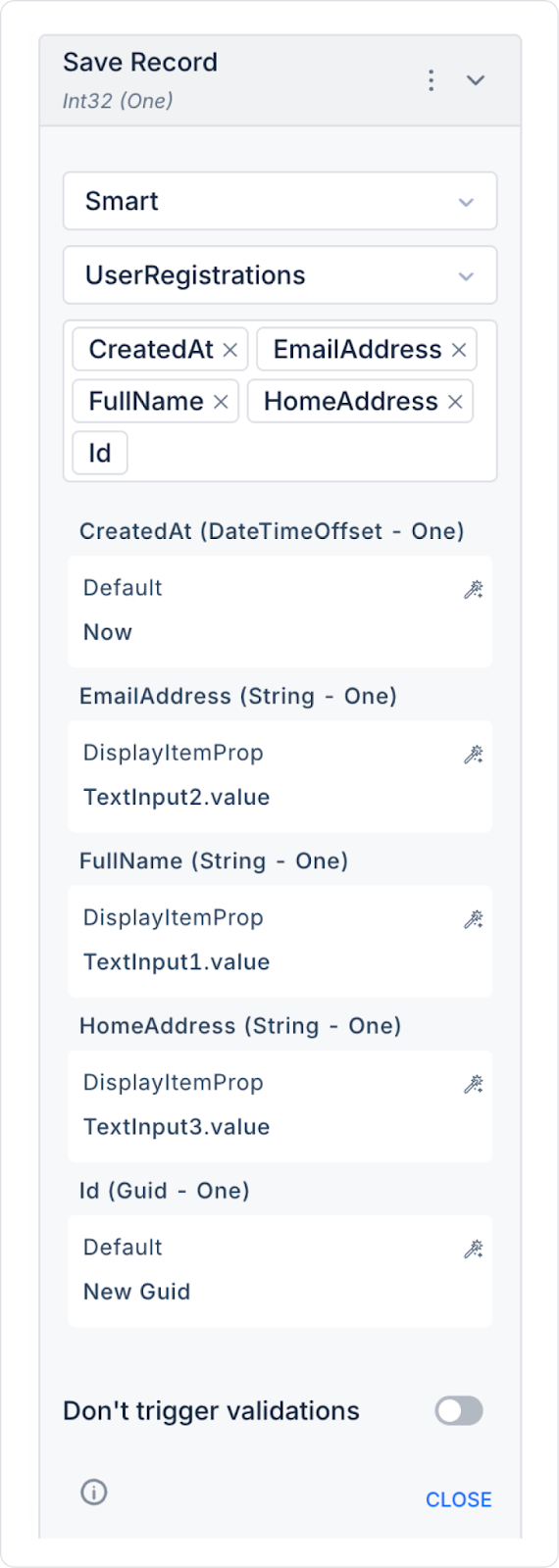
Add the save action to the Button element: Button > Add Action > onClick > ManagedDb > Save Record.
In the Save Record action, select the UserRegistrations table. In the column names field that opens, select all column names.
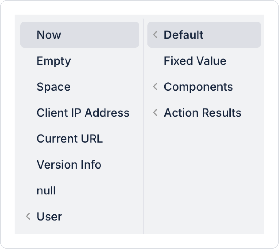
Define the CreatedDate field as Default > Now.
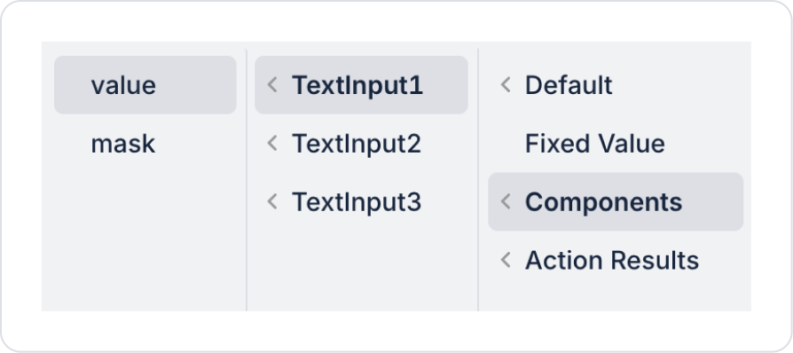
Define the EmailAddress field as Components > TextInput2 > value.
Define the FullName field as Components > TextInput1 > value.
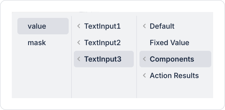
Define the HomeAddress field as Components > TextInput3 > value.
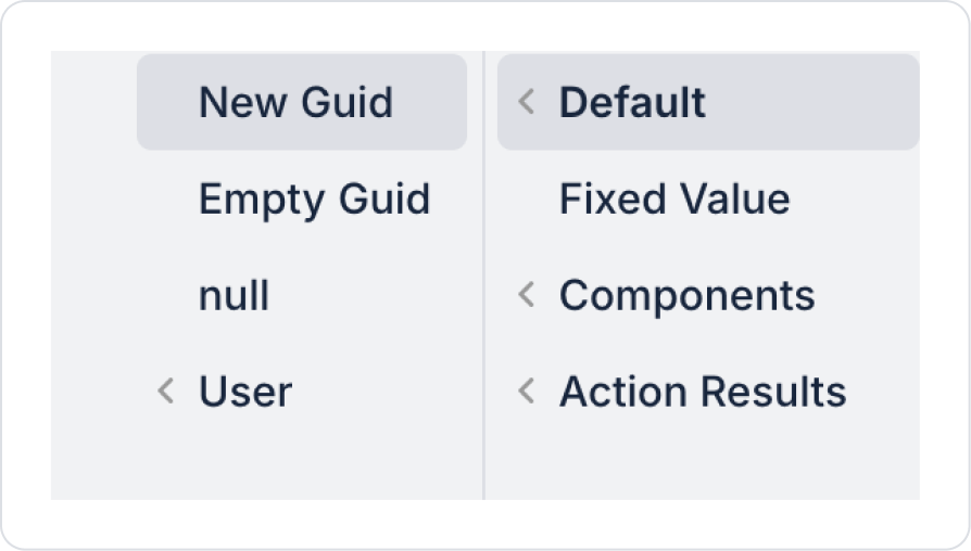
Define the Id field as Default > New Guid.
As a result of these definitions, all fields in the Save Record action should be as follows.
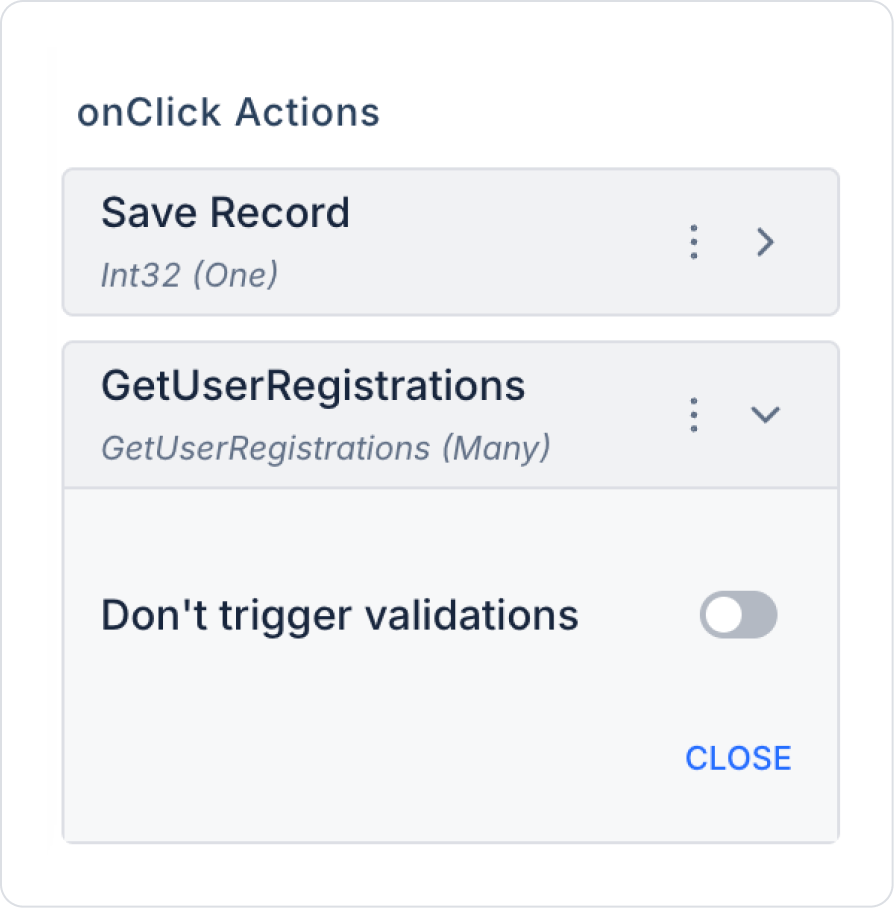
To view previously saved and newly saved records after clicking the button, add the Button > Add Action > onClick > Custom > Managed DB > GetUserRegistrations action.
Since redirection occurs after operations are completed on the registration page, the Set Value Of action does not clear the Text Input contents after registration.
To be able to see past entries when the page opens, add the Add Action > Initial Action > Custom > Managed DB > GetUserRegistrations action to the page.
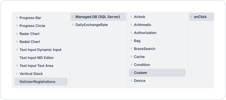
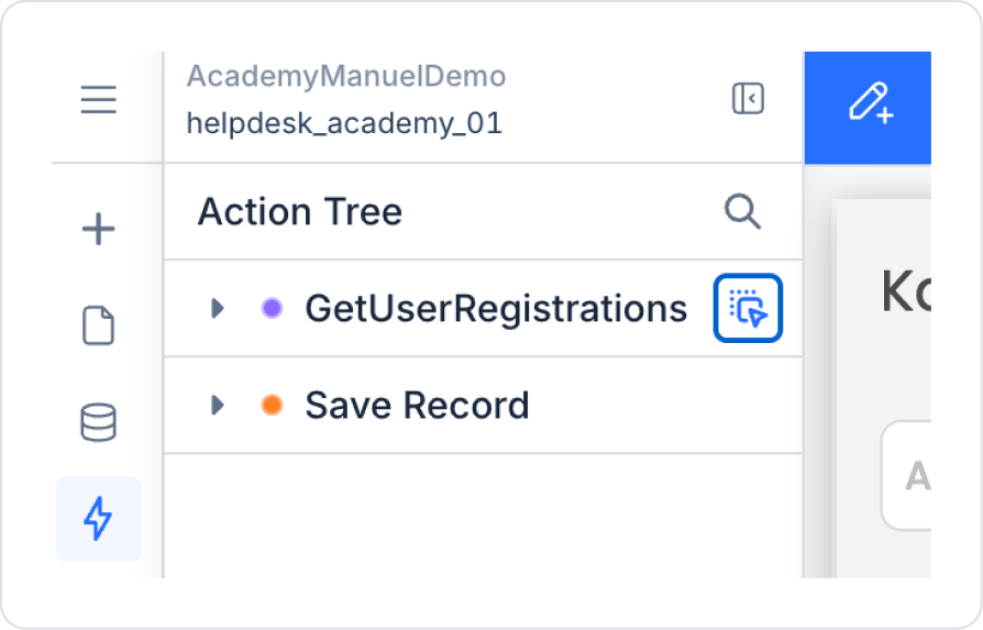
From the Action Tree area on the left side panel, press and hold the blue icon next to the GetUserRegistrations action and drag it to the page.
Select the relevant fields in the window that opens and create them.
The page should look like this in its final state.
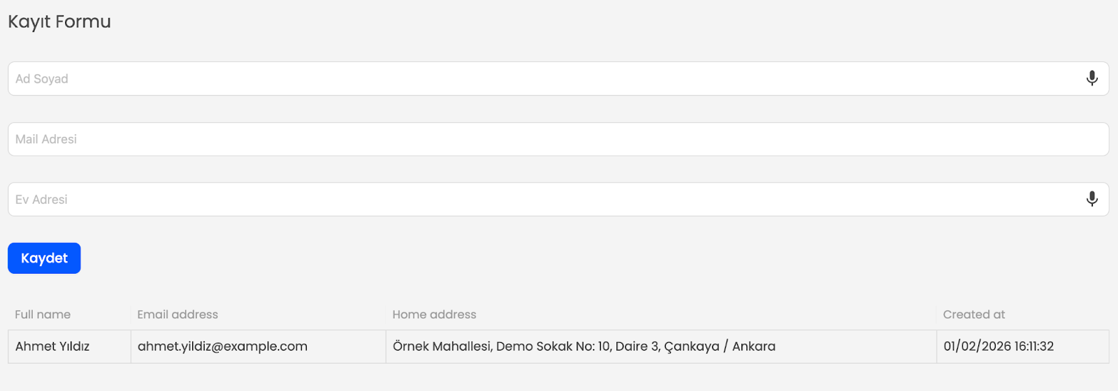
Preview:
When the application is tested, the user easily enters their First Name, Last Name, Email Address, and Home Address information through a single form. Text fields can be filled in using the keyboard, or voice data entry can be performed using the microphone icon.
After the form is filled out, clicking the Save button adds the information to the system and instantly lists the entered first name, last name, email address, home address, and registration date in the table below.
This structure allows user information to be recorded quickly, consistently, and verifiably.
4. Common Properties
Some fields on the Text Input element are commonly used across all UI elements. Therefore, detailed explanations of the following properties can be found in the relevant general guide pages:


