The password element is a special input element that allows users to securely enter their passwords within the application. Characters entered by the user are hidden (• / *) by default for security purposes, preventing unauthorized persons from seeing the password.
The Password element supports the Show/Hide Password feature to enhance the user experience. This allows users to temporarily view the password they entered as plain text if they wish.
Additionally, the Password element integrates with the Password Policy settings defined within the Configuration Manager module. This integration supports the creation of strong passwords by enforcing rules such as minimum length, uppercase/lowercase letters, numbers, and special characters.
The Password element is supported in both web and mobile applications.
1.1. Common Use Cases
User registration (Sign Up) screens
Login forms
Password change and reset steps
Account and security settings
Authorization and authentication processes
2. Key Features
Hidden character display: Entered password characters are hidden by default with asterisks (*).
Show/hide password support: Users can temporarily view the password they entered using the show icon.
Password Policy integration: Password rules (length, character types, etc.) defined in Configuration Manager are automatically applied.
Structure supporting strong password creation: Security level is increased by blocking weak password entries.
Compatibility with form validation: Password fields work seamlessly with form submit and validation processes.
Dynamic value binding support: Values can be managed with state, variables, or action outputs.
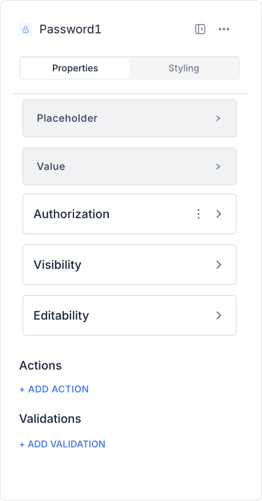
2.1. Password Element Properties
You can configure the following settings from the Properties panel:
Value: Represents the password entered by the user. As the password is entered, this value is stored in the element and can be used within the application.
Placeholder: The placeholder text that appears when the user has not entered any data (e.g., “Enter your password”).
2.2. Actions That Can Be Added to the Element
The Password element supports the following triggers (events) based on user interactions. These triggers ensure that actions are executed in a controlled manner based on the password entry.
onBlur: Triggered when the user loses focus from the password field (moves to another field).
Usage scenarios:
Check compliance with password policies
Display a warning message for weak passwords
Run validation after the user finishes typing
onPressEnter: Triggered when the user presses the Enter key in the password field.
Usage scenarios:
Initiating the Login or Sign Up process
Redirecting the user to the next step
3. How to Use the Password Element?
In this section, we will cover the end-to-end use of the Password element through example scenarios.
Scenario: User Login Screen
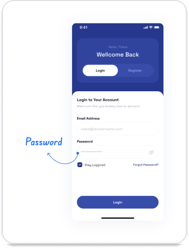
In an application, users verify their credentials through the login screen to access the system. In this scenario, the Passwordelement forms the basic step of the login process by allowing the user to enter their password securely.
In the scenario:
The user enters their account information in the Username/Email field.
Since the Password field is created with the Password element, the characters entered are automatically hidden and the password information is not visible on the screen.
If desired, the user can temporarily view the password by clicking the show/hide (eye) icon to the right of the password field, reducing login errors.
When the user clicks the Log In button, the entered information is verified. If the password is correct, the user is redirected to the application.
If the password is incorrect, a warning message is displayed to the user, and for security reasons, the login process is not completed.
Step 1 - Adding and Configuring Elements
Drag and drop the Elements > Display > Label element onto the page.
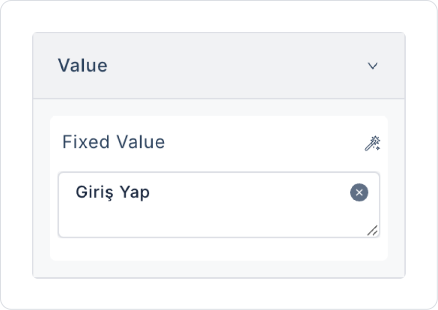
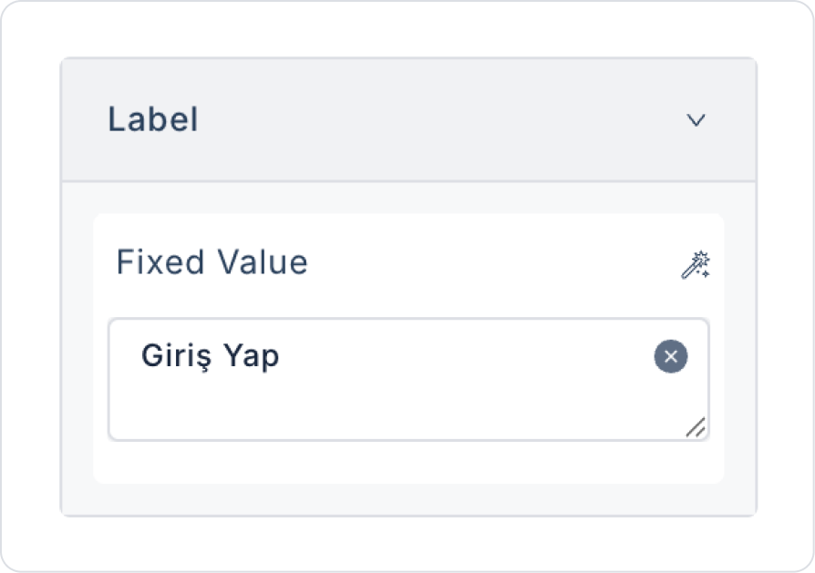
Set the text to Label > Properties > Value > “Login”.
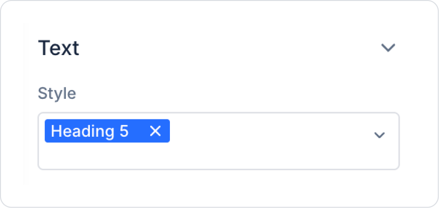
Set the text style to Label > Styling > Text > Style > Heading 5.
Drag and drop the Elements > Text Input > TextInput element onto the page.
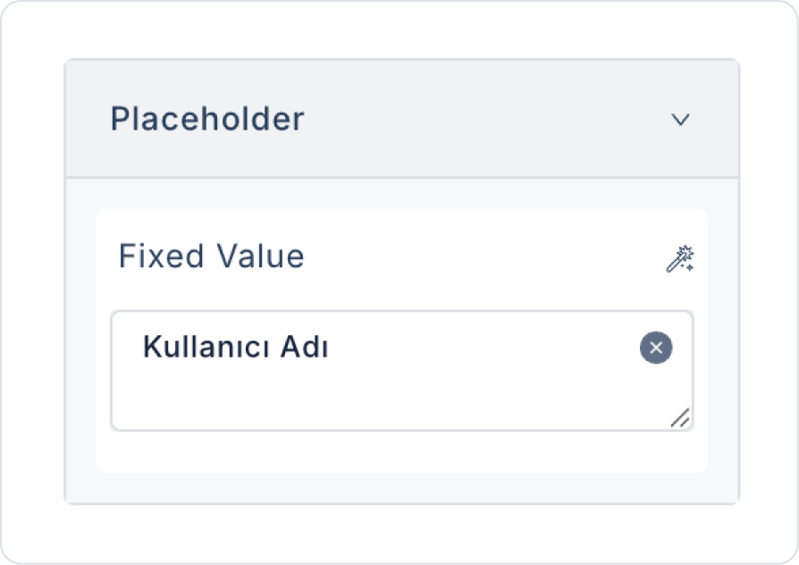
Set the placeholder text to TextInput > Properties > Placeholder > “Username”.
Drag and drop the Elements > Text Input > Password element onto the page.
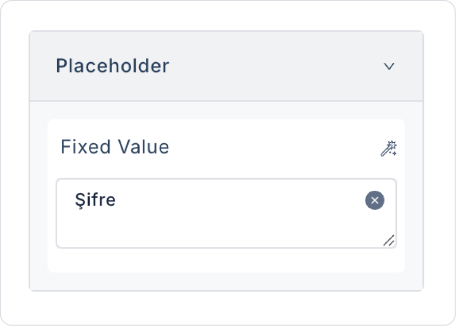
Set the placeholder text to Password > Properties > Placeholder > “Password”.
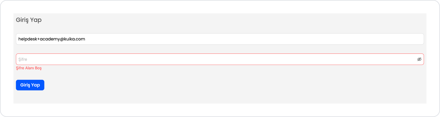
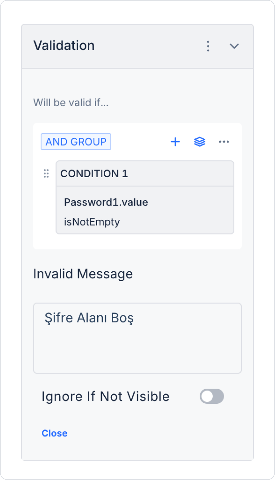
To prevent the field from being left blank, add Password > Properties > Add Validations. The condition will be defined automatically.
Update the Invalid Message field in the validation to “Password Field is Empty”.
Drag and drop the Elements > Navigation > Button element onto the page.
Set the button text to Button > Properties > Label > “Sign In”.
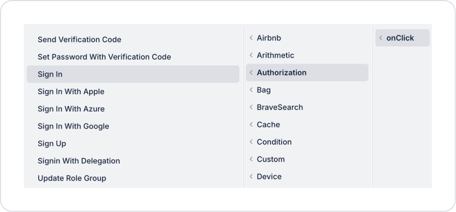
Add the ready-made system action Button > Properties > Add Action > onClick > Authorization > Sign In to the Button element.
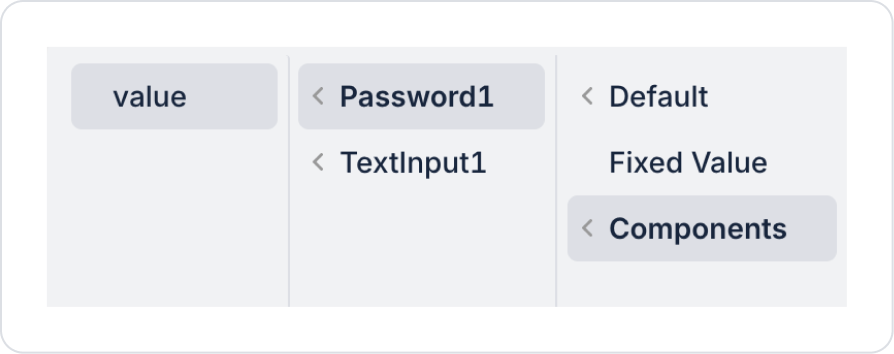
Define the value in Components > TextInput for the username field within the Sign Inaction.
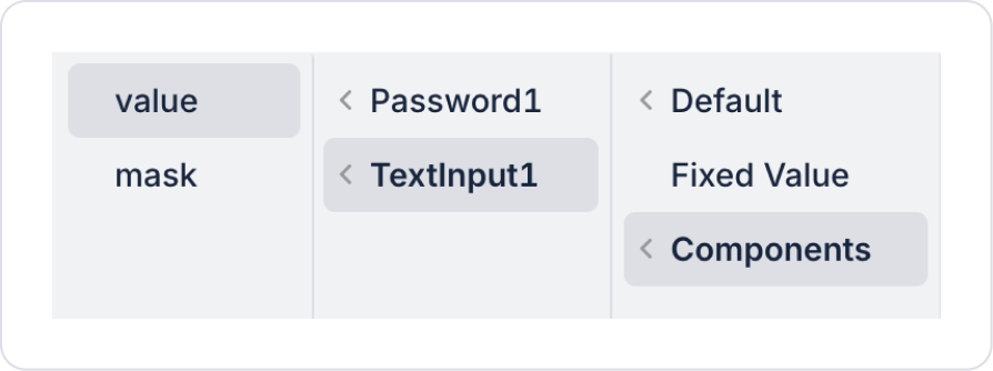
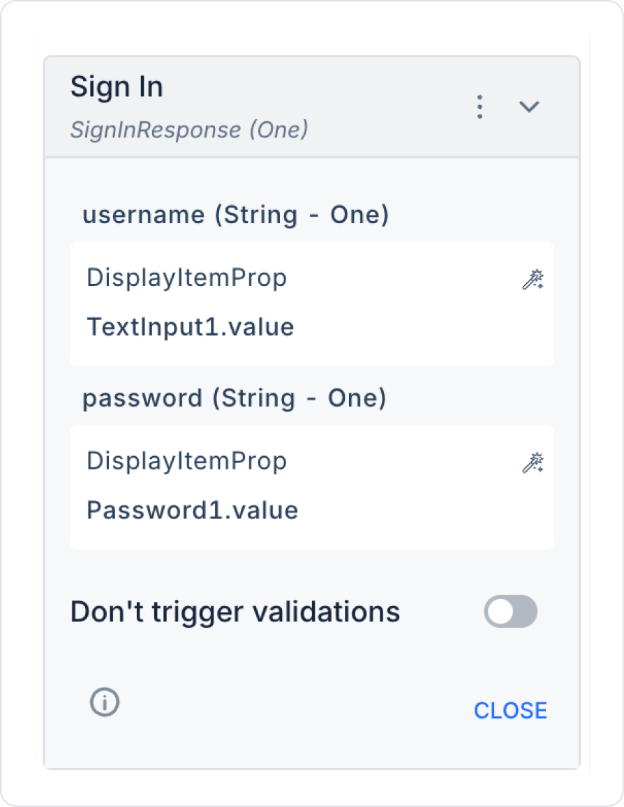
Define the value in Components > Password for the password field within the Sign Inaction.
The final Sign In action should look like this.
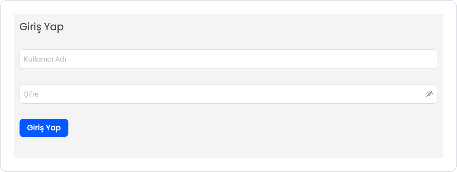
The final page structure should be as follows.
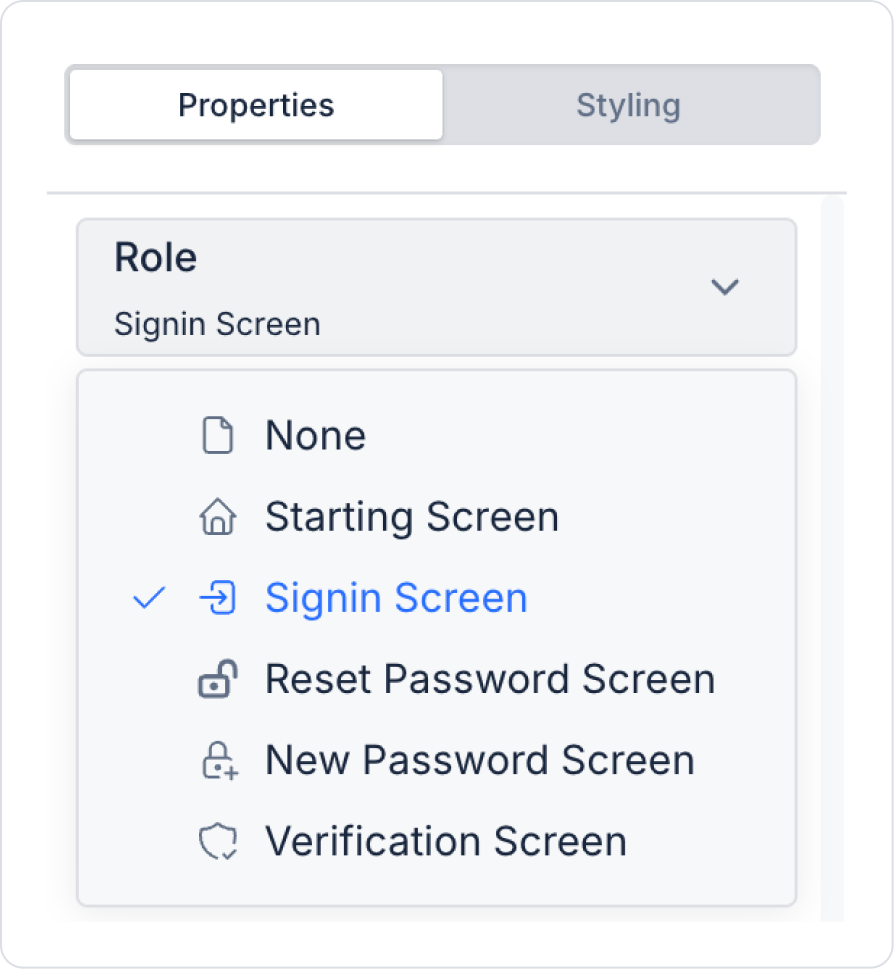
To display the login screen, click on an empty area within the Page and set it to Page > Role > Signin Screen.
Make sure a Home Page is defined in the project. If you have implemented and tested the work on the HomePage, create a new page and set this page to Role > Starting Screen.
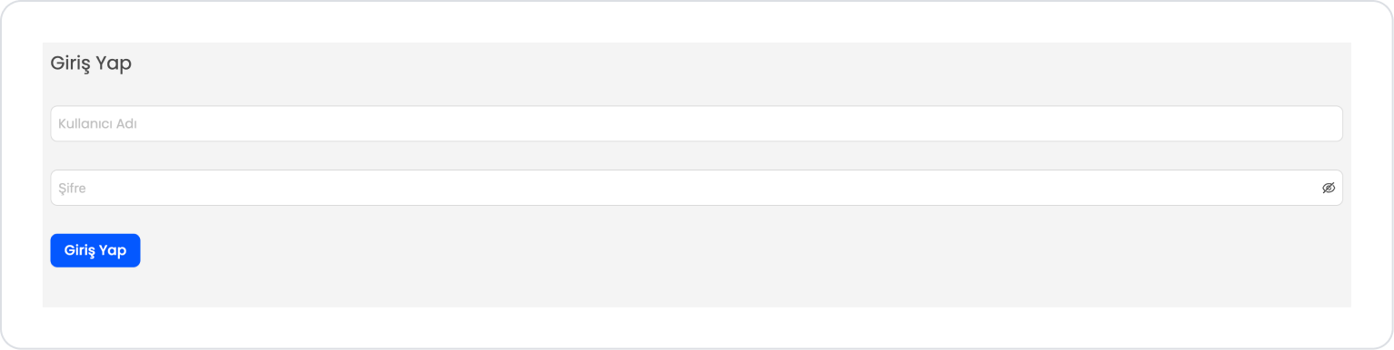
Preview:
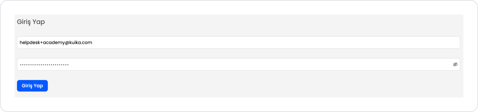
When the application is tested, the user enters their Username and Password information on the login screen and clicks the Login button. The password field is displayed in a hidden manner with the Password element and can be controlled with the show/hide password icon on the right.
If the password field is left blank, a warning message is displayed to the user and the login process is not initiated. If the information is entered correctly, the login process is successfully completed and the user is redirected to the Home screen.
4. Common Properties
Some fields on the Password element are used commonly across all UI elements. Therefore, detailed descriptions of the following properties are provided in the relevant general guide pages:


