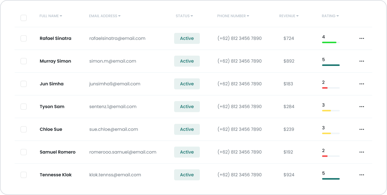
Kuika's Table element allows you to display data in a structured and understandable table format in your applications. Users can examine, compare, and manage data through rows and columns. The Table element provides an effective solution in many scenarios, such as data lists, report screens, management panels, and information presentations.
The Table element is supported in web and mobile applications. On the mobile side (Android & iOS), columns now automatically adapt to the screen thanks to the advanced responsive table view, optimizing the user experience.
1.1. Common Use Cases
Displaying tables from the database, such as
user, product, order, task, and record lists.
Listing data with filtering and searching.
Redirecting to the detail page: Going to the detail screen when clicking on a row.
Performing CRUD operations by adding edit & delete buttons.
Displaying large data sets by splitting them with pagination.
Responsive table usage on mobile devices.
Row-based coloring: Rows in different colors according to status (e.g., Approved, Pending, Rejected).
Displaying buttons, icons, badges, images within the table.
Hiding/showing columns based on user permissions.
2. Key Features
Dynamic data binding (Datasource): Data can be pulled by connecting an action or datasource to the Table.
Column configuration: Settings such as label, field, format, width, alignment, formatter, and visibility can be configured.
Pagination support: Large data sets are displayed by splitting them into pages.
Column-based sorting feature is supported.
Mobile responsive table: Columns can be listed in card view on mobile.
Column types suitable for different purposes: Text, numeric, date, icon, button, status labels, etc.
Conditional visibility: Columns can be hidden/shown with Visibility settings.
2.1. Table Element Properties
The table element is a data repeater element. The elements you add to the columns in the first row of the element will repeat in subsequent rows based on the data source. After selecting the data source, you can also link other elements within the row/column by selecting the fields in the relevant data table.
2.1.1. Table Properties
Covers the functionality, appearance, and interaction settings for the table as a whole.
Data Source: Specifies the data set to which the table is linked.
Show header: Determines whether the table headers are displayed.
Fixed header: Ensures that the headers remain fixed even when the page is scrolled.
Editable: Determines whether the table is editable.
In Android apps, the Select Box is supported as an editable component within an editable Table.
Editable Always Active: Ensures that the cell editing mode is always open. Available only in web applications.
Table Width Mode: Determines whether the table width is fixed or as wide as the content.
Global Search, Searchable, Sorter, and Filtering features are only supported in web applications.
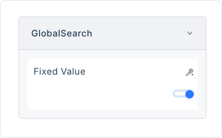
Global search: Enables global search across all table data.
Searchable: Ensures that the search box is displayed at the top right.
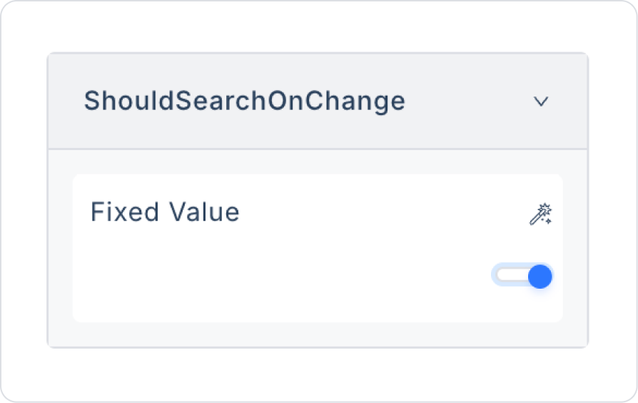
Should Search On change: Enables instant filtering as you type in the search box.
Search delay: Sets the delay time (in milliseconds) before searching.
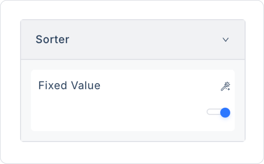
Sorter: Enables sorting of columns.
Filtering options are specific to the data type of the column and only work on tables with a data connection.
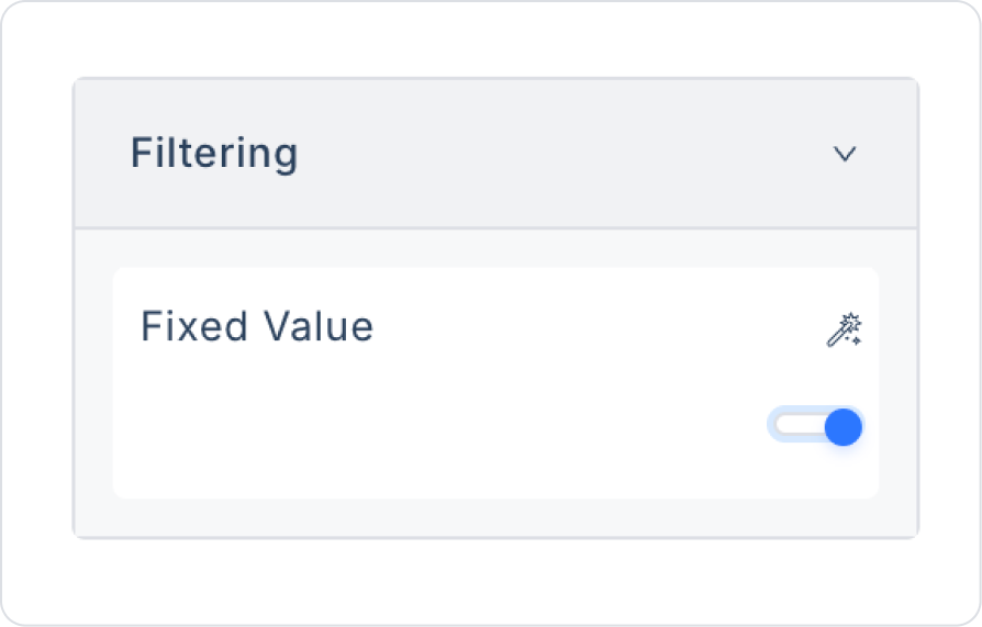
Filtering: Allows filtering based on the data type of the columns. In the Table element, it offers different filtering options depending on the data type of the columns (String, Number, or Date). For example, when one of the options such as contains, equals, begins with is selected for String columns, filtering can be applied to the column based on this option. The options are specific to the column type. With multi-filter support, the second filter field automatically appears when the first condition is entered and can be used for all conditions (equals, not equals, greater than, etc.). Filtering becomes active after three letters are entered, and the search is automatically refreshed with each letter entered, providing more dynamic and faster filtering. The filtering feature works with both Turkish and English character sets, preventing filtering issues arising from language differences.
Pagination: Allows data to be divided into pages.
Pagination Selected Text Color: Sets the text color of the active (selected) page number.
Pagination Unselected Text Color: Sets the text color of the inactive page numbers.
Page size: Determines the number of rows to be displayed on each page.
Show Size Changer: Allows the user to change the page size.
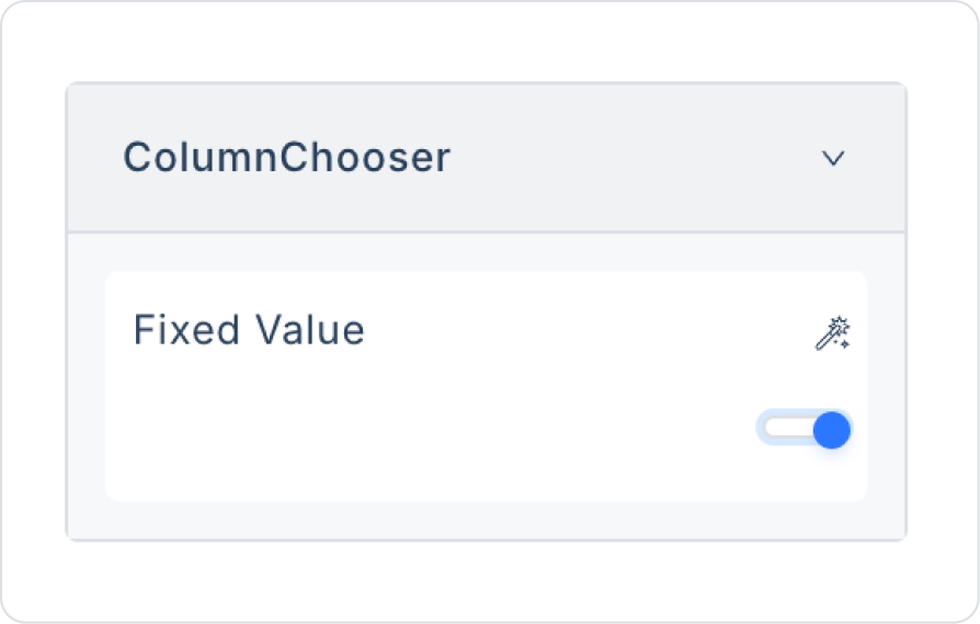
Column chooser: Allows the user to select which columns to display.
Resizable columns: Allows the width of columns to be adjusted.
Hide table on empty: Hides the table if there is no data.
Striped: Displays rows with a striped (striped) appearance.
Striped color: Sets the background color of striped rows.
Row hover bg color: Changes the background color when hovering over a row.
Insert row active: Enables the feature to insert new rows. Available only in web applications.
Insert row positon: Determines whether the new row will be inserted at the top or bottom. Available only in web applications.
Show Row Numbers: Displays row numbers at the beginning of table rows.
Show no data found: Displays a “No data found” message if no data is available.
No data found message: Allows you to customize the content of this message.
No data found image: Sets the image to display when no data is available.
Multiselect: Allows you to select multiple rows at the same time.
Multiselect Scope: Determines whether the multi-select applies to cells, rows, or columns.
Selected values: Stores the values of the selected rows.
Selected Row Color: Sets the background color of the selected row.
Selected Count: Displays the number of rows selected when Multi Select is enabled.
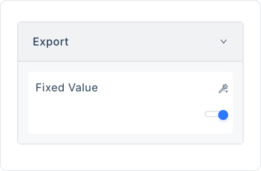
Export: Enables the table export feature (Excel, CSV).
Export Button Bg Color: Sets the background color of the export button.
Export File Name: Sets the default name of the exported file.
In web applications, you can visually display row-based progress statuses by dragging a Progress Bar or Progress Circle into the cells within a Table.
2.1.2. Columns Properties
These are the properties that appear when a column is selected. Each one controls the appearance, function, or behavior of the column.
Title: The column header is the name displayed to the user.
Second Title: The secondary title displayed below the column header.
Default Data Field: The default data field to be displayed in this column.
Group: Used to group columns under a header.
Group Bg Color: Sets the background color of the group header.
Group Font Color: Sets the text color of the group header.
Group Font Size: Sets the font size of the group header.
Group Font Weight: Sets the boldness of the group header.
Title Bgcolor: Sets the background color of the column header.
Special sorting format: Enables processing according to a specific rule during sorting.
Always Visible On Mobile Resolution: Ensures this column is always visible on mobile devices.
Hide Filtering: Prevents filtering in this column.
Hide sorting: Prevents sorting in this column.
Hide search: Hides the search box in this column.
Footer Options: Allows adding footer information (total, average, etc.) to this column.
Footer Formatter: Defines custom formatting rules for the footer.
Footer Option Label: Specifies the title/text to be displayed in the footer.
Footer Font Size: Sets the font size for the footer.
Footer Font Color: Sets the font color for the footer.
Footer Text Align: Sets the text alignment for the footer (left, right, center).
Footer Font Weight: Determines the boldness of the footer text, making it appear more emphasized or plain.
Exclude From Export: Prevents this column from being included in the export.
Fixed: Ensures the column remains fixed (stays in place when scrolling). In tables using Fixed Columns, column widths are calculated correctly, and column visibility remains stable in “Sometimes Visible / Hidden” scenarios.
Placeholder: The text displayed when the cell is empty and editable.
Date Search Format: Specifies the date format to be used when searching in date-type columns (e.g., DD.MM.YYYY, MM/DD/YYYY).
2.1.3. Title Properties
Becomes active when the column header is selected. These properties allow you to edit the column header area.
Column Titles: Represents the column headers in the table. These are usually the headers in the first row.
Hide Mobile Resolution: Hides table headers on mobile devices.
Text direction: Determines the text direction of the column (left to right / right to left).
2.1.4. Using Sorter in the Table Element
Add the Table element and connect the data source.
To use the Sorter feature on the Table, you must first connect data to the table.
Open the Sorter feature from the Properties panel on the right side.
Users can sort data in ascending or descending order by clicking the sort icon in the column headers.
2.1.5. Using Inline Grid in the Table Element
The Inline Grid feature is used with the Editable Table Column added to the Table element and allows you to not only view data in your table, but also edit and save it. To use this feature, you need to add Editable Table Column to the Table element.
Adding Editable Table Column to the Table Element
Select the Table element on the screen.
Open the Properties panel.
Click the Add Editable Table Column button under Table Row.
The column will be added automatically with a Label element.
Using Editable Table Column
Editable Table Column is different from the standard Table Column. It cannot be edited directly during the design process and has basic properties.
You can bind dynamic data to the column and make style adjustments.
Using Dynamic Data in Editable Table Column
Select the Table element.
Go to the Datasources field in the Properties panel.
From the actions you added to the screen as Initial Action, select the action you want to use as the data source.
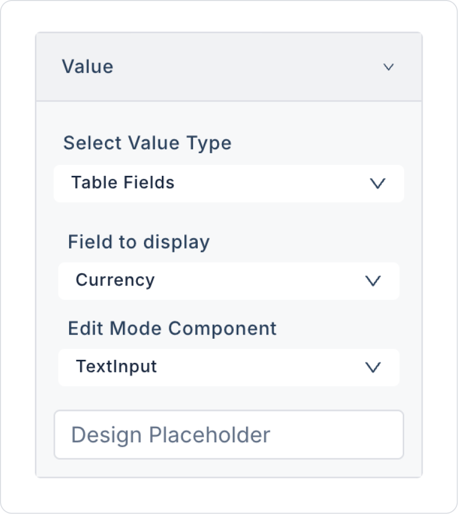
Binding Data to the Label Element in the Editable Table Column
Select the Label element in the Editable Table Column.
In the Properties panel, select the data you want to display from the Field to Display parameter in the Value field.
Use the Edit Mode Component parameter to specify the element to be used during editing.
For example, the TextInput element can be used for name entry, and the Select Box element can be used for department selection.
Example of Editable Table Column Usage
In a Table element consisting of Editable Table Columns, the first row may appear in edit mode.
You can manage the Property and Styling settings of the elements in the columns.
During the preview or publishing phase of the application, you can switch to edit mode by double-clicking on the row.
You can save the values by pressing the “Enter” key or clicking outside the table.
To save the values you have edited, you must save the new values with the action you have defined in the “On Row Edit Finished” event of the Table element.
Using On Row Edit Finished
On Row Edit Finished is only meaningful with the Table's Inline Grid feature. It is used to define actions to be executed to add/update records to the database after editing the row is complete.
In the On Row Edit Finished event, the table's data source action must be called again after the record operation is complete.
Example Scenario: Listing Customer Address and Customer Name as Editable
Add the action that will provide the listing function as the Initial Action.
Add a Table element to the screen.
With the Table element selected, follow these steps in the Properties panel:
Add Action → On Row Edit Finished → Managed DB → Save Record
Under the Save Record action, define the relevant parameters.
After adding the Save Record action, add the On Row Edit Finished action again to define the action that will provide the listing function.
Select the Label elements in the columns and define the data through the Value field in the Properties panel.
Thanks to the Inline Grid feature, you can not only view data in the Table element, but also edit and save it. This feature adds dynamic editing and data saving functions to your applications.
2.1.6. Using Inline Edit on Mobile
The Inline Grid structure used in the Table element is now also supported in mobile applications (Android & iOS). This feature allows users to edit table rows directly from their mobile device.
1. Preparing the Table Element
Enable the Editable feature.
Add editable columns for inline editing using Add Editable Table Column.
2. EditableTableColumn Configuration
Within Editable Table Column:
Link the data from the Value / Field to Display field to display the data in the column.
Select the component to be used during editing (TextInput, Selectbox, etc.) from the Edit Mode Component field.
This structure ensures that the appropriate input opens when the user taps the cell on mobile.
3. Save Record Process
Save Record works in a manner compatible with inline editing.
Save Record is triggered when the user finishes editing.
The “On Row Edit Finished” event is not currently available in the UI and therefore cannot be used.
To save the edited data:
On the Edit Mode Component within the edited EditableTableColumn
define the Save Record action.
When the save operation is successful:
On Success → call the listing action again
(e.g., Initial Action).
This method is the correct workflow for both mobile and web.
4. User Flow on Mobile
Inline editing works as follows on mobile devices:
The user taps the cell they want to edit.
The EditMode Component becomes active and the mobile keyboard opens.
The user edits the value.
When editing is complete:
Presses the Done/Enter key or
Taps outside the cell.
This triggers the Save Record action.
The table's data source is refreshed and the updated value is displayed.
5. Recommendations for Mobile Design
Limit the number of columns; hide unnecessary columns on mobile screens.
Use the Always Visible On Mobile Resolution feature for critical columns.
You can add a light background or icon to visually distinguish editable cells.
Inline Edit in the Table element now works stably in both web and mobile applications. Users can easily edit rows on mobile devices, save them with Save Record, and update the table instantly.
2.1.7. Using Hover in the Table Element
You can enhance the user experience by adding a hover effect to the rows of the Table element. The hover effect changes the background color when the user hovers over a row.
Steps to Add a Hover Effect
Select the Table element to which you want to add the hover feature.
Open the Properties panel.
Click on the Row Hover Bg Color option.
In the panel that opens, use the Color option to set the hover color.
With this setting, the background color will change when the user hovers over the rows with the mouse.
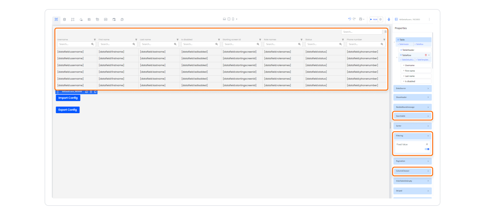
2.1.8. Saving and Restoring Table Filter Settings
After adding the Table element to your application, configure the Searchable, Filtering, and Column Chooser settings from the Properties panel on the right side.
Searchable: Allows you to search the table.
Filtering: Allows you to filter your table data.
Column Chooser: Allows you to hide or show columns.
Then click the Preview button in the upper left corner.
You can save previously filtered or hidden columns.
The saved settings are automatically restored when the table is reopened.
You can export them in JSON format with the Export Table Config action.
You can reload previously saved settings with the Import Table Config action.
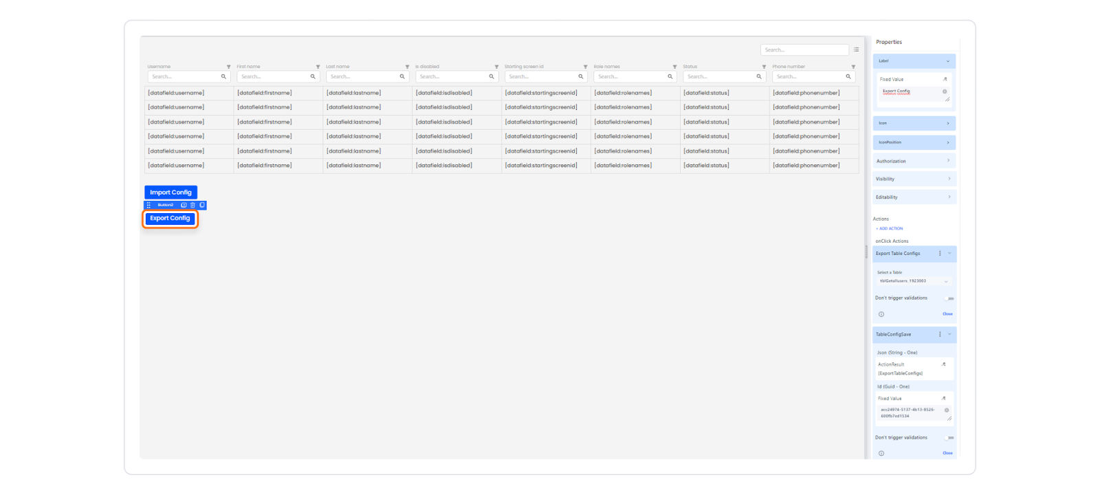
Saving the Table to Managed DB with the Export Table Configs Action
Let's assume you typed the word you want to search for in the first column of the table and filtered it.
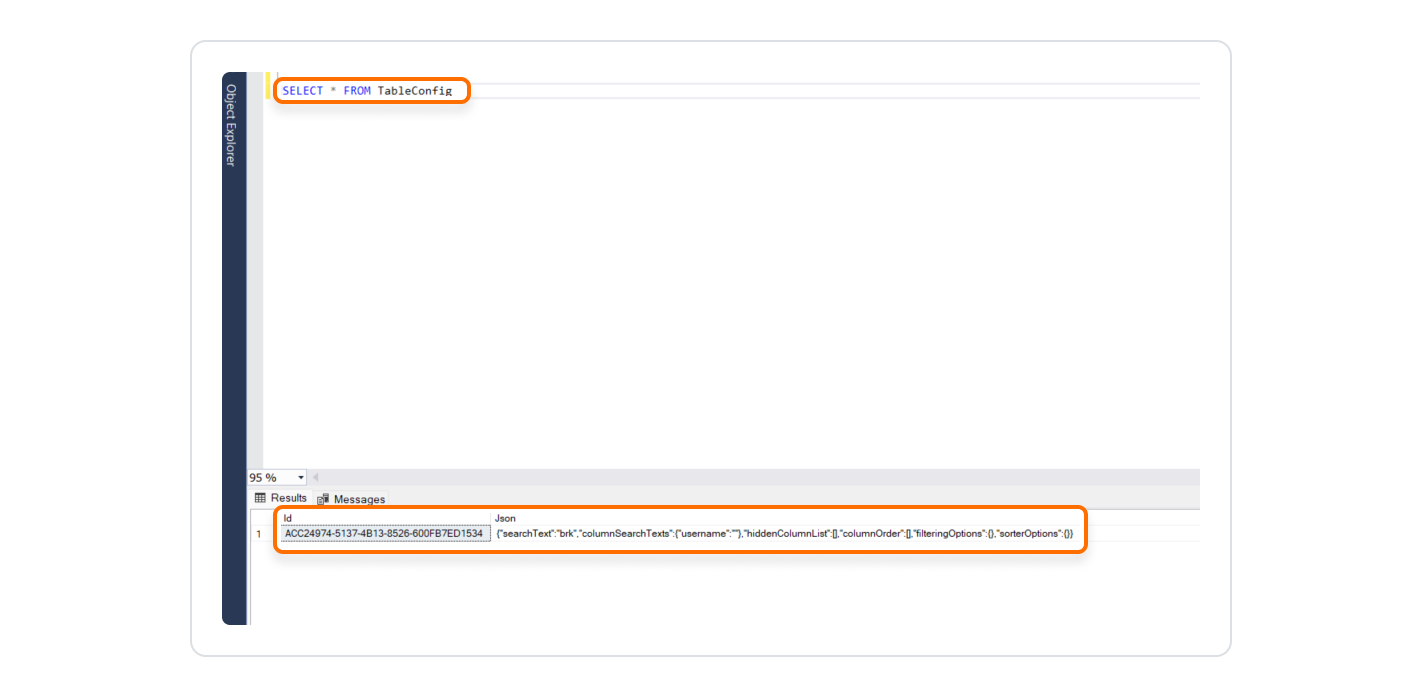
In this case, the current state of the table, i.e., the applied filters and column settings, is exported as a string in JSON format via the “Export Table Config” action, and this data is saved in the “Tables” field in the Managed DB panel.
For example, you created a data table named “TableConfig” and added the “Id” and ‘Json’ columns to this table. During the “Export” process, the table JSON data is saved to this table.
2.1.9. Resetting Filtering Settings in the Table Element
Kuika's Clear Table Filtering Configs action, specific to the Table element, is used to reset the filtering settings applied to table data. This action removes any previous filtering operations, making all data visible again.
The Clear Table Filtering Configs action does not delete the data in the table columns, it only clears the filters.
Click on the Table element you added to your application.
While in the UI Design module, open the Properties panel on the right side.
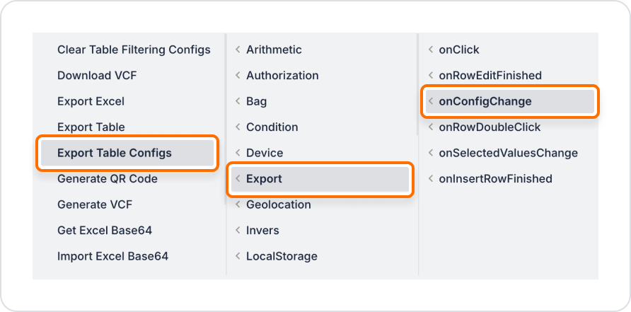
From the + ADD ACTION drop-down menu, select on Config Change → Export → Clear Table Filtering Configs.
To remove previously applied filters, select the relevant table from the Select a Table field.
After completing these steps, all filtering applied to the Table element will be cleared, and all data will become visible again.
2.1.10. Exporting and Importing Table Data
Exporting
Select the Table element.
From the +ADD ACTION menu, select on Config Change → Export → Export Table Configs.
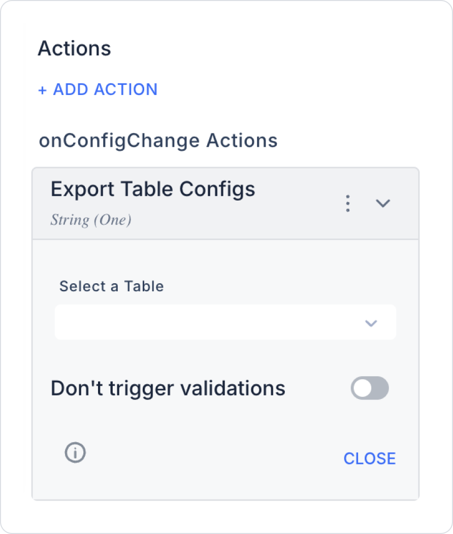
Select the table you want to export.
Applied filters and column settings are exported as a string in JSON format via the Export Table Config action, and this data is saved in the Tables area of the Managed DB panel. For example, you created a data table named TableConfig and added Id and Json columns to this table. During the Export process, the table JSON data is saved to this table.
Import
Select the Table element.
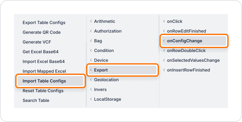
From the +ADD ACTION menu, select on Config Change → Export → Import Table Configs.
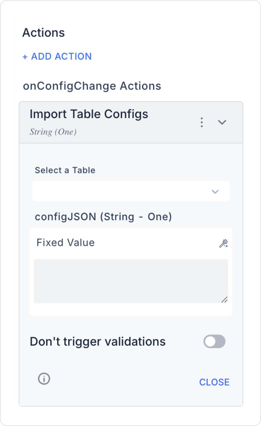
Specify the table you want to import and configure the JSON settings.
When you reopen the table or click the Import button, this previously saved configuration is reapplied to the table. It loads along with the filters and column settings saved to the table. Once these steps are complete, when you reopen the table, it automatically loads with the last saved filters and column settings. This eliminates the need to reconfigure the table each time.
2.1.11. Resetting Table Settings
Select the Table element.
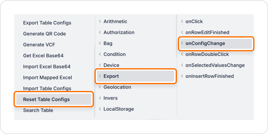
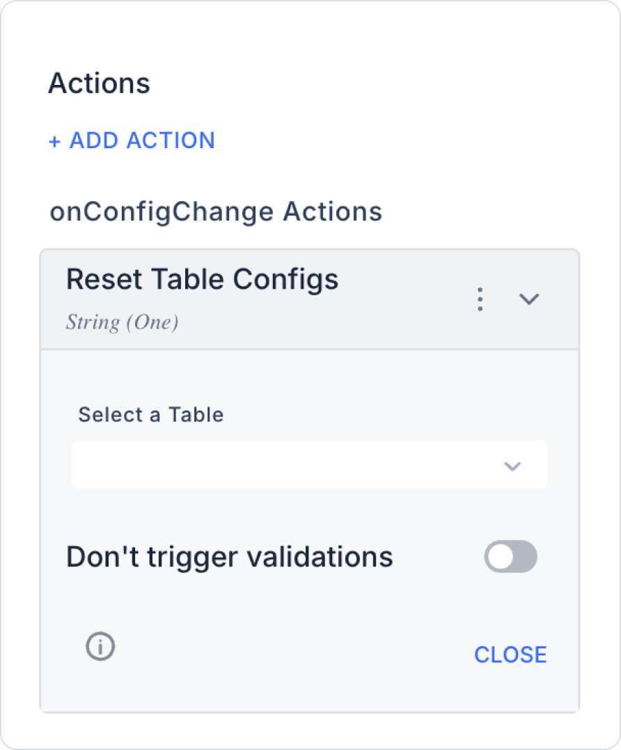
From the +ADD ACTION menu, select on Config Change → Export → Reset Table Configs.
All settings are reset to their default values.
2.1.12. Displaying Data Under the Table in Groups
Select the Table element.
Add the Collapse element from the Interactive category in the Elements panel of the UI Design module under the data rows in the Table.
Create an SQL Action for the relevant table.
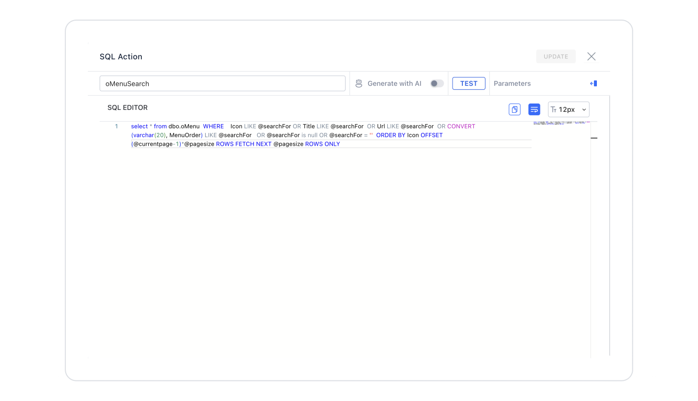
Creating an SQL Action
Click the + icon next to the Actions heading in the left panel.
Select New SQL Action from the menu that opens.
Write your SQL query using the SQL Editor and click the CREATE button.
You can get suggestions by enabling the Generate with AI option from the Kuika AI assistant.
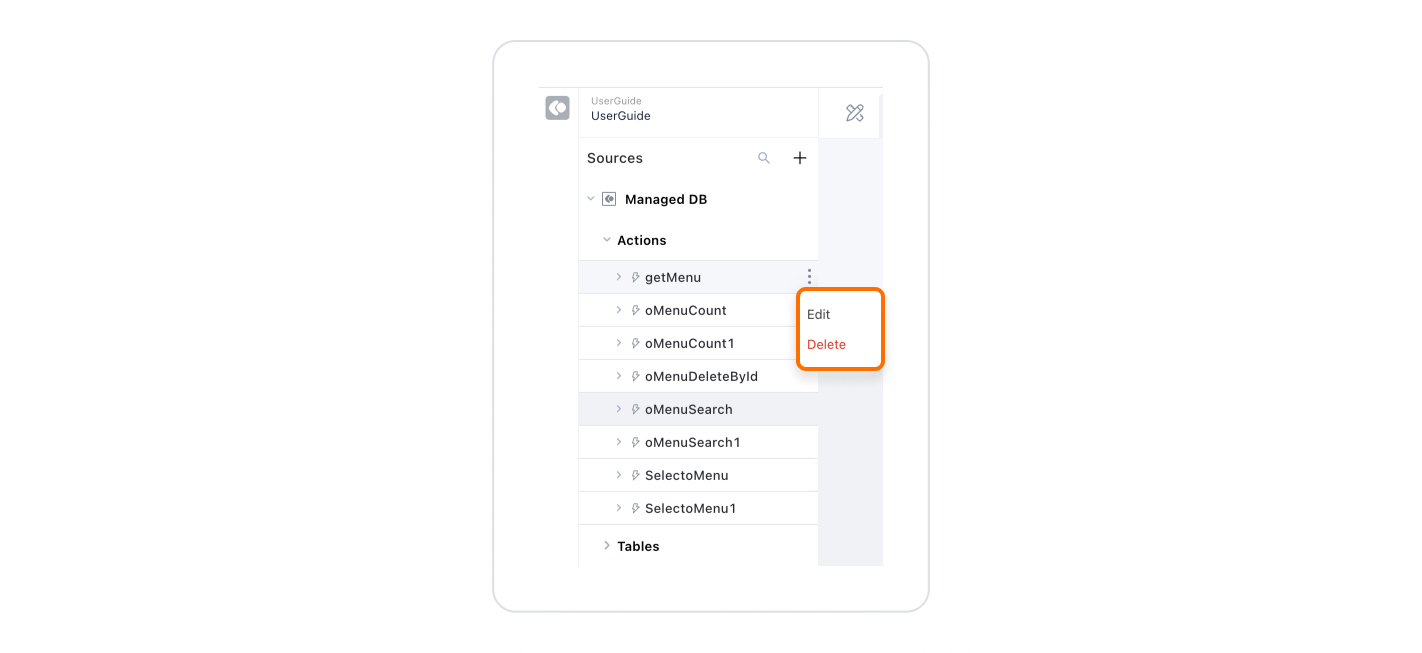
You can view, rename, and delete the action you created in the left panel.
To edit, click on the action and select the Edit option.
You can update existing SQL queries by clicking the Update button.
Use the Delete option to delete the action.
Collapse Layout
In the Collapse element, specify the area to be grouped.
For example, if you want to group customer information, select the customer name as the header.
Add the necessary fields for detailed data to the Collapse.
Each row of the table represents a customer.
When the row is expanded, the detailed list of customer orders becomes visible.
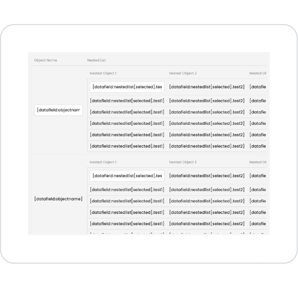
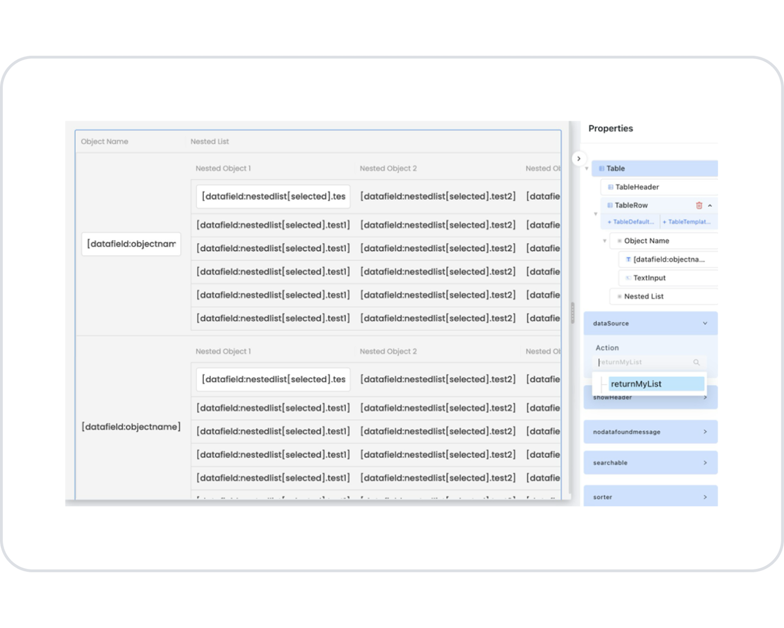
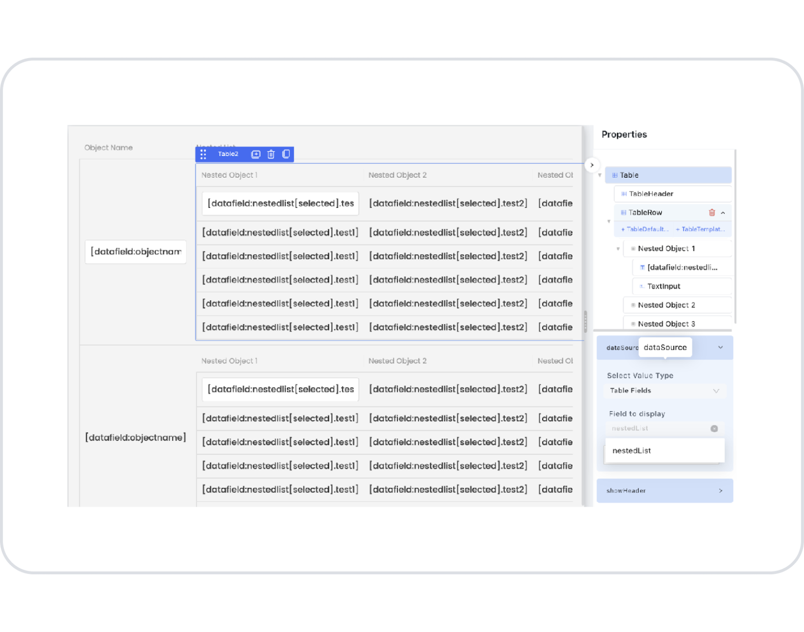
2.1.13. Using the Master-Detail Feature in the Table Element
To use the Master-Detail feature, follow these steps:
Add a Table element from the Data category in the Elements panel on the left.
Drag a second Data Repeater category element into the relevant area.
Add elements suitable for the data returned via Datasource to the Table.
Create a data-returning Action and link it to the Page Init event.
Select the Table element you will use as the Master.
Select the Action Result you created as the Datasource.
Specify the Table element you will use for Detail.
As the Datasource, specify the second list within the data in the Master table.
Arrange the other elements according to your needs.
After completing all the steps, your Master-Detail table will be ready for use.
The Kuika platform does not directly support the Master-Detail feature with SQL. However, it is possible to manage this process with SQL queries.
Master-Detail Feature with SQL Support
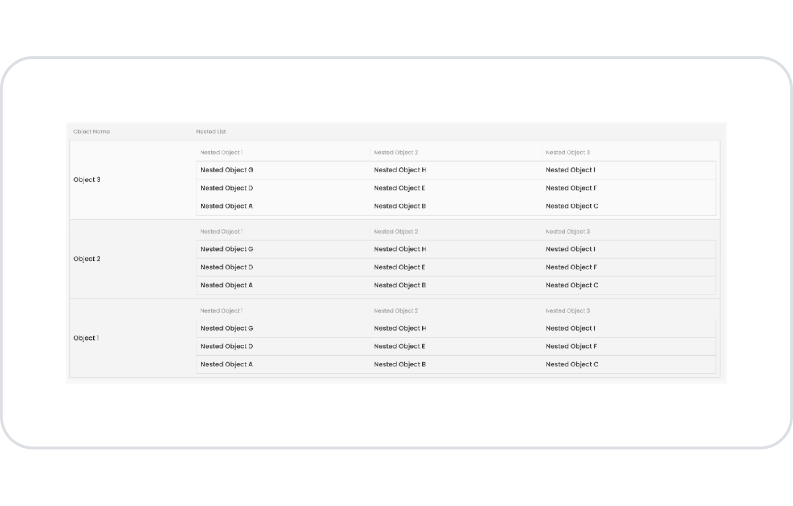
The Kuika platform does not directly support the Master-Detail feature with SQL. However, you can manage the Master-Detail relationship using SQL queries. Below is an example of C# code:
using Newtonsoft.Json;
using RestSharp;
using System;
using System.Collections.Generic;
using System.Data;
using Microsoft.Data.SqlClient;
using System.Linq;
using Kuika.Common.Helpers;
using Kuika.Common.Settings;
using Kuika.Common.Classes;
using Kuika.Common.Accessors;
namespace Kuika.ThirdPartyApisCollection
{
public classmyClass{
public static List<myList> returnSQLList(string connectionString){
List<myList> myListObj = new List<myList>();
string getMasterCommand = “SELECT * FROM MasterTable”;
var masterResult = KPersister.Fetch(connectionString, getMasterCommand, null);
foreach (var masterObject in masterResult.ResultList)
{
myList newObj = new myList();
newObj.objectName = masterObject.GetValueByFieldName(“ObjectName”).ToString();
var prms = new List<kSqlParameter>()
{
newkSqlParameter() { Name = “masterId”, Value = masterObject.GetValueByFieldName(‘Id’).ToString() }
};
string getDetailCommand = “SELECT * FROM DetailTable WHERE masterId = @masterId”;
var detailResult = KPersister.Fetch(connectionString, getDetailCommand, prms.ToArray());
newObj.nestedList = new List<myNestedList>();
foreach (var detailObject in detailResult.ResultList)
{
myNestedList nestedListObj = new myNestedList();
nestedListObj.test1 = detailObject.GetValueByFieldName(“Data1”).ToString();
nestedListObj.test2 = detailObject.GetValueByFieldName(“Data2”).ToString();
nestedListObj.test3 = detailObject.GetValueByFieldName(“Data3”).ToString();
newObj.nestedList.Add(nestedListObj);
}
myListObj.Add(newObj);
}
return myListObj;
}
}
public classmyList{
public string objectName { get; set; }
public List<myNestedList> nestedList { get; set; }
}
public classmyNestedList{
public string test1 { get; set; }
public string test2 { get; set; }
public string test3 { get; set; }
}
}
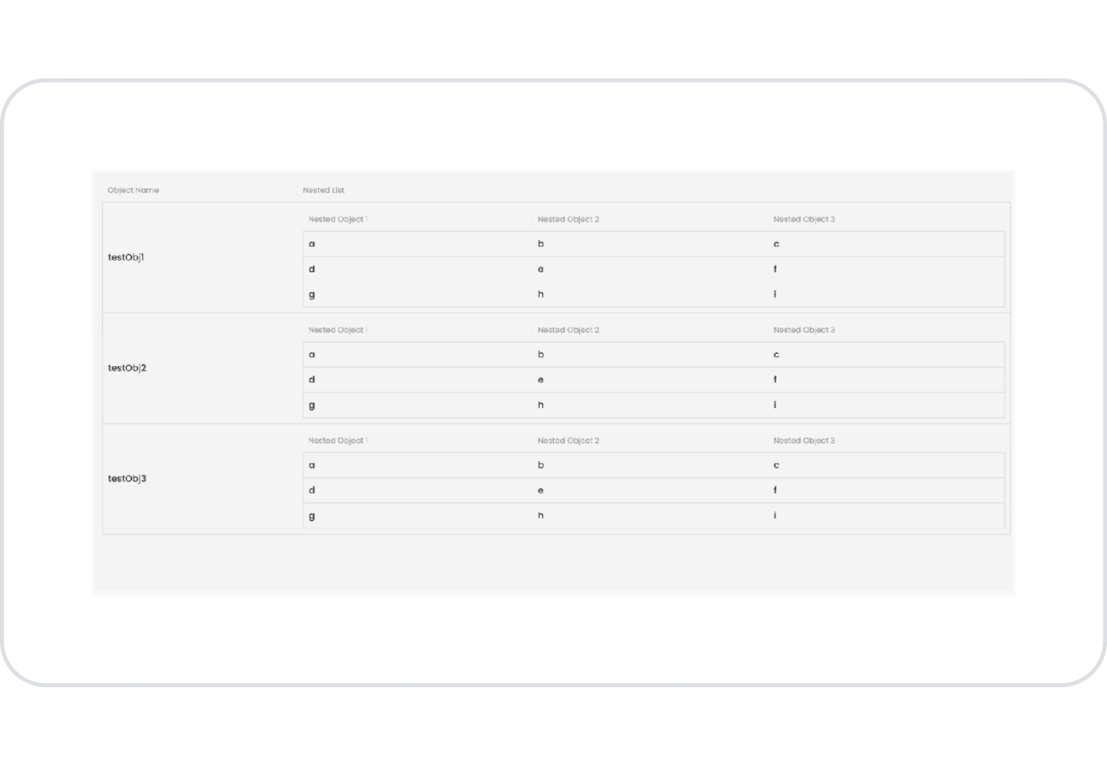
Master-Detail Example Using Custom C#
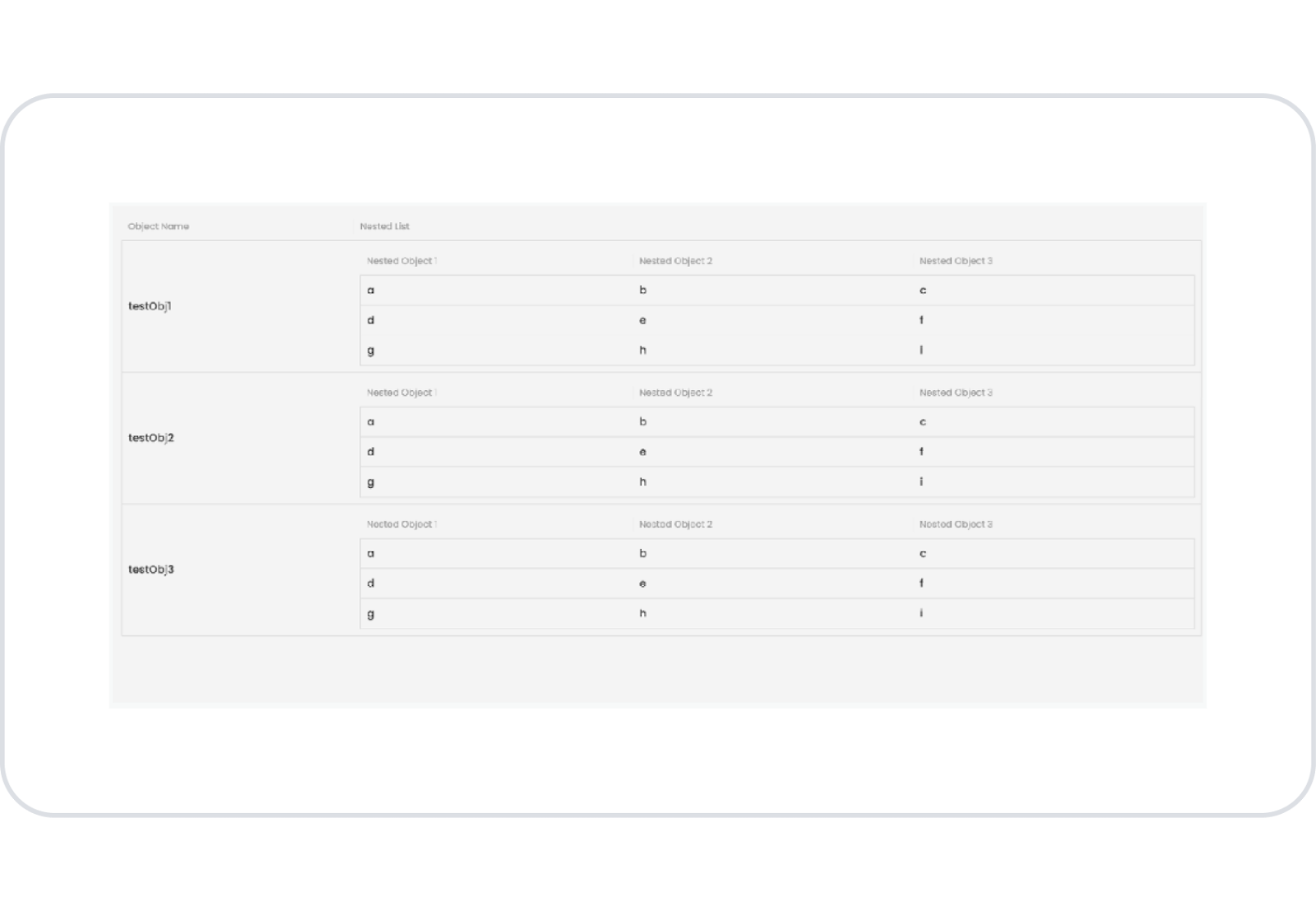
You can also manage Master-Detail tables with Custom C# code. The following example shows how to group detail data by creating an object list:
public static List<myList> returnMyList(){
List<myList> myListObj = new List<myList>();
myList myListItem = new myList { objectName = “testObj1” };
myListItem.nestedList = new List<myNestedList>
{
new myNestedList { test1 = “a”, test2 = “b”, test3 = “c” },
new myNestedList { test1 = “d”, test2 = ‘e’, test3 = “f” },
new myNestedList { test1 = “g”, test2 = ‘h’, test3 = “i” }
};
myListObj.Add(myListItem);
return myListObj;
}
With this method, you can manage your Master-Detail tables with Custom C# code and optimize your data.
This guide explains in detail how you can use Kuika's Table element. By effectively configuring the Table element, you can improve the user experience and manage your data in a more organized manner.
2.1.14. Actions That Can Be Added to the Table Element
The Table element is an advanced list that can trigger actions based on user interactions. Specific events can be automatically triggered as a result of actions performed on the table. These actions are used to manage interactions such as row selection, editing, adding, double-clicking, and configuration changes.
When you select the Table element, the following triggers can be added via the ADD ACTION button in the right panel:
onClick
Triggered when the user single-clicks on a table row.
Usage Scenarios:
Open row details
Redirect to another page based on the selected row's ID
Display the relevant record by opening a modal
Synchronize the table with another component
This trigger provides the data of the selected row as Current on each click.
onRowEditFinished
Triggered when the user completes editing a row. (Meaningful when Inline Edit / EditableTableColumn is used.)
Use Cases:
Save the edited data to the database with the Save Record action
Refresh the table after the update
Perform validation checks after editing
onConfigChange
Triggered when the user changes the table configuration.
These changes include:
Column sorting
Hiding/showing columns (ColumnChooser)
Filter changes
Search field changes
Usage Scenarios:
Saving the user's table settings (e.g., filter & column layout) to Local Storage
Creating a personalized table template
Managing the table view on a per-session basis
onRowDoubleClick
Triggered when the user double-clicks on a table row.
Use Cases:
Quickly open row details
Redirect to the editing screen
Display all record information in a modal
Create a quick editing flow in management screens
This trigger is particularly common in desktop applications.
onSelectedValuesChange
Triggered when the user selects rows or changes selections.
(Covers multiple rows if multiselect is active.)
Usage Scenarios:
Apply bulk operations to selected rows (delete, update, export, etc.)
Transfer selected values to another element
Update linked charts on dashboard-like screens
Works with the SelectedValues parameter.
onInsertRowFinished
Triggered when the user completes adding a new row to the table. (InsertRowActive must be active.)
Usage Scenarios:
Add the new record to the database using Save Record
Refresh the table after the record is added
Perform validation or logging operations after row insertion
It is particularly useful in CRUD structures.
onChange (Slider / Range Slider)
The onChange event is now supported for Slider and Range Slider elements used within a table. This event is triggered when the user changes the slider value.
Use Cases:
Filtering table data based on the slider value
Triggering dynamic actions based on the selected range
Transferring the slider value to another element or data source
Recommendations for Action Usage
When Inline edit is used, onRowEditFinished must be supported by a Save Record action.
If the user wants to create a custom table view, the onConfigChange trigger can be used.
On screens requiring multiple selections, a bulk processing flow can be set up with onSelectedValuesChange.
For double-click behavior in web applications, as per user habit, onRowDoubleClick is recommended.
3. How to Use the Table Element?
In this section, we will discuss the end-to-end use of the Table element through example scenarios.
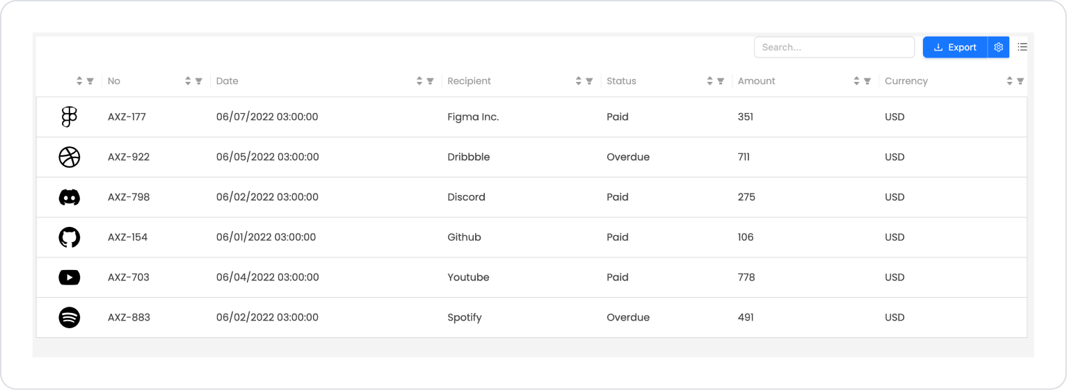
Scenario: Invoice List
In a business management or accounting application, a table-based invoice list is used so that users can easily track the invoices they have created. This list allows the user to quickly analyze the invoice status by presenting the basic information for each invoice in an organized and readable manner on a single screen.
In the invoice list, critical fields such as the invoice number, invoice date, recipient company information, invoice status, amount, and currency. Each row is structured to represent a single invoice, with the invoice logo or icon positioned at the beginning of the row for visual support.
Users can scroll down the list to review invoices and use column headers to sort and filter. This structure makes it easy to distinguish between paid and overdue invoices and quickly assess the financial situation.
In the scenario:
The invoice list is presented in a table structure, row by row.
Each row displays the invoice number, invoice date, recipient company name, invoice status, amount, and currency information in that order.
The logo or icon on the left side of the row visually represents the relevant company.
The invoice status field clearly displays statuses such as “Paid” and “Overdue.”
Users can compare invoices from the list and access summary information at a glance.
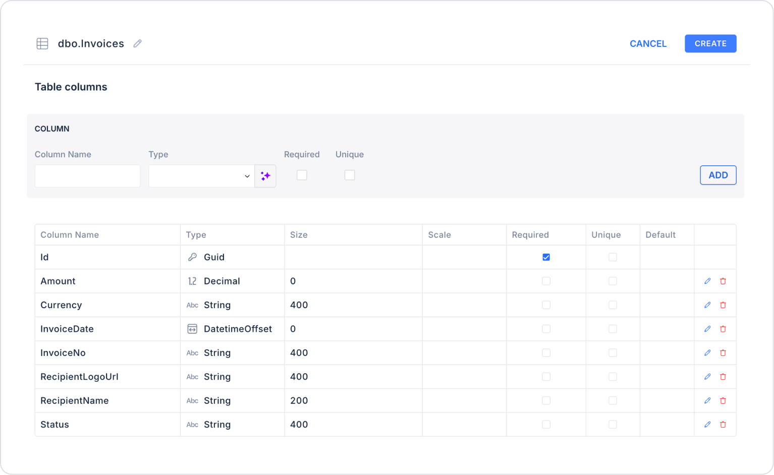
Step 1 - Creating a Data Source
Creating a table in the DataSources module:
Go to the Datasources module.
Then go to the Tables tab.
Create a new table named “Invoices”.
The table structure to be set up is as follows:
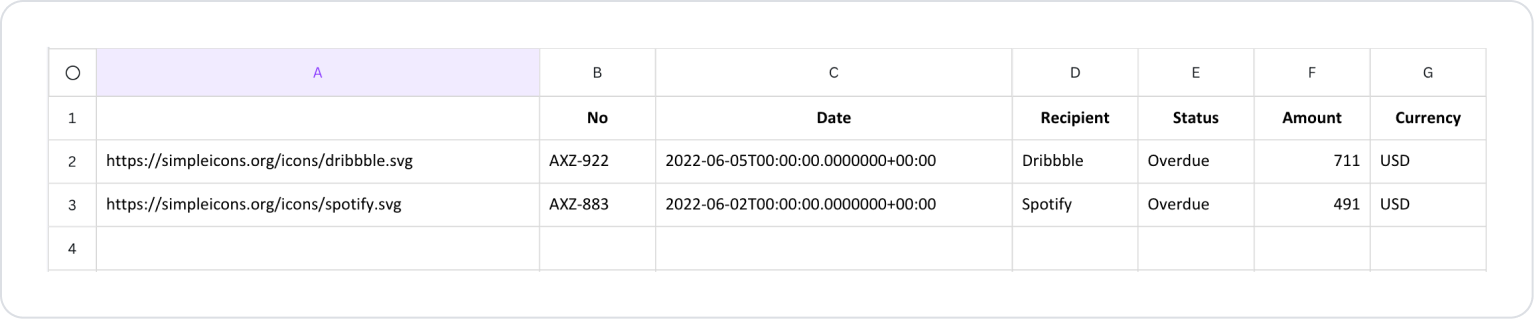
Important Field names:
InvoiceNo: Represents the unique number of the invoice. It is the main reference information shown to the user in list and table views and allows the invoice to be quickly distinguished.
InvoiceDate: Holds the date the invoice was created or issued. Users use this field to sort invoices by date and make periodic comparisons.
RecipientName: Specifies the name of the recipient company or customer to whom the invoice is issued. It clearly shows in the invoice list on whose behalf it was issued.
RecipientLogoUrl: Contains the URL information of the logo or representative image belonging to the recipient company. It provides visual support in the list rows, making it easier to distinguish between invoices.
Status: Indicates the current status of the invoice (e.g., Paid, Overdue, Draft). It is an informative field that helps the user quickly analyze the payment status.
Amount: Specifies the total amount of the invoice. It provides the user with a numerical and comparable value, enabling them to assess the financial situation.
Currency: Indicates the currency in which the invoice amount is denominated (e.g., TRY, USD, EUR). Ensures that amounts are interpreted correctly in scenarios where multiple currencies are used.
Step 2 - Defining the Necessary Actions
To display and add data in the interface:
You need to define two actions.
Add a new action from the Actions > New SQL Action tab in the Datasources module.
Action that Adds Sample Data (InsertInvoices): To test the application with sample data, add the following SQL action and press the TEST button.
When applying, delete the Invoices section, rewrite Invoices, and press Enter. This will add the correct schema name before the table name.
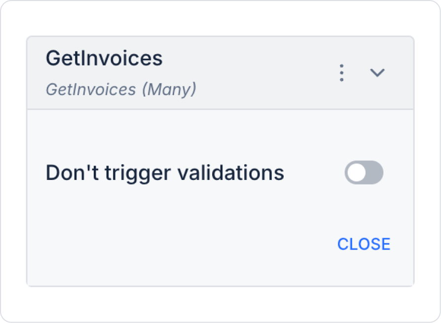
Action Providing Data (GetInvoices):
SELECT * FROM Invoices;
When applying, delete the ‘Invoices’ part, retype ‘Invoices’, and press Enter. This will add the correct schema name before the table name.
Step 3 - Adding Initial Action
Initially on the home page:
Open the ‘UI Design’ module.
Add the Add Action > Initial Action > Custom > Managed Db > GetInvoices action to the page.
Step 4 - Adding an Element and Editing the Style
Drag and drop the Elements > Data > Table element onto the page from the left side panel.
Set the background color to Table > Styling > Fill > White Background.
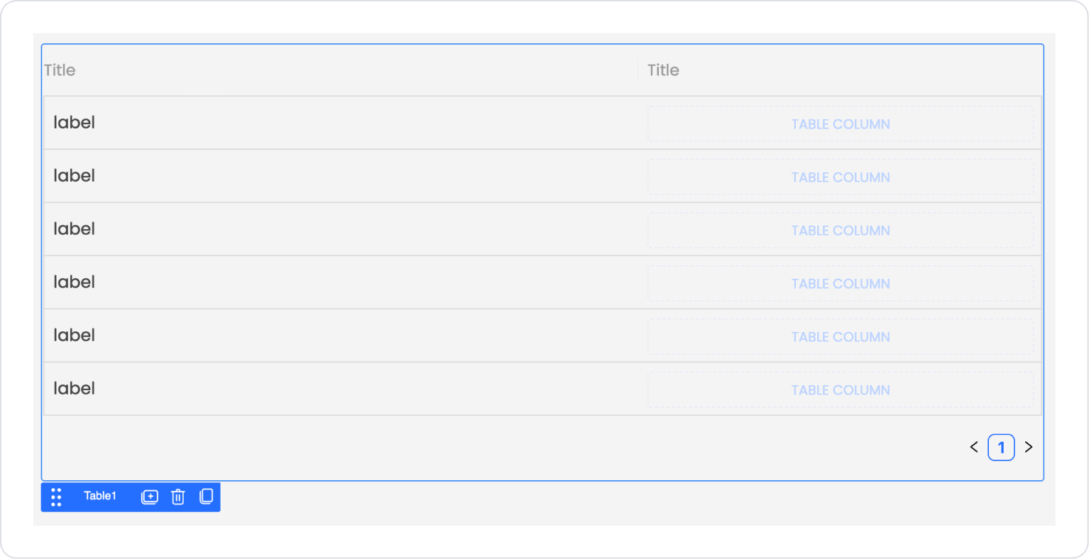
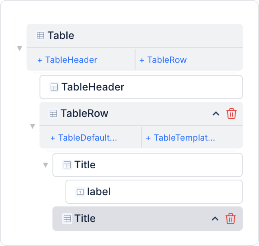
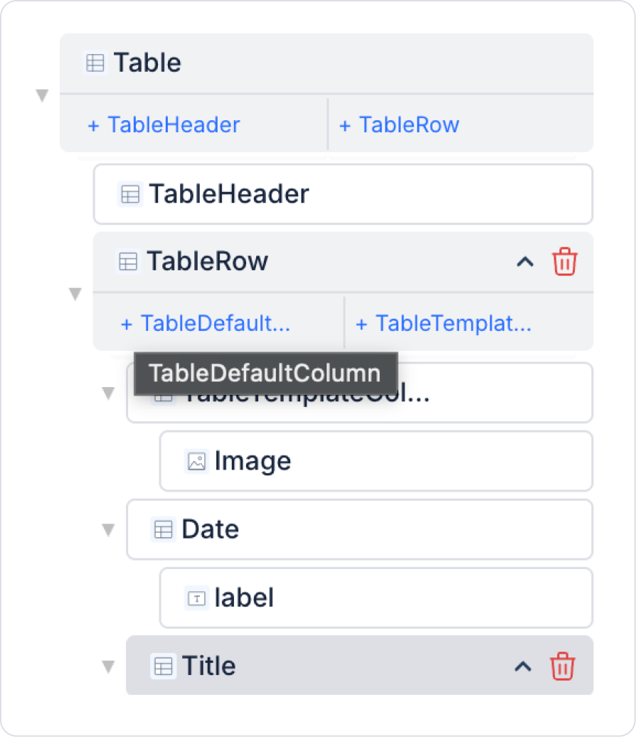
With the Table element selected, press the up arrow on the Title field at the bottom of the Table > Properties > Table > Last Title field to move it to the first row.
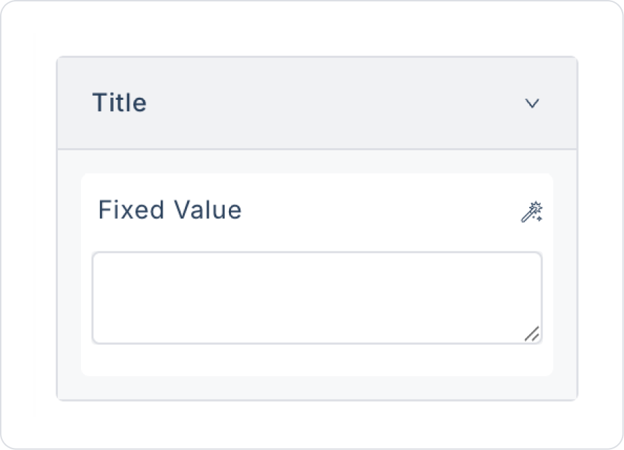
Leave the column name blank in the Table > Properties > Title field.
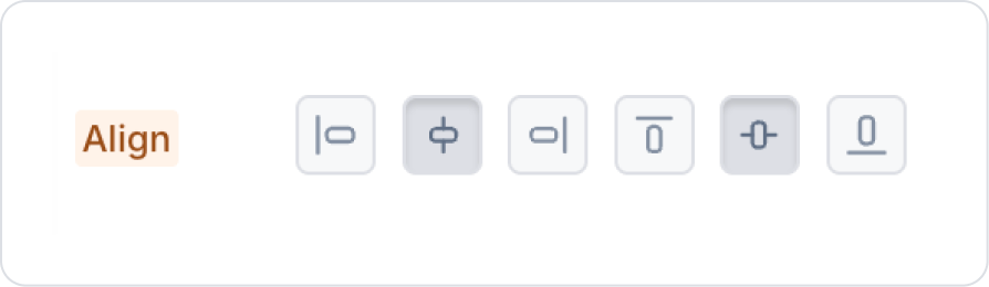
Click on the Table Column field within the table. Follow the steps TableTemplateColumn > Styling > Layout > Align to set the vertical and horizontal alignment to “Center”.
Drag and drop the Elements > Display > Image element into it.
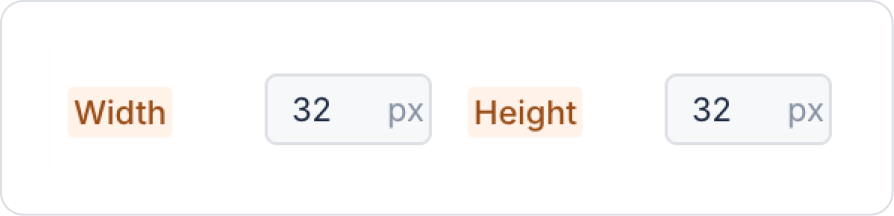
In the Image element, set the Image > Styling > Style > Width and Height values to 32px.
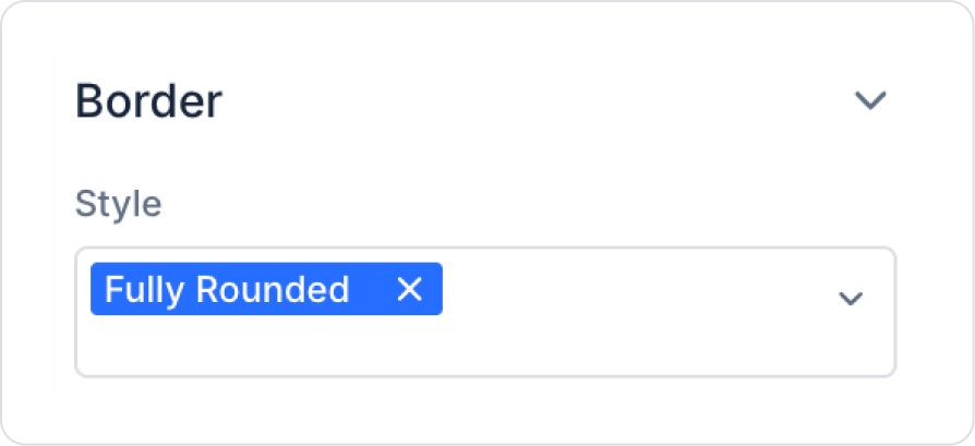
For the borders, select Image > Styling > Border > Style > Fully Rounded.
Click on the Table element. Select the second title column Table > Properties > TableRow > Title and name the title ‘No’.
You can use the breadcrumb below to access the Table element. Simply click on the Table element.
To add new columns, create a new column from the Table > Properties > Table > TableRow > TableDefaultColumn field.
Select the new title column and name the Table > Properties > TableRow > Title header “Date”.
Similarly, add four more new columns from the Table > Properties > Table > TableRow > TableDefaultColumn field. The column names will be “Recipient,” “Status,” “Amount,” and “Currency,” respectively.
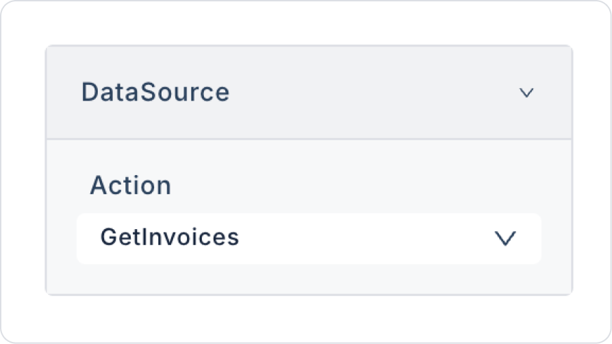
Set the data source in the Table element to Table > Properties > DataSource > GetInvoices.
To enable searching in the table, set Table > Properties > GlobalSearch to on.
To enable searching when changes occur, set Table > Properties > ShouldSearchOnChange to on.
To enable sorting, enable the Table > Properties > Sorter field.
To enable filtering, enable the Table > Properties > Filtering field.
To enable column selection, enable the Table > Properties > ColumnChooser field.
Finally, to export as an Excel file, enable the Table > Properties > Export field.
Step 5 - Configuring Element Settings
Link the initial action added to the page to the elements:
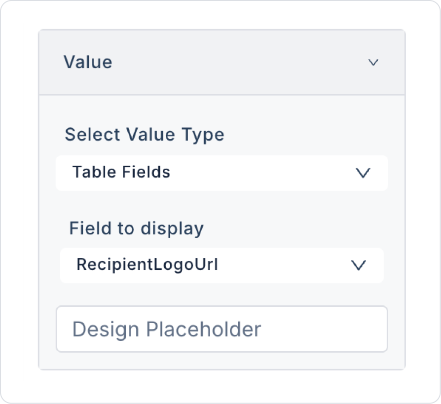
Click on any Image element in the first column of the table. Set it to Image > Properties > Value > Field to display > RecipientLogoUrl.
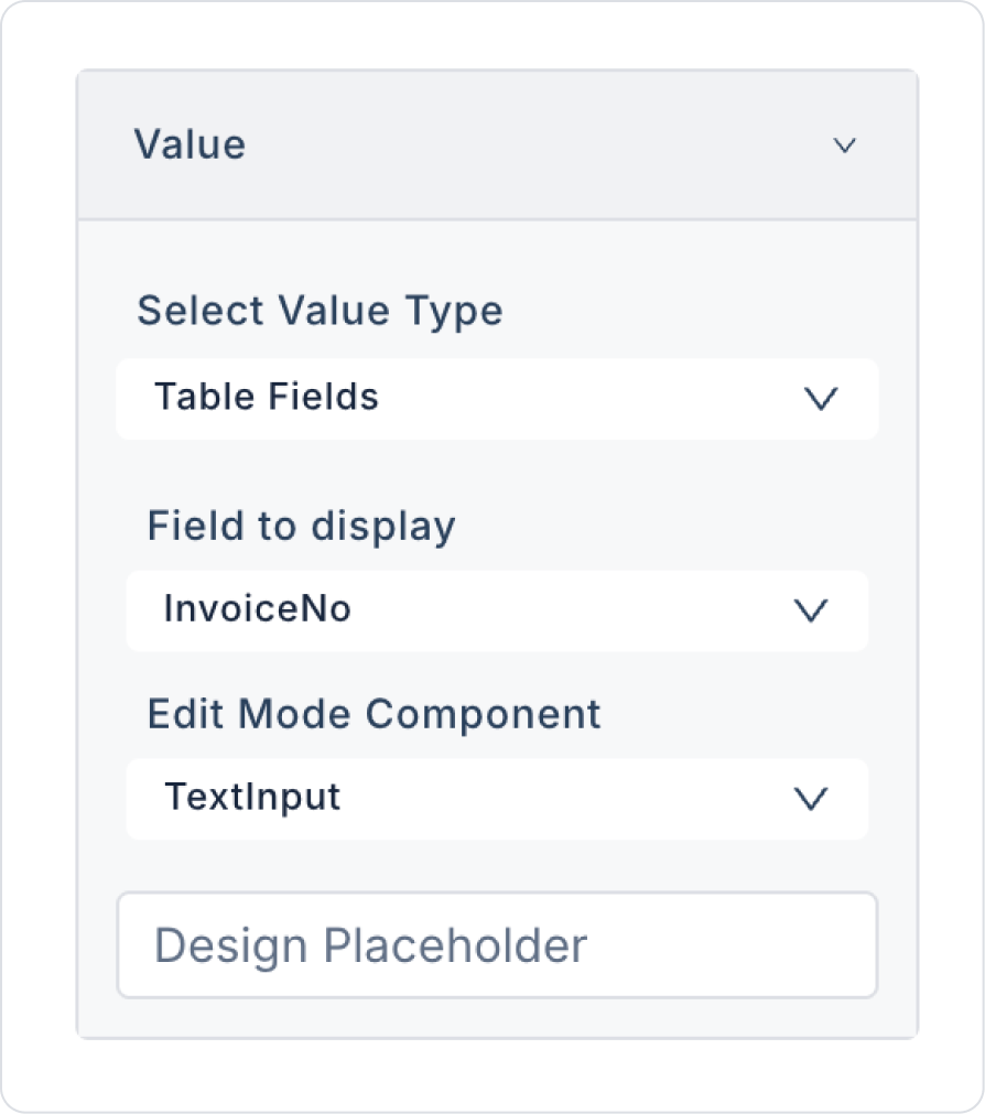
Click on any Label element in the second column named No. Set it to Label > Properties > Value > Field to display > InvoiceNo.
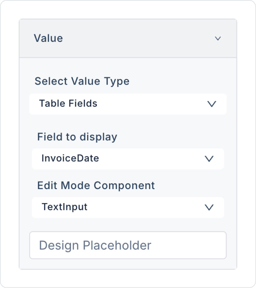
Click on any Label element in the third column named Date. Set it to Label > Properties > Value > Field to display > InvoiceDate.
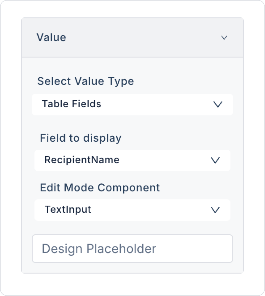
Click on any Label element in the fourth column named Recipient. Set it to Label > Properties > Value > Field to display > RecipientName.
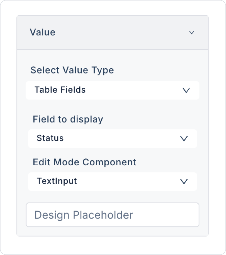
Click on any Label element in the fourth column named Status. Set it to Label > Properties > Value > Field to display > Status.
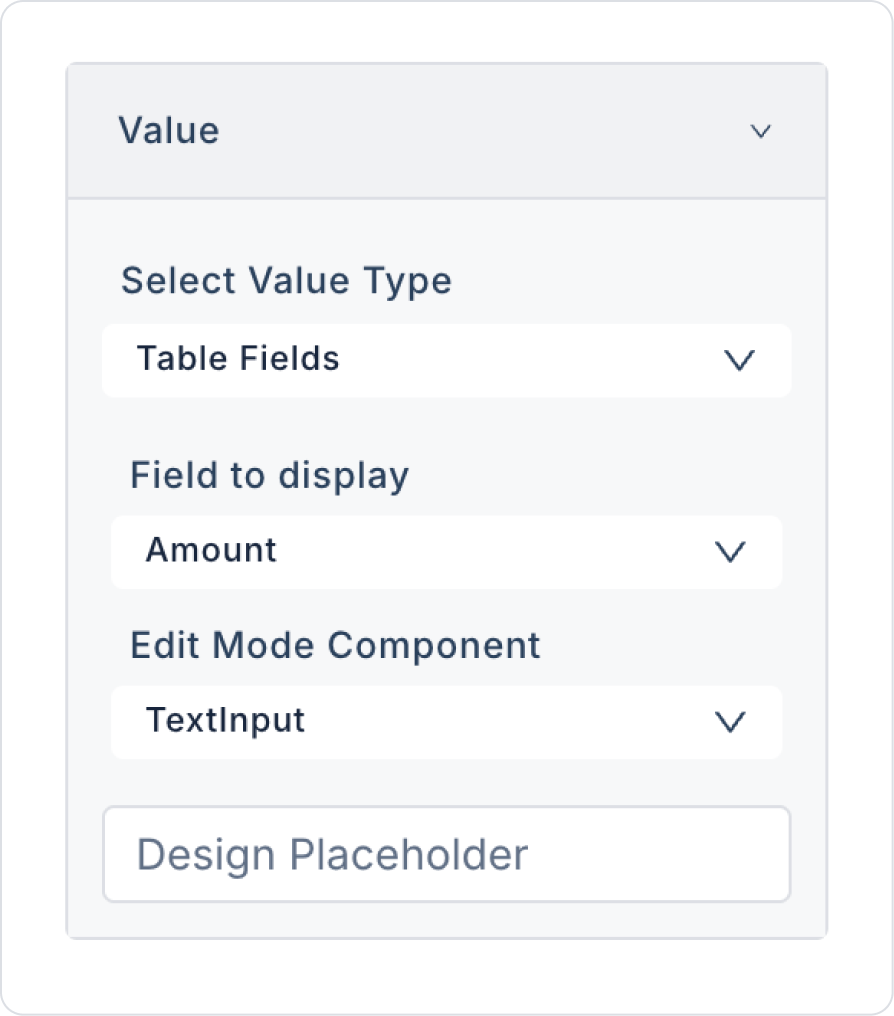
Click on any Label element in the fourth column named Amount. Set it to Label > Properties > Value > Field to display > Amount.
Click on any Label element in the fourth column named Currency. Set it to Label > Properties > Value > Field to display > Currency.
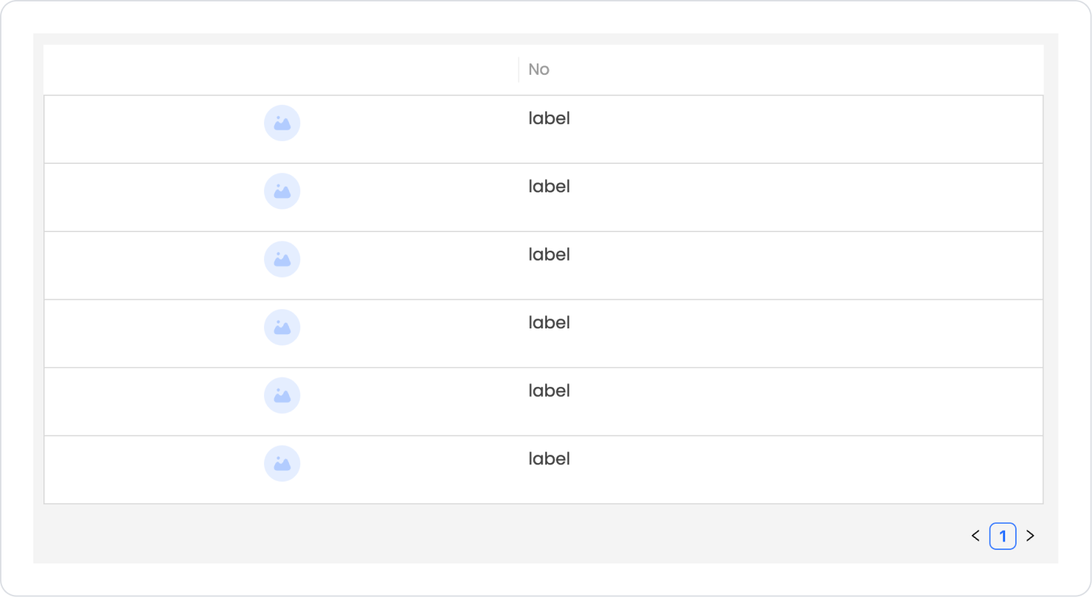
The expected structure in the final state is as follows.
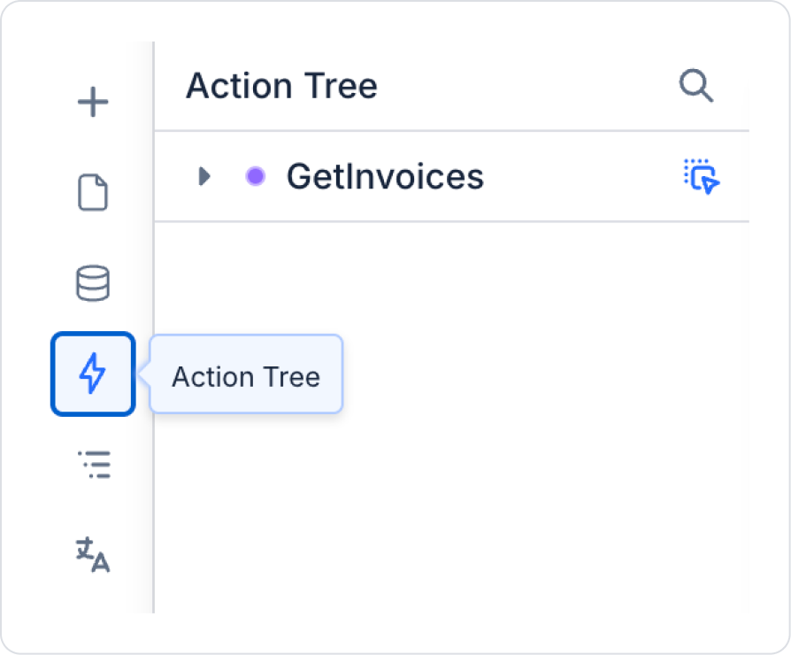
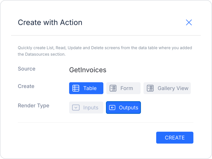
To apply a similar structure more quickly, you can click on the Action Tree area in the left side panel and drag and drop the GetInvoices initial action onto the page.
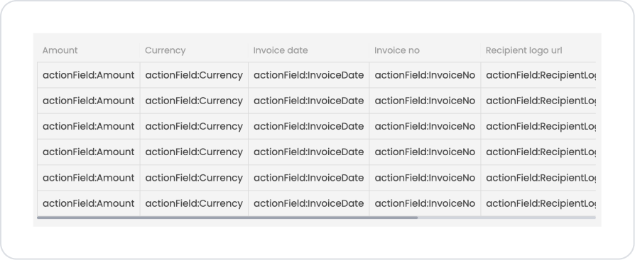
In the example scenario, the RecipientLogoUrl column has been removed and replaced with a TableTemplateColumn. Simply add an Image element to this field, make the necessary visual adjustments, and apply similar Table Properties settings.
Preview:
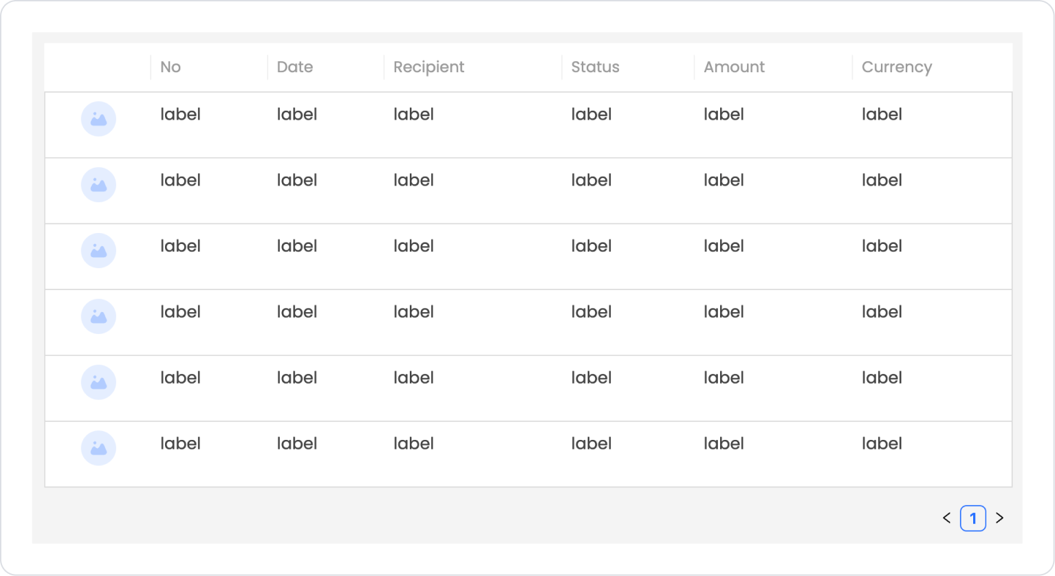
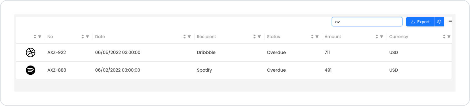
When the application is tested, an Invoice List screen is displayed, showing the invoices listed row-by-row within the table structure. The logo representing the relevant company is located on the left side of each row, followed by the invoice number, invoice date, recipient company name, invoice status, amount, and currency information, presented in an organized and readable manner.
The user can scroll down the list to review invoices and easily distinguish between Paid and Overdue invoices at a glance. The table structure supports sorting and filtering operations via column headers, enabling quick comparisons between invoices.
When, for example, the term “ov” is entered in the search field, invoices with an Overdue status are instantly filtered and listed. This allows the user to quickly view overdue invoices and easily access the relevant records.
After filtering, when the Export button is used to export the data, the data listed on the screen is downloaded as an Excel file with the same structure and content preserved. Columns that are not desired in the file can be removed if desired. This feature allows users to conveniently export filtered invoice data for reporting or sharing purposes.
4. Common Properties
Some fields on the Table element are used in common across all UI elements. Therefore, detailed explanations of the following properties are provided in the relevant general guide pages:
Proper configuration of data tables is important for both performance and user experience. When using the Table element, pay attention to the following recommendations:
Use data types correctly. If the data types of fields linked to columns are incorrect (e.g., linking a numeric column to a string), sorting, filtering, and search features may not work correctly.
Use the Filtering feature efficiently. Filter options appear automatically based on the data type. Disabling unnecessary filter types in large data sets improves performance.
Optimize the Search Delay value when using Searchable. Very low values may trigger unnecessary actions; very high values slow down the user experience.
Leave column widths to the user when necessary. Enabling the Resizable Columns feature allows users to customize the table according to their needs.
Use column grouping (Group) for tables with many columns. This provides a more organized and understandable view on both desktop and mobile.
If you use inline editing (Inline Edit), manage the record flow correctly. After editing, always trigger the Save Record action and refresh the data source.
Add a hover effect to rows. Using Row Hover BgColor to highlight rows when hovered over improves table readability.
If you are using MultiSelect, set a meaningful background color for selected rows. Clearly distinguishing selected rows improves the user experience.
6. Limitations
The following limitations should be considered when using the Table element:
The table will not work without a defined data source. If the datasource is not connected, the columns will be visible but the rows will not be listed.
Filtering only works when the data source is connected. Filter options will not be active in tables containing static content.
Sorting may not work with data type errors. Sorting operations may produce incorrect results if the date, number, or text format is incorrect.
Inline Edit can only be used with EditableTableColumn. Editing is not possible in normal columns; EditableTableColumn must be selected for editable cells.


