Kuika's Pivot Table element allows you to dynamically summarize large data sets and provide users with an interactive analysis environment. Data can be grouped, filtered, and rearranged by row, column, and metric fields. Pivot Table is a powerful visualization tool for reporting, performance monitoring, operational data analysis, and decision support processes.
The Pivot Table element only supports web applications.
1.1. Common Use Cases
Summarizing and analyzing large data sets: Users can quickly analyze complex data sets by grouping them by row, column, and metric fields.
Financial reporting and budget analysis: Can be used for income-expense distributions, cost analysis, and periodic financial comparisons.
Sales performance and operational tracking: Easily presents performance comparisons based on product, category, region, or sales representative.
Examining breakdowns of KPIs and measurement metrics: Used for target-actual analysis and detailing metrics based on quantity and ratio.
Department, team, or project-based reporting: An effective tool for processes such as summarizing resource usage, workload distribution, or project performance.
2. Key Features
The Pivot Table element was developed to dynamically summarize data and provide a user-customizable analysis structure. The following key features describe the scope and functions of Pivot Table:
Dynamic Data Summarization: Users can group large data sets by row, column, and value (metric) fields and analyze them across different breakdowns.
Exporting Pivot Table Configuration: The column layout, metrics, total settings, and data fields created by the user can be exported in JSON format.
Importing Saved Templates: Previously saved Pivot Table configurations can be reloaded from a JSON file.
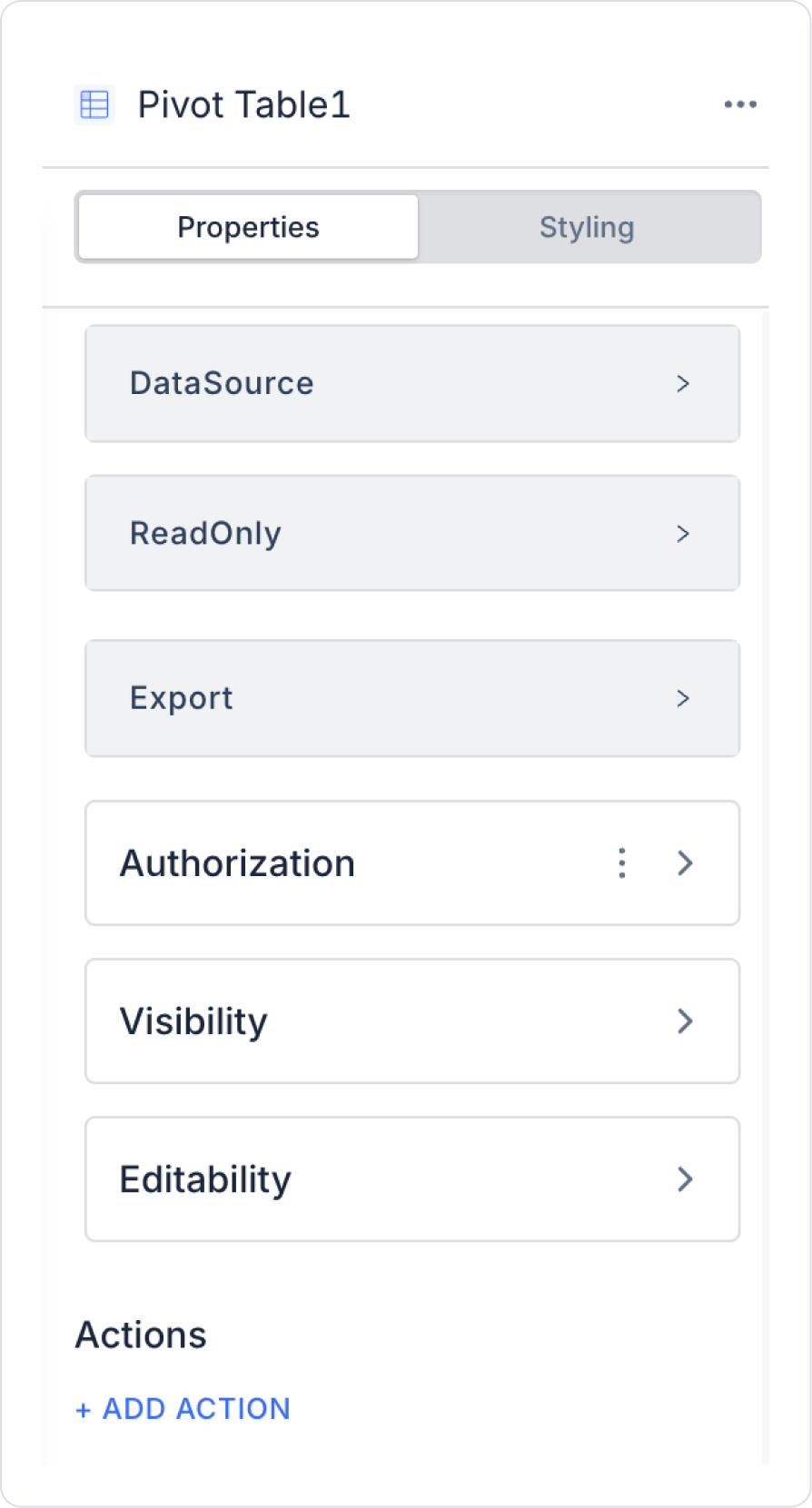
2.1. Pivot Table Element Properties
The following settings can be configured via the Properties panel on the right when you select the Pivot Table element:
Data Source
Specifies the source of the data to be displayed in the Pivot Table. Result sets returned from SQL, REST API, or Managed DB actions can be used as the Pivot Table data source.
Pivot Table supports special actions that allow the table layout to be saved and reloaded in JSON format.
3.1 Pivot Table Config Export
ADD ACTION → Export Table Config is selected.
The current Pivot Table's:
Row and column fields,
Metrics,
Total and calculation settings are converted to JSON format.
The generated JSON:
Can be stored in a database table,
Or in Local Storage.
3.2 Pivot Table Config Import
ADD ACTION → Import Table Config is selected.
The previously saved JSON configuration is loaded into the Pivot Table.
The user continues to use the table with the configuration they left it in.
4. Multi-User and Template Management
Different Pivot Table templates can be stored for each user.
JSON configurations:
Can be stored in the database
associated with the user ID.
When the application is opened:
The Pivot Table template last used by the relevant user
can be loaded automatically.
2.2. Actions That Can Be Added to the Pivot Table Element
The Pivot Table element supports a special action that is triggered whenever users change the configuration (row/column fields, metrics, filters) on the table. This action is accessed via the ADD ACTION panel.
onConfigChange
This action is triggered when the user makes a configuration change on the Pivot Table. The following actions trigger this action:
Adding/removing a Row or Column field
Changing a metric
Sorting updates
Changing the Pivot Table layout
What can be done with the onConfigChange action?
You can retrieve the current table configuration with Export Table Config and save it to the database or Local Storage.
You can automatically save user-specific report templates.
You can ensure that the Pivot Table updates another UI element after each change.
The Pivot Table does not trigger actions directly through row/cell clicks.
The only event triggered when the user changes the table configuration is onConfigChange.
Export/Import Table Config actions are only used to save/load the configuration; they are not triggered directly on the table.
3. How to Use the Pivot Table Element
In this section, we will cover the end-to-end use of the Pivot Table element through example scenarios.
Scenario: Restaurant Invoice Analysis Scenario
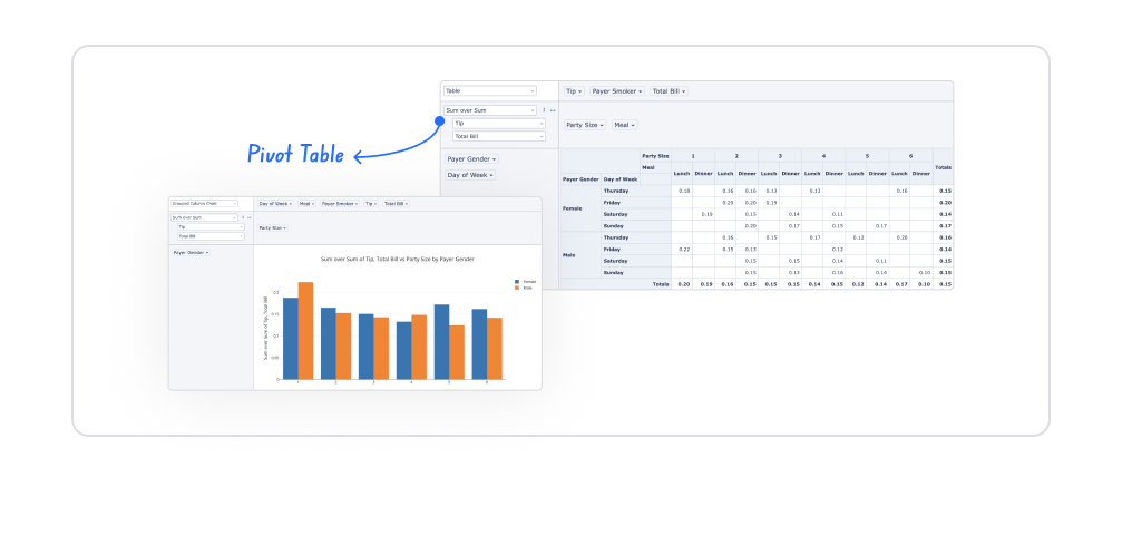
The Pivot Table element in the Kuika platform allows users to analyze restaurant data in a multidimensional way. Thanks to the Pivot Table, data can be grouped according to different fields such as day, meal, customer profile, and invoice information, and displayed in tables and graphs.
Within this scenario, the total invoice amount, maximum values, number of transactions, and distributions were analyzed using the Pivot Table. The images shared for the relevant scenario provide examples using table views and multiple analysis tools integrated with the Pivot Table. The Kuika Pivot Table element has the flexibility to meet many other analysis needs beyond these examples.
In the scenario:
Pivot Table is used to dynamically group and summarize restaurant data.
The dayOfWeek field indicates on which day of the week the transactions took place.
The meal field specifies at which meal time the transaction took place, such as lunch or dinner.
The partySize field indicates the number of people at the table.
The payerGender field stores the gender information of the person making the payment.
The payerSmoker field indicates whether the customer smokes.
TotalBill represents the bill amount; tip represents the tip information.
Calculations such as sum, maximum, and count can be easily applied using the Pivot Table.
Data created with Pivot Table is supported by different visualizations such as Stacked Column, Grouped Bar/Column, Heatmap, and Scatter Chart.
Users can obtain quick and meaningful insights by evaluating both table and graph analyses together on a single screen.
Step 1 - Action Definition
To display data in the interface:
You need to define the following action named RestaurantBills. In the example scenario, the data is presented without using a table by typing Select.
Add a new action from the Actions > New SQL Action tab in the Datasources module.
Action Retrieving Sample Data (RestaurantBills):
SELECT ‘Female’ AS PayerGender, ‘Thursday’ AS DayOfWeek, ‘Lunch’ AS Meal, 2 AS PartySize, 45.00 AS TotalBill, 8.00 AS Tip, ‘No’ AS PayerSmoker
UNION ALL
SELECT ‘Male’, ‘Friday’, ‘Dinner’, 3, 120.00, 20.00, ‘Yes’
UNION ALL
SELECT ‘Female’, ‘Sunday’, ‘Dinner’, 4, 200.00, 35.00, ‘No’
UNION ALL
SELECT ‘Male’, ‘Saturday’, ‘Lunch’, 2, 80.00, 12.00, ‘No’
UNION ALL
SELECT ‘Female’, ‘Monday’, ‘Lunch’, 2, 100.00, 10.00, ‘No’
UNION ALL
SELECT ‘Male’, ‘Thursday’, ‘Lunch’, 3, 180.00, 20.00, ‘No’
UNION ALL
SELECT ‘Female’, ‘Saturday’, ‘Lunch’, 4, 250.00, 50.00, ‘No’;
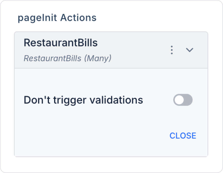
Step 2 - Adding the Initial Action
Initially on the homepage:
Open the UI Design module.
Add the Add Action > Initial Action > Custom > Managed Db > RestaurantBills action to the page.
Step 3 - Add and Configure Element
Drag and drop the Elements > Data > Pivot Table element onto the page from the left side panel.
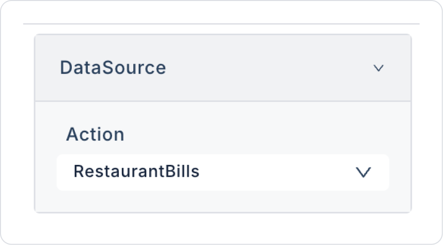
Define the PivotTable > Properties > DataSource> Action > RestaurantBills action for the Pivot Table element.
Preview:
After the main description, write how it is used under Images.
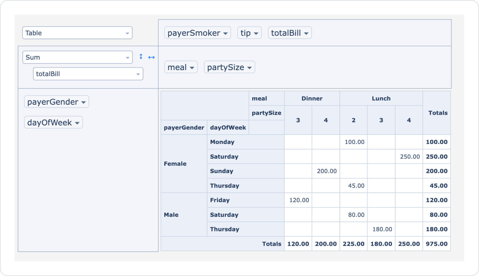
When the application is tested, the Pivot Table element opens in Table mode by default and waits for the fields to be placed on the axes. In this example, the Sum mode has been selected in Table mode, and the calculation has been made using the totalBill field.
On the Pivot Table, the payerGender and dayOfWeek fields are positioned on the row axis, and the meal and partySize fields are positioned on the column axis. Thanks to this structure, the total bill amounts created by female and male customers on different days of the week for lunch and dinner, according to the number of people at the table, are displayed comparatively on the table.
The fields displayed as labels in the upper section can be dragged and dropped to the desired axes. The user can dynamically update the table by changing the position of the fields and quickly create different analysis scenarios.
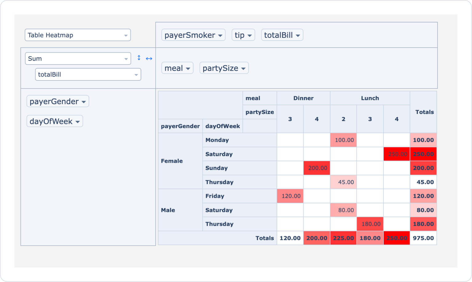
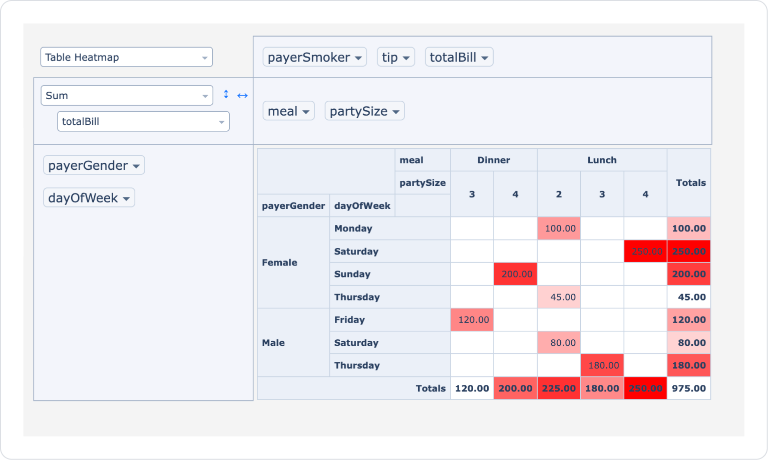
In the second example, when the display type is changed to Table Heatmap, the total bill amounts on the Pivot Table are visualized as a heat map. Cells with higher amounts are highlighted in darker colors, making it easy to identify the days, meals, and table sizes with the highest spending.
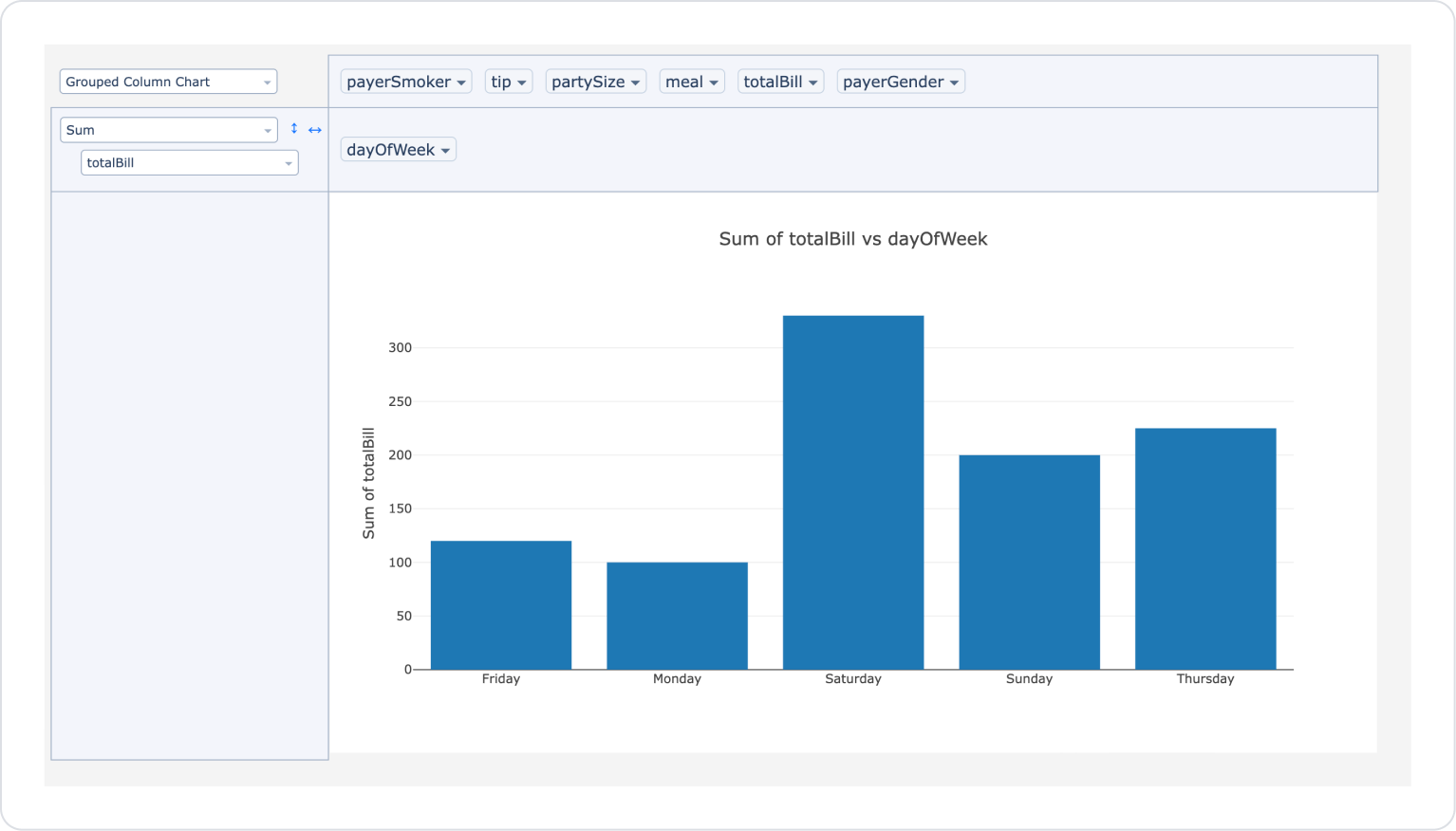
When the display type is selected as Grouped Column Chart and the axes are set only according to the dayOfWeek field, the total account distribution for the days worked is clearly displayed on the graph.
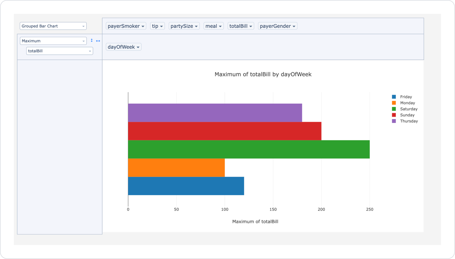
In the last example, when the display type is selected as Grouped Bar Chart and the totalBill field is used in Maximum mode, the highest account amounts for the days worked are grouped by day and listed for comparison. This allows for quick analysis of which days had the highest expenditures.
4. Common Properties
Some fields on the Pivot Table element are used commonly across all UI elements. Therefore, detailed explanations of the following properties can be found in the relevant general guide pages:
Offer users the option to save templates. The reporting experience is greatly improved when users can save their own report layouts as JSON.
Use user-based template keys. Storing each user's template in the database via their own ID is the most reliable method.
Make frequently used templates default. When the application is first opened, a specific JSON can be imported to present the user with a ready-made report.
6. Limitations
Pivot Table can only be used in web applications.
User interactions on the table do not trigger actions. Actions such as clicking on a row, selecting a cell, or changing a filter do not initiate any actions.
Export/Import operations only work in JSON format. Configurations cannot be transferred directly in XML, CSV, or other formats.
Templates must be stored manually. Storing the Export Table Config output is the responsibility of the developer or application logic.