Kuika's Breadcrumb element is a navigation element developed to enable users to easily track their current location and page hierarchy within web applications. Its dynamic structure works in harmony with your menu and page structure to enhance the user experience.
Breadcrumb not only shows the user the current screen, but also allows them to quickly return to previous levels. This prevents disorientation and facilitates navigation, especially in multi-layered and complex applications.
The Breadcrumb element is only supported in web applications.
1.1. Common Use Cases
Clarifying the user's location in multi-level page structures
Displaying the module → submodule → screen flow in management panels and admin screens
Presenting the category → subcategory → product detail hierarchy in e-commerce applications
Visualizing the page and content structure in content management systems (CMS)
Directing the user to the relevant data path in reporting and analysis screens
Displaying heading and subheading relationships in documentation and help pages
Clearly presenting return paths to the user in complex navigation structures
2. Key Features
Hierarchical navigation support. Visually displays the parent-child relationships of the page the user is on.
Working with dynamic data. Can be automatically updated based on the menu structure or page hierarchy.
Clickable steps. Users can return to previous levels with a single click.
2.1. Breadcrumb Element Features
The breadcrumb element marks the screen the application is on as current, while dynamically placing its top-level parent menus on the left. It updates automatically based on the menu structure and works hierarchically without any manual intervention.
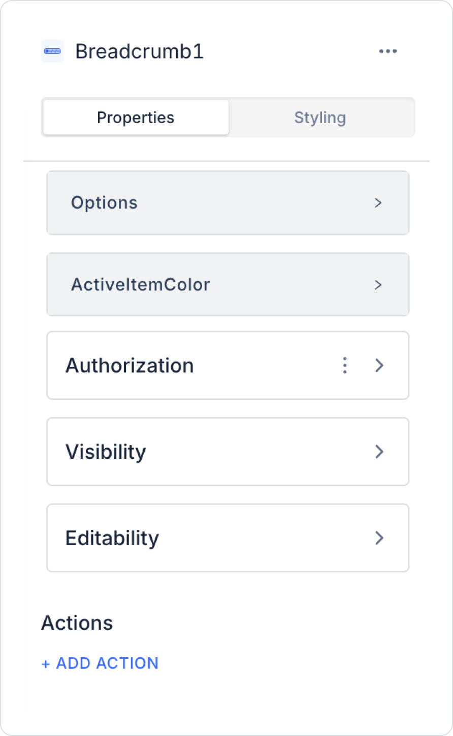
Main settings that can be customized via the Properties panel:
Options: Menu items are defined in this area. For each item, a label, path, and optionally an action (the operation to be triggered after clicking) can be defined.
Active Item Color: Determines the color of the breadcrumb item representing the current (active) page.
Title Field: This is the area where the titles to be displayed on the BreadCrumb are located.
Parent Key Field: Determines the parent (higher level) step of a step within the breadcrumb.
Link Field: Enables the NAVIGATE action to be performed by clicking on the steps on the breadcrumb. Screen names within the project should be linked to this field.
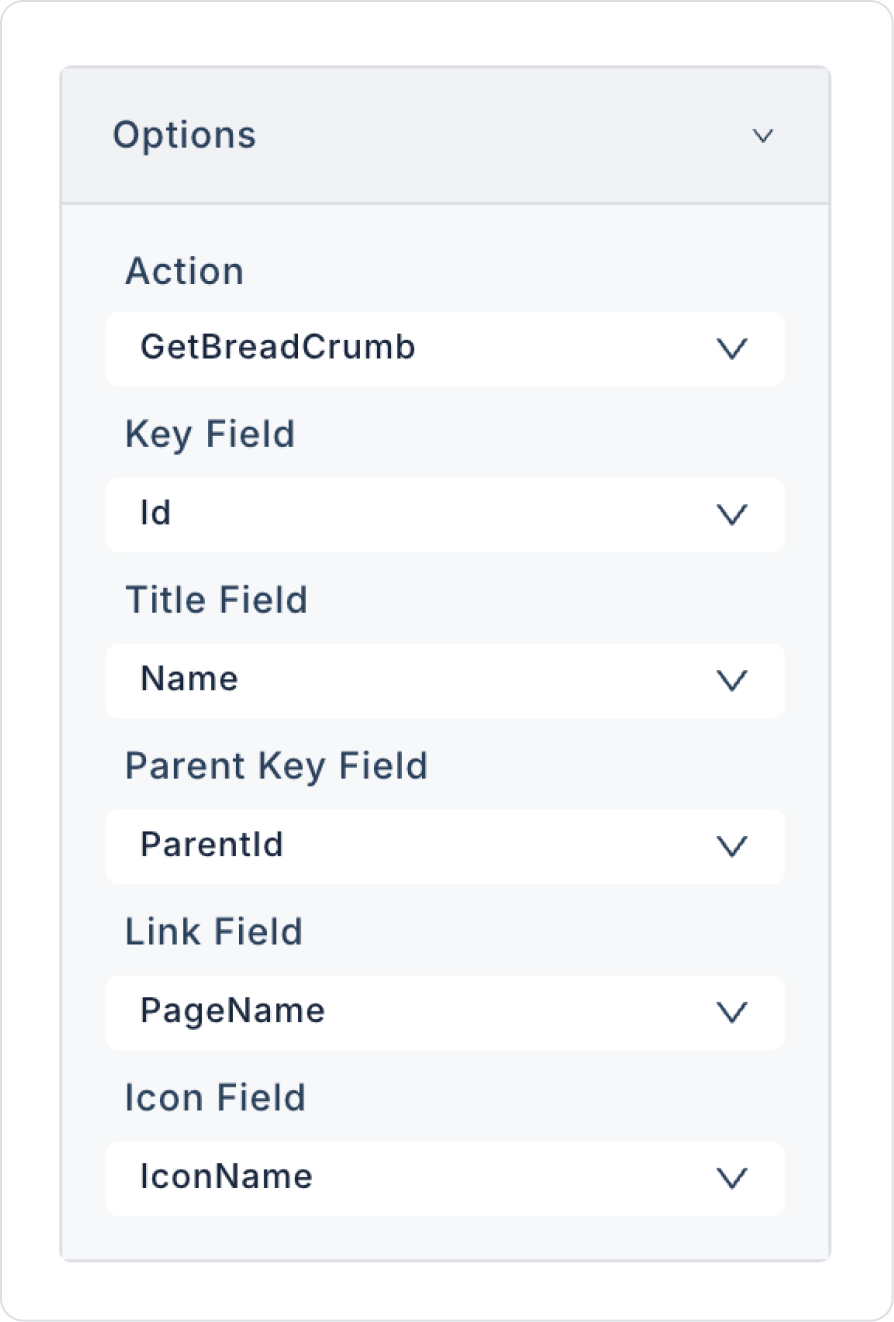
Key Field: Typically represents a unique value in the table, such as “Id,” and is used to distinguish each row.
2.2. Actions That Can Be Added to Elements
The breadcrumb element supports the OnChange trigger to capture user tab/location changes. This trigger runs when the user's active breadcrumb step changes.
Actions that can be performed with the OnChange action:
Update the relevant page or content information when the user moves to a different breadcrumb level
Reload the list, table, or form content based on the active breadcrumb
Dynamically change the page title, description, or header fields
Perform filtering or data restriction operations based on the selected breadcrumb level
Control the visibility of different UI elements based on breadcrumb changes
Thanks to the OnChange trigger, the breadcrumb ceases to be merely a passive navigation indicator and becomes a more dynamic structure that works in sync with the page content.
3. How to Use the Breadcrumb Element?
In this section, we will cover the end-to-end use of the breadcrumb element through an example scenario.
Scenario: Using Breadcrumbs for Profile Settings
In an application, the breadcrumb menu structure serves as an important guide, allowing users to navigate through settings screens without getting lost. In this scenario, the breadcrumb structure is used to guide the user step by step to the profile editing screen.
In the scenario:
The breadcrumb structure is created based on hierarchical records stored in the BreadCrumbMenu table.
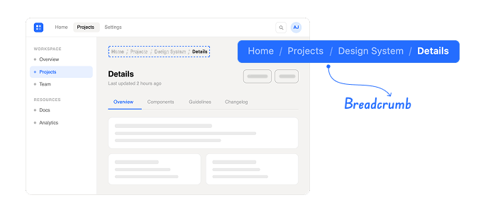
When the user reaches the Profile Information page, the path Home > Settings > Account > Profile Information is displayed in the breadcrumb area.
The user can easily return to the relevant parent pages by clicking on the Settings or Account steps in the breadcrumb.
Thanks to this structure, the user can clearly see their current location within the settings and does not have to use extra menus to return.
For example:
When the user is on the Profile Information page and clicks on the Account step in the breadcrumb, they are directed directly to the Account Settings page.
The user can quickly return to the main screen without leaving the current page by selecting the Home link in the breadcrumb.
Step 1 - Creating a Data Source
Creating a table in the DataSources module:
Go to the Datasources module.
Then go to the Tables tab.
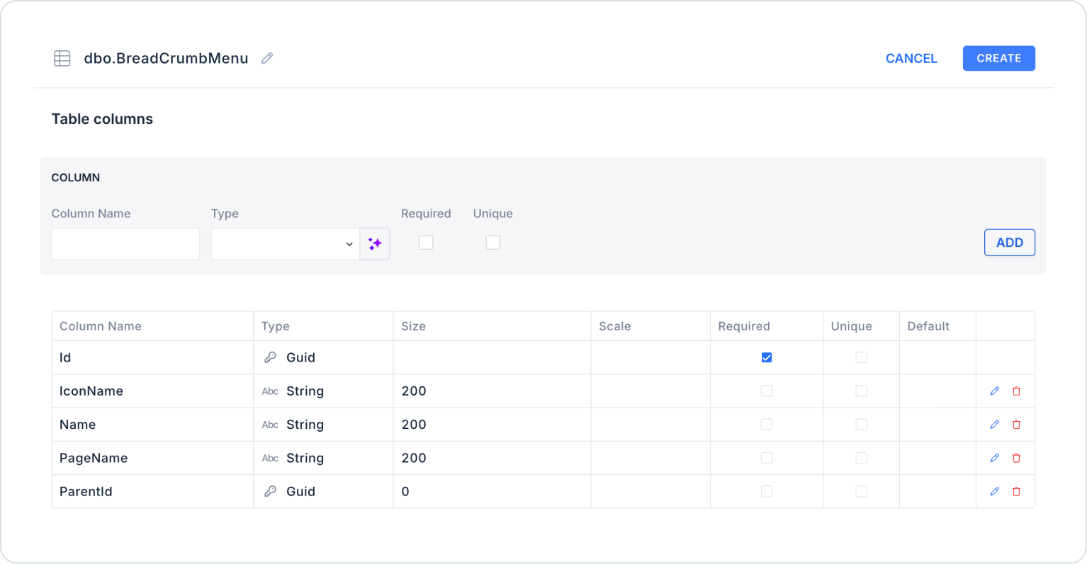
Create a new table named “BreadCrumbMenu”.
The table structure to be set up is as follows:
Important Field names:
IconName: Represents the name of the icon to be displayed with the menu item. It ensures that the breadcrumb element is visually supported on the UI side.
Name: Holds the text information displayed to the user on the breadcrumb. It is the readable name of the page or menu step.
PageName: Specifies the name of the page to which the breadcrumb element directs in the system. Clicking on this field takes you to the relevant page.
ParentId: Indicates the parent menu record to which the breadcrumb element is linked. This field establishes a hierarchical (parent-child) relationship between pages and creates the breadcrumb chain.
Step 2 - Defining the Necessary Actions
To display and add data in the interface:
You need to define two actions.
Add a new action from the Actions > New SQL Action tab in the Datasources module.
Action that Adds Sample Data (InsertBreadCrumbMenu): To test the application with sample data, add the following SQL action and press the TEST button.
When applying, delete the BreadCrumbMenu sections, rewrite BreadCrumbMenu, and press Enter. This will add the correct schema name before the table names.
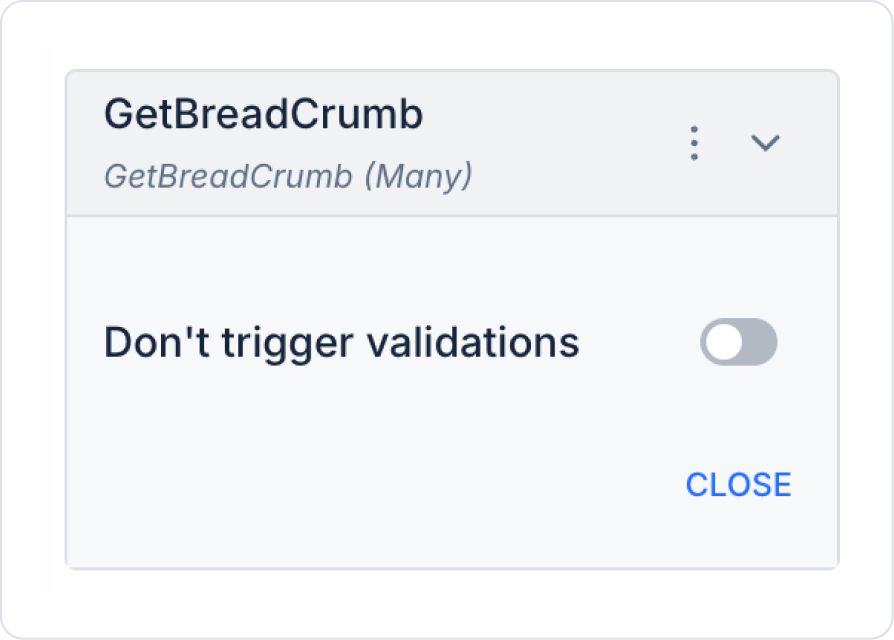
Action Providing Data (GetBreadCrumbMenu):
SELECT * FROM BreadCrumbMenu;
When applying, delete the BreadCrumbMenu part, rewrite BreadCrumbMenu, and press Enter. This will add the correct schema name before the table name.
Step 3 - Add Initial Action
Open the UI Design module.
Add the Initial Actions > Custom > Managed Db > GetBreadCrumb action to the page using the ADD ACTION button.
Step 4 - Add and Configure Elements
Drag and drop the Elements > Navigation > Breadcrumb element onto the page from the left panel.
Link the action to be used in the Breadcrumb element to Breadcrumb > Properties > Options > Action > GetBreadcrumb and make the following definitions.
Step 5 - Creating New Pages
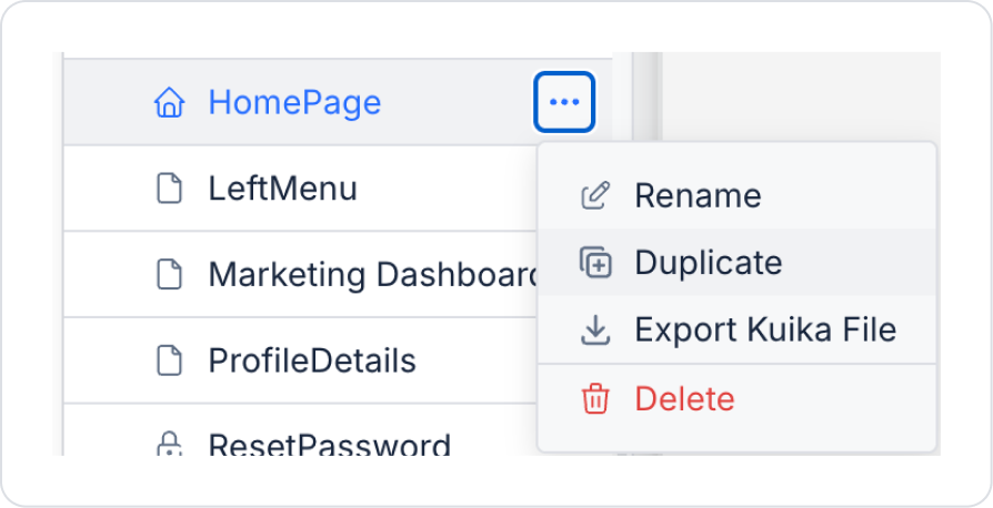
Three pages will be created, all with a similar structure but with different names. Click on the Screens area in the left side panel.
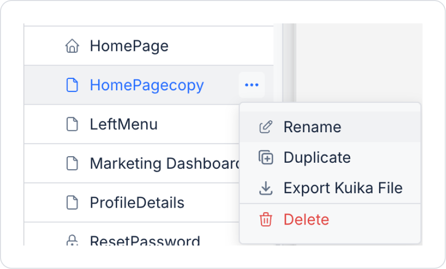
Click the Duplicate option in the options of the HomePage page where the breadcrumb was added.
Rename the copied page to “SettingsPage”.
Similarly, create the other “AccountSettings” and “ProfileDetails” pages by clicking the “Duplicate” option.
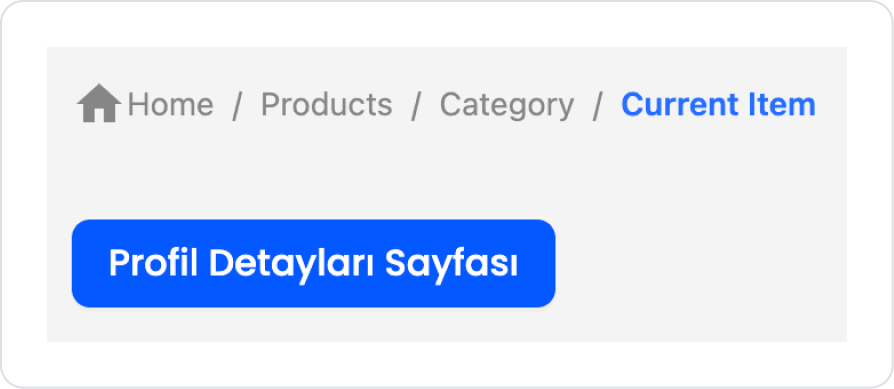
Click on the HomePage page and add the Elements > Navigation > Button element to the main page.
Set the name of the Button element to Button > Properties > Label > “Profile Details Page”.
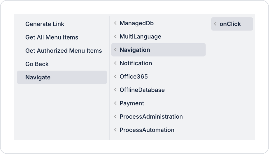
Add the Button > Add Action > onClick > Navigation > Navigate action to the Button element.
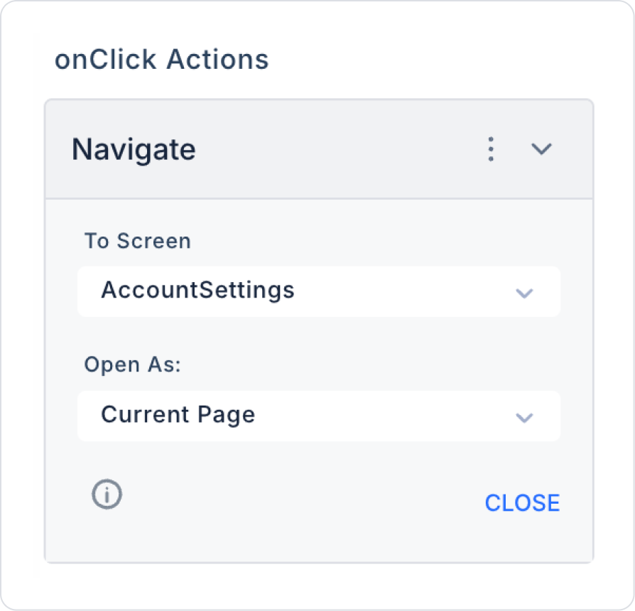
In the Navigate action, add the To Screen > AccountSettings page to navigate from the home page to the last page and experience the breadcrumb element.
Preview
When the application is tested, clicking the “Profile Details Page” button on the Home Page screen takes you to the relevant page, and the breadcrumb element is displayed at the bottom of the screen. It can be observed that the breadcrumb structure is created according to the defined ParentId hierarchy in the order Home Page / Settings / Account / Profile Information.
Thanks to this structure, users can clearly track the location of the page they are on within the application and easily return to the upper pages using the steps on the breadcrumb.
4. Common Properties
Some fields on the breadcrumb element are common to all UI elements. Therefore, detailed descriptions of the following properties are available in the relevant general guide pages:


