The Switch element is a toggle element that allows users to quickly control whether a feature or state is on (active) / off (inactive). It provides an intuitive and seamless user experience by enabling users to change the state with a single tap or click.
The Switch element is supported in both web and mobile applications.
1.1. Common Use Cases
Turning features on/off in settings screens
Notification, permission, or visibility controls
Active–inactive state management
Quickly changing user preferences
2. Key Features
B Binary state (on/off) control: B The Switch represents only two states: on (true) or off (false).
Instant visual feedback: The Switch’s position and color clearly indicate its current state to the user.
Quick interaction with a single tap: Users can easily toggle the state by clicking or tapping.
Structure compatible with forms and actions: The Switch works seamlessly with state updates, saving settings, and conditional operations.
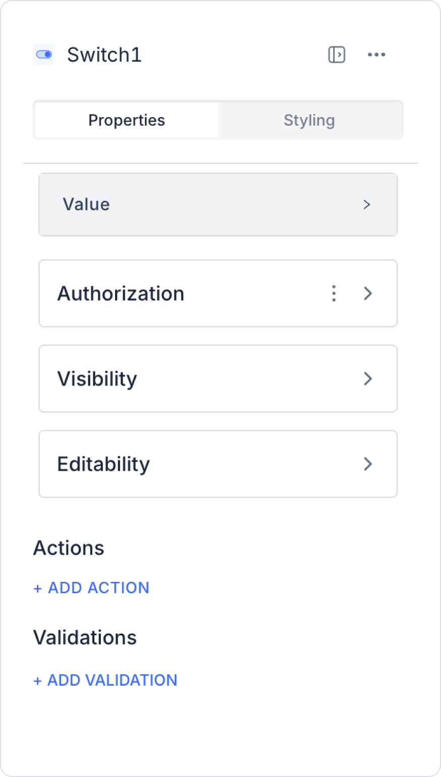
2.1. Switch Element Properties
Value: You can statically set the Switch’s active or inactive state. Additionally, you can dynamically determine this value based on the content of another element or the result of an action using the Symbol Picker.
2.2. Actions That Can Be Added to the Element
The Switch element supports triggering event-based actions based on whether the user sets the switch to the on or off position. Actions are not tied to the element itself but to the event triggered when the Switch’s state changes.
Actions for the Switch element can be defined via the following event through the Properties > Add Action section.
Supported Action Triggers
onChange: Triggered when the user changes the Switch’s state (on ↔ off).
Use cases:
Save the Switch state to a state or variable (true / false)
Toggle the visibility of fields based on the selection
Automatically saving settings or preference information
Triggering conditional flows (if/else)
Communicating the state change to the system via an API or workflow call
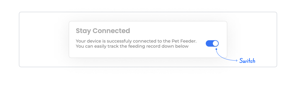
Example scenario: When the user activates the “Enable Notifications” Switch, the notification settings area becomes visible and the preference is saved to the state.
Basic Rules Regarding Actions
The Switch element can trigger actions only via the onChange event.
The onChange event fires with every state change (true → false or false → true).
Multiple actions can be defined for the same onChange event.
The Switch element provides a fast and intuitive user experience, especially when used with actions in settings management, permission controls, and active/inactive state scenarios.
3. How to Use the Switch Element?
In this section, we will cover the end-to-end usage of the Switch element through an example scenario.
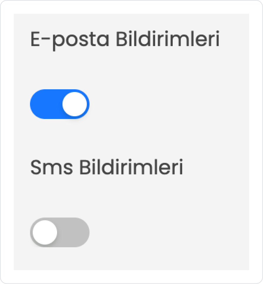
The user uses the Switch element on the notification settings screen within the app to specify which channels notifications should be sent through. On this screen, the user is presented with two different notification preferences: Email Notifications and SMS Notifications.
In the scenario:
Both options are represented by a Switch element. When the user sets the Switch to the On position, the corresponding notification type is enabled; when set to the Off position, that notification type is disabled.
When the user changes their preferences, the system saves the relevant values to the notification preferences table in the database. This way, each user’s notification settings are stored by the system, and the notifications to be sent are determined based on these preferences.
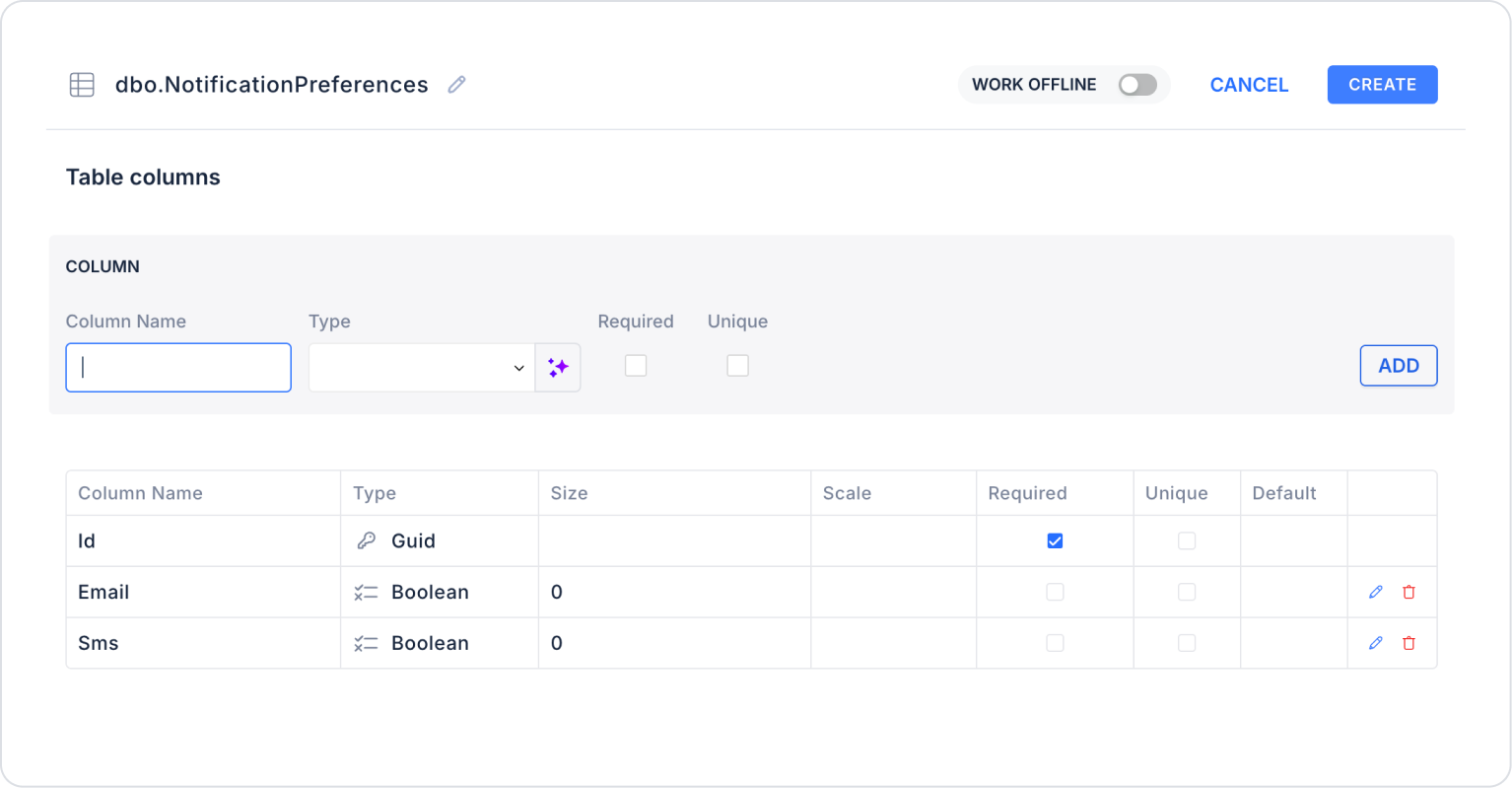
Step 1 - Creating a Data Source
Creating a table in the DataSources module:
Go to the DataSources module.
Then go to the Tables tab.
“NotificationPreferences” Create a new table with this name.
The required table structure is as follows:
Important Field Names:
Id: Stores the user’s information.
Email: Stores the on/off status of email notifications.
Sms: Stores the on/off status of SMS notifications.
Step 2 - Defining the Required Action
To display the data on the interface:
You need to define a sample action.
Add a new action from the Actions > New SQL Action section within the Datasources module.
Action to Retrieve User Preferences (UserNotificationPreferences):
SELECT * FROM NotificationPreferences WHERE Id = @Id
When applying, delete the “NotificationPreferences” part, type “NotificationPreferences” again, and press Enter. This will ensure the correct schema name is prepended to the table name. Set the type of the Id parameter to Guid.
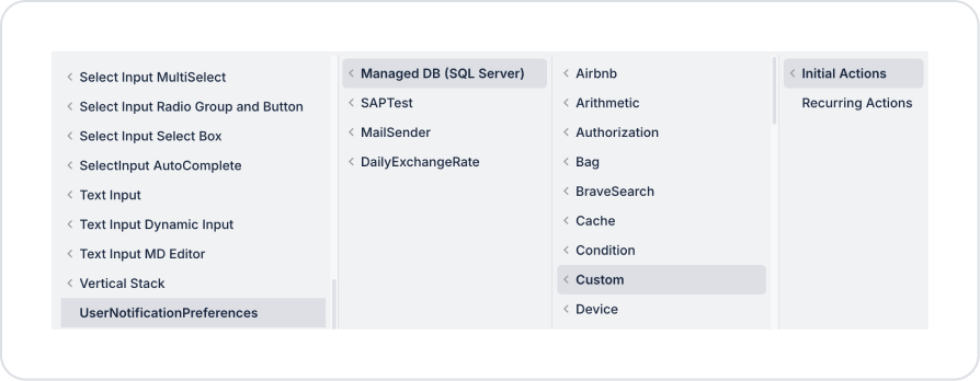
Step 3 - Adding the Initial Action
On the home page at the start:
To display the selected preferences on the switch elements, add the Add Action > Initial Action > Custom > Managed DB > UserNotificationPreferences action.
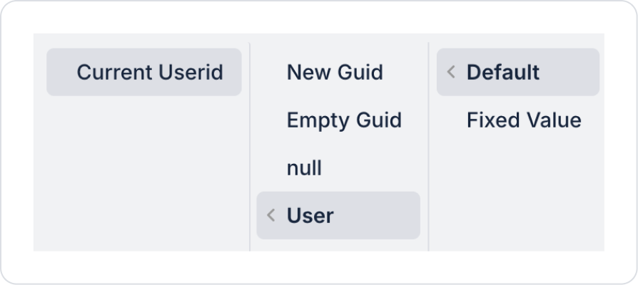
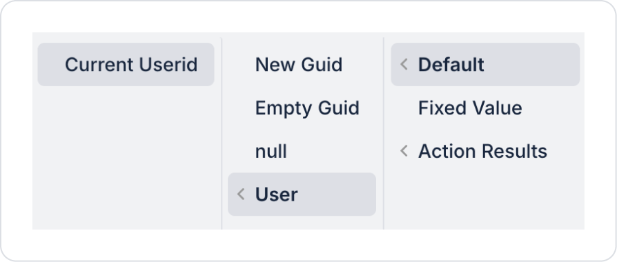
Within the UserNotificationPreferences action, define Id > Default > User > Current Userid for the relevant user record.
Step 4 - Adding the Switch Element and Defining the Action
On the home page:
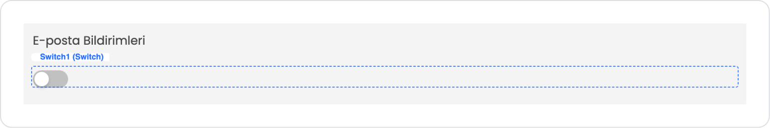
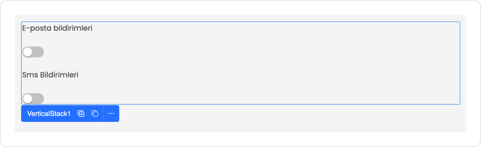
From the left sidebar, drag and drop the Elements > Container > VerticalStack element onto the page to create a design with fixed spacing between items in a vertical stack.
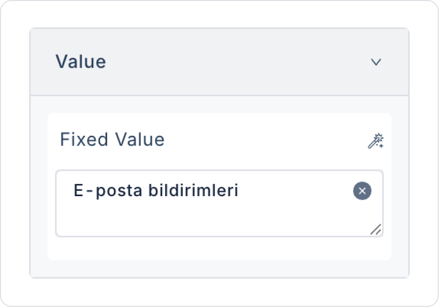
From the left sidebar, drag and drop the Elements > Display > Label element into the VerticalStack to specify the field name.
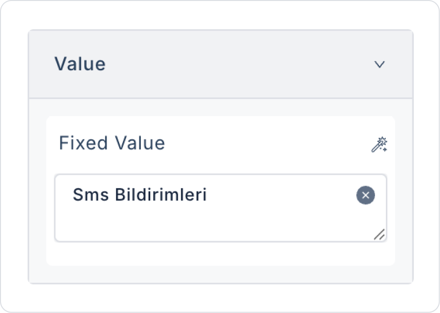
Set the text to Label > Properties > Value > “Email notifications”.
Drag and drop the Elements > Select Input > Switch element below the Label element.
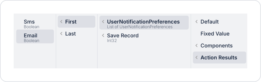
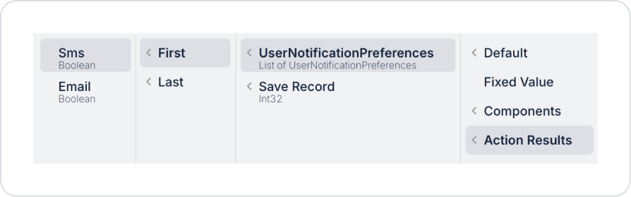
To display the current setting in the Switch element, configure Switch > Properties > Value > Action Results > UserNotificationPreferences > First > Email.
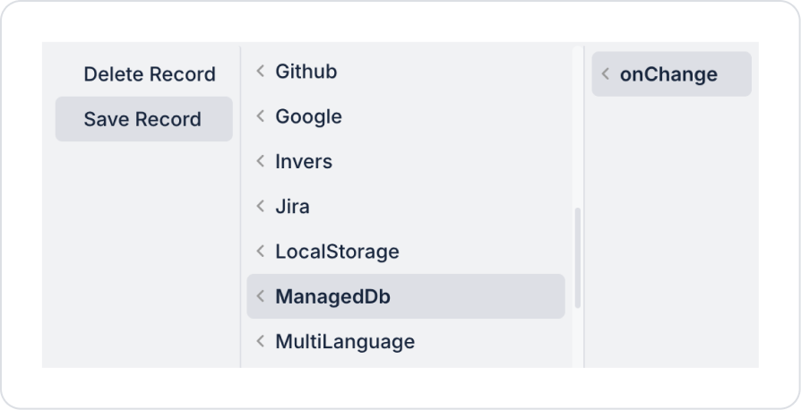
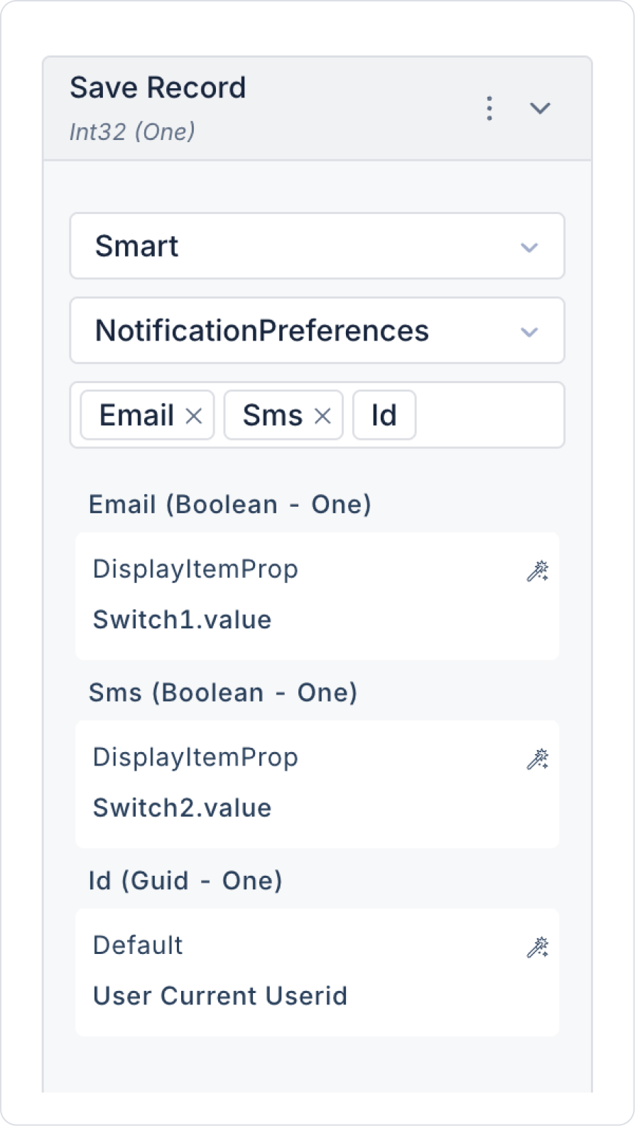
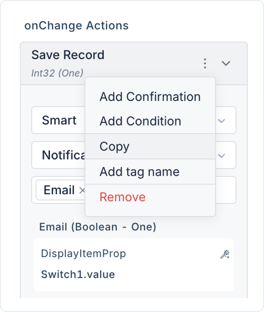
Add the Switch > Properties > Add Action > onChange > ManagedDb > Save Record action to the Switch element for the record-saving process after changes.
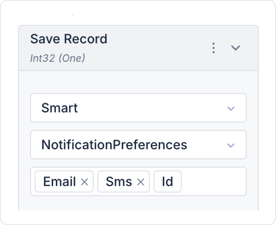
Within the Save Record action, select Select Table > NotificationPreferences and Select Columns > Sms - Email.
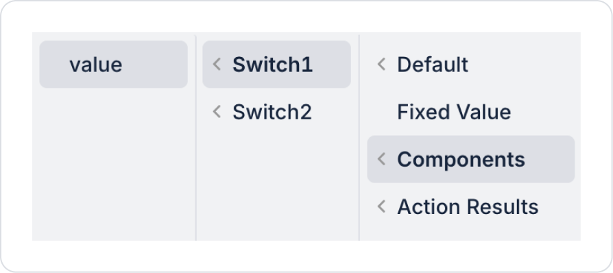
In the opened Email field, define Components > Switch1 > value.
Set the Sms field to Components > Switch2 > value.
For the user’s preference record, set the Id field to Default > User > Current Userid.
From the left panel, drag and drop the Elements > Display > Label element into the Vertical Stack to specify the second field name.
Set the text to Label > Properties > Value > “SMS notifications”.
Drag and drop the Elements > Select Input > Switch element below the Label element.
To display the current setting in the Switch element, configure Switch > Properties > Value > Action Results > UserNotificationPreferences > First > Sms.
Since a similar record-saving process will be performed, navigate to the Save Record action within Switch1 > Properties > onChange in the Email field and copy it.
Paste the action into Switch2 > Properties > onChange in the SMS field.
Preview:
Users can use the Switch elements to manage their notification preferences. The Email Notifications and SMS Notifications options on the screen can be toggled on or off separately. When a Switch is set to the on position, the corresponding notification channel becomes active, and notifications are sent to the user via that channel. When the Switch is set to the off position, notification delivery is disabled.
When the user changes their preferences, the selected settings are saved, and notifications to be sent can be determined based on these preferences.
4. Common Properties
Some fields on the Switch element are used in common across all UI elements. Therefore, detailed descriptions of the following properties can be found in the relevant general guide pages:
Use it for binary (on/off) states. The Switch is suitable only for scenarios with an on–off logic.
Write labels that are clear and action-oriented. Phrases like “Enable Notifications” or “Activate Account” should clearly indicate what the Switch controls.
Use the onChange event as the primary trigger. Manage all operations related to state changes through this event.
6. Limitations
The Switch element is not suitable for multi-state or multi-option scenarios.
Actions can only be triggered via the onChange event.
In screens using multiple Switches, the visual hierarchy must be well-planned.


