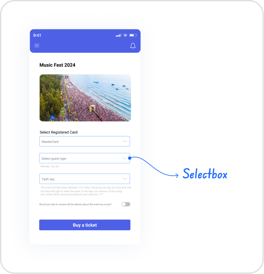
The Select Box element is a basic selection element that allows users to make a single selection from a list of predefined options via a dropdown menu. Its compact structure enables the organized presentation of a large number of options.
The Select Box element is frequently used in form fields, filtering options, and settings screens. The dropdown menu structure saves space on the interface while supporting users in making quick and controlled selections.
The Select Box element is supported in both web and mobile applications.
1.1. Common Use Cases
Form fields requiring a single selection
Category, status, or type selection
Filtering and sorting options
Settings and preferences screens
Scenarios involving multiple options but requiring a single selection
2. Key Features
Single-select support: The user can select only one option at a time.
Dropdown-based structure: Options are displayed by opening the dropdown when needed, saving space on the interface.
Support for static and dynamic options: Options can be defined manually or dynamically linked via data sources.
Clear display of the selected value: The user’s selection is clearly displayed on the Select Box.
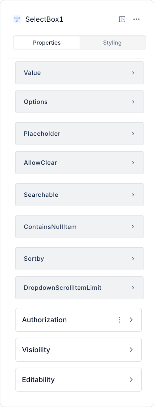
2.1. Select Box Element Properties
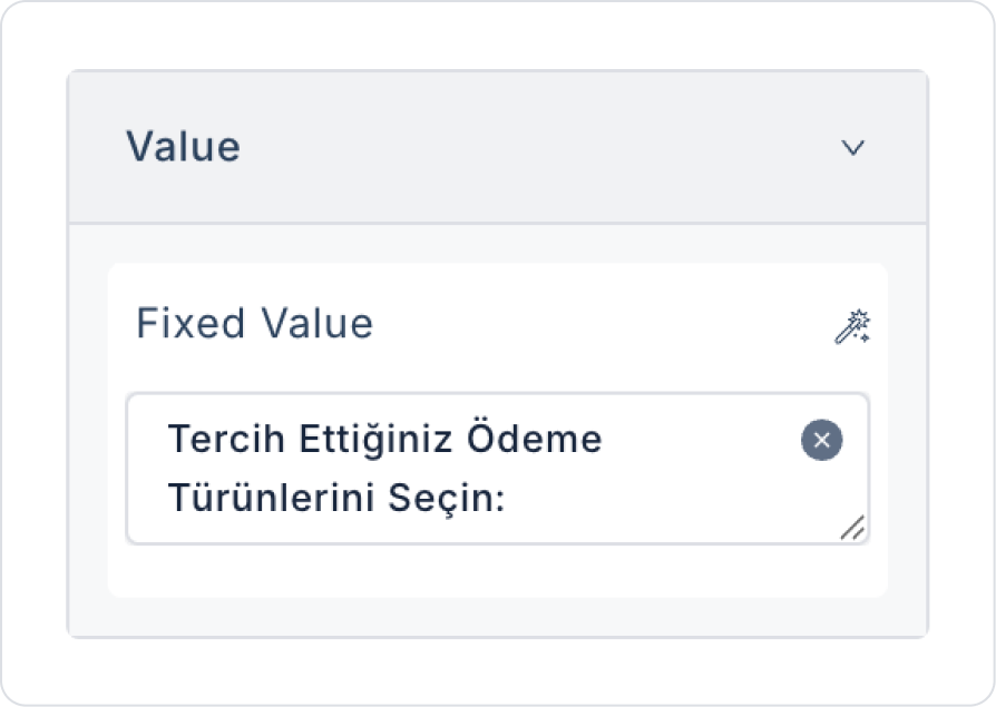
Value: You can add a static value or use the Symbol Picker to dynamically display the content of another element or the result of an action.
Options: Provides the link to the data table to be displayed in the dropdown list.
Fixed Options List: Allows for the display of manually defined fixed data.
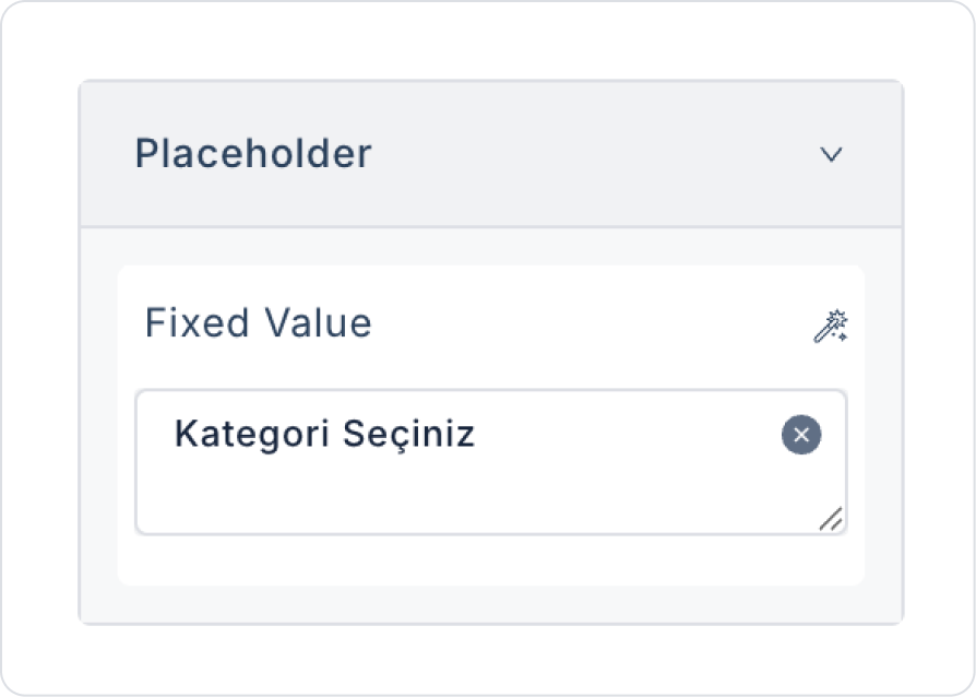
Placeholder: The placeholder text visible when the user has not entered any data.
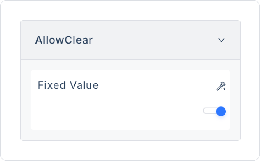
Allow Clear: Allows the selected value to be cleared with a single click.
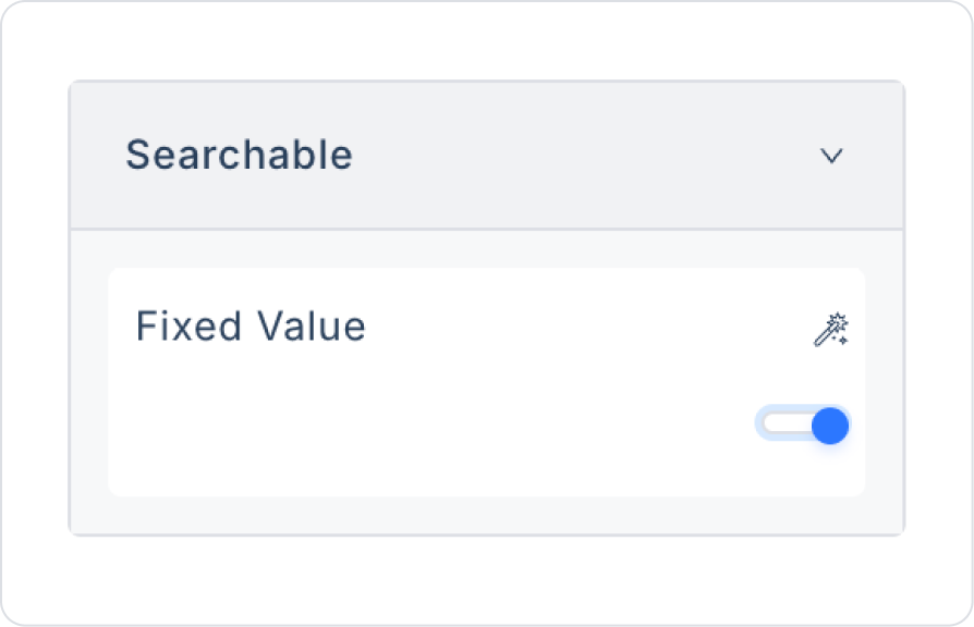
Searchable: Enables searching within the dropdown list.
Contains Null Item: You can set the first value of the list to be empty.
Sort By: Sorts list items alphabetically from A-Z or Z-A.
Dropdown Scroll Item Limit: Sets the maximum number of items displayed in the dropdown list at once. When the specified limit is exceeded, the user can scroll down to view the remaining options.
2.2. Data Transfer in the Datasources Module
Open the Datasources module.
Create a table containing your data. Example: Department table.
Add the necessary columns to the table (e.g., DepartmentName).
Create a new SQL Action from the Actions section. Example: SelectDepartment.
In the SQL Editor, enter the following query:
SELECT * FROM Department
Save the Action.
2.3. Data Transfer in the UI Design Module
Go to the UI Design module.
On the screen where you added the Select Box, click the ADD ACTION button in the Properties panel on the right.
Follow the steps Initial Actions → Custom → Datasource to select the SelectDepartment action.
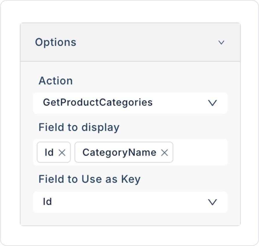
Click the Select Box element and configure the following settings from the Options menu:
Action: SelectDepartment
Field to display: DepartmentName
Field to Use as Key: Id
2.2. Actions That Can Be Added to an Element
The Select Box element supports defining event-based actions based on the user’s selection from the dropdown menu. Actions are not tied to the element itself but are linked to events triggered by user interactions.
Actions for the Select Box element can be added via the following events through the Properties > Add Action section.
Supported Action Triggers
onSelect: Triggered when the user selects an option from the dropdown list.
Usage purposes:
Save the selected value to a state or variable
Automatically populate fields based on the selection
Initiate filtering or list update operations
Example scenario: When the user selects an option in the “Status” field, the list is filtered based solely on the selected status.
onChange: Triggered whenever the value inside the Select Box changes.
Usage purposes:
Monitoring selection changes
Updating the status of dependent fields
Controlling form flow or steps
onBlur: Triggered when the user loses focus from the Select Box field.
Usage purposes:
Check whether a selection has been made
Run validation or display a warning
getTextFromValue: Used to retrieve the text to be displayed corresponding to the selected value.
Usage purposes:
Display the correct text in data structures with a Value–Label distinction
To provide meaningful labels to the user in complex data structures received from the API
Basic Rules Regarding Actions
The Select Box element can trigger actions through multiple events.
Multiple actions can be defined for the same event.
Thanks to the single-select structure, action flows are predictable and controlled.
When working with dynamic data sources, using getTextFromValue is recommended.
The Select Box element offers a simple and effective user experience, especially when used with actions in form fields, filtering, and settings screens.
3. How to Use the Select Box Element?
In this section, we will cover the end-to-end usage of the Select Box element through an example scenario.
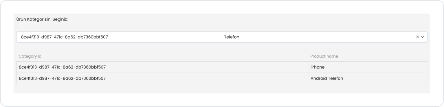
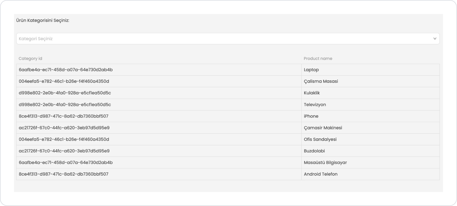
Scenario: Category Selection and Product Listing
The user uses the Select Box element to view products belonging to a specific category. With the Select Box, the user can make a single selection from the listed categories, and products associated with the selected category are displayed on the screen.
In the scenario:
A Select Box field appears on the screen. This field lists the categories defined in the system. When the user selects a category from the list, the selected category information is used as the relevant filtering parameter.
After the category is selected, the system retrieves the products associated with the selected category and displays them to the user in a list. This allows the user to view only the products associated with the relevant category.
Thanks to this structure, users can easily choose between categories and quickly filter products based on the selected category.
Step 1 - Creating a Data Source
Creating a table in the DataSources module:
Go to the DataSources module.
Then go to the Tables tab.
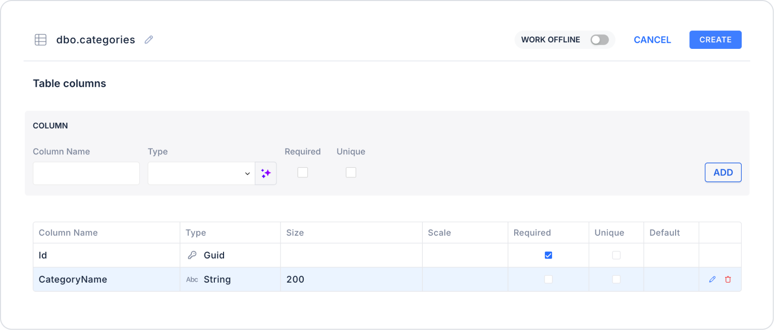
Create a new table named “Categories”.
The required table structure is as follows:
Important Field Names:
CategoryName: Represents the category name displayed to the user in the Select Box. The user makes a selection via this field.
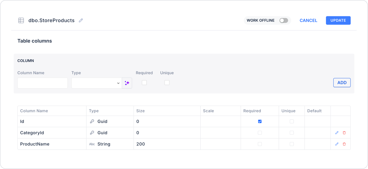
Create a new table named “StoreProducts”.
The required table structure is as follows:
Important Field Names:
CategoryId: Indicates which category the product belongs to. It enables filtering of products based on the selected category.
ProductName: Represents the product name that will be listed to the user based on the selected category.
Step 2 - Defining the Required Action
To display data on the interface:
You need to define a sample action.
Add a new action via the Actions > New SQL Action tab within the Datasources module.
Action to Add Categories and Products (InsertCategoriesStoreProducts): To test the application with sample data, add the following SQL action and click the TEST button.
When applying, delete the Categories and StoreProducts sections, then retype Categories and StoreProducts and press Enter. This will ensure the correct schema names are added before the table names.
Action to List Categories (GetProductCategories):
SELECT * FROM Categories
When applying this, delete the “Categories” part, type “Categories” again, and press Enter. This will add the correct schema name before the table name.
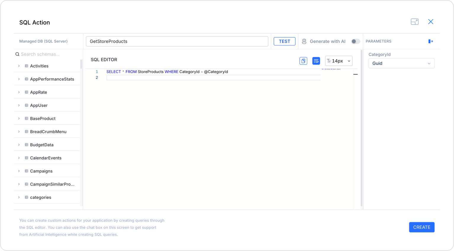
Action to List Products in the Selected Category (GetStoreProducts):
SELECT * FROM StoreProducts WHERE CategoryId = @CategoryId OR @CategoryId IS NULL
When applying this, delete the “StoreProducts” part, type “StoreProducts” again, and press Enter. This will add the correct schema name before the table name. Define the CategoryId parameter type as Guid.
Step 3 - Adding an Initial Action
Initially on the homepage:
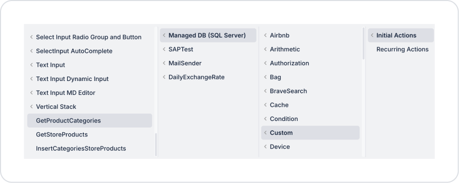
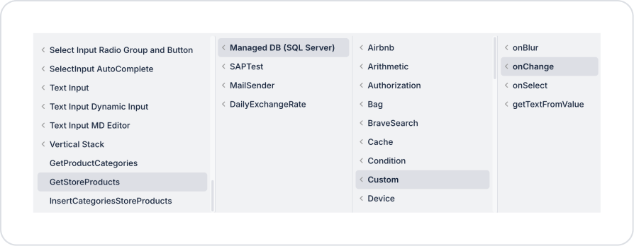
To display the labels within the Radio Group, add the Add Action > Initial Action > Custom > Managed DB > GetProductCategories action.
To observe the save and update operations of the Radio Group selections on the selection screen, add the Add Action > Initial Action > Custom > Managed DB > GetStoreProducts action.
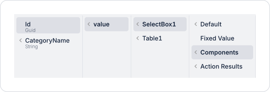
In the GetStoreProducts action, define CategoryId > Default > null.
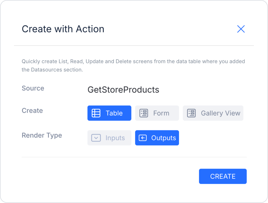
Step 4 - Adding the Select Box Element and Defining Actions
On the home page:
From the left-hand panel, drag and drop the Elements > Display > Label element onto the page to specify the field name.
Set the text to Label > Properties > Value > “Select Product Category:”.
Drag and drop the Elements > Select Input > SelectBox element below it.
To list categories dynamically, define SelectBox > Properties > Options > GetCategories. Define the fields as follows: Field to display > PaymentTypeName and Id and Field to Use as Key > Id.
You can define multiple display fields, including Id, as properties of the Select Box element.
Set the placeholder text to SelectBox > Properties > Placeholder > “Select Category”.
To allow clearing of selections, set SelectBox > Properties > AllowClear > On.
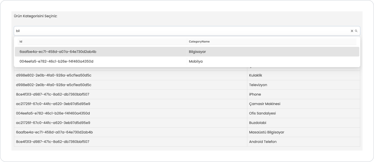
To enable text-based searching within the Select Box element, set SelectBox > Properties > Searchable > On.
To filter products after category selection, add the SelectBox > Properties > Add Action > onChange > Custom > ManagedDB > GetStoreProducts action.
In the GetStoreProducts action, define CategoryId > Components > SelectBox > value > Id.
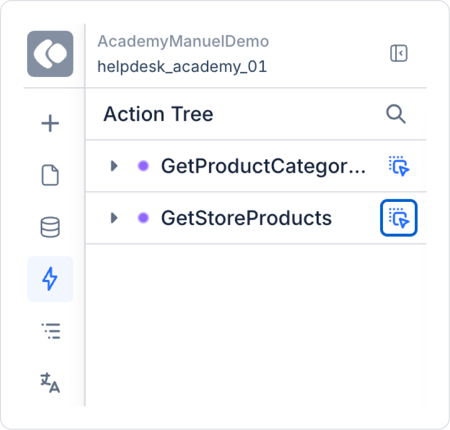
To display products, drag the GetStoreProducts action from the Action Tree area in the left sidebar to the page by holding down the icon next to it.
In the opened screen, make the following definitions.
The expected page structure in the final state is as follows.
Preview:
In this example, the Select Box element is used to filter the product list by selecting from product categories. When the page first opens, no category is selected, and in this case, all products are listed in the table. When the user selects a category from the dropdown list, the table below automatically updates and displays only the products belonging to the selected category.
Thanks to the search field within the Select Box, the user can quickly search the list by typing the category name and easily find the desired category. Additionally, the selection can be cleared using the clear icon located on the right side of the field. When the selection is cleared, the filter is removed, and the table is updated to display all products again.
4. Common Properties
Some fields on the Footer element are used in common across all UI elements. Therefore, detailed descriptions of the following properties can be found on the relevant general guide pages:
Use it in scenarios requiring a single selection. If the user needs to select only one option, the Select Box should be preferred.
Keep the option list meaningful and simple. For lists containing too many options, use the searchable feature to improve the user experience.
Guide the user with a placeholder. Phrases like “Select” or “Choose an option” clarify the expected interaction.
Use the onSelect and onChange events thoughtfully. Create a controlled flow by binding post-selection actions to these events.
Enable the Allow Clear feature when necessary. Allowing the user to easily clear their selection is particularly useful in filtering scenarios.
Do not neglect the use of getTextFromValue in dynamic data sources. In structures with a Value–Label separation, this ensures the correct text is displayed to the user.
6. Limitations
The Select Box element is suitable for single-select scenarios; Multi Select should be used for multiple selections.
Actions can only be triggered through supported events (onSelect, onChange, onBlur).


