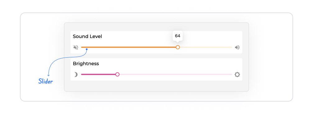
The slider element is an input element that allows users to visually and interactively select a single value within a specific range. Thanks to the slider mechanism, users can quickly set the desired value by sliding between the minimum and maximum values.
The slider element is used in scenarios that require single value selection, such as settings, preferences, and level determination.
The slider element is supported in both web and mobile applications.
1.1. Common Usage Scenarios
Volume, brightness, or zoom level settings
Determining points, scores, or levels
Single-value selections on filtering screens
Intensity or ratio selection based on settings and preferences
Level control in games and interactive applications
2. Key Features
Minimum–maximum value range: The Slider operates within defined lower and upper limits, and users can only select values within this range.
Single value selection: Unlike Range Slider, the Slider element allows only a single value to be selected at a time.
Instant visual feedback: The selected value is updated and displayed in real time as the user moves the slider.
Numerical validation and boundary control: The selected value cannot exceed the defined minimum and maximum limits.
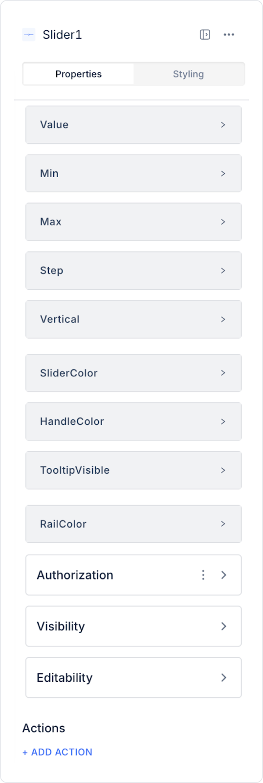
2.1. Slider Element Properties
You can configure the following settings from the Properties panel:
Value: You can specify a static value or dynamically display a value associated with a state, input element content, or action result via the Symbol Picker.
Max: Specifies the highest value that can be selected on the slider (e.g., 0-100 range for volume control).
Min: Sets the lowest value that can be selected on the slider (e.g., starting from 0 up to the maximum value for a price range).
Step: Determines how much the value changes with each movement of the slider (e.g., when set to 5, only values such as 5, 10, 15 can be selected).
Vertical: Allows the slider to be displayed horizontally (default) or vertically.
Slider Color: You can set the color of the slider.
Handle Color: Determines the color of the handle on the slider.
Tooltip Visible: Allows the selected value to be displayed above the slider handle.
Rail Color: You can set the color of the slider rail. The rail is the line along which the slider moves. It can be customized for aesthetic appearance and usability.
2.2. Actions That Can Be Added to Elements
The Slider element supports triggering event-based actions based on the value selected by users via the slider. Actions are not linked to the element itself, but to the event triggered as a result of user interaction.
Actions for the slider element can be defined via the Properties > Add Action area using the following event.
Supported Action Trigger
onChange: Triggered whenever the user changes the value on the slider.
Uses:
Update state or variables based on the selected value
Apply settings and preference values instantly
Dynamically update lists, graphs, or other UI elements
Perform calculations based on the value
Show live feedback to the user (label, tooltip, text, etc.)
Example scenario: As the user increases the volume slider, the volume level in the application is instantly updated and the selected value is displayed on the screen.
Basic Rules Regarding Actions
The slider element can trigger actions only through the onChange event.
The onChange event runs every time the slider is moved.
Multiple actions can be defined for the same onChange event.
The slider element provides an intuitive and fluid user experience when used with actions, especially in scenarios that require settings, levels, and dynamic feedback.
3. How to Use the Slider Element?
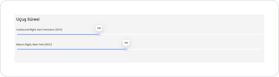
In this section, we will cover the end-to-end use of the slider element using the “Duration” screen shown in the image.
Scenario: Setting Flight Duration Based on Selected Ticket
In a travel app, users use slider components to review the departure and return times for their selected flight ticket and filter them if necessary. This structure allows users to quickly evaluate more suitable and comfortable options based on flight durations.
In the scenario:
When the user selects a flight ticket, the flight durations for the selected ticket are automatically loaded onto the screen.
There are two separate sliders on the screen under the “Flight Duration” heading:
Outbound flight, San Francisco (SFO): Shows the departure flight duration for the selected ticket.
Return flight, New York (NYC): Shows the return flight duration of the selected ticket.
The sliders display the current flight durations of the selected ticket as the default value on the screen.
As the user slides the slider to the right or left, the flight duration value is updated instantly.
The selected duration value is visually presented to the user in the tooltip area on the slider.
Step 1 — Creating an Action for the Data Source
Open the Datasources module.
Click Add New SQL Action.
In the editor that opens, add the following SQL code and name the created action GetDurationDefaults.
SELECT
‘Outbound flight, San Francisco (SFO)’ AS FlightType,
30 AS MinValue,
300 AS MaxValue,
120 AS DefaultValue,
5 AS StepValue
UNION ALL
SELECT
‘Return flight, New York (NYC)’ AS FlightType,
30 AS MinValue,
300 AS MaxValue,
150 AS DefaultValue,
5 AS StepValue
Step 2 — UI Design: Creating the Screen
Open a new screen in the UI Design module (e.g., Duration).
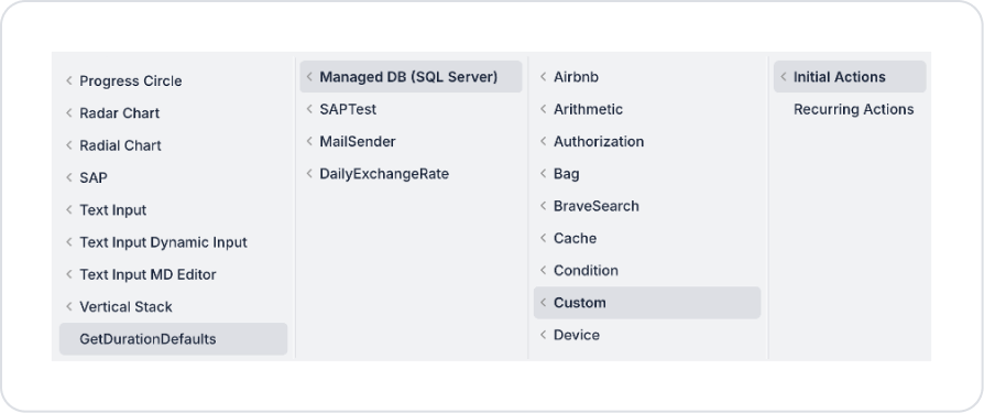
Add an Initial Action (pageInit) to the screen: Add Action > Initial Action > Custom > GetDurationDefaults
Step 3 — Adding and Configuring Elements to the Screen
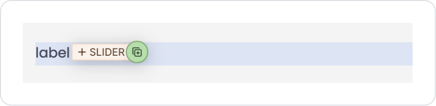
Drag and drop the Elements > Display > Label element onto the page.
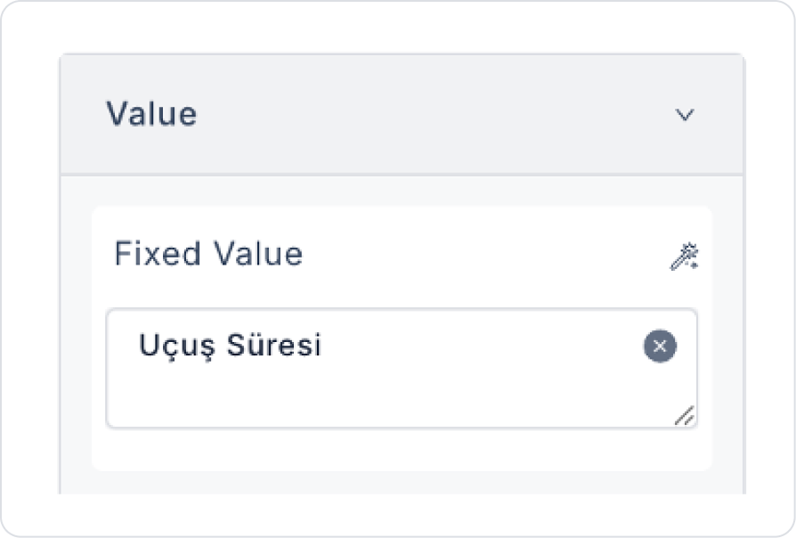
Update the text to Label > Properties > Value > “Flight Duration”.
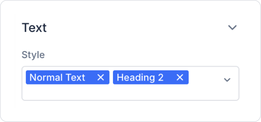
Define the text style as Label > Styling > Text > Style > Normal Text and Heading 2.
Drag and drop another Elements > Display > Label element onto the page.
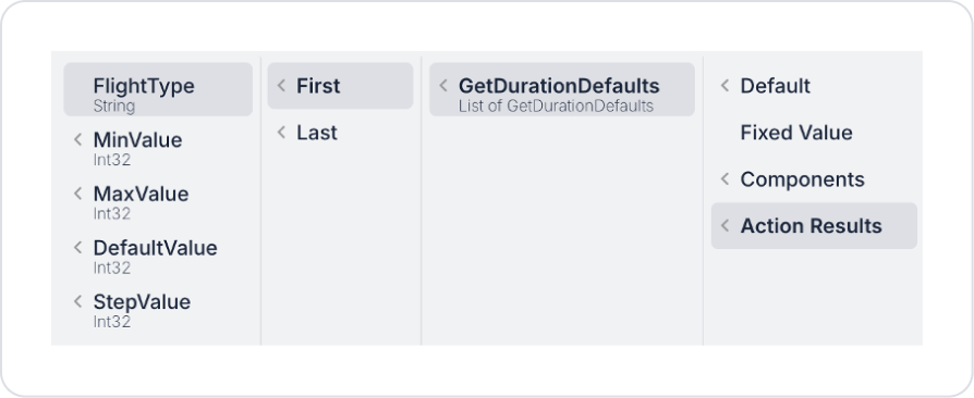
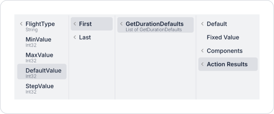
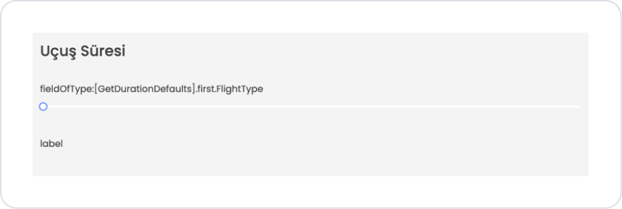
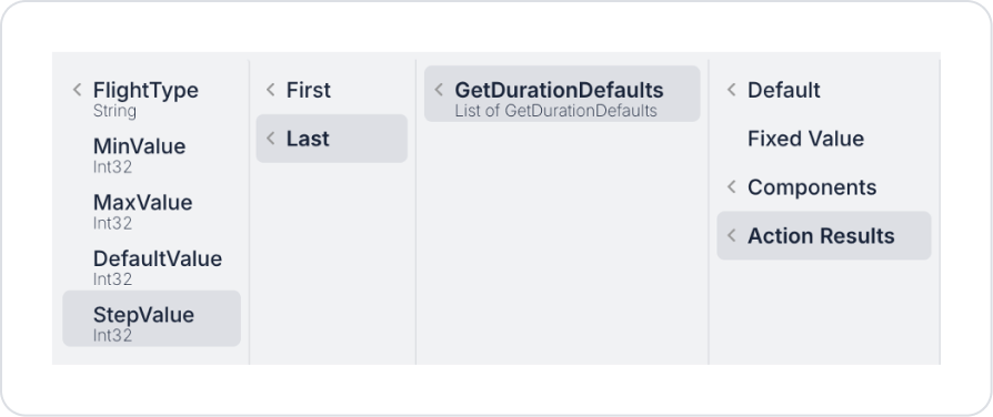
Define the text as Label > Properties > Value > Action Results > GetDurationDefaults > First > FlightType.
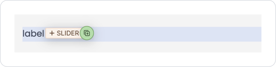
Drag and drop the Elements > Numeric Input > Slider element below the Label element.
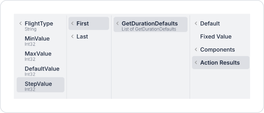
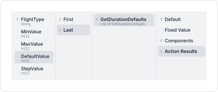
Set the Slider value to Slider > Properties > Value >Action Results > GetDurationDefaults > First > DefaultValue.
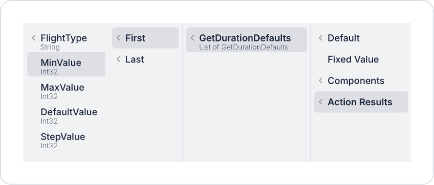
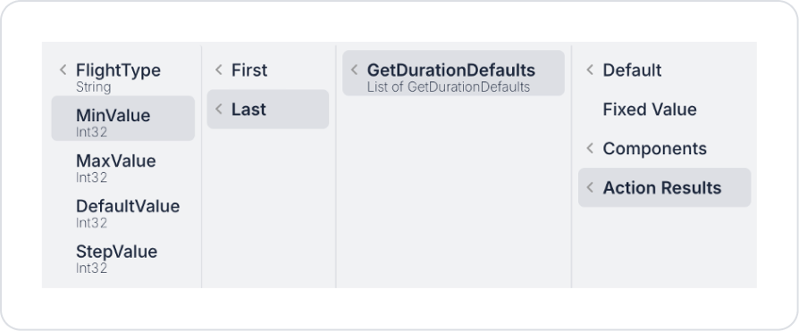
Set the minimum value to Slider > Properties > Min >Action Results > GetDurationDefaults > First > MinValue.
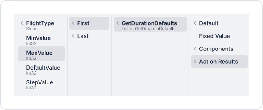
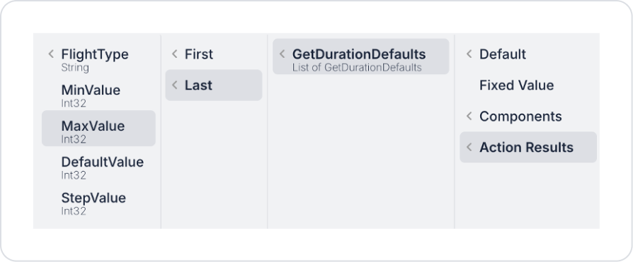
Set the maximum value to Slider > Properties > Max >Action Results > GetDurationDefaults > First > MaxValue.
Define the range value as Slider > Properties > Step >Action Results > GetDurationDefaults > First > StepValue.
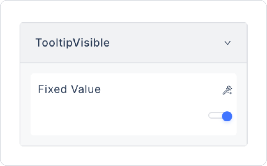
To display the flight duration value, set Slider > Properties > TooltipVisible > On.
Similarly, add another Elements > Display > Label element to the page.
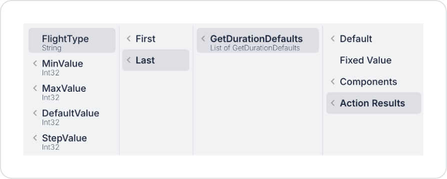
Define the text as Label > Properties > Value > Action Results > GetDurationDefaults > Last > FlightType.
Drag and drop another Elements > Numeric Input > Slider element under the Label element.
Define the Slider value as Slider > Properties > Value >Action Results > GetDurationDefaults > Last > DefaultValue.
Set the minimum value as Slider > Properties > Min >Action Results > GetDurationDefaults > Last > MinValue.
Set the maximum value as Slider > Properties > Max >Action Results > GetDurationDefaults > Last > MaxValue.
Set the interval value as Slider > Properties > Step >Action Results > GetDurationDefaults > Last > StepValue.
To display the flight duration value, set Slider > Properties > TooltipVisible > On.
Preview
When the application is tested, the departure and return times for the selected flight ticket are displayed as default values on two separate sliders under the “Flight Duration” heading.
The times for the departure flight to San Francisco (SFO) and the return flight to New York (NYC) are reflected in the slider positions. As the user moves the sliders, the flight duration values are updated instantly, and the selected times are visually displayed in the tooltip areas. This structure allows the user to easily review and adjust the flight durations according to their preferences.
4. Common Properties
Some fields on the slider element are used commonly across all UI elements. Therefore, detailed explanations of the following properties can be found in the relevant general guide pages:
Set meaningful minimum and maximum values. The range that the user will actually need should be defined, and unnecessarily wide ranges should be avoided.
Make the selected value visible. Displaying the selected value textually next to or on the Slider increases user awareness.
6. Limitations
The slider element only allows for the selection of a single value. For scenarios requiring range selection, a Range Slider should be used.
Actions can only be triggered via the onChange event.
Manual number input is not supported; the value is only set via the slider.


