The checkbox element is a fundamental selection element that allows users to make multiple selections from a list of options. Each option can be checked or unchecked independently, enabling users to select multiple preferences at the same time.
The checkbox element is frequently used in scenarios involving forms, settings, filtering, and confirmation. Its simple and intuitive structure ensures users can clearly express their selections.
The checkbox element is supported in both web and mobile applications.
1.1. Common Use Cases
Form fields containing multiple options
Filtering and category selection screens
Settings and preference lists
User consents and permissions (e.g., “I accept the terms of use”)
Surveys and evaluation questions requiring multiple answers
2. Key Features
Multiple selection support: Users can select or deselect multiple checkboxes at the same time.
Independent behavior: Each checkbox is independent of the others; selecting one option does not affect the others.
Clear and intuitive user experience: Checked and unchecked states are visually distinct.
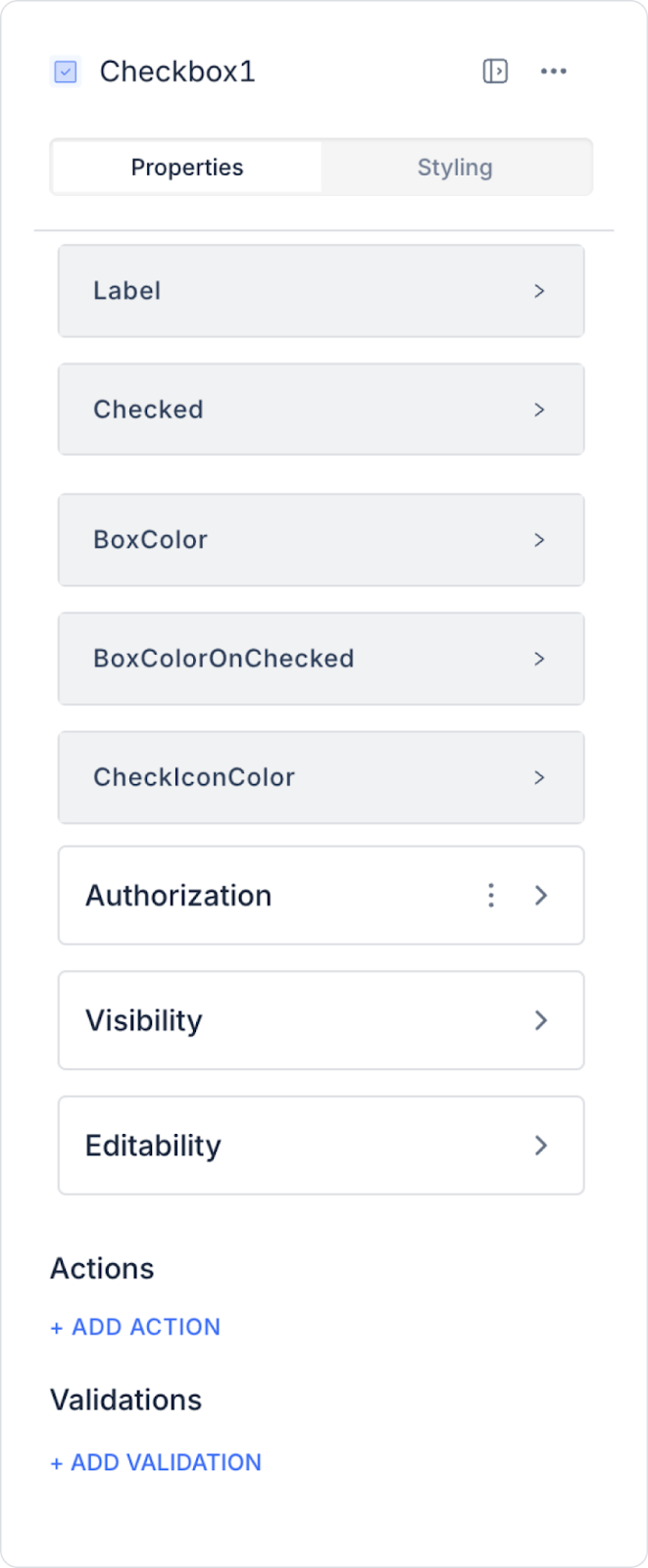
2.1. Checkbox Element Properties
You can configure the following settings from the Properties panel:
Label: Defines the text displayed next to the checkbox element.
Checked: Determines whether the checkbox is selected. When selected, the checkbox appears checked.
Box Color: Sets the background color of the checkbox (visible when unchecked).
Box Color OnChecked: Defines the background color of the checkbox when it is checked.
Check Icon Color: Sets the color of the checkmark displayed when the checkbox is checked.
In Android and iOS apps, you can change the color of the Checkbox element via the Text Color field in the Properties panel.
2.2. Actions That Can Be Added to the Element
The Checkbox element supports triggering event-based actions based on the user’s selection. Actions are not tied to the element itself but to the event triggered when the Checkbox is checked or unchecked.
Actions for the Checkbox element can be defined via the following event through the Properties > Add Action section.
Supported Action Trigger
onChange: Triggered when the user checks or unchecks the Checkbox.
Usage scenarios:
Save the selection status to a state or variable
Make other fields visible/hidden based on the selection
To enable/disable form fields
To update filtering options
To save the selection by triggering an API or workflow
Example scenario: When the user checks the “I accept the terms of use” checkbox, the “Continue” button becomes active.
Basic Rules Regarding Actions
The Checkbox element can trigger actions only through the onChange event.
The onChange event runs every time the Checkbox’s state changes.
Multiple actions can be defined for the same onChange event.
The checkbox element offers a flexible and user-friendly experience when used with actions, particularly in form confirmations, filtering, and preference management scenarios.
3. How to Use the Checkbox Element?
In this section, we will cover the end-to-end usage of the checkbox element using an example scenario.
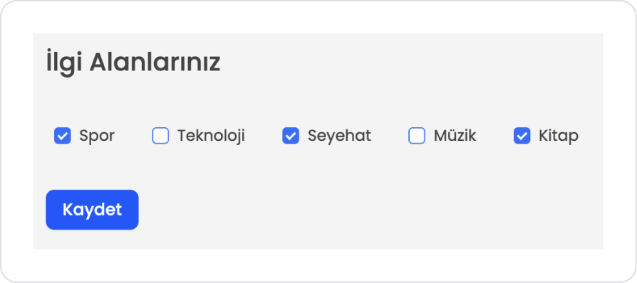
Scenario: Interest Selection
Users can use the Checkbox element to select their interests on a profile creation or preference settings screen. Each interest is displayed as a separate Checkbox, and users can select multiple options at the same time.
In the scenario:
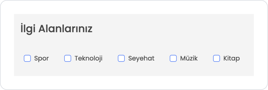
The following options are displayed on the screen:
Technology
Sports
Travel
Music
Books
The user selects the areas they are interested in. The selected interests are saved in the user’s profile and used to personalize recommended content or notifications within the application.
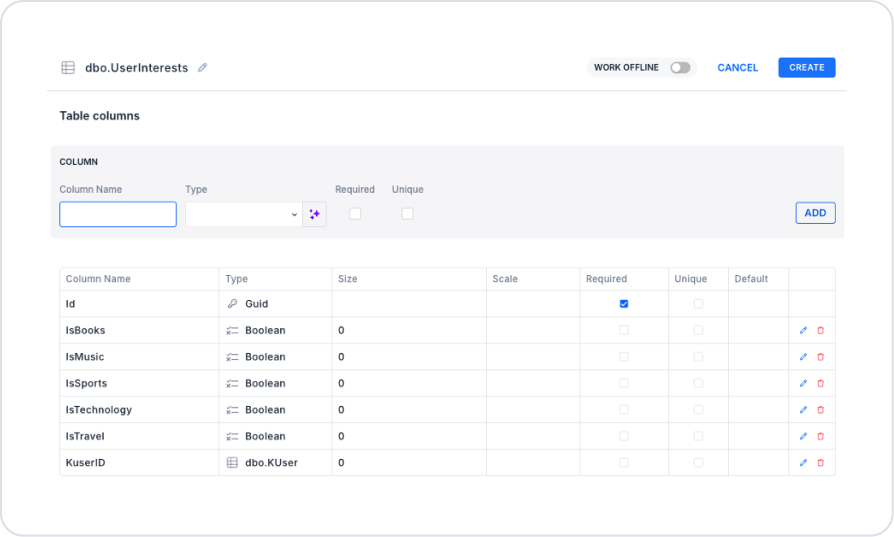
Step 1 - Creating a Data Source
Creating a table in the DataSources module:
Go to the DataSources module.
Then go to the Tables tab.
Create a new table named “UserInterests”.
The table structure to be created is as follows:
Important Field Names:
KUserId: Indicates which user the relevant records belong to. It is used to store user preferences on a per-user basis and retrieve the relevant user’s selections when needed. You must select the KUser table in the Type field.
IsTechnology: Indicates whether the user is interested in the technology field. When the checkbox is selected, the value is stored as true (1); when unselected, it is set to false (0).
IsSports: Indicates whether the user is interested in sports-related content. Depending on the checkbox selection, it takes the value true (1) or false (0).
IsTravel: Indicates whether the user is interested in travel-related content. When the user selects the relevant checkbox, the value is stored as true (1).
IsMusic: Indicates whether the user is interested in music-related content. Depending on the checkbox selection, it takes the value true (1) or false (0).
IsBooks: Indicates whether the user is interested in book-related content. When the checkbox is selected, it is saved as true (1) and included in the user’s interests.
Step 2 - Adding the Checkbox Element and Defining the Action
Start on the homepage:
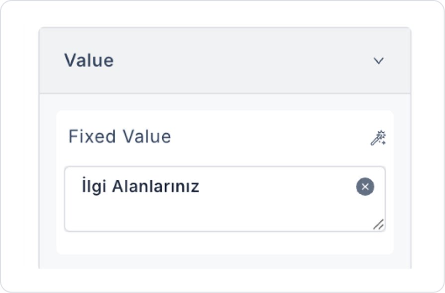
Drag and drop the Elements > Display > Label element onto the page from the left sidebar.
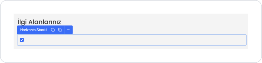
Set the text to Label > Properties > Value > “Your Interests”.
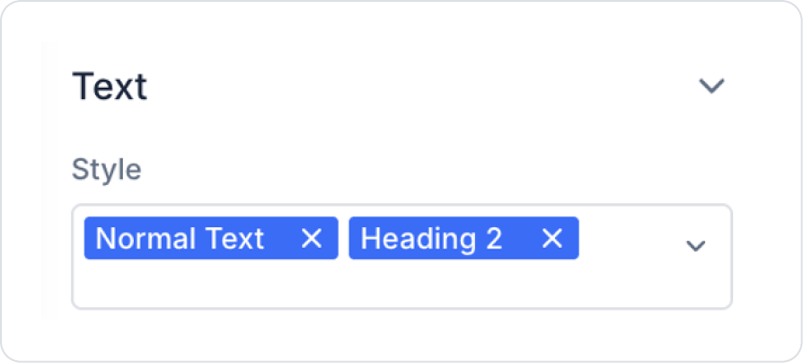
Set the text style to Label > Styling > Text > Style > Normal Text and Heading 2 from the predefined text styles.
Below this, drag and drop the Elements > Container > HorizontalStack element onto the page from the left sidebar.
Drag and drop the Elements > Select Input > Checkbox element into the Horizontal Stack.
Set the label text to Checkbox > Properties > Label > “Sports”.
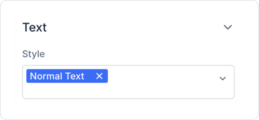
Set the text style to the default Checkbox > Styling > Text > Style > Normal Text.
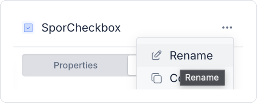
To ensure multiple checkbox elements can be selected correctly during registration, rename the Checkbox1 > Rename > “SporCheckbox” element from the right-hand panel.
Add another new Elements > Select Input > Checkbox element inside the Horizontal Stack element.
Set the label text to Checkbox > Properties > Value > “Technology”.
Set the text style to the Checkbox > Styling > Text > Style > Normal Text default style.
Apply similar checkbox addition and editing steps for Travel, Music, and Books as well.
Drag and drop the Elements > Navigation > Button element onto the page.
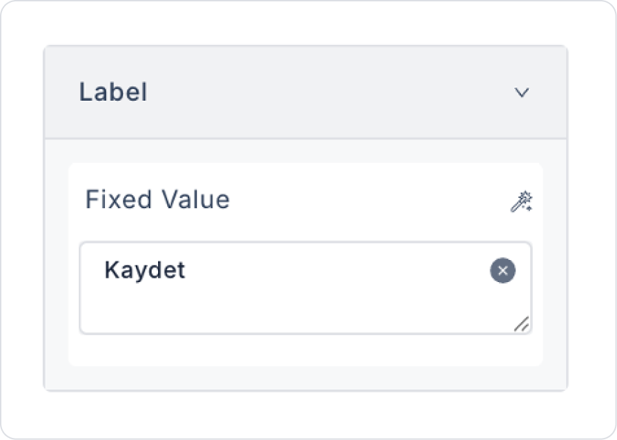
Set its name to Button > Properties > Label > “Save”.
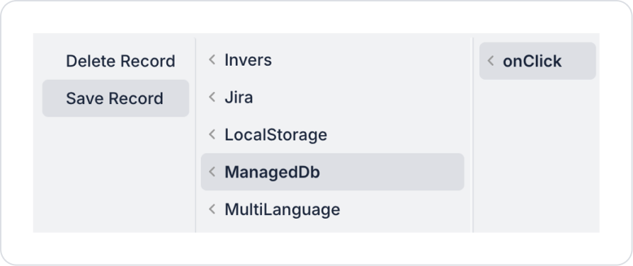
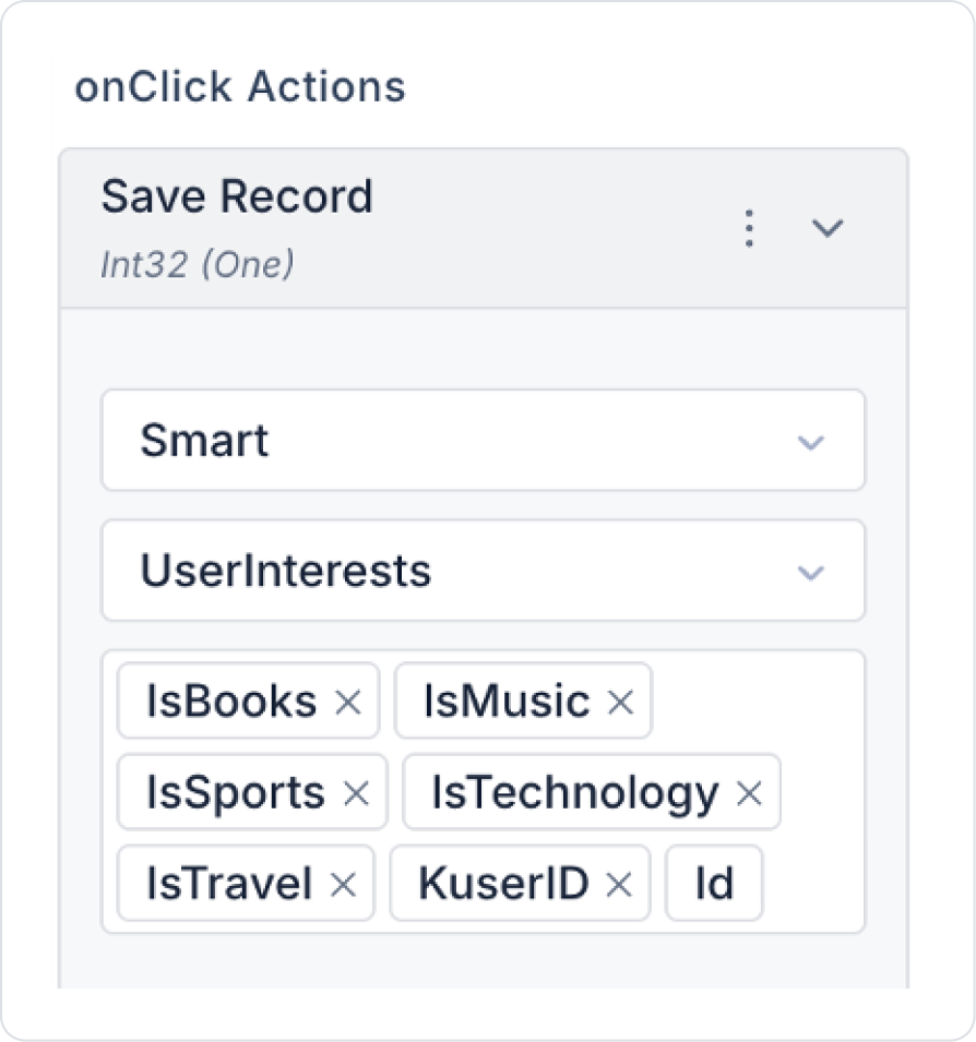
Add the save action to the button. Button > Properties > Add Action > onClick > Managed Db > Save Record.
In the Save Record action, select the following fields.
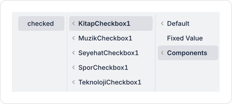
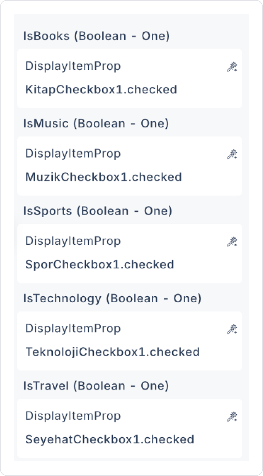
Set the IsBooks field to Components > BookCheckbox1 > checked.
Similarly, define the IsMusic, IsSports, IsTechnology, and IsTravel fields as Components > relevant Checkbox1 > checked.
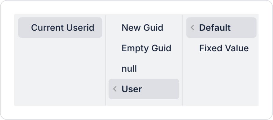
To specify which user the preference belongs to, set the KuserID field to Default > User > Current Userid.
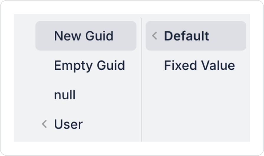
Finally, set the Id field for the new record to Default > New Guid.
Preview:
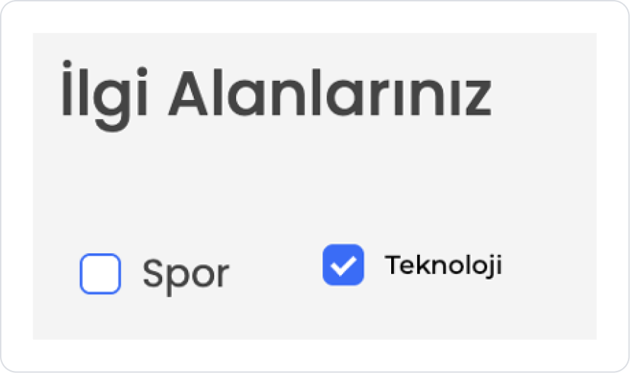
In this example, Checkbox elements are used to allow users to select their interests. The user can check the Sports, Technology, Travel, Music, and Books options displayed on the screen to indicate their interests. Each option can be selected or deselected independently.
After making their selections, the user clicks the Save button to save their preferences to the system. The selected interests are stored specifically for the user, and recommendations, content, or notifications within the application can be customized based on these preferences.
4. Common Properties
Some fields on the checkbox element are used across all UI elements. Therefore, detailed descriptions of the following properties are available on the relevant general guide pages:


