The Rate element is a visual evaluation element that allows users to rate a piece of content, service, or experience on a specific scale. Thanks to its structure supported by stars, icons, or similar visual indicators, users can make their evaluations quickly and intuitively.
The Rate element is used to collect subjective evaluations such as satisfaction, quality, performance, and level of appreciation. Providing visual feedback increases user engagement and simplifies the evaluation process.
Rate elements are supported in web and mobile apps.
1.1. Common Use Cases
Product or service satisfaction evaluations
Content, training, or event ratings
User feedback and survey screens
Quality, performance, or experience measurements
Comment and rating systems
2. Key Features
Visual rating system: Thanks to its star or icon-based structure, users can make their evaluations intuitively.
Evaluation on a specific scale: Rating is performed based on defined minimum and maximum values (e.g., 1–5).
Instant visual feedback: The selected value is visually highlighted as the user rates.
Compatible with forms and actions: The Rate element can be used seamlessly in form submit, state update, survey, and feedback scenarios.
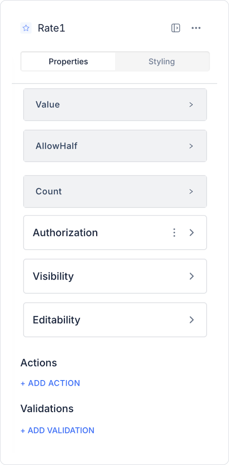
2.1. Rate Element Properties
You can configure the following settings from the Properties panel:
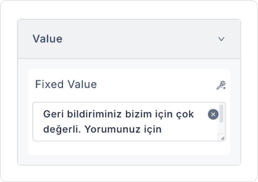
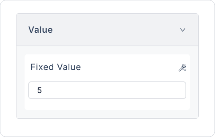
Value: Displays the selected score or rating result. A fixed score can be set as the initial value, or the value can be changed dynamically.
Allow Half: Allows users to select half points (e.g., 3.5 stars or displaying a total score of 4.3).
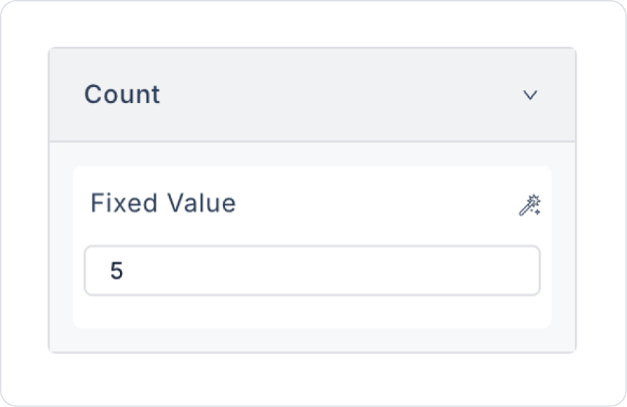
Count: Determines the total number of stars or points in the rating system (e.g., a 5-star or 10-star rating).
2.2. Actions That Can Be Added to the Element
The Rate element supports triggering event-based actions based on the rating actions performed by users. Actions are not linked to the element itself, but to the event triggered when the user changes the rating.
Actions for the Rate element can be defined via the Properties > Add Action area using the following event.
Supported Action Trigger
onChange: Triggered whenever the user changes the rating they selected on the Rate element.
Usage purposes:
Save the selected rating as a state or variable
Process user feedback instantly
Display additional fields based on the rating (e.g., open a comment field for low ratings)
Update survey or evaluation results
Send evaluation data by triggering an API or workflow
Example scenario: When a user rates a service with 2 stars, the system automatically makes the “Would you like to share your feedback?” field visible.
Basic Rules Regarding Actions
The Rate element can trigger actions only through the onChange event.
The onChange event runs every time the user updates their rating.
Multiple actions can be defined for the same onChange event.
The Rate element provides an effective and user-friendly rating experience, especially when used with actions in feedback, satisfaction measurement, and survey scenarios.
3. How to Use the Rate Element?
In this section, we will discuss how to use the Rate element to collect user feedback, using an example application scenario.
Scenario: Application Satisfaction Evaluation
In a mobile/web application, after the user completes a specific task (e.g., when they finish a task or use the application for a while), an evaluation screen is displayed for them to quickly indicate their satisfaction.
On this screen, the user is expected to:
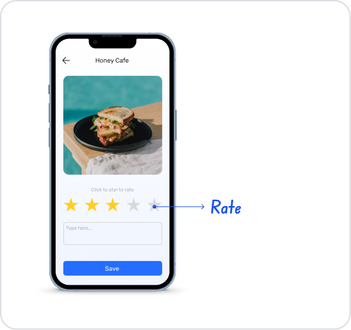
Rate the app with stars,
Be redirected to the app store if they wish,
Or skip the evaluation.
This structure allows for direct and low-effort feedback from the user.
In the scenario:
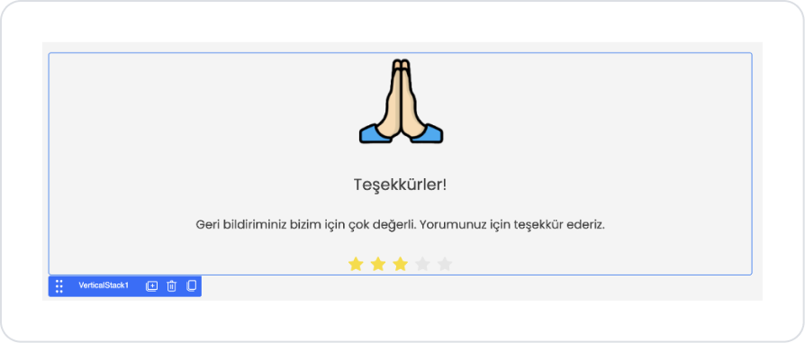
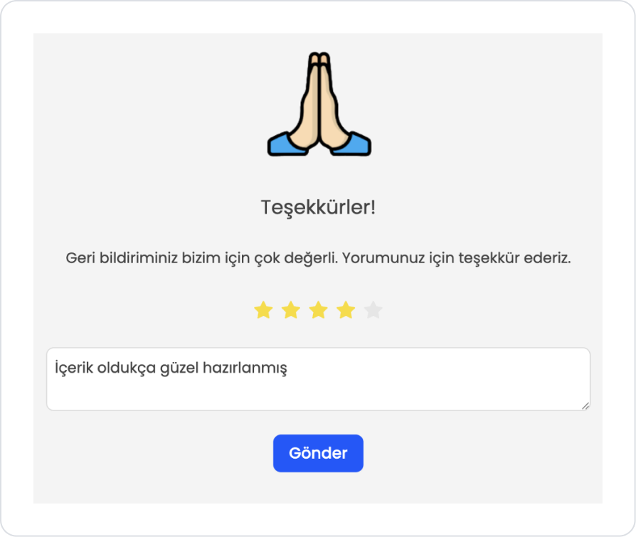
A thank you message is displayed to the user at the top of the screen.
Star ratings are given using the Rate element in the middle area.Depending on the rating selection, the user is directed to take action.At the bottom, the user is presented with two options:Rate on App StoreNo, thanks
Step 1 - Creating a Data Source
Creating a table in the DataSources module:
Go to the Datasources module.
Then go to the Tables tab.
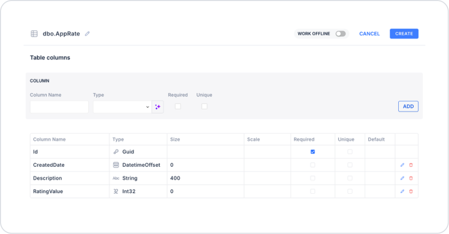
Create a new table named “AppRate”.
The table structure to be set up is as follows:
Important Field Names:
Description: Stores the user's comment or review about the app and is displayed as feedback on listing screens.
RatingValue: Stores the rating value given by the user and is used for calculating average ratings, filtering, and statistical analysis.
Step 2 – Adding and Configuring UI Elements
Open the UI Design module.
Drag and drop the Elements > Container > VerticalStack element onto the page.
Set the Vertical Stack element to VerticalStack > Styling > Layout > Center Horizontally.
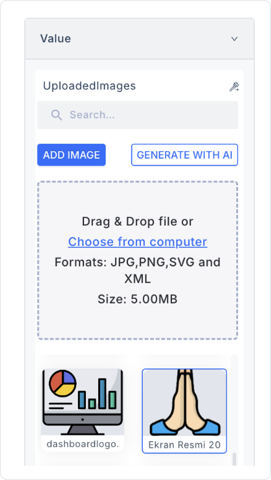
Drag and drop the Elements > Display > Image element into the Vertical Stack.
Select the image to be displayed from the Image > Properties > Value > Uploaded Images > Add Image field.
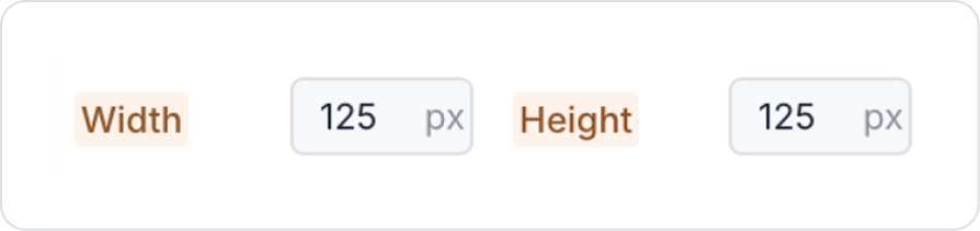
Set the image dimensions to Image > Styling > Layout > Width and Height > 125 px.
Drag and drop the Elements > Display > Label element into the Vertical Stack below the Image.
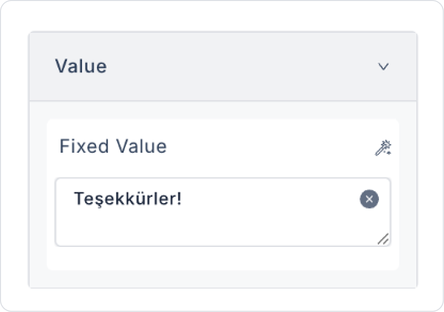
Update the text content to Label > Properties > Value > “Thank you!”.
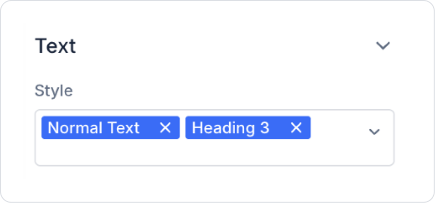
Select the text style as Label > Styling > Text > Style > Normal Text and Heading 3.
Drag and drop another Elements > Display > Label element below it.
Update the text content to Label > Properties > Value > "Your feedback is very valuable to us. Thank you for your comment!" .
Drag and drop the Elements > Numeric Input > Rate element below it.
Initially set the Rate element value to Rate > Properties > Value > 5.
Depending on your scenario, set Rate > Properties > AllowHalf > Off.
For half ratings, you need to define the RatingValue field in the table as type Decimal.
Set the number of stars to Rate > Properties > Count > 5. It will come as 5 in the default definition.
Drag and drop the Elements > Text Input > TextArea element under the Rate element.
Drag and drop the Elements > Navigation > Button element under it.
Update the text on the button to Button > Properties > Label > “Submit”.
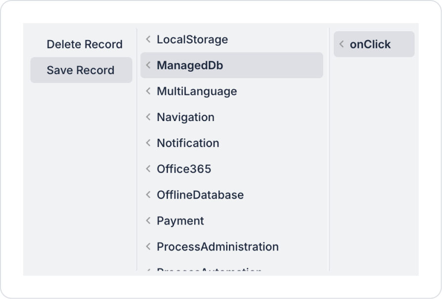
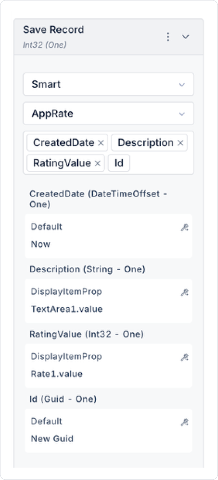
Add the Button > Add Action > onClick > Managed DB > Save Record action to the Button element.
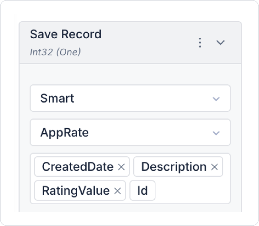
In the action, select the AppRate table and the following columns.
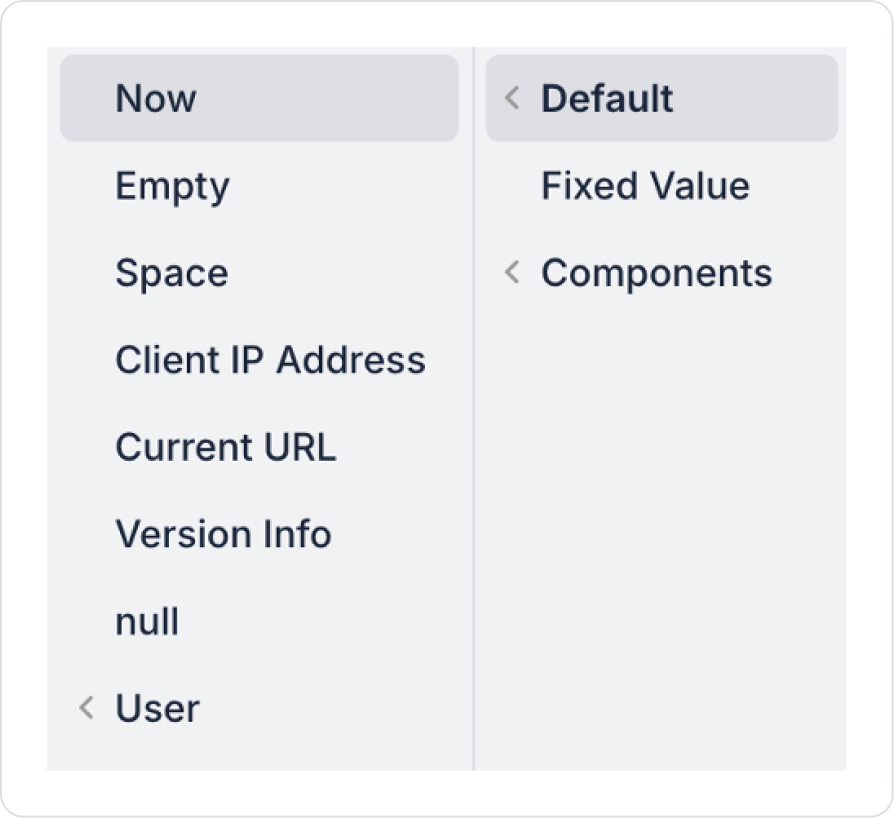
Set the CreatedDate field to Default > Now.
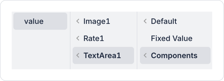
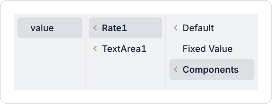
Set the Description field to Components > TextArea > value.
Set the RatingValue field to Components > Rate > value.
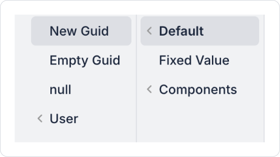
Set the Id field to Default > New Guid.
The final save action should look like this.
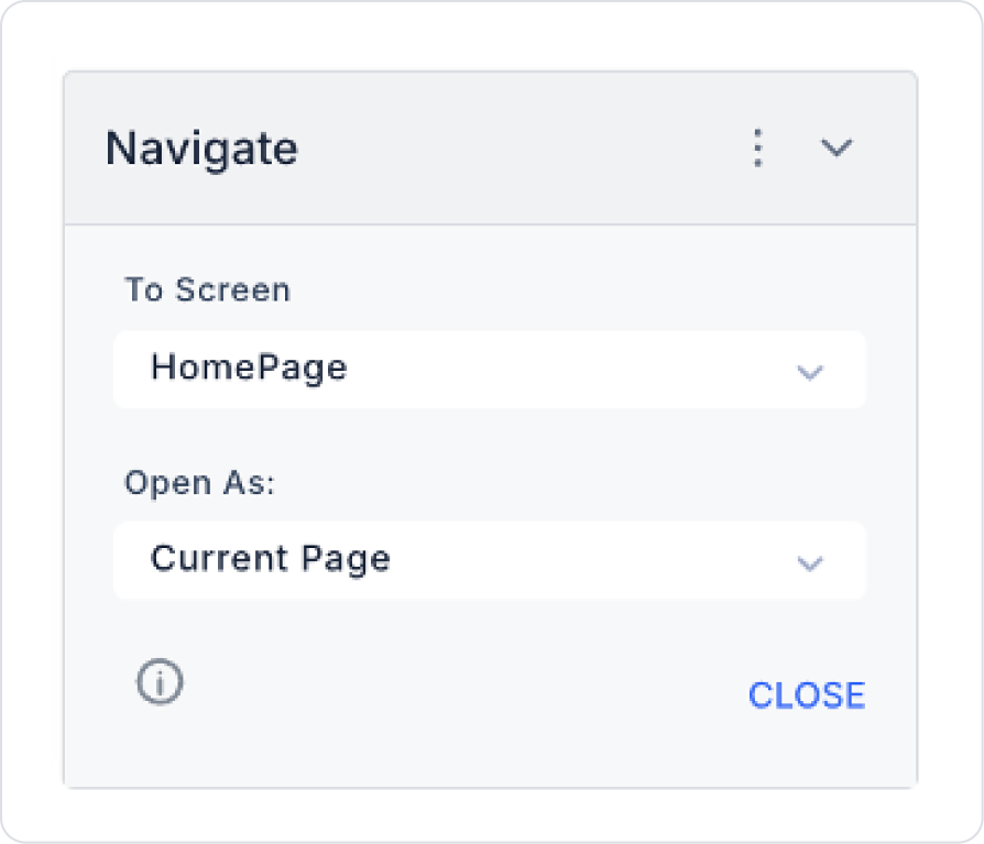
To return to the home page after submission, select your home page in the Button > Add Action > Navigation > Navigate field.
Preview
When the application is tested, users can easily communicate their opinions and evaluations about the application through the star rating field. After selecting their rating, users can write their thoughts in the comment field and submit their feedback to the system using the “Submit” button. After submission, a thank you message is displayed to the user, informing them that the evaluation process has been successfully completed. This structure allows user satisfaction and the feedback collection process to be managed in a practical and understandable way.
4. Common Properties
Some fields on the Rate element are commonly used in all UI elements. Therefore, detailed explanations of the following properties can be found in the relevant general guide pages:
When using the Rate element, the following best practices make it easier for users to rate and improve the quality of the feedback collected:
Define the rating scale clearly and consistently. Scales such as 1–5 or 1–10 should be clearly defined and used consistently throughout the application.
Explain what the rating represents. If necessary, guide the user by using a short description or label near the Rate element.
Use default rating assignments with caution. An automatically selected value may unintentionally influence the user. Leaving it blank is recommended when unnecessary.
6. Limitations
It is not suitable for evaluations requiring numerical precision; it only provides symbolic ratings.
Actions can only be triggered via the onChange event.


