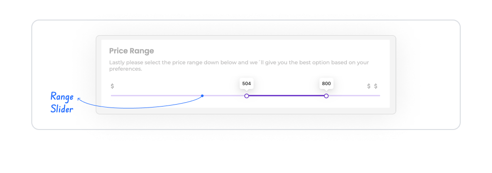
The Range Slider element is a visual input element that allows users to select from a specific range of values within the application. Thanks to its slider-based interface, users can intuitively and quickly determine values instead of manually typing them.
1.1. Common Use Cases
Selecting price, budget, or amount ranges
Setting age, score, or rating ranges
Selecting minimum–maximum values on filtering screens
Setting levels or ratios on settings and preferences screens
Selecting range-based data on analysis and reporting screens
2. Key Features
Minimum–maximum range support: Users can select values within defined lower and upper limits.
Step-based value selection: Value increases and decreases can be limited to specific steps, enabling controlled selection.
Instant value display: The selected value is displayed in real time as the user moves the slider.
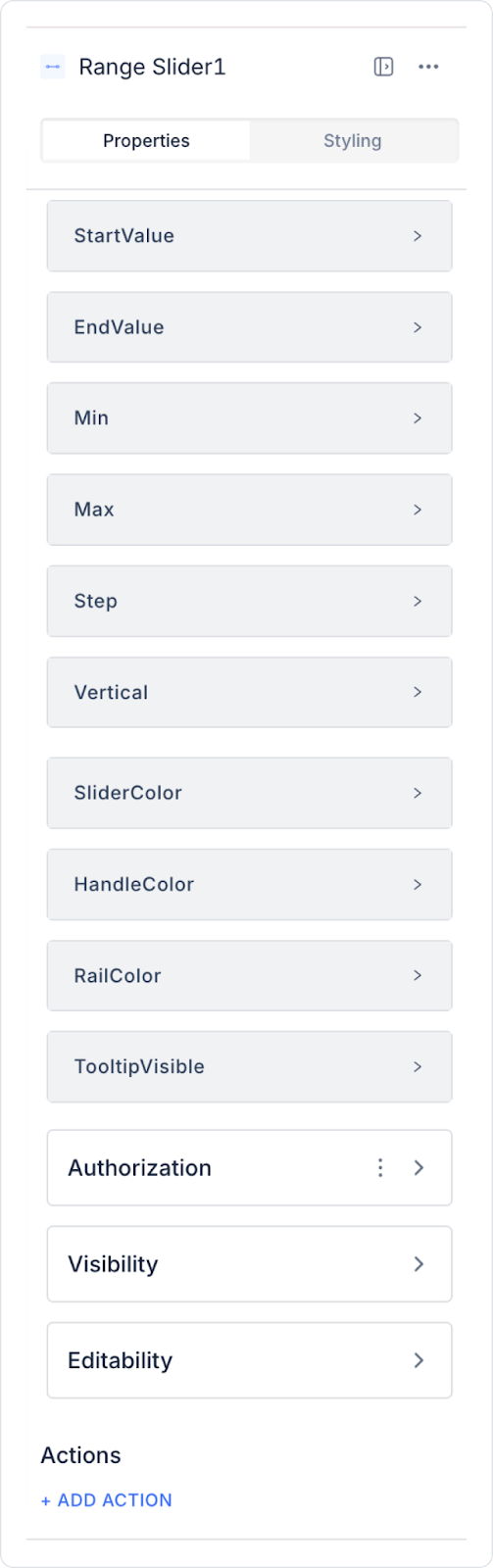
2.1. Range Slider Element Properties
You can configure the following settings from the Properties panel:
Start Value: The default starting value of the slider.
End Value: The default ending value of the slider.
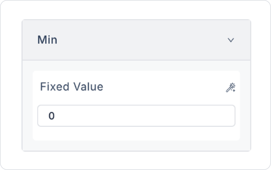
Min: The lowest value the user can select.
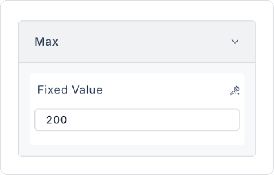
Max: The highest value the user can select.
Step: Determines how much the value changes when the slider is moved (e.g., when set to 1, the value changes by one unit each time the slider is moved).
Vertical: Allows the slider to be displayed vertically or horizontally.
Slider Color: You can set the color of the slider.
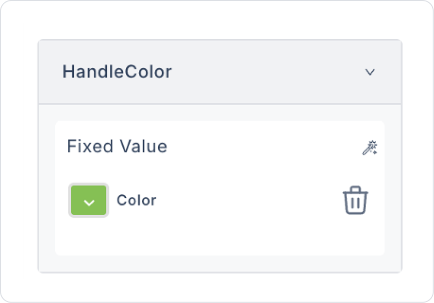
Handle Color: Determines the color of the handle on the slider.
Rail Color: Defines the color of the rail below the slider.
Tooltip Visible: Ensures that the value is visible when the slider is dragged.
2.2. Actions That Can Be Added to Elements
The Range Slider element is an interactive input element that can trigger event-based actions depending on the range value selected by the user. Actions are not linked to the element itself, but to the event triggered as a result of user interaction with the slider.
Actions for the Range Slider element can be defined via the Properties > Add Action area using the following events.
Supported Action Triggers
onChange: Triggered whenever the user changes the value or range on the slider.
Uses:
Filter based on the selected range
Update state or variables
Dynamically update components such as lists, tables, or charts
Perform range-based calculations
Display live feedback or informative text
Example scenario: When the user changes the price range, the product list is automatically filtered according to the selected minimum and maximum values.
Basic Rules Regarding Actions
The Range Slider element can trigger actions only through the onChange event.
The onChange event runs every time the slider is moved.
Multiple actions can be defined for the same onChange event.
The Range Slider element provides a powerful and intuitive user experience when used with actions, especially in filtering, range selection, and dynamic data update scenarios.
3. How to Use the Range Slider Element?
In this section, we will cover the end-to-end use of the Range Slider element through a simple scenario configured with dynamic values.
Scenario: Dynamic Price Range Selection
In an e-commerce application, the user uses the Range Slider to select a price range.
The goal in this scenario is not to filter, but simply to let the user select a range and get the slider's Min / Max / StartValue / EndValue / Step values from the data.
In the scenario:
The slider is dynamically configured when the page opens.
The user determines the range by moving the slider.
The selected range is only displayed visually on the screen (the list is not filtered).
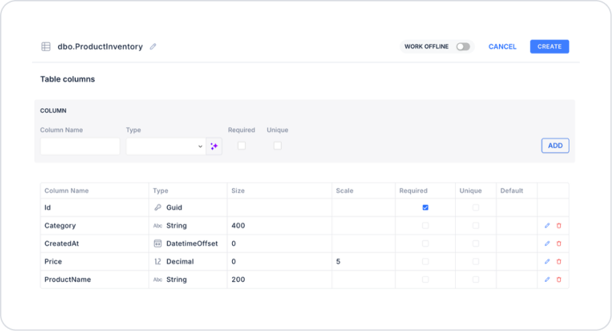
Step 1 - Creating the Data Source
Creating a table in the DataSources module:
Go to the Datasources module.
Then go to the Tables tab.
Create a new table named “ProductInventory”.
The table structure to be set up is as follows:
Important Field Names:
ProductName: Holds the name of the product in stock displayed on the screen and is shown to the user in listing and sales screens.
Category: Stores the category information to which the product belongs and is used in filtering, reporting, or grouping operations.
Price: Stores the sales price of the product and is used in total amount, cart calculation, or price range filtering operations.
Step 2 - Defining the Necessary Actions
To display and save data in the interface:
Two actions will be used in this scenario.
Add a new action from the Actions > New SQL Action tab in the Datasources module.
Action that Retrieves Data (InsertProductInventory): To test the application with sample data, add the following SQL action and press the TEST button.
When applying, delete the ProductInventory part, rewrite ProductInventory, and press Enter. This will add the correct schema name before the table name. You will also use the schema name in the following action.
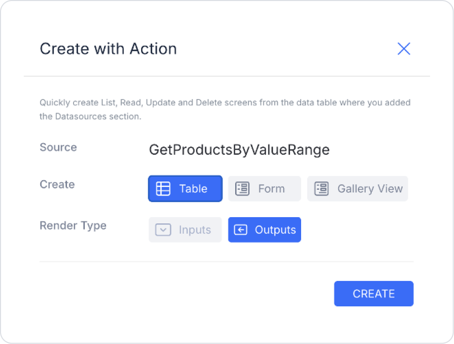
Action that Retrieves Products Based on the Scanned Barcode (GetProductsByValueRange):
SELECT
Id,
ProductName,
Category,
Price,
CreatedAt
FROM ProductInventory
WHERE Price BETWEEN @MinValue AND @MaxValue
ORDER BY Price ASC;
When applying, deleteProductInventory, rewriteProductInventory, and press Enter. This will add the correct schema name before the table name. You will also use the schema name in the following action.
Step 3 – Creating the Page
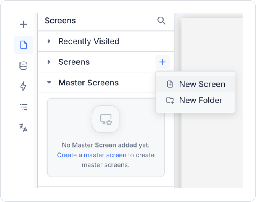
Open the UI Design module:
Create a new screen named PriceRange.
Step 4 – Adding and Configuring Elements to the Page
Drag and drop the Elements > Numeric Input > Range Slider element onto the page.
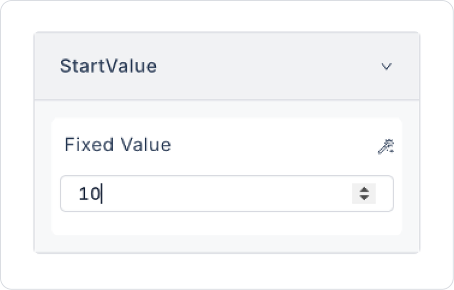
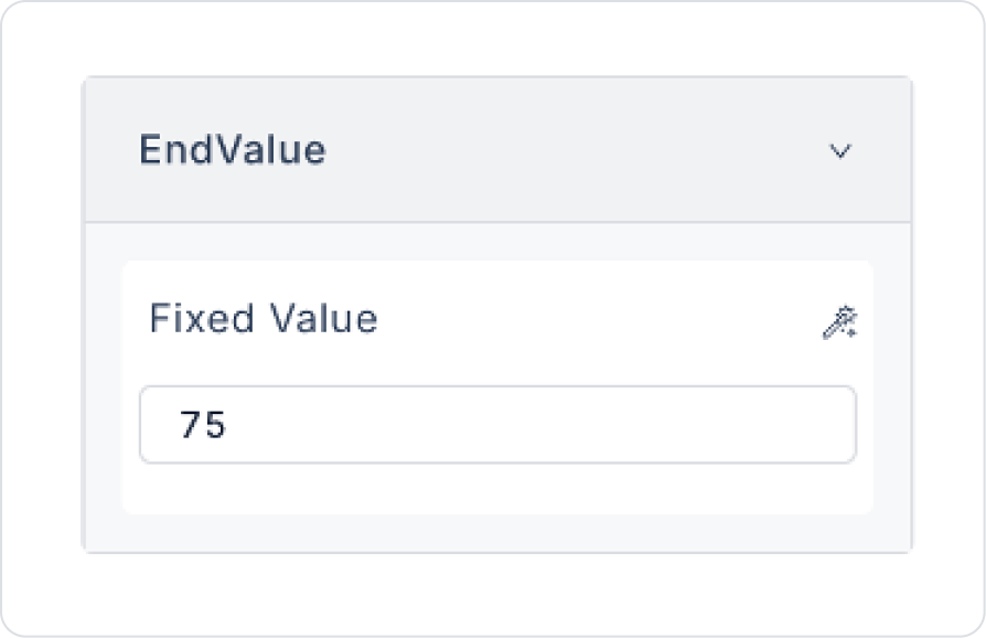
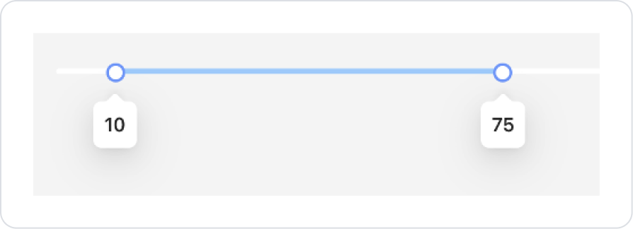
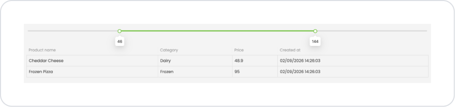
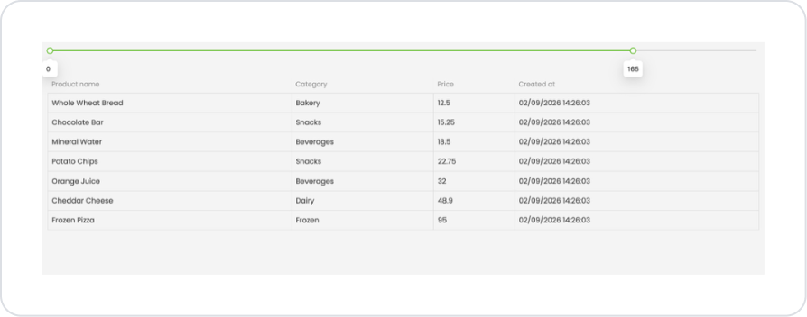
When the screen opens, set the range values to Range Slider > Properties > StartValue > 10 and EndValue > 75.
Set the minimum and maximum values in the Range Slider to Range Slider > Properties > Min > 0 and Max > 200.
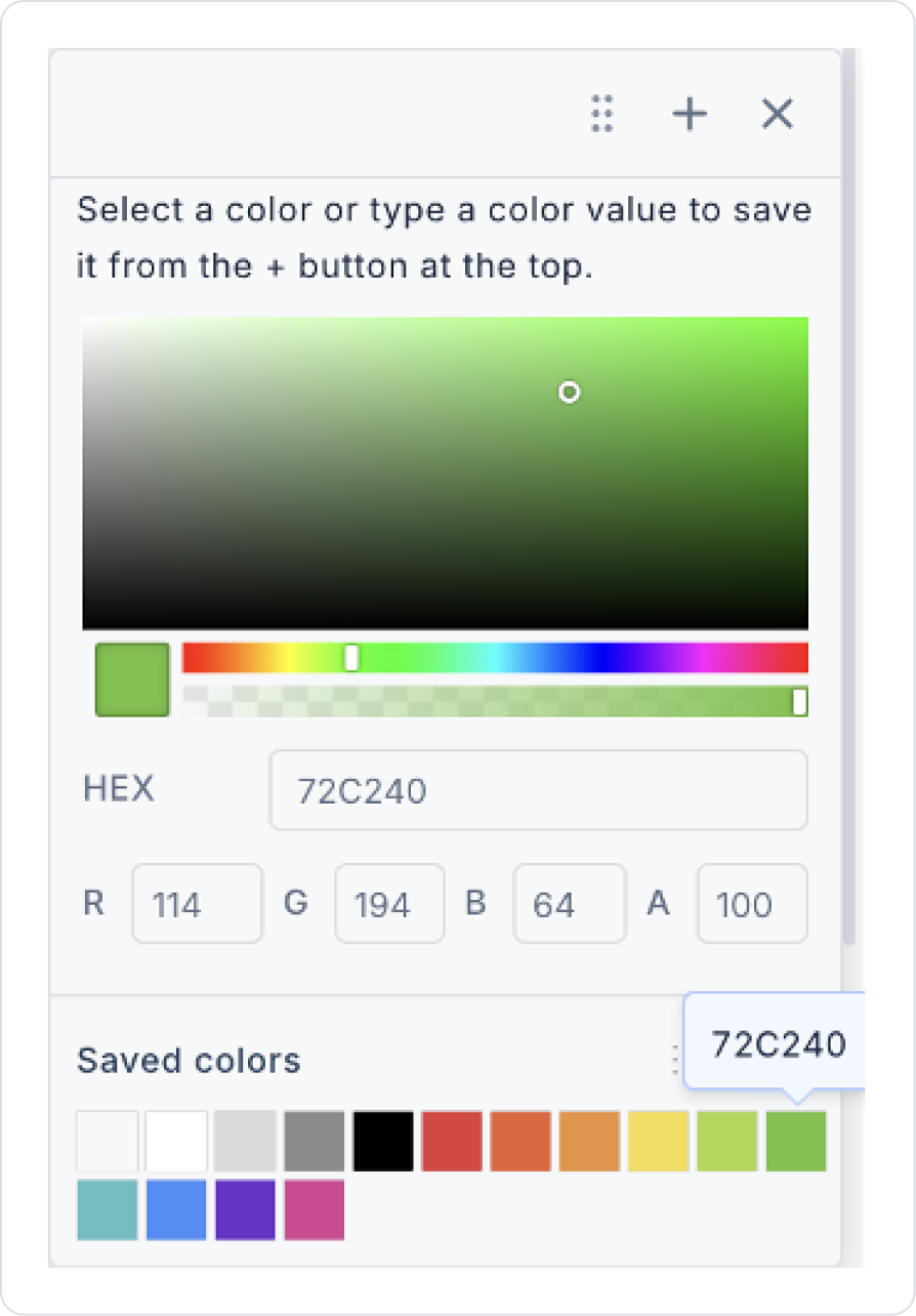
To set the color between the sliders, set the green color to Range Slider > Properties > SliderColor > 72C240.
For the handle colors, set the green color to Range Slider > Properties > SliderColor > 72C240.
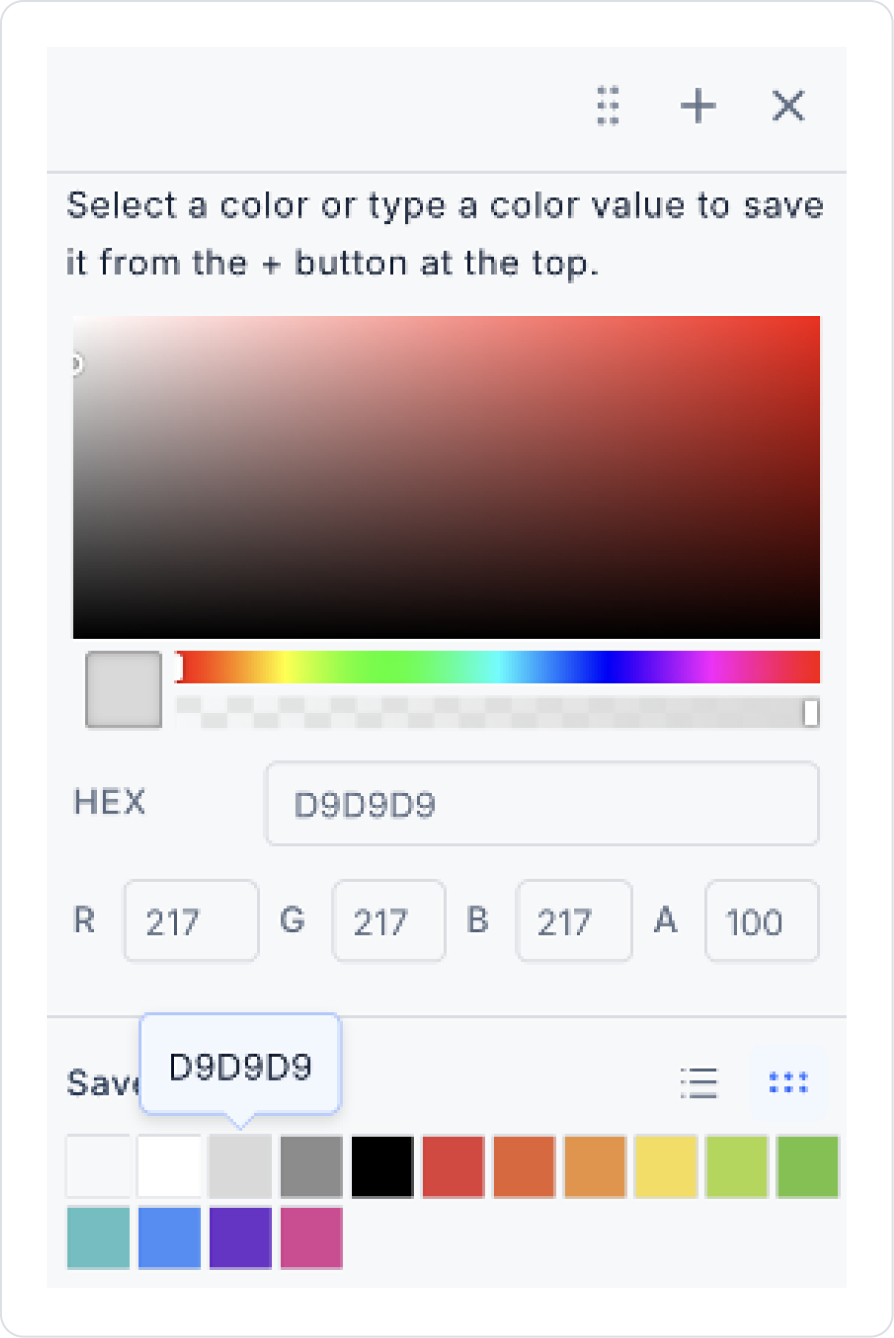
For the line color, set the color to Range Slider > Properties > SliderColor > D9D9D9.
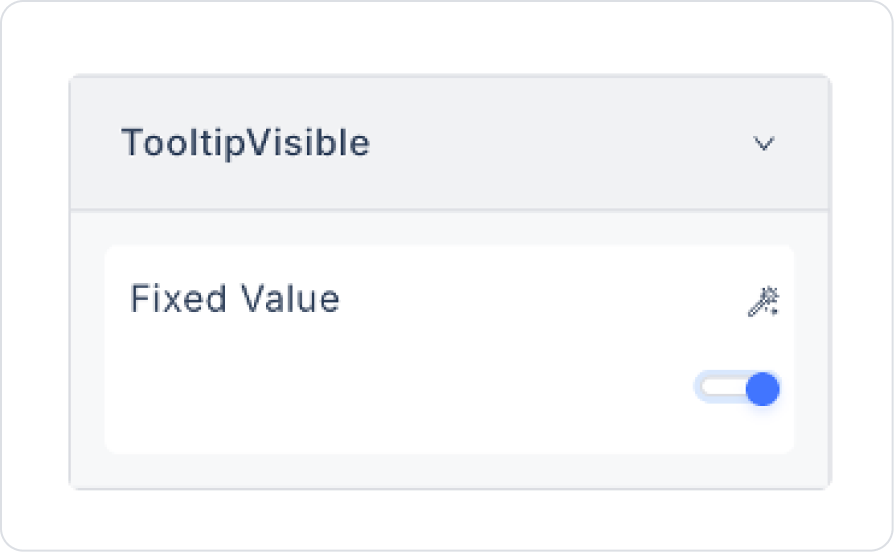
To view the selected range values, set Range Slider > Properties > TooltipVisible > On.
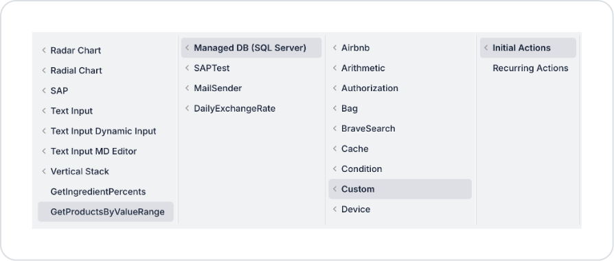
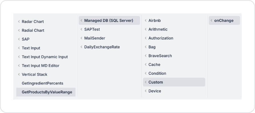
Add a pageInit Action to the screen: Add Action > Initial Action > Custom > Managed DB > GetProductsByValueRange.
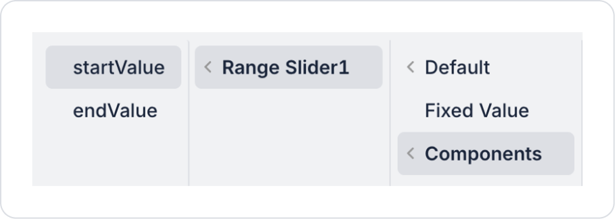
From the action parameters, define GetProductsByValueRange > MinValue > Range Slider > StartValue in the MinValue field.
In the action parameters, define the MinValue field as GetProductsByValueRange > MinValue > Range Slider > StartValue.
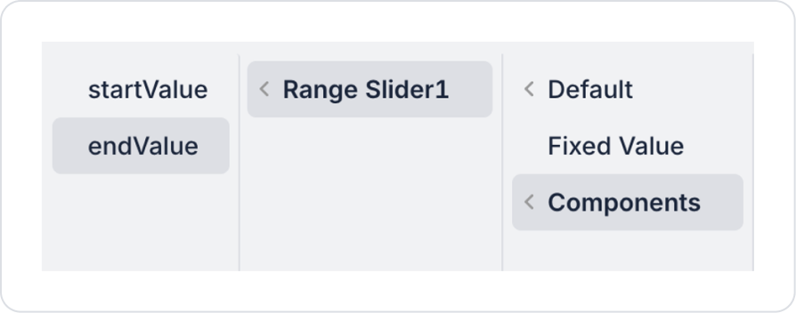
To display changes instantly, add the Range Slider > Add Action > onChange > Custom > Managed DB > GetProductsByValueRange action to the Range Slider.
Define GetProductsByValueRange > MinValue > Range Slider > StartValue in the MinValue field of the action parameters.
Define GetProductsByValueRange > MinValue > Range Slider > StartValue in the MinValue field of the action parameters.
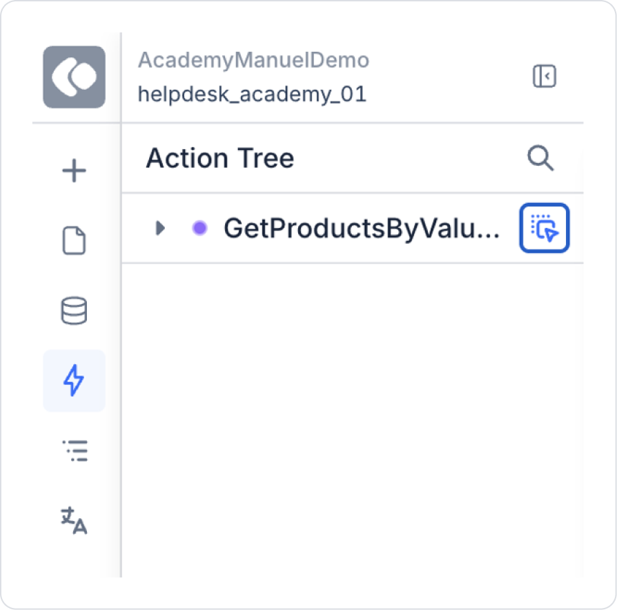
Drag the GetProductsByValueRange action from the Action Tree area on the left side of the page to the page using the blue icon next to it.
Finally, make the following definitions on the screen that opens.
Preview
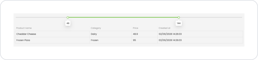
When the application is tested, the product list is dynamically filtered by selecting the minimum and maximum price range via the Range Slider at the top of the screen. The values set on the slider are updated instantly, and products that match this range are automatically displayed in the table. The selected minimum and maximum values are visually displayed to the user in the tooltip areas above the Range Slider handles. The user can quickly and easily list only the products that fit their budget or search criteria by narrowing or widening the price range. This structure provides an interactive filtering experience where products are instantly updated according to the selected price range.
4. Common Properties
Some areas on the Range Slider element are used in common across all UI elements. Therefore, detailed explanations of the following properties can be found in the relevant general guide pages:
Set minimum and maximum values appropriate for the scenario.The range that the user will actually need should be defined; overly wide or narrow ranges should be avoided.
Use the Step value consciously. Very small step values provide precision but can complicate the user experience. A step range appropriate for the scenario should be selected.
Support the selected value visually or textually. Displaying the selected minimum–maximum values next to or on the slider increases user awareness.
Manage the onChange event carefully in terms of performance. Since it is triggered every time the slider moves, be careful when binding heavy calculations or API calls to this event.
6. Limitations
Actions can only be triggered via the onChange event.
For numerical inputs requiring high accuracy, the Number Input or Currency element should be preferred.


