The Percent element is a special input element that allows users to enter numerical values in the percentage (%) format within the application. As the user enters a value, the input is automatically formatted and the percentage symbol (%) is added. This makes percentage-based data entry more understandable, consistent, and error-free.
The Percent element can be used in all scenarios where percentage values need to be entered, such as ratios, discounts, increases/decreases, success rates, commissions, and similar scenarios. Its structure, specific to the percentage format, prevents users from making incorrect or invalid entries.
The Percent element is only supported in web applications.
1.1. Common Usage Scenarios
Discount and campaign rates
Tax, commission, or service fee percentages
Success, completion, or progress rates
Increase/decrease percentage entries
Ratio-based values in performance and analysis screens
Percentage fields for filtering and reporting in management panels
2. Key Features
Automatic percentage formatting: As the user enters a value, the input is automatically formatted and the percent (%) symbol is added.
Compatible with forms and actions: The Percent element works seamlessly in form submit, state update, calculation, and validation scenarios.
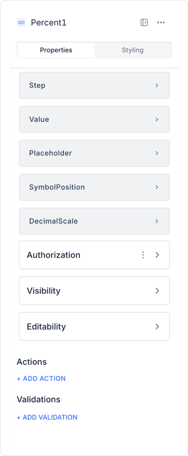
2.1. Percent Element Properties
You can configure the following settings from the Properties panel:
Step: Determines the interval at which percentage values can be entered (e.g., when set to 0.01, users can enter values in increments of 0.01).
Value: The default value initially displayed in the percentage field.
Placeholder: The placeholder text displayed when the user has not entered a value.
Symbol Position: Determines whether the percent symbol (%) appears before or after the value.
Decimal Scale: Determines the number of decimal places for the percentage value (e.g., when set to 2, the value is displayed as 12.34%).
2.2. Actions That Can Be Added to Elements
Since the Percent element is an input element that aims to receive values from the user in percentage format, it works with event-based action triggering logic. Actions are not linked to the element itself, but to the event triggered as a result of user interaction.
Actions for the Percent element can be defined via the Properties > Add Action area using the following event.
Supported Action Triggers
onChange: Triggered whenever the user changes the value in the Percent field.
Uses:
Performing instant calculations based on the entered percentage (e.g., discounted price, ratio-based amount calculation)
Update state or variables
Dynamically change the values of other fields
Display live validation or informative messages
Example scenario: When the user changes the discount percentage, the total amount is automatically recalculated and updated on the screen.
Basic Rules Regarding Actions
The Percent element can trigger actions only through the onChange event.
Actions run each time the user updates the value.
Multiple actions can be defined for the same onChange event.
In scenarios requiring intensive processing, the performance impact of actions running via onChange should be considered.
The Percent element provides an effective and user-friendly experience, especially when used with actions in ratio-based calculation and dynamic update scenarios.
3. How to Use the Percent Element?
In this section, we will cover the end-to-end use of the Percent element through a material percentage distribution scenario in an order application.
Scenario: Material Percentage Distribution
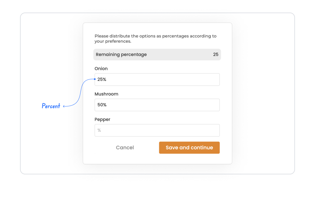
In a food ordering application, the user specifies the mix ratio of the selected ingredients as a percentage. For example, for a pizza:
Onion → 25%
Mushroom → 50%
Pepper → 25%
The total is expected to be 100%. If the user enters an incorrect distribution, they are guided by the “Remaining percentage” field.
In the scenario:
The user enters the percentage value for each ingredient in the Percent field.
The entered value is automatically displayed in % format.
The input accuracy is controlled with Step/Decimal Scale.
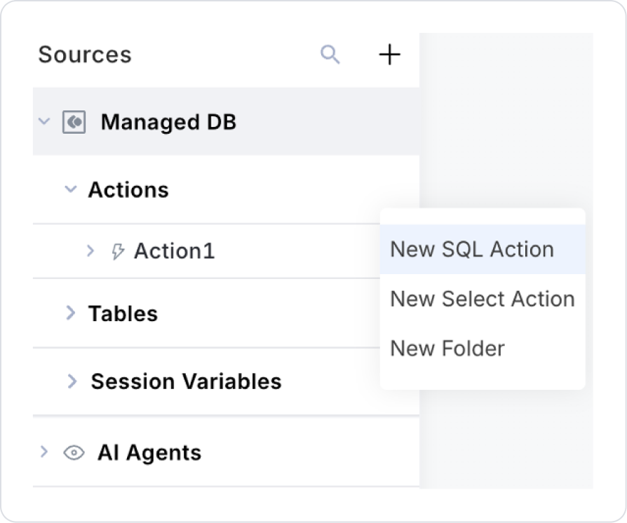
Step 1 – Creating an SQL Action
Open the DataSources module.
Go to the Actions section.
Click on the + New SQL Action option.
Set the action name as GetIngredientPercents.
SELECT *
FROM (
VALUES
(1, ‘Onion’, 25.00),
(2, ‘Mushroom’, 50.00),
(3, ‘Pepper’, 25.00))
AS IngredientsMock(Id, Name, PercentValue);
Step 2 – Creating the Page
Open the UI Design module.
From the Screens section, create a screen named IngredientMix.
Step 3 – Adding and Configuring Elements to the Page
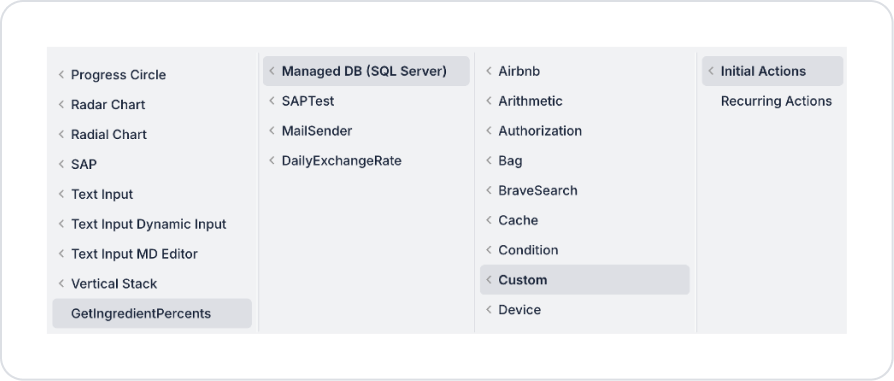
Add an Initial Action to the page. Add the Add Action > Initial Actions > Custom > Managed DB > GetIngredientPercents action.
Drag and drop the Elements > Display > Label element onto the page for the title.
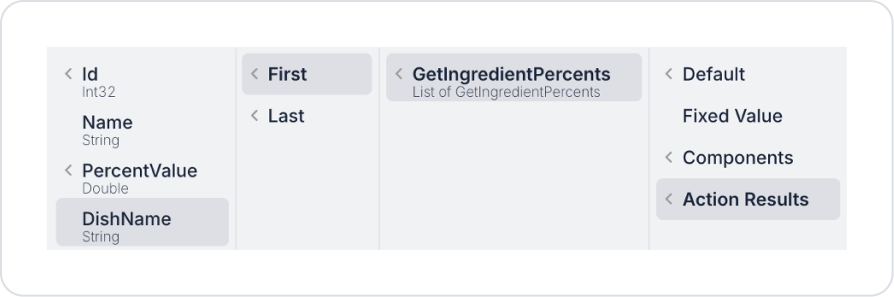
Set the text to Label > Properties > Value > Action Results > GetIngredientPercents > First > DishName.
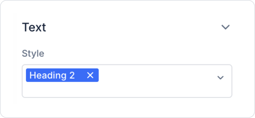
Set the text style to Label > Styling > Text > Style > Heading 2.
Drag and drop the Elements > Display > Label element onto the page for the content name.
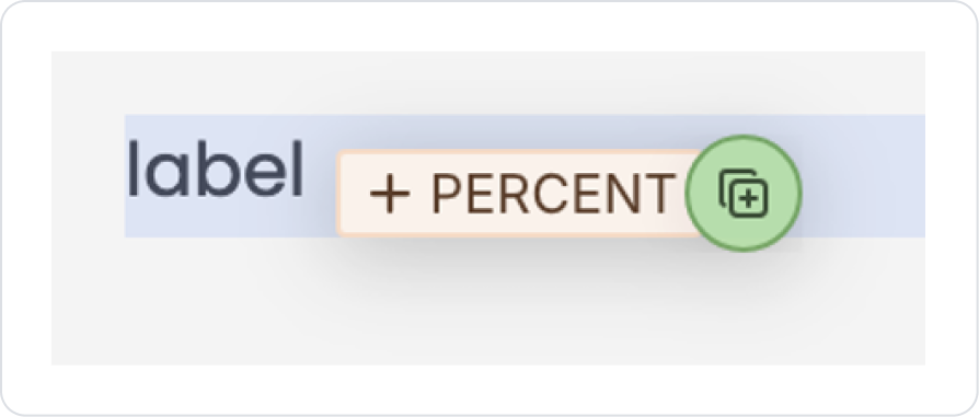
Drag and drop the Elements > Numeric Input > Percent element below the Label element.
Drag and drop the Elements > Data > GalleryView element onto the page.
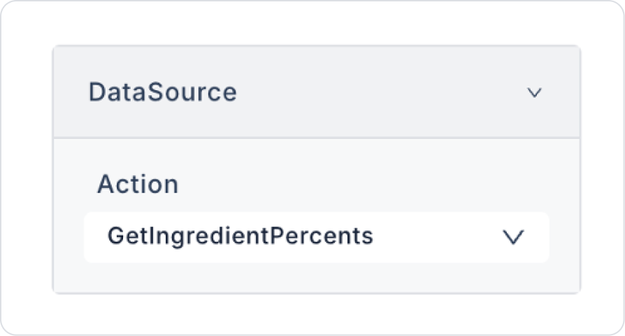
Connect the data source to the Gallery View element: GalleryView > Properties > DataSource > Action > GetIngredientPercents.
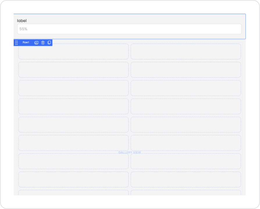
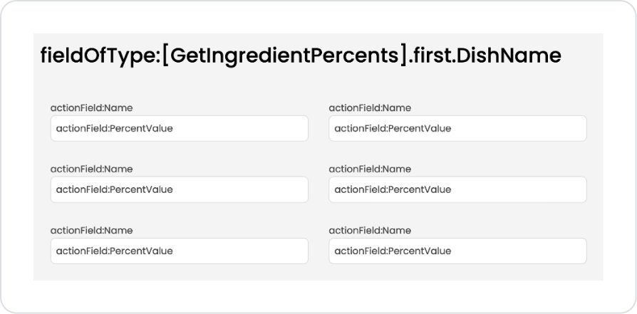
Drag and drop the Row group with Percent and Label selected into the Gallery View.
The expected result after adding it correctly to the Gallery View should look like this.
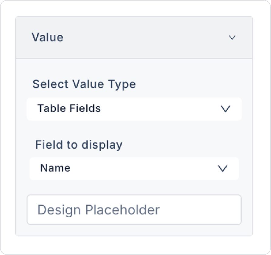
Click on the Label element and define Label > Properties > Value > Field to display > Name.
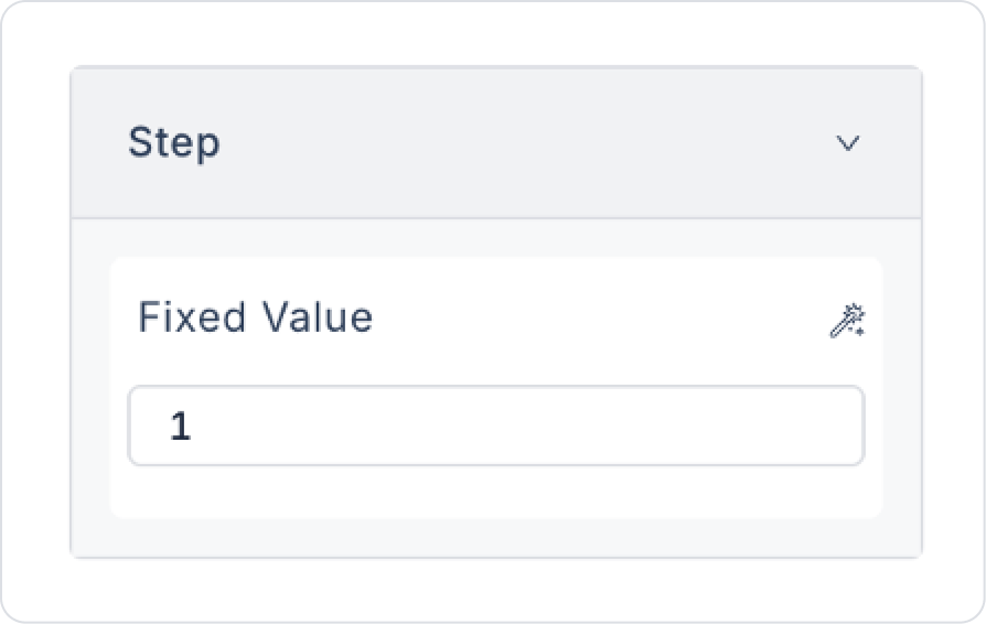
Click on the Percent element and define it as Percent > Properties > Step > 1 to determine how much increase will be made with the up and down arrow increases.
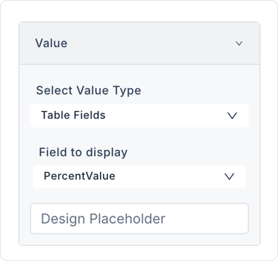
Define the percentage value as Percent > Properties > Value > Field to display > PercentValue.
Define the preview text as Percent > Properties > Placeholder > 0%.
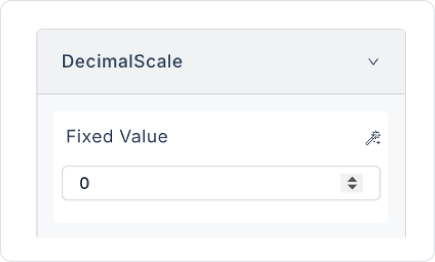
Set the value scale to Percent > Properties > DecimalScale > 0 to accurately capture the mixtures.
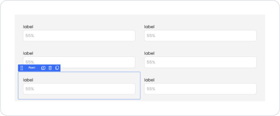
The expected page structure in the final state is as follows.
Preview
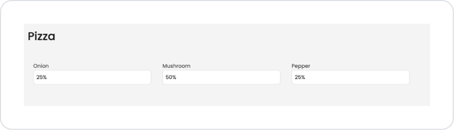
When the application is tested, the percentage content distribution of the ingredients defined under the Pizza heading is presented to the user in a visual and readable structure. Each ingredient (Onion, Mushroom, and Pepper) is listed in separate fields, and the percentage of that ingredient in the recipe is displayed opposite it. This structure allows the user to quickly review the content distribution of the pizza and clearly see the share of each ingredient in the total recipe. This screen provides a preview structure that presents the recipe contents in a simple and understandable way.
4. Common Properties
Some fields on the Percent element are used in common across all UI elements. Therefore, detailed explanations of the following properties are provided in the relevant general guide pages:
Clarify the percentage range according to the scenario. The expected value range (e.g., 0–100) should be clear and, if necessary, limited by validation.
Guide the user with a placeholder. Phrases such as 0%, Enter discount percentage help the user quickly understand the expected format.
Use the onChange event consciously. Since the Percent element only supports the onChange event, the performance impact of actions triggered on every change should be considered.
6. Limitations
Designed only for numerical entries in percentage (%) format; does not offer monetary or general numerical formatting.
Actions can only be triggered via the onChange event.
Visual customizations are limited to the Styling panel; behavioral controls are managed via Properties and Actions.


