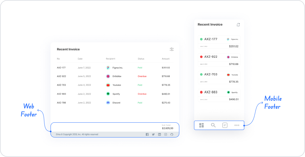
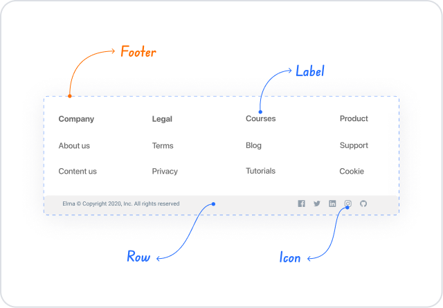
The footer element is a complementary interface element located at the bottom of your application's pages. Positioned below the page content, it is used to provide users with additional information, copyright text, navigation links, social media icons, or helpful explanations. It also allows you to create a tabbar menu in the style of a mobile application using combinations of icons and text. Balancing the overall look of the application, the Footer provides visual consistency and improves the user experience by offering additional navigation options.
The Footer element is supported in both web and mobile applications.
Create a fixed navigation area at the bottom of the page. Can be used to create a mobile app-style tabbar menu.
Placing social media icons and links (e.g., Instagram, LinkedIn, YouTube links)
Displaying additional explanations or supporting text Suitable for content such as version information, support contact information, and warning texts.
Creating designs that provide continuity throughout the page Used to ensure theme consistency and aesthetically complete the page.
Provide a “final information area” for users on very long pages. When users reach the end of the content, they can see important short notes here.
Add functional mini menus or shortcut buttons (e.g., Home, Profile, Settings, Cart buttons).
Provide quick access to support/contact components.
2. Key Features
Fixed structure at the bottom of the page. The footer element is positioned at the bottom regardless of the length of the page content and ensures design integrity.
Flexible content area. A rich submenu can be created by adding text, icons, buttons, links, and other UI elements.
Tabbar-like navigation support. It enables quick navigation by creating icon-based submenus, especially on mobile interfaces.
Custom style and layout customizations. All visual details such as background color, text color, alignment, spacing, and typography can be adjusted.
Fixed or scroll-based appearance options. Optionally, you can create a fixed footer that remains in place when the page is scrolled or a structure that moves according to the content.
Works seamlessly with other elements. The footer can be turned into a functional area by adding many elements such as Buttons, Icons, and Text.
Consistent appearance on both web and mobile interfaces. Its responsive design ensures balanced placement on all screens.
A design element that complements the page layout. It makes the end of the page more meaningful by providing additional information to the user.
2.1. Element Settings (Properties)
Unlike other UI components, the Footer element does not have a dedicated Properties panel. The Footer area functions like a container and is configured through other UI elements (Text, Icon, Button, etc.) added to it.
Therefore:
The Footer itself does not have any customizable settings.
All visual and content adjustments are made through the own Properties panels of the elements added to the Footer.
Adjustments such as background color, alignment, margin–padding are also dependent on the elements placed inside the Footer.
The Footer is a layout element; its properties are shaped by the elements it contains. It does not have its own independent Properties settings.
2.2. Actions That Can Be Added to Elements
Since the Footer element is a structural layout component, it does not support adding actions (ADD ACTION) to itself. Therefore, when the Footer is selected, no action trigger appears in the right panel.
Basic principles regarding action behavior:
Actions cannot be assigned to the Footer itself.
Actions can be added to elements such as Button, Icon, etc. within the Footer; however, these actions belong to that element, not the Footer.
The Footer only acts as a container; all functionality is provided through the elements added to it.
The footer does not have its own action triggers. Functional use is provided by the actions of other UI elements placed within the footer.
3. How to Use the Footer Element?
In this section, we will discuss the end-to-end use of the footer element through an example scenario.
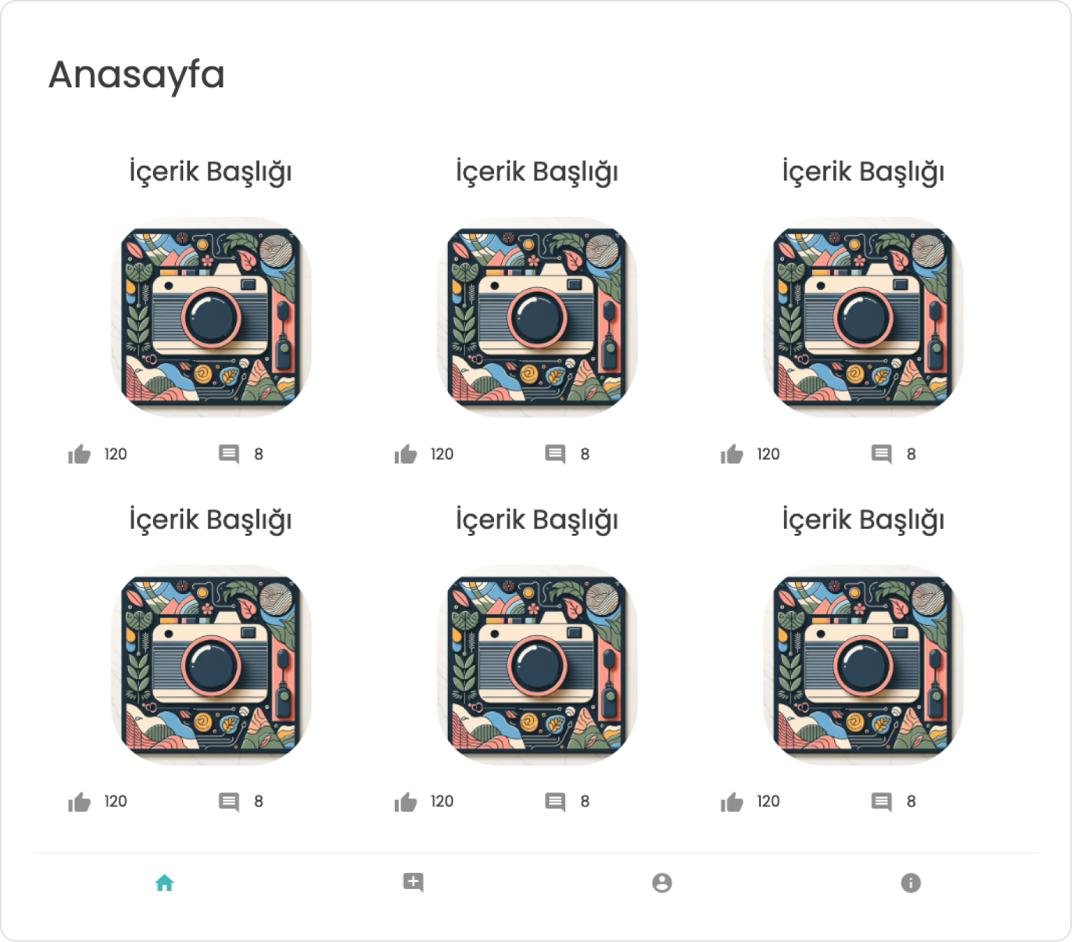
Scenario: Social Media Platform
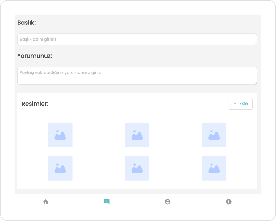
In a social media application, users navigate the platform using the Footer area located at the bottom of the page. The Footer provides quick access to four main pages that provide the application's basic navigation: Home, Add Comment, Profile, and Info pages.
In the scenario:
The Footer is the app's main navigation area.
Users can quickly access the Home, Add Comment, Profile, and Info pages from here.
Each icon triggers an action that directs the user to the relevant page.
Step 1 - Adding Elements and Editing Styles
Initially on the home page:
Open the UI Design module.
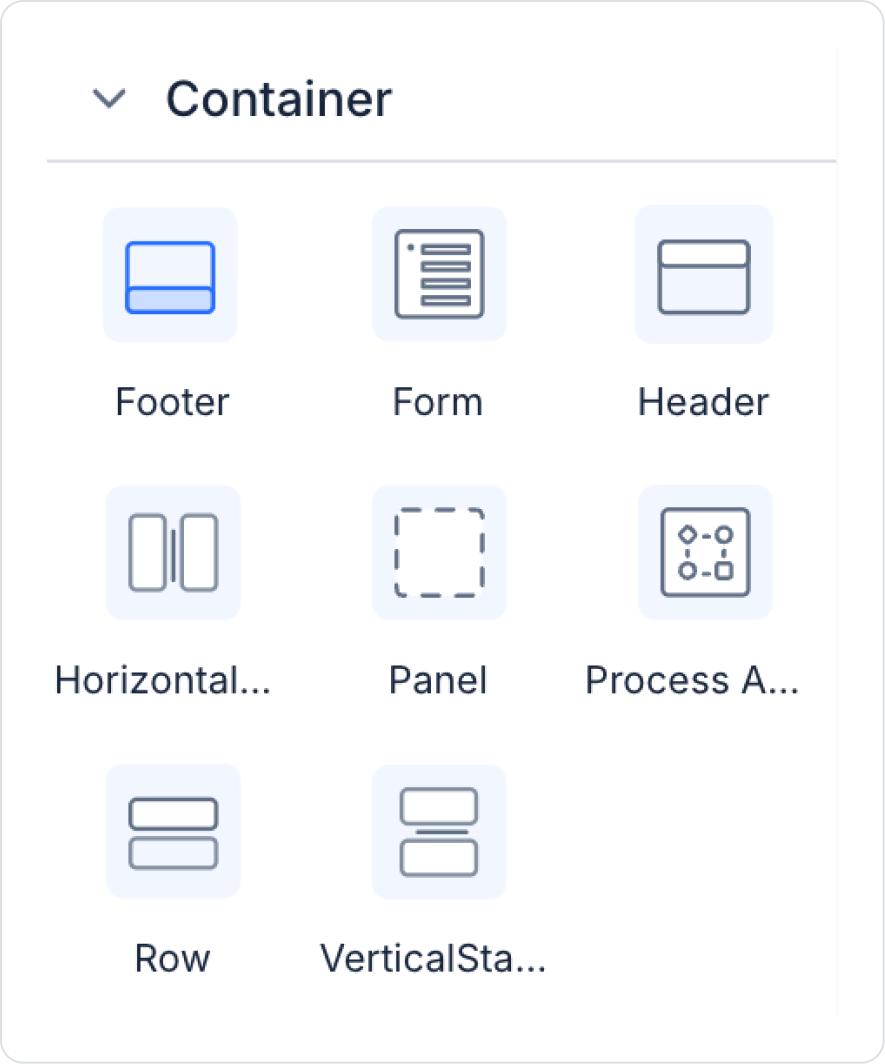
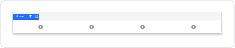
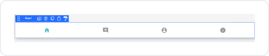
From the left side panel, click on the Elements > Container > Footer element.
Drag and drop the Elements > Container > Row element into the Footer.
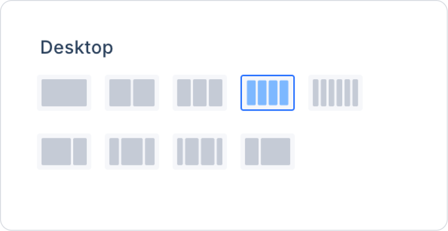
In the Row element, select the following option in the Row > Properties > Desktop setting.
Click on the Col field within the Row. Within Col, select center alignment vertically and horizontally from Col > Styling > Align.
Drag and drop the Elements > Display > Icon element from the left side panel into each Col.
Step 2 - Configuring Element Settings
Within the added icons:
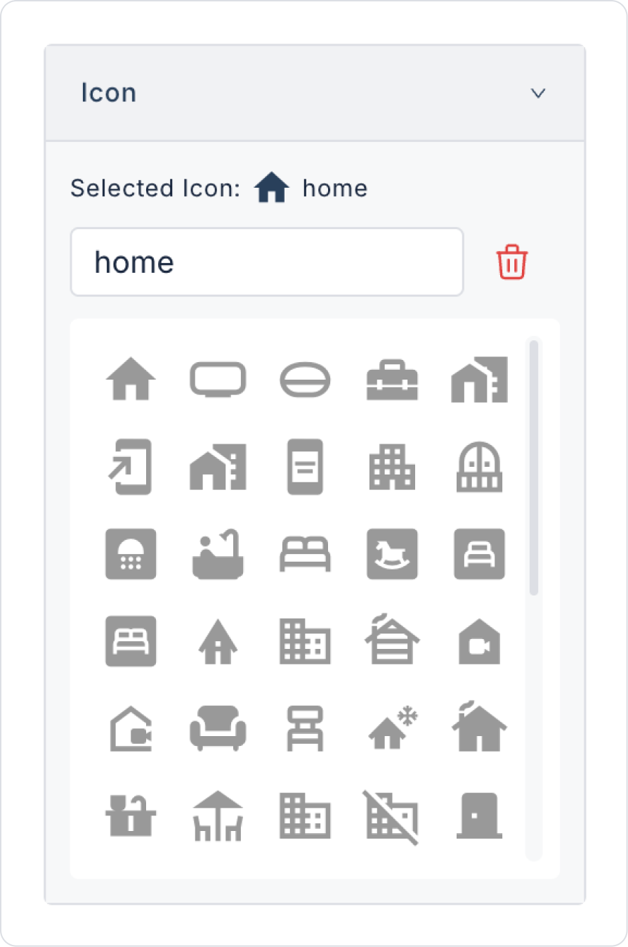
Click on the first icon element. Add the ‘home’ icon to the Icon > Properties > Icon field within the element.
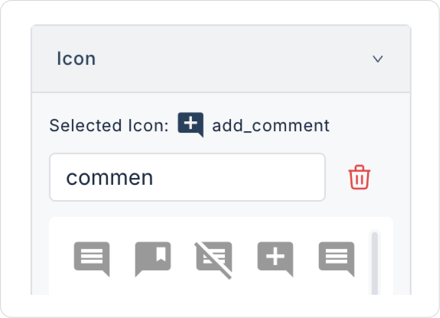
Click on the second icon element. Within the element, add the “add_comment” icon to the Icon > Properties > Icon field.
Similarly, click on the third icon element. Within the element, add the ‘account_circle’ icon to the Icon > Properties > Icon field.
Click on the fourth icon element. Within the element, add the “info” icon to the Icon > Properties > Icon field.
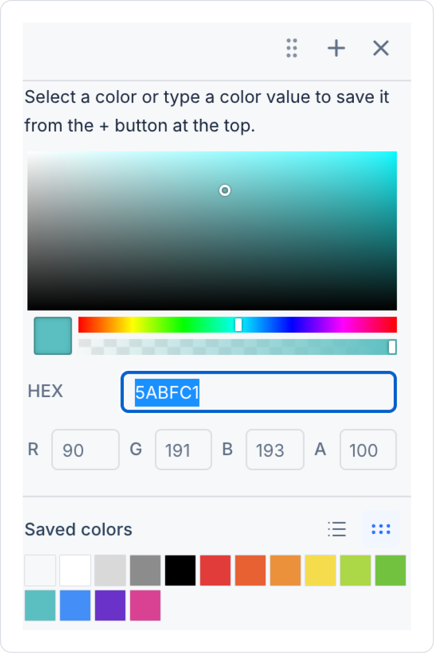
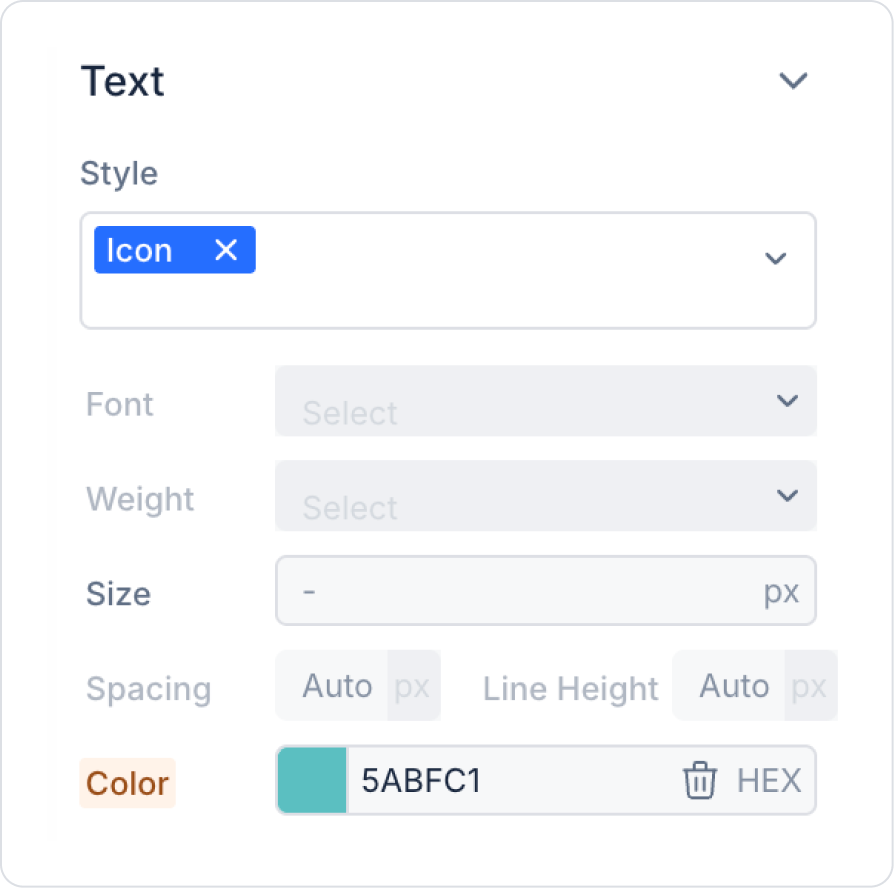
Since we are on the home page, click on the first icon. In the Icon > Styling > Text > Color field, select the color “5ABFC1”.
Add the footer element Elements > Container > Footer to the other Add Comment, Profile, and Info pages you will use and leave it blank. You can add your new pages via the left side panel Screens > New Screen.
Step 3 - Add Action
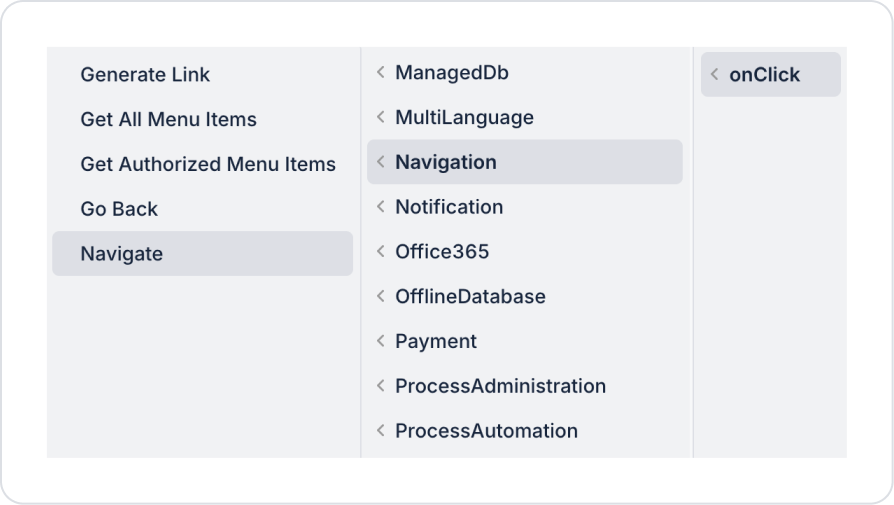
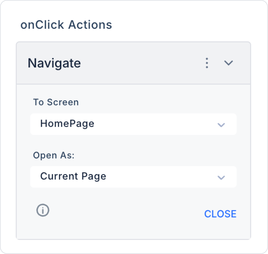
Click on the Home icon. Select Icon > Properties > Add Action > onClick >Navigation > Navigate.
Within the Navigate action, add the Navigate > To Screen > HomePage home screen.
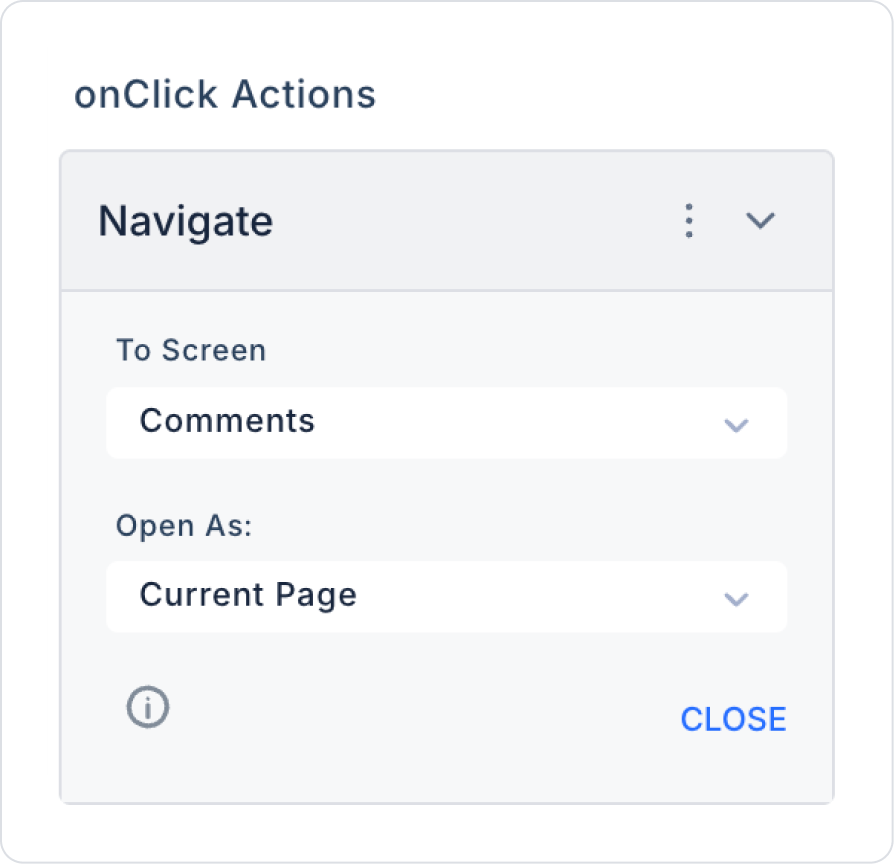
Similarly, click on the second comment addition icon. Select Icon > Properties > Add Action > onClick >Navigation > Navigate.
Within the Navigate action, add the comment addition screen by selecting Navigate > To Screen > Comments.
Perform similar steps within the Profile and Information pages.
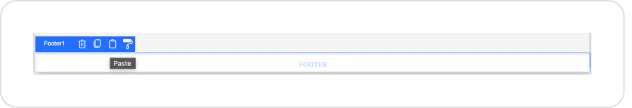
Step 4 - Copying the Footer Element to Other Pages
Go to the homepage screen you created, select the Row element within the footer, and click the third option, the Copy button.
Go to the Add Comment page, click inside the empty Footer element, and press the third option, the Paste button.
Click on the home page icon, click the trash can button in the Icon > Styling > Text > Color field, and clear it.
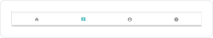
Click on the add comment icon, select the color ‘5ABFC1’ in the Icon > Styling > Text > Color field.
Perform similar steps on the Profile and Info pages.
Preview:
When tested, clicking on the relevant icons in the footer redirects to the pages. In the example scenario, the comment addition page was clicked and redirected to the page.
4. Common Properties
Some areas on the footer element are used commonly across all UI elements. Therefore, detailed explanations of the following properties are provided in the relevant general guide pages:
Keep the footer simple and functional. When the page footer is unnecessarily cluttered, the user experience is negatively affected.
When creating a tabbar on mobile interfaces, use a combination of icons + short text.
This makes navigation more understandable.
Keep the alignment of elements placed in the footer consistent. Decide on left, center, or right alignment and maintain consistency.
It is a useful area for version notes, copyright information, or help links.
If you are using icons, consider adding tooltips. This provides clear navigation, especially in tabbar scenarios.
6. Limitations
The footer does not have its own Properties panel. All settings are made through the elements added to it.
The footer cannot trigger actions on its own. Functionality is only provided through the elements it contains.
Background color, padding, or margin settings cannot be made directly through the footer. They are resolved through the Container or Text elements inside it.


