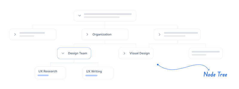
Kuika's Node Tree element allows you to visualize dynamic data in a hierarchical tree structure. It is a solution for projects where multi-level relational data structures need to be presented in a readable format. Users can explore the data hierarchy step by step by expanding or collapsing branches.
This element is frequently preferred in scenarios such as organizational charts, category–subcategory structures, file directories, product groups, process relationships, or hierarchical representations of user roles. Node Tree enables you to dynamically create comprehensive structures by integrating with data sources.
The Node Tree element can only be used in web applications.
1.1. Common Use Cases
Creating Organizational Charts: Can be used to display department, team, role, and sub-role relationships in a hierarchical structure.
Category–Subcategory Structures: Can be used for e-commerce product groups, content categories, or multi-level classifications.
Visualizing File/Folder Structures: Effective for displaying nested directories such as documents, folders, or project structures.
Displaying Hierarchical Dependencies: Suitable for process steps, linked tasks, or datasets with parent–child relationships.
User – Role – Permission Maps: Can be used to show which permissions a user has or the permission chain.
Interfaces with Tree Structure Navigation: Used in screens where menus are nested, new screens are accessed by clicking on subheadings, or details are reached step by step.
2. Key Features
Hierarchical Data Visualization: Data structures with parent–child relationships can be displayed in a multi-level tree view.
Dynamic Data Loading: Node Tree can automatically build structures using data from the Datasource. This means that when the data is updated, the tree structure is also updated.
Clickable Node Structure: Each node is clickable, allowing actions such as opening detail screens, making selections, or triggering other operations.
Customizable Node Content: Node titles, icons, colors, and text structures can be customized according to business needs
Flexible Data Binding: Fields such as Parent ID, Node ID, and Display Name can be configured via Properties to match specific data columns.
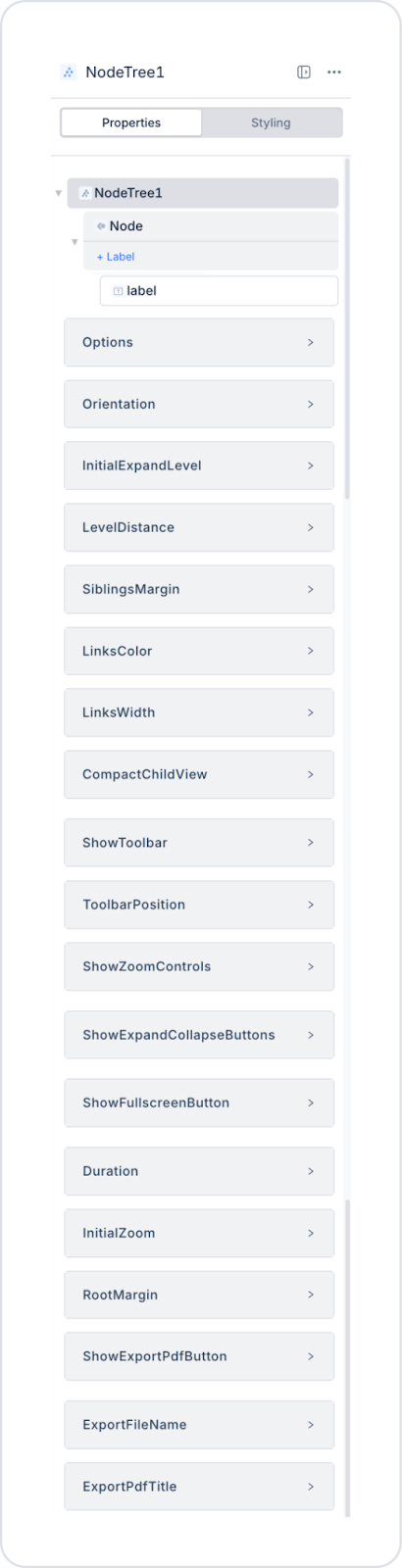
2.1. Node Tree Element Properties
When you select the Node Tree element, you can configure the tree's data source, display structure, and node behaviors in detail via the Properties panel on the right. All settings are explained below.
Visual and Size Settings
Node Width / Node Height: Determines the width and height values of node boxes. Can be adjusted dynamically. Used especially for nodes with long content or structures similar to card designs.
Background Color: Determines the node background color. Can be used for theme matching or level-based coloring.
Connection Height: Affects the length and visual spread of the connection lines between nodes.
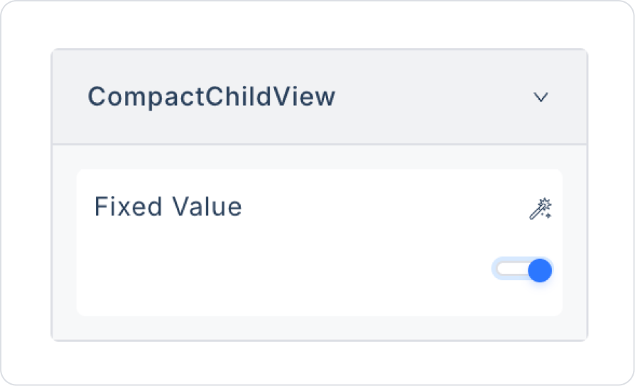
Compact Child View: Enables child nodes to be displayed in a more compact form. Optimizes screen usage in large data trees.
Toolbar and Interaction Settings
Show Toolbar: Determines whether the toolbar is displayed on the Node Tree.
Toolbar Position: Sets the position of the toolbar (e.g., top, bottom, etc.).
Show Zoom Controls: Displays the zoom in and zoom out control buttons.
Show Expand / Collapse Buttons: Displays the buttons for expanding and collapsing nodes in bulk.
Show Fullscreen Button: Provides the option to view the Node Tree area in full-screen mode.
Show Export Pdf Button: Allows the Node Tree structure to be exported as a PDF.
Animation and Initial Behavior
Duration: Sets the animation duration (in ms) for opening/closing nodes.
Initial Zoom: Sets the initial zoom level to be applied when the Node Tree is first loaded.
Root Margin: Sets the space between the root node and the top edge. This provides visual balance, especially in vertical structures.
Link and Line Settings
Links Width: Specifies the thickness of the connection lines between nodes.
PDF Export Settings
Export File Name: Specifies the file name to be used when exporting as PDF.
Export Pdf Title: Specifies the title text to be displayed in the PDF.
Label Element Properties Added to the Node
You can drag as many Labels as you want into the Node Tree. Each added element appears as part of the Node. The following settings are specific to the Label element marked in the image:
Label Element Settings (Within the Node)
Value: Specifies the static text or dynamic data to be displayed on the Label.
Via the Symbol Picker:
Current → columnName can be selected to link data belonging to the node.
Max Line: Determines the maximum number of lines the Label content will be displayed in. Used to prevent long titles from overflowing.
Formatter: Used to format the Label content. For example:
Text → Uppercase
Number → Money format
Date → dd/MM/yyyy
Tooltip: Determines the explanatory text that will be displayed when the user hovers over the Label. This is particularly useful for long node names.
Node Tree Usage and Customization
Every UI element added within the Node can be linked to the node data using Symbol Picker → Current.
The Node Tree automatically creates its own layout; Layout settings are specific to the Node Tree, not the Node element.
The tree structure is automatically updated based on the data; changing the data set reshapes the entire structure.
To ensure visual consistency, elements such as Label and Image can be positioned within the node box.
2.2. Actions That Can Be Added to the Node Tree Element
The Node Tree element offers a limited but powerful action structure for enabling user interaction on hierarchical data structures. Only the onNodeClick trigger can be used on the Node Tree. This action can be defined via the ADD ACTION button in the Properties panel when the element is selected.
The following points explain how actions work in the Node Tree:
The Node Tree only supports node-based click interactions.
When the user clicks on a node, onNodeClick is triggered.
onNodeClick ensures that the node's data (e.g., NodeID, ParentID, Name, etc.) is sent to the action as a parameter. This allows operations to be performed specifically on the clicked node.
The Node Tree does not trigger actions such as hover, selection, or expand-change, other than clicking. Expansion/collapse operations are only visual behaviors and do not generate actions.Actions such as data updates or redirecting to other screens are performed via the onNodeClick action.Scenarios requiring user interaction (e.g., “open details when node is selected,” “fetch related sub-data”) are entirely managed via onNodeClick.Node Tree does not initiate actions internally; all business logic is controlled externally via the action triggered after a click.Multiple action types cannot be defined on the Node Tree; the element supports only a single user interaction (node click).
3. How to Use the Node Tree Element?
In this section, we will cover the end-to-end use of the Node Tree element through example scenarios.
Scenario: Employee Hierarchy and List View
In an HR application, a table-based employee list and hierarchical structure are used together to easily track employees within the organization and clearly display the organizational structure. This structure allows managers to quickly analyze the team structure by presenting the basic information for each employee in an organized and readable manner on a single screen.
The employee list displays critical fields such as name, position/title, manager, department, start date, and employment status in columns. Each row represents a single employee, with the employee's profile picture or icon positioned at the beginning of the row for visual support.
Users can scroll down the list to review employees and filter and sort by department, position, or employment status. The hierarchical view makes it easy to distinguish between managers and their team members. This structure allows HR teams to clearly visualize the organizational chart and quickly and accurately assess the personnel structure.
In the scenario:
The employee list is presented in a table structure on a row-by-row basis.
Each row displays the employee name, title/position, department, manager they report to, and employment status information in that order.
The profile image or icon on the left side of the row visually represents the relevant employee.The title and department information clearly show the employee's position within the organization.
Users can compare employees from the list and quickly access basic personnel information at a glance.
Step 1 - Creating a Data Source
Creating a table in the DataSources module:
Go to the Datasources module.
Then go to the Tables tab.
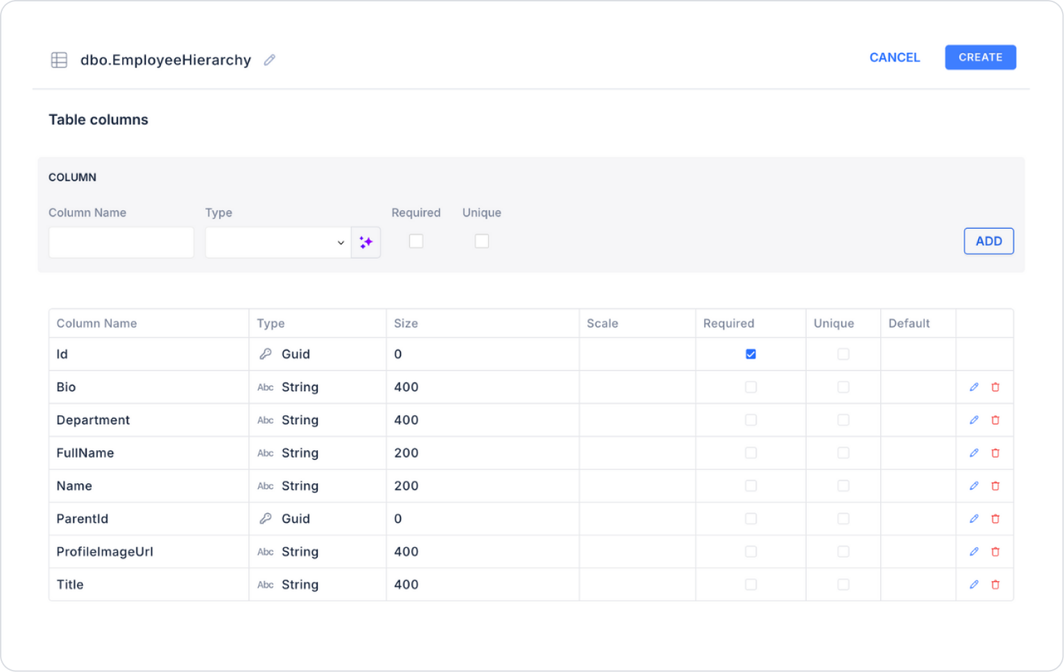
Create a new table named “EmployeeHierarchy”.
The table structure to be set up is as follows:
Important Field Names:
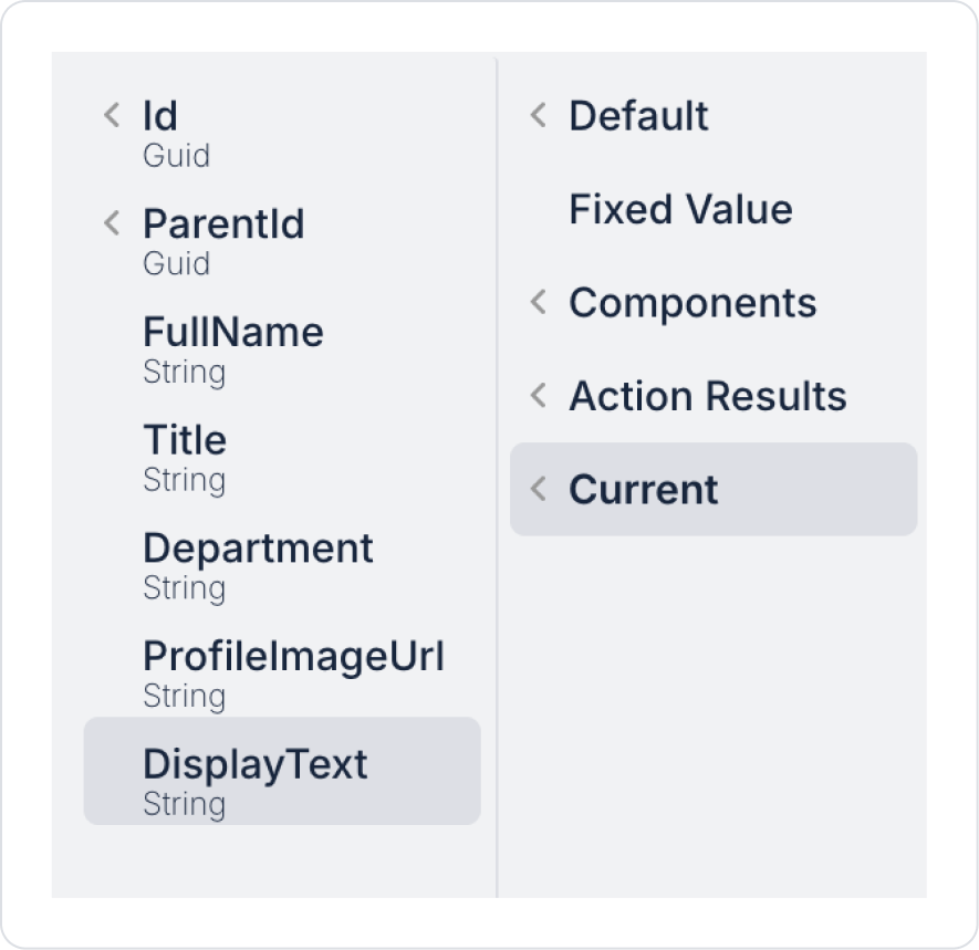
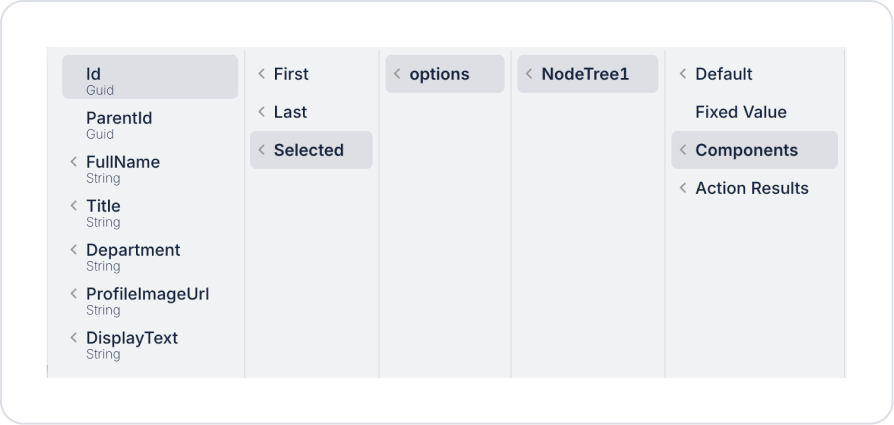
Id: Represents the employee's unique ID information. It ensures that each record is uniquely identified within the hierarchical structure and is used as the root node ID in the Node Tree structure.
ParentId: Represents the employee's superior manager or unit information. This field establishes the employee-manager relationship and correctly builds the organizational hierarchy in a tree structure. It can be left blank for top-level (root) records.
FullName: This is the employee's visible name displayed in lists and hierarchical views. It allows users to quickly recognize and distinguish employees.
Name: This holds the employee's short name, code, or alternative display information. It can be used for simple naming in training, demo, or guide scenarios.
Title: Indicates the employee's position or title within the organization (e.g., Executive, HR Manager, Software Specialist). It is a descriptive field that facilitates understanding of the hierarchical structure.
Department: Indicates the department to which the employee belongs. It enables department-based analysis in lists and filtering operations.
ProfileImageUrl: Contains the URL of the employee's profile image. Enhances the user experience by providing visual support in list or Node Tree views and helps distinguish records more easily.
Step 2 - Defining the Necessary Actions
To display and add data in the interface:
You need to define two actions.
Add a new action from the Actions > New SQL Action tab in the Datasources module.
Action Adding Sample Data (InsertEmployeeHierarchy): Add the following SQL action to test the application with sample data and press the TEST button.
DECLARE @Manager UNIQUEIDENTIFIER = NEWID();
DECLARE @HR UNIQUEIDENTIFIER = NEWID();
DECLARE @IT UNIQUEIDENTIFIER = NEWID();
DECLARE @Dev UNIQUEIDENTIFIER = NEWID();
INSERT INTO EmployeeHierarchy
(Id, ParentId, FullName, Name, Title, Department, ProfileImageUrl, Bio)
VALUES
(@Manager, NULL, N'Employee 001', N'EMP-001', N'Senior Manager', N'Management',
N'https://i.pravatar.cc/300?img=12',
N'Manager responsible for corporate management and team coordination processes.'),
(@HR, @Manager, N'Employee 002', N'EMP-002', N'HR Manager', N'Human Resources',
N'https://i.pravatar.cc/300?img=32',
N'Manager responsible for recruitment and employee relations processes.'),
(@IT, @Manager, N'Employee 003', N'EMP-003', N'IT Manager', N'Information Technology',
N'https://i.pravatar.cc/300?img=56',
N'Manager responsible for managing the technical team and system infrastructure.'),
(@Dev, @IT, N'Employee 004', N'EMP-004', N'Software Specialist', N'Information Technologies',
N'https://i.pravatar.cc/300?img=8',
N'Technical expert who plays an active role in application development processes.');
When applying, delete the EmployeeHierarchy part, rewrite EmployeeHierarchy, and press Enter. This will add the correct schema name in front of the table name.
Action that provides personnel (GetEmployeeHierarchy):
SELECT
Id,
ParentId,
FullName,
Title,
Department,
ProfileImageUrl,
(Title + N' • ' + Department) AS DisplayText
FROM EmployeeHierarchy;
When applying, delete the EmployeeHierarchy section, rewrite EmployeeHierarchy, and press Enter. This will add the correct schema name before the table name.
When applying, delete the EmployeeHierarchy part, rewrite EmployeeHierarchy, and press Enter. This will add the correct schema name in front of the table name.
Step 3 - Adding Initial Action
Initially on the home page:
Open the UI Design module.
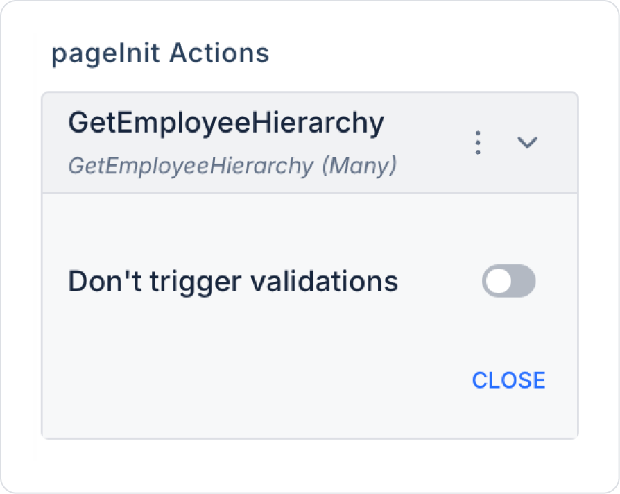
Add the Add Action > Initial Action > Custom > Managed Db > GetEmployeeHierarchy action to the page.
Step 4 - Setting Elements on the Home Page
Drag and drop the Elements > Data > NodeTree element from the left side panel onto the page.
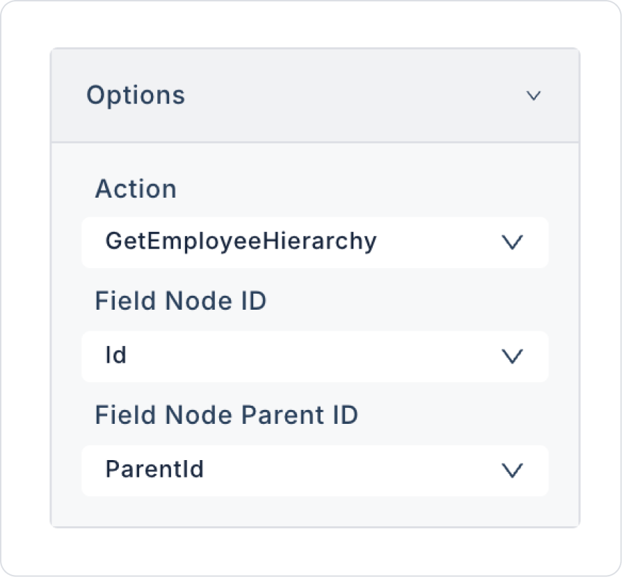
Configure the NodeTree > Properties > Options > Action > GetEmployeeHierarchy definition that provides data to the Node Tree element.
Apply the relevant definitions to the newly opened fields as follows.
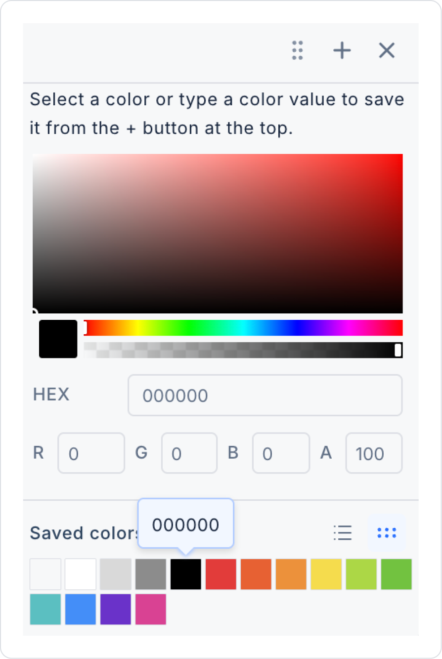
Set the colors of the connection lines to NodeTree > Properties > LinksColor > HEX > 000000.
For a more organized look, set NodeTree > Properties > CompactChildView> On.
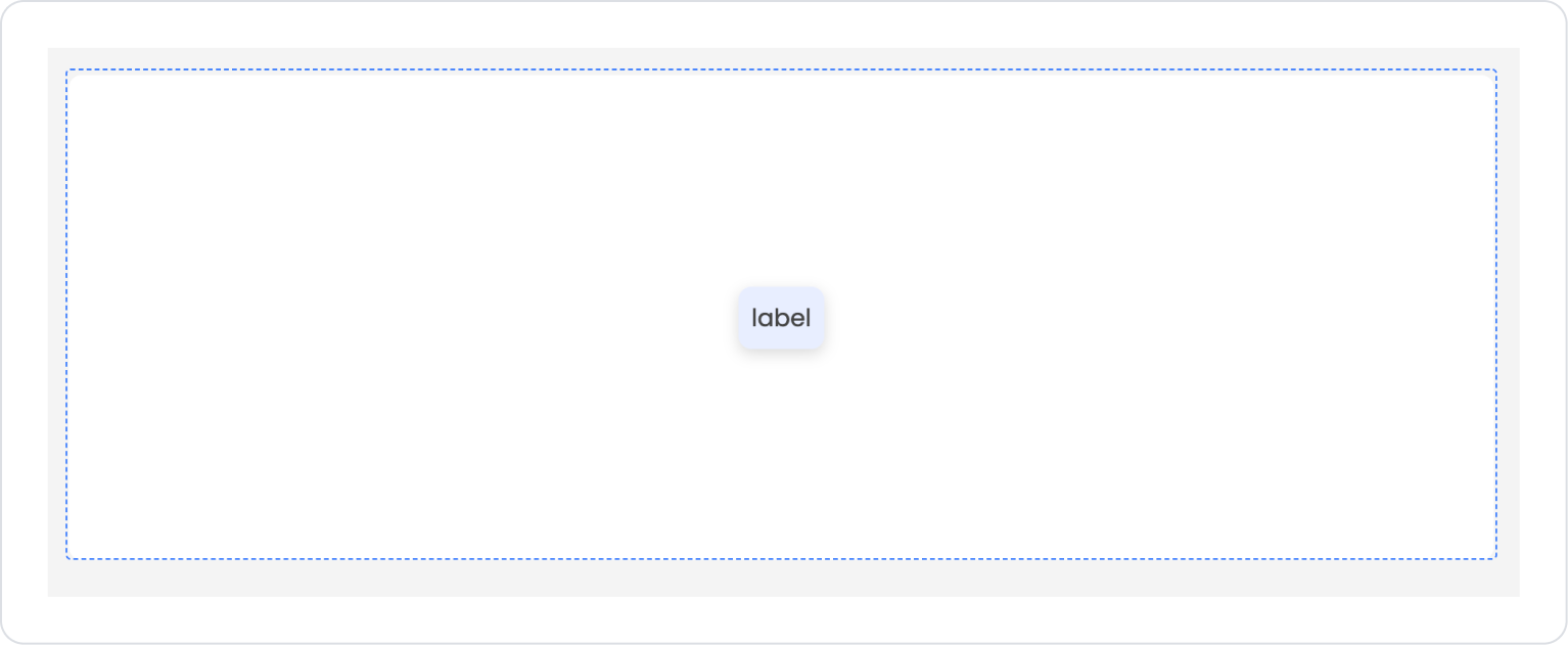
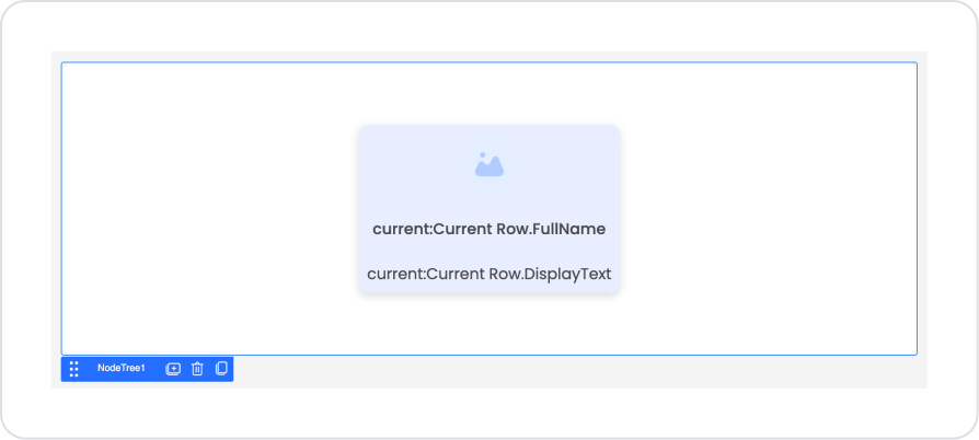
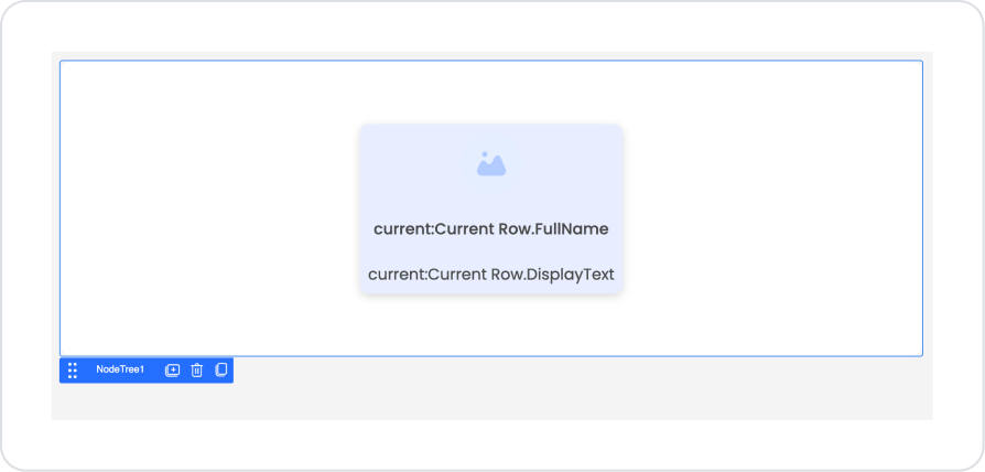
Drag and drop the Elements > Container > VerticalStack element under the label element in the Node Tree area.
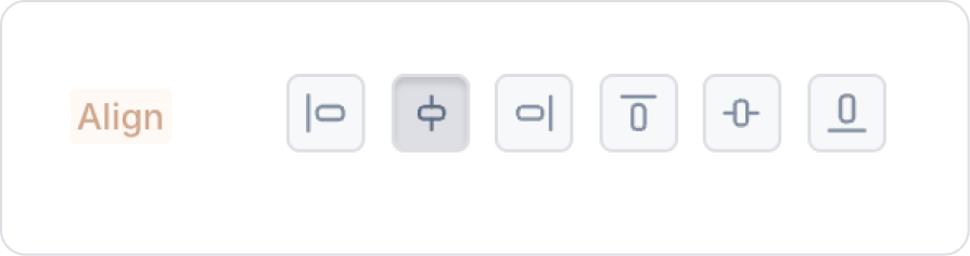
To center the contents of the Vertical Stack element, set VerticalStack > Styling > Layout > Align > Horizontally Center.
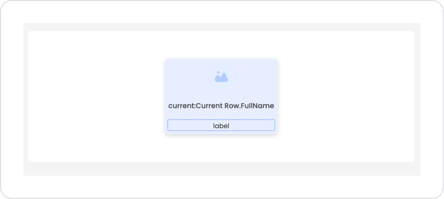
Drag and drop the Label element into the Vertical Stack.
Drag and drop the Elements > Display > Image element onto the Label element.
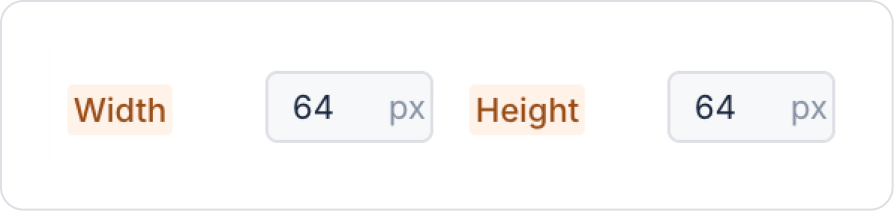
Click on the Image element. Set its dimensions to Image > Styling > Width and Height > 64 px.
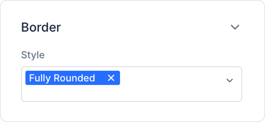
Set the border style to Image > Styling > Style > Fully Rounded.
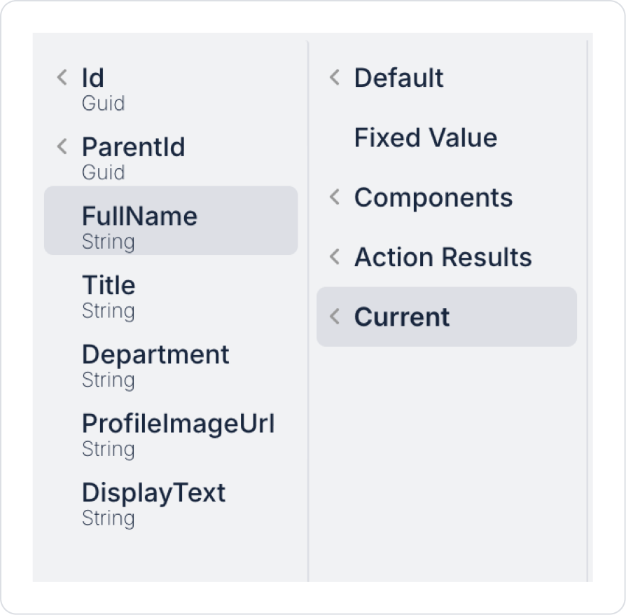
In the Image element, define Image > Properties > Value > Current > ProfileImageUrl.
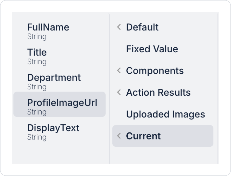
Click on the Label element. Define Label > Properties > Value > Current > FullName.
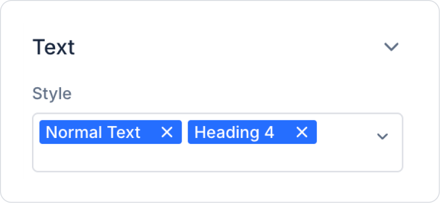
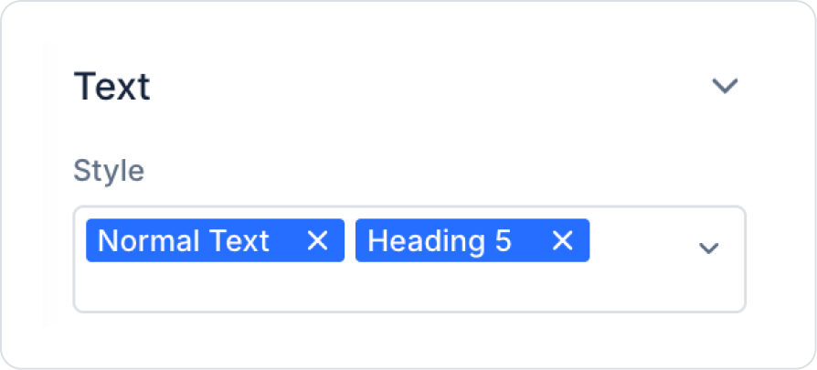
Set the label size to Label > Styling > Text > Style > Normal Text and Heading 4.
Drag and drop another Elements > Display > Label element under the Label element.
In the Label element, define Label > Properties > Value > Current > DisplayText.
Set the label size to Label > Styling > Text > Style > Normal Text and Heading 5.
As a result of these steps, the main page should look like this.
After completing the steps, the main page should look like this.
Step 5 - Element Settings on the Detail Screen
To open the new screen when the worker is clicked in the Node Tree:
Create new pages named “NodeDetail” from the Screens section in the left side panel.
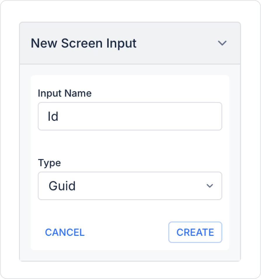
Add Screen Inputs > Add Screen Input to the newly opened page. Set the Input Name field of the added input to Id and the Type field to Guid.
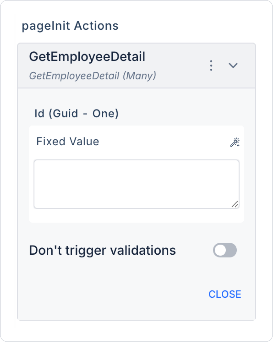
Add the Action > Add Action > Initial Action > Custom > Managed DB > GetEmployeeDetail action to the page.
In the GetEmployeeDetail action, define the Id field as ScreenInputs > Id.
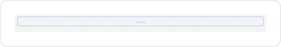
Drag and drop the Elements > Container > Panel element onto the newly opened page.
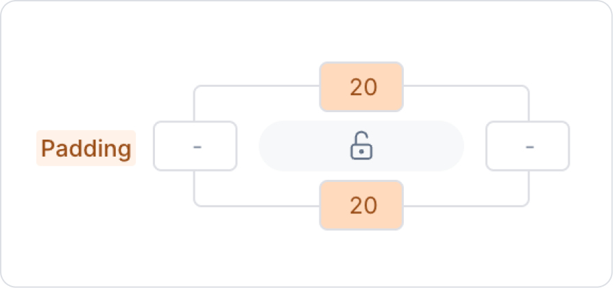
Add 20 px spacing to the bottom and top edges of the Panel element from Panel > Styling > Layout > Padding.
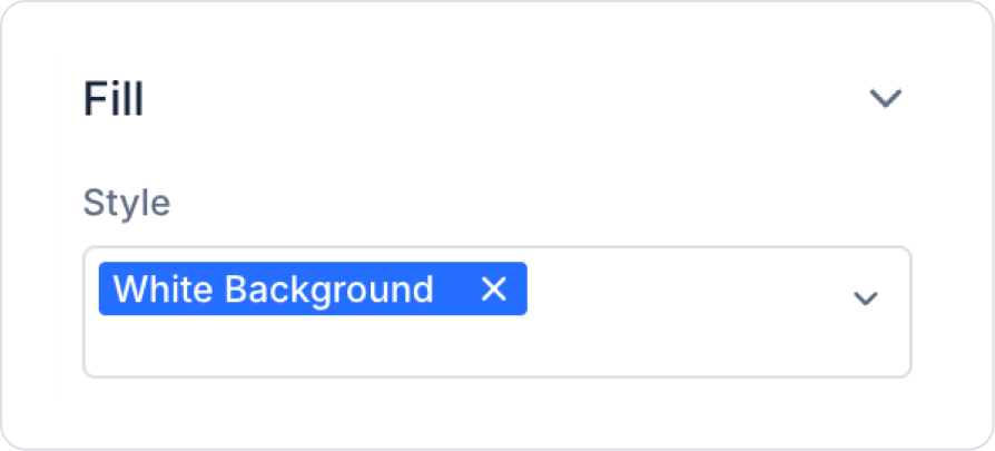
Set the background color to Panel > Fill > Style > White Background.
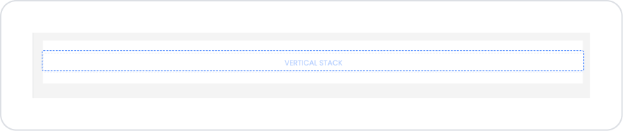
Drag and drop the Elements > Container > VerticalStack element into the Panel element.
In the Vertical Stack element, set VerticalStack > Styling > Align > Horizontally Center.
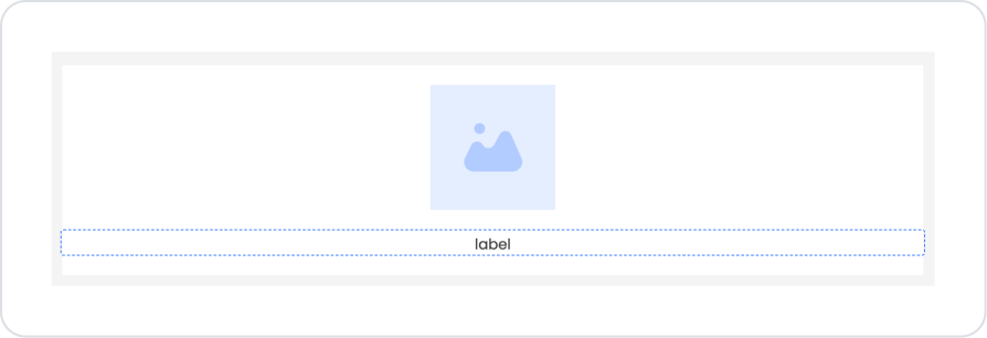
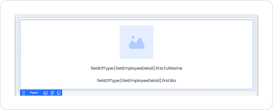
Drag and drop the Elements > Display > Image element into the Vertical Stack.
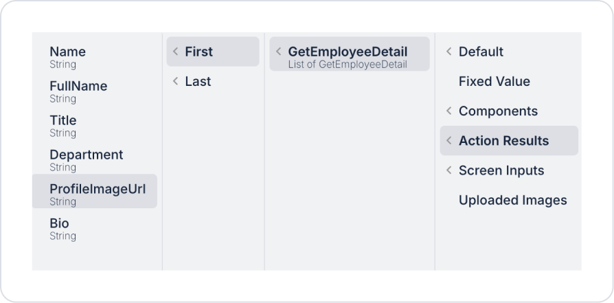
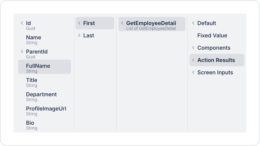
In the Image element, define Image > Properties > Value > Action Results > GetEtmployeeDetail > First > ProfileImageUrl.
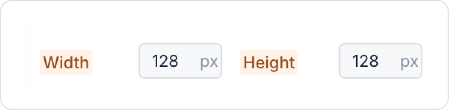
Set the image size to Image > Styling > Width and Height > 128 px.
Add the Elements > Display > Label element to the Vertical Stack element below the image.
In the Label element, define Label > Properties > Value > Action Results > GetEmployeeDetail > First > FullName.
Add another new Elements > Display > Label element inside the Vertical Stack below the Label element.
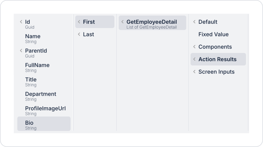
In the Label element, define Label > Properties > Value > Action Results > GetEmployeeDetail > First > Bio.
The detail page should now look like this.
To link the detail page to the main page, go to the main page where the Node Tree element is located from the Screens area in the left side panel.
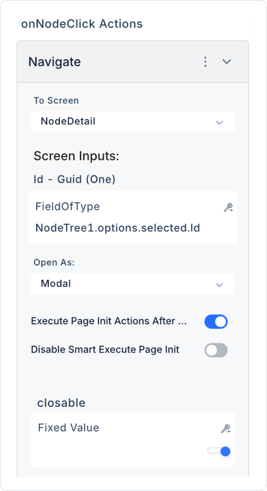
Click on the Node Tree element. Add the NodeTree > Properties > Add Action > onNodeClick > Navigation > Navigate action to the element.
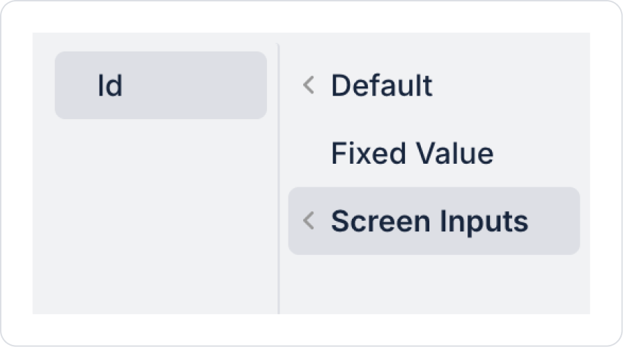
In the Navigate action, set the To Screen field to NodeDetail, set the Open As type to Modal, and define the Id value in the Screen Inputs section as Components > NodeTree > Options > Selected > Id.
Preview:
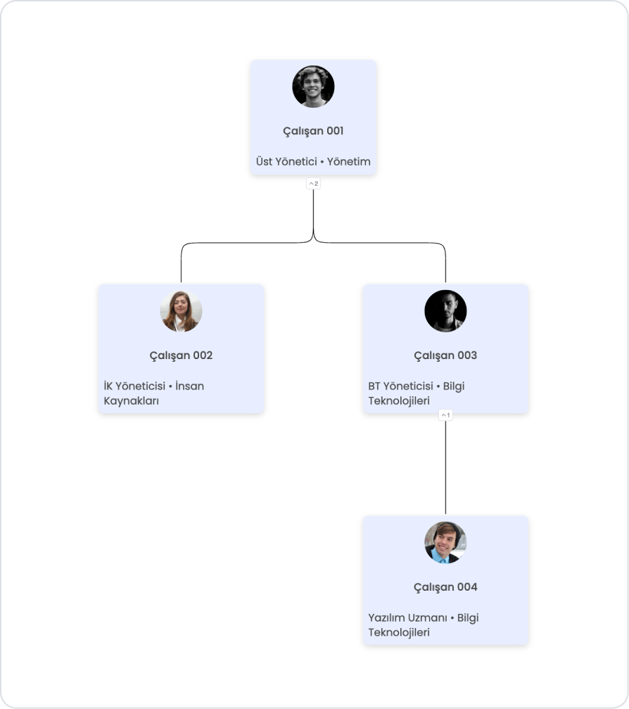
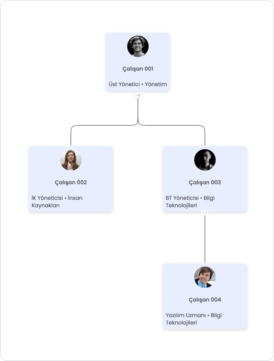
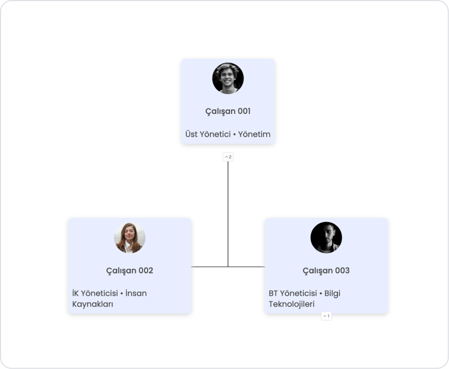
When the application is tested, a Node Tree main page displaying the hierarchical structure of the organization is displayed. On this screen, each employee is presented within a card structure along with their profile picture, employee name, and title/department information. The number indicators below the cards represent the number of sub-hierarchies associated with the relevant employee. These indicators allow the user to view the hierarchical structure in a controlled manner by opening and closing sub-teams; the top manager is positioned at the highest level, while subordinate managers and team members are displayed clearly and understandably.
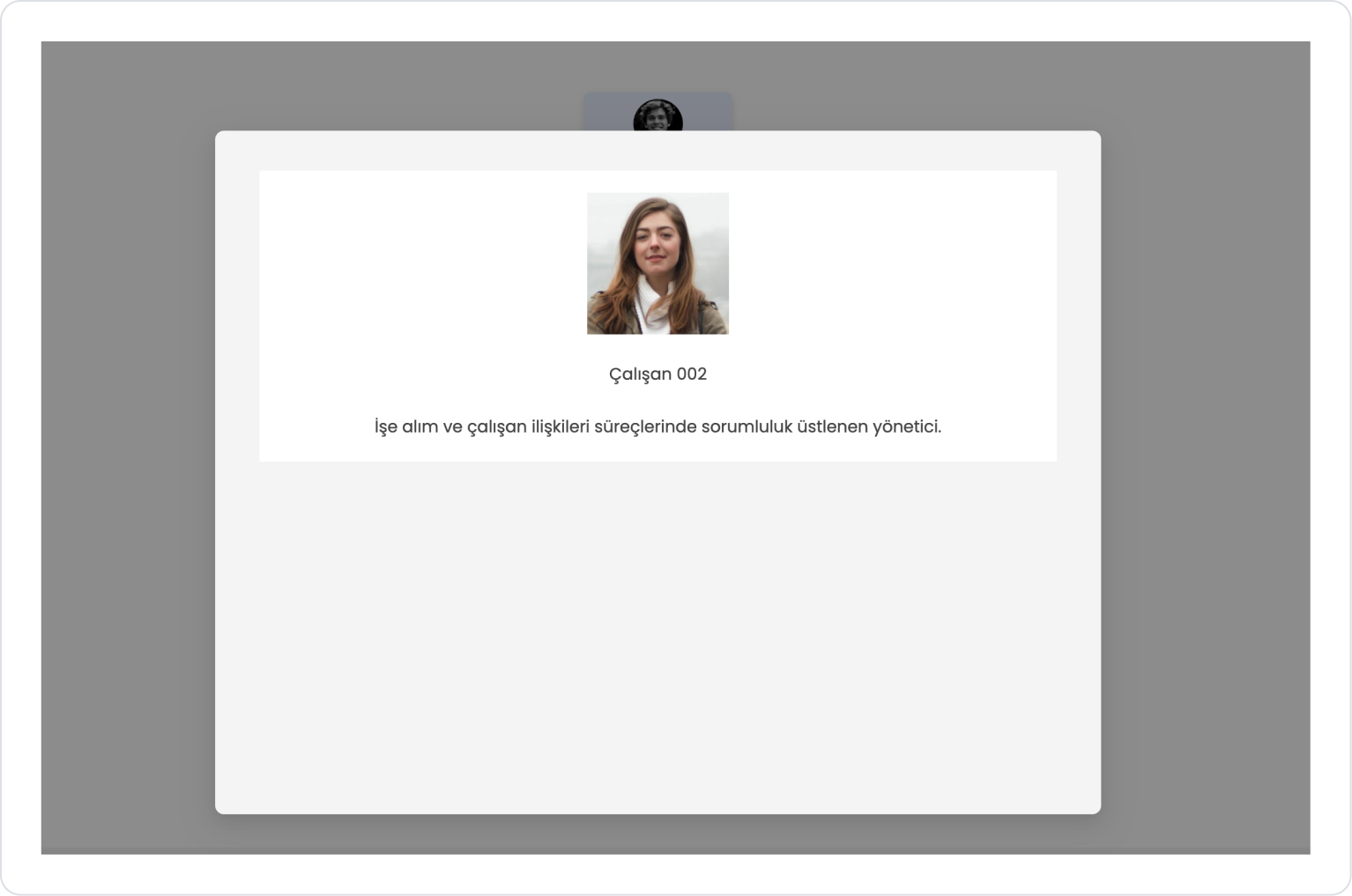
When the user clicks on any employee card in the Node Tree, a details page (modal) opens, displaying details about the selected employee. On this screen, the employee's profile picture, name, and short biography are presented in a simple and focused layout. This structure allows users to quickly obtain information about employees without disrupting the organizational chart and to navigate within the hierarchical structure in a controlled manner.
4. Common Properties
Some fields on the Node Tree element are used in common across all UI elements. Therefore, detailed explanations of the following properties can be found in the relevant general guide pages:
Set up the data structure correctly. For the Node Tree to work correctly, the data source must contain the NodeID and ParentID fields. Incorrect hierarchy disrupts the graph structure.
Select the most appropriate Expand Level value on initial load. In very large tree structures, InitialExpandLevel = 1 improves performance and readability.
Link the Label content to the data as much as possible. Dynamically linking data with Symbol Picker → Current allows the Node Tree to automatically adapt to data updates.
Optimize view spacing. Increasing the LevelDistance and siblingsMargin values in highly branched structures reduces visual clutter.
Match the LinksColor setting to the overall colors of the application for theme consistency. This preserves the integrity of the graphic.
6. Limitations
Node Tree is only supported in web applications. It cannot be used in mobile applications.
Only one action type is supported (onNodeClick). No actions other than clicking on the Node Tree can be triggered
If the data structure is incorrect, the Tree will not be generated. Missing ParentID or recursive relationships prevent the Node Tree from loading.


